Supply chain management is one of the most critical areas for any business. From raw materials to customer delivery, every stage involves multiple processes, decisions, and stakeholders. Without clear visibility into these processes, businesses often face delays, inefficiencies, or increased costs. To address these challenges, companies rely on Supply Chain Management KPI Dashboards in Excel.
A well-structured KPI dashboard brings data together in a single place, allowing managers to monitor performance, track trends, and take corrective action. In this article, we will explore a ready-to-use Supply Chain Management KPI Dashboard in Excel, its features, benefits, and best practices for implementation.
Click to Purchases Supply Chain Management KPI Dashboard in Excel
What Is a Supply Chain Management KPI Dashboard?
A Supply Chain Management KPI Dashboard is a reporting tool that helps businesses measure, monitor, and manage supply chain performance. It combines key performance indicators (KPIs) such as order fulfillment rate, inventory turnover, supplier lead time, and logistics costs into a visual, interactive format.
Unlike static reports, dashboards allow you to view both monthly and year-to-date (YTD) metrics, compare them against targets, and analyze trends over time. With Excel, you can build dashboards that are not only interactive but also customizable, making them a cost-effective solution compared to expensive BI software.
Key Features of the Supply Chain Management KPI Dashboard in Excel
This dashboard is designed with seven worksheets, each serving a specific purpose. Let’s explore each sheet in detail.
Home Sheet
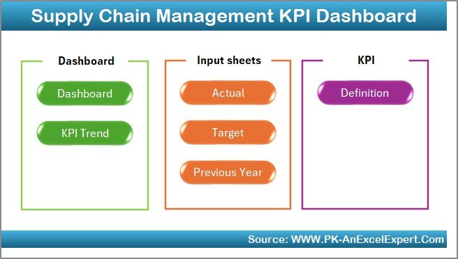
The Home sheet acts as the index page. It includes six navigation buttons that allow you to jump to different parts of the dashboard with a single click. This ensures easy navigation even for users who are not very familiar with Excel.
Dashboard Sheet Tab

The Dashboard sheet is the main control center.
-
You can select a month from the drop-down menu (cell D3).
-
The dashboard updates automatically to show the MTD (Month-to-Date) and YTD (Year-to-Date) actuals, targets, and previous year (PY) data.
-
Visual indicators such as conditional formatting arrows (up/down) highlight whether performance improved or declined.
This tab gives managers an instant performance snapshot across all KPIs.
KPI Trend Sheet Tab

The KPI Trend sheet focuses on individual KPIs.
-
You can choose a KPI from the drop-down menu (cell C3).
-
The sheet displays details such as KPI group, unit, type (UTB – Upper the Better, LTB – Lower the Better), formula, and definition.
-
Trend charts show MTD and YTD progress for Actual, Target, and Previous Year values.
This allows deeper insights into performance trends over time.
Actual Numbers Input Sheet

This sheet is used for data entry.
-
Enter monthly actual values for both MTD and YTD.
-
Use cell E1 to set the first month of the year, making the dashboard flexible for fiscal or calendar year tracking.
This ensures accurate and up-to-date data feeds into the dashboard.
Target Sheet Tab

In this sheet, you define monthly and YTD targets for each KPI. Targets act as benchmarks against which actual performance is measured.
Click to Purchases Supply Chain Management KPI Dashboard in Excel
Previous Year Number Sheet Tab

This tab captures historical data from the previous year. By comparing current performance with the past, you can spot improvement areas and growth patterns.
KPI Definition Sheet Tab

This sheet documents the KPI Name, KPI Group, Unit, Formula, and Definition. Maintaining clear definitions ensures consistency and avoids confusion among team members.
Why Do You Need a Supply Chain Management KPI Dashboard?
Modern supply chains involve many moving parts—suppliers, warehouses, logistics partners, and customers. Tracking these manually through spreadsheets or emails can result in missed deadlines and inefficiencies.
With this dashboard, businesses can:
-
Monitor performance in real-time
-
Identify bottlenecks quickly
-
Compare actual vs. target data
-
Enhance decision-making with accurate insights
-
Ensure accountability with clear metrics
Key KPIs Tracked in the Dashboard
Here are some of the important KPIs that this Excel dashboard can track:
-
Order Fulfillment Rate – Percentage of customer orders delivered on time and in full.
-
Supplier Lead Time – Average time taken by suppliers to deliver goods.
-
Inventory Turnover – How often inventory is sold and replaced over a given period.
-
Logistics Cost per Unit – Total logistics cost divided by the number of units shipped.
-
Forecast Accuracy – How accurate your demand forecasting is compared to actual sales.
-
Return Rate – Percentage of products returned by customers.
-
Backorder Rate – Orders delayed due to stock unavailability.
These KPIs give a 360-degree view of supply chain efficiency.
Advantages of Supply Chain Management KPI Dashboard in Excel
Using a KPI dashboard has several advantages:
✅ Centralized Monitoring – View all supply chain KPIs in one place.
✅ Better Visibility – Spot underperforming areas instantly.
✅ Improved Decision Making – Compare actuals against targets and previous years.
✅ Cost Efficiency – Excel dashboards are cost-effective compared to advanced BI tools.
✅ Customization – Modify KPIs, charts, and targets as per your business needs.
✅ Trend Analysis – Identify long-term improvement or decline.
✅ User-Friendly – Designed for both beginners and advanced Excel users.
Opportunities for Improvement
Even though Excel dashboards are powerful, businesses can further enhance them by:
🔹 Automating data entry using Power Query or VBA.
🔹 Integrating with ERP systems for real-time updates.
🔹 Expanding KPI coverage by adding supplier performance, sustainability, and compliance metrics.
🔹 Using interactive visuals like slicers and pivot charts for more engaging reporting.
🔹 Scaling to Power BI when dealing with very large datasets.
Best Practices for Supply Chain Management KPI Dashboards
To maximize the value of your dashboard, follow these best practices:
📊 Define clear KPIs – Ensure everyone agrees on KPI formulas and definitions.
⏳ Update data regularly – Keep monthly and YTD numbers current.
🎯 Set realistic targets – Benchmark targets based on historical data and market trends.
🔄 Review trends, not just snapshots – Use the KPI Trend sheet to track performance over time.
🤝 Involve stakeholders – Share the dashboard with supply chain, procurement, and finance teams.
⚙️ Leverage automation – Use macros or Power Query to save time.
🌍 Focus on sustainability – Include metrics for carbon footprint and waste reduction.
How to Implement the Dashboard in Your Organization
-
Gather Data – Collect actual, target, and previous year numbers.
-
Customize KPIs – Align KPIs with your supply chain strategy.
-
Enter Data – Populate the Actual Numbers, Targets, and Previous Year sheets.
-
Review Trends – Use the Dashboard and KPI Trend tabs to analyze.
-
Take Action – Address bottlenecks and adjust processes.
-
Continuously Improve – Refine KPIs and targets over time.
Conclusion
A Supply Chain Management KPI Dashboard in Excel empowers businesses to track, monitor, and improve supply chain performance. With real-time insights into KPIs such as order fulfillment, supplier lead time, and logistics costs, managers can make data-driven decisions and stay competitive.
By following best practices and continuously updating the dashboard, organizations can ensure that their supply chain remains efficient, resilient, and future-ready.
Frequently Asked Questions (FAQs)
1. What is a Supply Chain Management KPI Dashboard?
It is a reporting tool in Excel that tracks and analyzes supply chain performance using key metrics such as order fulfillment, lead time, and inventory turnover.
2. Why should I use Excel for a KPI dashboard?
Excel is cost-effective, flexible, and widely available. It allows easy customization without the need for expensive BI software.
3. How often should I update the dashboard?
You should update the dashboard monthly with MTD and YTD data. However, if possible, automate updates for real-time reporting.
4. Can I add my own KPIs?
Yes, the dashboard is fully customizable. You can add new KPIs, formulas, and charts to match your business requirements.
5. Is this dashboard suitable for small businesses?
Absolutely. Small businesses can benefit from clear visibility into their supply chain without investing in complex software.
6. Can this Excel dashboard handle large datasets?
For very large datasets, Excel may become slow. In such cases, consider integrating with Power BI for scalability.
7. What makes this dashboard different from a simple Excel report?
Unlike a static report, the dashboard is interactive, includes drop-down filters, trend charts, and comparisons against targets and previous years.
Visit our YouTube channel to learn step-by-step video tutorials