In the fast-moving world of logistics and supply chain management, efficiency is everything. Whether it’s on-time deliveries, fuel cost management, or route optimization, every metric counts. That’s where the Transportation Dashboard in Power BI becomes a powerful ally — helping logistics professionals visualize, analyze, and optimize transportation performance in real time.
This article explores the full potential of the Transportation Dashboard in Power BI, including its key features, advantages, practical use cases, best practices, and frequently asked questions to help you master data-driven logistics.
Click to Purchases Transportation Dashboard in Power BI
What Is a Transportation Dashboard in Power BI?
A Transportation Dashboard in Power BI is a visual analytics tool designed to help logistics teams monitor and analyze transportation metrics such as delivery performance, route efficiency, fuel costs, and regional trends.
Using Microsoft Power BI, data collected from Excel or other sources is transformed into interactive visual reports, enabling faster decision-making and performance tracking.
Unlike static reports, this dashboard allows users to filter, slice, and compare key performance indicators (KPIs) across multiple dimensions — such as vehicle type, region, route, or month — providing a 360° view of transportation operations.
Structure of the Transportation Dashboard in Power BI
The Transportation Dashboard is designed with five pages, each offering a unique analytical perspective on logistics performance. Let’s explore each page in detail.
Overview Page — The Command Center
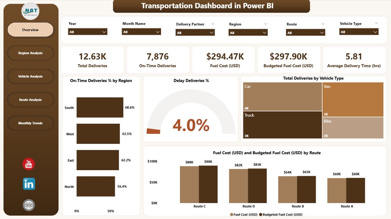
The Overview Page acts as the control room for transportation performance monitoring. It brings together high-level KPIs and summary charts to provide a quick view of operational efficiency.
Key Features:
-
📋 5 KPI Cards: Show critical figures like total deliveries, on-time delivery rate, delay percentage, fuel cost, and budgeted fuel cost.
📈 4 Interactive Charts:
- On-Time Deliveries % by Region – Visualize which regions meet delivery deadlines.
- Delay Deliveries % – Identify problem areas where delays occur.
- Total Deliveries by Vehicle Type – Track which vehicle categories handle the most deliveries.
- Fuel Cost (USD) vs. Budgeted Fuel Cost (USD) by Route – Compare actual and budgeted spending for cost control.
The Overview Page enables logistics managers to make instant assessments and drill down into detailed analysis within seconds.
Region Analysis Page — Understanding Regional Performance
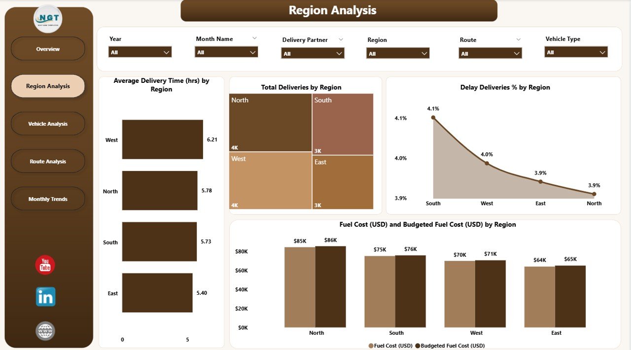
The Region Analysis Page dives deeper into how each region performs in terms of deliveries, fuel efficiency, and delays.
Key Charts:
🚚 Average Delivery Time (hrs) by Region – Evaluate delivery speed across territories.
📦 Total Deliveries by Region – Understand regional workload distribution.
⏳ Delayed Deliveries % by Region – Identify underperforming regions.
⛽ Fuel Cost (USD) vs. Budgeted Fuel Cost (USD) by Region – Compare real and planned spending to highlight inefficiencies.
This page helps organizations pinpoint bottlenecks, plan resource allocation effectively, and reward regions that perform efficiently.
Vehicle Analysis Page — Performance by Vehicle Type
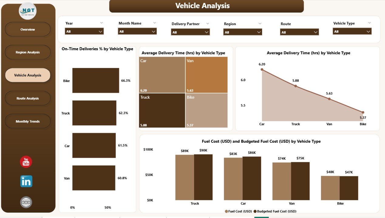
Vehicle efficiency plays a critical role in transportation success. The Vehicle Analysis Page focuses on metrics related to vehicle performance.
Click to Purchases Transportation Dashboard in Power BI
Key Charts:
-
🚛 On-Time Deliveries % by Vehicle Type – Measure reliability across fleets.
-
🕒 Average Delivery Time (hrs) by Vehicle Type – Determine how different vehicles contribute to time efficiency.
-
🛣️ Total Deliveries by Vehicle Type – Analyze which vehicle types are most utilized.
-
⛽ Fuel Cost (USD) and Budgeted Fuel Cost (USD) by Vehicle Type – Track actual vs. planned consumption for cost optimization.
By comparing different vehicle types, logistics managers can decide fleet composition, optimize maintenance schedules, and reduce operational costs.
Route Analysis Page — Optimizing Delivery Paths
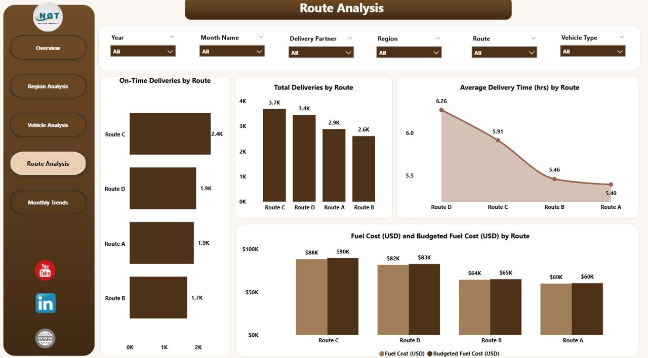
The Route Analysis Page is designed to reveal how specific routes impact overall logistics efficiency.
Core Visuals:
🛤️ On-Time Deliveries % by Route – Evaluate which routes consistently meet timelines.
🕓 Average Delivery Time (hrs) by Route – Track how route conditions affect performance.
📦 Total Deliveries by Route – Analyze which routes handle maximum load.
💰 Fuel Cost (USD) vs. Budgeted Fuel Cost (USD) by Route – Identify high-cost routes that need attention.
This analysis enables decision-makers to optimize route planning, reduce fuel wastage, and enhance overall delivery performance.
Monthly Trends Page — Tracking Performance Over Time
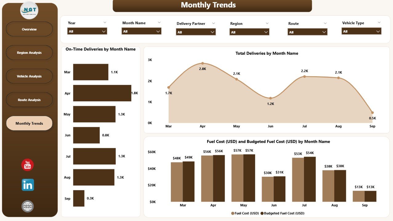
The Monthly Trends Page captures how logistics performance evolves throughout the year.
It’s ideal for management reviews and monthly operational summaries.
Key Charts:
-
📆 On-Time Deliveries % by Month – Track improvements or declines in punctuality.
-
🚚 Total Deliveries by Month – Visualize delivery volume trends.
-
⛽ Fuel Cost (USD) vs. Budgeted Fuel Cost (USD) by Month – Compare monthly spending and budgeting efficiency.
This time-based analysis helps identify seasonal variations, budget deviations, and patterns in delivery efficiency.
Advantages of the Transportation Dashboard in Power BI
A Transportation Dashboard offers numerous operational and strategic advantages. Let’s explore the key benefits that make it indispensable for logistics teams.
📈 1. Real-Time Visibility
Gain instant access to performance data across all regions, routes, and vehicles. The dashboard updates dynamically, allowing you to monitor KPIs as they change.
📊 2. Centralized Data Integration
Power BI combines information from multiple data sources — such as Excel, ERP systems, or GPS trackers — to create one unified view.
⚙️ 3. Performance Comparison
Compare actual vs. target vs. budget metrics across multiple dimensions to identify success areas and performance gaps.
💸 4. Cost Control and Budget Optimization
Track fuel cost deviations and identify patterns that help reduce overall logistics expenses.
🔍 5. Actionable Insights
Interactive slicers and filters enable detailed drill-downs, helping teams investigate issues and take corrective action immediately.
🌍 6. Regional and Vehicle Insights
Understand which regions or vehicle types perform best, ensuring informed decision-making for resource allocation and planning.
🕐 7. Time Efficiency
Automated dashboards eliminate manual report creation, saving countless hours for analytics teams.
📉 8. Improved Decision-Making
With visual insights available in one place, management can make quick, informed, and data-driven decisions.
Why Power BI Is Ideal for Transportation Analytics
Power BI stands out as the preferred tool for transportation analytics due to its combination of power and simplicity.
Key Strengths:
-
Seamless integration with Excel and cloud sources
-
Drag-and-drop visualization
-
Built-in AI and forecasting
-
Security and role-based access
-
Easy publishing and sharing through Power BI Service
Organizations using Power BI can turn raw transportation data into business intelligence dashboards that empower teams at every level.
Click to Purchases Transportation Dashboard in Power BI
How to Create a Transportation Dashboard in Power BI
Here’s a simplified step-by-step guide to build your own version:
-
Prepare Data:
Collect transportation data in Excel or a database with columns like Region, Vehicle Type, Route, Delivery Time, Fuel Cost, etc. -
Load Data into Power BI:
Use Get Data → Excel and connect your dataset. -
Transform Data:
Clean, filter, and calculate new metrics (e.g., Delay % or Fuel Efficiency) in Power Query. -
Design the Pages:
Create 5 report pages — Overview, Region Analysis, Vehicle Analysis, Route Analysis, and Monthly Trends. -
Add Visuals:
Use bar charts, KPI cards, and slicers to visualize each metric effectively. -
Apply Filters and Slicers:
Add Month, Region, and Vehicle Type slicers for easy navigation. -
Format the Dashboard:
Use consistent colors, icons, and Power BI themes for a professional look. -
Publish and Share:
Publish your report to Power BI Service and share with stakeholders.
Best Practices for the Transportation Dashboard in Power BI
Creating a powerful and user-friendly dashboard requires strategic design choices. Follow these best practices to get the most out of your Power BI reports.
✅ 1. Define Clear KPIs
Choose metrics that truly represent performance, such as On-Time Delivery Rate, Average Delivery Time, Fuel Cost, and Delay Percentage.
✅ 2. Keep It Simple
Avoid clutter. Use concise visuals that deliver quick insights.
✅ 3. Ensure Data Accuracy
Regularly validate source data to maintain trust and reliability.
✅ 4. Use Consistent Visual Themes
Apply a consistent color scheme and chart design to make the dashboard look professional.
✅ 5. Add Interactivity
Use slicers and filters to allow users to analyze data dynamically.
✅ 6. Automate Data Refresh
Schedule automatic data updates through Power BI Service for real-time analytics.
✅ 7. Highlight Key Insights
Use conditional formatting, arrows, and color indicators to emphasize critical trends.
✅ 8. Optimize for Performance
Reduce visual clutter and limit heavy visuals to improve report loading speed.
Opportunities for Improvement
Even with robust features, there’s always room to enhance performance dashboards. Consider adding:
-
Predictive Analytics: Use Power BI’s AI features to forecast future delivery trends.
-
Geospatial Mapping: Integrate Power BI Maps for live route visualization.
-
Alert Notifications: Set thresholds for KPIs like fuel cost or delay rate to trigger alerts.
-
Mobile Optimization: Design layouts for Power BI Mobile for on-the-go visibility.
Conclusion
The Transportation Dashboard in Power BI revolutionizes how logistics teams monitor, analyze, and optimize transportation performance.
By integrating real-time data, interactive visuals, and smart analytics, this dashboard delivers a complete view of logistics operations — from vehicle efficiency and route planning to regional performance and cost control.
When implemented effectively, this dashboard not only enhances delivery reliability but also improves profitability and sustainability.
Frequently Asked Questions (FAQs)
1. What data sources can I connect to a Transportation Dashboard in Power BI?
You can connect Power BI to Excel, SQL databases, ERP systems, GPS trackers, or cloud-based logistics tools like SAP and Oracle Transport.
2. Can I customize the dashboard visuals?
Yes! Power BI allows full customization — you can change colors, chart types, and even add custom visuals from the marketplace.
3. How often can the dashboard update?
You can schedule automatic refreshes daily, hourly, or in real time, depending on your data source connection.
4. What KPIs are most important for transportation analytics?
Common KPIs include On-Time Delivery Rate, Average Delivery Time, Total Deliveries, Fuel Cost, Delay %, and Budget Variance.
5. Is Power BI suitable for small logistics businesses?
Absolutely. Power BI is scalable and affordable, making it ideal for both small operators and large enterprises.
6. Can I view the dashboard on mobile devices?
Yes, Power BI reports are mobile-friendly and can be viewed through the Power BI Mobile App on Android or iOS.
7. How do I share the dashboard with my team?
You can publish it to the Power BI Service and share access via email or Microsoft Teams.
Visit our YouTube channel to learn step-by-step video tutorials