In today’s healthcare environment, data is the key to better decisions, higher efficiency, and improved patient care. Hospitals, clinics, and health tech companies rely on real-time performance monitoring to ensure service quality and operational excellence. The HealthTech KPI Dashboard in Power BI makes this possible by turning complex healthcare data into simple, interactive visual insights.
This ready-to-use dashboard is built to help healthcare organizations measure, track, and improve performance using key performance indicators (KPIs). In this article, you’ll learn everything about this professional Power BI dashboard — its structure, features, advantages, and best practices for effective use.
Click to Purchases HealthTech KPI Dashboard in Power BI
💡 What Is a HealthTech KPI Dashboard in Power BI?
A HealthTech KPI Dashboard is a performance management tool designed to help healthcare institutions visualize their key metrics — from patient care efficiency to revenue growth — all in one place.
Built in Microsoft Power BI, the dashboard integrates data from Excel and other sources to create a unified analytical view. It enables healthcare leaders to analyze trends, compare performance with targets, and make informed, data-driven decisions.
Whether you manage a small clinic or a multi-hospital network, this dashboard helps you monitor every aspect of your operations — from clinical quality to administrative performance.
Click to Purchases HealthTech KPI Dashboard in Power BI
🧩 Structure of the HealthTech KPI Dashboard in Power BI
The dashboard is divided into three key pages, each providing a unique view of healthcare performance.
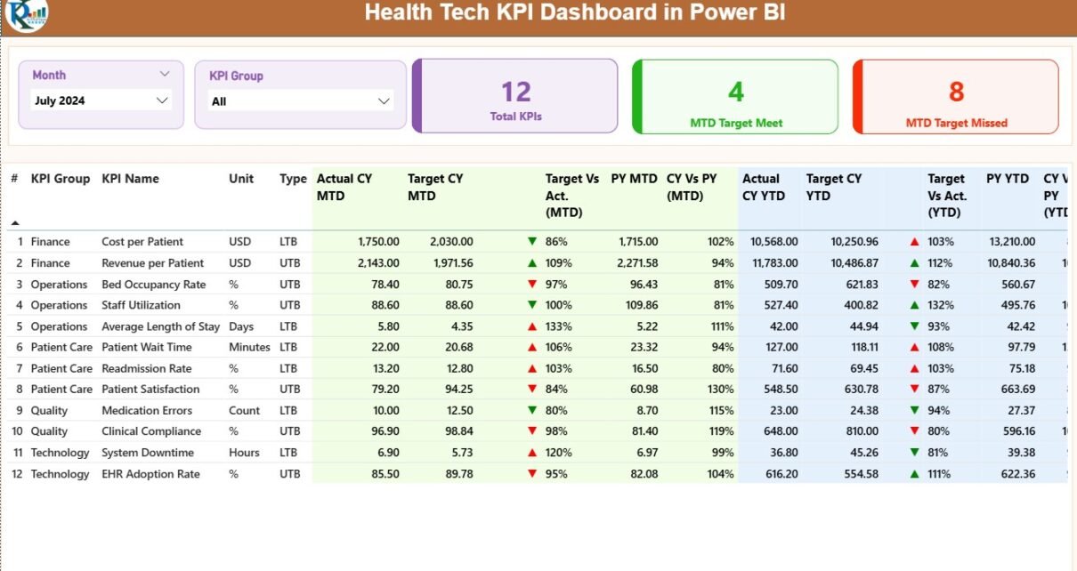
1️⃣ Summary Page — The Central View
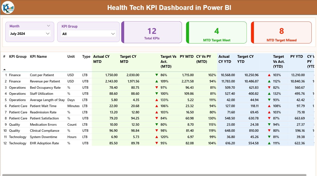
The Summary Page is the main page of the dashboard. It offers a comprehensive snapshot of all KPIs across departments.
Key Features:
-
📅 Month and KPI Group Slicers: Filter your data by specific months or KPI groups to customize the analysis.
-
📊 Performance Cards: Display key numbers such as:
-
Total KPIs Count
-
MTD (Month-to-Date) Target Met
-
MTD Target Missed
-
These summary cards instantly highlight how well your healthcare organization is performing.
2️⃣ KPI Trend Page — Tracking Performance Over Time
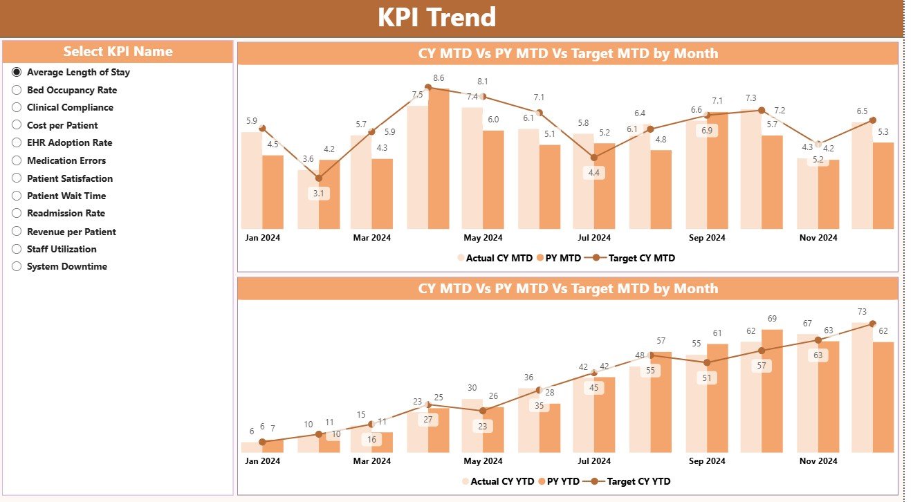
The KPI Trend Page focuses on progress visualization.
It displays two combo charts to compare Actual, Target, and Previous Year values for both MTD and YTD KPIs.
You can use a slicer on the left to choose any KPI name and instantly view how its performance has evolved over time. This dynamic approach allows you to identify trends, predict outcomes, and adjust strategies accordingly.
3️⃣ KPI Definition Page — Drill-Through Detail View
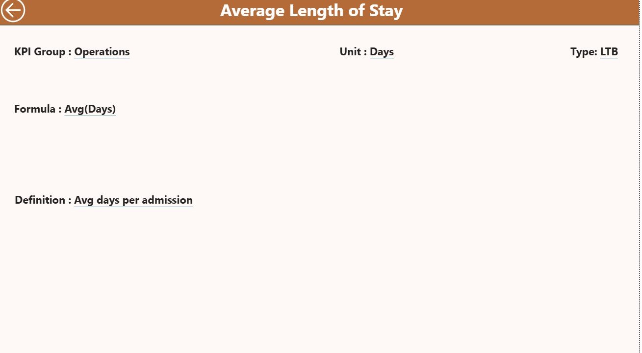
The KPI Definition Page is a hidden, drill-through page that offers deeper insights into each KPI.
From the Summary Page, users can right-click any KPI and drill through to see its Formula and Definition.
This ensures complete transparency — every team member can understand what each KPI measures and how it’s calculated.
To return to the Summary Page, simply click the Back Button in the top-left corner.
📘 Excel Data Source for the Dashboard
The data powering the HealthTech KPI Dashboard comes from an Excel file with three key worksheets. Each sheet plays a crucial role in data management.
Click to Purchases HealthTech KPI Dashboard in Power BI
📄 1. Input_Actual Sheet
Here, you record the Actual KPI data.
-
Columns include KPI Name, Month (use the first date of each month), MTD, and YTD values.
-
These figures automatically feed into Power BI visuals.
📄 2. Input_Target Sheet
In this sheet, you enter the Target values for each KPI — again categorized by month, MTD, and YTD.
This helps compare planned goals versus actual performance.
📄 3. KPI Definition Sheet
This sheet includes:
-
KPI Number
-
KPI Group
-
KPI Name
-
Unit
-
Formula
-
Definition
-
Type (LTB or UTB)
This acts as a reference library for every metric in your dashboard.
🧠 Common KPIs in a HealthTech Dashboard
A HealthTech KPI Dashboard can cover a wide range of metrics depending on your organization’s focus. Here are some commonly used KPIs:
🏥 Clinical Performance KPIs
-
Average Patient Wait Time
-
Bed Occupancy Rate (%)
-
Patient Readmission Rate
-
Average Length of Stay
-
Emergency Response Time
👩⚕️ Operational KPIs
-
Staff Utilization Rate
-
Appointment Cancellation Rate
-
Equipment Downtime (Hours)
-
Surgical Turnaround Time
💰 Financial KPIs
-
Total Revenue
-
Cost per Patient
-
Revenue per Bed
-
Insurance Claim Processing Time
-
Profit Margin (%)
📊 Patient Experience KPIs
-
Patient Satisfaction Score
-
Complaint Resolution Rate (%)
-
Online Appointment Success Rate
-
Telehealth Session Completion Rate
🧩 Technology & Data KPIs
-
System Uptime (%)
-
Data Accuracy (%)
-
EHR (Electronic Health Record) Error Rate
-
Cybersecurity Compliance (%)
By combining these KPIs, healthcare organizations can create a 360-degree view of performance.
💡 Advantages of the HealthTech KPI Dashboard in Power BI
Using Power BI for healthcare analytics brings immense benefits. Here are the most important ones:
1. 📈 Real-Time Visibility
Get up-to-date insights on operations, financials, and patient outcomes in one click.
2. 🧭 Data-Driven Decision-Making
Identify trends quickly, compare with past years, and take timely corrective actions.
3. 🧮 Automated Calculations
All formulas and ratios are computed automatically, eliminating manual effort.
4. 🖥️ Interactive Design
Slicers, filters, and drill-through pages make analysis interactive and user-friendly.
5. 💰 Cost-Effective Analytics
Combining Excel data with Power BI visualization avoids expensive software investments.
6. 🧩 Scalability
You can easily expand the dashboard with new KPIs or departments as your organization grows.
7. 📊 Standardized Reporting
With consistent metrics and visuals, teams can collaborate using the same performance framework.
⚙️ How the Dashboard Works Step-by-Step
-
Prepare Excel Data: Fill in Actual, Target, and Definition sheets.
-
Load Data into Power BI: Connect your Excel file to Power BI Desktop.
-
Refresh Dashboard: Power BI auto-calculates MTD and YTD comparisons.
-
Analyze & Interact: Use slicers and drill-through options to explore performance in real time.
-
Export Reports: Share insights with your leadership team or healthcare partners.
This process ensures accuracy, transparency, and faster decision-making.
🚀 Best Practices for the HealthTech KPI Dashboard in Power BI
To make the most of your dashboard, follow these best practices:
✅ 1. Keep KPIs Focused
Limit the number of KPIs to the ones that truly reflect success in patient care, cost control, and operational efficiency.
✅ 2. Maintain Data Accuracy
Ensure all Excel sheets are regularly updated and reviewed for errors.
✅ 3. Use Standardized Units
Keep units consistent (e.g., hours, %, counts) to ensure clear comparison.
✅ 4. Utilize Conditional Formatting
Use color codes and icons to instantly show progress or risk areas.
✅ 5. Enable Drill-Throughs
Allow users to dig deeper into KPIs to understand the “why” behind the data.
✅ 6. Refresh Data Regularly
Schedule Power BI refreshes weekly or monthly for real-time insights.
✅ 7. Collaborate Effectively
Share Power BI reports securely across departments for collective performance tracking.
🧩 Opportunities for Improvement
You can enhance your HealthTech KPI Dashboard even further by:
-
Adding Power BI Service dashboards for web-based sharing.
-
Integrating Power Automate for email alerts on critical KPIs.
-
Connecting SQL databases or APIs for live hospital system data.
-
Embedding AI-driven insights for predictive analysis (e.g., readmission risks).
These upgrades make the dashboard smarter and more proactive.
🧭 Real-World Use Case: Hospital Chain Example
Let’s imagine a healthcare provider called MedCore Hospitals uses this dashboard.
-
On the Summary Page, management sees that MTD readmission rates are above target.
-
On the Trend Page, it’s clear this issue has been rising for three consecutive months.
-
The Drill-Through Page explains that the problem is mainly within cardiac patients.
Armed with this data, MedCore launches a targeted follow-up care program, resulting in a 25% reduction in readmissions over the next quarter.
This example shows how Power BI helps healthcare professionals make data-backed, impactful decisions.
Click to Purchases HealthTech KPI Dashboard in Power BI
🎯 Why Power BI Is Perfect for HealthTech
Power BI is the ideal platform for healthcare analytics because it combines visual clarity, automation, and scalability.
It integrates seamlessly with Excel, allowing users to move from static reports to dynamic insights without technical complexity.
In the HealthTech sector, where accuracy and timeliness matter most, Power BI delivers real-time intelligence for smarter operations and better patient outcomes.
🏁 Conclusion
The HealthTech KPI Dashboard in Power BI is a complete solution for tracking healthcare performance efficiently.
It consolidates clinical, financial, and operational data into one visual platform, enabling hospitals, startups, and clinics to make confident, data-driven decisions.
By integrating Excel data with Power BI, healthcare leaders can monitor trends, identify bottlenecks, and enhance patient care quality.
Whether you aim to reduce costs, improve response times, or enhance patient satisfaction, this Power BI dashboard empowers you to achieve measurable success.
❓ Frequently Asked Questions (FAQs)
1. What is the main purpose of the HealthTech KPI Dashboard?
It helps healthcare organizations monitor key metrics related to operations, patient care, and finance in real time.
2. Can I customize the KPIs?
Yes, you can add, edit, or remove KPIs easily by updating the Excel source file.
3. Does it require advanced Power BI knowledge?
No. The dashboard is prebuilt and user-friendly, even for beginners.
4. How often should I update the Excel data?
Monthly updates are ideal to ensure accurate MTD and YTD results.
5. Can this dashboard handle multiple hospitals or clinics?
Yes, you can extend the data model to include multiple facilities.
6. Is the Excel file automatically linked?
Yes, once connected, Power BI will refresh the visuals whenever the Excel data changes.
7. What makes this dashboard unique?
It integrates financial, clinical, and operational KPIs into one unified analytics tool.
8. Can I share it with my team?
Yes, you can publish it to Power BI Service or export it as a PDF report.
9. Does it work with live databases?
Yes, it can connect with SQL Server, Azure, or other live data sources.
10. How does it improve decision-making?
It gives real-time insights, enabling faster and more accurate business and clinical decisions.
Click to Purchases HealthTech KPI Dashboard in Power BI
Visit our YouTube channel to learn step-by-step video tutorials