The banking industry runs on data — from customer transactions to branch profitability. However, with data spread across multiple reports, spreadsheets, and systems, decision-making often becomes slow and complex.
A Banking Dashboard in Excel solves this challenge by bringing everything into one place — providing clear visual insights, performance trends, and department-wise analytics at a glance.
In this article, we’ll explore everything about the Banking Dashboard in Excel, including its key features, benefits, best practices, and how to make the most out of it for smarter banking management.
Click to Purchases Banking Dashboard in Excel
What Is a Banking Dashboard in Excel?
A Banking Dashboard in Excel is an interactive reporting tool designed to help banks, financial institutions, and credit unions visualize and monitor their performance across multiple areas such as transactions, revenue, customer satisfaction, and risk.
This Excel-based dashboard transforms complex financial data into meaningful visuals, enabling faster and more accurate decision-making. It eliminates the need for manual report compilation and offers real-time updates through automated charts and formulas.
With this ready-to-use template, banking professionals can track KPIs, compare departmental efficiency, and analyze monthly trends without needing any coding or advanced BI tools.
Why Use Excel for Banking Dashboards?
Many organizations use tools like Power BI or Tableau for analytics, but Excel remains one of the most flexible, accessible, and cost-effective solutions for banking analysis.
Here’s why Excel continues to be the go-to platform:
✅ Ease of Use: Anyone familiar with Excel can start using the dashboard immediately.
✅ Customizable: You can modify charts, formulas, and filters to match your organization’s KPIs.
✅ Offline Access: No need for internet or cloud login — everything runs locally.
✅ Integration-Ready: Easily connect Excel data with accounting, ERP, or CRM systems.
✅ Cost-Effective: No need for expensive software licenses or technical teams.
Key Features of the Banking Dashboard in Excel
This prebuilt Banking Dashboard includes five analytical pages plus support sheets, each designed for specific performance areas. Let’s explore them in detail.
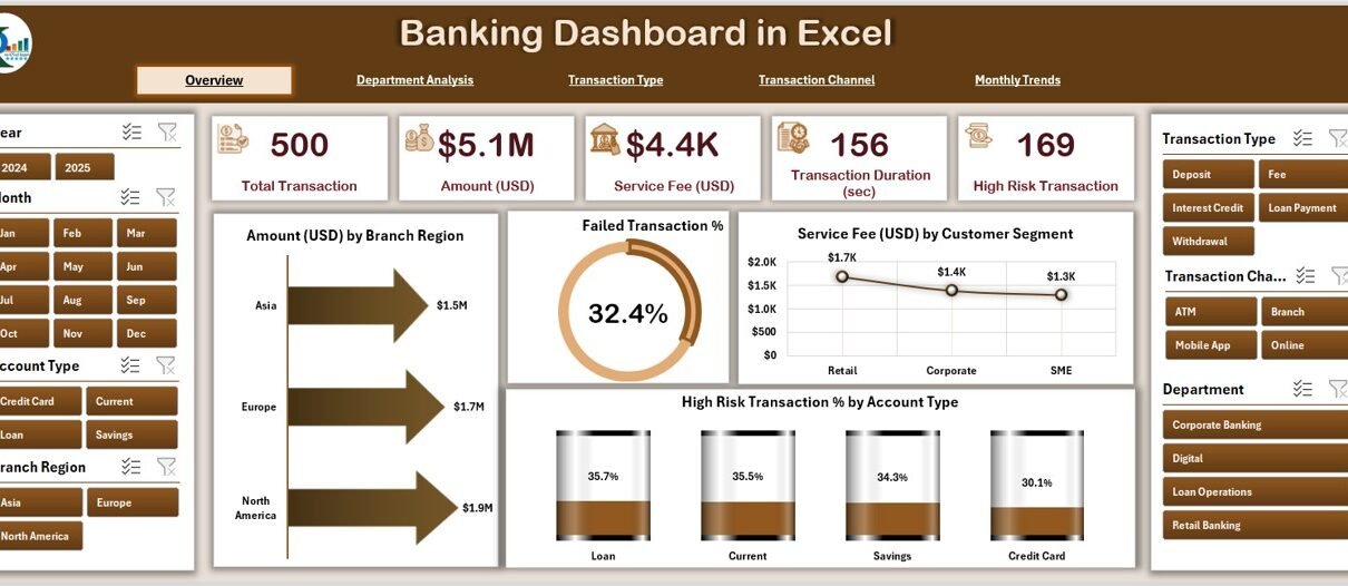
1. Overview Page — Your Central Command Center
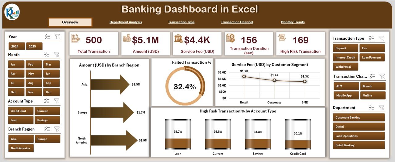
The Overview Page is the main control panel of the dashboard.
On the left side, you’ll find the page navigator, allowing smooth movement between pages. On the right, slicers let you filter data by branch, region, month, or customer segment.
At the top, five KPI cards summarize crucial figures such as total transactions, service fee revenue, failed transaction percentage, and more.
Below the cards, you’ll find four dynamic charts:
💰 Amount (USD) by Branch Region — Understand regional transaction volume and identify high-performing branches.
⚠️ Failed Transaction % — Monitor transaction issues and detect service disruptions early.
💼 Service Fee (USD) by Customer Segment — Analyze which segments contribute the most to service income.
🔒 High-Risk Transaction % by Amount Type — Track risk exposure and flag potential fraud.
This page gives an instant snapshot of the organization’s financial and operational status.
2. Department Analysis — Compare Banking Unit Performance
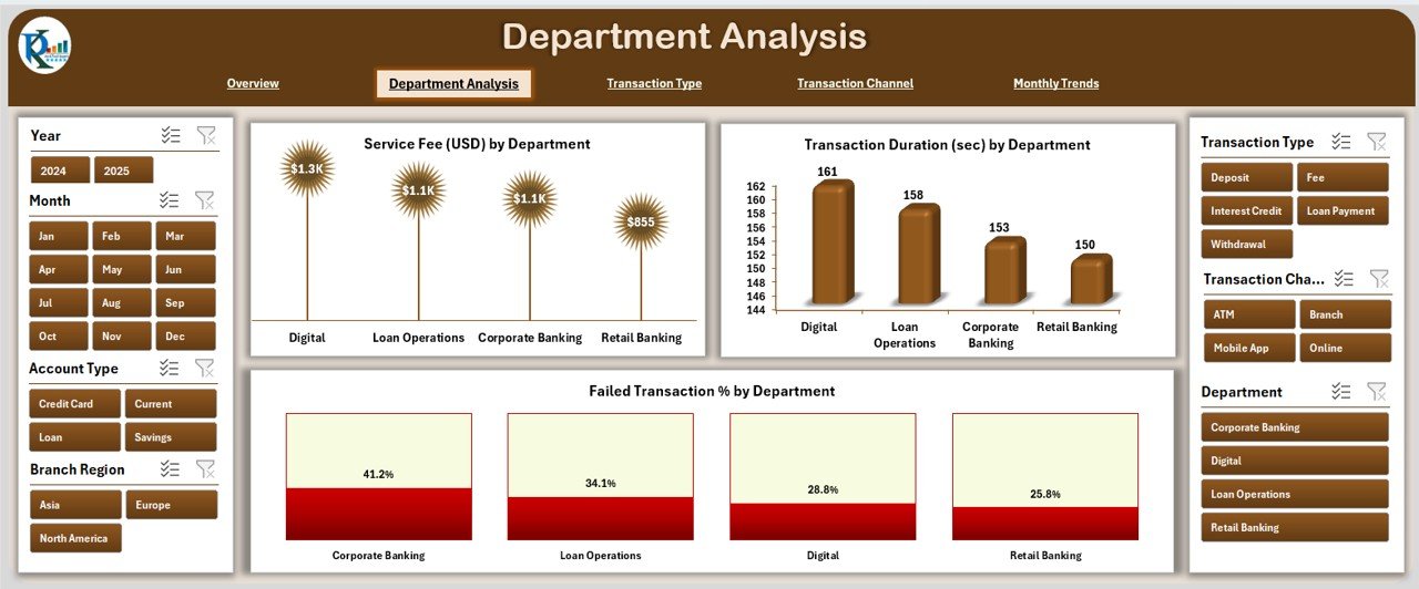
The Department Analysis page helps managers evaluate how each department contributes to overall performance.
It includes:
⭐ Satisfaction Rating (1-5) by Department — Assess internal service quality and customer satisfaction trends.
✅ Completed Event % by Department — Measure departmental efficiency in completing assigned activities.
💵 Profit (USD) by Department — Compare profit contribution from Retail, Corporate, and Investment Banking.
📊 Cost (USD) vs Revenue (USD) by Department — Identify cost-heavy or underperforming units.
With these visuals, executives can allocate resources effectively and focus on departments that deliver the best returns.
3. Transaction Type Analysis — Understand Transaction Behavior
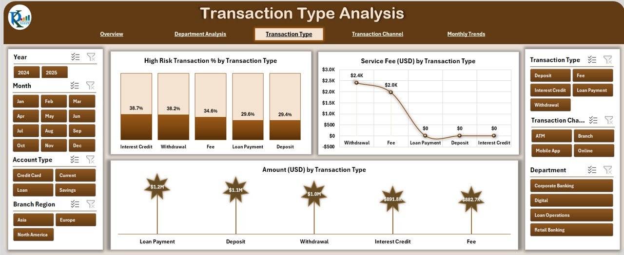
This page focuses on analyzing how different types of transactions affect profitability and performance.
You’ll find three detailed visuals:
🔐 High-Risk Transaction % by Transaction Type — Detect patterns in suspicious or failed transaction categories.
💳 Service Fee (USD) by Transaction Type — Evaluate which services (e.g., loans, deposits, transfers) generate the most fees.
💲 Amount (USD) by Transaction Type — Understand the monetary distribution across different banking operations.
This analysis helps banks optimize transaction processes, strengthen compliance, and improve fee structures.
4. Transaction Channel Analysis — Optimize Customer Experience
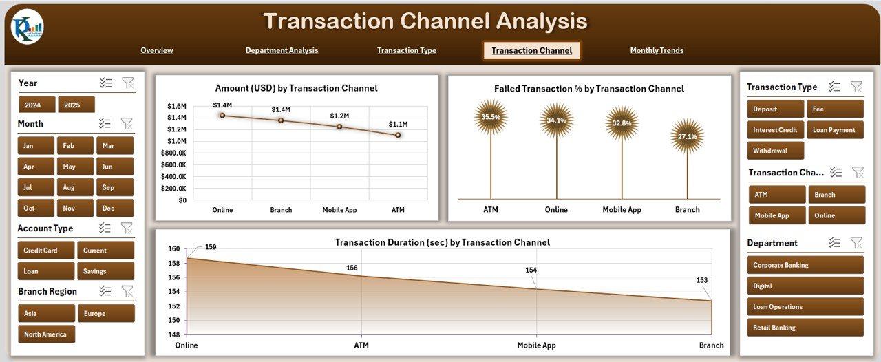
In today’s digital world, transactions happen through multiple channels — ATMs, mobile apps, online banking, and branches.
The Transaction Channel Analysis page helps track and compare their performance.
Charts on this page include:
🏦 Amount (USD) by Transaction Channel — See where customers prefer to transact.
❌ Failed Transaction % by Channel — Identify technical issues or inefficiencies in specific platforms.
⏱ Transaction Duration (sec) by Channel — Measure customer wait time and system performance.
This analysis guides technology teams in enhancing digital experience and reducing failure rates.
Click to Purchases Banking Dashboard in Excel
5. Monthly Trends — Visualize Growth Over Time
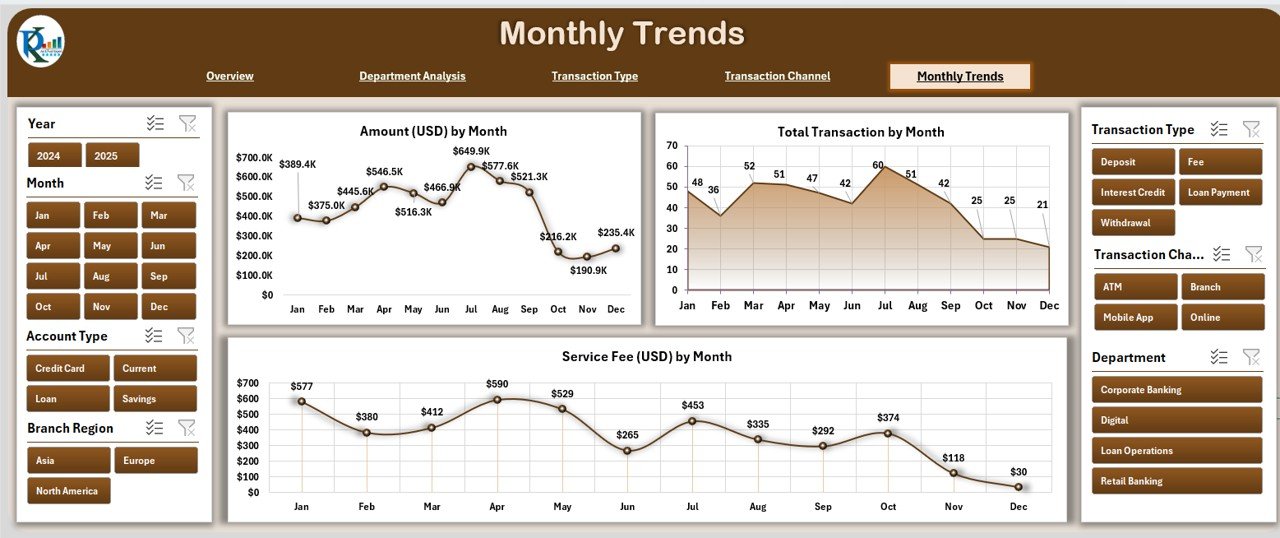
The Monthly Trends page highlights long-term progress and seasonal patterns.
Here, you’ll find:
📆 Amount (USD) by Month — Track revenue growth or decline throughout the year.
🔢 Total Transactions by Month — Monitor customer activity trends.
💸 Service Fee (USD) by Month — Analyze service-based revenue generation trends.
With slicers for selecting months and regions, users can easily evaluate month-over-month improvements and make data-driven plans.
Support Sheets and Data Sheet
The Support Sheet contains reference lists such as branch names, transaction types, and customer segments — all of which populate dropdown menus and slicers automatically.
The Data Sheet holds the master dataset used by all dashboards.
It records transaction amounts, fees, satisfaction scores, and other KPIs. You can refresh or expand this data anytime, and the dashboard updates automatically.
How to Use the Banking Dashboard in Excel
Using this dashboard is simple. Follow these steps:
-
Open the Excel file.
-
Navigate to the Overview Page using the left-side navigator.
-
Use slicers to filter by date, region, or transaction type.
-
Move between analytical pages for deeper insights.
-
Update the Data Sheet periodically with new transactions to refresh visuals automatically.
-
Export or print charts for presentations and management reports.
Advantages of Banking Dashboard in Excel
Let’s look at why banks and financial teams love using this Excel dashboard.
1. Real-Time Decision Making
The dashboard consolidates data across departments, allowing leaders to act instantly when they spot inefficiencies or risk trends.
2. Enhanced Transparency
All metrics are visible in one place. Managers, auditors, and executives can view the same data, reducing confusion and promoting accountability.
3. Time Savings
No more manual reporting or multiple spreadsheets — the dashboard automates calculations, charts, and summaries.
4. Improved Customer Service
By tracking satisfaction ratings and transaction failures, teams can identify issues that affect customer experience and resolve them quickly.
5. Fraud Detection and Risk Monitoring
The High-Risk Transaction visuals highlight suspicious activity, allowing early intervention and better compliance management.
6. Profitability Optimization
By comparing revenue and costs per department or channel, banks can focus on areas that generate higher returns and cut unnecessary expenses.
Opportunities for Improvement
While the Excel dashboard is powerful, you can make it even better with these enhancements:
📈 Add predictive analysis: Integrate formulas to forecast monthly performance.
🔔 Set alert triggers: Use conditional formatting to highlight critical KPIs automatically.
🌐 Connect with external systems: Link the dashboard to live banking data for real-time refresh.
🧾 Include customer feedback analysis: Combine survey data with performance metrics.
🎯 Automate data input: Use macros or Power Query to fetch updated transactions regularly.
Best Practices for Using the Banking Dashboard in Excel
To get the most out of this dashboard, follow these simple but effective best practices:
1. Keep Data Clean and Updated
Always maintain consistent data formatting — date, currency, and text values must be standardized to avoid formula errors.
2. Use Filters Effectively
The slicers on each page allow deeper analysis. Regularly filter by region, branch, or transaction channel to discover patterns and hidden insights.
3. Protect Sensitive Information
Use Excel’s built-in password protection or restricted view options to secure financial data.
4. Review KPIs Monthly
Set a routine to review dashboards at the end of each month to identify performance gaps early.
5. Leverage Visual Storytelling
Add descriptive titles and annotations to make insights clear when presenting to stakeholders.
6. Backup Regularly
Keep a backup copy of your dashboard file to prevent data loss or corruption.
How the Banking Dashboard Supports Different Teams
Click to Purchases Banking Dashboard in Excel
A Banking Dashboard is not just for finance departments. It benefits multiple teams across the organization:
🏢 Branch Managers: Track regional performance, transaction trends, and customer satisfaction.
💼 Finance Teams: Compare revenue and cost performance and generate instant financial summaries.
👨💻 Operations Teams: Identify service delays, failed transactions, and process bottlenecks.
👥 Customer Service Teams: Monitor client feedback and improve service delivery.
🕵️ Risk and Compliance Teams: Detect high-risk activities and ensure regulatory compliance.
Practical Use Cases of the Banking Dashboard in Excel
Let’s see how real-world banking scenarios benefit from this dashboard:
-
Retail Banking: Analyze deposits, withdrawals, and service fees by customer segments.
-
Corporate Banking: Track profitability and transaction types for business clients.
-
ATM Operations: Monitor transaction failures, duration, and regional performance.
-
Digital Banking: Compare mobile and web channel efficiency.
-
Credit Risk Teams: Identify high-risk transactions based on type or region.
-
Executive Reporting: Generate monthly summaries and visuals for board presentations.
How to Customize the Banking Dashboard
You can personalize the dashboard easily by modifying colors, KPI metrics, or formulas.
Here’s how:
-
Change chart themes using Excel’s built-in color palettes.
-
Add new KPIs such as Loan Recovery Rate or Customer Growth %.
-
Include interactive elements like dropdowns or pivot filters.
-
Expand the Data Sheet with new transaction fields (e.g., card type, branch code).
-
Use Power Query or VBA macros for data automation.
These changes make the dashboard fully adaptable to your organization’s reporting needs.
Tips for Building Confidence with Data Visualization
Even if you’re new to dashboards, you can use these tips to become confident in interpreting and presenting insights:
-
Always double-check formulas and pivot data sources.
-
Simplify visuals — use fewer colors and cleaner layouts.
-
Focus on trends rather than individual data points.
-
Use labels and notes to highlight anomalies or achievements.
-
Combine monthly trend charts with comments to explain performance drivers.
Conclusion
The Banking Dashboard in Excel empowers banks and financial institutions to make faster, data-driven decisions.
It transforms raw data into a structured, interactive visual report — allowing leaders to monitor performance, detect risks, and improve profitability in real time.
Whether you manage a regional branch or oversee corporate banking operations, this Excel-based solution helps simplify complex analytics and deliver clear, actionable insights.
With proper maintenance, customization, and adoption, your banking dashboard can become one of your most valuable business intelligence tools.
Frequently Asked Questions (FAQs)
1. What is a Banking Dashboard in Excel used for?
It helps track banking KPIs such as transaction volume, service fees, risk levels, and departmental performance in one visual platform.
2. Do I need advanced Excel skills to use this dashboard?
No. The template is fully ready to use. Basic Excel knowledge like navigation and filter usage is enough.
3. Can I add my own data to this dashboard?
Yes. You can replace the sample data in the Data Sheet with your own banking data, and all charts will update automatically.
4. Is this dashboard compatible with Mac?
Yes, it works on both Windows and macOS versions of Excel.
5. How often should I update the data?
It’s recommended to refresh or update the Data Sheet monthly for accurate insights.
6. Can I add new KPIs or modify charts?
Absolutely. The dashboard is fully editable. You can add or modify KPIs, charts, and slicers to match your organization’s needs.
7. Does the dashboard require VBA or macros?
No. It works with standard Excel formulas and pivot tables. However, you can enhance it with macros if you wish to automate data input.
8. Is my financial data secure in this dashboard?
Yes. Since it operates locally in Excel, you can secure it with password protection and access controls.
9. Who can benefit from this dashboard?
Branch managers, finance analysts, auditors, and executives who want clear insights into financial performance and customer behavior.
10. How do I get started with the Banking Dashboard?
Simply open the file, load your data, and explore the different analytical pages using the left-side page navigator.
Visit our YouTube channel to learn step-by-step video tutorials