In today’s digital-first world, influencer marketing has become one of the most powerful ways for brands to build trust, reach new audiences, and drive conversions. However, managing multiple influencers, tracking campaign results, and measuring engagement performance across platforms can be overwhelming.
That’s where an Influencer Engagement KPI Dashboard in Power BI becomes a game-changer. This ready-to-use, data-driven solution helps marketing teams monitor, analyze, and optimize influencer activities with precision and clarity.
By transforming scattered data from social platforms and reports into interactive visuals, it allows businesses to make data-backed decisions that strengthen influencer strategies and improve ROI.
Click to Purchases Influencer Engagement KPI Dashboard in Power BI
What Is an Influencer Engagement KPI Dashboard in Power BI?
An Influencer Engagement KPI Dashboard is an interactive reporting tool built in Microsoft Power BI that consolidates all key performance indicators (KPIs) related to influencer marketing.
Instead of juggling multiple spreadsheets or manual reports, this dashboard centralizes data from your Excel sheets or campaign management systems into a single, visual platform.
It tracks and compares metrics such as engagement rate, reach, impressions, conversion rate, cost per engagement, and overall influencer performance.
This dashboard provides instant insights on:
-
Which influencers deliver the highest ROI
-
Which campaigns perform best
-
How current results compare with past performance
-
Where optimization opportunities exist
Power BI’s real-time visualization, slicers, and drill-through capabilities make it easy to explore data interactively and uncover actionable insights.
Key Features of the Influencer Engagement KPI Dashboard
This dashboard has three main pages within the Power BI Desktop file, each offering a unique analytical view.
Let’s explore them one by one:
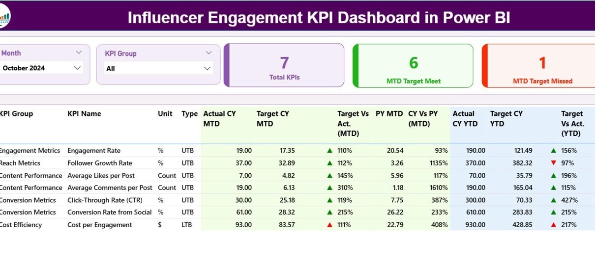
Summary Page
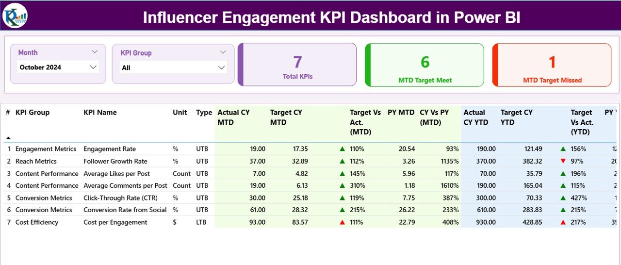
The Summary Page serves as the main control center of the dashboard. It provides a quick overview of all KPIs and their current performance.
Top Section
At the top, you’ll find:
-
Month Slicer — select the reporting month for analysis.
-
KPI Group Slicer — filter KPIs by performance category (for example: Reach, Engagement, Conversion).
KPI Cards
Three performance cards summarize:
-
Total KPIs Count — total number of metrics tracked.
-
MTD Target Met Count — number of KPIs that achieved or exceeded their month-to-date targets.
-
MTD Target Missed Count — number of KPIs that failed to meet their month-to-date targets.
Detailed Table Section
Below the cards, a detailed and dynamic table displays in-depth KPI information, including:
-
KPI Number: Sequential number of each KPI.
-
KPI Group: The performance category (Reach, Engagement, Cost, etc.).
-
KPI Name: Specific metric name such as “Engagement Rate” or “Click-Through Rate.”
-
Unit: Unit of measurement (e.g., %, count, USD).
-
Type: Type of KPI — UTB (Upper the Better) or LTB (Lower the Better).
-
Actual CY MTD: Actual value for current month-to-date.
-
Target CY MTD: Target value for current month-to-date.
-
MTD Icon: Green ▲ or red ▼ indicator showing KPI status against target.
-
Target vs Actual (MTD): Percentage ratio between actual and target.
-
PY MTD: Previous year’s MTD value for comparison.
-
CY vs PY (MTD): Growth comparison percentage between current and previous MTD.
-
Actual CY YTD: Year-to-date actual values for the current year.
-
Target CY YTD: Year-to-date target values.
-
YTD Icon: Green ▲ or red ▼ indicator showing progress against annual target.
-
Target vs Actual (YTD): Performance ratio for year-to-date.
-
PY YTD: Previous year’s YTD value.
-
CY vs PY (YTD): Year-on-year growth percentage.
With this page, marketing managers can instantly see which KPIs are meeting targets, which are underperforming, and where strategic adjustments are needed.
KPI Trend Page
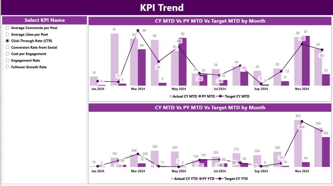
The KPI Trend Page focuses on visual analytics and time-based performance comparison.
This page contains two combo charts that display:
-
MTD (Month-to-Date) Actual vs Target vs Previous Year
-
YTD (Year-to-Date) Actual vs Target vs Previous Year
You can use the KPI Name Slicer on the left to filter and analyze any metric individually.
These visuals reveal how influencer engagement evolves over time, making it easier to spot:
-
Seasonal trends
-
Campaign spikes
-
Long-term growth patterns
-
Consistency of influencer performance
Such visualization helps brands plan upcoming influencer collaborations and allocate budgets more effectively.
KPI Definition Page
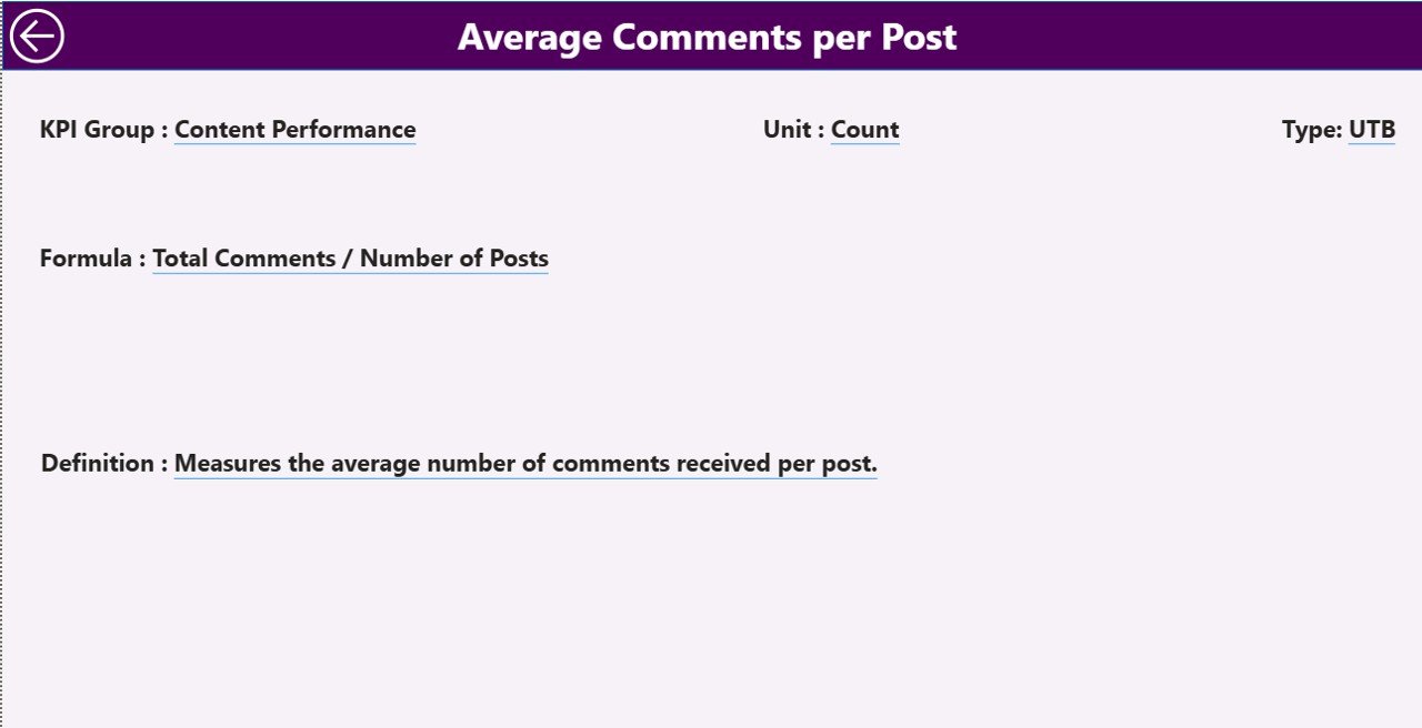
The KPI Definition Page is a drill-through page that provides detailed explanations of each KPI.
Although this page remains hidden by default, users can right-click on any KPI from the Summary Page and select “Drill Through” to view its details.
Here, users find:
-
KPI Formula — how the metric is calculated.
-
KPI Definition — clear description of what the metric represents.
This feature enhances transparency, ensures everyone understands the KPIs uniformly, and maintains consistency in performance reporting.
To return to the main view, simply click the Back button located at the top-left corner.
Excel Data Source Integration
The dashboard connects directly to an Excel file, which acts as its data source.
That Excel file contains three key worksheets, each serving a unique function:
Input_Actual Sheet
This sheet stores actual KPI values for each month.
Columns include:
-
KPI Name
-
Month (use the first date of each month)
-
MTD (Month-to-Date) actual value
-
YTD (Year-to-Date) actual value
Marketers update this sheet every month to refresh the dashboard automatically.
Input_Target Sheet
This sheet contains target values for each KPI.
Columns include:
-
KPI Name
-
Month (use the first date of each month)
-
MTD target value
-
YTD target value
By comparing Actual vs Target data, Power BI dynamically calculates percentage variances and status icons.
KPI Definition Sheet
This sheet defines every KPI used in the dashboard.
Columns include:
-
KPI Number
-
KPI Group
-
KPI Name
-
Unit
-
Formula
-
Definition
-
Type (UTB or LTB)
This ensures every metric remains standardized and easy to interpret.
Why Every Brand Needs an Influencer Engagement KPI Dashboard
Modern influencer campaigns generate massive amounts of data — likes, shares, comments, reach, impressions, conversions, and costs.
Without a structured reporting system, these insights remain hidden in spreadsheets, making performance tracking difficult.
By implementing a Power BI-based Influencer Engagement KPI Dashboard, brands can:
-
Centralize all influencer data
-
Automate performance reporting
-
Eliminate manual Excel errors
-
Visualize trends instantly
-
Compare campaigns easily
-
Save hours of reporting time
It turns raw numbers into interactive intelligence, allowing marketers to act faster and smarter.
Advantages of Influencer Engagement KPI Dashboard in Power BI
Implementing this dashboard brings several benefits that go beyond simple reporting.
1️⃣ Real-Time Insights
With Power BI’s live connection, you can monitor influencer performance as soon as new data is updated in Excel.
2️⃣ Better Decision-Making
Interactive visuals allow teams to explore the data and understand why certain influencers or campaigns perform better.
3️⃣ Target Tracking
The MTD and YTD comparisons ensure every KPI aligns with short-term and annual goals.
4️⃣ Performance Transparency
Color-coded icons (▲▼) make it immediately clear which KPIs are on track and which need attention.
5️⃣ Year-on-Year Comparison
You can compare the current year’s progress against last year’s metrics for continuous improvement.
6️⃣ Centralized Data Source
With all data stored in a single Excel file, everyone accesses the same information — ensuring consistency.
7️⃣ Easy Drill-Through Analysis
Users can drill through to KPI definitions and formulas, making analytics transparent and easy to interpret.
8️⃣ Saves Time and Effort
Once configured, this dashboard updates automatically, eliminating repetitive manual reporting tasks.
How to Use the Influencer Engagement Dashboard Effectively
To get the most out of your dashboard, follow these simple steps:
-
Prepare Data in Excel
-
Update the Input_Actual and Input_Target sheets monthly.
-
Maintain consistent KPI names to avoid mismatches.
-
-
Refresh Power BI Connection
-
Open the Power BI file and refresh to load the latest data.
-
-
Navigate Between Pages
-
Use slicers on the Summary Page to view specific time periods or KPI groups.
-
-
Analyze Trends
-
Visit the KPI Trend Page to examine how your performance changes over time.
-
-
Review KPI Definitions
-
Use the drill-through feature to verify calculations and KPI meaning.
-
-
Export or Share Reports
-
Publish the dashboard to Power BI Service for real-time collaboration and mobile access.
-
-
Click to Purchases Influencer Engagement KPI Dashboard in Power BI
Best Practices for the Influencer Engagement KPI Dashboard
To ensure accurate and actionable insights, apply these best practices:
1️⃣ Define Clear KPI Metrics
Before tracking, ensure every KPI has a clear purpose and measurable definition. Examples include:
-
Engagement Rate = (Likes + Comments + Shares) ÷ Total Followers
-
Conversion Rate = Conversions ÷ Total Clicks
-
Cost per Engagement = Total Spend ÷ Total Engagements
2️⃣ Keep Data Consistent
Use consistent naming conventions for influencer names, campaigns, and months in Excel.
3️⃣ Validate Targets Regularly
Review targets monthly or quarterly to ensure they reflect realistic and updated business goals.
4️⃣ Automate Data Refresh
If possible, automate Excel data imports or connect to social APIs for real-time updates.
5️⃣ Use Color Coding Intelligently
Green and red indicators are great visual cues — but ensure accessibility by adding labels or tooltips.
6️⃣ Compare Performance Across Campaigns
Use slicers to compare influencers or campaigns side-by-side and identify your top performers.
7️⃣ Maintain Data Security
Protect your Excel file and Power BI dashboard with role-based access to safeguard sensitive influencer data.
How This Dashboard Transforms Influencer Marketing
This dashboard isn’t just about numbers — it’s about creating a data-driven influencer ecosystem.
By providing instant insights on performance trends, brands can:
-
Allocate budgets to high-performing influencers
-
Identify underperforming partnerships
-
Optimize campaign timing
-
Track ROI across social channels
-
Build long-term, data-based influencer relationships
Essentially, it bridges the gap between marketing creativity and data-backed decision-making.
Conclusion
The Influencer Engagement KPI Dashboard in Power BI is more than a visualization tool — it’s a strategic ally for every brand investing in influencer marketing.
With its seamless Excel integration, automated updates, and powerful visuals, it helps organizations track engagement, measure ROI, and fine-tune strategies in real time.
From executives to campaign managers, everyone can gain actionable insights, compare results, and make informed decisions — all from one interactive platform.
By adopting this dashboard, brands no longer need to rely on guesswork. Instead, they gain a clear, measurable path toward improved influencer performance and stronger marketing outcomes.
Frequently Asked Questions (FAQs)
1️⃣ What is the purpose of an Influencer Engagement KPI Dashboard in Power BI?
It helps marketing teams track, analyze, and visualize influencer performance metrics like engagement rate, reach, conversion rate, and ROI in a single dashboard.
2️⃣ Can I connect this dashboard to live social media data?
Yes. You can integrate Power BI with APIs from platforms like Instagram, YouTube, or Meta to automatically fetch and refresh influencer data.
3️⃣ How often should I update the Excel data source?
Ideally, update it monthly. For fast-moving campaigns, weekly updates provide even more timely insights.
4️⃣ What kind of KPIs can be tracked?
Common KPIs include engagement rate, reach, impressions, follower growth, cost per engagement, and conversion rate — but you can customize them easily.
5️⃣ Can small businesses use this dashboard?
Absolutely. This tool works for both startups and large enterprises. Even small brands benefit from structured influencer tracking and improved visibility.
6️⃣ Does it require advanced Power BI skills?
Not at all. The dashboard uses intuitive slicers, cards, and charts — so even non-technical users can navigate it effortlessly.
7️⃣ Can I export reports from Power BI?
Yes. You can export visuals to PDF, PowerPoint, or Excel, or share them directly with stakeholders using Power BI Service.
8️⃣ How does this dashboard help improve ROI?
By comparing actual results against targets and previous performance, marketers can identify what works best and allocate budgets more effectively.
9️⃣ Can I customize the KPIs and visuals?
Definitely. You can modify KPI definitions, adjust visuals, and add new filters based on your organization’s specific influencer strategy.
10️⃣ Why choose Power BI instead of Excel alone?
While Excel provides raw data, Power BI adds automation, interactivity, and powerful visualizations — saving time and enhancing decision quality.
Visit our YouTube channel to learn step-by-step video tutorials