Architecture and design projects require a delicate balance of creativity, functionality, and efficiency. Whether you are managing a small architectural studio or a large design firm, tracking key performance indicators (KPIs) is vital to measure performance, ensure client satisfaction, and maintain profitability.
Traditional reporting methods often rely on manual spreadsheets or disconnected tools, which can lead to data errors and wasted time. An Architecture and Design KPI Dashboard in Excel solves this challenge by providing a centralized, dynamic, and easy-to-use solution. With the right dashboard, teams can monitor KPIs such as project delivery timelines, cost efficiency, design quality, and resource utilization in one place.
This article explores the structure, features, advantages, and best practices for implementing an Architecture and Design KPI Dashboard in Excel, along with frequently asked questions.
Click to Purchases Architecture and Design KPI Dashboard in Excel
What Is the Architecture and Design KPI Dashboard in Excel?
The Architecture and Design KPI Dashboard in Excel is a ready-to-use template designed to monitor essential KPIs for design and architectural projects. It helps professionals track performance across multiple metrics with real-time updates, conditional formatting, and automated comparisons against targets and previous years.
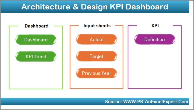
The dashboard includes seven key worksheets that together form a complete monitoring system:
Structure of the Dashboard
Home Sheet – The Central Navigation Hub
The Home sheet serves as the index page of the dashboard.
-
It includes six navigation buttons that allow users to jump quickly to any of the main sections.
-
This ensures easy accessibility and reduces the time spent searching for data.
-
By organizing the entire workflow into clickable buttons, the dashboard feels less like a traditional spreadsheet and more like an interactive tool.
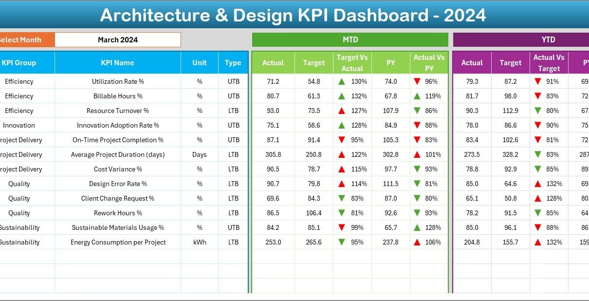
Dashboard Sheet – The Main Visual Display

The Dashboard sheet is the heart of the template.
-
A drop-down in cell D3 lets users choose the month, instantly updating all KPI values across the dashboard.
The sheet displays both Month-to-Date (MTD) and Year-to-Date (YTD) data for:
- Actual values
- Target values
- Previous Year (PY) values
-
Conditional formatting provides green and red arrows to highlight whether performance is improving or declining.
-
Side-by-side comparisons of Target vs Actual and PY vs Actual help management quickly identify strengths and weaknesses.
This visual layout ensures decision-makers can analyze project health at a glance.
KPI Trend Sheet – In-Depth Performance Analysis

The KPI Trend sheet focuses on the progress of individual KPIs over time.
-
A drop-down in cell C3 allows the user to select a specific KPI.
Once selected, the sheet shows:
- KPI Group
- Unit of Measurement
- Type (Lower the Better – LTB, or Upper the Better – UTB)
- Formula and Definition of the KPI
-
Dynamic trend charts visualize both MTD and YTD performance against targets and previous years.
This sheet is ideal for spotting long-term trends and making strategic adjustments.
Click to Purchases Architecture and Design KPI Dashboard in Excel
Actual Numbers Input Sheet – Feeding the Dashboard
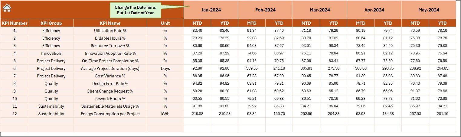
This sheet acts as the data entry area.
-
Users input actual monthly performance figures for each KPI.
-
A field in cell E1 lets you set the starting month of the reporting year.
-
Once entered, these values flow automatically into the dashboard and charts.
This setup ensures data accuracy and reduces duplication, making the dashboard self-updating once numbers are entered.
Target Sheet – Defining Performance Goals
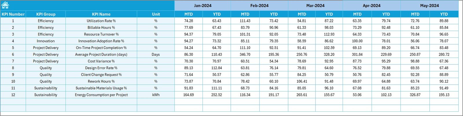
The Target sheet stores monthly and yearly targets for each KPI.
-
Both MTD and YTD targets are included.
-
This allows easy performance evaluation and ensures goals are clear and measurable.
-
By setting these targets at the beginning of the year, managers create a benchmark to compare with actual performance.
Previous Year Numbers – Benchmarking for Growth
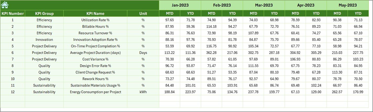
Historical data plays a key role in performance evaluation.
-
The Previous Year Numbers sheet captures last year’s values in the same structure as current data.
-
It enables year-over-year comparison to highlight growth, stagnation, or decline.
-
This provides context for evaluating whether projects are improving over time.
KPI Definition Sheet – Standardizing Metrics
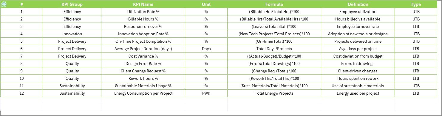
This sheet creates a single source of truth for all KPIs.
-
It lists KPI Names, Groups, Units, Formulas, and Definitions.
-
Standardization ensures that everyone across the team understands each KPI consistently.
-
By defining KPIs clearly, it avoids confusion and improves transparency.
Advantages of the Architecture and Design KPI Dashboard in Excel
Implementing this dashboard provides several benefits:
✅ Centralized Monitoring – All KPIs in one dashboard instead of scattered spreadsheets.
✅ Time-Saving – Automated updates and pre-built formulas reduce manual work.
✅ Visual Insights – Charts, arrows, and conditional formatting make performance trends easy to understand.
✅ Flexibility – Suitable for small studios and large architectural firms.
✅ Customization – Add, modify, or remove KPIs based on project needs.
✅ Benchmarking – Compare current performance with targets and past years.
✅ Ease of Use – No advanced software required; Excel makes it accessible for all.
Opportunities for Improvement
While the dashboard is powerful, there are areas where improvements can enhance its functionality:
🔹 Automation with Macros – Adding VBA scripts can automate data entry and generate reports with one click.
🔹 Integration with External Tools – Linking with project management tools like MS Project or AutoCAD outputs can further streamline data.
🔹 Advanced Visualization – Incorporating Power BI or Excel Power Query for more interactive visuals.
🔹 Real-Time Collaboration – Using cloud-based Excel (Microsoft 365) for multiple users working simultaneously.
Best Practices for Using the Dashboard
To maximize results, follow these best practices:
-
Define Clear KPIs – Ensure all KPIs are aligned with business objectives.
-
Update Data Regularly – Input actual numbers consistently to keep the dashboard accurate.
-
Set Realistic Targets – Define achievable goals based on industry standards and past performance.
-
Use Visual Cues – Rely on arrows, charts, and color codes for quick insights.
-
Review Trends Monthly – Don’t just track numbers; analyze them to improve future performance.
-
Train Your Team – Ensure all stakeholders understand how to use the dashboard effectively.
-
Automate Where Possible – Use formulas and macros to save time and reduce errors.
Conclusion
The Architecture and Design KPI Dashboard in Excel is more than just a reporting tool—it is a decision-making companion. By combining structured data entry, automated calculations, and visual representation, it helps design and architecture professionals stay on top of their projects.
It ensures firms can track efficiency, compare performance against targets, and improve continuously. In an industry where precision and creativity go hand in hand, this dashboard offers the perfect balance of clarity, flexibility, and control.
Frequently Asked Questions (FAQs)
1. What KPIs should an architecture and design firm track?
Key KPIs include project delivery timelines, budget adherence, design quality rating, client satisfaction, resource utilization, and profitability.
2. Can I customize this Excel dashboard for my firm?
Yes, the dashboard is fully customizable. You can add or remove KPIs, adjust targets, and modify visuals to suit your business needs.
3. Is this dashboard suitable for small firms?
Absolutely. It is designed for scalability and can be used by both small studios and large firms.
4. Do I need advanced Excel skills to use this dashboard?
No, the template is user-friendly. Basic Excel knowledge is enough to operate it, though advanced users can enhance it with macros and Power Query.
5. Can I use this dashboard in Microsoft 365 online?
Yes. Using it on Microsoft 365 allows real-time collaboration across teams.
6. How often should I update the actual numbers?
For accurate results, update data at least once a month. Weekly updates can be even more effective for time-sensitive projects.
Visit our YouTube channel to learn step-by-step video tutorials