Running a cleaning business successfully depends on how efficiently you manage operations, track performance, and satisfy clients. When your business grows, managing multiple clients, cities, and service types manually becomes difficult. That’s where the Cleaning Services Dashboard in Excel comes in.
This ready-to-use analytical solution transforms raw cleaning service data into interactive insights — allowing you to visualize performance trends, understand profitability, and make data-driven decisions with ease.
Click to Purchases Cleaning Services Dashboard in Excel
What Is a Cleaning Services Dashboard in Excel?
A Cleaning Services Dashboard in Excel is a powerful analytical tool that helps cleaning businesses monitor their operations across different dimensions — service type, client segment, region, and time.
It is built in Microsoft Excel and designed for business owners, managers, and operations teams to easily evaluate performance using key metrics like:
-
🧾 Total Revenue and Cost
-
💰 Profit (USD) by Region
-
💼 Paid Service %
-
⭐ Customer Satisfaction (1–10)
-
🏙️ Services by City, Region, or Client Segment
This dashboard presents information visually through pivot charts and slicers, making it simple to explore patterns, identify improvement areas, and act quickly.
Key Features of the Cleaning Services Dashboard
The Cleaning Services Dashboard in Excel offers an intuitive, well-organized structure that simplifies data exploration. It includes:
1️⃣ Page Navigator
Located on the left side, the Page Navigator allows smooth navigation across all analytical pages — ensuring you can jump between pages like Overview, Service Analysis, or Region Analysis in just one click.
2️⃣ Multi-Page Dashboard
The dashboard consists of five analytical pages, each focusing on a unique business perspective.
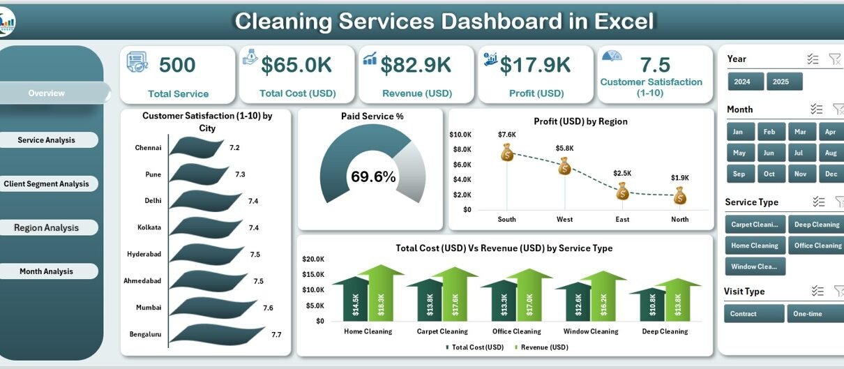
1. Overview Page
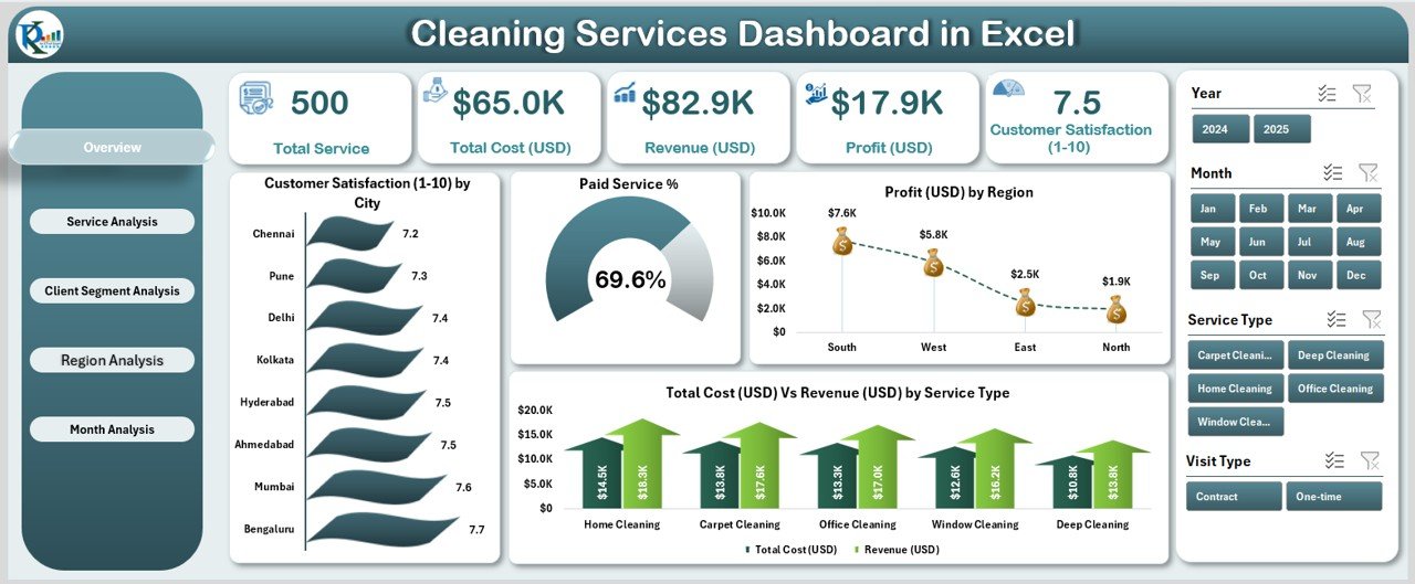
This is the heart of the dashboard — a quick summary of your cleaning business.
You can find four main KPI cards on top for instant performance tracking:
-
Total Customers Served
-
Total Profit (USD)
-
Paid Service %
-
Customer Satisfaction (1–10)
Below these KPIs, the Overview Page presents four powerful charts:
-
⭐ Customer Satisfaction (1–10) by City
-
💳 Paid Service %
-
💰 Profit (USD) by Region
-
⚖️ Total Cost (USD) vs Revenue (USD) by Service Type
These visuals help you understand the overall business health — how satisfied your customers are, where profits come from, and whether services are financially balanced.
2. Service Analysis Page
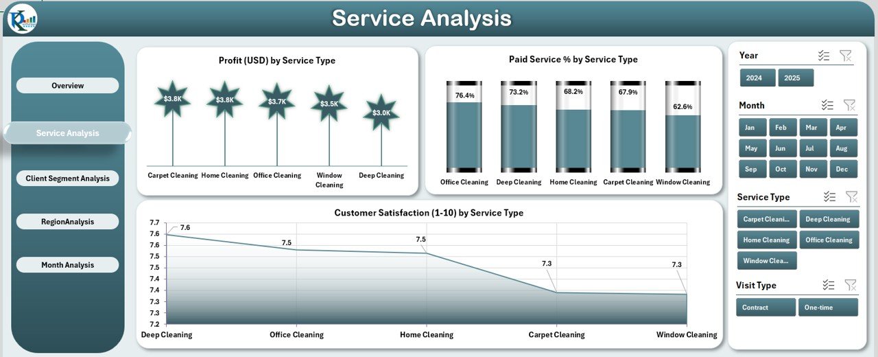
The Service Analysis Page helps you compare profitability and satisfaction across different service types — such as deep cleaning, carpet cleaning, window cleaning, or sanitation services.
It includes:
-
💰 Profit (USD) by Service Type
-
💳 Paid Service % by Service Type
-
⭐ Customer Satisfaction (1–10) by Service Type
By analyzing these charts, you can identify which services deliver the best financial and customer outcomes — guiding your pricing, marketing, and investment decisions.
3. Client Segment Analysis Page
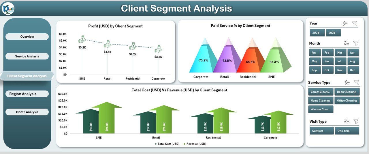
Not all clients are the same. Some belong to the residential segment, others to commercial, industrial, or institutional categories.
This page shows:
-
💰 Profit (USD) by Client Segment
-
💳 Paid Service % by Client Segment
-
⚖️ Total Cost (USD) vs Revenue (USD) by Client Segment
Click to Purchases Cleaning Services Dashboard in Excel
It helps you understand which segment drives the most revenue and where service costs are high, allowing you to target the right clients strategically.
4. Region Analysis Page
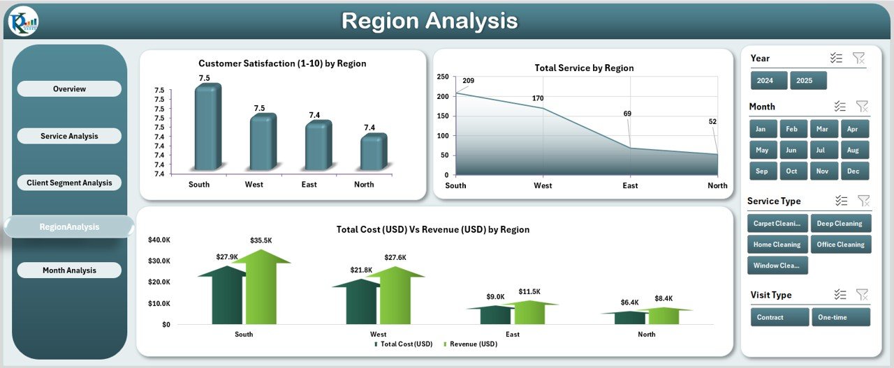
Performance often varies by geography.
This page presents:
-
⭐ Customer Satisfaction (1–10) by Region
-
🧾 Total Services by Region
-
⚖️ Total Cost (USD) vs Revenue (USD) by Region
Using these charts, you can easily find which regions perform best in terms of service volume, customer happiness, and profitability.
5. Month Analysis Page

Understanding performance over time is essential.
This page displays:
-
💰 Profit (USD) by Month
-
🧾 Total Services by Month
-
⚖️ Total Cost (USD) vs Revenue (USD) by Month
This trend analysis shows how your business performs month-to-month, helping you plan budgets, manage resources, and forecast future profits.
Support Sheet: Data Sheet
The Data Sheet is the backbone of this dashboard.
It stores all service data such as:
-
Service ID
-
Date
-
City / Region
-
Service Type
-
Client Segment
-
Cost and Revenue
-
Satisfaction Rating
-
Payment Status (Paid / Unpaid)
The data sheet connects dynamically with all pivot tables, ensuring real-time updates as new information is added.
📊 Why Every Cleaning Business Needs a Dashboard
A Cleaning Services Dashboard in Excel is not just a reporting tool — it’s a complete management assistant.
It helps you:
-
✅ Understand which services generate the most profit
-
✅ Track customer satisfaction across multiple cities
-
✅ Compare revenue vs. cost by month or client segment
-
✅ Monitor payment patterns to improve cash flow
-
✅ Identify inefficiencies before they become losses
With clear visuals, you can quickly pinpoint trends and take proactive steps.
⚙️ How Does the Cleaning Services Dashboard Work?
The dashboard works through a combination of pivot tables, slicers, and formulas in Excel.
You input your operational data into the Data Sheet, and Excel automatically updates all pages.
Here’s how it works step-by-step:
-
Data is entered or imported into the Data Sheet.
-
Pivot tables summarize key metrics (Revenue, Cost, Profit, Satisfaction).
-
Charts visualize these summaries by Service Type, Region, Month, and Client Segment.
-
Slicers provide interactive filtering by City, Month, or Year.
-
KPI cards on the Overview page update automatically.
This automation makes the dashboard ideal even for non-technical users.
Click to Purchases Cleaning Services Dashboard in Excel
Advantages of the Cleaning Services Dashboard in Excel
Implementing this dashboard brings numerous business benefits:
1. Centralized Data Management
You no longer need to manage multiple files or reports. Everything — revenue, costs, customer satisfaction — stays in one Excel file.
2. Real-Time Business Insights
As soon as you update the data, all charts and metrics refresh instantly, giving you real-time visibility into performance.
3. Informed Decision-Making
You can easily compare service profitability, identify high-performing regions, and take corrective actions early.
4. Improved Customer Satisfaction
Tracking feedback helps you focus on underperforming areas, improving service quality and client retention.
5. Enhanced Financial Tracking
Revenue and cost comparisons make budgeting and forecasting more accurate.
6. Easy to Customize
Since it’s Excel-based, you can modify charts, KPIs, or formulas to suit your business model.
Opportunities for Improvement Using This Dashboard
Even though the Cleaning Services Dashboard is feature-rich, businesses can extend it further by:
-
🔁 Integrating VBA Automation for auto-refresh or monthly reports.
-
☁️ Connecting Excel to Power BI for cloud-based visualization.
-
📲 Creating a Mobile-Friendly Version for on-site team reporting.
-
🧮 Adding Predictive KPIs like “Projected Monthly Revenue” or “Expected Service Demand.”
-
🧍 Including Employee Performance Metrics such as average task completion time or customer feedback per cleaner.
These additions can make your dashboard even more powerful.
Analytical Insights You Can Derive
From this dashboard, you can generate many actionable insights, such as:
-
Which city has the highest customer satisfaction?
-
Which month generated the maximum profit?
-
Which service type has low profitability despite high volume?
-
Which region contributes most to revenue?
-
What is the overall paid vs unpaid service ratio?
Each of these insights helps in optimizing operations and strategy.
🧭 Step-by-Step Guide to Using the Dashboard
Step 1: Enter or Import Data
Input your service details into the Data Sheet — including service date, type, region, cost, revenue, and satisfaction rating.
Step 2: Refresh Pivot Tables
Use the Refresh All option in Excel to update the dashboard visuals.
Step 3: Use Slicers
Select any City, Month, or Client Segment slicer to filter visuals instantly.
Step 4: Analyze Trends
Go through each page (Overview, Service, Client, Region, Month) to study performance.
Step 5: Export Reports
Export charts or KPI summaries as PDFs or images for sharing with management or clients.
Best Practices for the Cleaning Services Dashboard in Excel
Follow these best practices to ensure maximum benefit:
✅ Keep Data Consistent: Always use standard names for services, regions, and clients.
✅ Update Data Regularly: Input new service records weekly or monthly for real-time accuracy.
✅ Use Slicers Efficiently: Apply one slicer at a time for clear insights.
✅ Avoid Manual Calculations: Use formulas or pivot tables to reduce errors.
✅ Create Backup Files: Save a backup before making major changes.
✅ Track Key KPIs Monthly: Use the Month Analysis page to compare progress.
✅ Add Conditional Formatting: Highlight high profits or low satisfaction automatically.
These practices help maintain reliability and data accuracy.
🧮 Example Scenario: Business Insight in Action
Let’s say “CleanPro Services” uses this dashboard.
By analyzing the Service Analysis page, they notice:
-
Carpet cleaning has the highest satisfaction rating (9.2/10) but low profit margin.
-
Deep cleaning generates most profit but lower satisfaction (7.8/10).
With this insight, they decide to:
-
Increase carpet cleaning prices slightly.
-
Retrain deep cleaning staff to improve client experience.
This simple data-driven decision improves both profit and customer retention.
🏁 Conclusion
The Cleaning Services Dashboard in Excel transforms how cleaning companies manage performance.
It centralizes data, automates calculations, and provides meaningful visuals that empower business owners to act strategically.
Whether you operate locally or across multiple cities, this dashboard helps you measure growth, control costs, and keep customers happy.
With consistent updates and insights, it becomes your one-stop solution for managing operational excellence.
❓ Frequently Asked Questions (FAQs)
1. Who can use the Cleaning Services Dashboard in Excel?
This dashboard suits cleaning service providers, facility management companies, and contractors who want to monitor performance and profitability using Excel.
2. Can I modify or customize the dashboard?
Yes, you can easily customize it. You can add charts, rename KPIs, or change slicers to match your business requirements.
3. How often should I update the data?
For best results, update your data weekly or monthly. This ensures real-time accuracy in your reports.
4. Do I need advanced Excel knowledge to use it?
Not at all. The dashboard uses simple pivot tables and slicers. Anyone familiar with basic Excel can use it effectively.
5. Can I share the dashboard with my team?
Yes, you can share the Excel file with your team or upload it to OneDrive or Google Drive for collaborative use.
6. What type of charts are used in the dashboard?
It uses Pivot Charts — such as Column, Bar, and Line charts — for easy analysis and comparison.
7. Is the Cleaning Services Dashboard compatible with Mac?
Yes, it works on both Windows and Mac, though slicer visuals may appear slightly different on Mac Excel versions.
8. Can I integrate this Excel dashboard with Power BI?
Absolutely. You can import the Excel dataset into Power BI for advanced visualization and cloud sharing.
Visit our YouTube channel to learn step-by-step video tutorials