In today’s dynamic business world, effective communication is the foundation of organizational success. Whether it’s internal announcements, public relations campaigns, or stakeholder engagement, every message shapes the company’s brand and reputation. To manage this process efficiently, communication leaders need data—not just intuition.
That’s where the Corporate Communications KPI Dashboard in Excel comes in. This ready-to-use template transforms raw data into meaningful insights, helping you track, measure, and improve communication performance across multiple channels.
Let’s explore how this Excel-based dashboard empowers communication teams to build trust, enhance engagement, and align with strategic business goals.
Click to Purchases Corporate Communications KPI Dashboard in Excel
What Is a Corporate Communications KPI Dashboard?
A Corporate Communications KPI Dashboard is an analytical Excel tool that consolidates communication-related metrics into a single, interactive view. It helps organizations monitor key performance indicators (KPIs) such as message reach, employee engagement, media coverage, campaign performance, and sentiment trends.
By combining Excel’s data management power with visual analytics, this dashboard helps corporate communication professionals:
-
Evaluate the effectiveness of internal and external communications
-
Measure audience engagement across multiple platforms
-
Track performance against monthly or yearly targets
-
Visualize progress toward communication goals
This ensures that the communication strategy stays transparent, measurable, and impactful.
Click to Purchases Corporate Communications KPI Dashboard in Excel
Key Features of the Corporate Communications KPI Dashboard in Excel
This KPI Dashboard has 7 interactive worksheets, each with a specific purpose designed for tracking and reporting performance seamlessly.
1. Home Sheet: Easy Navigation

The Home Sheet acts as the main navigation panel of the file.
It features six buttons that allow users to quickly jump to specific sections like:
-
Dashboard
-
KPI Trend
-
Input Sheets
-
Target Sheet
-
Previous Year Data
-
KPI Definition
This setup provides a professional, user-friendly experience where users can access any part of the file with just one click.
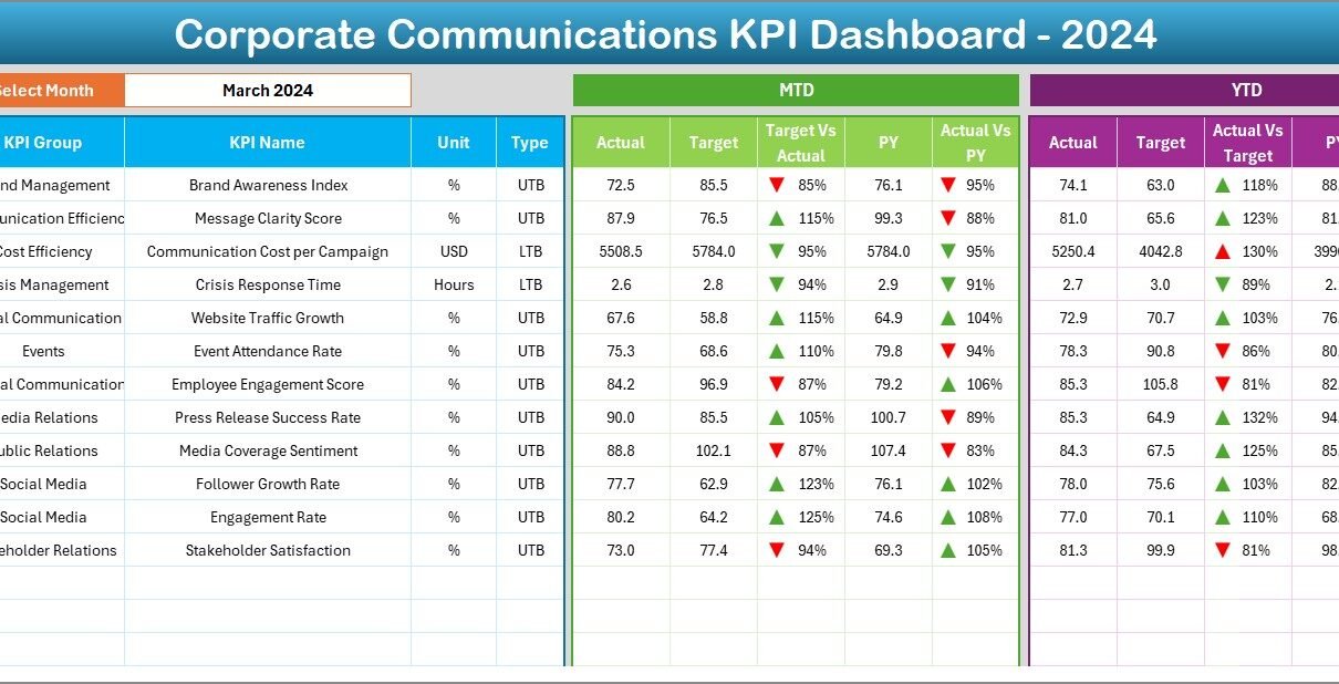
2. Dashboard Sheet: The Heart of the Dashboard
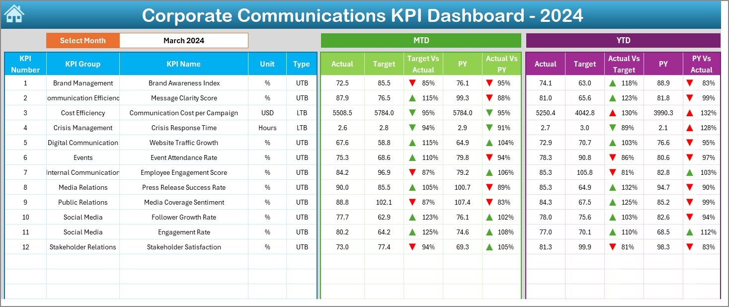
The Dashboard Sheet is the main analytical hub where all KPIs are visually displayed.
Key Highlights:
-
🗓️ Month Selector (Range D3):
Select a specific month from the dropdown. All dashboard data automatically updates. -
📊 MTD and YTD Comparisons:
The sheet shows both Month-to-Date (MTD) and Year-to-Date (YTD) performance metrics. -
🎯 Target vs Actual:
See how actual results compare to monthly and yearly targets. -
🔁 Previous Year Comparisons:
Evaluate performance improvement by comparing current numbers with last year’s data. -
⚙️ Conditional Formatting with Arrows:
Red and green arrows indicate KPI trends—green (▲) for improvement and red (▼) for decline.
With this visual format, communication leaders can instantly identify areas of strength and weakness.
3. KPI Trend Sheet: Visualize the Journey
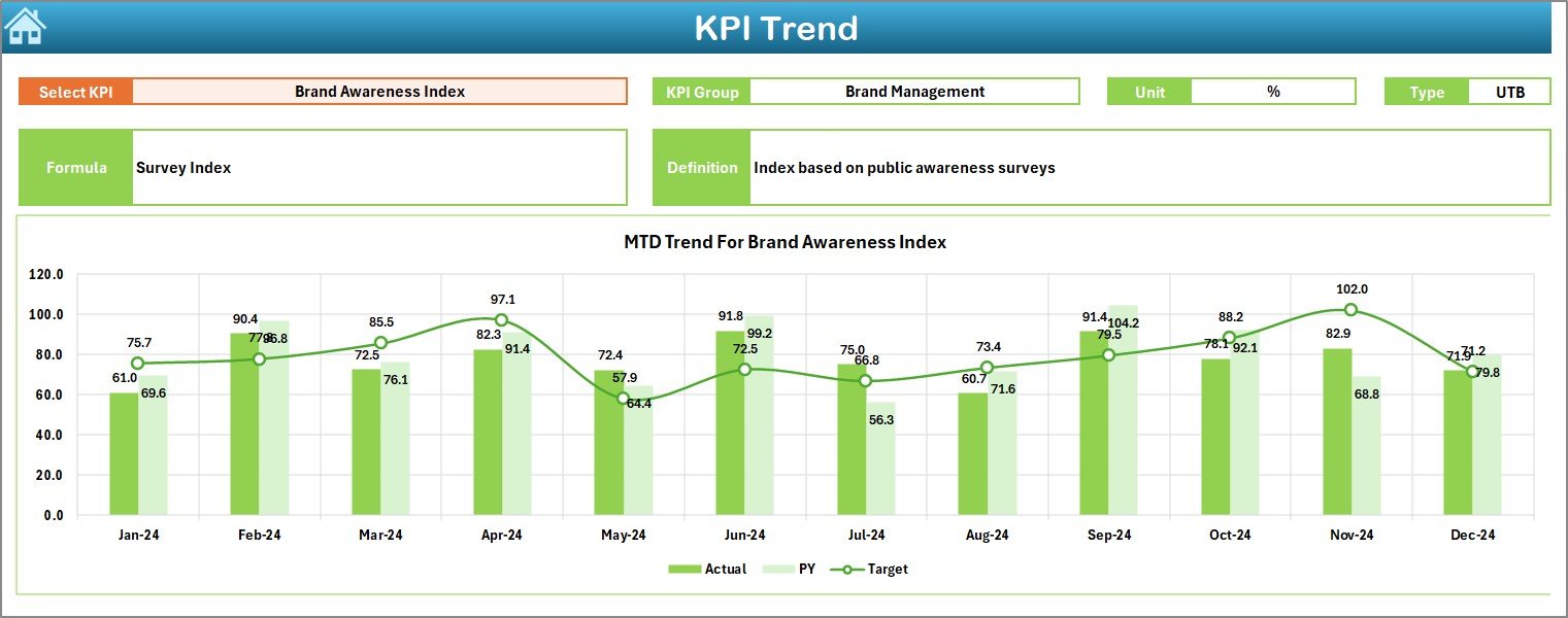
The KPI Trend Sheet brings trends to life. It allows users to select any KPI from a dropdown (cell C3) and view detailed metrics.
Features Include:
-
🔍 KPI Group, Unit, and Type:
Clearly display whether the metric is Lower the Better (LTB) or Upper the Better (UTB). -
📈 MTD & YTD Trend Charts:
Interactive charts visualize how each KPI’s actual, target, and previous year values evolve over time. -
🧮 Formula & Definition:
Every KPI includes a clear formula and definition to ensure consistent interpretation across departments.
This sheet helps communication professionals understand long-term progress, identify performance dips, and plan corrective actions.
Click to Purchases Corporate Communications KPI Dashboard in Excel
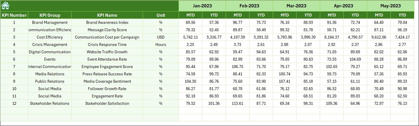
4. Actual Numbers Input Sheet: Record Real-Time Data
This sheet captures the actual performance values for all KPIs.
Instructions:
-
Input MTD and YTD values for each KPI monthly.
-
Modify the month in cell E1 to match your reporting period.
-
Enter accurate data to ensure all connected dashboards update automatically.
This structure keeps the dataset transparent and ready for monthly reporting.
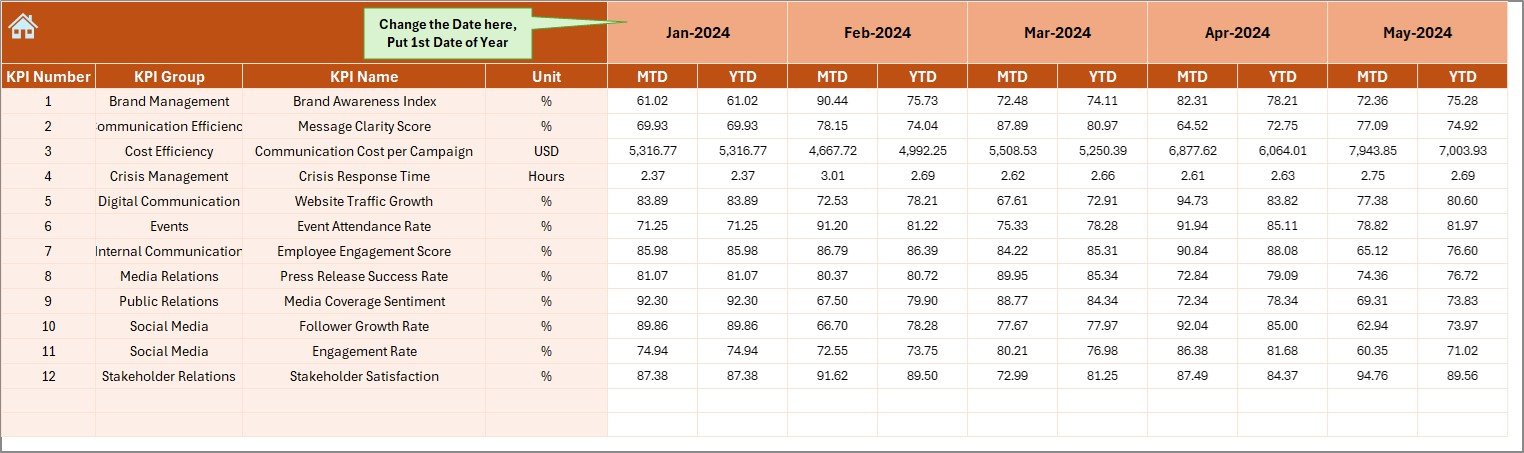
5. Target Sheet: Set Your Goals
Targets define success. In this sheet, you’ll record the MTD and YTD target values for each KPI.
Setting realistic and measurable targets allows teams to:
-
Track goal achievement
-
Identify performance gaps early
-
Align departmental efforts with overall communication strategy
Excel’s built-in formulas and cell references automatically link these targets to the dashboard and trend sheets.
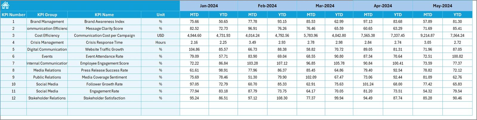
6. Previous Year Numbers Sheet: Track Historical Performance
This sheet stores data from the previous year for the same KPIs.
Comparing current results with historical data enables teams to:
-
Evaluate long-term progress
-
Understand seasonality or recurring trends
-
Celebrate areas of consistent growth
This approach helps build a narrative around communication performance, strengthening strategic reviews.
7. KPI Definition Sheet: Maintain Clarity and Consistency
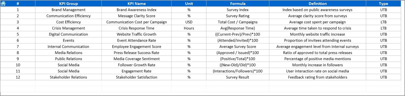
Every KPI should have a clear meaning. The KPI Definition Sheet ensures everyone in the organization interprets metrics consistently.
You’ll find columns for:
-
KPI Name
-
KPI Group
-
Unit of Measurement
-
Formula
-
Definition
This sheet acts as your reference library—essential for onboarding new team members and maintaining accuracy.
Advantages of Using the Corporate Communications KPI Dashboard in Excel
Implementing this Excel-based tool brings several strategic advantages to any organization.
1. Simplifies Complex Data
Instead of juggling multiple spreadsheets, this dashboard consolidates everything—saving time and improving focus.
2. Increases Accountability
Each KPI reflects departmental or campaign responsibility, helping leaders track ownership and drive improvement.
3. Real-Time Performance Visibility
MTD and YTD comparisons ensure that communication teams always know whether they’re meeting goals.
4. Improves Strategic Decision-Making
Data-driven insights enable smarter campaign planning, budget allocation, and resource management.
5. Promotes Transparency
Visual dashboards communicate performance openly across departments, encouraging a culture of collaboration.
6. Easy Customization
Since it’s built in Excel, you can add new KPIs, modify formulas, or integrate with other datasets effortlessly.
Click to Purchases Corporate Communications KPI Dashboard in Excel
Best Practices for Using the KPI Dashboard
To get the best results from this Excel dashboard, follow these best practices:
-
Update Data Monthly:
Keep MTD and YTD figures fresh to ensure accuracy. -
Define KPIs Clearly:
Avoid confusion by maintaining detailed definitions. -
Visualize Progress:
Use conditional formatting and charts to make results easy to understand. -
Compare Against Benchmarks:
Always evaluate against both targets and previous year data. -
Encourage Collaboration:
Share the dashboard across departments for joint accountability. -
Review Trends, Not Just Numbers:
Focus on long-term progress, not single-month performance. -
Use Dropdowns Efficiently:
Utilize filters for months, KPIs, and KPI groups to enhance usability.
How the Dashboard Supports Communication Strategy
A data-driven dashboard transforms communication strategy into measurable outcomes. It helps organizations:
-
Identify which channels (email, press releases, social media) drive the most engagement.
-
Optimize communication frequency and tone based on feedback.
-
Measure the ROI of corporate events and campaigns.
-
Strengthen employee engagement and transparency.
-
Align communication goals with company-wide KPIs.
By quantifying communication impact, teams can continuously improve strategies and build stronger relationships with employees, media, and stakeholders.
Click to Purchases Corporate Communications KPI Dashboard in Excel
How to Use the Corporate Communications KPI Dashboard
Step 1: Enter data in the Actual Numbers Input Sheet.
Step 2: Record monthly goals in the Target Sheet.
Step 3: Add previous year metrics in the Previous Year Sheet.
Step 4: Review the Dashboard Sheet for visual insights.
Step 5: Explore KPI trends through the KPI Trend Sheet.
Step 6: Refer to the KPI Definition Sheet for clarity.
With this structured flow, teams can easily update and analyze performance each month.
Advantages of Building It in Excel
-
Universal Accessibility: Excel is widely available and easy to use.
-
No Additional Software Costs: Fully functional without extra tools.
-
High Flexibility: Users can modify or expand as per business needs.
-
Data Visualization: Built-in charts and conditional formatting simplify analytics.
-
Integration: Excel data can connect with Power BI or other tools later.
This makes Excel the perfect starting point for small and medium communication teams looking for affordable, robust performance management.
Conclusion
The Corporate Communications KPI Dashboard in Excel empowers organizations to track, measure, and enhance communication performance.
It bridges the gap between strategy and execution, turning abstract communication goals into tangible results.
From employee engagement and message reach to media coverage and stakeholder feedback, every KPI offers valuable insights.
With this Excel dashboard, communication professionals can create transparency, boost engagement, and align efforts with business objectives.
If you want your communications to be measurable, data-driven, and impactful, this dashboard is your perfect starting point.
Frequently Asked Questions (FAQ)
1. What is a Corporate Communications KPI Dashboard?
It’s an Excel-based tool that tracks internal and external communication performance using KPIs.
2. Who should use this dashboard?
Communication heads, HR teams, PR managers, and corporate strategists.
3. How often should I update the data?
Monthly updates are ideal to ensure real-time tracking.
4. Can I add more KPIs?
Yes. Simply add new KPIs in the KPI Definition and Input sheets.
5. Is Excel suitable for large organizations?
Yes, especially when departments input their own data in shared templates.
6. What’s the difference between MTD and YTD?
MTD measures current month performance, while YTD tracks progress since the year’s start.
7. Can I track both internal and external communications?
Absolutely. You can define KPIs for both segments within the same file.
8. How does the dashboard show performance trends?
Conditional formatting and trend charts highlight performance visually.
9. Can this Excel dashboard integrate with Power BI later?
Yes. You can import the Excel file into Power BI for advanced visualization.
10. What is the biggest advantage of this dashboard?
It provides measurable, transparent insights into communication performance using a simple Excel interface.
Click to Purchases Corporate Communications KPI Dashboard in Excel
Visit our YouTube channel to learn step-by-step video tutorials