Curriculum work is sold as a project and delivered as a pile of modules, and the two rarely line up. A studio quotes twelve modules, delivers nine, bills the fee anyway, and only finds out at year end that the audit line earns four points less margin than the design line. The Curriculum Development Services Dashboard in Power BI exists to close that gap on a Monday morning rather than in an annual review.
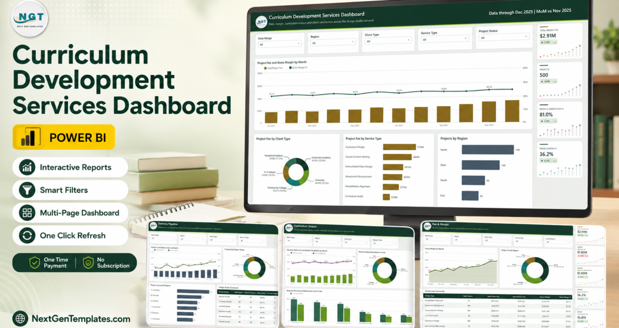
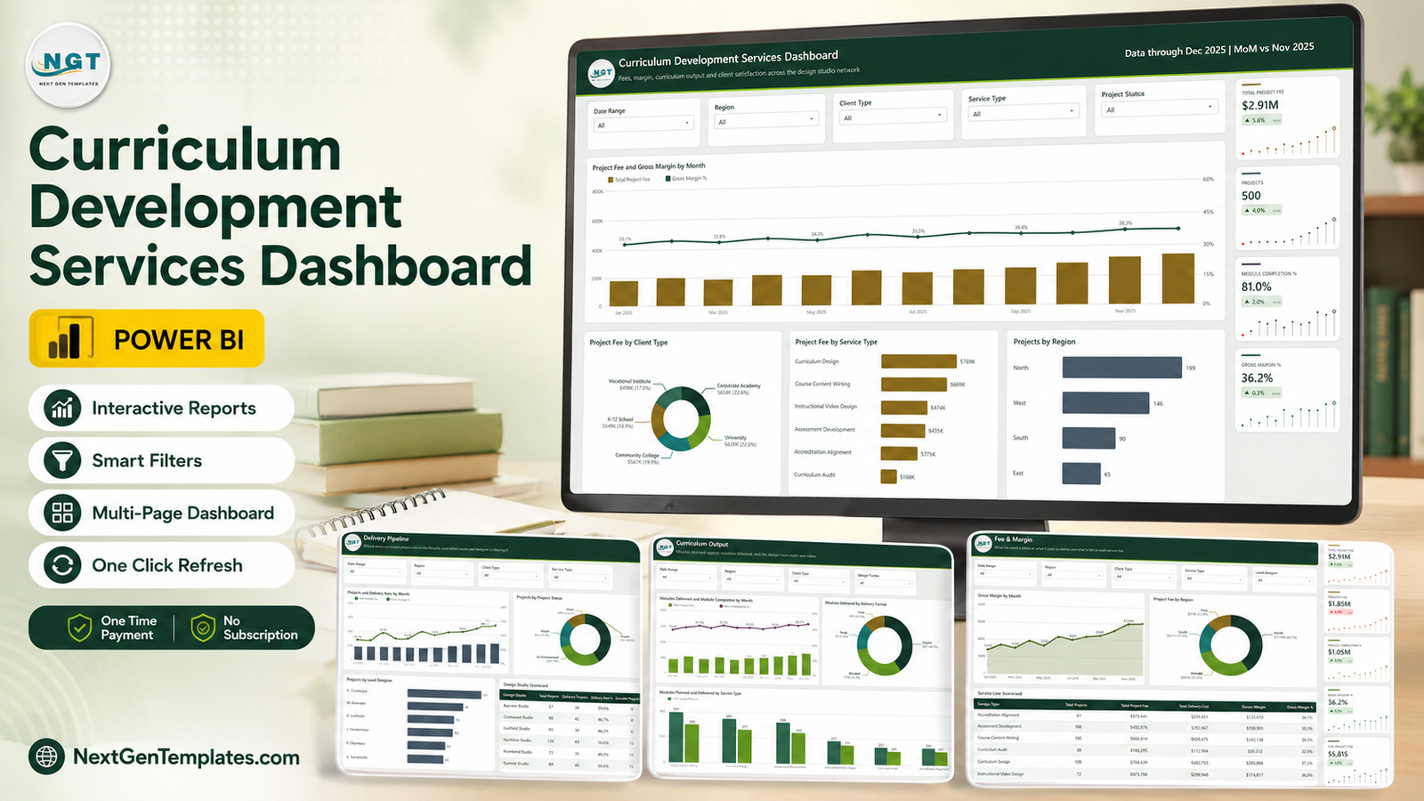
The shipped model carries 500 curriculum projects spanning January to December 2025 – $2.91M of project fees, $1.85M of delivery cost, $1.05M of gross margin at 36.2%, 2,594 modules planned against 2,102 delivered and 17,454 development hours logged across six design studios. Nine report pages, 32 named DAX measures referenced by the visuals, five synced slicers per analysis page and an eight-field drillthrough. Everything below is read off the actual report, not a brochure.
Curriculum Development Services Dashboard in Power BI
Key Features of the Curriculum Development Services Dashboard in Power BI
- Five analysis pages that share a filter context. Overview, Delivery Pipeline, Curriculum Output, Fee & Margin and Clients & Channels. Each page carries Date Range, Region, Client Type and Service Type slicers plus one page-specific slicer, and the selection follows you between pages.
- A KPI rail with month-on-month movement. Every page ends in a right-hand column of cards showing the value, the MoM delta and a twelve-point spark strip – Total Project Fee $2.91M (+5.6%), Projects 500 (+4.0%), Module Completion 81.0% (+2.0%), Gross Margin 36.2% (+0.3%), Avg. Client Rating 4.1 (+1.8%).
- Margin at service-line level. The Fee & Margin scorecard gives projects, fee, delivery cost, gross margin and margin % for all six service types, so a 32.9% line and a 37.2% line cannot hide inside one blended average.
- Plan against delivery, not just delivery. Curriculum Output charts modules planned beside modules delivered for every service type and turns the shortfall into design hours.
- Studio and designer league tables. Delivery rate, cancellations and project load for six studios and six lead designers.
- A hidden Details drillthrough on eight fields – Design Studio, Region, Lead Designer, Client Type, Service Type, Delivery Format, Client Source and Project Status – plus two hover tooltip pages, Category Detail and Trend Detail.
- An open model. One 17-column source table, editable DAX, an editable theme, a swappable logo. Nothing is locked.Curriculum Development Services Dashboard in Power BI
Dashboard Pages Explanation
Page 1 – Overview
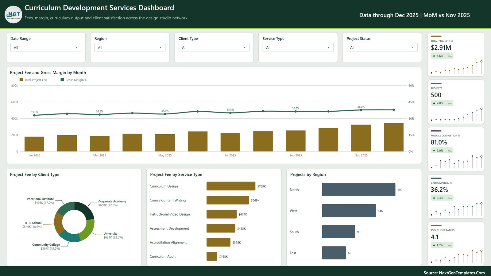
The landing page answers “what did we bill and what did we keep”. Project Fee and Gross Margin by Month puts monthly fee bars behind a margin line that climbs from 33.1% in January to 38.3% in November – the fee grew, and the margin grew with it, which is not always the case. Underneath, Project Fee by Client Type splits the $2.91M almost evenly across five institution types: Corporate Academy $658K (22.6%), University $639K (22.0%), Community College $567K (19.5%), K-12 School $549K (18.9%) and Vocational Institute $496K (17.0%). Project Fee by Service Type ranks the six lines from Curriculum Design at $769K down to Curriculum Audit at $168K, and Projects by Region shows how lopsided the footprint is – North 199 projects against East’s 65.Curriculum Development Services Dashboard in Power BI
Page 2 – Delivery Pipeline
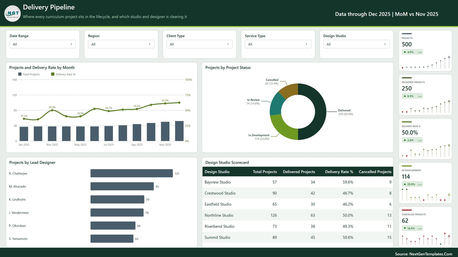
This is the operations page. Of the 500 projects, 250 are delivered, 114 are in development, 74 are in review and 62 were cancelled. Projects and Delivery Rate by Month tracks the rate from 35.1% in January to 62.0% late in the year, and Projects by Lead Designer shows the load is anything but even – R. Chatterjee carries 121 projects while S. Yamamoto carries 63. The Design Studio Scorecard is the page’s sharpest instrument: Bayview clears 59.6% of 57 projects, Northline clears exactly 50.0% of 126 and has cancelled 13, Summit has cancelled 15. The Design Studio slicer replaces Project Status here.
Page 3 – Curriculum Output
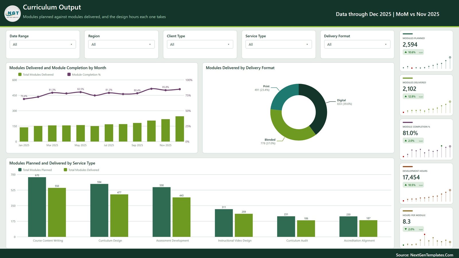
Output measured in modules rather than invoices. Modules Delivered and Module Completion by Month lifts completion from 70.4% to 85.8% over the year. Modules Delivered by Delivery Format splits 2,102 modules into Digital 833 (39.6%), Blended 778 (37.0%) and Print 491 (23.4%) – print is still nearly a quarter of the output. The clustered Modules Planned and Delivered by Service Type is where the gaps show: Course Content Writing planned 670 and delivered 550, Curriculum Design planned 594 and delivered 477, Assessment Development planned 558 and delivered 443. The KPI rail prices it – 17,454 development hours at 8.3 hours per module, and hours per module is the one card trending down. Curriculum Development Services Dashboard in Power BI
Page 4 – Fee & Margin
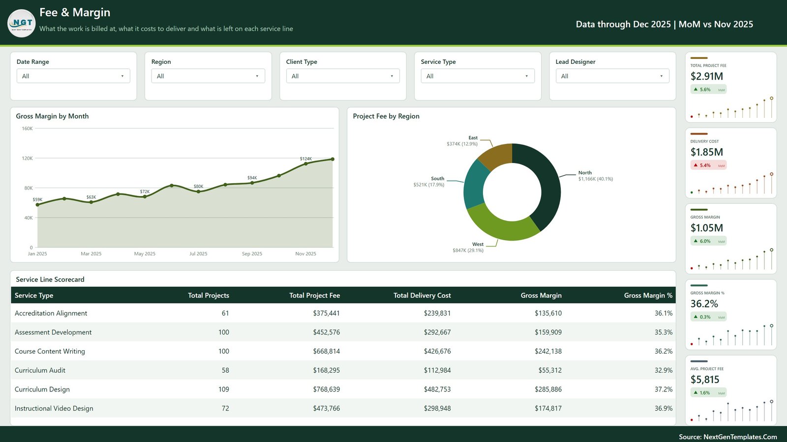
The commercial page. A monthly gross-margin area chart rises from $59K to $124K, Project Fee by Region shows North at $1,166K (40.1%) against East at $374K (12.9%), and the Service Line Scorecard lays out the P&L: Curriculum Design 109 projects, $768,639 fee, $482,753 cost, $285,886 margin at 37.2%; Course Content Writing 100 projects at 36.2%; Instructional Video Design 72 at 36.9%; Assessment Development 100 at 35.3%; Accreditation Alignment 61 at 36.1%; Curriculum Audit 58 at 32.9%. Average project fee sits at $5,815. The page-specific slicer here is Lead Designer, so you can see a single designer’s margin contribution. Curriculum Development Services Dashboard in Power BI
Page 5 – Clients & Channels
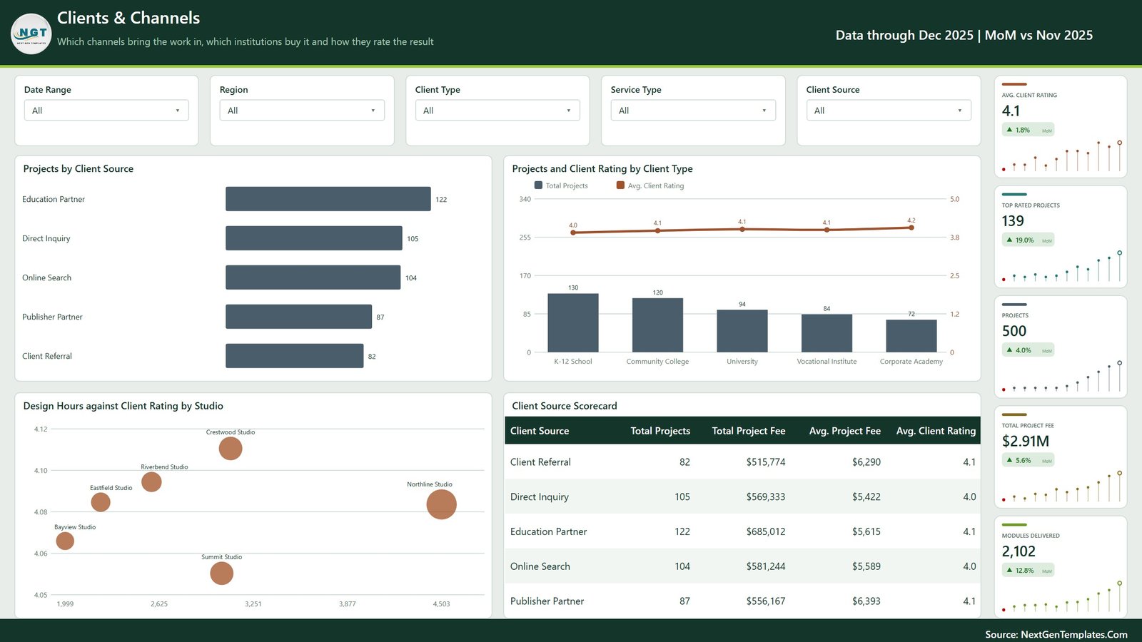
Where the work comes from and how it is received. Projects by Client Source ranks Education Partner 122, Direct Inquiry 105, Online Search 104, Publisher Partner 87 and Client Referral 82. The Client Source Scorecard adds the money: Publisher Partner brings fewer projects but the highest average fee at $6,393, while Direct Inquiry brings more at $5,422. Projects and Client Rating by Client Type shows K-12 School as the biggest volume at 130 projects and Corporate Academy as the best rated at 4.2. The Design Hours against Client Rating by Studio scatter is the quiet insight – Northline sits far right on hours with a mid rating, Crestwood sits left on hours with the highest.
Page 6 and the hidden pages
Page 6 is a “Get More Dashboards” index of the wider NextGenTemplates Power BI catalogue; delete or hide it before you publish internally. Behind the visible pages sit the Details drillthrough (right-click any studio, designer, region, client type, service type, delivery format, client source or status) and the two tooltip pages that render on hover.
Curriculum Development Services Dashboard in Power BI vs. Excel vs. Paid Agency SaaS – Feature Comparison
| This Power BI dashboard | Excel edition | Paid agency SaaS (Mavenlink, Kantata) | |
|---|---|---|---|
| Cost | $17.99 once | $17.99 once | $19-45 per user / month |
| Platform | Power BI Desktop (free, Windows) | Microsoft Excel | Vendor-hosted web app |
| Setup time | Under 30 minutes | Under 20 minutes | 2-6 weeks onboarding |
| Real-time team collaboration | After publishing to the Service | File-based | Built in |
| Mobile access | Power BI mobile app | Excel mobile | Native apps |
| Customisable fields | Full – model, DAX and layout open | Full | Admin-limited |
| Share with a link | After publishing to the Service | No | Yes |
| Year-1 cost at 5 users | $17.99 | $17.99 | $1,140-$2,700 |
| Planned vs delivered modules | Dedicated page | Dedicated sheet | Custom fields required |
| Service-line gross margin | Built in, six lines | Built in | Premium tier |
Who Should Use This Template
Curriculum design studios and instructional-design agencies that bill a project fee and need to see margin by service line. Publisher and EdTech content teams that subcontract writing, video and assessment work to studios. University and community-college centres for teaching and learning running internal curriculum builds with a budget. Accreditation and alignment consultants who want audit work costed separately from design work.
It is not an LMS. The grain is one row per curriculum project, so there is no learner table and no course completion tracking – it reports on the production of curriculum, not on its consumption.
Real-World Use Cases
Rebalancing studio load. A network director opens Delivery Pipeline, sees Northline holding 126 projects at a 50.0% delivery rate with 13 cancellations while Bayview clears 59.6% on 57, and redirects the next intake instead of hiring.
Repricing a weak service line. A finance lead reads the Service Line Scorecard, finds Curriculum Audit at 32.9% against Curriculum Design’s 37.2%, and raises the audit rate rather than cutting across the board.
Closing a module gap. A teaching-centre head sees Course Content Writing 120 modules behind plan on Curriculum Output and moves two writers off video design for a term.
Choosing a channel to invest in. A partnerships manager compares $6,393 average fee from Publisher Partner against 122 projects from Education Partner and funds both differently.
Advantages of the Curriculum Development Services Dashboard in Power BI
- Cost and output live on the same page. Most curriculum reporting shows revenue or module counts, never both – here delivery cost, gross margin and modules delivered share one filter context.
- Honest cancellations. 62 cancelled projects are counted and charted rather than dropped, so the delivery rate means something.
- Consistent filtering. Four common slicers plus one page-specific slicer everywhere means a Region selection survives a page change.
- Detail on demand. The eight-field drillthrough gives project-level rows without cluttering the summary pages.
- No lock-in. A .pbix you own outright, editable in the free Desktop app, with 500 rows of sample data you overwrite.
Opportunities for Improvement
Being straight about the limits: this is an import model, so figures move when you refresh, not live. There is no budget or target table – variance is planned-versus-delivered modules, not fee-versus-budget. Designer utilisation is inferred from development hours and project counts; there is no timesheet or capacity table. The sample calendar runs to December 2025 and every header reads “Data through Dec 2025 | MoM vs Nov 2025” until you load your own dates. And Power BI Desktop is Windows-only, so Mac users need the Service or a VM.
Best Practices
- Explore the shipped sample before touching it – click through all five pages and try one drillthrough so you know what the report can do.
- Keep the 17 source headers exactly as they are when you paste your own rows into Data.xlsx: Project ID, Start Date, Design Studio, Region, Lead Designer, Client Type, Service Type, Delivery Format, Client Source, Project Status, Modules Planned, Modules Delivered, Development Hours, Project Fee, Designer Cost, Operating Cost, Client Rating.
- Repoint the query under Transform data > Data source settings rather than editing the M code, then refresh once and check the KPI rail before publishing.
- Keep Designer Cost and Operating Cost separate. Merging them into one cost column removes the only reason the margin figures are trustworthy.
- Record cancelled projects rather than deleting them – the delivery rate is only meaningful if the denominator is complete.
- Delete or hide the “Get More Dashboards” page before an internal or client release.
- Publish to the Power BI Service if you want links and mobile access; see the Microsoft Learn guide to publishing from Power BI Desktop.
Explore Relevant Templates
- Curriculum Development Services Dashboard in Power BI – the template covered in this post.
- Curriculum Development Services Dashboard in Excel – same subject, pivot-table build.
- Curriculum Development Services KPI Dashboard – a month-picker scorecard rather than an analytical report.
- Teacher Training Institutes Dashboard in Power BI
- E-learning Content Services Dashboard in Power BI
- Corporate Skill Hubs Dashboard in Power BI
Frequently Asked Questions
Do I need a paid Power BI licence to use this dashboard?
No. Power BI Desktop is free from Microsoft and will open, edit and refresh the .pbix. A Pro licence is only required if you want to publish the report to the Power BI Service and share a link.
How do I load my own curriculum projects?
Open Data.xlsx, replace the 500 sample rows keeping all 17 column headers, then in Power BI Desktop use Transform data > Data source settings to point at your file and refresh. Every visual, card and scorecard recalculates.
How many DAX measures does the report contain?
32 named measures are referenced by the report visuals: 16 business metrics – Total Project Fee, Gross Margin, Gross Margin %, Delivery Rate %, Module Completion %, Total Development Hours, Avg. Client Rating and the rest – each paired with an SVG card measure that draws the KPI tile and its spark strip.
Can I add my own KPIs?
Yes. The model is unlocked, so new measures can be written in DAX and dropped onto any page. Adding a source column means adding it to Data.xlsx and refreshing.
Does it track individual courses, learners or enrolments?
No. One row equals one curriculum project. Modules are counted as planned and delivered totals but not named, and there is no learner or enrolment table.
What is the difference between this and the KPI dashboard version?
This is an analytical report – five pages of charts, scorecards and slicers you explore. The KPI edition is a month-picker scorecard with targets and traffic lights for a fixed KPI list. Teams that report monthly to a board often use both.
Is the sample data real?
No. All 500 projects, six studios and six designer names are realistic but fictional sample data, generated so every visual has something meaningful to show before you load your own.
About the Author
Built by PK – Microsoft Certified Professional with 15+ years of Excel, Google Sheets, and Power BI experience. Founder of NextGenTemplates, reaching 300K+ subscribers across YouTube channels. Every template is hand-built and tested before release.
Conclusion
Curriculum production goes wrong in small, quiet ways – a service line that slowly stops paying, a studio that takes on more than it clears, a module plan nobody reconciles. The Curriculum Development Services Dashboard in Power BI puts all three on the same five pages, with the cost side of the ledger visible next to the output side, and it takes about half an hour to load your own data.
Get the Curriculum Development Services Dashboard in Power BI for $17.99 (regular $29.99) – one payment, instant download, yours to rebrand. For walkthroughs of this and every other NextGenTemplates report, subscribe on youtube.com/@PKAnExcelExpert.