Anyone who has tried to report on decentralized finance activity in a spreadsheet knows the problem: the export is easy, the reporting is not. A single month can carry a dozen protocols, eight chains, ten assets and nine transaction types, and the moment somebody asks “which chain is eating our gas budget?” you are back in pivot-table land building the same four charts you built last month. DeFi (Decentralized Finance) Dashboard in Excel
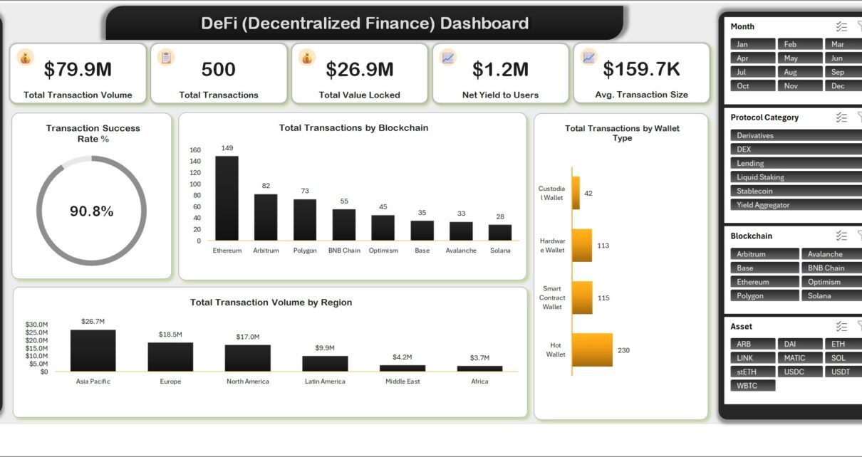
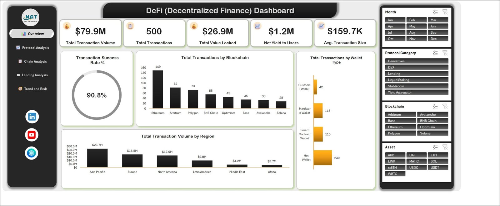
The DeFi (Decentralized Finance) Dashboard in Excel is that reporting pack, already built. Five pages, 25 pivot tables, 20 charts and four slicers sit on top of one data table of 500 sample rows and 31 columns. The demo file opens on $79.9M of transaction volume, $26.9M of total value locked, $1.2M of net yield to users and a 90.8% transaction success rate – every one of those numbers sample data you replace with your own export.
One thing to be clear about up front: this workbook is an offline Excel reporting template. It does not connect to any blockchain, wallet, exchange or price API, it does not fetch live prices, and it offers no investment advice of any kind. It reports the numbers you paste into it. Nothing more, and nothing less. DeFi (Decentralized Finance) Dashboard in Excel
Key Features of the DeFi (Decentralized Finance) Dashboard in Excel
- Five navigable pages – Overview, Protocol Analysis, Chain Analysis, Lending Analysis and Trend and Risk, all reached from a left rail that stays put.
- Four slicers wired across every page – Month, Protocol Category, Blockchain and Asset.
- 25 pivot tables and 20 charts fed by a single Excel Table on the Data sheet, so new rows are picked up without touching a pivot range.
- 31 data columns covering transaction, wallet, protocol, chain, asset, lending and risk attributes.
- No macros – the file is a plain
.xlsx, so there is no security prompt and no macro-enabled workbook to whitelist. - A user manual PDF ships inside the download alongside the workbook.
Dashboard Pages Explanation
Page 1 – Overview
Five KPI cards run across the top: Total Transaction Volume, Total Transactions, Total Value Locked, Net Yield to Users and Avg. Transaction Size. Below them a donut shows Transaction Success Rate %, and three charts break the period down – Total Transactions by Blockchain (Ethereum leads the sample at 149, then Arbitrum 82 and Polygon 73, down to Solana at 28), Total Transactions by Wallet Type (Hot Wallet 230, Smart Contract Wallet 115, Hardware Wallet 113, Custodial Wallet 42) and Total Transaction Volume by Region, where Asia Pacific carries $26.7M against Africa’s $3.7M.
Page 2 – Protocol Analysis
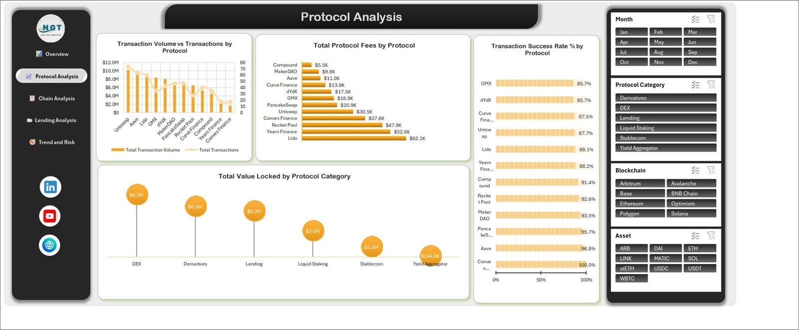
This page answers “which protocol, and at what cost”. Transaction Volume vs Transactions by Protocol puts the money against the count on a combo chart. Total Protocol Fees by Protocol ranks the fee take – Lido at $62.1K, Yearn Finance $52.8K, Rocket Pool $47.9K, down to Compound at $5.5K. Beside it, Transaction Success Rate % by Protocol keeps the reliability column next to the fee ranking, which is the pairing that stops a cheap protocol from looking better than it is. A lollipop chart at the foot shows Total Value Locked by Protocol Category: DEX $8.5M, Derivatives $6.9M, Lending $6.3M, Liquid Staking $3.6M, Stablecoin $1.4M and Yield Aggregator $144.9K. DeFi (Decentralized Finance) Dashboard in Excel
Page 3 – Chain Analysis
Transaction Volume vs Gas Spend by Blockchain is the headline here – the sample data has Ethereum carrying both the largest volume and by far the largest gas spend. Avg. Transaction Size by Blockchain reorders the same chains entirely, with Base at $244.4K and Polygon at $208.7K ahead of Ethereum’s $153.9K, which is the kind of reversal that only shows up when you separate value from count. Two asset charts finish the page: Total Transaction Volume by Asset (ETH $21.6M, then USDC $11.6M and DAI $10.3M) and Total Value Locked by Asset (ETH $5.1M, USDT $3.9M, stETH $3.8M).
Page 4 – Lending Analysis
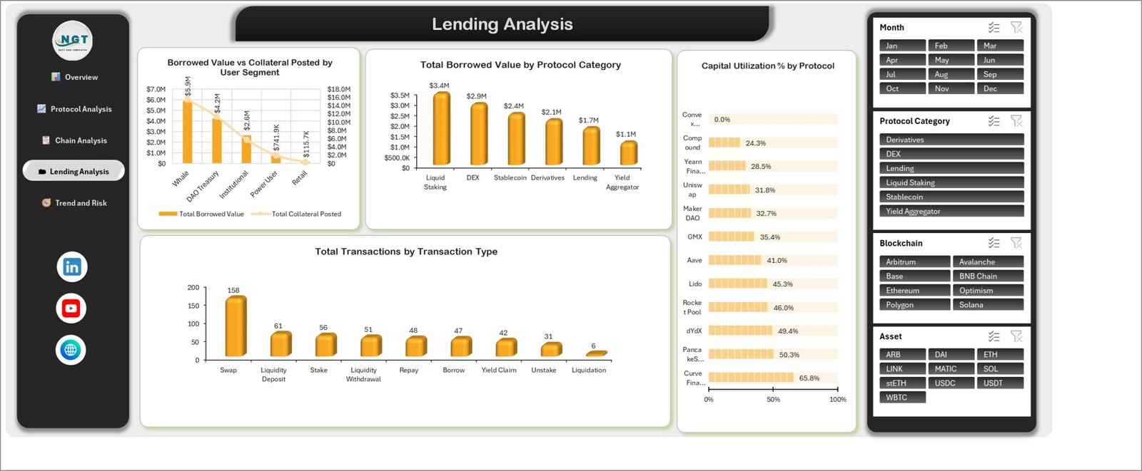
Borrowed Value vs Collateral Posted by User Segment sets borrowing against collateral for Whale, DAO Treasury, Institutional, Power User and Retail segments – $5.9M of borrowing sits with whales in the sample against $115.7K for retail. Total Borrowed Value by Protocol Category and Capital Utilization % by Protocol sit alongside, the latter running from Convex Finance at 0.0% up to Curve Finance at 65.8%. The lower panel counts Total Transactions by Transaction Type: Swap 158, Liquidity Deposit 61, Stake 56, Liquidity Withdrawal 51, Repay 48, Borrow 47, Yield Claim 42, Unstake 31 and Liquidation 6. DeFi (Decentralized Finance) Dashboard in Excel
Page 5 – Trend and Risk
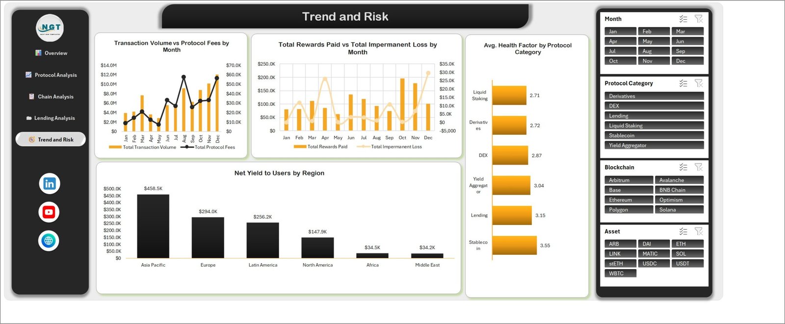
Two monthly combo charts open the page: Transaction Volume vs Protocol Fees by Month and Total Rewards Paid vs Total Impermanent Loss by Month, which is the honest version of a yield chart because it shows what the yield cost. Net Yield to Users by Region ranks Asia Pacific at $458.5K, Europe $294.0K and Latin America $256.2K, and Avg. Health Factor by Protocol Category closes with Liquid Staking at 2.71 through to Stablecoin at 3.55.
DeFi Dashboard in Excel vs. Google Sheets vs. a Paid Analytics Subscription – Feature Comparison
| This Excel dashboard | Google Sheets build | Paid analytics subscription | |
|---|---|---|---|
| Cost | One payment | Free platform, your build time | Typically $50-$500+ per month |
| Platform | Excel 2016+ / Microsoft 365 | Browser | Vendor web app |
| Setup time | Paste export, press Refresh All | Days of pivot and chart work | Onboarding plus data mapping |
| Real-time collaboration | OneDrive / SharePoint co-authoring | Yes, native | Yes |
| Mobile access | Excel mobile app | Yes | Yes |
| Customizable fields | Every column, chart and slicer | Yes | Vendor schema only |
| Share with link | Cloud link or send the file | Yes | Seat-based |
| Year-1 cost at 5 users | One template price | $0 plus your hours | $3,000-$30,000 |
| Live chain or price feed | No | No, unless scripted | Usually yes |
| Works offline | Yes | No | No |
Who Should Use This Template
Treasury and operations analysts who already pull activity exports and need a repeatable monthly pack. DAO contributors writing transparency updates. Research and consulting teams who need protocol, chain and asset splits in a file they can attach to an email. Finance leads who would rather hand over a pivot-driven workbook than a screenshot of somebody’s web app.
It is the wrong tool if you want live prices, wallet connection or streaming on-chain data. It is not portfolio management software, not a trading tool and not a tax report. DeFi (Decentralized Finance) Dashboard in Excel
Real-World Use Cases
Monthly treasury update. Filter the Month slicer to the closing month, take the Lending Analysis page, and the borrowed-versus-collateral picture by user segment is already drawn.
Routing cost review. The Chain Analysis page pairs volume with gas spend, so a chain whose costs are rising faster than its volume shows up immediately instead of at quarter end.
Protocol shortlist for a client brief. Total Protocol Fees by Protocol alongside Transaction Success Rate % by Protocol gives a fee ranking that is never read without its reliability number.
Advantages of the DeFi (Decentralized Finance) Dashboard in Excel
- Everything runs on native Excel features – pivot tables, pivot charts and slicers – so nothing breaks when a vendor changes an API.
- One file. It emails, it archives, it opens on a laptop with no internet.
- The source range is a real Excel Table, so appending rows never means re-pointing 25 pivots.
- The charts name the metric, not the chart type, so a page reads like a report rather than a gallery.
- No macros means no enable-content prompt and no IT exception request.
Opportunities for Improvement
Two things are worth knowing before you buy. First, the workbook is not set to refresh on open – after you paste new data you must press Refresh All on the Data tab (or Ctrl+Alt+F5), or the charts will keep showing the old numbers. Second, a handful of the longer category labels on the horizontal bar charts wrap across two lines at the default column widths; widening the chart area fixes it in a few seconds. Neither affects a single calculation, but both are better known in advance than discovered at 6pm before a review. DeFi (Decentralized Finance) Dashboard in Excel
Best Practices
- Keep dimension spellings identical. “Uniswap v3” and “Uniswap” become two separate bars on every protocol chart.
- Paste values, not formats. Use Paste Special > Values so your export does not overwrite the table styling.
- Refresh, then read. Make Refresh All the first thing you do after any paste.
- Clear the slicers before sharing. A file saved with the Month slicer on March will open on March for everyone.
- Keep one workbook per reporting period if you need an audit trail – the file is small enough to archive monthly.
Explore Relevant Templates
- Blockchain Finance Dashboard in Excel
- Digital Wallets KPI Dashboard in Excel
- Crowdsourced Investment Platforms Dashboard in Excel
- Crypto Portfolio Dashboard in Power BI
- Crypto Portfolio Tracker in Google Sheets
Frequently Asked Questions
Does the dashboard connect to a blockchain, wallet or exchange?
No. There is no API call, web query or price feed in the workbook. You export your own data and paste it into the Data sheet.
Is this financial or investment advice?
No. It is a reporting template and makes no recommendation about any asset, protocol or strategy.
Are the numbers in the screenshots real?
No. They are sample data built to demonstrate the layout, and you overwrite all 500 rows with your own.
Which Excel versions are supported?
Excel 2016 or later on Windows, and Microsoft 365. The slicers and pivot charts need the desktop app.
Why did my charts not update?
The workbook does not refresh on open. Press Refresh All on the Data tab or Ctrl+Alt+F5.
Can I add my own protocols, chains and assets?
Yes. Type them into the relevant column and refresh – the slicers and chart axes rebuild from your values.
About the Author
Built by PK – Microsoft Certified Professional with 15+ years of Excel, Google Sheets, and Power BI experience. Founder of NextGenTemplates, reaching 300K+ subscribers across YouTube channels. Every template is hand-built and tested before release.
Conclusion
Decentralized finance reporting is not hard because the maths is hard – it is hard because the same five pages have to be rebuilt every month. This workbook builds them once, wires four slicers through 25 pivots and 20 charts, and then gets out of the way. Paste your export, press Refresh All, and the protocol, chain, lending and risk views are ready to hand over.
Get the DeFi (Decentralized Finance) Dashboard in Excel on NextGenTemplates. For step-by-step Excel dashboard tutorials, subscribe at youtube.com/@PKAnExcelExpert.