Customer feedback plays a critical role in shaping products, services, and overall customer experience. However, collecting feedback alone does not create value. Instead, businesses must analyze, interpret, and act on feedback quickly and accurately. That is exactly where a Customer Feedback Analysis Dashboard in Power BI becomes a powerful solution.
In this detailed guide, you will learn what a Customer Feedback Analysis Dashboard in Power BI is, why businesses need it, how it works, its page-wise dashboard structure, key advantages, best practices, and frequently asked questions. By the end of this article, you will clearly understand how this dashboard helps organizations convert raw customer opinions into meaningful business decisions.
Click to buy Customer Feedback Analysis Dashboard in Power BI
What Is a Customer Feedback Analysis Dashboard in Power BI?
A Customer Feedback Analysis Dashboard in Power BI is an interactive business intelligence solution designed to analyze customer feedback data using visual reports and KPIs.
Instead of reading thousands of survey responses, emails, reviews, or support tickets, decision-makers can instantly view trends, sentiments, response times, and Net Promoter Scores (NPS) on a single screen.
Moreover, Power BI enables businesses to filter data dynamically using slicers. As a result, teams can analyze feedback by product, channel, region, and time period without manual effort.
Because the dashboard uses Power BI, it offers:
- Interactive visuals
- Real-time insights
- Fast performance
- Easy scalability
Therefore, organizations gain clarity, speed, and accuracy while managing customer feedback.
Why Do Businesses Need a Customer Feedback Analysis Dashboard?
Customer feedback often exists in multiple systems. For example, surveys may sit in one tool, while complaints may exist in another. Because of this fragmentation, businesses struggle to see the full picture.
A Customer Feedback Analysis Dashboard solves these challenges effectively.
Key Reasons Businesses Need This Dashboard
- First, it centralizes feedback data into one unified view
- Second, it highlights customer satisfaction and dissatisfaction trends
- Third, it identifies product, channel, and regional performance gaps
- Fourth, it improves response and resolution time tracking
- Finally, it supports data-driven customer experience decisions
As a result, businesses no longer react blindly. Instead, they respond strategically.
How Does a Customer Feedback Analysis Dashboard in Power BI Work?
The dashboard works by connecting structured feedback data to Power BI. Once connected, Power BI processes, aggregates, and visualizes the data into meaningful insights.
Typical Data Sources Include
- Customer surveys
- Feedback forms
- Support tickets
- CRM systems
- Product reviews
- Customer service logs
After loading the data, Power BI applies calculations such as averages, percentages, and sentiment scores. Then, the dashboard displays the results using charts, cards, and tables.
Because slicers exist across pages, users can instantly drill down into specific insights.
What Is the Dashboard Structure of a Customer Feedback Analysis Dashboard in Power BI?
This Customer Feedback Analysis Dashboard contains five structured pages, each designed to answer specific business questions clearly and efficiently.
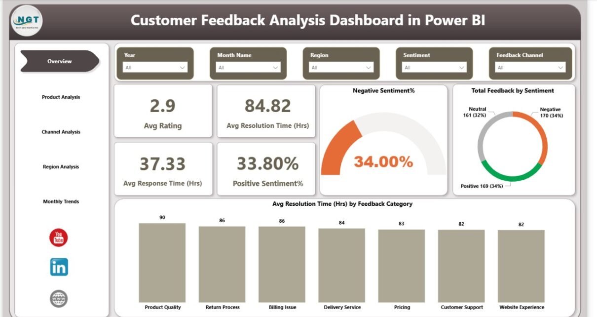
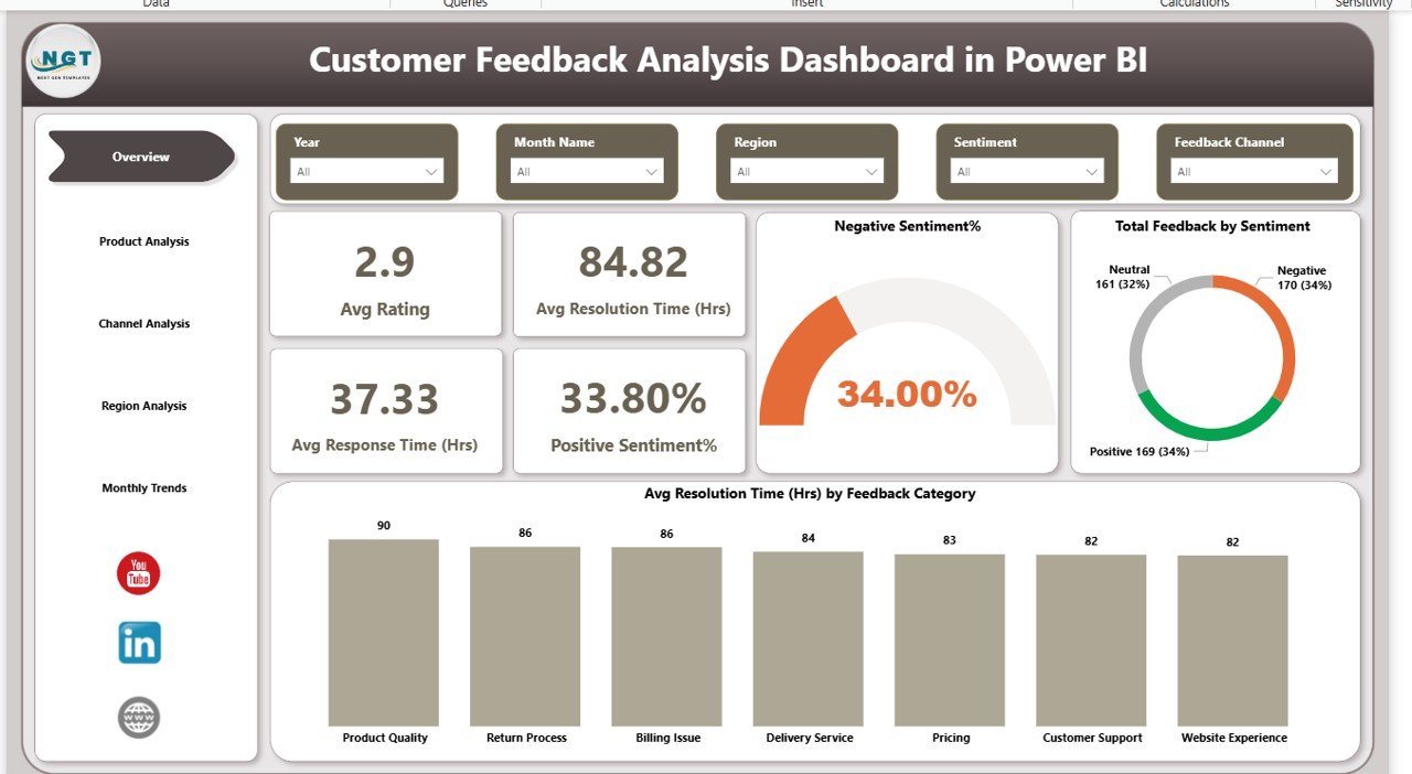
Overview Page: What Is the Overall Customer Feedback Performance?
The Overview Page acts as the command center of the dashboard. It provides a high-level snapshot of customer feedback performance across all dimensions.
Key Elements of the Overview Page
This page includes slicers that allow users to filter data dynamically. For example, users can filter by time period, product, region, or channel.
Key KPI Cards on the Overview Page
- Average Rating
Shows overall customer satisfaction level. - Average Resolution Time (Hours)
Indicates how quickly issues get resolved. - Average Response Time (Hours)
Measures how fast teams respond to customer feedback. - Positive Sentiment Percentage
Reflects the share of satisfied customer feedback. - Negative Sentiment Percentage
Highlights customer dissatisfaction levels.
Key Visuals on the Overview Page
- Total Feedback by Sentiment
Displays the distribution of positive, neutral, and negative feedback. - Average Resolution Time by Feedback Category
Identifies which categories take longer to resolve.
Because this page summarizes everything, leadership teams can assess performance within seconds.
Click to buy Customer Feedback Analysis Dashboard in Power BI
Product Analysis Page: Which Products Receive the Best or Worst Feedback?
The Product Analysis Page focuses on understanding feedback at the product level.
Why Is Product-Wise Feedback Analysis Important?
Different products generate different customer experiences. Therefore, analyzing feedback by product helps teams identify:
- High-performing products
- Products causing customer dissatisfaction
- Opportunities for product improvement
Key Metrics on the Product Analysis Page
- Average NPS Score by Product
Measures customer loyalty for each product. - Average Response Time (Hours) by Product
Shows how quickly teams respond to product-related feedback. - Positive and Negative Sentiment by Product
Compares customer sentiment across products.
With these insights, product managers can prioritize fixes, enhancements, and feature upgrades more effectively.

Click to buy Customer Feedback Analysis Dashboard in Power BI
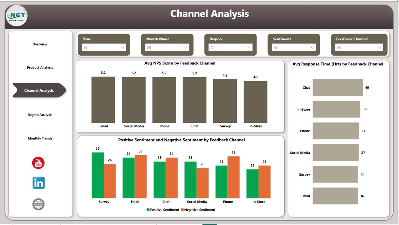
Channel Analysis Page: Which Feedback Channels Perform Best?
The Channel Analysis Page evaluates customer feedback based on communication channels such as email, chat, phone, or social media.
Why Should Businesses Analyze Feedback Channels?
Each channel creates a different customer experience. Some channels may respond faster, while others may generate more complaints.
Key Visuals on the Channel Analysis Page
- Average NPS Score by Feedback Channel
Shows customer loyalty by channel. - Average Response Time (Hours) by Feedback Channel
Highlights channel efficiency.
Because this page highlights channel performance, businesses can optimize staffing, tools, and workflows accordingly.
Click to buy Customer Feedback Analysis Dashboard in Power BI
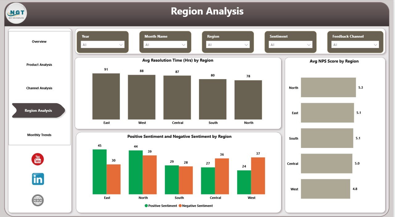
Region Analysis Page: How Does Customer Feedback Vary by Location?
The Region Analysis Page helps organizations understand geographic trends in customer feedback.
Why Is Regional Feedback Analysis Critical?
Customer expectations vary across regions. Therefore, analyzing feedback region-wise helps businesses:
- Identify regional service gaps
- Improve localized support strategies
- Maintain consistent customer experience
Key Metrics on the Region Analysis Page
- Average Resolution Time by Region
Shows how quickly teams resolve issues in each region. - Average NPS Score by Region
Measures customer loyalty geographically. - Positive and Negative Sentiment by Region
Highlights satisfaction differences across locations.
As a result, regional managers gain actionable insights to improve local performance.
Click to buy Customer Feedback Analysis Dashboard in Power BI
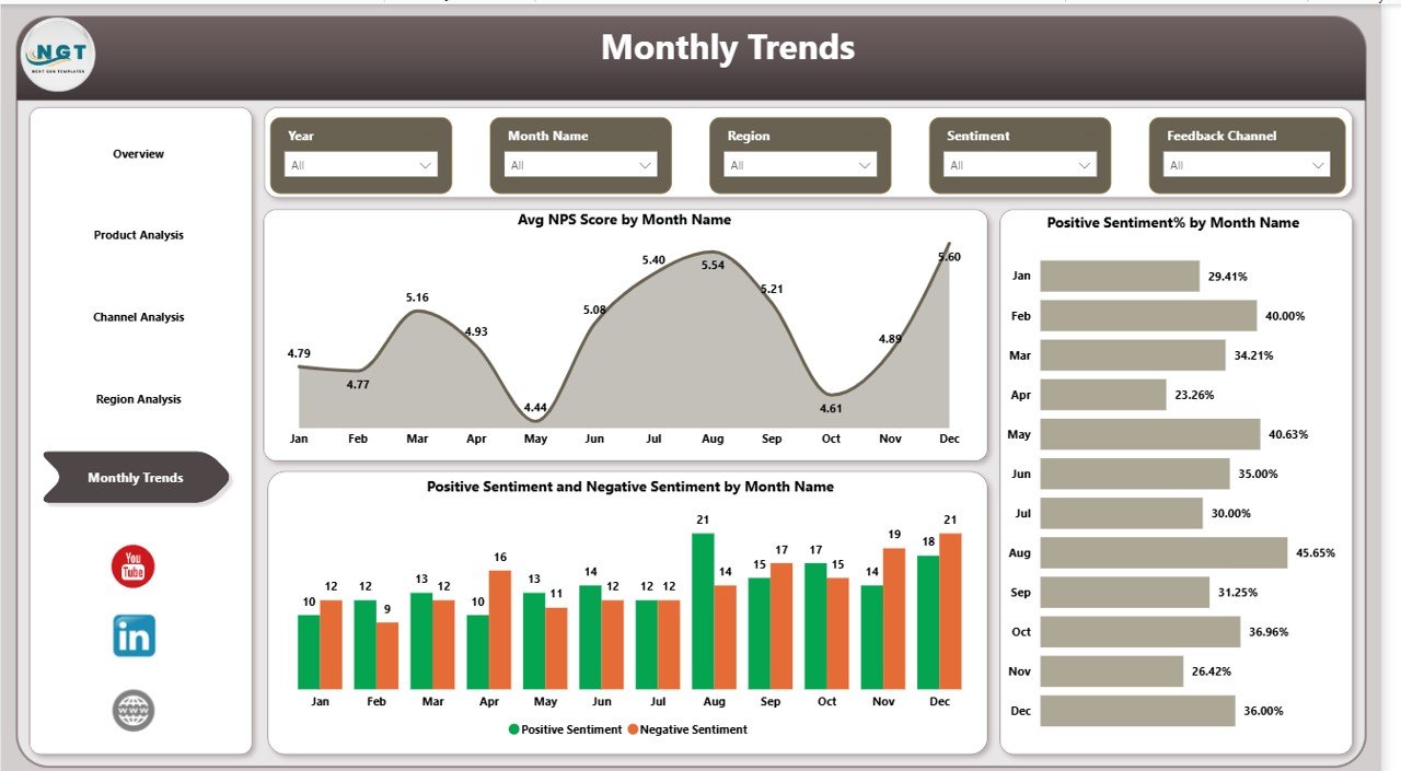
Monthly Trends Page: How Is Customer Feedback Changing Over Time?
The Monthly Trends Page focuses on time-based analysis.
Why Are Monthly Trends Important?
Trends reveal whether customer experience improves or declines over time. Therefore, businesses can track the impact of changes, campaigns, or process improvements.
Key Visuals on the Monthly Trends Page
- Average NPS Score by Month Name
Shows loyalty trends over time. - Positive Sentiment Percentage by Month Name
Tracks customer satisfaction changes month-by-month.
Because trends show direction, leaders can take proactive actions instead of reactive measures.
Click to buy Customer Feedback Analysis Dashboard in Power BI
Advantages of Customer Feedback Analysis Dashboard in Power BI
Using a Customer Feedback Analysis Dashboard in Power BI offers several powerful advantages.
- Centralized Feedback Insights
The dashboard consolidates feedback from multiple sources into one unified platform. As a result, teams no longer switch between tools.
- Faster Decision-Making
Interactive visuals and KPIs allow users to identify issues instantly. Therefore, decisions become faster and more confident.
- Improved Customer Satisfaction
By tracking sentiments, response times, and resolution times, businesses can address customer concerns more effectively.
- Product and Service Optimization
Product-wise and channel-wise insights help teams focus on areas that need improvement.
- Enhanced Accountability
Because performance metrics remain visible, teams take ownership of customer experience outcomes.
Best Practices for the Customer Feedback Analysis Dashboard in Power BI
To maximize the value of your dashboard, you should follow these best practices.
- Keep KPIs Simple and Relevant
Focus on metrics that matter most, such as NPS, sentiment, response time, and resolution time.
- Use Clear and Consistent Naming
Ensure that labels, categories, and measures remain easy to understand for all users.
- Leverage Slicers Effectively
Use slicers to enable fast filtering by product, channel, region, and time.
- Update Data Regularly
Ensure that feedback data refreshes frequently to maintain accuracy.
- Align Insights with Business Goals
Design visuals that directly support customer experience and service improvement objectives.
How Does This Dashboard Improve Customer Experience Strategy?
This dashboard does more than visualize data. It changes how organizations approach customer experience.
Because insights remain transparent and actionable:
- Teams respond faster
- Issues get resolved sooner
- Customer loyalty improves
- Churn risk reduces
As a result, customer experience becomes proactive instead of reactive.
Conclusion: Why Should Organizations Use a Customer Feedback Analysis Dashboard in Power BI?
A Customer Feedback Analysis Dashboard in Power BI transforms raw customer feedback into clear, actionable insights. Instead of guessing what customers want, businesses rely on data-driven evidence.
By using structured pages such as Overview, Product Analysis, Channel Analysis, Region Analysis, and Monthly Trends, organizations gain complete visibility into customer experience.
Ultimately, this dashboard empowers teams to listen, learn, and improve continuously.
Frequently Asked Questions (FAQs)
What is the main purpose of a Customer Feedback Analysis Dashboard in Power BI?
The main purpose is to analyze customer feedback data visually and identify trends, sentiments, and performance gaps quickly.
Can this dashboard handle large volumes of feedback data?
Yes, Power BI efficiently handles large datasets and delivers fast performance with optimized models.
Which KPIs are most important in customer feedback analysis?
Key KPIs include average rating, NPS score, response time, resolution time, and sentiment percentages.
Can businesses customize this dashboard?
Yes, businesses can easily customize visuals, KPIs, and slicers based on their specific needs.
How often should customer feedback data be updated?
Ideally, businesses should update data daily or weekly to maintain real-time insights.
Does this dashboard support strategic decision-making?
Absolutely. The dashboard provides actionable insights that support product improvement, service optimization, and customer retention strategies.
Visit our YouTube channel to learn step-by-step video tutorials
Watch the step-by-step video tutorial:
Click to buy Customer Feedback Analysis Dashboard in Power BI