In today’s business landscape, customer experience begins the moment someone signs up for your product or service. A smooth onboarding process not only builds trust but also sets the stage for long-term customer retention. However, tracking and improving the onboarding journey across departments, regions, and customer segments can quickly become complex.
That’s where the Customer Onboarding Dashboard in Power BI becomes an indispensable tool. It’s a powerful, ready-to-use analytics solution that transforms raw onboarding data from Excel or CRM systems into interactive visual insights. Whether you manage SaaS subscriptions, enterprise clients, or retail customers, this dashboard gives you a unified view of every onboarding stage—helping you spot delays, reduce drop-offs, and improve overall satisfaction.
Click to Purchases Customer Onboarding Dashboard in Power BI
What Is a Customer Onboarding Dashboard in Power BI?
A Customer Onboarding Dashboard in Power BI is an interactive business intelligence tool designed to monitor and analyze each stage of the customer onboarding process. Built using Microsoft Power BI and powered by data from Excel, CRM, or ERP systems, it gives you real-time visibility into how efficiently new customers are moving through onboarding stages.
The dashboard consolidates all relevant metrics—like completion rate, drop-off percentage, average time to completion, customer satisfaction (CSAT), and team performance—into a single, visually engaging interface.
Instead of juggling multiple spreadsheets or emails, you can now instantly see where customers stand, which industries take longer to onboard, and which locations or reps drive better outcomes.
Why Businesses Need a Customer Onboarding Dashboard
Customer onboarding isn’t just an administrative process—it’s the foundation of customer success. A poorly managed onboarding journey can lead to customer frustration, cancellations, and lost revenue.
Here’s why every customer-centric business should consider implementing an onboarding dashboard in Power BI:
-
📊 Centralized Insights: View onboarding progress, customer stages, and key KPIs in one place.
-
⚡ Proactive Decision-Making: Detect bottlenecks early and take corrective actions before customers disengage.
-
💬 Improved Communication: Align sales, onboarding, and support teams through shared visibility.
-
⏱️ Efficiency Tracking: Measure time taken to complete onboarding across reps, regions, and industries.
-
😊 Customer Retention: Identify satisfaction trends to improve experience and reduce churn.
Key Features of the Customer Onboarding Dashboard in Power BI
The dashboard consists of five comprehensive pages, each providing unique insights into onboarding efficiency and customer experience. Let’s explore them in detail.
1. Overview Page
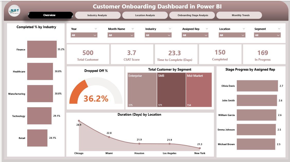
The Overview Page serves as the main control center of the dashboard. It gives an instant snapshot of the overall onboarding performance.
Highlights include:
-
Five KPI Cards:
-
Total Customers Onboarded
-
In-Progress Customers
-
Completion Rate (%)
-
Drop-Off Rate (%)
-
Average Onboarding Duration (Days)
-
-
Charts and Visuals:
-
✅ Completed % by Industry
-
⚠️ Dropped-Off %
-
👥 Total Customers by Segment
-
👨💼 Stage Progress by Assigned Representative
-
🌍 Duration (Days) by Location
-
These visuals allow you to quickly identify which industries or reps are performing well and which areas need attention.
2. Industry Analysis Page

The Industry Analysis Page dives deeper into onboarding performance across different business sectors.
Key Metrics:
-
Dropped-Off % by Industry
-
Time to Complete (Days) by Industry
-
CSAT (Customer Satisfaction) Score by Industry
-
In-Progress % by Industry
By analyzing these charts, decision-makers can identify industries where customers face more onboarding challenges. For instance, the dashboard may reveal that clients in the financial sector take longer to onboard than those in retail, prompting further investigation or process optimization.
3. Location Analysis Page
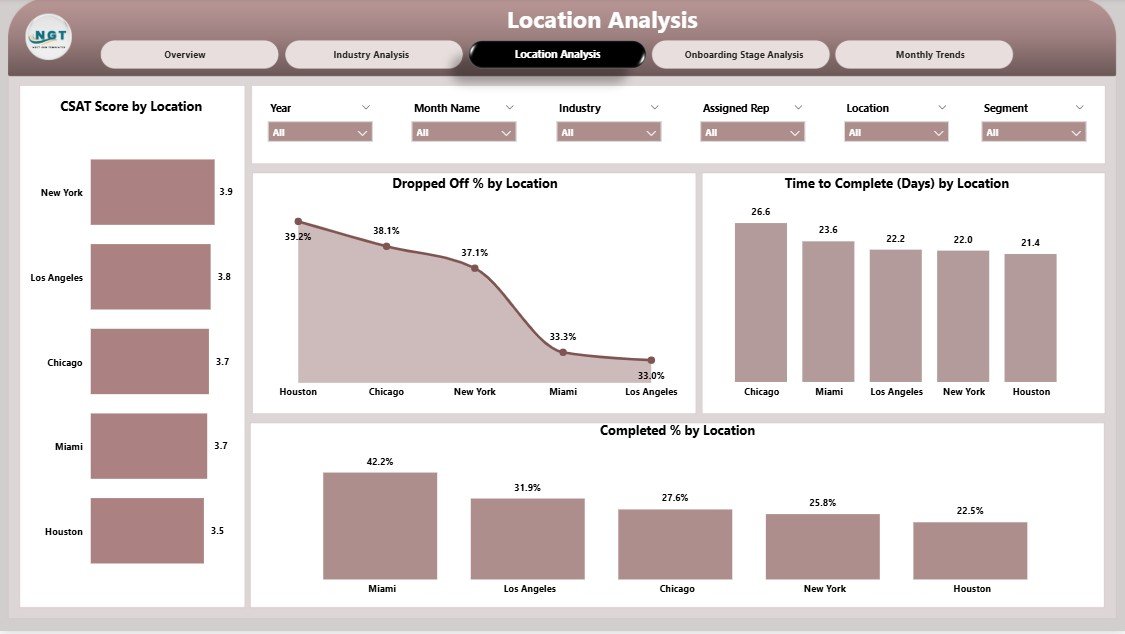
The Location Analysis Page focuses on geographical performance. It highlights how onboarding varies across branches, offices, or countries.
Visuals include:
-
Dropped-Off % by Location
-
Time to Complete (Days) by Location
-
CSAT Score by Location
-
Completed % by Location
This data helps management identify regional bottlenecks—perhaps due to resource allocation, time zone differences, or local regulations—and take steps to improve efficiency in specific markets.
4. Onboarding Stage Analysis Page

Every onboarding journey consists of multiple stages—such as registration, documentation, verification, training, and go-live. The Onboarding Stage Analysis Page breaks down performance at each step.
Charts on this page:
-
Dropped-Off % by Onboarding Stage
-
Time to Complete (Days) by Onboarding Stage
-
CSAT Score by Onboarding Stage
-
Completed % by Onboarding Stage
This analysis helps teams pinpoint exactly where customers drop off or face delays, enabling targeted interventions. For example, if most customers abandon the process during “document verification,” the company can simplify requirements or automate that step.
5. Monthly Trends Page

The Monthly Trends Page provides a time-based perspective of onboarding metrics. It reveals how performance changes month-to-month and helps evaluate the impact of process improvements or policy changes.
Metrics include:
-
Dropped-Off % by Month
-
Completed % by Month
-
Total Customers by Month
This trend analysis supports forecasting and allows management to set realistic monthly targets based on historical performance.
Advantages of the Customer Onboarding Dashboard in Power BI
Click to Purchases Customer Onboarding Dashboard in Power BI
The Power BI onboarding dashboard delivers multiple advantages that extend beyond simple reporting. It becomes a strategic decision-making tool that helps improve performance, transparency, and customer satisfaction.
🌟 1. Unified Data View
All onboarding information—from Excel files, CRMs, or ticketing tools—comes together in one dashboard. This eliminates the need to switch between systems.
⚙️ 2. Real-Time Monitoring
Managers can track customer progress as it happens. Any delay or drop-off becomes immediately visible.
👨💼 3. Improved Team Accountability
By displaying KPIs by representative or department, it encourages healthy competition and accountability across teams.
💡 4. Actionable Insights
The dashboard doesn’t just display data—it highlights patterns, trends, and exceptions that lead to smarter decisions.
🕒 5. Time Efficiency
Automating data updates and visualizations saves countless hours of manual reporting.
📈 6. Enhanced Customer Experience
Understanding customer behavior and pain points enables faster problem-solving and improved onboarding satisfaction.
How to Build a Customer Onboarding Dashboard in Power BI
While this template is ready-to-use, knowing the process behind it helps in customization. Here’s a step-by-step approach:
-
Data Collection:
Gather onboarding data from Excel, CRM, or ERP systems—include columns like customer name, industry, assigned rep, location, stage, start date, completion date, and CSAT score. -
Data Cleaning:
Ensure there are no duplicates or missing values. Standardize column formats (dates, percentages, etc.). -
Data Import into Power BI:
Load the dataset into Power BI and establish relationships between relevant tables. -
Measure Creation:
Use DAX formulas to calculate key KPIs such as Completion %, Drop-Off %, and Average Duration. -
Visualization Design:
Use charts, cards, and slicers to create intuitive visuals for users. -
Dashboard Navigation:
Add slicers for Month, Industry, and Location on each page to make analysis dynamic and user-friendly. -
Automation & Refresh:
Schedule automatic refreshes to ensure the dashboard always reflects the latest data.
Best Practices for the Customer Onboarding Dashboard in Power BI
To maximize the impact of your dashboard, follow these best practices:
✅ 1. Define Clear KPIs
Use measurable, business-aligned KPIs such as:
-
Onboarding Completion Rate (%)
-
Drop-Off Rate (%)
-
Average Onboarding Time (Days)
-
Customer Satisfaction Score
-
Stage Progress %
🧩 2. Keep the Design Clean and Intuitive
Avoid overcrowding visuals. Focus on clarity and relevance. Users should be able to understand performance at a glance.
🔄 3. Use Dynamic Filters and Slicers
Enable users to analyze performance by Month, Industry, or Location easily. Power BI’s slicers make dashboards interactive and engaging.
📅 4. Incorporate Time Comparisons
Show comparisons such as MTD (Month-to-Date), YTD (Year-to-Date), and previous month/year data to reveal trends and performance improvements.
🔍 5. Highlight Key Insights
Use conditional formatting, arrows, or color codes (green for improvement, red for decline) to draw attention to key changes.
🧠 6. Encourage Cross-Team Use
Share the dashboard with both sales and support teams to promote cross-functional collaboration and transparency.
🔐 7. Secure and Automate Data Refresh
Set permissions based on roles and automate refreshes to maintain accuracy and consistency.
How This Dashboard Helps Different Teams
The Customer Onboarding Dashboard supports various departments across the organization.
🎯 For Customer Success Teams
They can monitor which customers need follow-ups and where the process slows down.
💬 For Sales Teams
It provides clarity on how long new deals take to activate and helps them set realistic expectations.
🧾 For Management
Executives get a big-picture view of onboarding performance, allowing them to allocate resources effectively.
🧑💻 For Analysts
They can explore the data deeply, identify trends, and suggest process enhancements.
Integrating Excel Data with Power BI for Onboarding Tracking
Many organizations start their onboarding tracking in Excel. Power BI complements this by offering automation and visualization capabilities.
-
Automatic Data Sync: Power BI can directly connect to Excel workbooks stored on OneDrive or SharePoint.
-
Real-Time Updates: Whenever the Excel file updates, the Power BI dashboard refreshes automatically.
-
No Technical Complexity: Business users can build and update dashboards without heavy IT involvement.
This combination of Excel and Power BI ensures flexibility and scalability as your customer base grows.
Common Mistakes to Avoid
Even with a strong dashboard, avoid these pitfalls:
-
🚫 Ignoring Data Quality: Garbage in, garbage out. Always validate data sources.
-
🚫 Overcomplicating Visuals: Simple visuals communicate faster and better.
-
🚫 Neglecting User Feedback: Continuously gather input from users to improve dashboard usability.
-
🚫 Static Reporting: Schedule refreshes to keep your data live and useful.
Conclusion
The Customer Onboarding Dashboard in Power BI is more than a reporting tool—it’s a strategic asset that bridges customer data, team collaboration, and performance tracking. By visualizing onboarding metrics in real time, businesses can reduce drop-offs, shorten completion times, and enhance satisfaction.
Whether you run a SaaS startup, a financial institution, or a retail enterprise, this dashboard helps you ensure every new customer begins their journey on the right note. When your onboarding process becomes faster, clearer, and more data-driven, long-term loyalty follows naturally.
Frequently Asked Questions (FAQs)
1. What data sources can I connect to the Customer Onboarding Dashboard in Power BI?
You can connect Excel, Google Sheets, SQL databases, CRMs like Salesforce, and APIs. Power BI integrates seamlessly with multiple data sources.
2. How often does the dashboard update?
You can schedule automatic refreshes daily, hourly, or in real time depending on your Power BI setup.
3. Can I customize the dashboard layout and KPIs?
Yes. You can add or remove KPIs, rename stages, or modify visuals as per your business requirements.
4. Is this dashboard suitable for small businesses?
Absolutely. Even small teams benefit from visibility into onboarding progress, especially when managing multiple new customers monthly.
5. How does it improve customer experience?
By identifying bottlenecks early and monitoring satisfaction scores, teams can proactively solve issues, leading to smoother onboarding and happier customers.
6. Can Power BI show team-wise performance?
Yes. The dashboard includes “Stage Progress by Assigned Representative” visuals, allowing you to track individual rep performance.
7. What is the difference between Drop-Off % and In-Progress %?
Drop-Off % shows customers who left the process midway, while In-Progress % represents customers currently undergoing onboarding.
8. Can I export these reports?
Yes, Power BI allows exporting to Excel, PDF, and PowerPoint for easy sharing with management or clients.
Visit our YouTube channel to learn step-by-step video tutorials