In today’s competitive business landscape, customer feedback is more than just a formality—it’s a strategic tool. Companies that listen to their customers, track satisfaction trends, and measure service efficiency are the ones that grow consistently. One of the most powerful ways to achieve this is through a Customer Service and Support Customer Feedback KPI Dashboard in Excel.
This dashboard helps you consolidate, track, and visualize key performance indicators (KPIs) related to customer service and feedback—all within the comfort of Microsoft Excel. Whether you’re part of a startup, mid-sized company, or enterprise, this tool can drastically improve your decision-making process.
Click to Purchases Customer Service and Support Customer Feedback KPI Dashboard in Excel
What Is a Customer Feedback KPI Dashboard in Excel?
A Customer Feedback KPI Dashboard in Excel is a ready-to-use tool that allows customer service teams to monitor their key metrics like satisfaction score, resolution rate, and average response time—all in one place. It turns raw feedback data into clear, actionable insights using Excel sheets, charts, and visual indicators.
Instead of relying on complicated BI platforms, this dashboard empowers users with zero coding knowledge to take control of their customer experience metrics.
Key Features of the Excel Dashboard
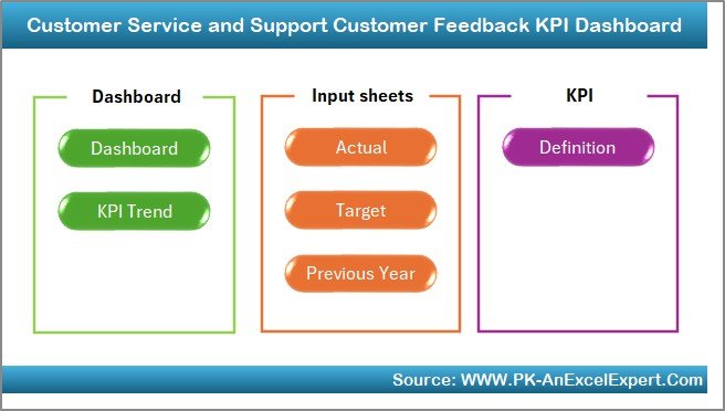
This comprehensive dashboard template includes 7 powerful worksheet tabs, each designed with a specific function to keep customer service feedback management easy and organized.
Home Sheet (Dashboard Navigation Panel)
-
A clean, intuitive index page.
-
Contains 6 quick-access buttons to navigate between sheets.
-
Acts as a user-friendly control panel.
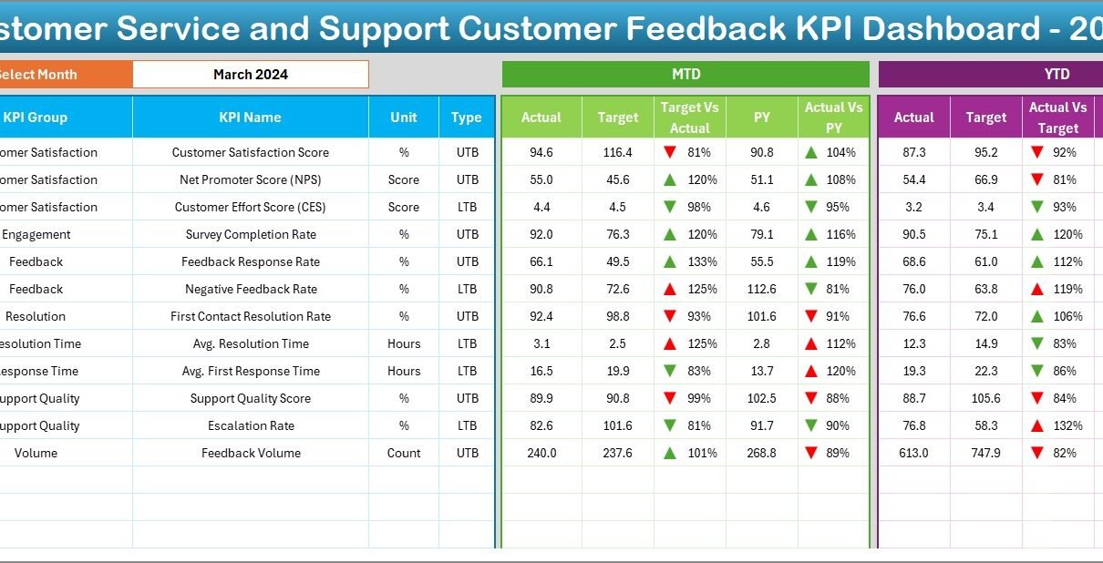
Dashboard Sheet
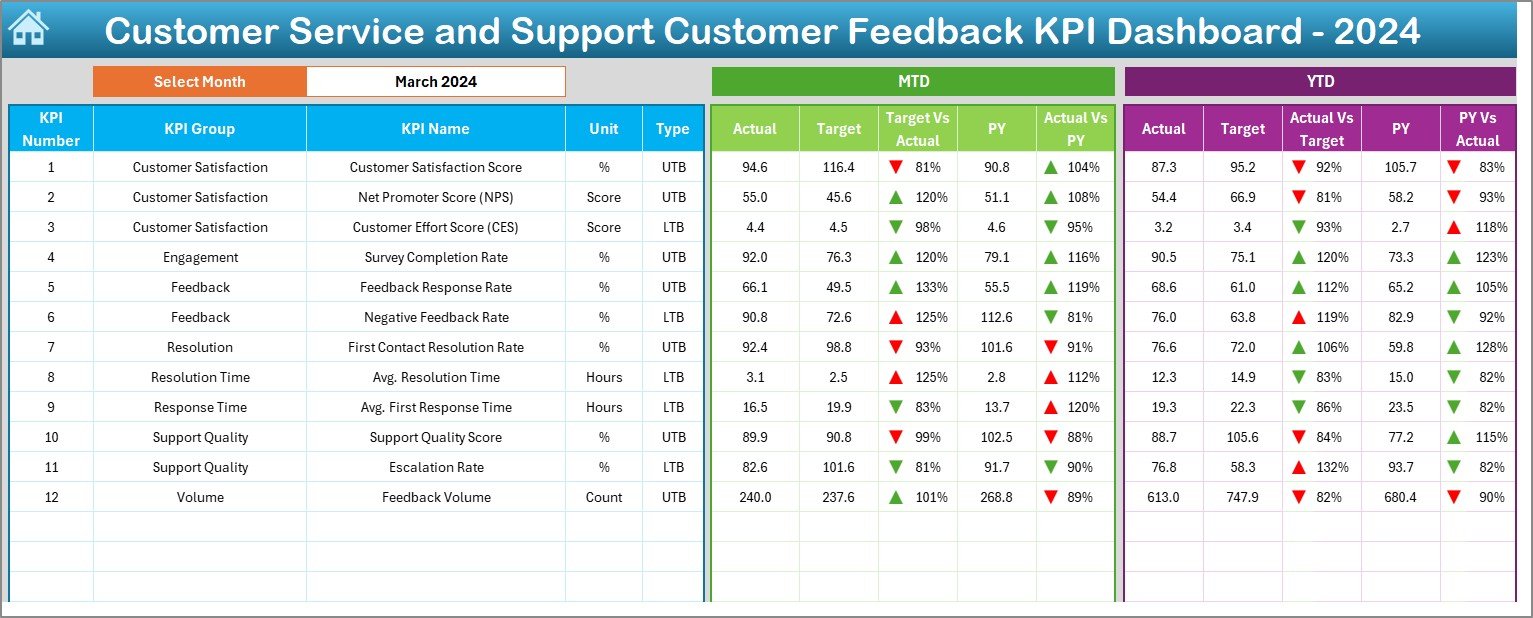
This is the heart of the tool. It gives a high-level summary of your service and feedback KPIs.
Key highlights:
-
Select any month from a drop-down (D3) to dynamically update the entire dashboard.
Shows Month-to-Date (MTD) and Year-to-Date (YTD) data:
- Actuals
- Target values
- Previous year data
-
Includes visual comparison indicators:
- Conditional formatting with up/down arrows for Target vs. Actual and PY vs. Actual.
-
Delivers a snapshot view of your performance in real-time.
KPI Trend Sheet
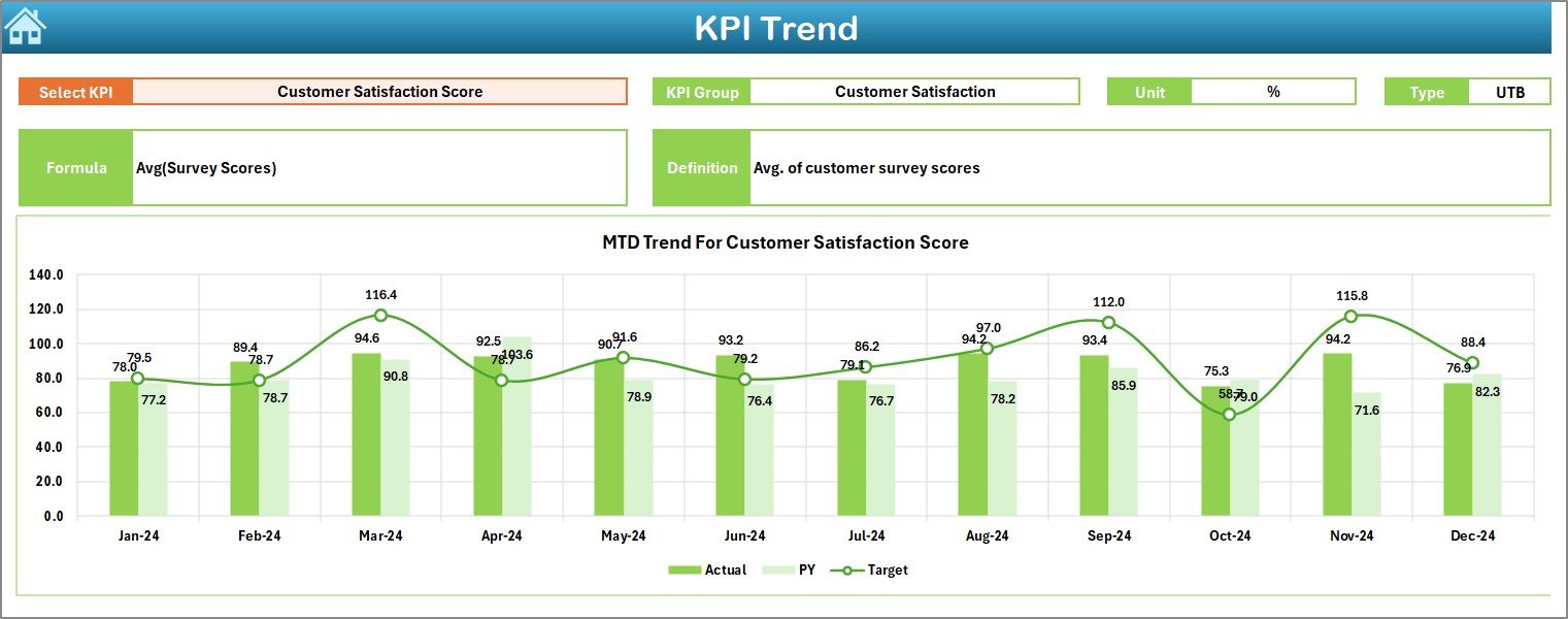
Dive deeper into individual KPIs.
Features include:
-
KPI selector drop-down in cell C3
Details like:
- KPI Group
- KPI Unit
- KPI Type (UTB: Upper the Better or LTB: Lower the Better)
- Formula
- Definition
Trend charts for:
- MTD Actual vs Target vs PY
- YTD Actual vs Target vs PY
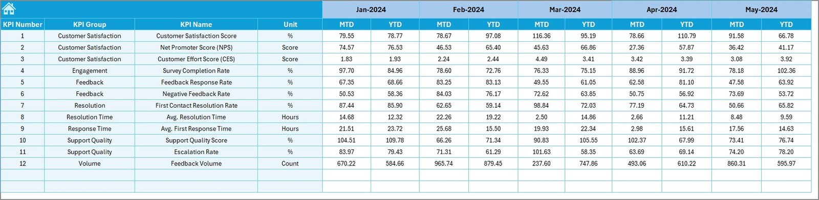
Actual Numbers Input Sheet
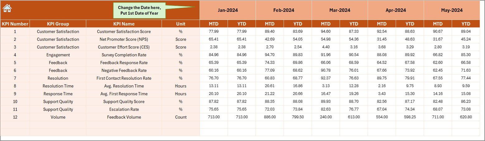
Input actual monthly values for MTD and YTD.
Key benefits:
-
Dynamic month control via cell E1
-
Ensures data consistency
-
Fully formula-driven with auto-populating charts
Target Sheet
Plan ahead by defining monthly KPI targets.
Features:
-
Space for both MTD and YTD goals
-
Easy-to-edit table format
-
Drives all dashboard visuals
Previous Year Number Sheet
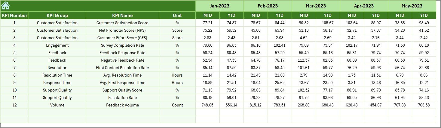
Compare performance year-over-year.
Details:
-
Same format as the Actual and Target sheets
-
Helps measure growth and service improvement trends
Click to Purchases Customer Service and Support Customer Feedback KPI Dashboard in Excel
KPI Definition Sheet
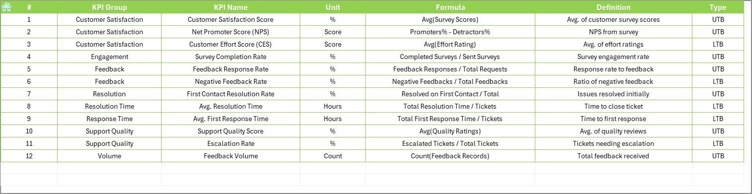
Define your KPIs in one place.
Includes columns for:
-
KPI Name
-
KPI Group
-
Unit
-
Formula
-
KPI Definition
This sheet ensures that everyone in the organization understands each metric.
Why Is This Dashboard Essential for Customer Service?
Without a structured view, customer feedback becomes noise instead of insights. This dashboard:
-
Centralizes data
-
Enhances performance tracking
-
Reduces guesswork in decision-making
-
Boosts service accountability
-
Strengthens team alignment on goals
Top KPIs You Can Track With This Dashboard
Here are some of the most common Customer Feedback KPIs included:
-
Customer Satisfaction Score (CSAT)
-
Net Promoter Score (NPS)
-
First Response Time
-
Average Resolution Time
-
Ticket Reopen Rate
-
Complaint Resolution Rate
-
Service Quality Rating
-
Feedback Response Rate
-
Escalation Rate
-
Repeat Complaints
-
Agent Rating
-
Feedback Volume Trends
Each of these KPIs helps assess how effectively your team addresses customer concerns.
Advantages of Using the Customer Feedback KPI Dashboard in Excel
Let’s explore the benefits of implementing this tool in your support workflow:
✅ Easy to Use
-
No complex BI software required.
-
Just open Excel and start analyzing.
✅ Cost-Effective
-
No recurring software costs.
-
Built with native Excel features and formulas.
✅ Real-Time Visual Feedback
-
Up/down arrows instantly show performance gaps.
✅ Data Transparency
-
Everyone from agent to manager sees the same numbers.
✅ Customizable
-
Add or remove KPIs to suit your needs.
-
Update formulas as your goals evolve.
✅ Better Accountability
-
Easily track which KPIs are lagging.
-
Take timely corrective action.
Who Should Use This Dashboard?
Click to Purchases Customer Service and Support Customer Feedback KPI Dashboard in Excel
This tool suits a wide range of professionals and teams:
-
Customer Service Managers
-
Support Team Leads
-
Quality Assurance Teams
-
Operations Managers
-
Customer Success Teams
-
Small Businesses
-
Call Centers and Helpdesks
If your team handles feedback, this tool is for you.
Best Practices for Using the Customer Feedback KPI Dashboard
To make the most of this Excel dashboard, follow these best practices:
-
✅ Update Actuals Monthly
Keep your MTD and YTD data fresh for accurate analysis. -
✅ Set Realistic Targets
Define clear, measurable goals on the Target Sheet. -
✅ Review PY Trends
Use past data to benchmark future improvements. -
✅ Focus on Both LTB and UTB KPIs
Track what should decrease (like response time) and what should grow (like CSAT). -
✅ Leverage Conditional Formatting
Visual cues help highlight wins and red flags instantly. -
✅ Involve Your Team
Share the dashboard with your agents to promote transparency and motivation. -
✅ Document KPI Definitions
Use the KPI Definition tab to keep everyone aligned on terminology.
How to Get Started with the Template
Getting started is as simple as:
-
Download the Excel dashboard.
-
Go to the Actual Numbers Input sheet and add real performance data.
-
Set up monthly and YTD targets in the Target sheet.
-
Add your previous year’s data.
-
Select any KPI in the Trend tab to view its graph.
-
Use the Dashboard to monitor progress.
In just a few steps, you’re on your way to improving service performance with real metrics.
Conclusion
In the modern business environment, customer feedback is a strategic asset. When used right, it leads to product improvements, stronger relationships, and increased loyalty. However, managing feedback and performance tracking manually can become chaotic and ineffective.
The Customer Service and Support Customer Feedback KPI Dashboard in Excel solves this problem by providing a centralized, easy-to-use, and dynamic system to monitor your key service metrics.
It empowers teams to turn feedback into insights and insights into continuous improvement—without expensive tools or technical barriers.
Frequently Asked Questions (FAQs)
1. What is a Customer Feedback KPI Dashboard?
A Customer Feedback KPI Dashboard is a visual reporting tool used to monitor and analyze key metrics related to customer satisfaction, resolution speed, agent performance, and service quality.
2. Can I customize the KPIs in this Excel dashboard?
Yes, absolutely! You can add new KPIs or remove ones that are not relevant to your team by modifying the KPI Definition and Data sheets.
3. Do I need Excel expertise to use this dashboard?
No. The template uses simple dropdowns, formulas, and formatting. If you are familiar with basic Excel, you can easily use this dashboard.
4. How do I enter data for new months?
Just update the Actual Numbers Input, Target, and Previous Year sheets for the new month. The dashboard updates automatically based on the dropdown.
5. Can this dashboard work for different industries?
Yes. The structure is industry-agnostic. Any business dealing with customers can adapt it to track feedback KPIs.
6. Is this template compatible with Excel Online or Google Sheets?
It works best in desktop versions of Excel where full features like slicers and conditional formatting function smoothly. For Google Sheets, some features may need tweaking.
7. What does UTB and LTB mean in KPI Type?
-
UTB (Upper the Better): Higher values are good (e.g., Satisfaction Rate)
-
LTB (Lower the Better): Lower values are good (e.g., Response Time)
8. Can I share this dashboard with my team?
Yes. You can share the file via email, cloud, or shared drive. It is especially useful for team meetings and performance reviews.
Visit our YouTube channel to learn step-by-step video tutorials