Destination Management Companies Dashboard in Excel is a ready-to-use Excel dashboard template for DMC owners, travel operations managers, tourism companies, event planners, and finance teams that need a clear view of revenue, profit, bookings, pax, satisfaction, destinations, client behavior, and service quality.
The workbook includes multiple dashboard pages: Overview, Booking Trend, Destination Insights, Client Analysis, Service Quality, Data Sheet, and Support Sheet. Each page has focused charts, and the dashboard includes slicers so users can filter the report quickly during review meetings.
Click here to purchase Destination Management Companies Dashboard in Excel
Overview Page
Key Features of Destination Management Companies Dashboard in Excel
- 7 workbook tabs: Overview, Booking Trend, Destination Insights, Client Analysis, Service Quality, Data Sheet, and Support Sheet.
- High-level KPI cards: Total Revenue, Total Net Profit, Total Bookings, Total Pax, and Avg. Satisfaction.
- Multiple slicers: Apply filters and see the filtered dashboard quickly.
- Chart-driven analysis: Review cost, revenue, net profit, pax, bookings, margins, discounts, satisfaction, and cancellation rate.
- Dynamic refresh: Add data in the same format, click Refresh All, and refresh all pivots and charts.
- No macros required: Built with standard Excel tables, pivot tables, slicers, and charts.
For more help with Excel features like tables, charts, and pivots, you can also review Microsoft Excel Support.
Dashboard Pages Explanation
1. Overview Page
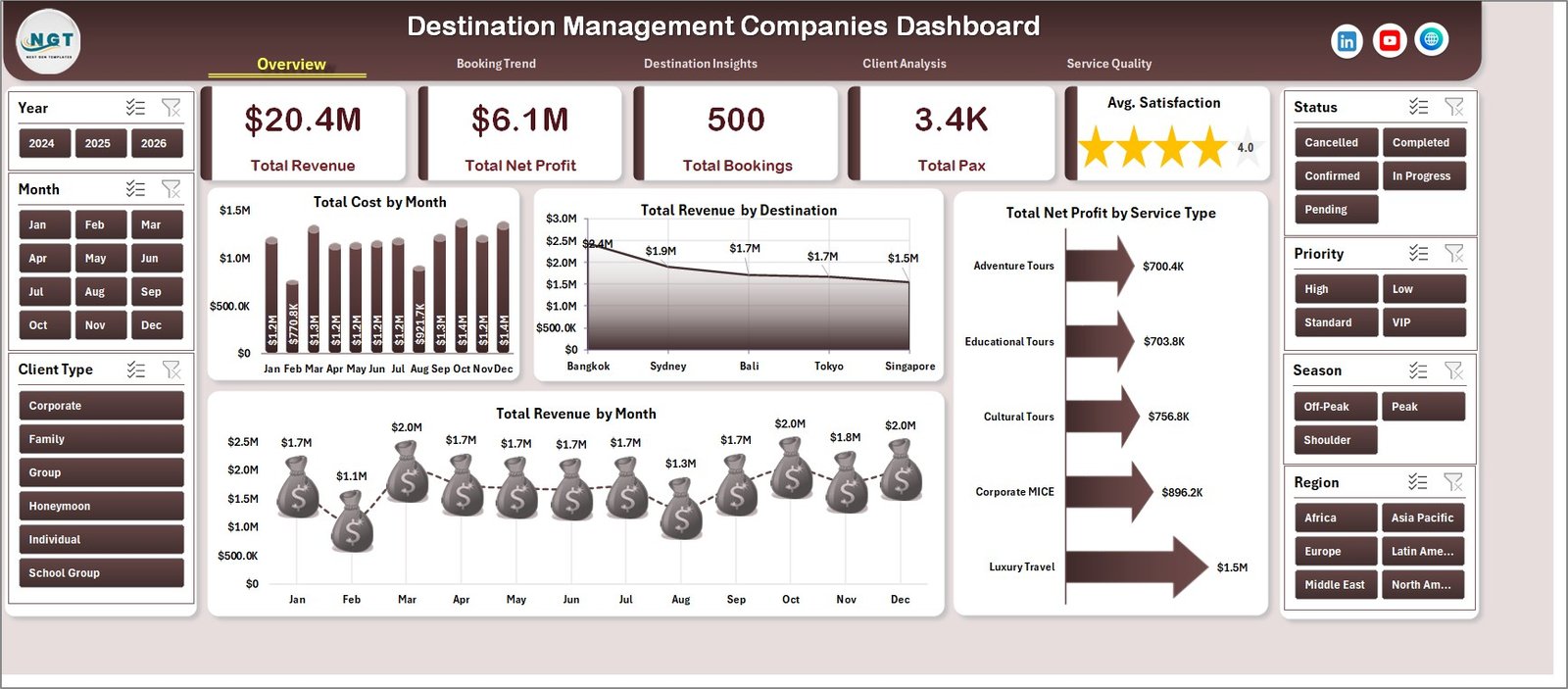
In this sheet, the top section includes KPI cards for Total Revenue, Total Net Profit, Total Bookings, Total Pax, and Avg. Satisfaction. These cards give management a fast summary of business performance before reviewing the detailed charts.
The page includes multiple slicers to filter the dashboard quickly. Users can apply slicers and immediately see filtered results across cards and charts.
Total Cost by Month: This chart shows monthly cost movement across the selected period. It helps DMC teams find high-cost months and investigate operating cost changes.
Total Revenue by Destination: This chart compares revenue generated by each destination. It helps identify top-performing destinations and locations that may need more promotion.
Total Net Profit by Service Type: This chart shows which service types generate the highest net profit. It helps managers understand whether transfers, tours, events, or other services are contributing stronger margins.
Total Revenue by Month: This chart tracks monthly revenue trends. It helps users understand seasonality, peak travel periods, and revenue growth patterns.
2. Booking Trend
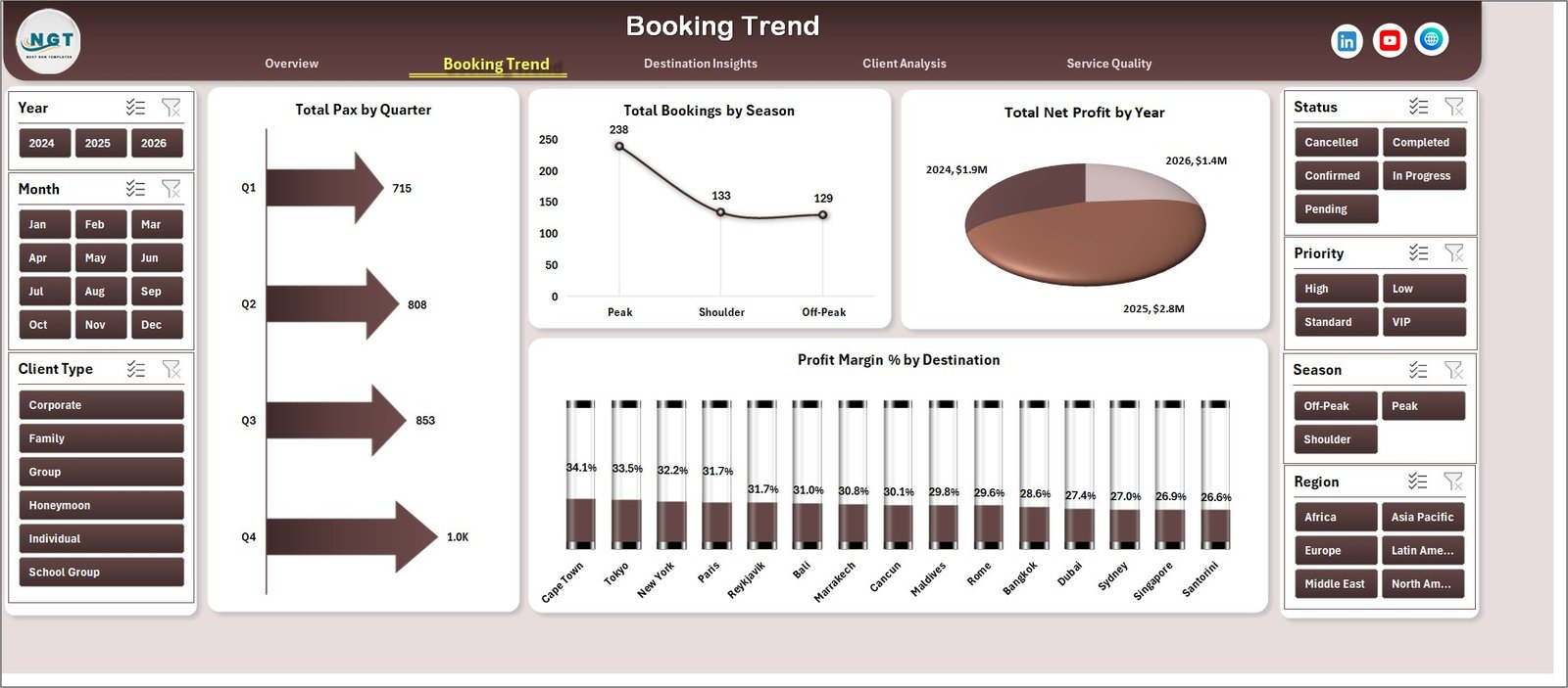
The Booking Trend sheet focuses on passenger count, booking seasonality, yearly profit, and destination margin. It is useful for understanding demand patterns and planning capacity.
Total Pax by Quarter: This chart shows total passengers by quarter. It helps teams plan staffing, vendor commitments, transport capacity, and package availability.
Total Bookings by Season: This chart compares bookings across seasons. It helps managers identify strong travel seasons and plan marketing campaigns in advance.
Total Net Profit by Year: This chart shows year-wise profit performance. It helps owners and finance teams review long-term profitability trends.
Profit Margin % by Destination: This chart compares margin percentage by destination. It helps identify destinations that may look busy but produce weaker profit margins.
Booking Trend
3. Destination Insights
The Destination Insights sheet reviews regional revenue, bookings by destination, discount behavior, and average revenue per booking. It helps teams evaluate where business value is coming from.
Total Revenue by Region: This chart compares revenue across regions. It helps identify the strongest regional markets for sales and destination planning.
Total Bookings by Destination: This chart shows booking count by destination. It helps users see which destinations are most popular and which destinations may need more sales effort.
Discount Rate % by Region: This chart compares discount rate by region. It helps teams understand where pricing pressure, offers, or promotional discounts are highest.
Avg. Revenue / Booking by Client Type: This chart shows average revenue per booking by client type. It helps identify premium client groups and stronger revenue opportunities.
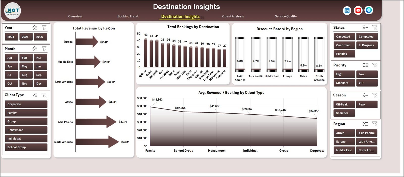
Destination Insights
4. Client Analysis
The Client Analysis sheet helps users review package-tier profitability, priority-level satisfaction, booking channel cost, and itinerary rating by service type. It supports client experience and pricing decisions.
Total Net Profit by Package Tier: This chart compares net profit by package tier. It helps identify whether budget, standard, premium, or luxury packages create stronger profit.
Avg. Satisfaction by Priority: This chart shows satisfaction by booking priority. It helps teams verify whether high-priority clients are receiving the expected level of service.
Total Cost by Booking Channel: This chart compares cost across booking channels. It helps identify channels that bring more operational cost or require process improvement.
Avg. Itinerary Rating by Service Type: This chart shows itinerary rating by service type. It helps improve service design by identifying which service categories clients rate higher or lower.
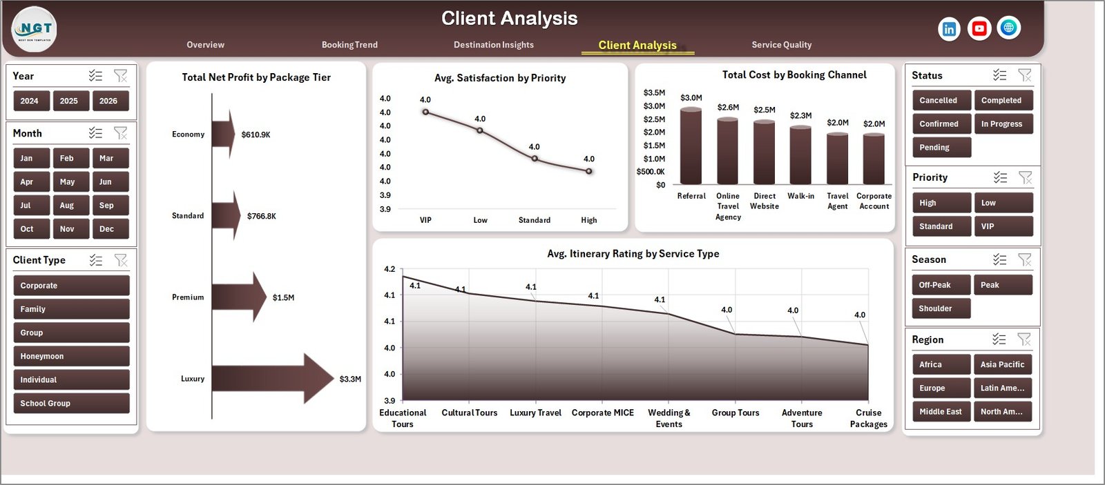
Client Analysis
5. Service Quality
The Service Quality sheet connects destination cost, status-level profit, and package-tier cancellation rate. It helps operations teams improve delivery quality and protect margin.
Total Cost by Destination: This chart compares cost by destination. It helps identify locations where vendor, hotel, activity, guide, or transport costs may need review.
Total Net Profit by Status: This chart shows net profit by status. It helps understand how completed, pending, cancelled, delayed, or other statuses affect profitability.
Cancellation Rate % by Package Tier: This chart compares cancellation rate by package tier. It helps identify package tiers where pricing, service promise, or client commitment may need improvement.
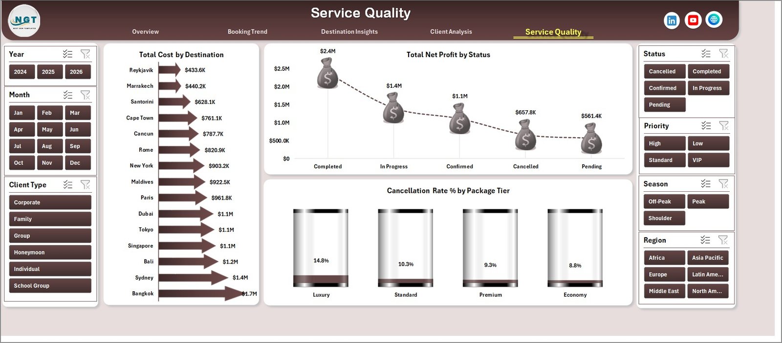
Service Quality
6. Data Sheet Tab
This is the Data Sheet. Here you need to add the data in the same format. After the sample records are replaced, the dashboard can be refreshed to update cards, charts, slicers, and pivot tables.

Data Sheet tab
7. Support Sheet
In this sheet, multiple pivot tables are created to build the entire dashboard dynamically. After updating the Data Sheet, go to the Data tab in the Excel Ribbon and click Refresh All. All pivots and charts will refresh, and you can keep this sheet hidden.
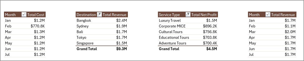
Support sheet tab
Destination Management Companies Dashboard in Excel vs. Google Sheets vs. Paid Travel SaaS – Feature Comparison
| Feature | This Excel Dashboard | Google Sheets Alternative | Paid Travel SaaS |
|---|---|---|---|
| Cost | $17.99 one-time | Low cost, but usually build-your-own | Recurring monthly or annual fee |
| Platform | Microsoft Excel | Browser-based spreadsheet | Vendor cloud platform |
| Setup time | Add data and refresh | Copy, connect, and adjust formulas | Implementation and onboarding |
| Customizable fields | Fully editable workbook | Editable sheet | Plan and vendor dependent |
| Year-1 cost at 5 users | $17.99 total | Usually low, plus build time | Often hundreds or thousands |
| DMC reporting structure | Built in | Must be built or adapted | Depends on vendor module |
Who Should Use This Template
This template is built for destination management companies, inbound tour operators, travel coordinators, MICE and event planners, tourism operations teams, finance analysts, and business owners that need repeatable Excel reporting for revenue, profit, bookings, pax, satisfaction, destination insights, client analysis, and service quality.
It is not a replacement for a booking engine, CRM, accounting system, ticketing platform, or live supplier portal. It is best used as a reporting and analysis workbook after operational data is exported or entered into the Data Sheet.
Real-World Use Cases
Anita, DMC Operations Manager: Anita reviews Total Pax by Quarter, Total Bookings by Season, and Service Quality charts before weekly team meetings.
Rahul, Travel Business Owner: Rahul uses Profit Margin % by Destination and Total Net Profit by Package Tier to decide which destinations and packages should receive more promotion.
Maria, Event Travel Coordinator: Maria reviews Avg. Satisfaction by Priority and Avg. Itinerary Rating by Service Type to improve group travel planning and client experience.
Advantages of Destination Management Companies Dashboard in Excel
The first advantage is speed. The dashboard pages, cards, slicers, charts, Data Sheet, and Support Sheet are already structured, so users do not need to build reporting from scratch.
The second advantage is ownership. You buy the workbook once, keep it, edit it, and reuse it without a monthly subscription or per-user fee.
The third advantage is flexibility. Because the file is built in Excel, you can rename fields, adjust chart styles, add columns, change colors, or adapt the workbook to your DMC reporting process.
Opportunities for Improvement
This dashboard is not connected to live booking systems by default. Users need to paste or import data into the Data Sheet. For large DMCs with live integrations, a database, Power BI model, or dedicated travel platform may be better for real-time operations.
The workbook also depends on consistent data entry. Destination names, service types, package tiers, booking channels, regions, and statuses should be standardized to avoid duplicated slicer values.
Best Practices
- Update the Data Sheet on a fixed weekly or monthly schedule.
- Use consistent names for destinations, regions, service types, package tiers, and booking channels.
- Click Data > Refresh All after replacing records.
- Keep the Support Sheet hidden when sharing the dashboard with end users.
- Use the Overview Page for leadership review and Service Quality for operations follow-up.
Explore Relevant Templates
- Destination Management Companies KPI Dashboard in Excel – KPI-focused DMC performance tracking.
- Destination Management Companies KPI Dashboard in Power BI – Power BI version for interactive analytics.
- Adventure Tourism KPI Dashboard in Excel – Useful for tourism activity and adventure travel reporting.
- Explore all Excel Dashboard Templates.
Frequently Asked Questions
What KPI cards are shown on the Overview Page?
The Overview Page includes Total Revenue, Total Net Profit, Total Bookings, Total Pax, and Avg. Satisfaction.
How do I update the dashboard?
Add data in the Data Sheet using the same format, then go to the Data tab in Excel and click Refresh All.
Does this template require macros?
No. It uses standard Excel tables, pivot tables, slicers, and charts.
Can I customize the dashboard?
Yes. You can edit chart titles, fields, slicers, colors, layouts, and formulas in Excel.
Can I hide the Support Sheet?
Yes. The Support Sheet contains pivot tables and can be hidden after setup.
Is this a booking management system?
No. It is an Excel reporting dashboard for analysis after your booking, finance, or operations data has been exported or entered.
About the Author
Built by PK – Microsoft Certified Professional with 15+ years of Excel, Google Sheets, and Power BI experience. Founder of NextGenTemplates, reaching 300K+ subscribers across YouTube channels. Every template is hand-built and tested before release.
Conclusion
The Destination Management Companies Dashboard in Excel gives DMC teams a practical way to review revenue, net profit, bookings, pax, satisfaction, booking trends, destination insights, client analysis, and service quality in one workbook. It is ideal when your team wants Excel-based reporting that can be refreshed quickly without a subscription platform.
Click here to purchase Destination Management Companies Dashboard in Excel
Instant download · One-time payment · No subscription
For video tutorials, visit Youtube.com/@PKAnExcelExpert
Last updated: June 2026