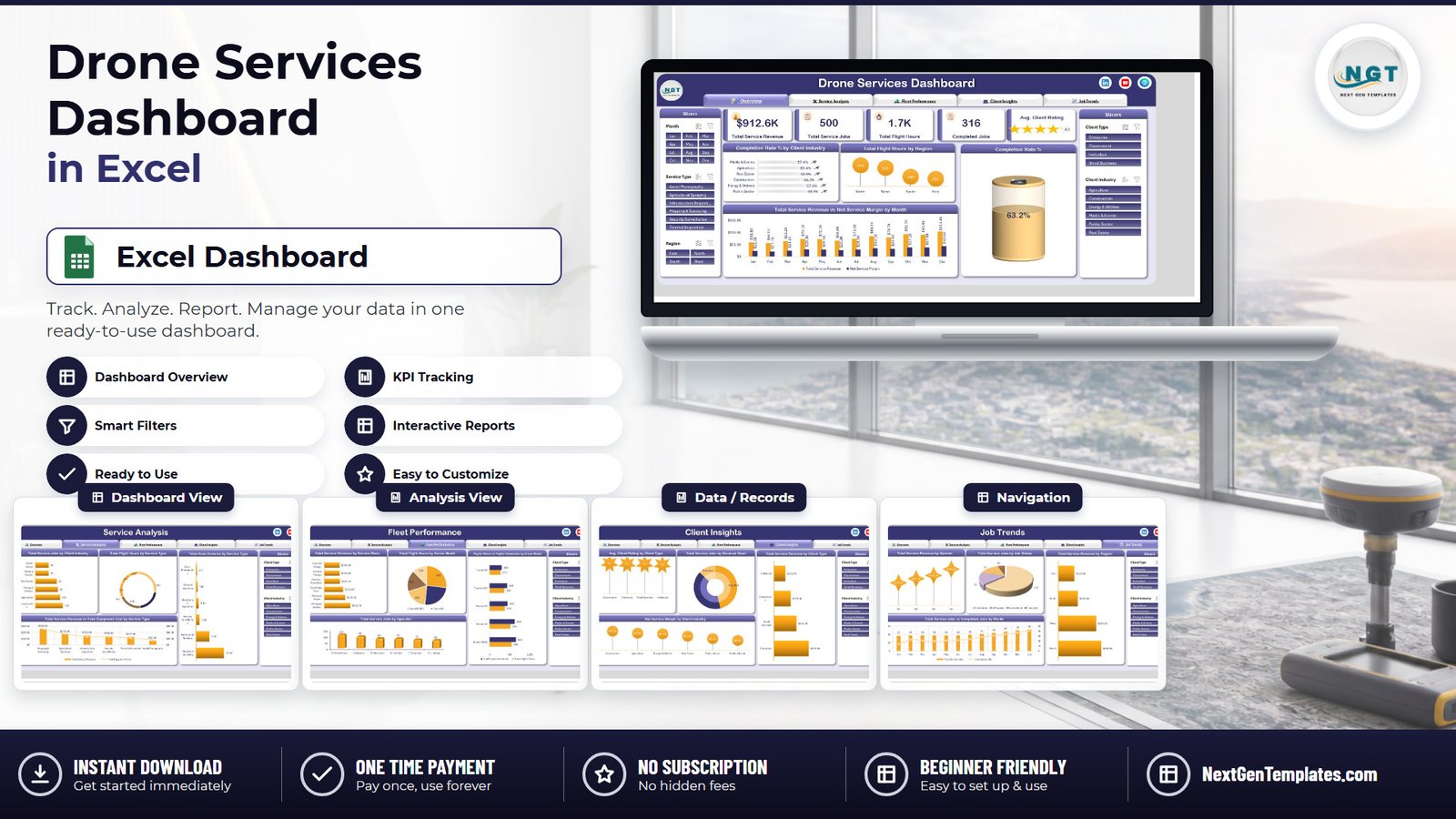
Most drone-services operators can tell you how many hours they flew. Far fewer can show, on one screen, what those hours were worth. In the sample book behind the Drone Services Dashboard in Excel, 500 jobs produced $912.6K of service revenue across 1,657 flight hours – and only 316 of those jobs closed as completed. That is a 63.2% completion rate, with 75 jobs rescheduled and 28 cancelled. The gap is not a flying problem. It is a reporting problem, and it is the one this template was built to fix.
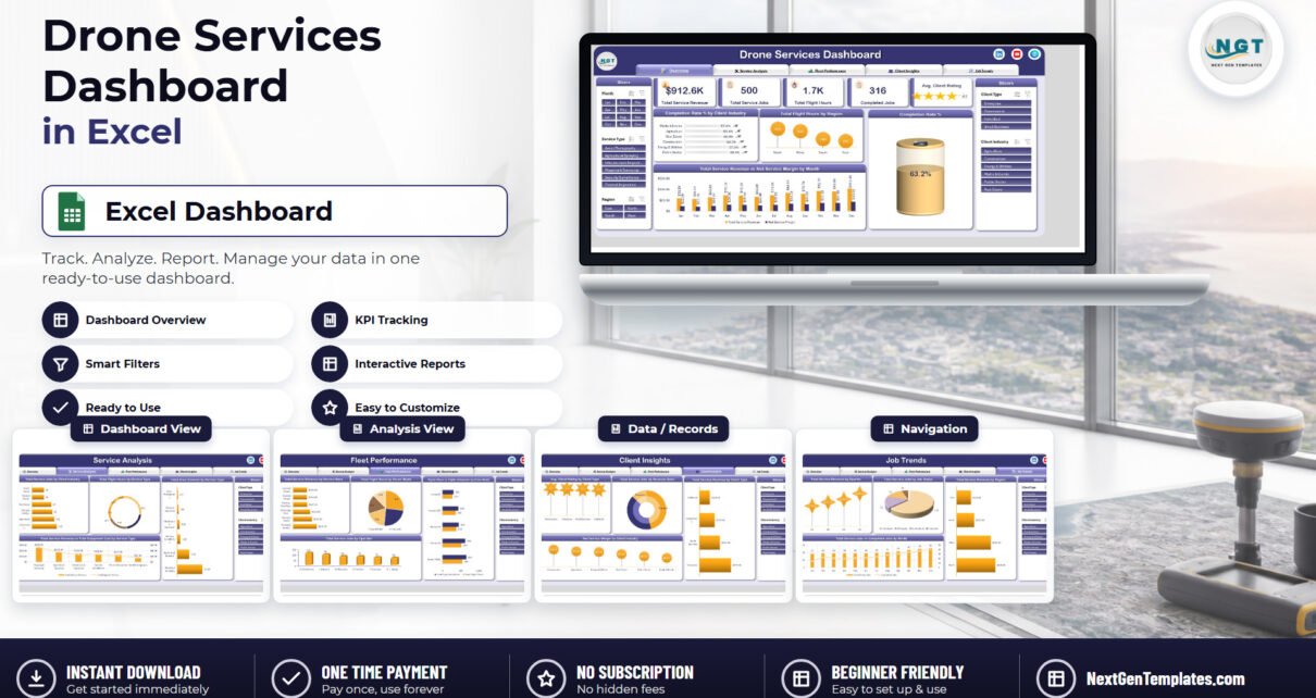
This is the analytical Excel dashboard line: five linked report pages, 20 charts and five synchronised slicers over a flat table you can replace with your own export. It is not a scorecard with targets and traffic lights, and it is not drone operations software. It is the monthly pack you currently rebuild by hand.
Key Features of the Drone Services Dashboard in Excel
- Five report pages – Overview, Service Analysis, Fleet Performance, Client Insights and Job Trends – reached from a tab strip that sits across the top of every sheet.
- Five KPI cards: Total Service Revenue, Total Service Jobs, Total Flight Hours, Completed Jobs and Avg. Client Rating with a five-star display.
- Five synchronised slicers – Month, Service Type and Region on the left, Client Type and Client Industry on the right – filtering every chart on every page at once.
- 20 charts, each named for the metric it shows rather than the chart type, so a screenshot needs no caption.
- Six service types pre-loaded: Aerial Photography, Agricultural Spraying, Infrastructure Inspection, Mapping & Surveying, Security Surveillance and Thermal Inspection.
- Five drone models across six service bases – Kestrel M300, Falcon X2, Osprey V8, Condor H20 and Harrier S9 flying out of Northgate Airfield, Westport Depot, Southridge Field, Harbour Point Base, Eastvale Hangar and Lakeside Hangar.
- 500 sample job records, ready to be replaced with your own export.
- No VBA – a plain .xlsx for Excel 2016+, Microsoft 365 and Excel for Mac, with a PDF user manual in the download ZIP.
Dashboard Pages Explanation
Page 1 – Overview
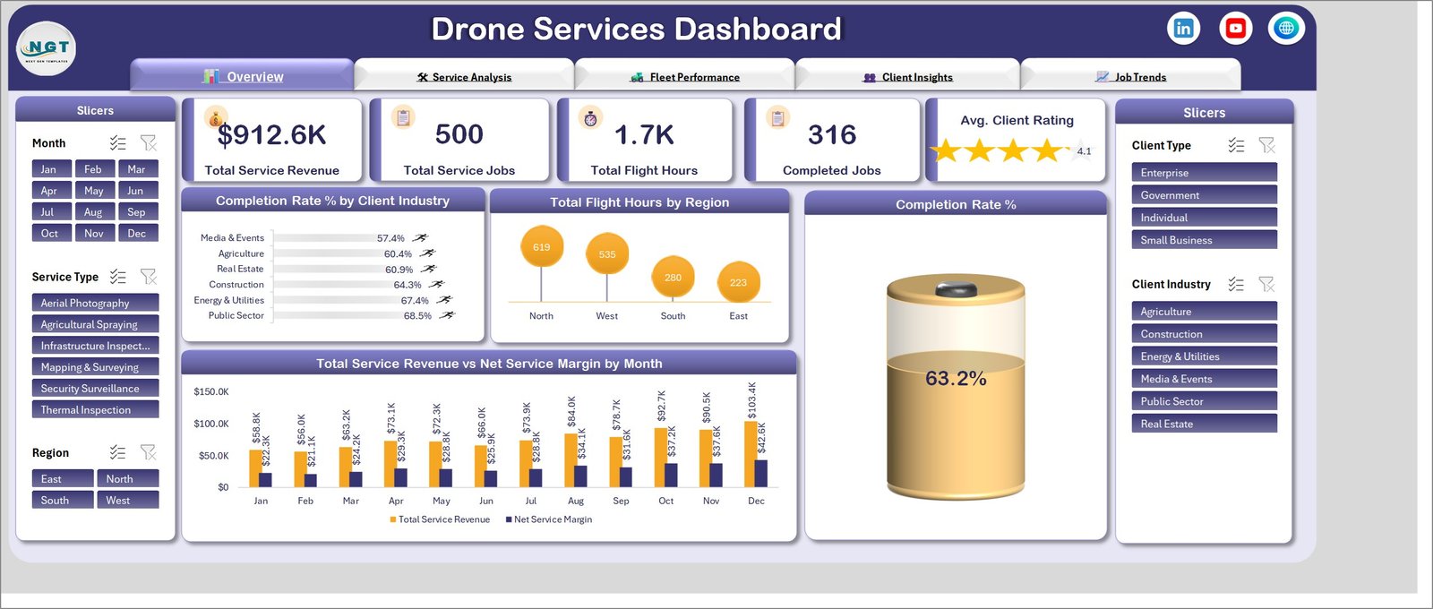
The five KPI cards run across the top: $912.6K total service revenue, 500 service jobs, 1.7K flight hours, 316 completed jobs and an average client rating of 4.1 shown as four filled stars. Below them, a Completion Rate % gauge reads 63.2%.
Completion Rate % by Client Industry is the chart that starts most conversations: Public Sector completes 68.5% of its jobs and Energy & Utilities 67.4%, while Media & Events sits at 57.4% – a spread of eleven points that is invisible in a flight log. Total Flight Hours by Region puts North at 619 hours and West at 535 against South’s 280 and East’s 223, and Total Service Revenue vs Net Service Margin by Month tracks the pair from $58.8K revenue against $22.3K margin in January to $103.4K against $42.6K in December.
Page 2 – Service Analysis
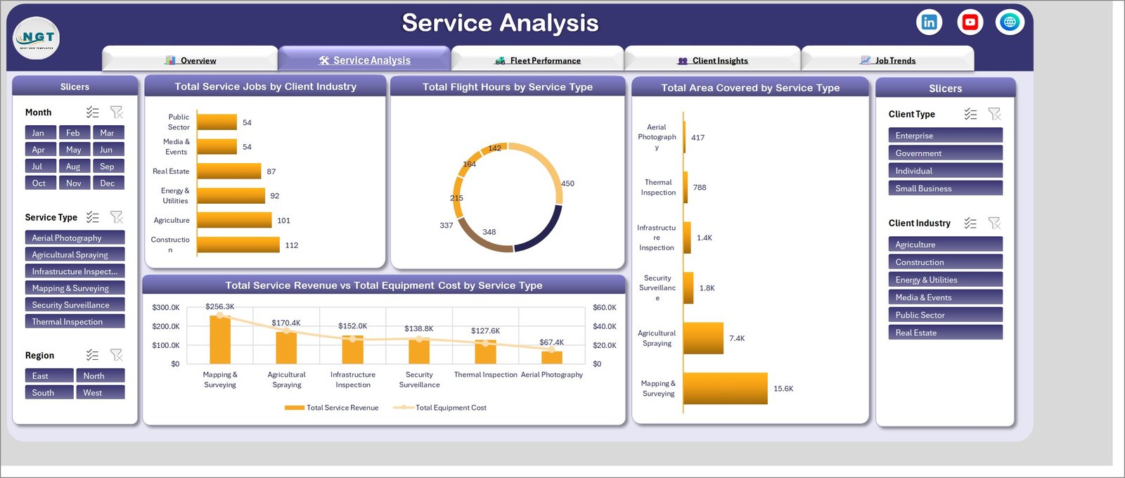
This is the page that tells you which lines of work are worth keeping. Total Service Jobs by Client Industry ranks Construction at 112 jobs and Agriculture at 101, with Media & Events and Public Sector tied at 54. Total Flight Hours by Service Type splits the 1,657 hours as a donut, and Total Area Covered by Service Type shows how unevenly area maps onto hours: Mapping & Surveying covers 15.6K, Agricultural Spraying 7.4K, and Aerial Photography just 417.
Total Service Revenue vs Total Equipment Cost by Service Type closes the page by putting revenue columns against an equipment-cost line – Mapping & Surveying at $256.3K, Agricultural Spraying $170.4K, Infrastructure Inspection $152.0K, Security Surveillance $138.8K, Thermal Inspection $127.6K and Aerial Photography $67.4K.
Page 3 – Fleet Performance
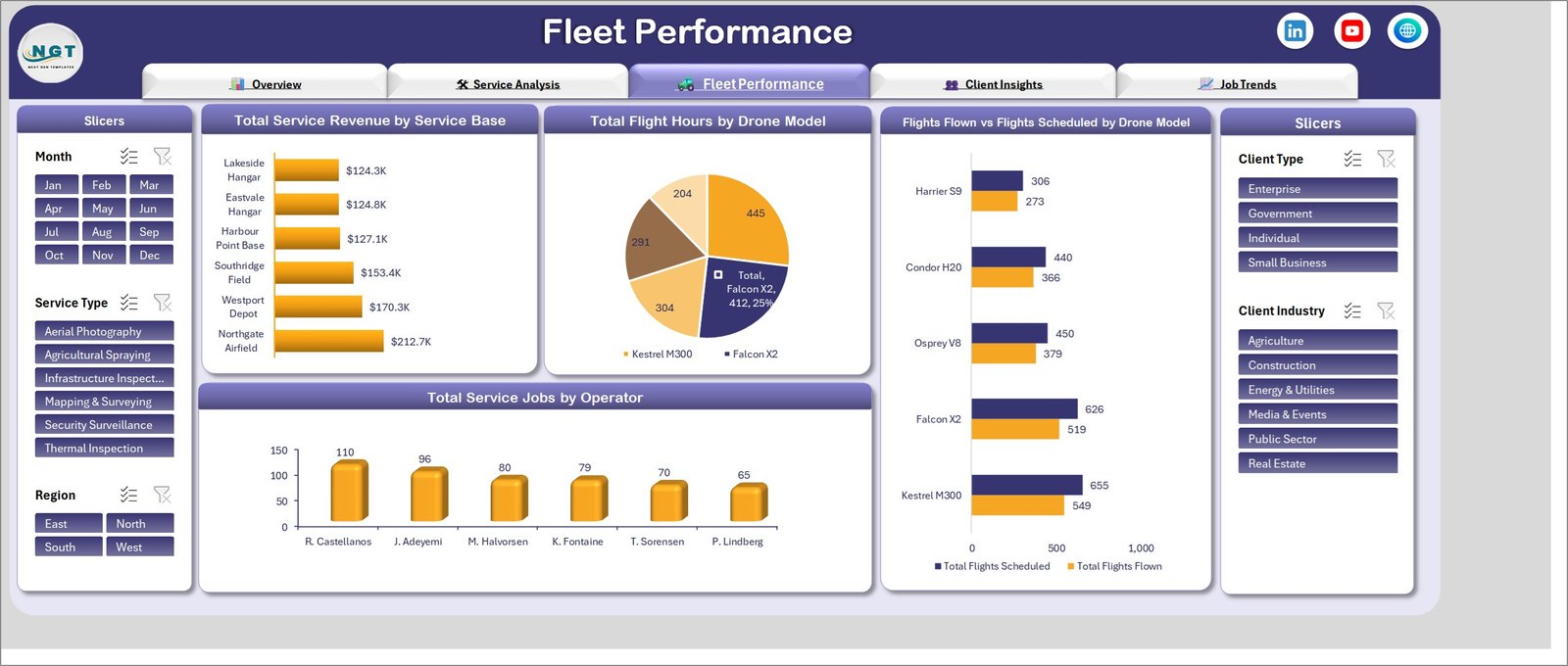
Total Service Revenue by Service Base spreads from Northgate Airfield’s $212.7K down to Lakeside Hangar’s $124.3K – narrower than most operators assume, which is itself a useful finding when someone proposes closing a base. Total Flight Hours by Drone Model gives Falcon X2 a 412-hour slice, a quarter of the total.
The chart to actually watch is Flights Flown vs Flights Scheduled by Drone Model. Kestrel M300 flew 549 of 655 scheduled flights, Falcon X2 519 of 626, Osprey V8 379 of 450, Condor H20 366 of 440 and Harrier S9 273 of 306. Every one of those gaps is weather, maintenance or a client no-show, and the page turns them into a number you can plan against. Total Service Jobs by Operator then ranks six pilots from R. Castellanos at 110 jobs to P. Lindberg at 65.
Page 4 – Client Insights

Avg. Client Rating by Client Type holds Government and Enterprise at 4.2, Small Business at 4.1 and Individual at 4.0. Total Service Jobs by Revenue Band splits the book into Premium, Standard and Basic tiers so you can see how much of the volume sits at the bottom.
Total Service Revenue by Client Type is the chart that changes sales plans – Enterprise $372.0K, Small Business $241.5K, Government $178.4K, Individual $120.7K. Then Net Service Margin by Client Industry reorders it all: Construction contributes $79.6K of margin, Agriculture $70.8K, Energy & Utilities $67.8K, Real Estate $57.8K, Public Sector $47.5K and Media & Events $40.0K. Biggest revenue and best margin are not the same client.
Page 5 – Job Trends
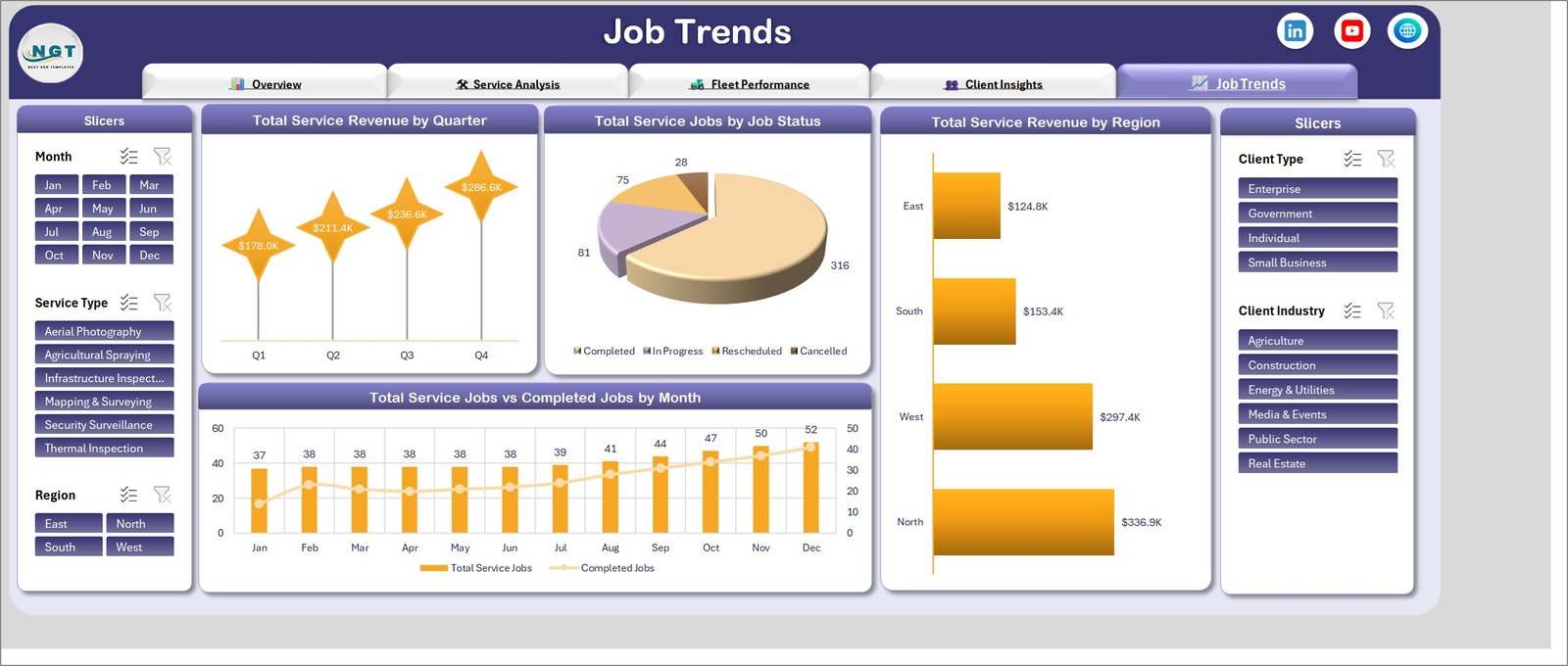
Total Service Revenue by Quarter climbs $178.0K, $211.4K, $236.6K, $286.6K – a 61% rise from Q1 to Q4. Total Service Jobs by Job Status accounts for all 500 jobs as 316 completed, 81 in progress, 75 rescheduled and 28 cancelled, so the reschedule rate stops being an anecdote.
Total Service Revenue by Region puts North at $336.9K and West at $297.4K well ahead of South’s $153.4K and East’s $124.8K, and Total Service Jobs vs Completed Jobs by Month traces the book from 37 jobs in January to 52 in December with the completed line running beneath it.
Drone Services Dashboard in Excel vs. Google Sheets vs. Paid Drone Operations SaaS – Feature Comparison
| What matters | This Excel dashboard | Google Sheets equivalent | Paid SaaS (DroneDeploy, Skyward, Kittyhawk) |
|---|---|---|---|
| Cost | $17.99 once | $9.99 once | $3,000-$30,000 per year |
| Platform | Excel 2016+, Microsoft 365, Mac | Browser, any device | Vendor cloud only |
| Setup time | Under 15 minutes | Under 15 minutes | 2-8 weeks |
| Real-time team collaboration | OneDrive or SharePoint co-authoring | Native, simultaneous | Native, with roles |
| Flight logging from the aircraft | No – you paste your export | No – you paste your export | Yes, automatic |
| Airspace and compliance checks | No | No | Yes |
| Revenue and margin by service type | Built in | Built in | Usually a paid finance module |
| Flights flown vs scheduled per model | Built in | Built in | Built in |
| Customizable fields | Any column you add | Any column you add | Admin-configured, often chargeable |
| Year-1 cost at 5 users | $17.99 | $9.99 | $6,000+ |
| Data leaves your organisation | No | Stays in your Google account | Yes, vendor-hosted |
Who Should Use This Template
It suits drone-services companies running two to ten aircraft out of more than one base, where the monthly question is which base and which airframe earned their keep. It suits aerial survey and mapping firms that bill by area covered rather than by hour, because area and hours diverge sharply on the Service Analysis page. It suits agricultural spraying contractors reporting completion and coverage back to growers, and infrastructure and thermal inspection providers who need a defensible utilisation figure per drone model before buying the next one.
It is the wrong choice if you need live flight logging, airspace clearance or maintenance-compliance workflows – that is operations software, not a reporting workbook. It is also wrong for per-pilot row-level permissions, for a job book past roughly 100,000 rows, or for nightly syncing from a fleet platform. If what you actually want is a one-page monthly scorecard with red/amber/green thresholds against targets, the Drone Services KPI Dashboard in Excel is the better fit – it is a different template from this analytical build, and plenty of operators keep both.
Real-World Use Cases
Monthly operations review at a six-base survey firm. Filter Region to North, and $336.9K of the $912.6K total appears against 619 of the 1,657 flight hours. The case for a seventh aircraft stops being a paragraph and becomes two charts.
Pricing review for an agricultural spraying contractor. Agricultural Spraying covers 7.4K of area against Mapping & Surveying’s 15.6K but brings $170.4K against $256.3K – and the equipment-cost line underneath is what justifies retiring an airframe rather than repairing it.
Quarterly client meeting at an inspection provider. Enterprise clients bring $372.0K against Individual’s $120.7K, yet Construction carries the highest net margin at $79.6K. Filtering Client Industry to Construction before the call reframes the whole discount conversation.
Fleet planning ahead of renewal. Kestrel M300 missing 106 of 655 scheduled flights and Falcon X2 missing 107 of 626 is the difference between a maintenance budget and a replacement budget.
Advantages of the Drone Services Dashboard in Excel
- It is one file. No account, no seats, no vendor. Email it, put it on OneDrive, or keep it on a laptop that never sees a client network.
- Every chart is named for its metric. Net Service Margin by Client Industry means the same thing in a screenshot as it does on screen, which matters when a page ends up in a board pack.
- The slicers are synchronised. One click on Thermal Inspection re-filters all five pages, so you can walk a client through their own slice of the data live.
- The sample data is complete and consistent. Regional revenue, quarterly revenue and revenue by client type all reconcile to $912.6K, so you can learn the workbook before you trust it with your own numbers.
- No macros to enable. A plain .xlsx opens without a security warning on a locked-down corporate build, and works in Excel for Mac.
- One-time price. $17.99 today, and the file is still yours in three years.
Frequently Asked Questions
Which Excel versions does the Drone Services Dashboard in Excel work in?
Excel 2016, 2019, 2021, 2024 and Microsoft 365 on Windows, plus Excel for Mac. It is a standard .xlsx built on pivot tables and slicers – there are no macros to enable and no add-ins to install.
How is this different from the Drone Services KPI Dashboard?
This is the analytical dashboard line: five exploration pages, 20 charts, free-form slicing across 500 job records. The KPI dashboard is a month-picker scorecard with targets and traffic lights, and the KPI scorecard is a one-page summary. They answer different questions – this one is for finding out why, the scorecard is for reporting whether.
Can I add my own service types, drone models or bases?
Yes. Type your own values into the data sheet and refresh. The slicers and charts rebuild around whatever list they find – nothing is hard-coded to the six sample service types or five sample airframes.
Does it connect to my flight logs automatically?
No. It reads a flat table you paste in, which is what almost every flight-log platform and job-management tool can export. There is no live link to an aircraft, a ground control station or an airspace service.
How many job records can it hold?
It ships with 500 rows and stays responsive into the tens of thousands. Past roughly 100,000 rows, refresh times start to be noticeable on an average laptop.
Is the sample data real?
No. Operator names, base names, drone models and every figure are realistic sample data used to demonstrate the charts. Replace them before you share anything externally.
What exactly is in the download?
A ZIP containing the .xlsx workbook and a PDF user manual. Instant download after checkout, lifetime access, no subscription.
Get the Drone Services Dashboard in Excel
Get the Drone Services Dashboard in Excel for $17.99 (regular $29.99) – instant download, one-time payment, lifetime access, no subscription.
If you run adjacent operations, these walkthroughs cover the same five-page build for neighbouring businesses: the Drone Delivery Services Dashboard in Excel for last-mile delivery fleets, the Drone Farming Startups Dashboard in Excel for agri-drone ventures, and the Crisis Mapping Startups Dashboard in Excel for emergency aerial mapping. If you would rather work in Power BI, there is a Drone Delivery Services Dashboard in Power BI as well.
Last updated: 6 September 2026.