Every collections shop runs on the same handful of numbers. Recovery rate. Collection Effectiveness Index. How many promises to pay were actually kept. What it costs to collect a dollar. How many complaints landed per thousand accounts. The numbers are not the hard part – pulling them together into one page every month, in the same shape, so the board or the client can read it in ninety seconds, is the hard part.
The Credit Recovery Agencies KPI Dashboard in Excel is that one page. It is a KPI scorecard: you type your monthly figures onto three input sheets, pick a month from a dropdown, and the workbook produces a fourteen-row scorecard with achievement percentages and traffic lights, a trend page for any single KPI, and an analysis page that rolls everything up by group and ranks the best and worst five.
Two things to be clear about before anything else, because the topic is a regulated one and the words matter.
First: this is not a compliance tool. It makes no claim about FDCPA, FCRA, CFPB rules, TCPA, GDPR, UK FCA rules, state licensing or bonding. It contains no rule checks and produces no regulatory return. It is a management reporting spreadsheet.
Second: every number you will see in the screenshots below is demo data. It was generated to show the layout working. It describes no real agency, no real portfolio and no real consumer. You replace all of it with your own figures.
Scorecard, not analytical dashboard
NextGenTemplates publishes two families of dashboard and the names are close enough to confuse. It is worth spending thirty seconds on which one this is.
| KPI Scorecard (this template) | Analytical Dashboard | |
|---|---|---|
| Input | One MTD and one YTD figure per KPI per month, typed by hand | A transaction-level table – hundreds or thousands of rows |
| Controls | A month dropdown; a KPI dropdown on the trend page | Slicers on region, segment, date, product |
| Headline view | A table of KPIs with achievement % and red/amber/green status | Charts, KPI cards and pivot-driven visuals |
| The question | Are we hitting target this month and year to date? | What is driving the number, and where? |
| Engine | Worksheet formulas only | Pivot tables or a data model |
| Reader | Board, monthly management review, agency owner, client | Analyst digging into detail |
If you have a clean account-level export and you want to explore it, you want the analytical family. If you already know your fourteen numbers and you need them presented consistently every month, you want this one. A good many teams run both.
The 14 KPIs it ships with
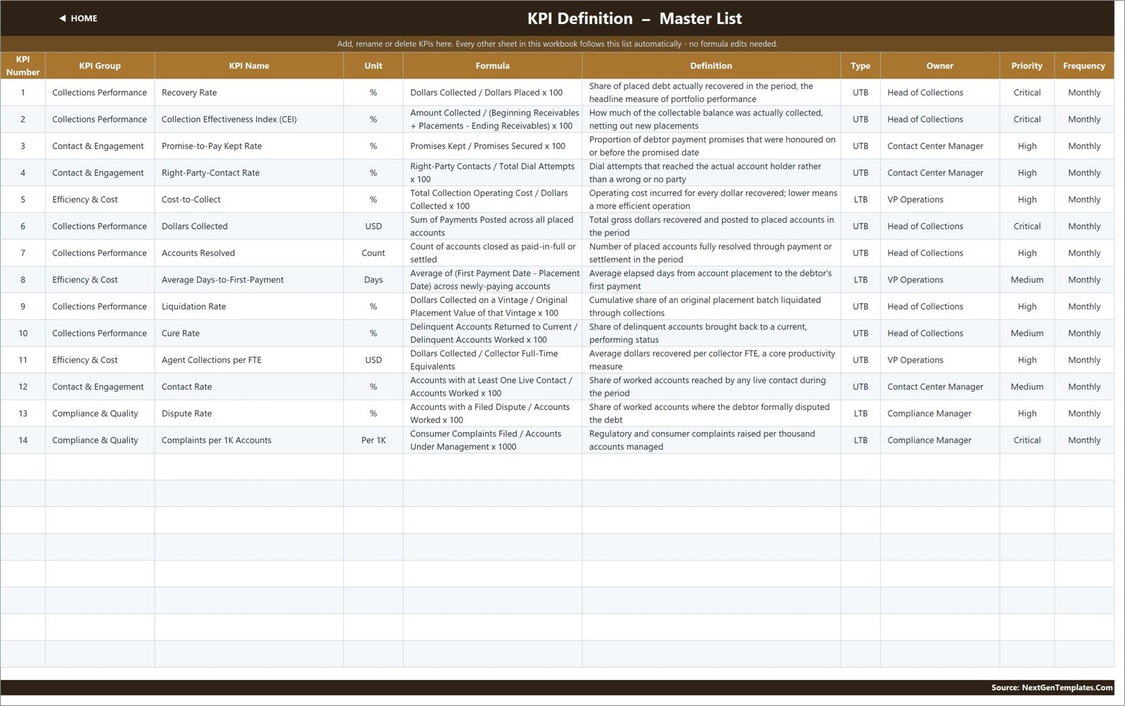
Each one arrives with a name, group, unit, written formula, plain-English definition, direction, owner, priority and reporting frequency. All of it is editable text on a single sheet – rename anything to match the language your agency actually uses.
Collections Performance (6)
- Recovery Rate (%) – Dollars Collected / Dollars Placed x 100. The headline portfolio measure.
- Collection Effectiveness Index (CEI) (%) – Amount Collected / (Beginning Receivables + Placements – Ending Receivables) x 100. How much of the collectable balance was collected, netting out new placements.
- Dollars Collected (USD) – the gross sum of payments posted in the period.
- Accounts Resolved (Count) – accounts closed as paid-in-full or settled.
- Liquidation Rate (%) – cumulative share of a placement vintage liquidated.
- Cure Rate (%) – delinquent accounts returned to current, over delinquent accounts worked.
Contact & Engagement (3)
- Promise-to-Pay Kept Rate (%) – promises kept over promises secured.
- Right-Party-Contact Rate (%) – contacts that reached the actual account holder, over total dial attempts.
- Contact Rate (%) – accounts with at least one live contact, over accounts worked.
Efficiency & Cost (3)
- Cost-to-Collect (%, lower is better) – total collection operating cost over dollars collected.
- Average Days-to-First-Payment (Days, lower is better) – placement date to the debtor’s first payment.
- Agent Collections per FTE (USD) – dollars collected per collector full-time equivalent.
Compliance & Quality (2)
- Dispute Rate (%, lower is better) – accounts with a filed dispute, over accounts worked.
- Complaints per 1K Accounts (Per 1K, lower is better) – complaints raised per thousand accounts under management.
The last two deserve a caveat of their own. They are management metrics – a count you type in so you can watch a trend. They are not a regulatory submission, they are not linked to any complaints database, and a low number in this workbook proves nothing about how disputes or complaints were actually handled.
How the scoring works
Three ideas, and once you have them the whole file makes sense.
UTB and LTB. Every KPI is flagged either UTB (upper the better – a bigger number is a better result) or LTB (lower the better). Recovery Rate is UTB. Cost-to-Collect is LTB.
Achievement %. For a UTB KPI it is Actual divided by Target. For an LTB KPI it flips: Target divided by Actual. That matters more than it sounds. Without the flip, coming in under a cost target reads as a miss. With it, beating a cost or a cycle-time target scores above 100%, exactly the way beating a collections target does – which means the Top 5 and Bottom 5 rankings are honest across mixed KPI types.
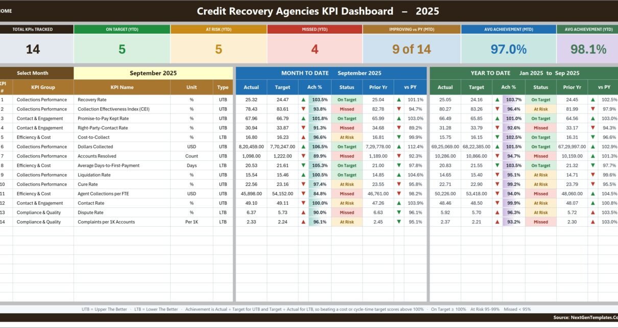
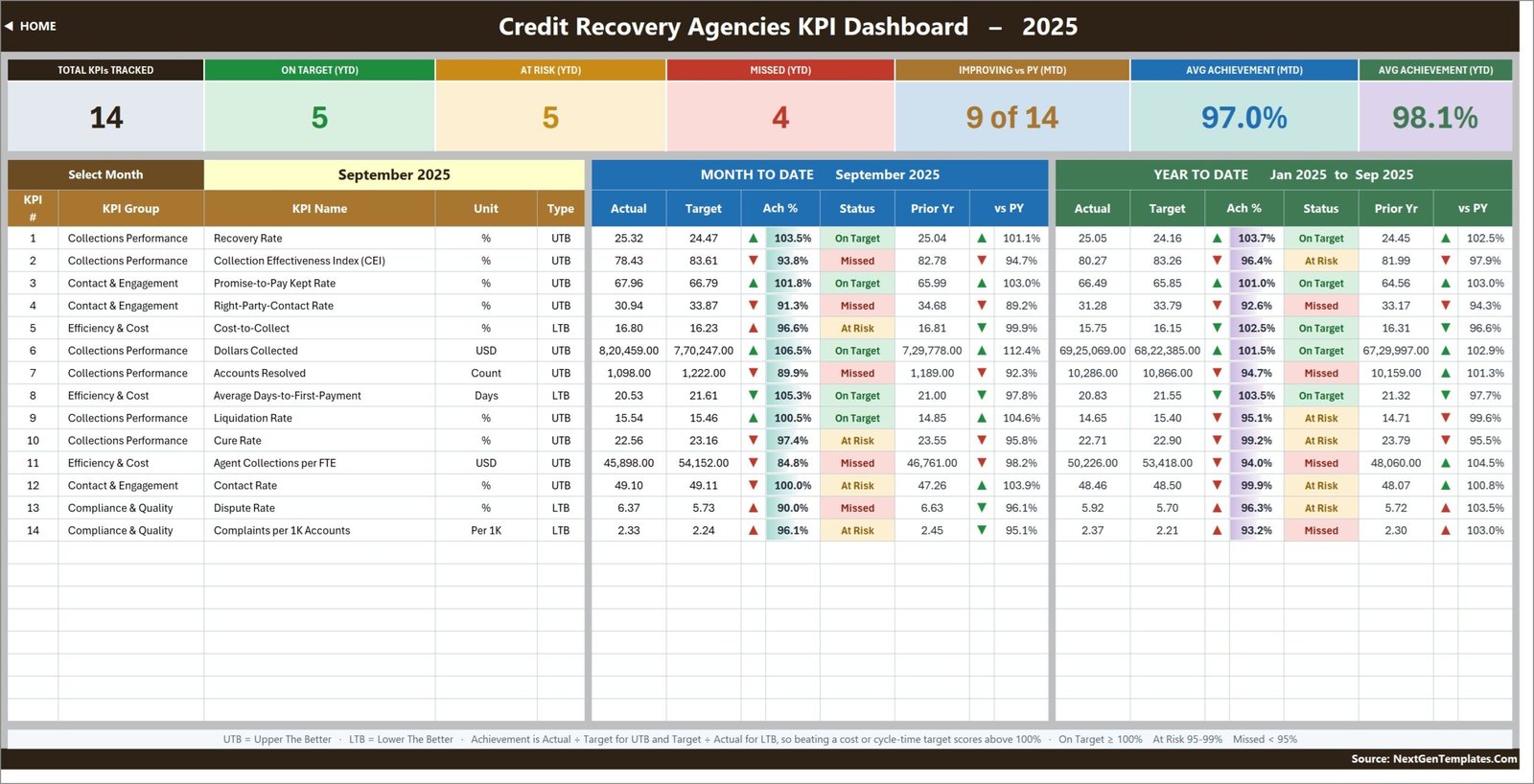
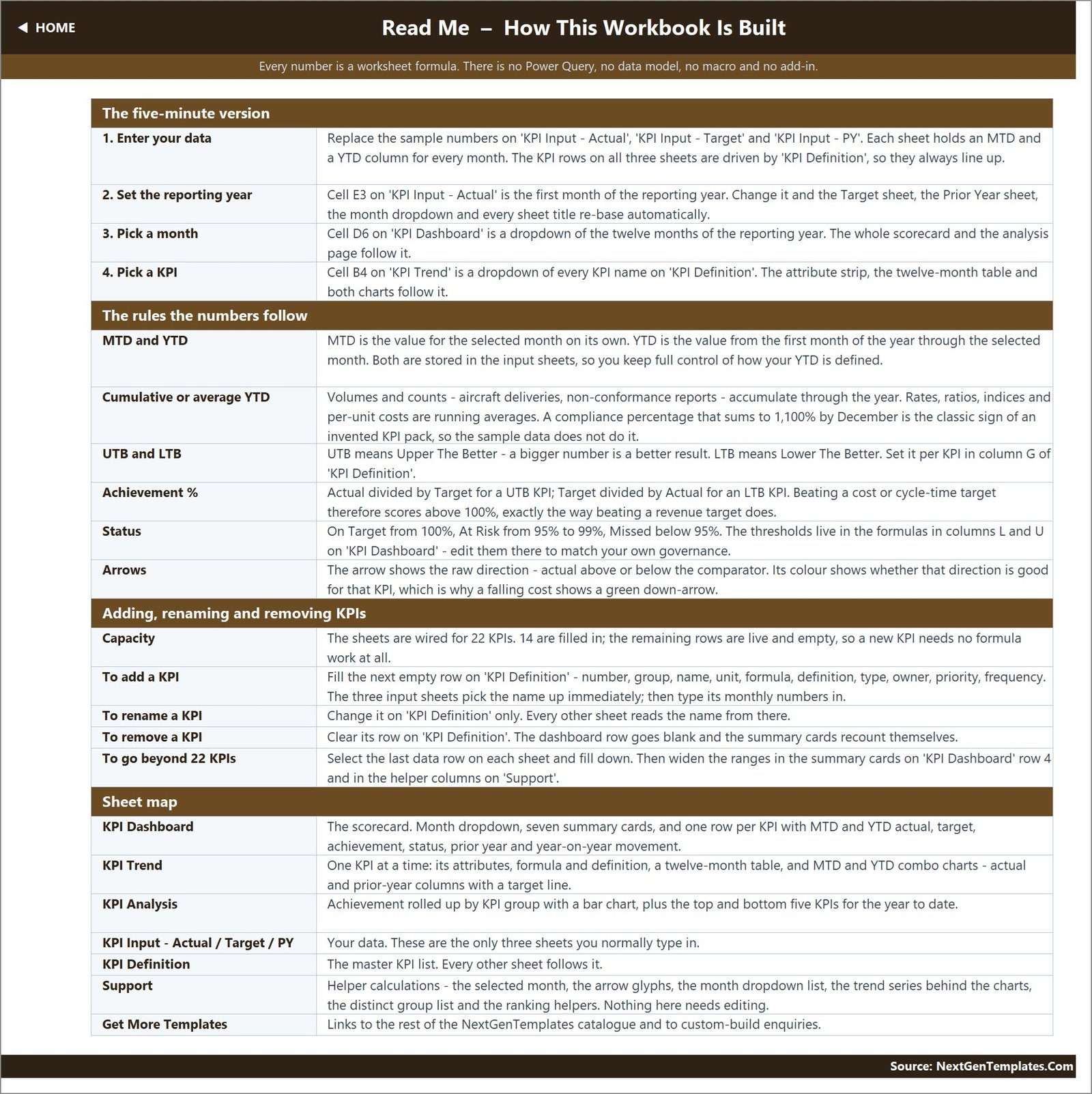
Status bands. On Target from 100%, At Risk from 95% to 99%, Missed below 95%. These are written into the formulas in columns L and U on the KPI Dashboard sheet, so if your governance uses 90/98 or anything else, edit them there once and the whole file follows.
Arrows are separate from status. An arrow shows the raw direction – actual above or below the comparator – while its colour shows whether that direction is good for that KPI. A falling cost therefore gets a green down-arrow, which is the behaviour you want in a board pack.
Page by page
Home
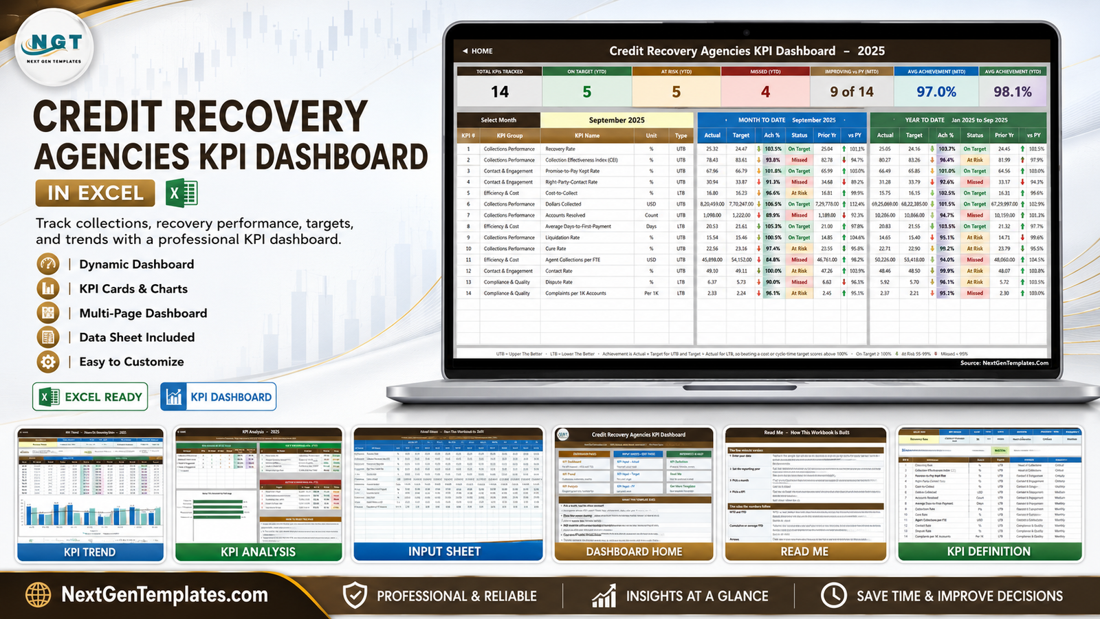
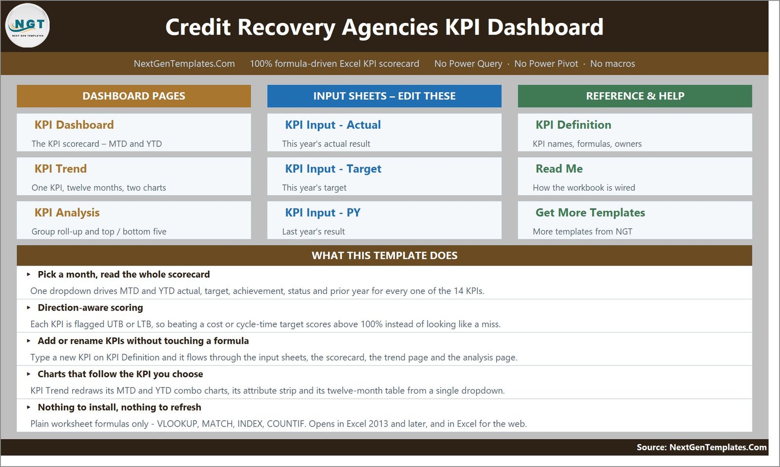
A navigation page with three blocks of hyperlinked tiles – Dashboard Pages, Input Sheets and Reference & Help – and a “What This Template Does” panel underneath.
KPI Dashboard – the scorecard
The page the file exists for. Seven cards run across the top: Total KPIs Tracked, On Target (YTD), At Risk (YTD), Missed (YTD), Improving vs PY (MTD), Avg Achievement (MTD) and Avg Achievement (YTD). Below them, the Select Month dropdown, and then one row per KPI. Each row carries the KPI number, group, name, unit and type, then a MONTH TO DATE block – actual, target, achievement %, status, prior year, vs PY – and a YEAR TO DATE block with the same six columns. Status cells are filled green, amber or red; achievement cells carry their own subtle fills. The footer restates the UTB/LTB rule and the threshold bands.
KPI Trend – one KPI, twelve months
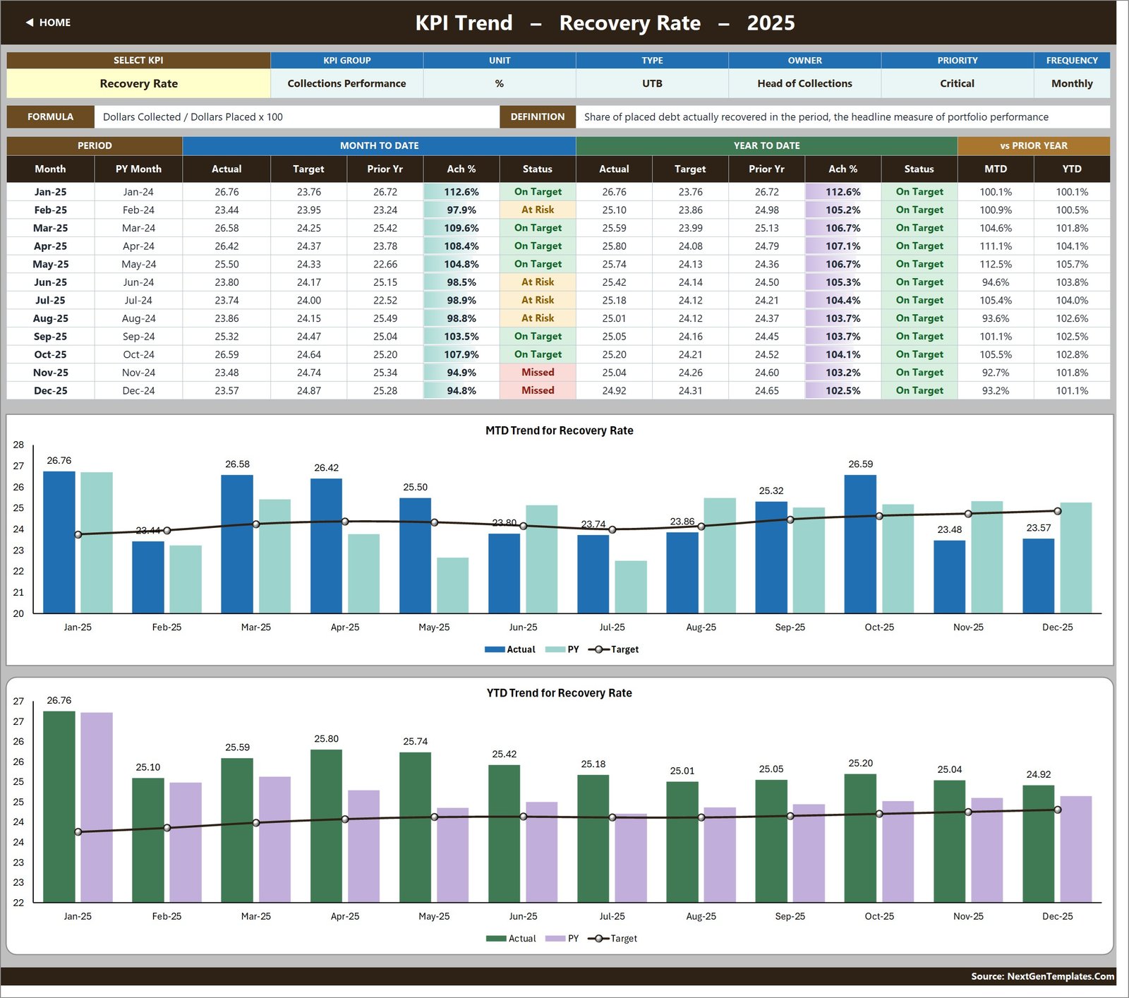
Cell B4 is a dropdown of every KPI name on the definition sheet. Choose one and the whole page redraws for it: an attribute strip (group, unit, type, owner, priority, frequency), the KPI’s formula and definition spelled out, and a twelve-month table with MTD actual, target, prior year, achievement % and status beside the YTD equivalents and the vs-prior-year columns.
Two charts sit underneath, and their titles follow the dropdown: MTD Trend for [selected KPI] and YTD Trend for [selected KPI]. Both are combo charts – actual and prior-year columns with a target line drawn over the top – so a run of amber months is visible before you have read a single number.
KPI Analysis – roll-up and rankings
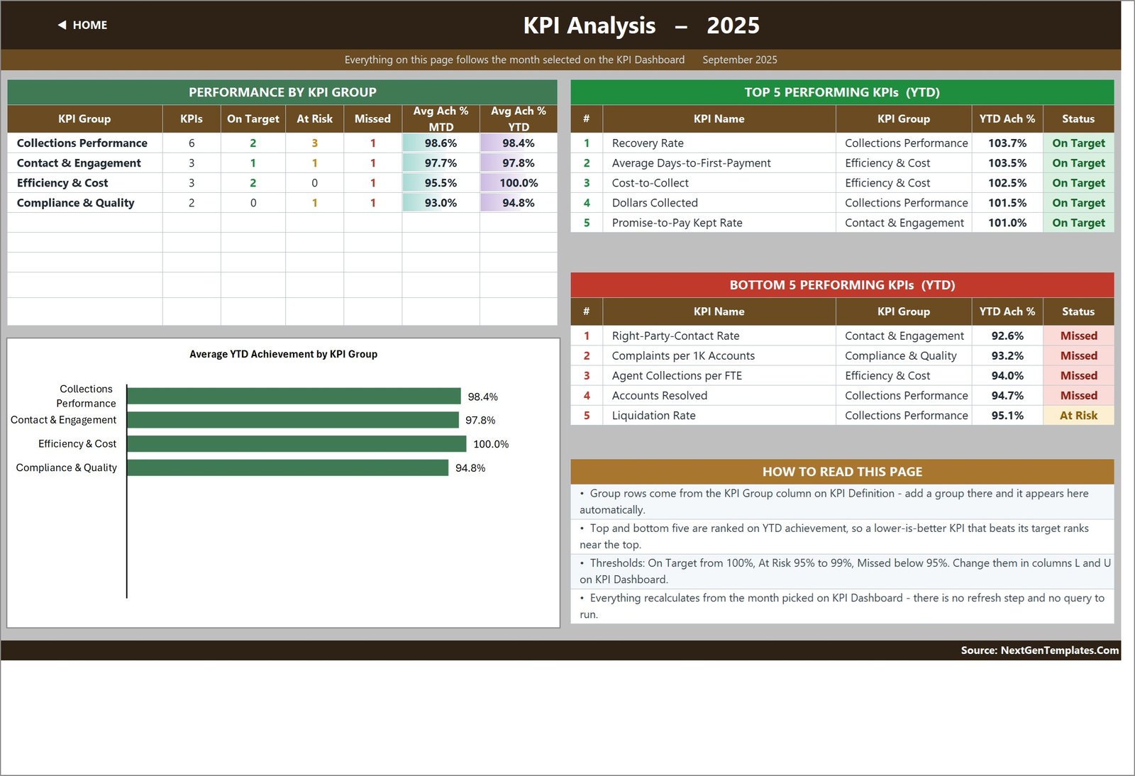
This page follows the same month you picked on the scorecard. On the left, Performance by KPI Group counts KPIs, On Target, At Risk and Missed for each of the four groups and shows average achievement for MTD and YTD; it feeds a bar chart titled Average YTD Achievement by KPI Group. On the right, Top 5 Performing KPIs (YTD) and Bottom 5 Performing KPIs (YTD), each with the KPI’s group, YTD achievement and status. A How to Read This Page panel explains the ranking logic and where to change the thresholds.
KPI Input – Actual, Target and PY
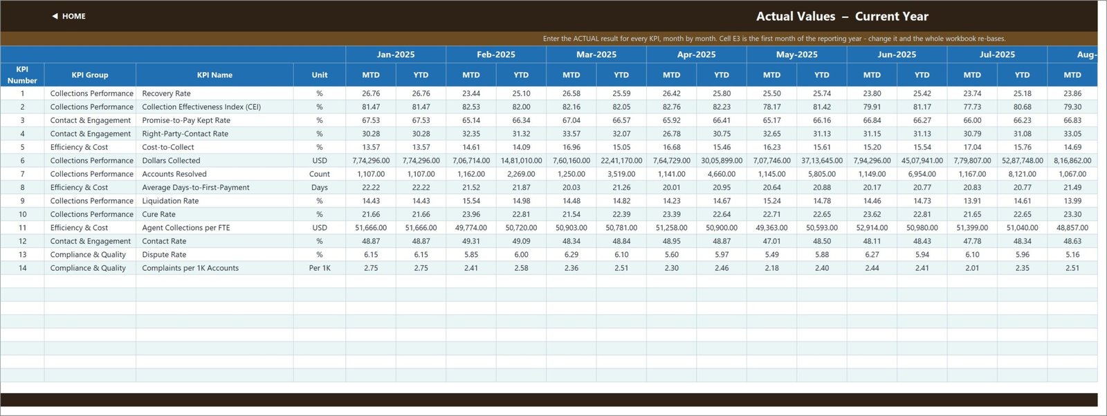
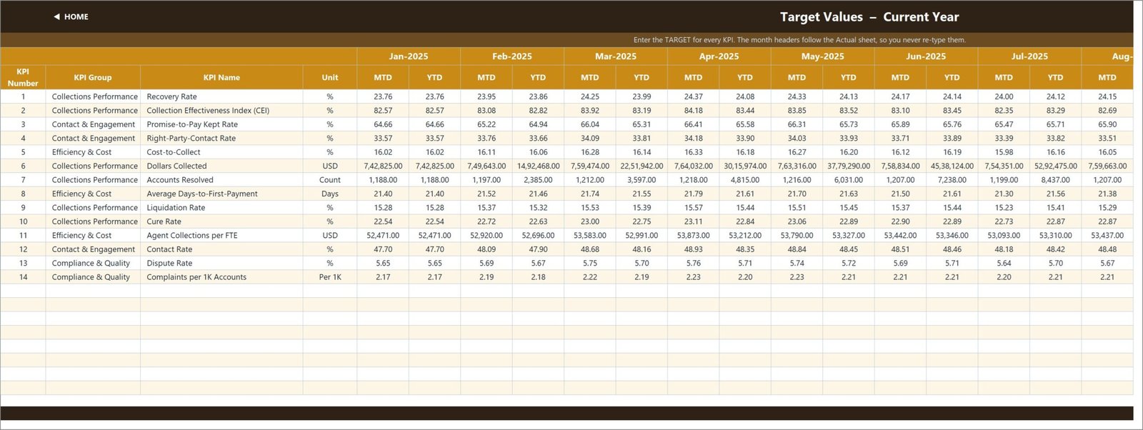
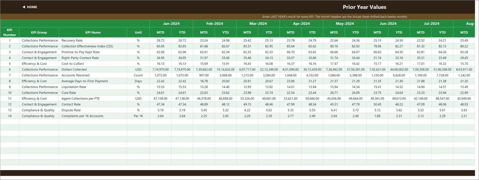
Three sheets with an identical grid: one row per KPI, one MTD and one YTD column for each of the twelve months. These are the only sheets you normally type on.
Cell E3 on the Actual sheet is the first month of your reporting year. Change it and the Target sheet, the PY sheet, the month dropdown and every sheet title re-base together, which is what makes a July-to-June financial year as easy as a calendar one. The Target sheet’s month headers follow the Actual sheet; the PY sheet’s are the same headers shifted back twelve months.
Both MTD and YTD are stored rather than derived, which is deliberate: you keep control of what “year to date” means for each KPI. Volumes and money accumulate; rates, ratios, indices and per-unit costs are running averages. A percentage that has climbed to 1,100% by December is the classic sign of a scorecard someone built in a hurry, and this one does not do it.
KPI Definition – the master list
The sheet every other sheet obeys. Ten columns per KPI: number, group, name, unit, formula, definition, type, owner, priority, frequency. Rename a KPI here and the input sheets, the scorecard, the trend dropdown and the analysis page all pick up the new name. Clear a row and the KPI disappears from the scorecard and the summary cards recount themselves.
Read Me
A written explanation of the build: the five-minute setup, the rules the numbers follow, how to add, rename or remove KPIs, how to go beyond the 22 wired rows, and a sheet-by-sheet map. Worth the five minutes.
Get More Templates
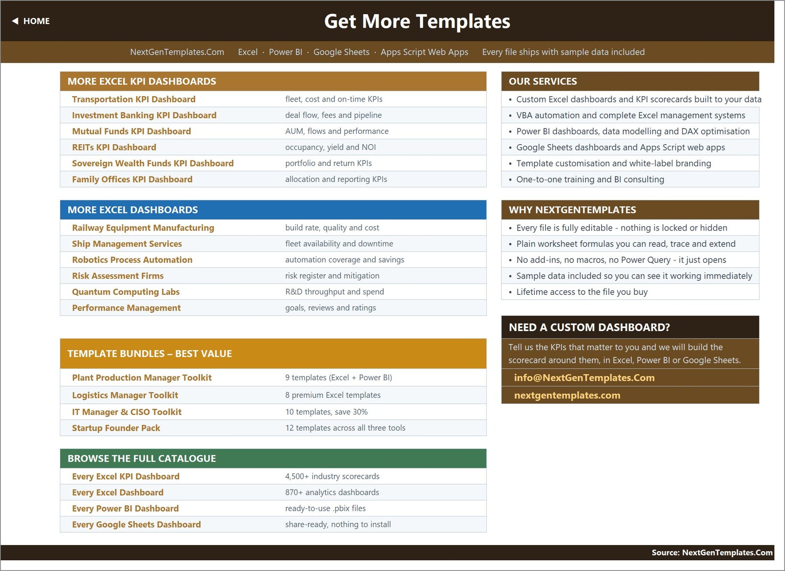
Page ten is a NextGenTemplates catalogue page – other Excel KPI dashboards, other Excel dashboards, bundles, and a custom-build note. It is a marketing page and we would rather you saw it here than were surprised by it after buying. It contains no data and can be deleted without affecting anything else in the workbook.
There is also a hidden Support sheet
Behind the ten visible pages sits a Support sheet holding the helper calculations – the selected month index, the arrow glyphs, the month dropdown list, the twelve-month series behind the trend charts, the distinct group list and the ranking helpers. Nothing on it needs editing, but it is not hidden from you either: open it, trace the formulas, change them if you want. Nothing in this workbook is locked or password-protected.
Setting it up in about twenty minutes
- Read the Read Me sheet. Five minutes, and it removes most of the questions that follow.
- Edit KPI Definition. Change the fourteen rows to the measures you actually report. For each one set the unit, the formula text, UTB or LTB, the owner, the priority and the frequency. Add extra KPIs in the empty rows if you need them.
- Set cell E3 on KPI Input – Actual to the first month of your reporting year.
- Type your figures onto the Actual, Target and PY sheets – MTD and YTD, month by month. Delete the demo numbers as you go; do not leave any of them in.
- Open KPI Dashboard and pick your month in cell D6. If your governance bands are not 100/95, edit the thresholds in columns L and U.
- Check KPI Analysis. If a KPI is ranking in a way that looks wrong, it is nearly always the UTB/LTB flag on that row.
Adding your own KPIs
The sheets are wired for 22 KPIs and 14 are filled in, so eight more rows are already live and empty – type a new KPI onto KPI Definition and the input sheets, scorecard, trend dropdown and analysis page pick it up with no formula work at all. To go past 22, select the last data row on each sheet and fill down, then widen the ranges in the summary cards on KPI Dashboard row 4 and in the Support sheet helper columns. The Read Me page walks through it.
Limitations, and two cosmetic defects in the current build
Being straight about this is more useful than a sales pitch.
Known cosmetic defects in the file as it ships today:
- South Asian digit grouping on large currency figures. Dollars Collected shows as
8,20,459.00rather than820,459.00, and the YTD figure as69,25,069.00rather than6,925,069.00. The same grouping appears on the three input sheets. The totals are arithmetically correct – it is purely a number-format setting. Fix it by selecting the affected rows and applying a standard#,##0.00format, or Format Cells > Number with the 1000 separator ticked under a locale that uses thousands grouping. Two minutes. Figures under six digits (Accounts Resolved, Agent Collections per FTE) are unaffected because the two conventions agree below 100,000. - One leftover sentence on the Read Me page. Under “Cumulative or average YTD”, the example reads “aircraft deliveries, non-conformance reports” – wording carried over from an aerospace template in the same range. The rule it describes is correct and applies here unchanged; only the example is off-topic. Read it as “dollars collected, accounts resolved”.
We checked two other faults that have appeared elsewhere in this range and neither is present here: the stated KPI count is right (Home and Read Me both say 14, the definition sheet holds 14, the scorecard shows 14 rows), and no KPI reads identically across all twelve months – every one of the fourteen varies month to month on all three input sheets, so there is no stuck unit producing a flat trend and a permanent 100% achievement.
Design limitations, which are choices rather than faults:
- It is monthly. Twelve columns, one reporting year. Weekly or daily reporting needs a different structure.
- It is typed, not connected. There is no link to a collections platform, a dialler, a payment processor or a general ledger. Someone types the numbers each month. That is the trade for a file with no data model, no query and no refresh.
- MTD and YTD are both entered. The workbook does not compute YTD from MTD, so an inconsistency between the two columns will show up in the scorecard exactly as entered.
- It holds no account-level detail. You cannot drill from Recovery Rate into the accounts behind it, because those accounts are not in the file.
- Charts are Excel charts. No sparklines in the scorecard rows, no conditional-format data bars – the trend page is where trend lives.
What it is not – the plain list
- Not a compliance tool. No FDCPA, FCRA, CFPB, TCPA, GDPR, FCA, state licensing or bonding claim of any kind. Using it demonstrates nothing to a regulator, an examiner, an auditor or a client.
- Not a system of record. Not a collections platform, not a dialler, not a payment processor, not a case-management system.
- Not a consumer-data store. There is no field anywhere in the workbook for a consumer name, account number, address, phone number or balance. It holds fourteen rows of monthly aggregate figures. If you add personal data in columns of your own, that is your decision – and then your own data-protection obligations apply to the file, including how it is stored, who can open it and how long you keep it. We would advise against it: the scorecard does not need it.
- Not a scoring or profiling tool. It does not rank, segment or score individual consumers, and it touches nothing to do with credit-bureau reporting, furnishing accuracy, dispute resolution, validation notices or call-recording legality.
- Not a source of benchmarks. The targets and thresholds in the file are placeholders. They are not industry standards and not a recommendation. Set your own.
- Not real data. Every figure in the screenshots above is demo data. Delete it.
Frequently asked questions
Does this make my agency FDCPA or CFPB compliant?
No. It is a spreadsheet that displays numbers you have typed into it. It contains no compliance logic, no rule checks, no regulatory reporting and no legal content, and nothing produced by it should be offered to a regulator, examiner, auditor or client as evidence of compliance with anything. Compliance is a matter for your own legal and compliance function. The same answer applies to FCRA, TCPA, GDPR, the UK FCA regime, and state licensing or bonding requirements.
Does it store debtor or consumer data?
No. There is no field for a name, an account number, an address, a phone number or a balance anywhere in the workbook. Its three input sheets take one MTD and one YTD number per KPI per month – fourteen rows of aggregates. Nothing in the file identifies a person. If you choose to add personal data yourself, the file becomes your responsibility under whichever data-protection regime applies to you, and it has none of the controls such a file would need.
Are the numbers in the screenshots real?
No. All of them are demo data, generated so the file works the moment you open it. No real agency, portfolio, client or consumer is described anywhere in the workbook.
Do I need Power Query, Power Pivot, macros or an add-in?
None of them. It is an .xlsx file built on plain worksheet formulas – VLOOKUP, MATCH, INDEX, COUNTIF. No data model, no query, no macro to enable, no refresh step, no security warning bar.
Which versions of Excel does it work in?
Excel 2013 and later on Windows and Mac, and Excel for the web. It will open in Google Sheets too, though chart formatting will shift and you may want to rebuild the two combo charts there.
Can I add or rename KPIs?
Yes, and that is the point of the KPI Definition sheet. Renaming is a text edit. Adding is typing a new row – eight empty rows are already wired. Going past 22 needs a fill-down and two range widenings, described on the Read Me page.
Can I change the red/amber/green bands?
Yes. The 100% and 95% thresholds live in the formulas in columns L and U on the KPI Dashboard sheet. Change them once and every status cell, every summary card and the analysis page follow.
Why does a lower-is-better KPI show above 100%?
Because that is correct. For an LTB KPI the achievement calculation is Target divided by Actual, so coming in under a cost or cycle-time target produces a score above 100 – the same way beating a collections target does. Without that flip, your most efficient month would look like your worst.
Is this the same as your Credit Recovery analytical dashboard?
No, they are different templates from different production lines. This is the month-picker scorecard. An analytical dashboard consumes a row-level table and gives you slicers and charts. See the comparison table near the top.
Is the file locked or protected?
No. Every sheet, formula, chart and colour is open. Rebrand it, restructure it, delete the pages you do not want.
What is actually in the download?
A single ZIP containing the .xlsx workbook and a PDF user manual covering the Excel KPI dashboard range.
Related templates
- Loan Recovery Services KPI Dashboard in Excel – the nearest sibling, framed for lender-side recovery.
- Debt Management KPI Dashboard in Excel – the same scorecard pattern from the debtor-portfolio side.
- Accounts Receivable KPI Dashboard in Google Sheets – for teams that work in Sheets.
- Loan Recovery Services Dashboard in Power BI – the analytical counterpart, if you have row-level data.
- Executive & Operations Scorecard Bundle – nine Excel scorecards together.
Get the template
The workbook is available now on NextGenTemplates: Credit Recovery Agencies KPI Dashboard in Excel. You get the .xlsx file, ten sheets, fourteen pre-built KPIs, a PDF user manual, demo data so it works on first open, and lifetime access – nothing locked, nothing hidden.
Want a different KPI set, your own branding, or the same scorecard in Power BI or Google Sheets? Tell us which measures matter and we will build it around them – info@nextgentemplates.com.