Most brokerage management packs are assembled the same way every month: someone pulls account numbers from one system, trade volumes from another, revenue from finance and support times from the service desk, then spends a day pasting them into a deck. The numbers change; the layout does not.
The Stock Brokerage KPI Dashboard in Excel is that layout, built once and left alone. You type your monthly figures onto three input sheets, pick a month from a dropdown, and the scorecard, the trend page and the analysis page all re-read themselves. It is 100% worksheet formulas – no macros, no Power Query, no data model, no add-ins – so it opens and works in Excel 2013 and later, and in Excel for the web.
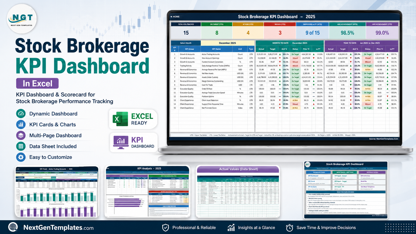
Before anything else, two plain statements. This template does not make a brokerage compliant with anything, and it does not connect to market data. It is a spreadsheet that summarises numbers you type in. Every figure in every screenshot below is sample demo data shipped with the file so it is not blank on first open – it is not real, and it is not a benchmark.
Scorecard or analytical dashboard? Know which one you want
There are two families of dashboard, and they answer different questions. Buying the wrong one is the most common mistake we see, mostly because the names look alike.
| KPI scorecard (this template) | Analytical dashboard | |
|---|---|---|
| Question | Did we hit target, this month and year to date? | What is driving the number, and by which segment? |
| Your data | One MTD and one YTD figure per KPI per month | A transaction table of hundreds or thousands of rows |
| Controls | A month dropdown and a KPI dropdown | Slicers and filters |
| Hero visual | A traffic-light KPI table | Charts split by category |
| Engine | Worksheet formulas only | Pivot tables or a data model |
| Used in | The monthly management review | Ad-hoc investigation |
If your meeting agenda is “here is what hit target and here is what did not”, you want the scorecard. If it is “why did the West region drop”, you want the analytical dashboard. Plenty of firms run both.
A tour of the workbook
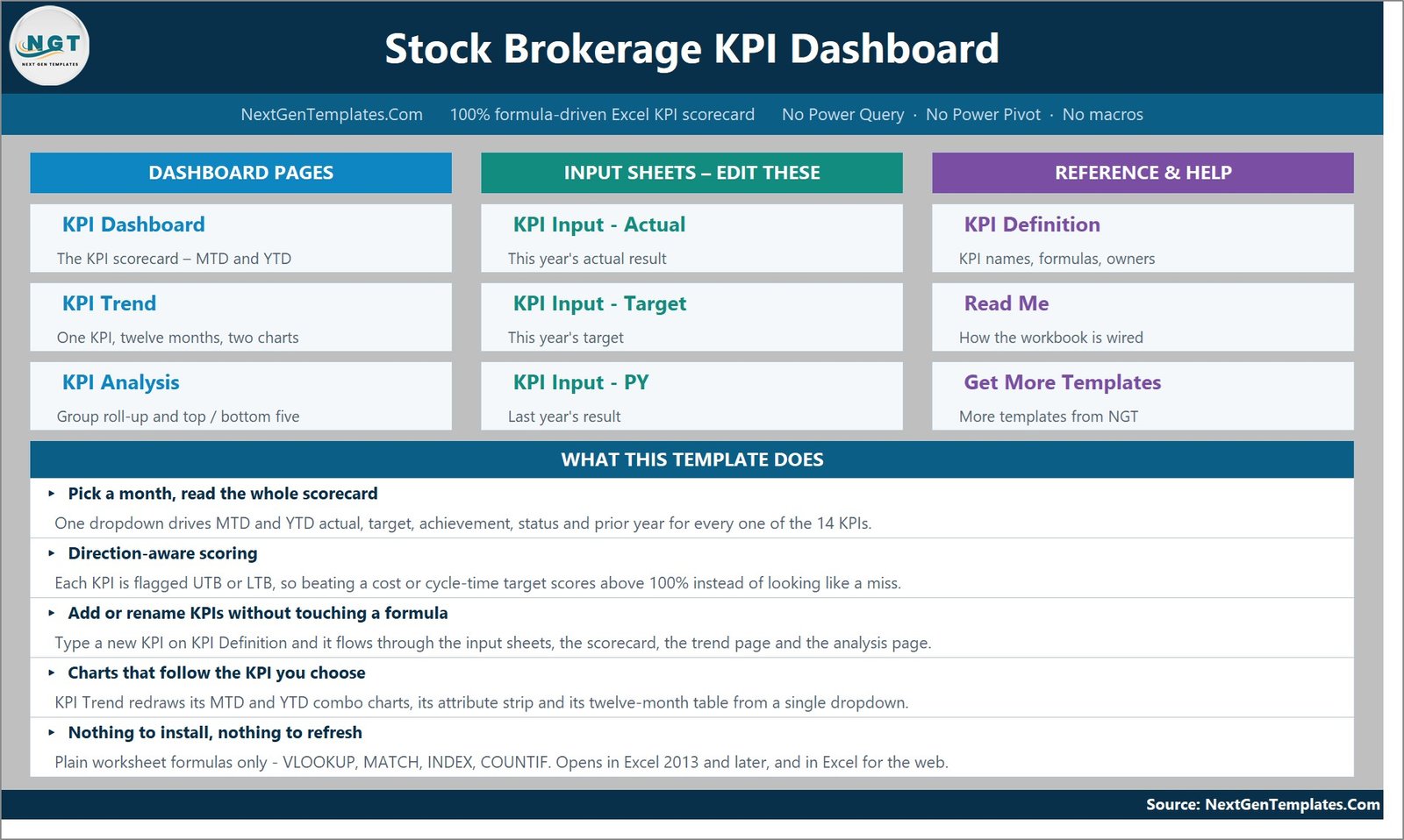
Home
The landing sheet. Tiles for the three dashboard pages, the three input sheets and the three reference pages, plus a short summary of what the file does. Every tile is a hyperlink and every other sheet has a HOME link back, so you never hunt through tabs.
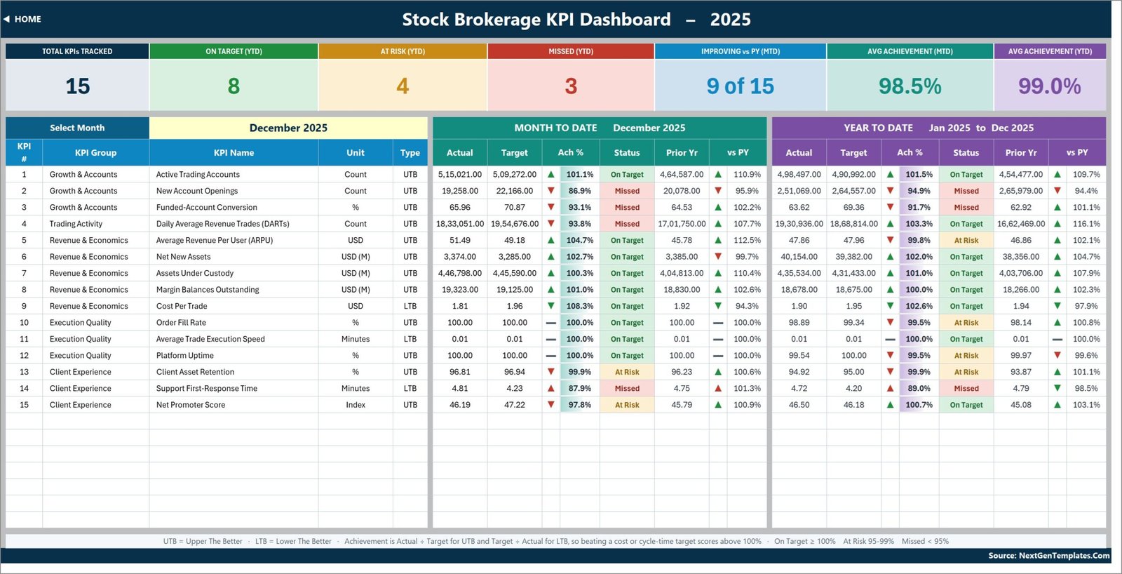
KPI Dashboard – the scorecard itself
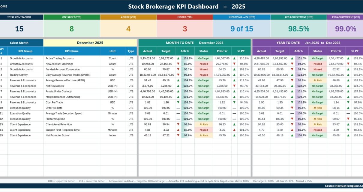
The page you will actually present. Seven summary cards run across the top – Total KPIs Tracked, On Target (YTD), At Risk (YTD), Missed (YTD), Improving vs PY (MTD), Avg Achievement (MTD) and Avg Achievement (YTD) – and they recount themselves whenever you add or remove a KPI.
Below them, the month picker on the left and then one row per KPI, split into a Month To Date block and a Year To Date block. Each block carries Actual, Target, Achievement %, Status, Prior Yr and a vs PY percentage with a direction arrow.
The arrow deserves a note. It shows the raw direction – actual above or below the comparator – while its colour shows whether that direction is good for that particular KPI. So a falling Cost Per Trade gets a green down-arrow, and a rising Support First-Response Time gets a red up-arrow. It reads correctly without anyone having to remember which metrics are inverted.
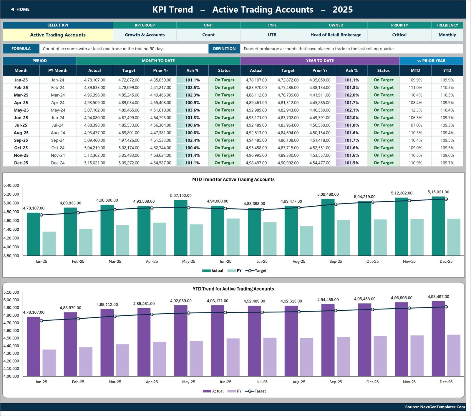
KPI Trend – one KPI, twelve months
Pick any KPI from the dropdown in cell B4 and the page rebuilds around it: its attribute strip (group, unit, type, owner, priority, frequency), its formula and its plain-English definition, then a twelve-month table of MTD and YTD actual, target, prior year, achievement and status.
Underneath sit two combo charts – MTD Trend for [the selected KPI] and YTD Trend for [the selected KPI] – each plotting actual and prior-year columns against a target line. Change the dropdown and both charts redraw. There is no chart to rebuild and no series to re-point.
KPI Analysis – groups and rankings
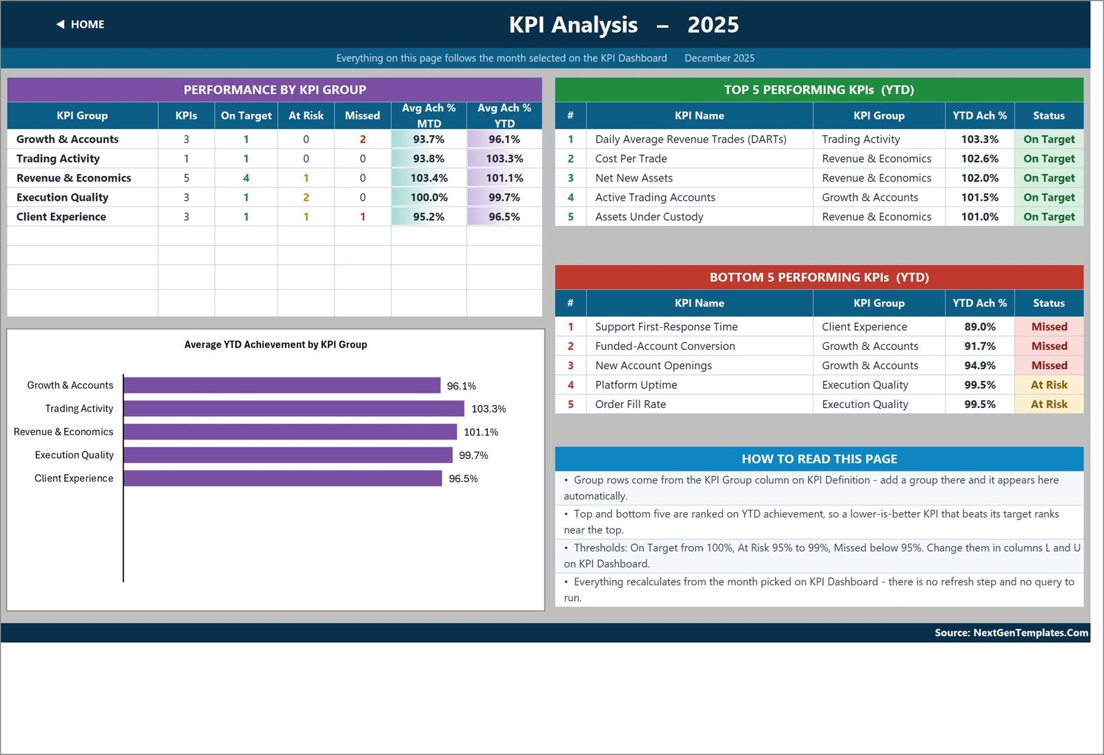
The “so what” page. On the left, a roll-up by KPI group: how many KPIs sit in each group, how many are On Target, At Risk or Missed, and the average MTD and YTD achievement for the group. On the right, Top 5 Performing KPIs (YTD) and Bottom 5 Performing KPIs (YTD). Below the roll-up, the Average YTD Achievement by KPI Group bar chart.
The ranking is done on achievement, not on the raw value, which is why a lower-is-better KPI that beats its target ranks near the top rather than at the bottom. The whole page follows the month you picked on the scorecard – there is no second selector to keep in sync.
The three input sheets
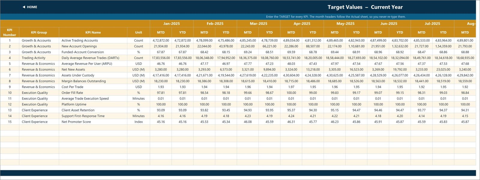
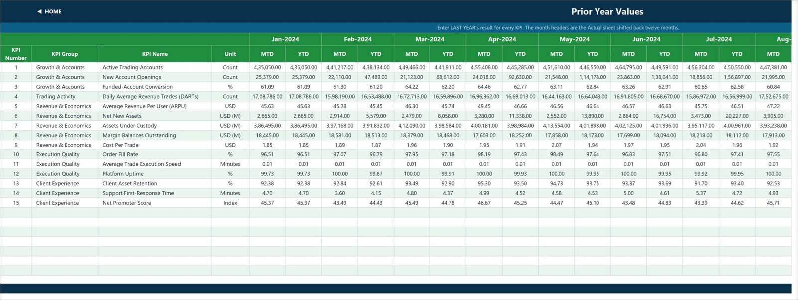
These are the only sheets you normally type into. KPI Input – Actual holds this year’s results, KPI Input – Target holds your targets and KPI Input – PY holds last year’s. All three share the same shape: one row per KPI, and an MTD plus a YTD column for each of the twelve months.
Storing YTD explicitly rather than deriving it is a deliberate design choice. It means you decide what YTD means for each KPI – a running total for volumes and counts, a running average for rates, ratios, indices and per-unit costs. A compliance percentage that sums to 1,100% by December is the classic sign of a KPI pack that got that wrong, and this one does not do it.
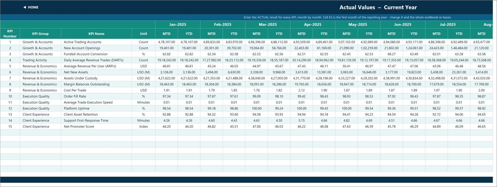
Cell E3 on the Actual sheet is the first month of your reporting year. Change it and the Target sheet, the Prior Year sheet, the month dropdown and every sheet title re-base themselves. A firm on an April-to-March year sets one cell.
The Prior Year sheet’s month headers are simply the Actual sheet shifted back twelve months, so the comparatives always line up with the right months.
KPI Definition – the sheet that drives everything
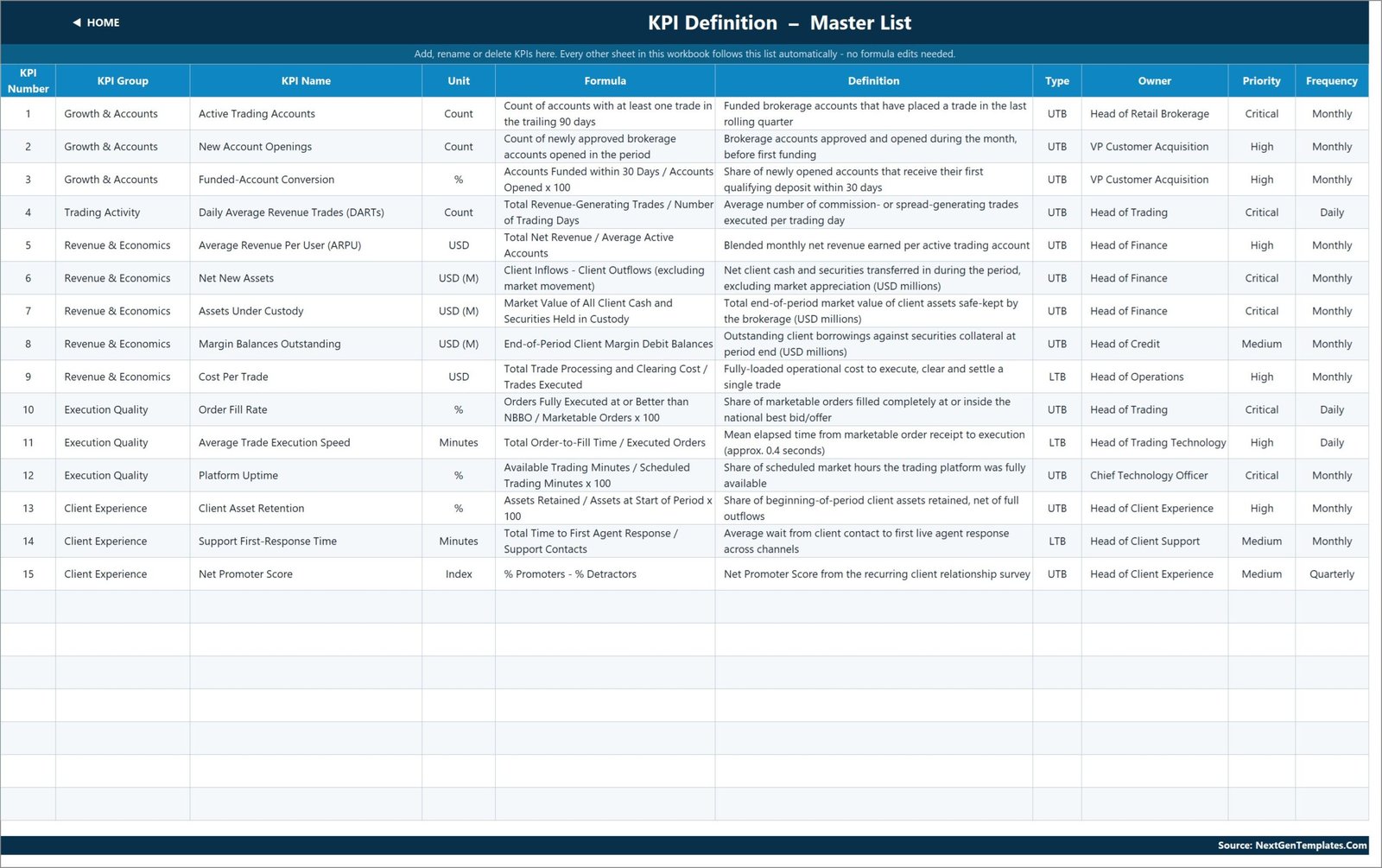
This is the master list, and it is where the template earns its keep. Each KPI gets a number, a group, a name, a unit, a formula, a definition, a type (UTB or LTB), an owner role, a priority and a reporting frequency.
Change a name here and every other sheet picks it up. Add a KPI in the next empty row and it appears on the three input sheets, the scorecard, the trend dropdown and the analysis roll-up immediately – no formula work at all. Clear a row and the dashboard row goes blank and the summary cards recount. The sheets are wired for 22 KPIs out of the box; 15 are filled in and the rest are live and empty.
Read Me and Get More Templates
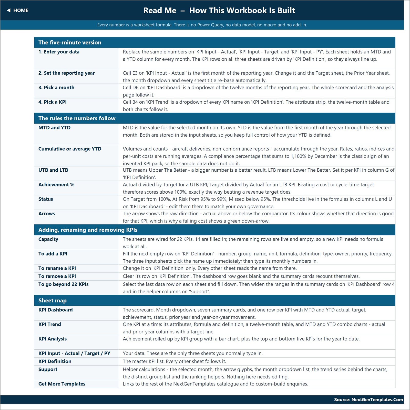
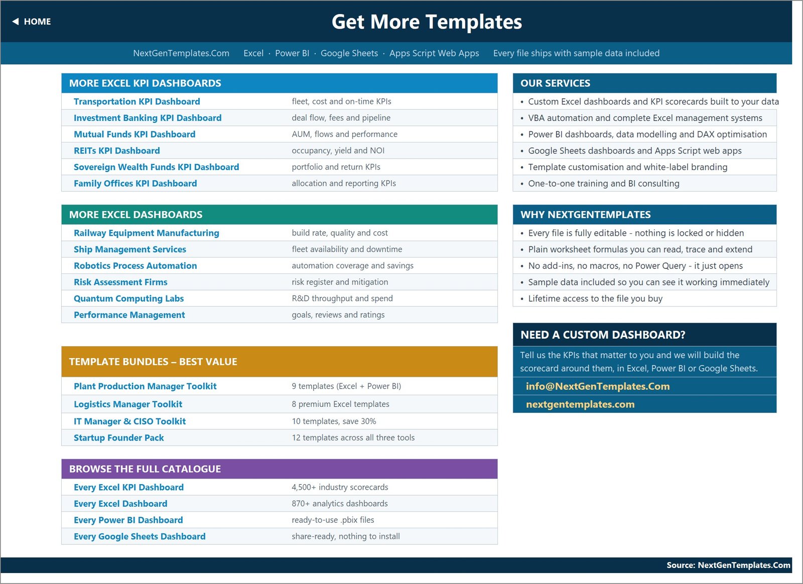
The Read Me page is a built-in manual: the five-minute setup, the rules the numbers follow, how to add or remove KPIs and how to go beyond 22, plus a map of every sheet. The Get More Templates page links out to the wider catalogue.
There is also a Support sheet holding the plumbing – the selected month, the arrow glyphs, the month dropdown list, the chart series, the distinct group list and the ranking helpers. You never need to touch it, but it is not hidden or locked, so you can read it if you want to know how something works.
The 15 KPIs it ships with
These are a starting point, not a prescription. Every one of them is editable text on KPI Definition.
| # | KPI | Group | Unit | Type |
|---|---|---|---|---|
| 1 | Active Trading Accounts | Growth & Accounts | Count | UTB |
| 2 | New Account Openings | Growth & Accounts | Count | UTB |
| 3 | Funded-Account Conversion | Growth & Accounts | % | UTB |
| 4 | Daily Average Revenue Trades (DARTs) | Trading Activity | Count | UTB |
| 5 | Average Revenue Per User (ARPU) | Revenue & Economics | USD | UTB |
| 6 | Net New Assets | Revenue & Economics | USD (M) | UTB |
| 7 | Assets Under Custody | Revenue & Economics | USD (M) | UTB |
| 8 | Margin Balances Outstanding | Revenue & Economics | USD (M) | UTB |
| 9 | Cost Per Trade | Revenue & Economics | USD | LTB |
| 10 | Order Fill Rate | Execution Quality | % | UTB |
| 11 | Average Trade Execution Speed | Execution Quality | Minutes | LTB |
| 12 | Platform Uptime | Execution Quality | % | UTB |
| 13 | Client Asset Retention | Client Experience | % | UTB |
| 14 | Support First-Response Time | Client Experience | Minutes | LTB |
| 15 | Net Promoter Score | Client Experience | Index | UTB |
Five of them are lower-is-better in spirit, and two – Cost Per Trade and Support First-Response Time, along with Average Trade Execution Speed – are flagged LTB so the maths treats them correctly.
How achievement and status are calculated
Two rules do all the work, and both are worth understanding before you set targets.
Achievement % is Actual divided by Target for a UTB (upper the better) KPI, and Target divided by Actual for an LTB (lower the better) KPI. Cutting Cost Per Trade from a $1.96 target down to $1.81 therefore scores 108.3%, not 92%. Without that flip, every cost and cycle-time KPI in the pack would read as a failure precisely when it succeeded.
Status as shipped is On Target from 100%, At Risk from 95% to 99%, and Missed below 95%. Those thresholds are not hard-coded anywhere exotic – they sit in the formulas in columns L and U on KPI Dashboard. If your governance says At Risk starts at 97%, edit them there and the summary cards and the analysis page follow.
Setting it up in about ten minutes
- Open it and click around. The sample data is already loaded, so you can see how every page behaves before you change a thing.
- Set your reporting year in cell E3 on KPI Input – Actual.
- Edit the KPI list on KPI Definition: rename what you keep, clear what you do not need, add your own in the empty rows, and set UTB or LTB in column G.
- Type your numbers into the three input sheets – actual, target and prior year, MTD and YTD per month.
- Pick a month on the scorecard, then pick a KPI on the trend page.
- Adjust the thresholds in columns L and U if 100 / 95 does not match your standard.
What it is not – read this part
Stock brokerage is a heavily regulated business, and a spreadsheet template is not a regulatory instrument. To be explicit:
- It is not a compliance tool. It makes no claim about SEC, FINRA, SIPC, MiFID II, FCA or SEBI requirements, net-capital rules, books-and-records obligations, trade surveillance, best execution, AML or KYC, suitability or Reg BI. No regulator has reviewed or accepted it, and nothing in it is designed for regulatory reporting.
- It is not a system of record. It is not a broker-dealer books-and-records system and it does not satisfy any record-retention obligation.
- It is not connected to anything. No market data, no quotes, no order routing, no link to any trading, execution, custody or clearing system. Every figure is one somebody typed in.
- It is not investment advice. It says nothing about returns, client portfolio performance, or the suitability of any security or strategy.
- The sample numbers and thresholds are not benchmarks. They are placeholders chosen so the file reads well on first open.
Honest notes on this build
Four cosmetic things we found while reviewing the file. None of them affects a calculation, and we would rather you heard them here than discovered them yourself:
- The Home page and the Read Me page both refer to 14 KPIs. The file actually ships 15. It is a stale label in two text boxes.
- The Read Me’s note on cumulative versus average YTD illustrates the rule with examples borrowed from a sibling template (aircraft deliveries, non-conformance reports). The rule is right; the examples are from the wrong industry.
- Numbers use Indian digit grouping – 5,15,021.00 rather than 515,021.00. Select the range and apply your own number format if you prefer Western grouping.
- Average Trade Execution Speed is held in minutes at two decimal places, so it shows 0.01 in every single month and its trend line is flat. Its own definition puts it at roughly 0.4 seconds. Switch the unit to seconds on KPI Definition and re-enter the values to make that KPI readable.
What you download
A single ZIP containing the Stock Brokerage KPI Dashboard.xlsx workbook – unlocked, with the sample data in place – and the Excel KPI Dashboard User Manual PDF that covers this whole scorecard family. Instant download, lifetime access to the file you buy.
Get the Stock Brokerage KPI Dashboard in Excel →
Related templates
Same scorecard engine, different industries:
- Stock Exchanges KPI Dashboard in Excel – the exchange side rather than the broker side
- Investment Banking KPI Dashboard in Excel
- Mutual Funds KPI Dashboard in Excel
- Family Offices KPI Dashboard in Excel
- Insurance Brokers KPI Dashboard in Excel
- Stock Exchanges KPI Dashboard in Power BI – the same idea, rebuilt in Power BI
Want the analytical view instead – slicers, category charts, record-level detail? Look at the Hedge Fund Administration Dashboard in Excel or the Mutual Funds Dashboard in Excel.
Frequently asked questions
Does this make my brokerage compliant, or connect to market data?
No – to both. It is not a compliance, surveillance or books-and-records tool, and it satisfies no regulatory obligation of any kind. It has no market data feed, no quotes, no order routing and no connection to any trading, custody or clearing system. Every number in it was typed in by a person.
Are the figures in the screenshots real?
No. They are sample demo data included so the workbook is not empty when you open it. They are not real brokerage figures and not industry benchmarks.
Do I need macros or Power Query?
No. Everything is plain worksheet formulas – VLOOKUP, MATCH, INDEX and COUNTIF. Nothing to enable, refresh or install.
Which versions of Excel does it work in?
Excel 2013 and later on Windows and Mac, plus Excel for the web. It is a .xlsx file, not macro-enabled.
Can I use it for a business that is not a brokerage?
Yes. The engine is completely generic – it is a monthly MTD/YTD scorecard. Replace the 15 KPIs with your own and it works for any organisation.
How many KPIs can it hold?
22 without any edits. The Read Me explains how to extend it further by filling down the last data row on each sheet and widening the ranges in the summary cards.
Can I get it customised?
Yes – your KPIs, your branding, in Excel, Power BI or Google Sheets. Email info@NextGenTemplates.Com with the metrics that matter to you.
Closing thought
A KPI scorecard is only useful if it survives contact with a monthly deadline. This one does, because there is nothing in it that can break: no refresh to forget, no macro to be blocked by a security policy, no data model to reload. You type the numbers, pick the month, and the page is ready. Everything else – the traffic lights, the arrows, the rankings, the charts – follows on its own.