Most product and R&D reporting lives in a slide deck that gets rebuilt every month. The Product Development KPI Dashboard in Power BI replaces that with one file you refresh: a month-picker scorecard carrying 14 KPIs across six groups, each with month-to-date and year-to-date actuals, a target you set, a traffic light and a 12-month sparkline. The download is a single .pbix with 6 report pages and 38 DAX measures, plus a four-sheet Excel data pack seeded with 168 target rows and 336 actual rows of demo figures and a PDF user manual. Product Development KPI Dashboard in Power BI
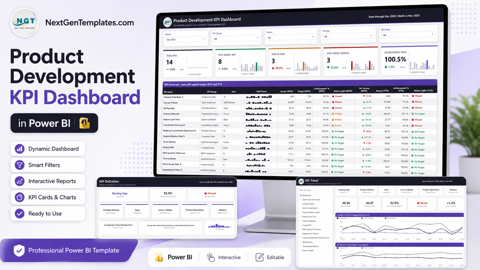
Two things are worth saying plainly before anything else. First, this is a scorecard, not an analytics report – a KPI-per-row table with lights, rather than a chart-led breakdown of a transaction table. Second, it does not connect to Jira, Azure DevOps, Asana or any other tracker. You type your own roadmap, release, defect, cycle-time and cost figures into the Excel data pack and click Refresh. Everything shipped in the file is demo data, and every target is a placeholder you replace.
Key Features of the Product Development KPI Dashboard in Power BI
- 14 KPIs in six groups. Speed to Market, Engineering Output, Product Quality, Portfolio Delivery, R&D Investment and Customer Value. The shipped set covers time to market, feature cycle time, sprint velocity, code review turnaround, features delivered, defect escape rate, technical debt ratio, backlog age, roadmap commitment attainment, requirements churn, feature adoption rate, product NPS, cost per release and R&D spend as a share of revenue – all of them editable labels, not a fixed list.
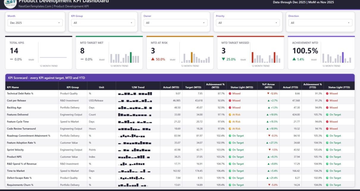
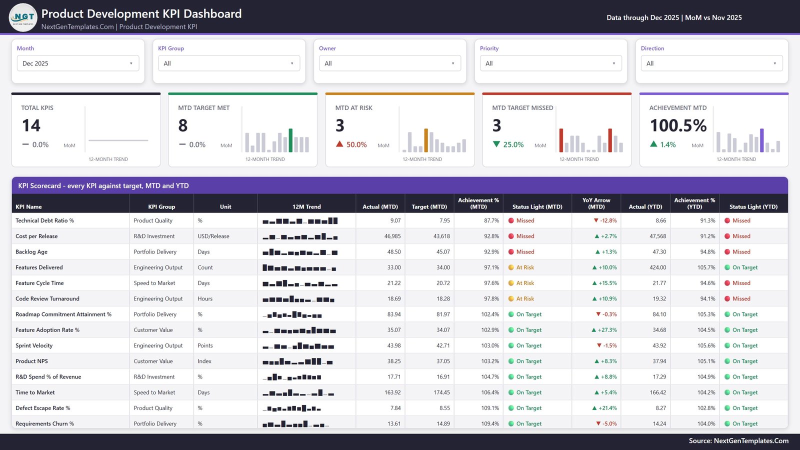
- A month picker that drives everything. Change the month and all five header cards, the whole scorecard table and both status columns re-read MTD and YTD.
- Four more slicers: KPI Group, Owner, Priority and Direction, so a reviewer can pull up just one team’s metrics or just the lower-is-better ones.
- Direction-aware achievement. Each KPI is marked UTB (upper is better) or LTB (lower is better) in the data pack. Beat a lower-is-better target and the achievement reads above 100%, not below it.
- Twelve columns per KPI row: name, group, unit, 12-month trend, MTD actual, MTD target, MTD achievement, MTD status light, MTD year-on-year arrow, YTD actual, YTD achievement and YTD status light.
- Six report pages, 38 DAX measures. Four visible pages plus two hidden tooltip pages at 280 x 360 that surface on hover.
- A custom theme. The palette is a registered theme JSON inside the report, so recolouring is one edit rather than ninety.
Dashboard Pages Explanation
KPI Scorecard
The landing page. Month, KPI Group, Owner, Priority and Direction slicers run across the top. Below them sit five cards – Total KPIs, MTD Target Met, MTD At Risk, MTD Target Missed and Achievement MTD – each with a month-on-month delta and a 12-month bar trend. Then the KPI Scorecard table, sorted by MTD achievement so the weakest KPI is the first thing you read. In the demo month the split is eight On Target, three At Risk and three Missed, with Achievement MTD at 100.5%. Those are illustrative numbers from generated data, not a benchmark.
KPI Trend
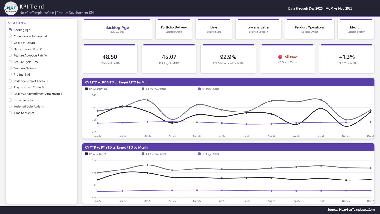
A list slicer of all 14 KPI names sits on the left. Select one and the page re-reads: six context cards name the selected KPI, its group, unit, direction, owner and priority, and five value cards show MTD actual, MTD target, MTD achievement, MTD status and MTD year-on-year change. Underneath are two line charts – CY MTD vs PY MTD vs Target MTD by Month and CY YTD vs PY YTD vs Target YTD by Month – each plotting current year, prior year and target across twelve months. This is the page that answers whether a red light is a bad month or a bad year. Product Development KPI Dashboard in Power BI
KPI Definition
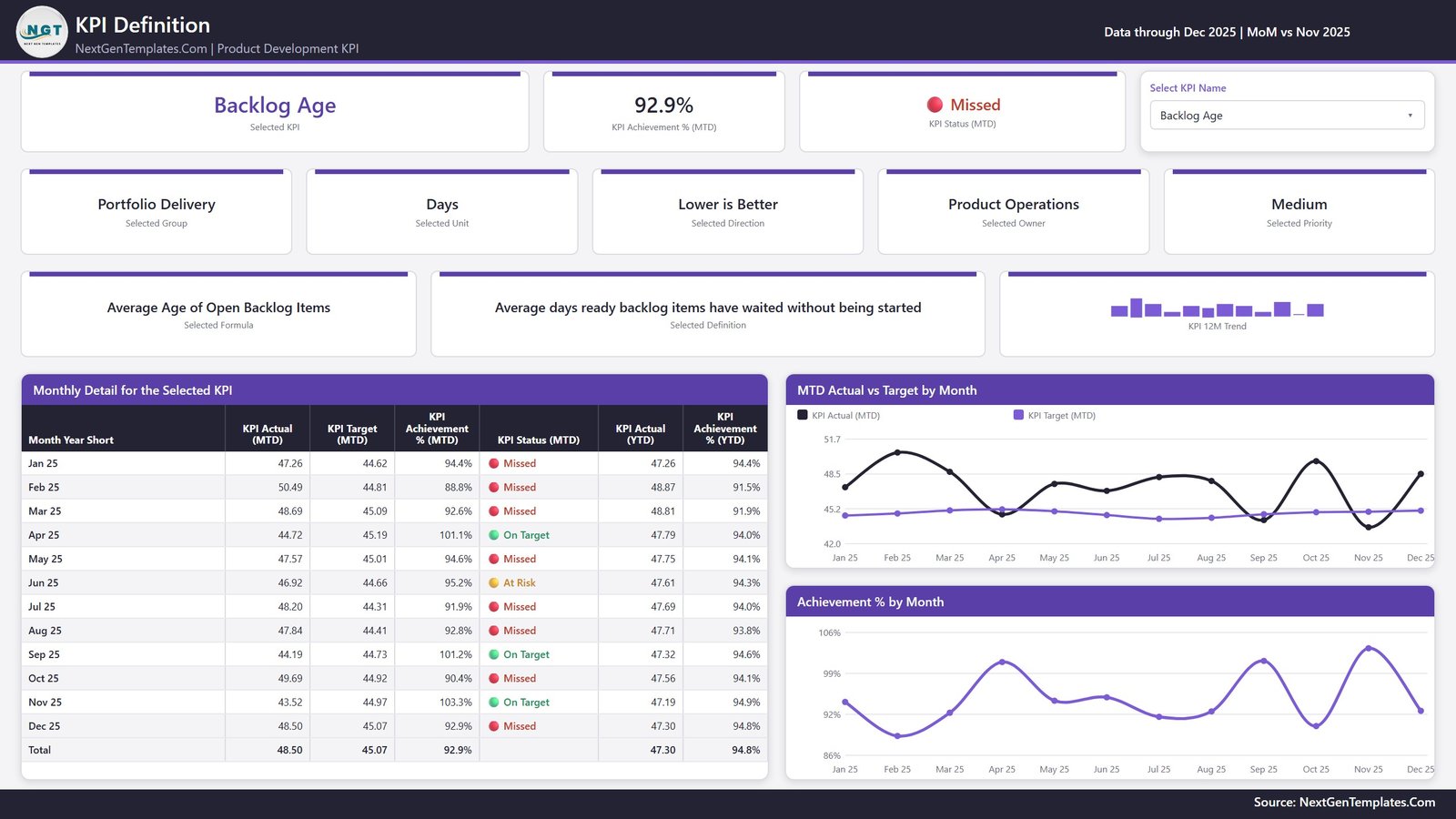
The same KPI selection follows you here through a synced slicer – worth flagging, because the sibling builds on this line use a right-click drillthrough and this one does not. There is no drillthrough defined in the report; the dropdown at the top right is what moves you between KPIs, and it stays in step with the KPI Trend page. The page shows the Selected Formula, the plain-English Selected Definition, the owning team and priority, a 12-month trend, the Monthly Detail for the Selected KPI table, and two charts: MTD Actual vs Target by Month and Achievement % by Month. For Backlog Age, for example, it reads “Average Age of Open Backlog Items” and “Average days ready backlog items have waited without being started” straight from the workbook. Product Development KPI Dashboard in Power BI
Get More Templates
The fourth page is an in-file help and catalogue sheet rather than a report page. It carries the short customising notes – how the month picker behaves, how to swap in your own data, how UTB and LTB scoring works, where the theme lives – next to a list of other NextGenTemplates dashboards and a contact block. It ships inside the .pbix so the guidance travels with the file. It is included here for completeness; you can delete the page without affecting anything else. Product Development KPI Dashboard in Power BI
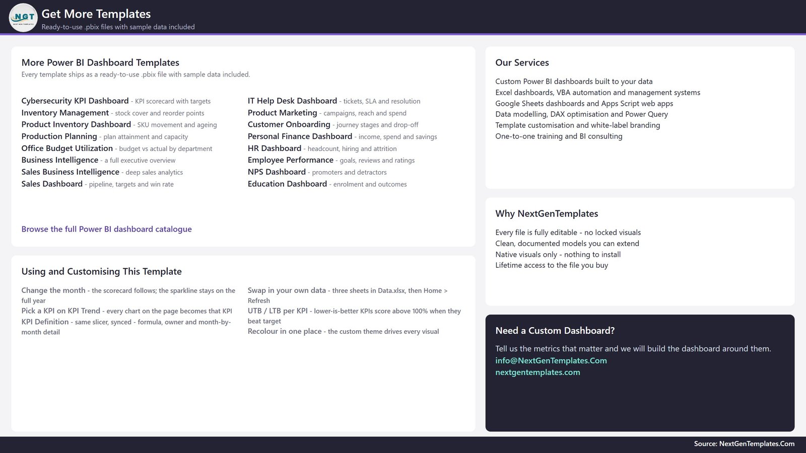
The two hidden pages
KPI Detail and Trend Detail are 280 x 360 tooltip pages set to hidden in view mode. They do not appear in the page tabs; they render when you hover a visual, each carrying three cards and a small bar chart.
Data.xlsx
Four sheets. Read Me explains the layout. Input_ Target holds 168 rows of monthly targets (KPI name, month, MTD, YTD). Input_ Actual holds 336 rows of actuals covering the current and prior year. KPI Definition is the control sheet: 14 KPIs across nine columns – number, group, name, unit, formula, definition, UTB/LTB type, owner and priority. Add a row and the KPI appears on all three report pages after a refresh.
Power BI Scorecard vs. Tableau or Qlik vs. a Paid Product Analytics SaaS – Feature Comparison
| This template (Power BI) | Tableau or Qlik build | Paid product analytics SaaS | |
|---|---|---|---|
| Cost | One-time template purchase | Licence plus build time | Recurring per seat, per month |
| Platform | Power BI Desktop (free) | Tableau Desktop or Qlik Sense | Vendor’s web app |
| Setup time | Paste your numbers and refresh | Model and design from scratch | Onboarding plus data plumbing |
| Real-time team collaboration | Via Power BI Service if you publish | Via that vendor’s server | Built in |
| Mobile access | Power BI mobile app once published | Vendor mobile app | Built in |
| Customizable fields | Every KPI, target, owner and threshold | Whatever you build | Only what the vendor exposes |
| Share with link | Yes, after publishing to your workspace | Yes, on that server | Yes |
| Year-1 cost at 5 users | Template price plus licences you already hold | Several hundred and up | Typically four figures and up |
| Connects to your issue tracker | No – manual entry into Excel | If you build the connector | Usually yes |
| Editable file you keep | Yes – the .pbix is yours | Yes | No |
Who Should Use This Template
It suits a head of product or engineering who already has these numbers scattered across exports and wants one page for the monthly review. It suits a PMO or product operations analyst assembling a release or portfolio pack. It suits an R&D manager reporting spend alongside delivery. And it suits anyone who would rather rename and recolour a working Power BI scorecard than start from a blank canvas.
It is a poor fit if you want an automatic feed from a tracker, if you need a sprint board or ticket system, or if you are hoping the file will tell you what good looks like. It ships no benchmarks and endorses no delivery methodology – the KPI names it comes with are simply labels you can rewrite. Product Development KPI Dashboard in Power BI
Real-World Use Cases
A 40-person software company’s monthly product review. The director of product updates two sheets, refreshes and opens the scorecard on screen. The Missed lights set the agenda; the KPI Trend page settles whether each one is a blip or a slide.
A hardware business’s steering group. The PMO analyst uses the Owner slicer to show each function only its own KPIs. When someone challenges a number, the KPI Definition page puts the formula next to the value and the argument ends there.
An R&D finance review. Cost per release and R&D spend as a share of revenue sit in the same table as the delivery metrics, so the spend and output conversations happen once instead of across two decks.
Advantages of the Product Development KPI Dashboard in Power BI
- Nothing is hard-coded to 14 KPIs. The KPI Definition sheet is the source of truth for names, units, owners, formulas and direction.
- MTD and YTD side by side. Two achievement columns and two status lights on every row, so a good month inside a bad year is visible at a glance.
- Honest scoring for lower-is-better metrics. The UTB/LTB flag stops cycle time and defect rates from looking like failures when they improve.
- Definitions travel with the numbers. The formula and the plain-English definition are in the file, not in a separate glossary nobody opens.
- Free to run. Power BI Desktop is a free download from Microsoft – see the Power BI Desktop documentation on Microsoft Learn for installation and refresh basics.
- One file, one theme. Rebranding is a theme edit, not a visual-by-visual pass. Product Development KPI Dashboard in Power BI
Opportunities for Improvement
Being straight about the limits is more useful than a feature list:
- Manual data entry. There is no connector. Every month someone updates the two input sheets. For a fully automated pipeline you would build the export yourself and repoint the query.
- The KPI Definition page is slicer-driven, not a drillthrough. If you expect to right-click a scorecard row and jump to the detail, you would need to add that drillthrough yourself – the report definition contains none.
- Only four visible pages, one of which is the catalogue page. The reporting surface is three pages. That is deliberate for a scorecard, but it is not a deep analytical model.
- Targets are flat inputs. There is no target-setting logic, no forecasting and no what-if parameter. A target is whatever you type for that KPI in that month.
- Sample data only. The shipped figures exist to prove the layout. None of them should be read as typical or recommended.
Best Practices
- Fix the KPI Definition sheet first. Get names, units, owners, priorities and UTB/LTB direction right before you load a single actual – everything else keys off it.
- Keep one row per KPI per month in both input sheets. Gaps show as missing points on the trend charts.
- Write the formula column as your team would defend it, not as shorthand. That text is what appears on screen during a review.
- Set targets before the month starts, not after the numbers land, so the traffic lights mean something.
- Trim the KPI set. Fourteen rows fit the page comfortably; thirty do not, and a scorecard nobody reads is worse than a shorter one.
- Recolour through the theme JSON rather than editing visuals individually, so a future update does not undo your branding.
- Keep a clean copy of the .pbix before you start customising. Product Development KPI Dashboard in Power BI
Explore Relevant Templates
- Product Development Dashboard in Power BI – the analytical counterpart. Same subject, different shape: charts and category breakdowns instead of a KPI-per-row scorecard. A different template, not another edition of this one.
- Product Development KPI Scorecard in Excel – the same scorecard idea for teams without Power BI.
- Research and Development Dashboard in Power BI – for R&D portfolio and project reporting.
- Product Development Dashboard in Google Sheets – a browser-based alternative.
- Retail and E-commerce Product Development KPI Dashboard in Excel – the retail-flavoured scorecard.
- Browse the full Power BI KPI Dashboard catalogue.
Frequently Asked Questions
Does this connect to Jira or my issue tracker?
No. There is no connector to Jira, Azure DevOps, Asana, Linear, GitHub or anything else, and none is included or implied. The report reads one Excel workbook that you maintain. Product Development KPI Dashboard in Power BI
Are the numbers in the screenshots real?
No. Every figure is demo data generated to show the layout working across a full year and a prior year. Replace it with your own.
Does the template recommend targets or benchmarks?
No. Targets, thresholds and traffic-light bands are all values you set. There are no benchmark cycle times, velocities, defect rates or spend ratios anywhere in the file, and no methodology is endorsed.
Can I change the KPI list?
Yes. Add, rename or delete rows on the KPI Definition sheet, fill the matching target and actual rows, then refresh. The scorecard, trend page and definition page all follow.
Is the KPI Definition page a drillthrough?
Not in this build. It is reached by a dropdown slicer that stays in sync with the KPI Trend page’s list slicer. You can add a drillthrough yourself if you prefer that interaction.
What do I need to open it?
Power BI Desktop, free from Microsoft, plus Excel or any tool that writes .xlsx files. Publishing to the Power BI Service is optional and depends on your organisation’s licensing.
Does it make us compliant with any standard?
No. It is a reporting file. It carries no ISO/IEC, design-control, audit or certification claim and should not be used as a controlled quality record.
About the Author
Built by PK – Microsoft Certified Professional with 15+ years of Excel, Google Sheets, and Power BI experience. Founder of NextGenTemplates, reaching 300K+ subscribers across YouTube channels. Every template is hand-built and tested before release.
Conclusion
If your product and R&D reporting already exists as numbers in someone’s spreadsheet, the work left is presentation – and that is exactly what this file does. Fourteen KPIs, one month picker, two achievement columns, honest scoring for the metrics you want to push down, and the formula on screen next to the value so reviews argue about the result rather than the definition. It will not gather the data for you and it will not tell you what good looks like; it gives you a clean, editable place to put what you already know.
Get the template here: Product Development KPI Dashboard in Power BI. For Power BI and Excel walkthroughs, subscribe on youtube.com/@PKAnExcelExpert.