In today’s fast-paced healthcare environment, tracking and improving quality standards is not just important — it is vital. That’s exactly where the Healthcare Quality Assurance KPI Dashboard in Excel plays a powerful role. It offers a clear, user-friendly, and data-driven way to monitor critical KPIs related to healthcare service quality.
In this comprehensive guide, we will walk you through everything you need to know about this ready-to-use Excel-based dashboard, how it works, its features, advantages, and best practices for making the most of it.
Click to Purchases Healthcare Quality Assurance KPI Dashboard in Excel
What is a Healthcare Quality Assurance KPI Dashboard in Excel?
A Healthcare Quality Assurance KPI Dashboard in Excel is a smart, automated, and dynamic tool designed to track key performance indicators (KPIs) that reflect the quality of care in healthcare settings. From patient satisfaction to infection rates and treatment accuracy, these KPIs offer an overview of performance, gaps, and improvement areas.
Built entirely in Excel, this dashboard empowers users — especially quality managers, hospital administrators, and healthcare analysts — to make informed, data-backed decisions.
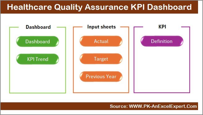
Key Features of the Dashboard
This dashboard includes seven powerful worksheet tabs, each designed with purpose and interactivity:
1. Home Sheet
- Acts as a navigation hub.
- Includes six clickable buttons to jump directly to each functional sheet.
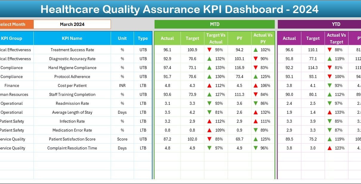
2. Dashboard Sheet
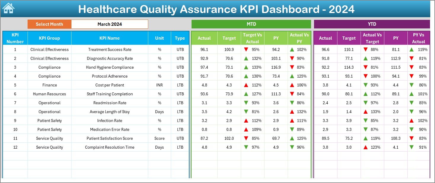
- Main analytical view.
- Drop-down in cell D3 allows month selection.
- Automatically updates all values including:
- MTD Actual, Target, and Previous Year data.
- YTD Actual, Target, and Previous Year data.
- Includes up/down arrow indicators with conditional formatting to show trends.
3. KPI Trend Sheet
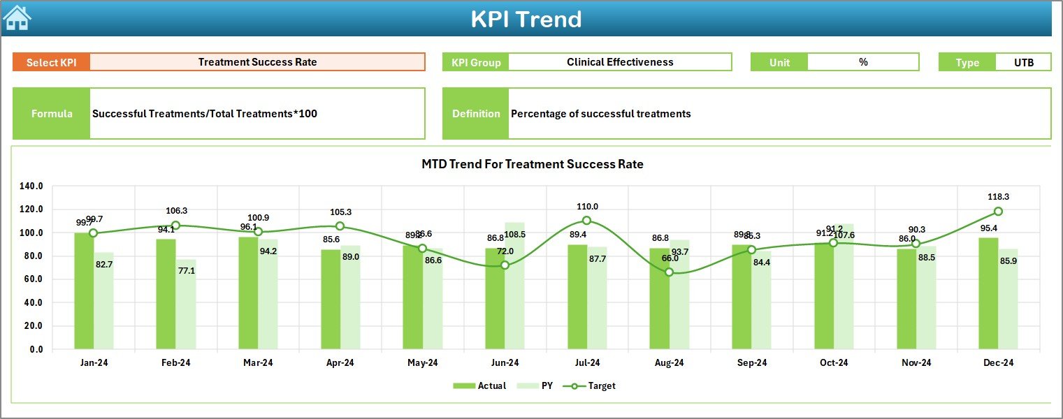
- Select any KPI from the drop-down in cell C3.
- Displays:
- KPI Group, Unit, Type (UTB/LTB), Formula, Definition.
- MTD and YTD trend charts showing Target, Actual, and PY values.
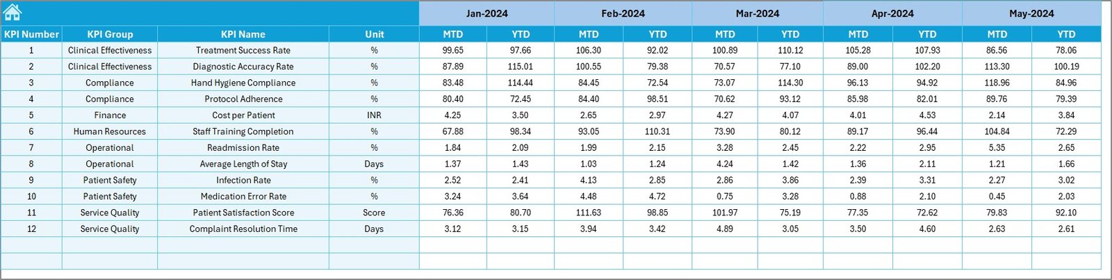
4. Actual Numbers Input Sheet
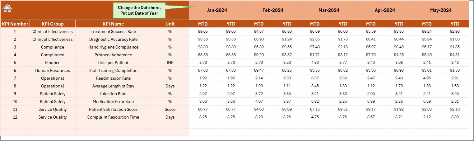
- Add real-time MTD and YTD values.
- Use cell E1 to update the starting month of the fiscal year.
5. Target Sheet
- Input the monthly and YTD targets for each KPI.
6. Previous Year Numbers Sheet
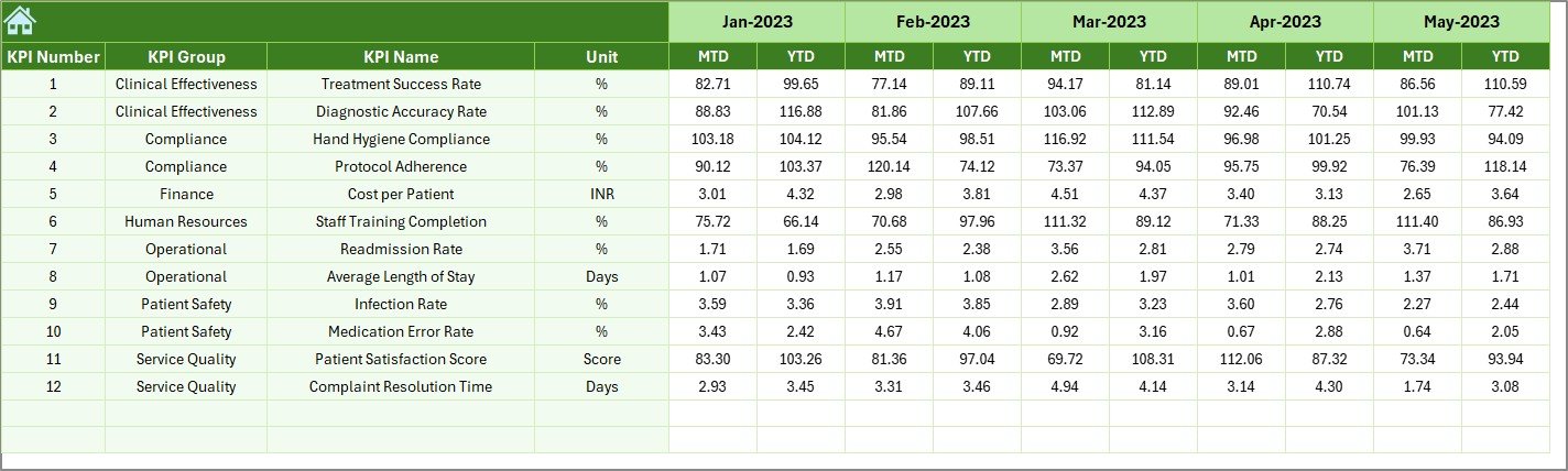
- Enter previous year’s MTD and YTD data to compare performance.
Click to Purchases Healthcare Quality Assurance KPI Dashboard in Excel
7. KPI Definition Sheet
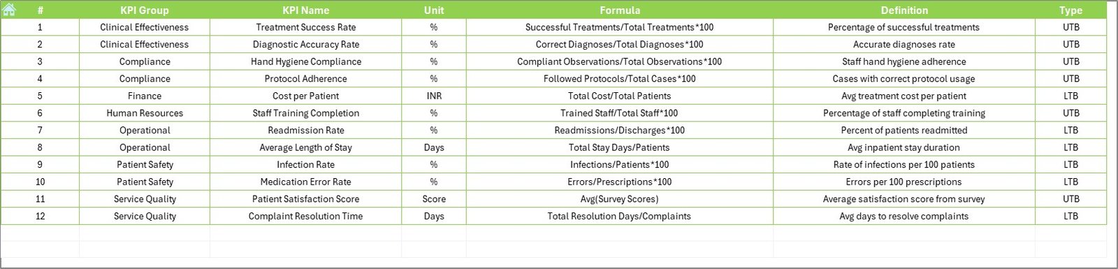
- Maintain structured KPI metadata:
- KPI Name, Group, Unit, Formula, and Definition.
Advantages of the Healthcare Quality Assurance KPI Dashboard
✅ Centralized KPI Management
All critical KPIs are tracked in one place, improving transparency and accountability.
✅ Easy Trend Analysis
With monthly and yearly views, users can quickly spot positive or negative trends.
✅ Better Decision-Making
Backed by data, managers can confidently make operational improvements.
✅ User-Friendly and Interactive
Dropdowns, conditional formatting, and charts make navigation smooth and reporting intuitive.
✅ Customizable for Any Hospital or Clinic
You can tailor the KPI definitions, formulas, and inputs to match your specific organizational goals.
Best Practices for Using the KPI Dashboard Effectively
Here are the top recommended practices to maximize the utility of your dashboard:
1. Define KPIs Clearly
Before entering any data, define your KPIs clearly. Make sure every user understands each KPI’s purpose, calculation, and target direction.
2. Keep Data Updated Monthly
Input MTD and YTD values each month. Regular updates ensure you always have the latest insights.
3. Involve Stakeholders
Use the dashboard in quality review meetings. Share the screen and use visual cues to drive discussions.
4. Use Conditional Formatting to Draw Attention
Leverage built-in arrows and highlights to quickly show areas needing attention.
5. Monitor Both Short-Term and Long-Term
Always look at both MTD (short-term) and YTD (long-term) views to avoid missing any seasonal or cumulative trends.
Why Use Excel for Healthcare KPIs?
While there are plenty of dashboard tools out there, Excel remains a favorite in healthcare because:
- It is universally available and easy to use.
- No extra software or licensing is needed.
- It supports customization without coding.
- Healthcare staff are often already familiar with it.
Excel dashboards are cost-effective, flexible, and practical.
Common KPIs in Healthcare Quality Assurance
Below are some KPIs you might include:
- Patient Satisfaction Score (UTB)
- Readmission Rate (LTB)
- Average Treatment Time (LTB)
- Infection Control Compliance (UTB)
- Medication Error Rate (LTB)
- Emergency Response Time (LTB)
- Staff-to-Patient Ratio (UTB)
- Discharge Summary Accuracy (UTB)
These KPIs provide both qualitative and quantitative insights.
❗ How to Customize the KPI Dashboard?
Customizing the dashboard is easy:
- Add or remove KPIs in the KPI Definition Sheet.
- Update or modify formulas as per your internal standards.
- Change the visual design with Excel’s chart formatting tools.
- Add more months or expand to multi-year comparisons.
You can also automate data entry using VBA scripts or connect with external databases for live updates.
📊 How to Interpret the Dashboard?
Interpreting the dashboard involves checking:
- Are Actual values meeting or missing the Target?
- How does current performance compare to last year (PY)?
- What trends do the charts reveal over the months?
- Which KPIs are consistently underperforming?
Using visual markers, like arrows and color coding, simplifies the reading process even for non-technical users.
🎓 Educational Use of This Dashboard
If you are in a healthcare education or training setting, this dashboard is an excellent tool to:
- Teach KPI concepts to students.
- Simulate real-life scenarios.
- Demonstrate how data can improve healthcare delivery.
- Conduct mock quality audits using sample data.
📝 Conclusion
The Healthcare Quality Assurance KPI Dashboard in Excel is more than just a spreadsheet. It is a powerful decision-making tool that brings data to the frontlines of quality care. Easy to use, fully customizable, and rich in features, this dashboard can transform how you track, evaluate, and improve healthcare services.
Whether you’re managing a hospital, running a clinic, or teaching healthcare analytics, this dashboard will save time, increase clarity, and promote continuous improvement.
Frequently Asked Questions (FAQs)
❓ What is the purpose of a Healthcare Quality Assurance KPI Dashboard?
It helps in tracking performance metrics like patient satisfaction, treatment accuracy, and infection control to improve healthcare quality.
❓ Can I customize this Excel dashboard for my clinic?
Yes, you can easily edit KPI definitions, formulas, and chart settings to match your clinic’s goals.
❓ What kind of data do I need to enter?
You will need to enter MTD (Month-to-Date) and YTD (Year-to-Date) values for each KPI, along with target values and last year’s figures.
❓ Do I need to know coding to use it?
Not at all! This Excel dashboard works with dropdowns, formulas, and charts — no coding required.
❓ Can I track trends over time?
Absolutely! The KPI Trend sheet shows both monthly and yearly trend lines to visualize performance.
Click to Purchases Healthcare Quality Assurance KPI Dashboard in Excel
Visit our YouTube channel to learn step-by-step video tutorials