Cryogenics Dashboard in Excel is built for teams that manage cryogenic gas distribution, industrial gas operations, cold-chain gas logistics, safety compliance, and facility performance. A cryogenics operation can involve high-value shipments, strict temperature and vessel controls, quality inspections, compliance checks, and safety incidents that must be tracked carefully. When that reporting is scattered across manual sheets, emails, and disconnected logs, monthly reviews become slow and error-prone.
This Excel dashboard turns those records into a clean reporting workbook with 5 dashboard pages, 5 KPI cards, 18+ charts, multiple slicers, a structured Data Sheet, and a Support Sheet powered by pivot tables. You can update the data, click Refresh All, and review revenue, volume, gas mix, shipment status, lead time, technician quality, compliance, incidents, and regional operations in minutes.
Key Features of Cryogenics Dashboard in Excel
- 5 dashboard pages: Overview, Shipment Trends, Gas Analysis, Safety Quality, and Regional Ops.
- 5 KPI cards: Total Revenue, Net Gross Margin, Total Volume, Total Incidents, and Avg. Quality Score.
- 18+ analysis charts: Review month, quarter, year, gas type, shipment status, application, storage vessel, customer segment, technician, compliance result, facility, and region.
- Interactive slicers: Apply filters quickly during monthly reviews without editing formulas.
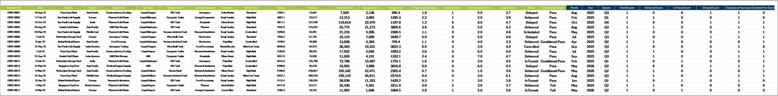
- Data Sheet included: Add your records in the same table format and keep the dashboard refreshable.
- Support Sheet included: Pivot tables power the dashboard dynamically and can be kept hidden from end users.
- No subscription: Use the workbook in Microsoft Excel with a one-time purchase.
Dashboard Pages Explanation
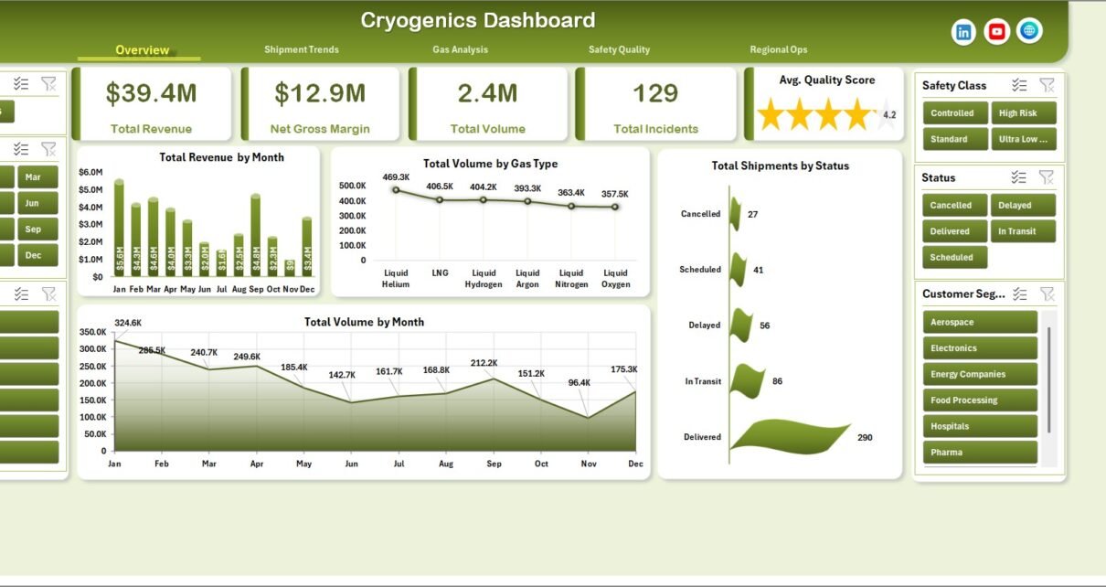
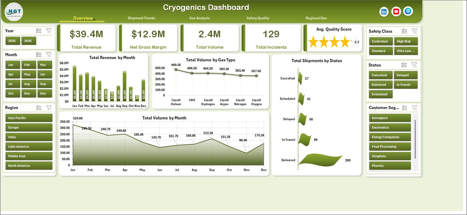
1. Overview Page
The Overview page gives leadership a fast read on the cryogenic operation. At the top, KPI cards show Total Revenue, Net Gross Margin, Total Volume, Total Incidents, and Avg. Quality Score so teams can review commercial, safety, and quality health before drilling into details.
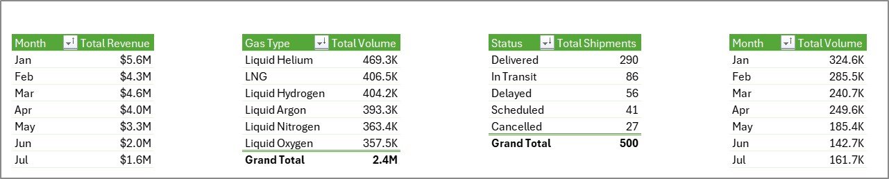
Total Revenue by Month shows month-wise revenue performance. It helps managers identify seasonal demand, pricing changes, and revenue spikes across the cryogenics business.
Total Volume by Gas Type compares shipped volume across gas categories. This is useful for understanding whether nitrogen, oxygen, argon, helium, hydrogen, or other gas types are driving workload.
Total Shipments by Status shows the delivery pipeline by status. It helps operations teams spot pending, delayed, completed, or cancelled shipments quickly.
Total Volume by Month tracks monthly gas movement. Pair it with revenue to understand whether growth is volume-led or margin-led.
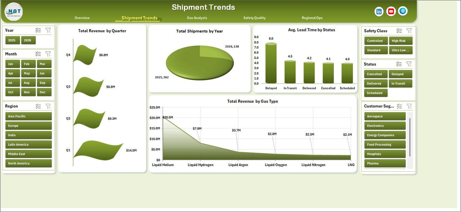
2. Shipment Trends
The Shipment Trends page focuses on time-based and status-based performance. It includes Total Revenue by Quarter, Total Shipments by Year, Avg. Lead Time by Status, and Total Revenue by Gas Type.
Total Revenue by Quarter helps finance teams compare quarter performance without manually building pivot summaries. Total Shipments by Year gives a longer-term activity view. Avg. Lead Time by Status highlights operational delays by shipment condition, while Total Revenue by Gas Type shows which gas categories generate the most value.
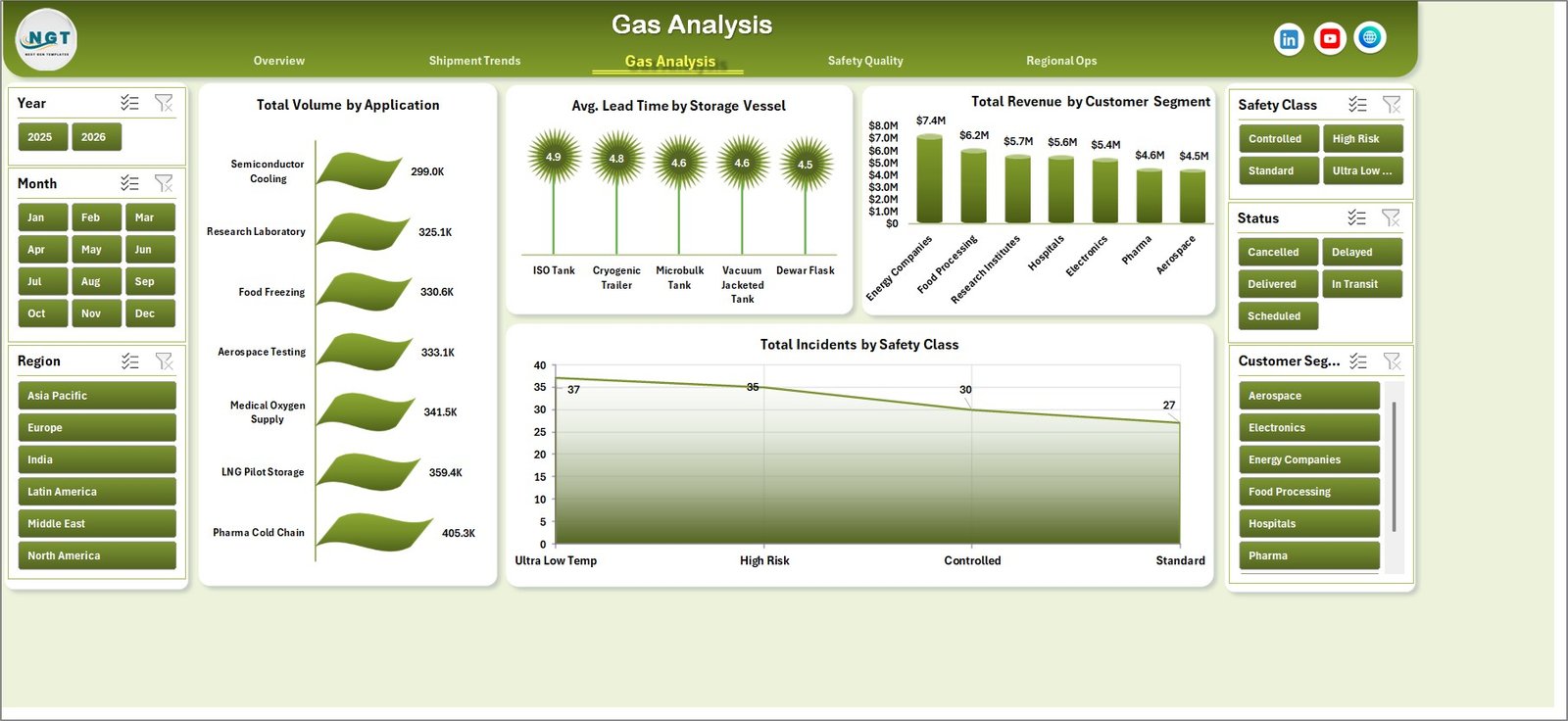
3. Gas Analysis
The Gas Analysis sheet helps teams understand how different gas applications, storage vessels, customer segments, and safety classes affect operations. It includes Total Volume by Application, Avg. Lead Time by Storage Vessel, Total Revenue by Customer Segment, and Total Incidents by Safety Class.
Total Volume by Application identifies which use cases consume the most gas volume. Avg. Lead Time by Storage Vessel helps teams evaluate whether cylinders, dewars, tanks, or other vessels are slowing delivery. Total Revenue by Customer Segment highlights the strongest customer groups, and Total Incidents by Safety Class supports targeted safety review.
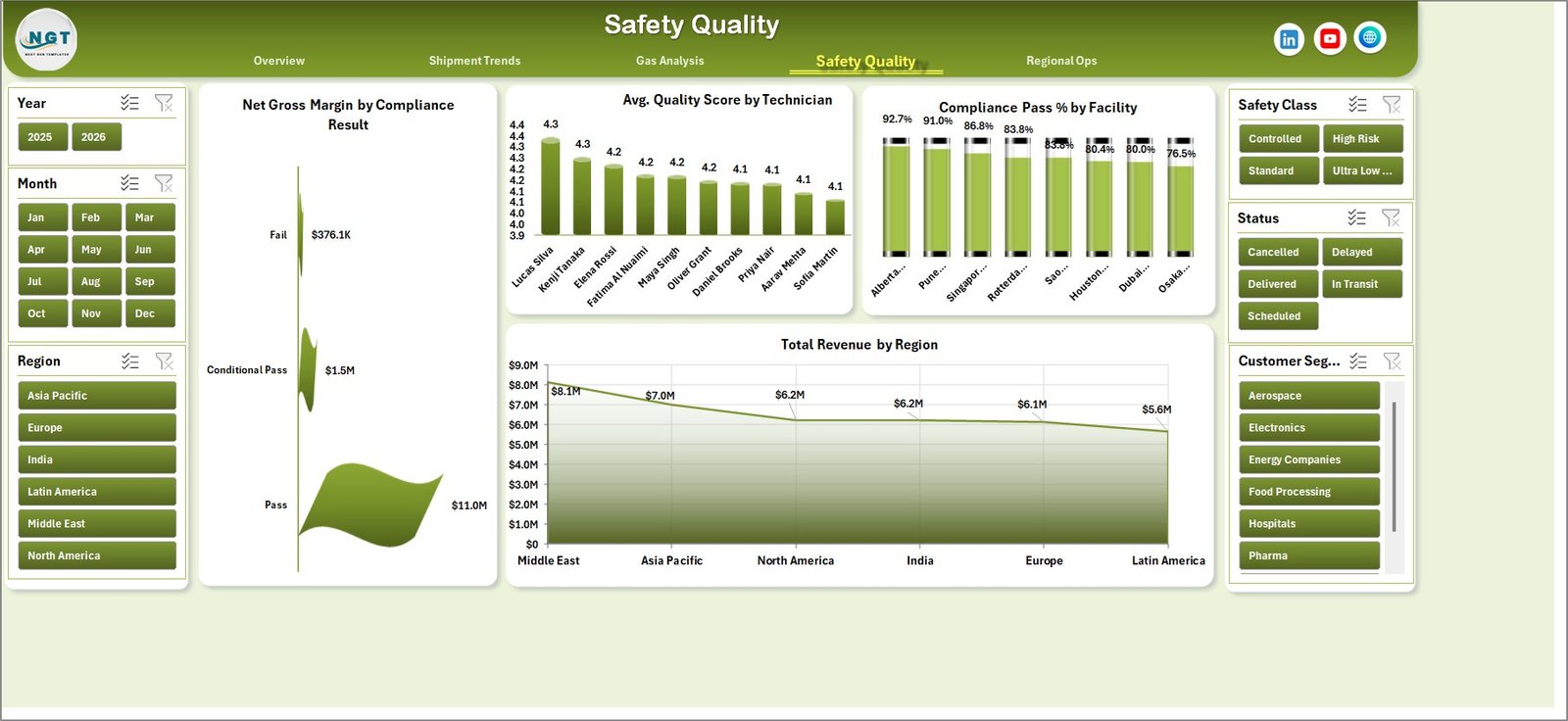
4. Safety Quality
The Safety Quality page connects operational quality with financial and compliance outcomes. It includes Net Gross Margin by Compliance Result, Avg. Quality Score by Technician, Compliance Pass % by Facility, and Total Revenue by Region.
Net Gross Margin by Compliance Result shows whether failed or conditional compliance records are affecting margin. Avg. Quality Score by Technician supports coaching and performance review. Compliance Pass % by Facility helps identify facilities needing audit attention, while Total Revenue by Region keeps commercial performance visible in the same view.
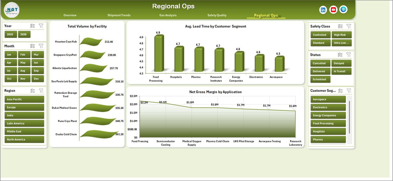
5. Regional Ops
The Regional Ops page compares facility, customer segment, and application performance. It includes Total Volume by Facility, Avg. Lead Time by Customer Segment, and Net Gross Margin by Application.
Total Volume by Facility reveals operational concentration across sites. Avg. Lead Time by Customer Segment shows which customer groups experience the longest fulfillment cycle. Net Gross Margin by Application helps finance and operations teams identify profitable cryogenic use cases.
6. Data Sheet Tab
The Data Sheet is the input layer. Add or replace data in the same format, keeping the expected column structure intact. Once your records are updated, refresh the workbook and every page updates.
7. Support Sheet
The Support Sheet contains the pivot tables used to create the dashboard dynamically. After updating the Data Sheet, go to the Data tab in the Excel Ribbon and click Refresh All. All pivots and charts refresh together. You can keep this sheet hidden.
Cryogenics Dashboard in Excel vs. Google Sheets vs. Paid CRM/SaaS – Feature Comparison
| Feature | Cryogenics Dashboard in Excel | Google Sheets Alternative | Paid Operations SaaS |
|---|---|---|---|
| Cost | $17.99 one-time | Low cost, online dependent | Monthly or annual subscription |
| Platform | Microsoft Excel | Browser-based Google Sheets | Vendor cloud platform |
| Setup time | Update data and refresh | Copy sheet and adjust formulas | Configuration and onboarding |
| Offline use | Yes | Limited | No |
| Customizable fields | Fully editable workbook | Editable sheet | Depends on plan and vendor |
| Share with link | Via OneDrive or SharePoint | Native sharing | Vendor user accounts |
| Year-1 cost at 5 users | $17.99 total | Usually low | Often hundreds or thousands of dollars |
| Cryogenic gas metrics included | Yes, pre-built | Build manually | May require customization |
Who Should Use This Template
This template is ideal for cryogenic gas distributors, industrial gas companies, facility managers, logistics coordinators, safety teams, quality teams, finance analysts, and operations leaders who already work in Excel and need faster dashboard reporting.
It is not a replacement for live ERP, tank telemetry, vehicle routing, or SCADA systems. It is best used as a reporting and management review workbook fed by structured operational data.
Real-World Use Cases
Operations review: A regional manager uses the Overview and Shipment Trends pages to review shipment status, volume, lead time, and revenue before weekly dispatch meetings.
Safety audit preparation: A quality manager uses Safety Quality and Gas Analysis pages to identify incident-heavy safety classes, low-scoring technicians, and facilities with weak compliance pass rates.
Quarterly finance reporting: A finance analyst uses Total Revenue by Quarter, Total Revenue by Gas Type, Net Gross Margin by Application, and Total Revenue by Region for leadership reporting.
Advantages of Cryogenics Dashboard in Excel
- Fast setup for Excel users.
- Works offline without subscription software.
- Uses familiar pivot table and slicer behavior.
- Separates input data from dashboard pages cleanly.
- Lets teams hide the Support Sheet for cleaner end-user access.
- Supports repeatable monthly and quarterly reporting.
Opportunities for Improvement
The template is designed for structured Excel reporting, so teams with live telemetry or automated dispatch systems may want to connect exported data into the Data Sheet through Power Query or a controlled import process. Teams with very large datasets may also consider a Power BI version for model-level performance and online sharing.
Best Practices
- Keep one row per transaction, shipment, or operational record in the Data Sheet.
- Do not rename required columns unless you also update the pivot tables.
- Refresh all pivots after every data update.
- Use slicers during review meetings instead of creating duplicate reports.
- Archive a monthly copy after closing each reporting period.
- Use Microsoft guidance for refreshing pivot tables if your team is new to the workflow: Refresh PivotTable data in Excel.
Explore Relevant Templates
You can download the product here: Cryogenics Dashboard in Excel. You may also like Oil and Gas Analysis Dashboard in Excel, Cement Products Dashboard in Excel, Specialty Chemicals KPI Dashboard in Excel, and Excel Dashboard Templates.
Frequently Asked Questions
What does the Cryogenics Dashboard in Excel track?
It tracks revenue, net gross margin, gas volume, shipments, shipment status, lead time, gas type, applications, storage vessels, customer segments, incidents, compliance, technician quality, facilities, and regions.
Do I need macros to use it?
No. The workbook is based on Excel tables, pivot tables, slicers, and charts. You update the Data Sheet and refresh the workbook.
Can I use it for multiple gas types?
Yes. You can add your own gas types in the Data Sheet, including nitrogen, oxygen, argon, helium, hydrogen, carbon dioxide, or any custom gas category used by your team.
Can I customize the dashboard pages?
Yes. You can edit charts, colors, headings, slicers, pivot fields, and workbook structure in Excel.
What Excel version is recommended?
Microsoft Excel 2016 or later is recommended. Microsoft 365 gives the smoothest experience with modern Excel features.
Can I share this dashboard with my team?
Yes. You can share the file through OneDrive, SharePoint, email, or your internal file system. For controlled editing, keep one owner for the Data Sheet update process.
About the Author
Built by PK – Microsoft Certified Professional with 15+ years of Excel, Google Sheets, and Power BI experience. Founder of NextGenTemplates, reaching 300K+ subscribers across YouTube channels. Every template is hand-built and tested before release.
Conclusion
The Cryogenics Dashboard in Excel gives industrial gas and cryogenic operations teams a practical way to track revenue, volume, shipment trends, gas mix, safety, quality, compliance, and regional operations without building a reporting system from scratch. Update the Data Sheet, refresh the workbook, and use the slicers to move from executive summary to detailed analysis quickly.
For step-by-step Excel dashboard tutorials, visit YouTube.com/@PKAnExcelExpert.
Last updated: May 23, 2026