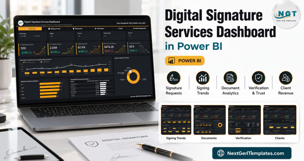

An e-signature operation generates a lot of numbers and very little clarity. You know how many envelopes went out. You are less sure why 37 of them expired, why one certificate authority fails 11.4% of its verification checks while another fails 9.7%, or which signature tier your slowest contracts are sitting in. The Digital Signature Services Dashboard in Power BI answers those questions from a single 500-row table: 500 signature requests, 2,832 documents sent, 2,049 signed, 6,653 verification checks and $474.2K of subscription revenue, laid out across five report pages that all share one filter bar.
It is a ready-to-use .pbix file. Open it in the free Power BI Desktop, look at the sample data, paste your own export under the same 21 headers, repoint one file path and refresh. There is no API, no connector and nothing locked.
Key Features of the Digital Signature Services Dashboard in Power BI
- Five analysis pages with synced slicers. Date Range, Region, Industry and Signature Type carry across every page; each page then adds a fifth slicer that suits it – Plan Tier, Status, Document Type, Certificate Authority and Channel.
- 25 KPI cards, each with a month-on-month delta. Not just a number: a coloured arrow and a sparkline, so Failed Checks at 701 with a red +36.4% reads as a problem at a glance.
- Completion rate and signing rate reported separately. 62.6% of requests reach Completed. 72.4% of documents actually sent get signed. Collapsing those into one figure hides where the loss happens.
- A hidden Details drillthrough page reachable from almost any visual, filtered on ten fields: industry, region, country, document type, signature type, certificate authority, plan tier, channel, status and client account.
- Two report-page tooltips – Metric Detail and Trend Detail – built as 280×360 hidden pages, so hovering a card gives context instead of a bare value.
- Over 35 named DAX measures, all visible and all editable, plus an editable theme file.
- A user manual PDF in the download, alongside the .pbix and the sample Data.xlsx.
Dashboard Pages Explanation
Overview
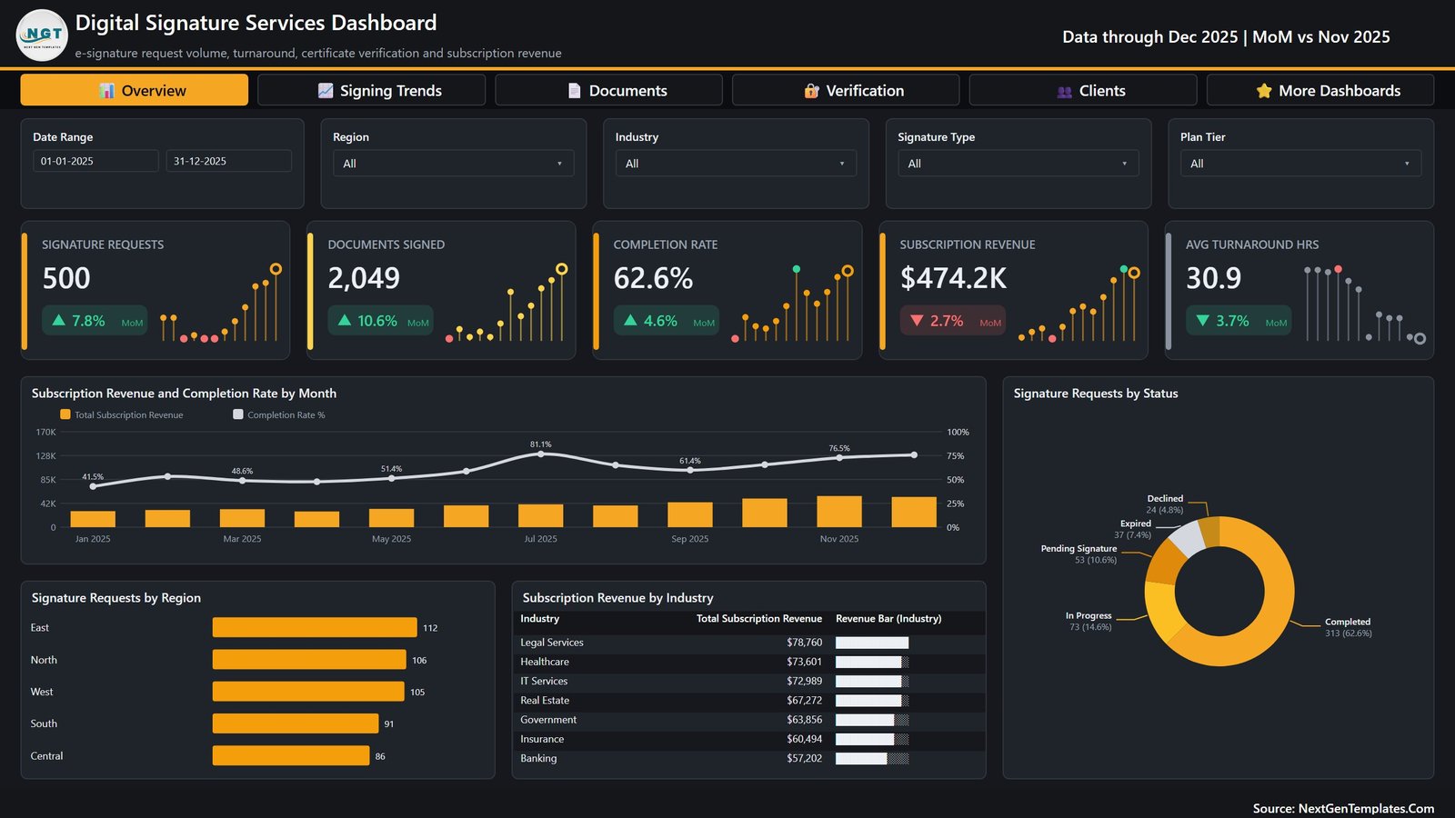
Five cards run across the top: Signature Requests 500 (+7.8%), Documents Signed 2,049 (+10.6%), Completion Rate 62.6% (+4.6%), Subscription Revenue $474.2K (-2.7%) and Avg Turnaround Hrs 30.9 (-3.7%). Below them, Subscription Revenue and Completion Rate by Month puts revenue bars against a completion line that climbs from 41.5% in January to a peak of 81.1% in July. The Signature Requests by Status donut splits the 500 requests into Completed 313, In Progress 73, Pending Signature 53, Expired 37 and Declined 24. A regional bar chart runs East 112, North 106, West 105, South 91, Central 86, and a revenue table by industry is led by Legal Services at $78,760.
Signing Trends
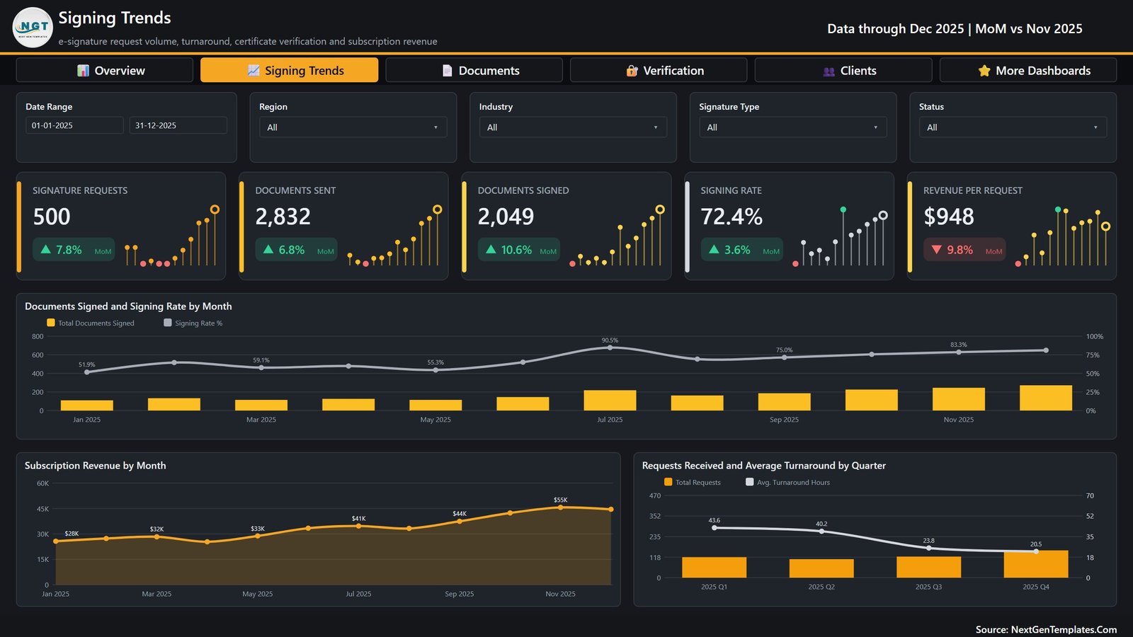
This is the page for the “are we getting better?” conversation. Documents Signed and Signing Rate by Month shows signing rate rising from 51.9% in January to 90.5% in July and settling at 83.3% in November. Subscription Revenue by Month traces $28K to $55K over the same period. The one worth pinning to a wall is Requests Received and Average Turnaround by Quarter: 43.6 hours in Q1, 40.2 in Q2, 23.8 in Q3, 20.5 in Q4 – turnaround more than halved while volume grew.
Documents & Signatures
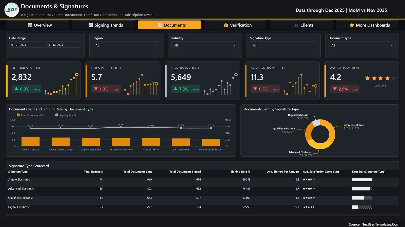
Here the unit of analysis becomes the document rather than the request: 2,832 documents sent, 5.7 documents per request, 5,649 signers involved, 11.3 signers per request and a 4.2 out of 5 satisfaction score. Documents Sent and Signing Rate by Document Type covers seven types, with Non Disclosure Agreement signing highest at 75.6% and Service Contract lowest at 70.6%. The signature type donut and the scorecard beneath it are the useful pair: Simple Electronic carries the most volume at 1,019 documents but signs at only 66.3%, while Qualified Electronic signs at 82.0% and Digital Certificate trails at 59.2%.
Verification & Trust
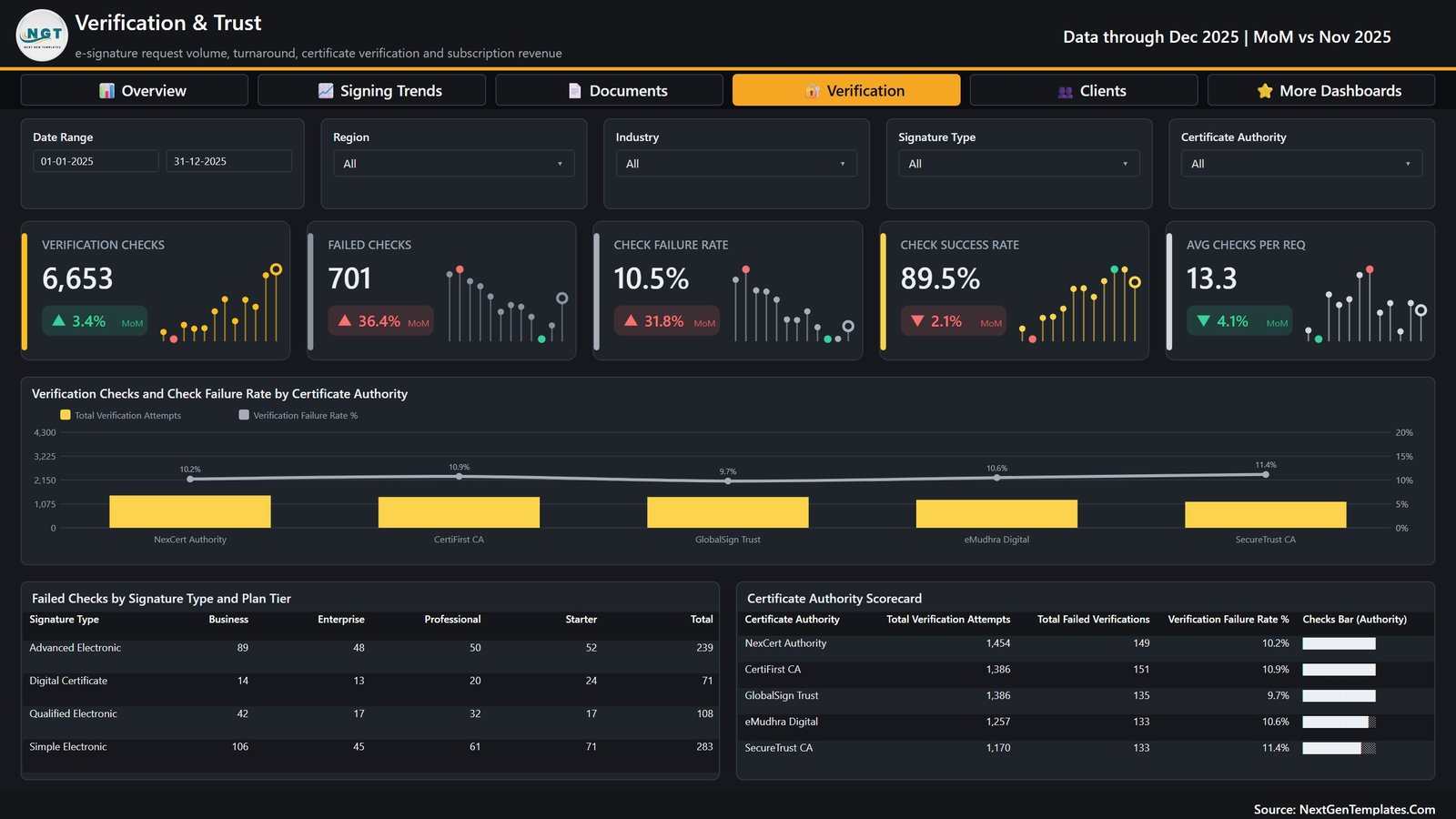
6,653 verification checks, 701 failed, a 10.5% failure rate and an 89.5% success rate. The main chart compares five certificate authorities – NexCert Authority 1,454 attempts at 10.2% failure, CertiFirst CA 1,386 at 10.9%, GlobalSign Trust 1,386 at 9.7%, eMudhra Digital 1,257 at 10.6% and SecureTrust CA 1,170 at 11.4%. The matrix below it is what makes the page actionable: failed checks cross-tabbed by signature type against Starter, Professional, Business and Enterprise plan tiers, so a 283-failure Simple Electronic total resolves to the tier producing it rather than staying an aggregate.
Clients & Channels
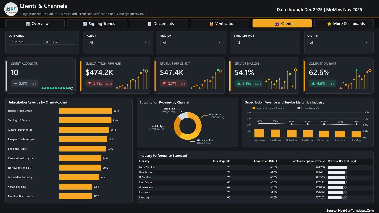
Ten client accounts ranked by subscription revenue, from Harbor Credit Union at $57K down to Meridian Bank Group at $35K, against $47.4K revenue per client and a 54.1% service margin. The channel donut splits revenue across Web Portal $162K, API Integration $126K, Mobile App $125K and Email Link $61K. The industry scorecard closes the report with requests, completion rate and revenue per industry – and it is where the sample data gets interesting, because Real Estate completes at 80.0% on 65 requests while Insurance completes at 51.3% on 78.
Digital Signature Services Dashboard in Power BI vs. Tableau vs. Vendor Analytics – Feature Comparison
| This template (Power BI) | Tableau or Qlik Sense | E-signature vendor analytics | |
|---|---|---|---|
| Cost | $17.99 one time | Per-creator subscription | Bundled into a higher plan tier |
| Platform | Power BI Desktop (free) | Desktop plus hosted server | Inside your signing platform |
| Setup time | Under 15 minutes | Days, plus a data source build | Instant, but fixed |
| Editable visuals and measures | Yes – all of them | Yes | No |
| Combines two signing vendors | Yes – it reads your table | Yes, with connector work | No |
| Certificate authority failure analysis | Built in, five authorities | Build it yourself | Rarely exposed |
| Mobile access | Power BI mobile app after publishing | Yes | Yes |
| Share with a link | Publish to the Service (Pro licence) | Server licence | Yes |
| Year-1 cost for five people | $17.99 plus optional Pro seats | Five creator seats | Account-wide plan upgrade |
Who Should Use This Template
It suits an e-signature or trust-services provider reporting monthly to clients, an in-house legal or contract operations team that exports envelope data from a signing platform, a RegTech or document-workflow vendor that resells signing as part of a wider product, and any vendor manager who has to open a conversation about a rising verification failure rate with evidence rather than an impression.
It is not for you if you need a live API feed. This file connects to no signing platform, certificate authority, identity provider or payment gateway. It is also not per-signer analytics – the model is request-level and holds no signer names, email addresses, IP addresses or document contents. And it is not a compliance artefact: the Simple, Advanced, Qualified and Digital Certificate labels are reporting categories in your own data, not an eIDAS, ESIGN or UETA conformance claim, and nothing in a Power BI file constitutes an audit trail or an evidence package.
Real-World Use Cases
A trust-services provider’s monthly client review. Filter Clients & Channels to one account and the whole review – revenue, service margin, completion rate, channel mix – fits in one screenshot instead of three stitched exports.
Routing high-value agreements. A contract operations manager seeing Qualified Electronic sign at 82.0% against Digital Certificate’s 59.2% has a concrete reason to move the agreements that matter onto the higher-completing tier.
A vendor conversation with evidence. Failed checks up 36.4% month on month sounds like an authority problem until the plan-tier matrix shows the increase sitting in one tier. That is a different meeting.
Advantages of the Digital Signature Services Dashboard in Power BI
- Vendor-agnostic by design. Because it reads a table rather than an API, one report can cover two signing platforms at once – something no vendor’s own analytics will do for you.
- The right metric pairs are already built. Volume against rate, attempts against failures, revenue against margin. You are not assembling those relationships from scratch.
- Drillthrough on ten fields means the answer to “which ones?” is a right-click, not a new report.
- Free to run. Power BI Desktop costs nothing; a Pro licence only matters when you want to share through the Service.
- Fully editable, with a commercial licence, so an agency can rebrand it per client.
Opportunities for Improvement
Being straight about the limits: there is no scheduled refresh out of the box, because there is no live source – you paste or repoint each period. The KPI cards compare month on month only, so a year-on-year view is something you would add. The sample carries ten client accounts and five regions; a provider with hundreds of accounts will want to add a top-N filter to the client bar chart before it becomes unreadable. And Certificate Cost exists as a column in the data but does not drive a dedicated cost-per-request visual – a natural first customisation if margin by authority matters to you.
Best Practices
- Keep the 21 headers exactly as they are spelled. Leave a column blank rather than deleting it – a missing column breaks the measures that depend on it.
- Standardise your Status vocabulary before the first refresh. Completed, In Progress, Pending Signature, Expired and Declined drive both the donut and the completion rate.
- Load one row per request, not per document. Documents Sent and Signers Involved are counts on the request row, which is what makes docs-per-request and signers-per-request work.
- Refresh on a fixed day each month so the month-on-month deltas compare like with like.
- If you publish to the Service, set the file path through a parameter first so you are not editing the query after every move. Microsoft’s Power BI query parameter documentation covers the pattern.
Explore Relevant Templates
- Digital Compliance Tools Dashboard in Power BI
- Compliance Monitoring Dashboard in Power BI
- Corporate Ethics Office Dashboard in Power BI
- Cyber Risk Management Dashboard in Power BI
- Digital Asset Custodians Dashboard in Power BI
- Content Rights Agencies Dashboard in Power BI
- DevOps Teams Dashboard in Power BI
- Document Management Dashboard in Excel
Frequently Asked Questions
Does the Digital Signature Services Dashboard in Power BI connect to my signing platform?
No. There is no API connection and no live refresh from any signing service. You export your request data to a spreadsheet and the report reads that file. The trade-off is deliberate: it means one report can cover more than one vendor.
Do I need a paid Power BI licence?
Not to use it. Power BI Desktop is free from Microsoft. A Power BI Pro licence is only required if you want to publish the report to the Power BI Service and share it by link.
What exactly is in the download?
A ZIP containing the .pbix report, Data.xlsx with the 500-row sample table and its 21 headers, and a Power BI Dashboard user manual PDF.
Can I rebrand it for a client?
Yes. Nothing is locked – the theme, every visual and every DAX measure are editable, and the licence is commercial.
Does it prove my signatures are legally valid?
No. It reports on the data you give it. Legal validity, evidence packages and audit trails come from your signing platform and your certificate authority.
Is there an Excel version of the same dashboard?
Yes – the Digital Signature Services Dashboard in Excel covers the same subject with pivot tables and slicers instead of a semantic model.
About the Author
Built by PK – Microsoft Certified Professional with 15+ years of Excel, Google Sheets, and Power BI experience. Founder of NextGenTemplates, reaching 300K+ subscribers across YouTube channels. Every template is hand-built and tested before release.
Conclusion
The Digital Signature Services Dashboard in Power BI takes the one thing an e-signature operation always has – a flat export of requests – and turns it into five pages that separate volume from rate, requests from documents, and authority failures from tier failures. It will not refresh itself and it will not certify anything, but it will tell you, in about a minute, which signature tier is losing you completions and which certificate authority is costing you checks.
Get the Digital Signature Services Dashboard in Power BI for a one-time $17.99, or browse the rest of the Power BI dashboard catalogue.
For step-by-step Power BI and Excel tutorials, subscribe to PK: An Excel Expert on YouTube.