The Disaster Relief Dashboard in Power BI reports on 500 relief responses across 5 interactive pages, 25 KPI cards and 218 report visuals. The shipped sample dataset carries 19 fields spanning 6 disaster types, 5 regions, 6 relief camps, 5 partner agencies, 6 aid categories and 5 funding sources, dated across the whole of 2025. Thirty-four named DAX measures sit behind those visuals, and every one of them is editable.
Relief teams almost always have the data already. It sits in a response log somebody maintains in Excel, and it answers questions nobody has time to ask it: which aid categories are losing kits between dispatch and delivery, which funding source is under-utilised, whether Critical-severity responses are actually getting the fastest turnaround. This report is the reporting layer over that log — it turns the rows you already keep into five pages you can put in front of a board or a donor.

What This Dashboard Is — and What It Is Not
This matters enough to say before anything else. The Disaster Relief Dashboard in Power BI is an analytical Power BI report built over a sample dataset. It reads a spreadsheet of responses that have already happened and summarises them.
It is not an emergency response system. It does not dispatch teams, raise alerts, allocate resources, or notify anyone. It is not a beneficiary registry — the shipped data holds no names, contact details, addresses, household identifiers or case notes, and the 19 columns are operational fields only. And it is not a substitute for whatever official relief coordination platform your organisation or cluster already uses. Treat it as the monthly reporting layer that sits downstream of those systems, not as a replacement for any of them.
One practical consequence: if you swap in your own data, keep it aggregate. The template is designed around counts and totals per response, and adding person-level rows to a file you then publish or share would be a poor idea for reasons that have nothing to do with Power BI.
Key Features of the Disaster Relief Dashboard in Power BI
- Five analysis pages behind one sidebar. Overview, Response Trends, Aid & Supply Mix, Field Operations and Beneficiary Impact. The sidebar buttons are real page navigation, so any page is one click from any other.
- 25 KPI cards, each with a month-on-month delta. Five per page, every one carrying a sparkline and a green or red MoM arrow against the prior month.
- Five synced slicers per page. A Date Range pair plus Region, Disaster Type and Severity Level carry across all five pages; each page adds one of its own — Status, Funding Source, Aid Category, Relief Camp and Partner Agency respectively.
- A real drillthrough page. A hidden Details page is configured as a Power BI drillthrough target on eight fields, so right-clicking a bar, slice or table row opens the underlying records filtered to exactly that selection.
- Two report-page tooltips. Trend Detail and Metric Detail are built as tooltip pages rather than default value lists, so hovering a chart gives a formatted panel.
- 34 named DAX measures wired into the visuals, including Kit Delivery %, Fund Utilization %, Avg. Response Hrs, Cost Per Beneficiary and Reach Per Household.
- Nothing is locked and nothing is an image. Every visual, measure, colour and page name is editable, and you can add pages of your own on top of the existing model.
Dashboard Pages Explanation
Page 1: Overview
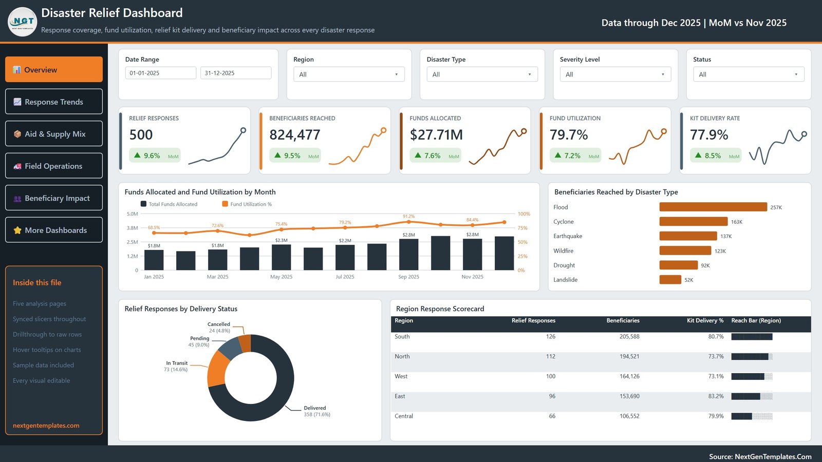
The landing page. KPI cards report Relief Responses, Beneficiaries Reached, Funds Allocated, Fund Utilization and Kit Delivery Rate. Charts are Funds Allocated and Fund Utilization by Month, Beneficiaries Reached by Disaster Type, Relief Responses by Delivery Status, and a Region Response Scorecard table. On the sample data this reads 500 responses, 824,477 beneficiaries reached, $27.71M allocated, 79.7% utilization and a 77.9% kit delivery rate.
Page 2: Response Trends
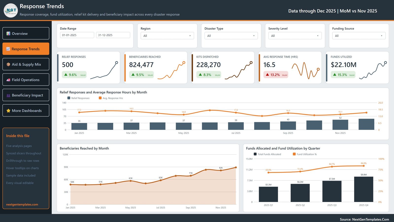
The time view. KPI cards report Relief Responses, Beneficiaries Reached, Kits Dispatched, Avg Response Time (Hrs) and Funds Utilized. Charts are Relief Responses and Average Response Hours by Month, Beneficiaries Reached by Month, and Funds Allocated and Fund Utilization by Quarter. The page-specific slicer here is Funding Source, which is what makes donor-by-donor acquittal reporting straightforward.
Page 3: Aid & Supply Mix
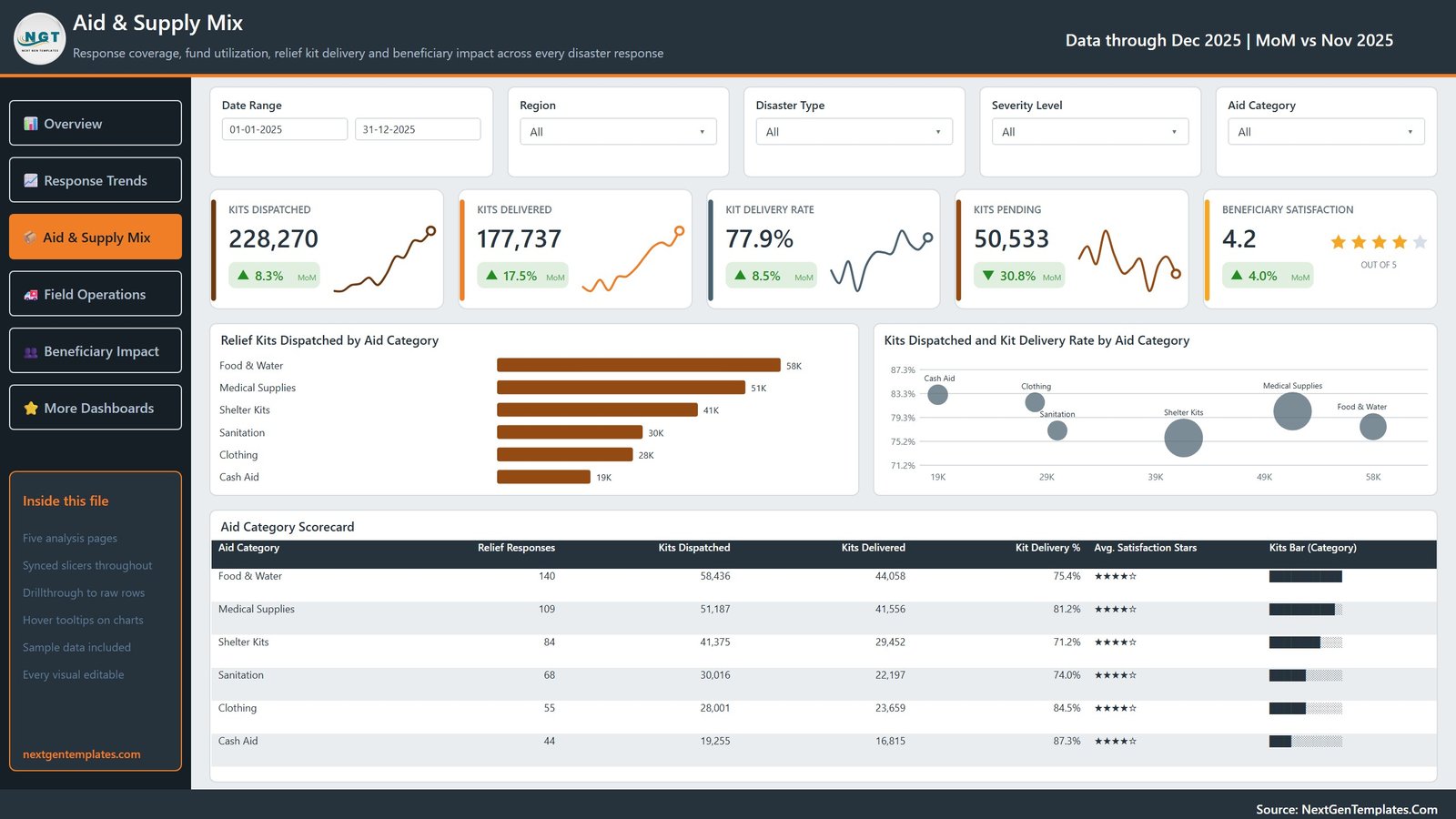
Where the kits actually go. KPI cards report Kits Dispatched, Kits Delivered, Kit Delivery Rate, Kits Pending and Beneficiary Satisfaction as a star rating. Charts are Relief Kits Dispatched by Aid Category, Kits Dispatched and Kit Delivery Rate by Aid Category, and an Aid Category Scorecard table across all six categories from Food & Water down to Cash Aid. This is the page that exposes the gap between what left the warehouse and what arrived.
Page 4: Field Operations
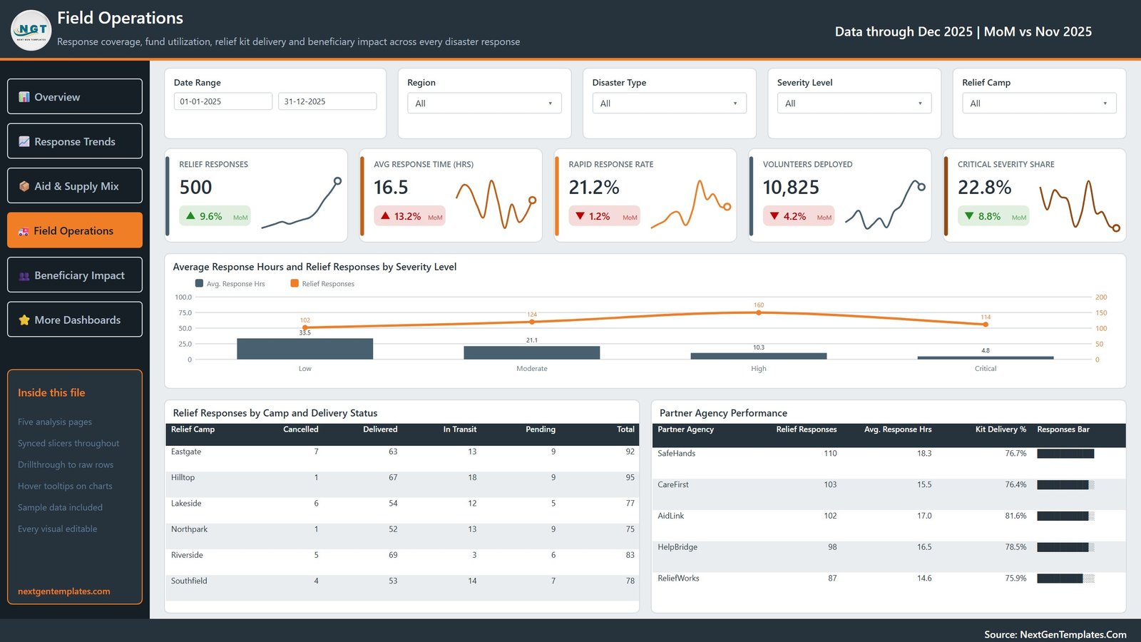
The delivery view. KPI cards report Relief Responses, Avg Response Time (Hrs), Rapid Response Rate, Volunteers Deployed and Critical Severity Share. Charts are Average Response Hours and Relief Responses by Severity Level, a Relief Responses by Camp and Delivery Status matrix across the six camps, and a Partner Agency Performance table covering the five agencies with their response hours and delivery rates side by side.
Page 5: Beneficiary Impact
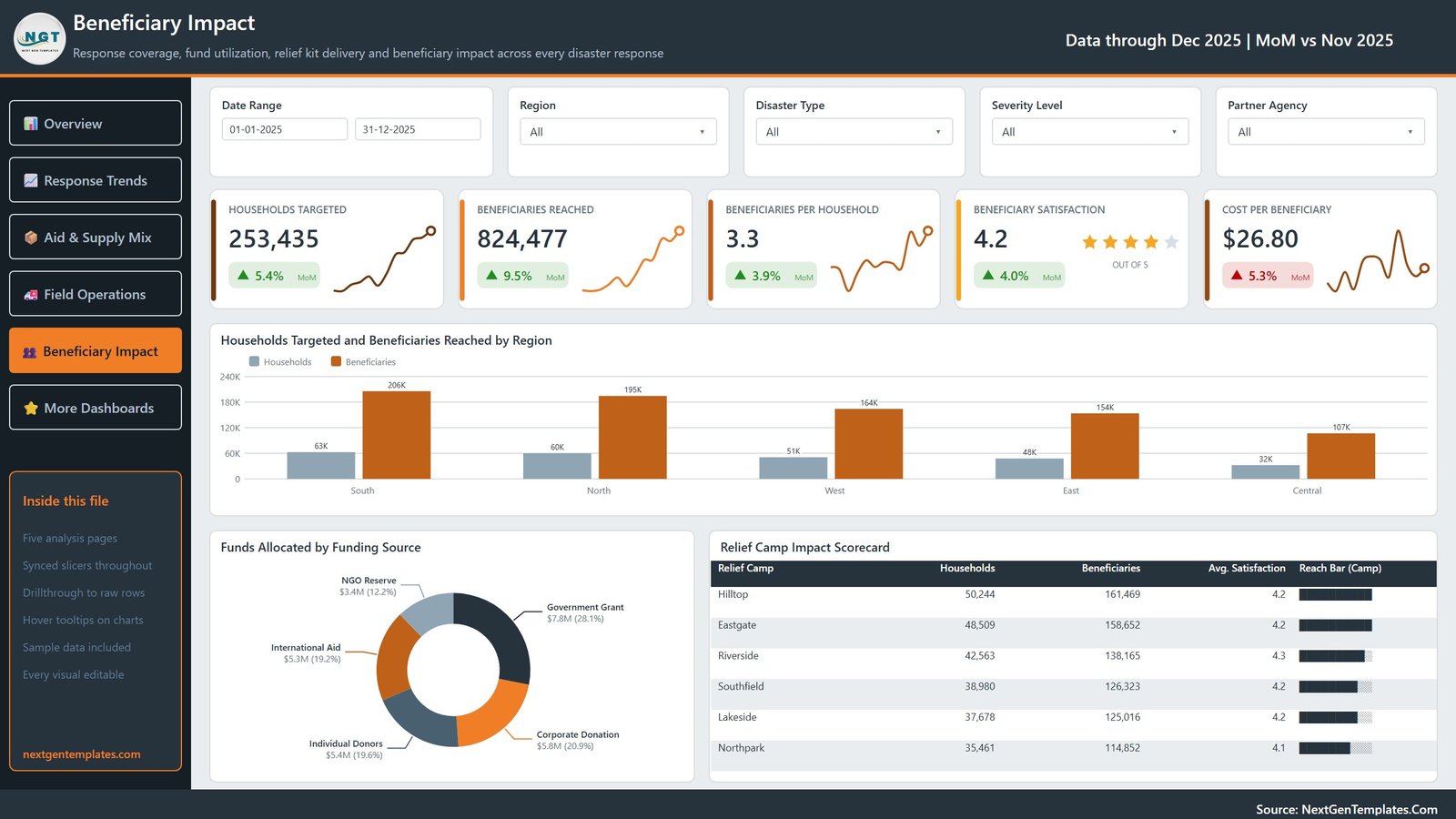
Reach and cost. KPI cards report Households Targeted, Beneficiaries Reached, Beneficiaries per Household, Beneficiary Satisfaction and Cost per Beneficiary. Charts are Households Targeted and Beneficiaries Reached by Region, Funds Allocated by Funding Source, and a Relief Camp Impact Scorecard table. Cost per Beneficiary is the number most donor reports want and the one least often calculated consistently.
Disaster Relief Dashboard in Power BI vs. Tableau / Qlik vs. Paid Relief-Analytics SaaS — Feature Comparison
| Feature | Disaster Relief Dashboard in Power BI | Tableau / Qlik build | Paid relief-analytics SaaS |
|---|---|---|---|
| Cost | $17.99 one-time | $75 / user / month (Tableau Creator) | $300-2,000 / month per organisation |
| Platform | Power BI Desktop (free) ✅ | Paid desktop licence required | Vendor-hosted, browser only |
| Setup time | Under 10 minutes ✅ | Days to weeks to build from scratch | Weeks of onboarding and data mapping |
| Report ships pre-built | Yes — 5 pages, 25 KPI cards ✅ | No, blank canvas | Fixed vendor templates only |
| Editable visuals and measures | Every visual, all 34 measures ✅ | Yes | Rarely — vendor controls the schema |
| Drillthrough to raw rows | Built in, on 8 fields ✅ | Build it yourself | Sometimes, often gated by tier |
| Data stays on your machine | Yes, offline .pbix ✅ | Yes | No — uploaded to the vendor |
| Year-1 cost at 5 users | $17.99 total ✅ | $4,500 | $3,600-24,000 |
| Real-time field data capture | No — reports an existing dataset | No | Yes ✅ |
For teams that want a finished relief-operations report they can open, rebrand and refresh today without a licence negotiation, the Disaster Relief Dashboard in Power BI sits in the sweet spot.
Who Should Use This Template
Perfect for:
- Programme and M&E officers who already keep a response log and need a repeatable monthly report from it
- Relief logistics and supply coordinators tracking dispatched against delivered by camp, category and agency
- Finance and grants staff reporting allocation and utilization by funding source, region and quarter
- Power BI learners who want a realistic 19-field model with working drillthrough and tooltip pages to take apart
Not a fit if:
- You need live dispatch, alerting or incident command — this is a reporting layer, not an operational system
- You need beneficiary case management — there is deliberately no person-level record in this model
- You need hosted multi-user editing with row-level security out of the box, which requires a Power BI Pro workspace you configure yourself
- You need certified reporting against a specific donor or cluster standard without adapting the measures first
Real-World Use Cases
Priya coordinates programmes for a regional relief NGO. Her field teams file one response record per deployment. She drops the export into the sample workbook’s 19-column layout, refreshes, and takes the Beneficiary Impact page straight into her monthly board meeting — households targeted, beneficiaries reached and cost per beneficiary by region — instead of rebuilding a slide deck each month.
Marcus runs supply logistics across five camps. He works from the Aid & Supply Mix page, where dispatched against delivered shows which aid categories are leaking. When Shelter Kits comes back with the lowest delivery rate in the Aid Category Scorecard, he right-clicks and drills through to the underlying rows to see which camps and agencies account for it.
Dana handles donor reporting at a foundation. She filters the Response Trends page by Funding Source and takes the Funds Allocated and Fund Utilization by Quarter chart into her grant acquittals, so each donor sees what their own contribution did rather than a blended organisation-wide figure.
Advantages of the Disaster Relief Dashboard in Power BI
The cost case is blunt: $17.99 once against $4,500 a year for five Tableau Creator seats, or several thousand a year for a hosted relief-analytics platform. But the more useful advantage is time. A five-page report with 25 KPI cards, synced slicers, a drillthrough page and two tooltip pages is roughly a week of build work for someone who already knows Power BI, and considerably more for someone learning. This ships finished.
The second advantage is that it runs offline. The .pbix and your data sit on your own machine, which matters when the data describes operations in places where you would rather not upload anything to a third-party vendor. And because every measure is a plain DAX measure rather than a black box, you can read exactly how Kit Delivery % or Cost Per Beneficiary is calculated and change the definition if your organisation computes it differently.
Opportunities for Improvement
Being straight about the limits is more useful than a sales pitch:
- The model expects the shipped 19-column shape. Renaming or dropping a column will break the measures that reference it. Adding columns is fine; changing the existing headers is not, unless you update the measures too.
- You must repoint Power Query at your own file. The .pbix ships bound to the sample workbook’s location, so the first Refresh on your machine will fail until you open Transform data and change the source. This is a one-time, thirty-second step and it is documented in the included manual, but it does catch people.
- There is no geographic map visual. Region is a text category (North, South, East, West, Central), not a mapped location, so regional analysis is charted rather than plotted.
- No row-level security is configured. Anyone who opens the .pbix sees all of it. If you need per-agency or per-region access control, you will need to add RLS roles and publish to a Power BI workspace.
- The MoM deltas need at least two months of data. If you load a single month, the comparison arrows have nothing to compare against.
Best Practices
- Keep one row per relief response, not one row per beneficiary. The whole model is built on that grain, and it is also the grain that keeps personal data out of the file.
- Load a full twelve months before judging the trends. The Response Trends and quarterly charts only earn their place with a year behind them.
- Fill Severity Level and Status consistently. Rapid Response Rate, Critical Severity Share and the delivery-status donut all depend on those two fields being clean.
- Use drillthrough before you build a new visual. Most “can we see the detail behind this?” questions are already answered by right-clicking.
- Rebrand once, then reuse. Change the title, logo and theme colours in the .pbix and save it as your organisation’s standard relief report.
- If you are new to drillthrough and tooltip pages, Microsoft’s own documentation on setting up drillthrough in Power BI Desktop explains the mechanics this report already implements.
Explore Relevant Templates
The closest relative is the Disaster Relief Dashboard in Excel — the same 500-record, 19-field relief dataset rebuilt as a pivot-driven Excel workbook with 20 pivot charts and 25 pivot tables. If your team lives in Excel rather than Power BI, start there instead; the two are alternatives, not companions.
If you want a fixed scorecard rather than a full analytical report, the Disaster Relief KPI Dashboard in Excel takes the traffic-light approach with a month picker. For the wider emergency space there is the Emergency Management Report in Excel and the Public Safety KPI Dashboard in Power BI.
On the funding side, the Nonprofit Grant Dashboard in Power BI covers grant applications, approvals and utilization in the same Power BI idiom. And if you need to capture the response records this dashboard reports on, the Relief Distribution Data Entry System in Excel is the data-entry front end, while Crisis Mapping Startups Dashboard in Excel covers the crisis-tech side.
Frequently Asked Questions
What does the Disaster Relief Dashboard in Power BI measure?
It measures response coverage, fund allocation and utilization, relief kit dispatch and delivery, response time, volunteers deployed and beneficiary reach. It runs 34 named DAX measures across 5 pages and 25 KPI cards, all recalculated from whatever data you load into it.
Is this an emergency response or coordination system?
No. The Disaster Relief Dashboard in Power BI is an analytical report over a spreadsheet of already-recorded responses. It does not dispatch teams, raise alerts, allocate resources or coordinate agencies, and it does not replace any official relief coordination platform your organisation uses.
Does the sample data contain beneficiary personal information?
No. The report ships with 500 rows of operational fields only — response ID, date, disaster type, region, camp, agency, aid category, severity, funding source, status and numeric totals. There is no name, contact detail, address, household identifier or case note anywhere in the file.
How long does setup take?
Under 10 minutes. Unzip the download, open the .pbix in Power BI Desktop, paste your own rows into the 19-column layout, repoint the Power Query source at your file and press Refresh. Every card, chart and table then updates automatically.
How does this compare to a paid relief-analytics platform?
A hosted platform gives you live field data capture and vendor support for $300-2,000 a month. This template gives you the reporting layer for $17.99 once, offline on free Power BI Desktop, with every measure editable. It reports data you already collect rather than collecting it for you.
Can I change the KPIs, charts and branding?
Yes. Nothing in this report is locked or a static image. All 34 DAX measures, every chart, the sidebar, the page names and the colour theme are editable, and you can add your own pages and measures on top of the existing model.
Do I need a paid Power BI subscription?
No. The report opens and refreshes in Power BI Desktop, which Microsoft provides free. A Power BI Pro or Premium licence is only required if you want to publish the report to the Power BI Service and share it with colleagues there.
About the Author
Built by PK — Microsoft Certified Professional with 15+ years of Excel, Google Sheets, and Power BI experience. Founder of NextGenTemplates, reaching 300K+ subscribers across YouTube channels. Every template is hand-built and tested before release.
Conclusion
If your organisation already logs relief responses and the reporting is the painful part, this template closes that gap in an afternoon. Five pages, 25 KPI cards, 218 visuals, working drillthrough and tooltips, and a 19-field model you can read and change — over data that stays on your own machine. It will not run your response, and it does not claim to. It will tell you honestly what your response did.
👉 Click here to Purchase the Disaster Relief Dashboard in Power BI
Instant download · One-time payment · No subscription · Lifetime access
🎥 For step-by-step video tutorials, visit Youtube.com/@PK-AnExcelExpert
Last updated: September 2026