Most compliance teams already have the data. It sits in an audit log: who reviewed what, which controls were tested, how many failed, what the remediation cost and how much penalty exposure is still open. What is missing is the picture. The Compliance Monitoring Dashboard in Power BI is that picture – nine report pages built on 500 demo audit records, delivered as an editable .pbix you open in free Power BI Desktop.
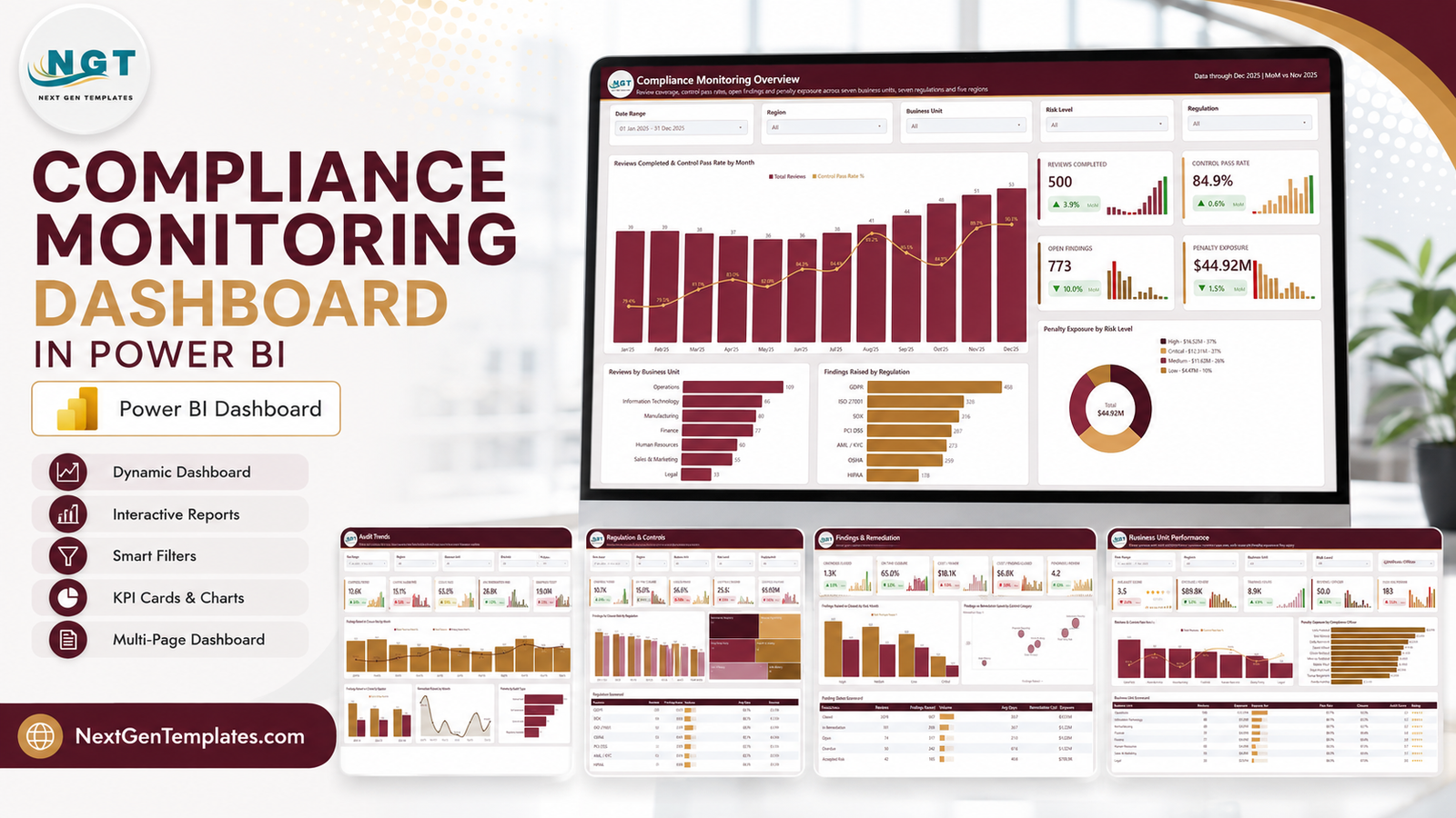
Before anything else, the honest framing. This is a reporting and visualisation template. It charts audit results that you enter or import. It is not a compliance management system. It performs no control testing and collects no evidence. It does not certify, guarantee or establish conformance with any law, regulation or standard, and nothing in it – or in this article – is legal, regulatory or audit advice. Whether your organisation is compliant is decided by your organisation, your auditors and your regulators. Never by a report file.
With that said, here is what the file actually does.
What You Get
- Nine pages in one .pbix – five visible analysis pages, a Get More Dashboards page, a hidden Details drillthrough and two hover tooltip pages sized 280×360.
- 24 SVG KPI cards – four on the Overview, five on each of the other four pages. Every card carries a month-on-month delta and a 12-month sparkline.
- 42 DAX measures referenced by the report visuals.
- Five slicers on every page – Date Range, Region, Business Unit and Risk Level are constant, and the fifth changes with the page.
- Three scorecard tables with in-cell volume bars: Regulation, Finding Status and Business Unit.
- 500 demo rows across 19 columns in Data.xlsx, plus a generated Date table.
- A Details drillthrough bound on eight fields.
Page 1: Compliance Monitoring Overview
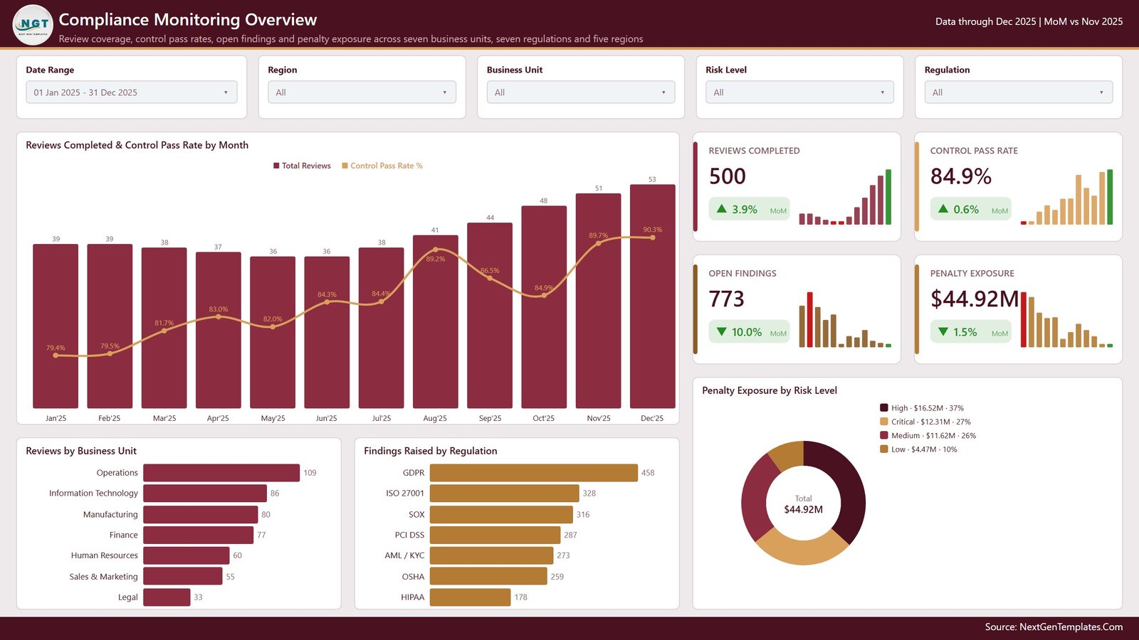
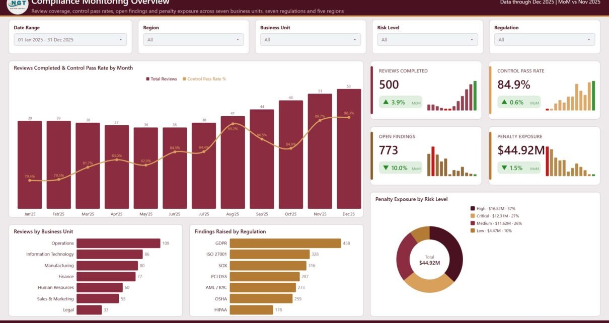
Four cards head the page on the demo data: Reviews Completed 500 (up 3.9% month on month), Control Pass Rate 84.9% (up 0.6%), Open Findings 773 (down 10.0%) and Penalty Exposure $44.92M (down 1.5%). Each one pairs the number with a small twelve-bar sparkline, so you see both the level and the shape at once.
The big combo chart, Reviews Completed & Control Pass Rate by Month, is the page’s argument in one visual: review volume climbs from 39 in January to 53 in December, and the pass-rate line climbs with it from 79.4% to 90.3%. Underneath, Reviews by Business Unit ranks Operations 109, Information Technology 86, Manufacturing 80, Finance 77, Human Resources 60, Sales & Marketing 55 and Legal 33.
Findings Raised by Regulation puts GDPR first at 458, then ISO 27001 328, SOX 316, PCI DSS 287, AML / KYC 273, OSHA 259 and HIPAA 178. And the donut, Penalty Exposure by Risk Level, splits the $44.92M total into High $16.52M (37%), Critical $12.31M (27%), Medium $11.62M (26%) and Low $4.47M (10%).
A word about those regulation names: they are text labels in a sample-data column, chosen so the charts look realistic. They are mapped to no clause, control set or certification scheme. Rename them to whatever framework your programme actually runs to.
Page 2: Audit Trends
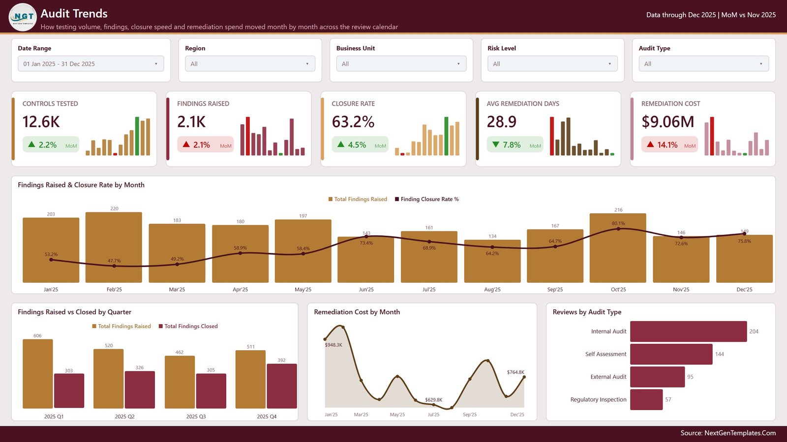
Five cards: Controls Tested 12.6K, Findings Raised 2.1K, Closure Rate 63.2%, Avg Remediation Days 28.9 and Remediation Cost $9.06M. Note that remediation cost is up 14.1% month on month while remediation days are down 7.8% – faster closure, more expensive closure. That tension is exactly the sort of thing a management pack should surface rather than bury.
Findings Raised & Closure Rate by Month shows the closure line rising from 53.2% in January to a peak of 80.1% in October before easing to 75.8% in December. Findings Raised vs Closed by Quarter makes the backlog visible: Q1 raised 606 and closed 303, Q2 520 and 326, Q3 462 and 305, Q4 511 and 392. Every quarter closes fewer than it opens, which is the story of the 773 open findings on page one.
Remediation Cost by Month is a smoothed area chart from $948.3K in January down to a $629.8K trough and back up to $764.8K, and Reviews by Audit Type splits Internal Audit 204, Self Assessment 144, External Audit 95 and Regulatory Inspection 57.
Page 3: Regulation & Controls
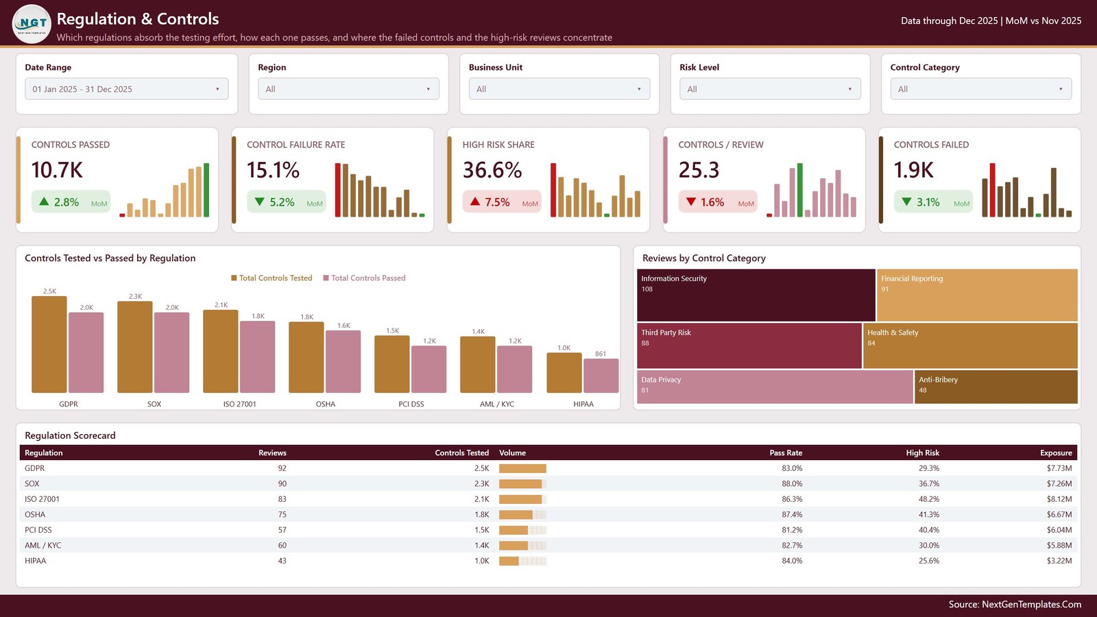
Cards for Controls Passed 10.7K, Control Failure Rate 15.1%, High Risk Share 36.6%, Controls / Review 25.3 and Controls Failed 1.9K.
Controls Tested vs Passed by Regulation puts the two bars side by side for all seven labels, from GDPR’s 2.5K tested and 2.0K passed down to HIPAA’s 1.0K and 861. A treemap breaks Reviews by Control Category into Information Security 108, Financial Reporting 91, Third Party Risk 88, Health & Safety 84, Data Privacy 81 and Anti-Bribery 48.
The Regulation Scorecard table is the page’s payload – reviews, controls tested, a proportional volume bar, pass rate, high-risk share and exposure, one row per regulation:
| Regulation | Reviews | Controls Tested | Pass Rate | High Risk | Exposure |
|---|---|---|---|---|---|
| GDPR | 92 | 2.5K | 83.0% | 29.3% | $7.73M |
| SOX | 90 | 2.3K | 88.0% | 36.7% | $7.26M |
| ISO 27001 | 83 | 2.1K | 86.3% | 48.2% | $8.12M |
| OSHA | 75 | 1.8K | 87.4% | 41.3% | $6.67M |
| PCI DSS | 57 | 1.5K | 81.2% | 40.4% | $6.04M |
| AML / KYC | 60 | 1.4K | 82.7% | 30.0% | $5.88M |
| HIPAA | 43 | 1.0K | 84.0% | 25.6% | $3.22M |
Read across rather than down and the table earns its place: ISO 27001 is only third by review count, yet it carries the largest exposure at $8.12M and by far the highest high-risk share at 48.2%. PCI DSS has the weakest pass rate at 81.2%. On real data, that is the paragraph you write for the committee. On this data it is demonstration only.
Page 4: Findings & Remediation
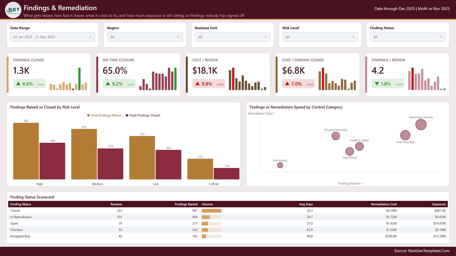
Cards for Findings Closed 1.3K, On Time Closure 65.0%, Cost / Review $18.1K, Cost / Finding Closed $6.8K and Findings / Review 4.2.
Findings Raised vs Closed by Risk Level shows High 693 raised against 448 closed, Medium 620 and 379, Low 533 and 361, and Critical 253 and 138 – the worst closure ratio sitting on the most severe band. A bubble chart plots Findings vs Remediation Speed by Control Category, with Information Security top-right on both axes and Anti-Bribery bottom-left.
The Finding Status Scorecard is the sharpest table in the file:
| Finding Status | Reviews | Findings Raised | Avg Days | Remediation Cost | Exposure |
|---|---|---|---|---|---|
| Closed | 233 | 967 | 20.2 | $4.18M | $487.6K |
| In Remediation | 101 | 408 | 30.7 | $1.72M | $6.87M |
| Open | 74 | 317 | 21.0 | $1.42M | $16.07M |
| Overdue | 50 | 242 | 67.6 | $1.02M | $9.10M |
| Accepted Risk | 42 | 165 | 40.8 | $709.9K | $12.39M |
Closed findings hold 967 of the total but only $487.6K of residual exposure. Open holds 317 findings and $16.07M. Overdue runs at 67.6 average days against 20.2 for closed. That contrast – small counts carrying large exposure – is the single most useful thing this page does.
Page 5: Business Unit Performance
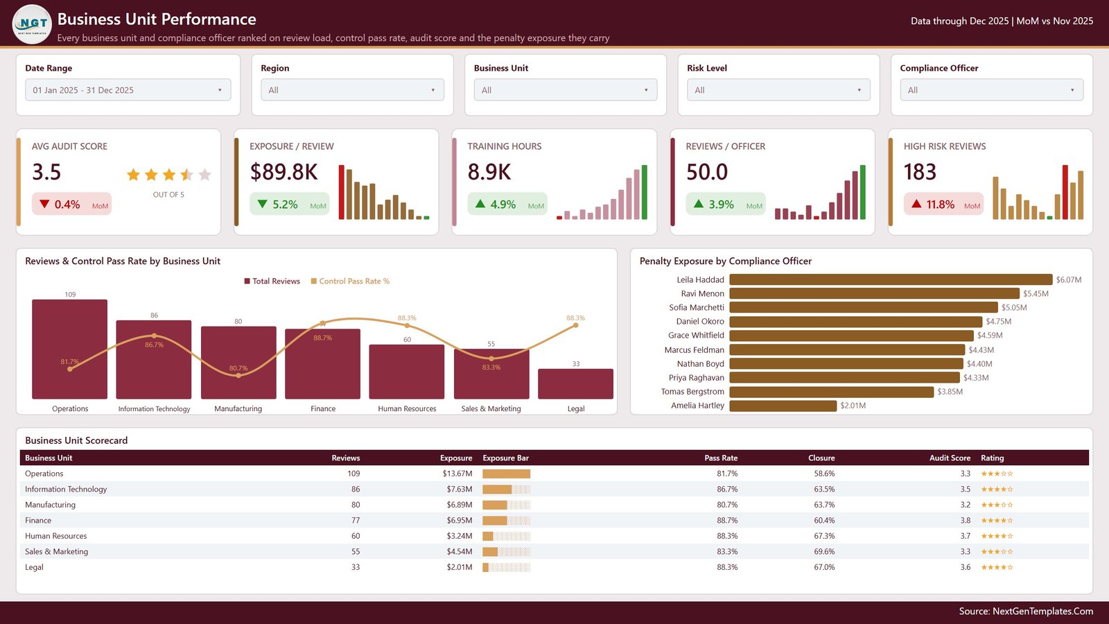
Cards for Avg Audit Score 3.5 out of 5 (drawn as a star rating), Exposure / Review $89.8K, Training Hours 8.9K, Reviews / Officer 50.0 and High Risk Reviews 183.
Reviews & Control Pass Rate by Business Unit combines volume columns with a pass-rate line. Penalty Exposure by Compliance Officer ranks ten officers from $6.07M down to $2.01M – and every one of those names is fictional demo data, generated so the visual has something to rank. Swap in your own team, or delete the column if officer-level reporting is not something you want to do.
The Business Unit Scorecard closes the page: Operations carries 109 reviews and $13.67M of exposure at an 81.7% pass rate; Finance leads on pass rate at 88.7%; Manufacturing trails at 80.7% with the lowest audit score at 3.2; Legal is smallest at 33 reviews and $2.01M.
The Three Pages You Do Not See in the Screenshots
Behind the five analysis pages sit three more. A hidden Details drillthrough, bound on eight fields – Business Unit, Region, Regulation, Control Category, Compliance Officer, Audit Type, Risk Level and Finding Status – so right-clicking any bar, slice or table row takes you to the records behind it. And two 280×360 tooltip pages (Category Detail and Trend Detail) that render on hover instead of the default value bubble.
There is also a sixth visible page, Get More Dashboards, which is an NGT catalogue page. If you are handing the file to a client, delete it – it takes two seconds and nothing else references it.
Power BI or Excel? Both Exist
This dashboard also ships as an Excel workbook. Same subject, same demo scenario, different tool:
| Power BI version | Excel version | |
|---|---|---|
| Software | Power BI Desktop (free) | Excel 2016+ or Microsoft 365 |
| Visible analysis pages | 5 | 5 |
| Drillthrough to records | Yes, on 8 fields | No |
| Hover tooltip pages | Yes, two | No |
| Cross-filter by clicking a visual | Yes | Slicers only |
| Scorecard tables with in-cell bars | Three | Charts instead |
| Source columns | 19 | 28 |
| Best for | Interactive exploration and board packs | Teams who live in workbooks |
If your organisation is a spreadsheet shop, take the Compliance Monitoring Dashboard in Excel instead. If you want click-to-filter and drillthrough, take this one.
How to Put Your Own Data In
- Unzip the download – you get the .pbix, Data.xlsx and a Power BI Dashboard User Manual PDF.
- Install Power BI Desktop if you do not already have it. It is free from Microsoft.
- Open the .pbix. Every page renders immediately on the demo rows.
- Open Data.xlsx, delete the demo rows, and paste your audit records under the same 19 headers. Keep the column order and the date format.
- In Power BI Desktop go to Transform data > Data source settings, point the query at your file, and press Refresh.
- Rename the label columns – regulations, control categories, audit types, business units, regions – to match your programme. New values appear in the slicers and charts automatically.
- Use the five slicers to filter, right-click into Drill through > Details for the underlying records, and hover a chart element to raise a tooltip page.
Who Should Buy This – and Who Should Not
Buy it if you are a compliance manager, internal audit lead, risk officer, quality manager or operations director who already collects audit results and wants a management-ready, cross-filtering view of them. It suits multi-unit, multi-region programmes and consultants presenting quarterly outcomes to a client board.
Do not buy it if you need automated evidence collection, continuous control monitoring, or a connector into a live GRC platform – this report visualises results you supply, it does not gather them. It is also wrong for you if you want a single-page scorecard with targets and traffic lights (that is a different NGT product line), if you need a tamper-evident audit record for a regulator, or if you expect the file to tell you whether you are compliant.
Frequently Asked Questions
Does this dashboard make my organisation compliant?
No. It charts the audit results, findings, remediation costs and training hours that you supply. It performs no control testing, collects no evidence, grants no certification or assurance, and is not legal, regulatory or audit advice. Compliance with GDPR, SOX, ISO 27001, PCI DSS, HIPAA, OSHA, AML / KYC or anything else is determined by your organisation, your auditors and your regulators.
The demo data names real regulations. Is the template built to those standards?
No. They are text labels in a Regulation column of sample data. They map to no clause, control set, framework or certification scheme. Replace them.
Do I need a Power BI Pro licence?
Not to use the file. Power BI Desktop is free and opens, edits and refreshes the .pbix locally. A licence only matters if you want to publish to the Power BI Service and share with colleagues – check Microsoft’s current licensing for that.
Is this the same as a Compliance KPI scorecard?
No, they are different products. This is the analytical line: five analysis pages, cross-filtering visuals, five slicers per page, a drillthrough. The KPI-scorecard line is built around a month picker, traffic-light targets and a KPI Trend page.
What if I have more or fewer than 500 rows?
It makes no difference. Load whatever you have and refresh. Every measure and visual scales to it.
Are the compliance officer names real?
No. Every name in the demo data is fictional, generated only so the officer-level visuals have something to rank.
Can I rebrand it?
Yes. Nothing is locked. Change the theme colours, swap the logo, delete the Get More Dashboards page, add pages of your own.
What is in the download?
A zip containing the .pbix report, the Data.xlsx source file and a Power BI Dashboard User Manual PDF. One-time payment, lifetime use, no subscription.
Get the Template
The Compliance Monitoring Dashboard in Power BI is $17.99 instead of $29.99 – instant download, lifetime use, User Manual PDF included.
Also available: the Compliance Monitoring Dashboard in Excel, the same dashboard for teams who work in workbooks.
Related Templates
- Compliance Audits Dashboard in Power BI – audit-cycle analytics, the closest Power BI sibling.
- Compliance and Audit Dashboard in Power BI – a broader combined view.
- Risk Management Dashboard in Power BI – for the risk register rather than the control tests.
- Data Privacy Office Dashboard in Power BI – privacy-office reporting.
- Reg Tech Dashboard in Power BI – regulatory technology spend and adoption.
- Audit & Internal Controls Dashboard in Google Sheets – the browser-based option.
- Coaching Networks Dashboard in Power BI – another analytical Power BI build from the same line.
- Corporate Skill Hubs Dashboard in Excel – training and capability reporting in Excel.
About the Author
Built by PK – Microsoft Certified Professional with 15+ years of Excel, Google Sheets, and Power BI experience. Founder of NextGenTemplates, reaching 300K+ subscribers across YouTube channels. Every template is hand-built and tested before release.
Last updated: 20 August 2026.
Reporting and visualisation template only. This file and this article do not certify, assure, audit or establish compliance with any law, regulation, standard or certification scheme, do not constitute a compliance management system, and are not legal, regulatory or audit advice. All figures, names and regulation labels shown are demonstration data.