Planning and managing events takes a lot of effort because many activities happen at the same time. Teams must track budgets, client requirements, venue details, timelines, vendor performance, and promotional spending. When this data stays scattered across sheets, the event team struggles to understand what works well and what needs improvement.
An Event Production Dashboard in Excel solves this challenge. It brings all event-related data into a single file and shows clear insights through tables, visuals, comparisons, and trend charts. You can use it to check event performance, monitor budget vs spend, track revenue, and measure profit margins without switching between multiple reports.
This article explains everything about the Event Production Dashboard in Excel. You will learn its structure, pages, features, benefits, best practices, and answers to common questions. So let us explore how this dashboard helps event teams improve decision-making and event outcomes.
Click to Purchases Event Production Dashboard in Excel
What Is an Event Production Dashboard in Excel?
An Event Production Dashboard in Excel is a ready-to-use reporting solution that helps event managers track important performance indicators for different events. The dashboard converts raw Excel data into meaningful visuals that show event schedules, budgets, revenue, profit margins, client details, venue performance, and month-wise trends.
It helps users make quick decisions because the dashboard displays:
-
Budget vs Spending
-
Profit Margins
-
Revenue by Event, Client, Venue, and Month
-
Event Scheduling Performance
-
Promotional Cost Impact
-
Weather Impact on Event Revenue
-
Event Type Insights
-
Client Type Analysis
Since the dashboard works in Excel, anyone can use it without learning new software. It is ideal for event planners, production teams, agencies, marketing teams, corporate event departments, and freelancers who manage multiple events.
Why Do Event Managers Need an Event Production Dashboard in Excel?
Event teams deal with complex workflows. They handle different vendors, clients, venues, budgets, and promotional activities. Without a proper dashboard, the entire process becomes stressful and confusing.
An Excel dashboard gives you clarity because it shows all the numbers in one place.
Here are a few reasons why event teams prefer this template:
-
It supports quick and accurate reporting.
-
It reduces the time spent on manual calculations.
-
It improves team coordination.
-
It allows better budgeting and cost control.
-
It highlights problems before they grow.
-
It increases overall event profitability.
Since Excel is familiar to most users, the dashboard allows seamless adoption across the organization.
Key Features of the Event Production Dashboard in Excel
This Event Production Dashboard includes five analytical pages and one support sheet. You can navigate these pages easily using the Page Navigator placed on the left side of the file.
Each page focuses on a different part of event operations so that you can study every detail clearly.
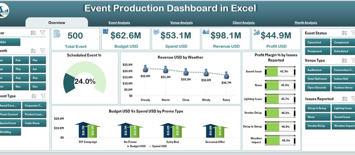
1. Overview Page
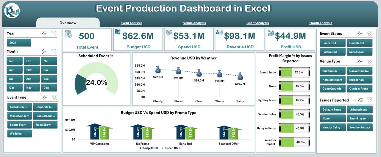
The Overview Page serves as the central summary of the dashboard. It provides a complete snapshot of event performance using cards and visuals.
It includes:
-
A right-side slicer for quick filtering
-
5 cards that show key metrics
-
4 charts that help analyze event performance in detail
The charts include:
-
Scheduled Event %
-
Revenue (USD) by Weather
-
Profit Margin % by Issues Reported
-
Budget USD vs Spend USD vs Promo Type
Click to Purchases Event Production Dashboard in Excel
This page gives you a clear picture of how your events perform overall so that you can make quick decisions without checking other sheets.
2. Event Analysis Page
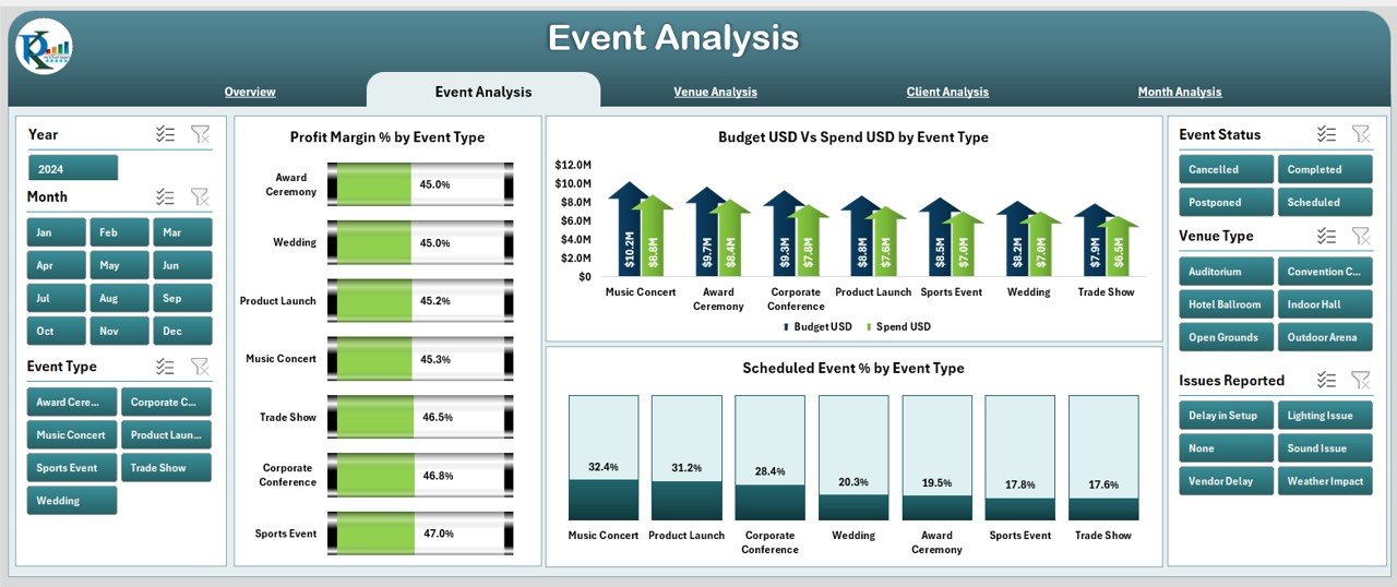
This page breaks down performance by Event Type. It helps you study which events deliver high profits, which events need improvement, and how budgets behave across different event categories.
The page includes:
-
A right-side slicer for dynamic filtering
-
3 charts that show:
-
Profit Margin % by Event Type
-
Budget vs Spend by Event Type
-
Scheduled Event % by Event Type
-
This analysis helps you improve planning and choose event types that generate better returns.
3. Venue Analysis Page
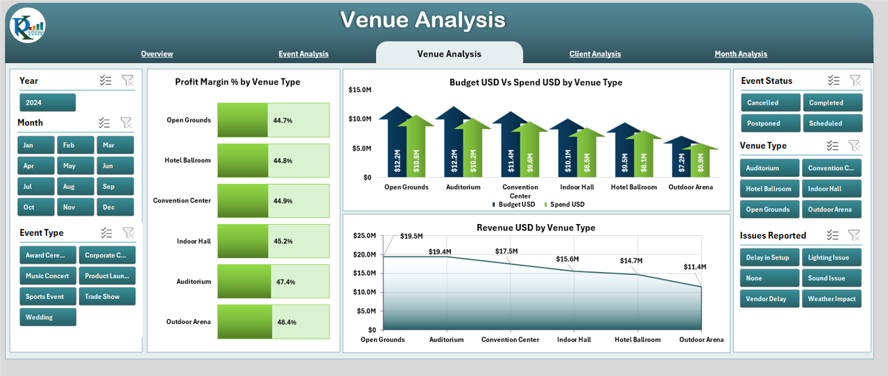
The Venue Analysis page helps you evaluate how different venues contribute to event success. Since venue selection affects cost, revenue, and customer satisfaction, these insights help teams negotiate better and choose locations wisely.
This page includes:
-
A right-side slicer
-
3 charts showing:
-
Profit Margin % by Venue Type
-
Budget vs Spend by Venue Type
-
Revenue (USD) by Venue Type
-
By comparing performance across venues, you can identify the best and worst-performing places.
4. Client Analysis Page
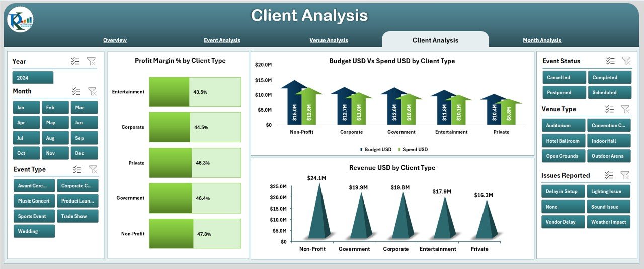
Different client types behave differently in terms of budget, expectations, and profitability. The Client Analysis page helps you understand these patterns.
It includes:
-
Right-side slicer
-
3 charts showing:
-
Profit Margin % by Client Type
-
Budget vs Spend by Client Type
-
Revenue USD by Client Type
-
This information helps you prioritize high-value clients and plan services for each segment.
5. Month Analysis Page
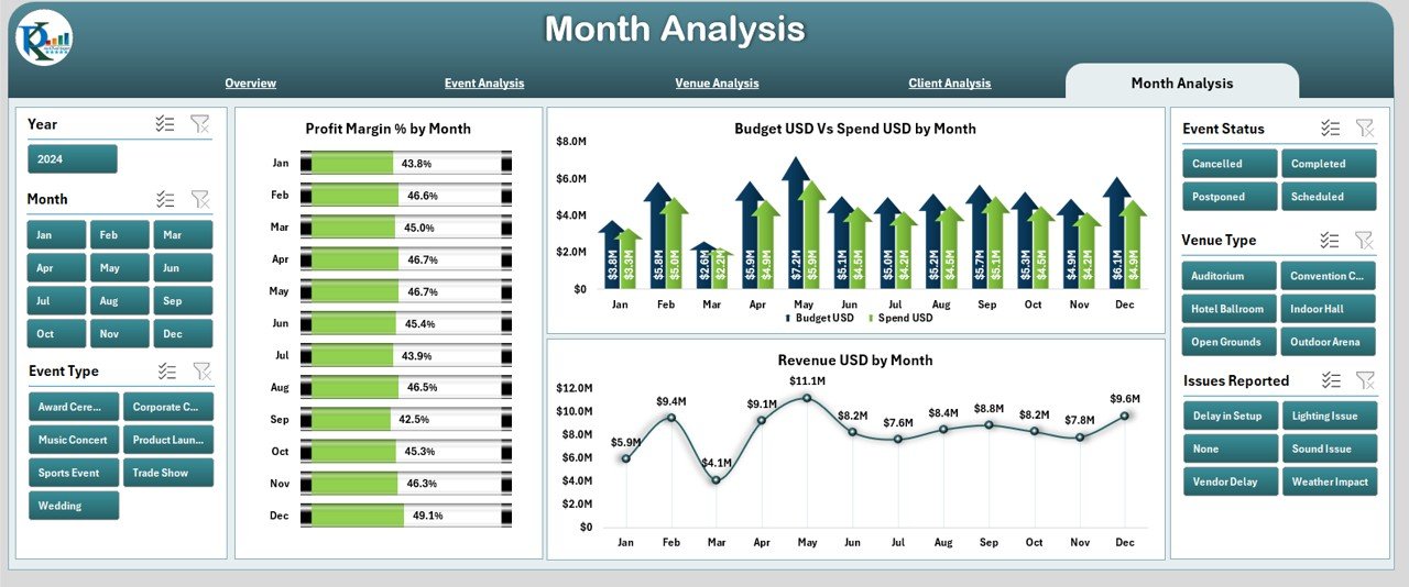
Events usually follow seasonal or monthly trends. The Month Analysis page helps you compare performance month by month.
It includes:
-
A right-side slicer
-
3 charts showing:
-
Profit Margin % by Month
-
Budget USD vs Spend USD by Month
-
Revenue USD by Month
-
You can see which months bring higher profits and which months need better planning.
Advantages of Event Production Dashboard in Excel
Using this dashboard creates strong advantages for event planners and businesses. It simplifies event reporting and improves decision-making in many ways.
1. Centralized and Organized Reporting
The dashboard stores every detail in one file. You do not need multiple sheets, tools, or manual calculations. Everything appears in one place with clear visuals.
2. Better Budget and Cost Control
You can compare Budget vs Spend in real time. This prevents overspending and keeps the event within financial limits.
3. Improved Event Planning and Execution
You get accurate insights into scheduled events, completed events, and event type performance. This helps you plan upcoming events with better clarity.
4. Clear Client and Venue Performance Insights
Client and venue analysis ensures you choose the right partners, negotiate better deals, and focus on activities that bring high returns.
5. Helps Teams Work Faster and Smarter
Since the dashboard displays clear numbers, the team does not waste time reviewing raw data. It helps them work with confidence and speed.
6. Easy to Customize and Scale
Excel dashboards allow full customization. You can change visuals, add KPIs, update slicers, include more months, or add more event types as per business needs.
Click to Purchases Event Production Dashboard in Excel
Best Practices for Using the Event Production Dashboard in Excel
To get the best results, you should follow these practices while using or customizing your dashboard.
1. Keep Data Clean and Well-Structured
Use consistent formats for dates, event types, client names, and venue names. Clean data helps the dashboard show accurate results.
2. Update the Data Regularly
Add new event information every week or month. Fresh data gives you real-time insights.
3. Use Filters and Slicers Wisely
Slicers help compare performance quickly. Use them to analyze event variations, seasons, promotions, and revenue trends.
4. Track the Budget and Spend Carefully
Budget management is the heart of event planning. Track actual spending frequently to avoid surprises.
5. Review Monthly and Yearly Trends
Use the Month Analysis page to study long-term patterns. This helps you plan promotions, pricing, and vendor decisions.
6. Customize the Dashboard for Your Event Type
You can add KPIs like:
-
Customer satisfaction
-
Vendor delays
-
Weather impact
-
Event cycle time
-
Ticket sales
This makes the dashboard match your business needs.
Conclusion
An Event Production Dashboard in Excel is an essential tool for event planners, production teams, and agencies. It helps you manage events with better accuracy, speed, and clarity. The dashboard includes multiple analysis pages that display event performance, venue insights, client patterns, and monthly trends. With clear visuals and structured reporting, event managers gain complete control over the event lifecycle.
When you use this dashboard regularly, you improve planning, reduce costs, increase profits, and deliver better event experiences. It is simple to use, easy to customize, and powerful enough to transform your event production workflow.
Frequently Asked Questions (FAQs)
1. What is an Event Production Dashboard in Excel?
It is a ready-to-use reporting file that tracks event performance, budgets, revenue, profit margins, and schedule efficiency using visuals and analytics.
2. Who should use this dashboard?
Event planners, production teams, marketing teams, freelancers, agencies, and corporate event departments can use this dashboard.
3. Does this dashboard work for small event companies?
Yes. It suits small, medium, and large event companies because it is easy to customize and scale.
4. Can I add more KPI metrics to the dashboard?
Yes. You can add more KPIs, charts, slicers, and pages as needed.
5. How often should I update the data?
You should update it weekly or monthly to get accurate and meaningful insights.
6. Does the dashboard require advanced Excel skills?
No. Basic Excel knowledge is enough because the dashboard is already designed and ready to use.
Visit our YouTube channel to learn step-by-step video tutorials
Click to Purchases Event Production Dashboard in Excel