The gig economy is transforming the global workforce at an unprecedented pace. Whether you’re managing freelance projects, ride-sharing platforms, food delivery teams, or remote contractors, the success of your operation depends on one thing—data. More specifically, how well you track and understand your Key Performance Indicators (KPIs).
That’s where the Gig Economy KPI Dashboard in Power BI becomes an essential tool. With this dynamic, Excel-powered dashboard, you can visualize performance, track trends, and drive better decisions—without writing a single line of code.
Let’s explore everything you need to know about this dashboard, from setup to benefits, best practices, and frequently asked questions.
Click to Purchases Gig Economy KPI Dashboard in Power BI
What Is the Gig Economy KPI Dashboard in Power BI?
The Gig Economy KPI Dashboard in Power BI is a plug-and-play analytics tool that helps gig economy managers, team leads, and decision-makers track key performance metrics for flexible workforces. It connects directly to Excel-based data and turns raw numbers into visual, actionable insights.
It’s ideal for platforms and teams that rely on freelancers, contractors, and independent workers.
Key Features of the Gig Economy KPI Dashboard
This dashboard contains three essential pages in Power BI:
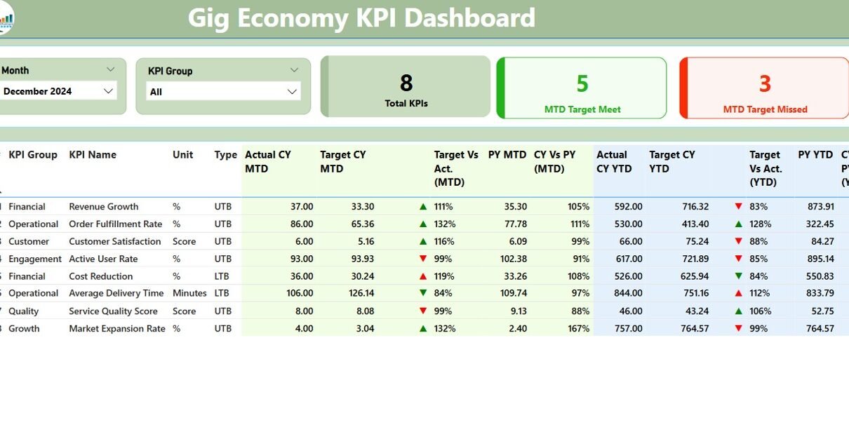
Summary Page – The Command Center for KPI Monitoring

At the top of this page, you’ll find intuitive slicers that let you filter the entire dashboard by Month and KPI Group. This means you can zero in on what matters most for your current reporting cycle.
Below the slicers, you’ll see three performance cards:
- Total KPIs Tracked
- KPIs Meeting MTD Targets
- KPIs Missing MTD Targets
The main KPI table offers:
- KPI Number
- KPI Group (e.g., Delivery, Retention, Onboarding)
- KPI Name
- Unit of measurement (e.g., %, hours, $)
- Type: UTB (Upper the Better) or LTB (Lower the Better)
- Actual CY MTD and Target CY MTD
- MTD Icon: Green ▲ or Red ▼ based on performance
- Target vs Actual (MTD) % comparison
- Previous Year (PY) MTD and CY vs PY (MTD) comparison
- Actual CY YTD, Target CY YTD, YTD Icon, and comparative figures
This layout ensures managers can instantly gauge whether service levels, average delivery times, customer satisfaction scores, or onboarding rates are hitting the mark.
Click to Purchases Gig Economy KPI Dashboard in Power BI
KPI Trend Page – Spot Trends, Not Just Numbers

The trend page helps you identify patterns over time.
With a KPI selection slicer on the left, you can drill down into any metric and review:
- MTD Trends: Actual vs. Target vs. Previous Year
- YTD Trends: All visualized in clean, color-coded combo charts
This lets you detect seasonality, spot performance dips, and uncover growth opportunities.
KPI Definition Page – Know What You’re Measuring

Understanding your metrics is as important as tracking them. This hidden drill-through page provides:
- KPI Name
- Group
- Unit
- Formula
- Type (UTB or LTB)
- Clear definition
Access this page by right-clicking on a KPI in the summary table and selecting “Drill Through.”
Click the “Back” button on the top-left to return.
Excel as the Data Engine: Simplicity Meets Power
You don’t need to be a data scientist to use this dashboard. Everything runs on a simple Excel workbook with three sheets:
1. Input_Actual Sheet

- Record Actual MTD and YTD values
- Enter data using the first day of each month as your date format
2. Input_Target Sheet

- Log MTD and YTD targets for each KPI
- Use the same date format as the Actual sheet
3. KPI_Definition Sheet

Input:
- KPI Number
- KPI Group
- KPI Name
- Unit
- Formula
- Definition
- Type (UTB or LTB)
Update your Excel file and refresh the Power BI dashboard to see real-time results.
Advantages of the Gig Economy KPI Dashboard
This dashboard is packed with features that make gig workforce management smoother and smarter:
✅ Centralized KPI Monitoring
⏳ Real-Time MTD & YTD Tracking
🔄 Performance Comparisons with Visual Indicators
🧲 Customizable Excel Inputs
🌐 Ideal for Distributed Teams
🤝 No Coding Required
Whether you’re managing hundreds of delivery partners or a small pool of freelance consultants, this dashboard helps you stay on top.
Best Practices for Using the Gig Economy Dashboard
To get the most value out of your dashboard, follow these tried-and-true tips:
🔄 Update Data Monthly: Consistency builds better insights
🌍 Use Consistent Naming Conventions: Avoid confusion across KPIs
📊 Track What Truly Matters: Don’t clutter your dashboard with low-value metrics
🏋️ Review KPI Trends Regularly: Monthly reviews lead to faster adjustments
✅ Train Team Members on Interpretation: Make sure everyone knows how to read the dashboard
Frequently Asked Questions (FAQs)
1. Who should use this dashboard?
Gig platform managers, HR leads, operations teams, and project owners managing flexible or contract-based workers.
2. Do I need Power BI Pro to use this?
No, you can use Power BI Desktop for free. You only need Power BI Pro if you’re sharing dashboards online.
3. Can I add more KPIs later?
Yes! Simply update the Excel sheets with new KPI rows and refresh the dashboard.
4. Is this dashboard suitable for remote teams?
Absolutely. It’s perfect for gig-based, remote-first, or hybrid work models.
5. Can I translate the dashboard into other languages?
Yes, you can localize the Excel file and Power BI visuals to suit different regions.
Conclusion
The gig economy isn’t slowing down—and neither should your performance tracking. With the Gig Economy KPI Dashboard in Power BI, you can move from reactive guesswork to proactive management.
Designed with ease, flexibility, and impact in mind, this dashboard turns your workforce data into real-time insights that drive results.
Click to Purchases Gig Economy KPI Dashboard in Power BI
Visit our YouTube channel to learn step-by-step video tutorials