In the modern design world, creativity and analytics must go hand in hand. While graphic design celebrates imagination, visual aesthetics, and brand storytelling, data helps measure the true impact of design decisions. The Graphic Design Dashboard in Power BI bridges this gap beautifully — combining the power of business intelligence with the art of design management.
This article explores everything about the Graphic Design Dashboard in Power BI — from its structure, pages, and KPIs to its advantages, best practices, and frequently asked questions. Whether you’re a creative agency owner, project manager, or freelance designer, this dashboard will help you track progress, optimize workflows, and improve client satisfaction — all through powerful visuals.
Click to Purchases Graphic Design Dashboard in Power BI
What Is a Graphic Design Dashboard in Power BI?
A Graphic Design Dashboard in Power BI is an interactive reporting tool built specifically for creative teams, design studios, and marketing agencies. It allows users to track the performance of design projects, monitor client satisfaction, analyze budgets, and evaluate designer productivity — all in one centralized platform.
Built using Microsoft Power BI, this dashboard connects seamlessly with Excel or other data sources. It transforms static data into dynamic visuals, making it easy to analyze creative operations in real time. By visualizing key performance indicators (KPIs), managers can quickly identify which projects perform best, which departments need improvement, and how efficiently resources are being used.
Unlike complex enterprise tools, this dashboard is simple, intuitive, and completely customizable — ideal for teams who value both creativity and clarity.
Structure of the Graphic Design Dashboard in Power BI
The Graphic Design Dashboard is organized into five main pages, each focusing on a different aspect of design management. Let’s explore them one by one.
1. Overview Page
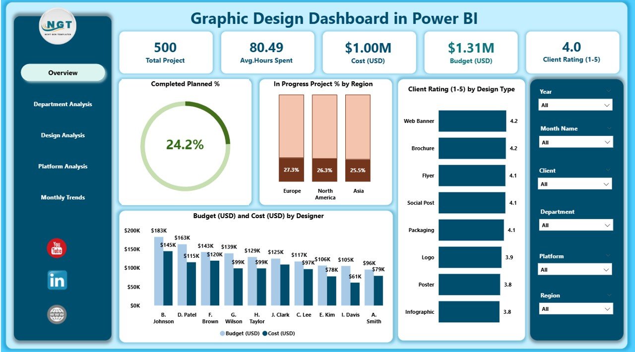
The Overview Page serves as the main control center of the dashboard. It offers a high-level summary of design performance through key metrics and interactive visuals.
Key Highlights:
-
Five KPI Cards showing important metrics such as Completed Planned %, In-Progress Projects %, Client Rating (1–5), Budget (USD), and Cost (USD).
-
Four Charts providing visual insights into:
-
Completed Planned % by Region
-
In-Progress Project % by Region
-
Client Rating by Design Type
-
Budget and Cost by Designer
-
This page helps you instantly evaluate project health, performance distribution across regions, and overall client satisfaction. It’s perfect for senior management who need a quick visual summary.
2. Department Analysis Page
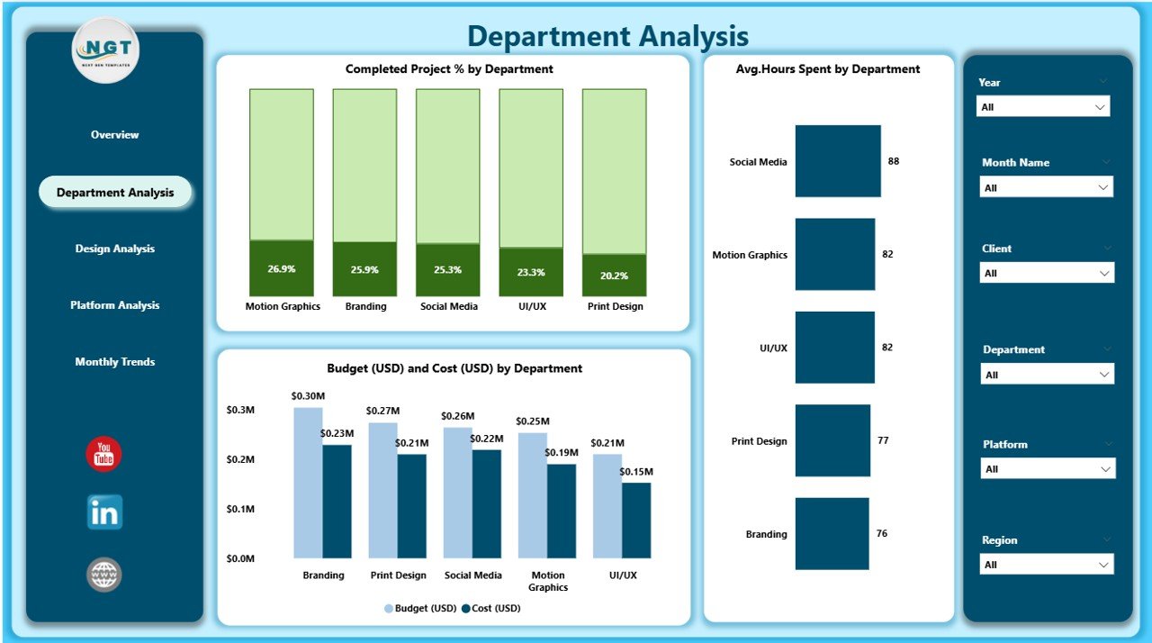
The Department Analysis Page focuses on understanding how different design departments perform in terms of productivity, efficiency, and financial outcomes.
Key Charts:
-
Completed Planned % by Department
-
Budget (USD) vs. Cost (USD) by Department
-
Average Hours Spent by Department
Click to Purchases Graphic Design Dashboard in Power BI
This page allows you to compare workloads between teams, track departmental costs, and ensure optimal resource allocation. For example, if the branding department consistently exceeds budget, managers can identify root causes and take corrective action.
3. Design Analysis Page
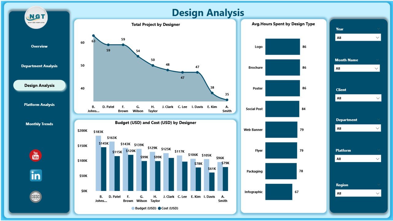
This section dives deeper into the creative process itself — examining designers, design types, and project volume.
Included Visuals:
-
Total Projects by Designer
-
Average Hours Spent by Design Type
-
Budget (USD) and Cost (USD) by Designer
This page is particularly useful for performance appraisals and efficiency reviews. Managers can analyze which designers handle more projects, which design types consume the most time, and where budget optimizations can be made.
4. Platform Analysis Page
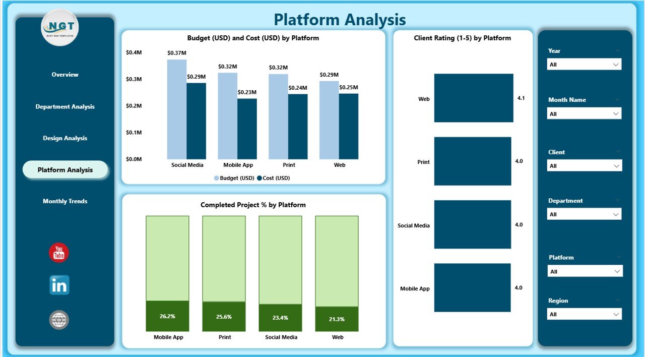
In today’s digital world, designs appear across multiple platforms — web, print, mobile, and social media. The Platform Analysis Page helps track how projects perform across these channels.
Key Charts:
-
Budget and Cost by Platform
-
Completed Planned % by Platform
-
Client Rating (1–5) by Platform
This analysis reveals which platforms deliver the best ROI. For example, if social media design projects have high client ratings but low costs, agencies can prioritize that niche for profitability.
5. Monthly Trends Page
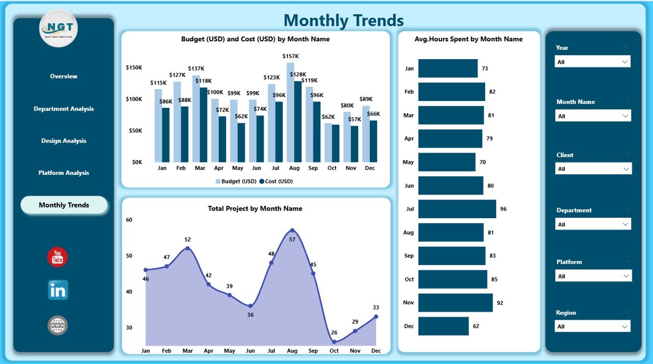
Every business needs to track progress over time. The Monthly Trends Page showcases month-by-month design metrics to identify trends, growth patterns, and seasonal variations.
Included Charts:
-
Budget and Cost (USD) by Month
-
Total Projects by Month
-
Average Hours Spent by Month
This time-based view helps managers forecast budgets, set performance targets, and spot recurring workload peaks.
Why Do You Need a Graphic Design Dashboard in Power BI?
Creative agencies handle dozens of design projects, each with unique clients, platforms, and budgets. Managing them manually often leads to confusion, delays, and inefficiency.
With a Power BI Dashboard, you can:
-
Centralize all project data in one place.
-
Monitor deadlines, costs, and progress visually.
-
Make faster, data-driven creative decisions.
-
Identify bottlenecks in real time.
-
Improve accountability across teams.
Essentially, this dashboard turns subjective creativity into measurable business success.
Advantages of the Graphic Design Dashboard in Power BI
The advantages of using this dashboard go beyond visual reporting. It transforms how design teams operate and make decisions.
1. Centralized Information
All key project data — timelines, budgets, client ratings, and designer workloads — appear in one unified workspace. You no longer need to search through multiple Excel sheets.
2. Real-Time Monitoring
With Power BI’s live connection to Excel or other data sources, your dashboard updates automatically. This ensures that all metrics reflect real-time performance.
3. Data-Driven Decisions
By visualizing KPIs, you can evaluate which projects perform well and which need improvement. This helps in allocating resources more effectively.
4. Enhanced Client Transparency
You can share reports with clients to show progress and justify budgets. Visual dashboards improve trust and client satisfaction.
5. Time and Cost Optimization
Tracking the actual cost versus budget helps reduce wastage and optimize designer time.
6. Improved Team Collaboration
Each department and designer can access tailored dashboards that display only relevant data — promoting transparency and accountability.
7. Scalable and Customizable
The dashboard can grow with your organization. You can easily add new KPIs, departments, or visuals as your operations expand.
Click to Purchases Graphic Design Dashboard in Power BI
How to Use the Graphic Design Dashboard Effectively
To get the most from this dashboard, follow a few simple steps:
-
Connect Your Data Source
Link the Power BI file to your Excel or database containing project details. -
Refresh Data Regularly
Keep your data current to maintain real-time accuracy. -
Use Slicers for Quick Filtering
Explore performance by designer, region, or platform using slicers for dynamic filtering. -
Analyze Department-Wise Results
Identify which teams or individuals drive the most value. -
Share Insights Across Teams
Export visuals or share dashboards with stakeholders for collaboration.
Best Practices for the Graphic Design Dashboard in Power BI
To ensure your dashboard delivers maximum value, consider these best practices:
1. Keep It Visually Balanced
Avoid cluttered visuals. Use clean charts, consistent colors, and meaningful icons.
2. Update Data Regularly
A dashboard is only as good as its data. Set automatic refresh schedules to ensure information stays current.
3. Highlight Key Metrics
Use KPI cards or color codes to emphasize important figures like budget variance or completion rate.
4. Simplify Navigation
Add page buttons or a navigation pane to help users move easily between dashboard pages.
5. Use Conditional Formatting
Apply up-down arrows, color indicators, or progress bars to make trends instantly visible.
6. Combine Quantitative and Qualitative Data
Don’t just focus on numbers — include client ratings, feedback, and qualitative insights for a complete view.
7. Encourage Collaboration
Enable shared access for team members and clients to view the same reports in real time.
8. Protect Sensitive Data
Use Power BI’s role-level security to control who can view or edit certain visuals.
9. Focus on Continuous Improvement
Review your dashboard layout and KPIs periodically to ensure they align with evolving business goals.
How Power BI Enhances Creative Decision-Making
Power BI isn’t just a data visualization tool; it’s a strategic companion for decision-making in creative industries.
Here’s how it elevates design management:
-
Visual Clarity: Converts complex datasets into clear, interactive visuals.
-
Insight Discovery: Highlights hidden patterns like seasonal demand or client preferences.
-
Performance Comparison: Allows quick comparisons between designers or departments.
-
Forecasting: Helps predict upcoming project loads and future budget requirements.
-
Automation: Eliminates manual data handling, saving time for creative work.
With Power BI, design leaders gain both a macro and micro understanding of their business — enabling smarter creative and financial decisions.
How to Customize the Dashboard for Your Agency
Every creative agency is unique. You can tailor the Graphic Design Dashboard by:
-
Adding custom KPIs like Revisions per Project, Turnaround Time, or Client Retention Rate.
-
Modifying visuals to match your brand colors and design identity.
-
Integrating data from other tools such as Trello, Asana, or Google Sheets.
-
Adding role-specific dashboards (for Designers, Project Managers, and Finance teams).
-
Setting up alerts for overdue projects or budget overruns.
This flexibility ensures your dashboard reflects your creative culture and operational goals.
Real-World Applications of the Graphic Design Dashboard
-
Creative Agencies: Track project timelines, client satisfaction, and profit margins.
-
Freelancers: Monitor personal productivity, hours spent, and client feedback.
-
Corporate Marketing Teams: Measure design efficiency across campaigns and departments.
-
Educational Institutions: Manage design coursework, student output, and quality benchmarks.
Regardless of scale, this dashboard empowers every creative professional to visualize success.
Conclusion
The Graphic Design Dashboard in Power BI is more than just a reporting tool — it’s a performance compass for creative professionals. It simplifies project tracking, boosts transparency, and ensures every design initiative contributes to measurable success.
By combining Power BI’s analytics capabilities with the creative pulse of graphic design, teams can finally achieve the perfect balance between art and intelligence. Whether you’re managing multiple clients, departments, or design platforms, this dashboard helps you stay informed, efficient, and inspired.
Frequently Asked Questions (FAQs)
1. Who can use the Graphic Design Dashboard in Power BI?
Design studios, freelancers, marketing agencies, and even corporate design departments can use this dashboard to track and analyze their creative operations.
2. Can I connect this dashboard with Excel data?
Yes. The dashboard is designed to pull real-time data from Excel files or other compatible sources.
3. What types of KPIs can be added to the dashboard?
You can include KPIs such as project completion rate, client satisfaction score, total cost, budget variance, and average design time.
4. Is this dashboard customizable?
Absolutely. You can modify visuals, colors, KPIs, and even data connections to suit your organization’s needs.
5. How often should I update the data?
For best results, refresh your data weekly or set an automatic update schedule in Power BI.
6. Do I need technical knowledge to use this dashboard?
No advanced skills are required. Power BI’s drag-and-drop interface makes it simple for non-technical users to navigate.
7. Can I share this dashboard with clients?
Yes, Power BI allows secure sharing through dashboards or reports with view-only access for clients.
8. How does this dashboard help with budget management?
It visually compares budgeted and actual costs, helping you manage project profitability more effectively.
Visit our YouTube channel to learn step-by-step video tutorials