Insurance companies handle thousands of claims every month. Every claim includes policy details, customer information, documents, payout amounts, broker data, and country-wise records. Because the process includes so many steps, even one small mistake slows everything down. Therefore, insurance companies now rely on digital dashboards to monitor claims in real time. One of the best tools for this job is the Insurance Claim Dashboard in Power BI.
This dashboard brings all insurance claim KPIs into one single view. It also gives complete visibility into claims, premiums, commissions, policy lapse trends, customer satisfaction, regional analysis, and monthly claim behavior. As a result, insurance teams make fast, data-driven decisions with confidence.
In this article, you will learn everything about the Insurance Claim Dashboard in Power BI, including features, structure, benefits, best practices, and how the different pages work.
Let’s begin.
Click to Purchases Insurance Claim Dashboard in Power BI
What Is an Insurance Claim Dashboard in Power BI?
An Insurance Claim Dashboard in Power BI is a visual reporting system that tracks and analyzes all important insurance KPIs. It pulls structured data related to claims, brokers, policy types, commission, and customer satisfaction. Then, it displays these numbers in charts, cards, tables, and filters.
This dashboard includes five interactive pages, each designed to give a different level of detail:
✔ Overview Page
✔ Broker Name Analysis
✔ Policy Type Analysis
✔ Country Analysis
✔ Monthly Trends
Each page helps insurance teams understand performance clearly without running multiple manual reports.
Why Insurance Companies Need a Claim Dashboard
Insurance claim management becomes stressful when the team does not have the right insights. Claims might take longer to settle. Customers may face delays. Fraud may increase. Policies may lapse without any early warning.
But when companies use a Power BI dashboard, they solve these challenges easily.
You need this dashboard because:
-
It offers complete visibility of every claim.
-
It tracks trends for policies, payouts, and satisfaction ratings.
-
It helps identify the best brokers and high-performing regions.
-
It highlights claim delays instantly.
-
It helps compare present performance with past data.
-
It reduces manual reporting and saves time.
Because the dashboard updates automatically, teams always look at real-time data.
Click to Purchases Insurance Claim Dashboard in Power BI
Key Features of the Insurance Claim Dashboard in Power BI
Now let’s explore each page of the dashboard in detail.
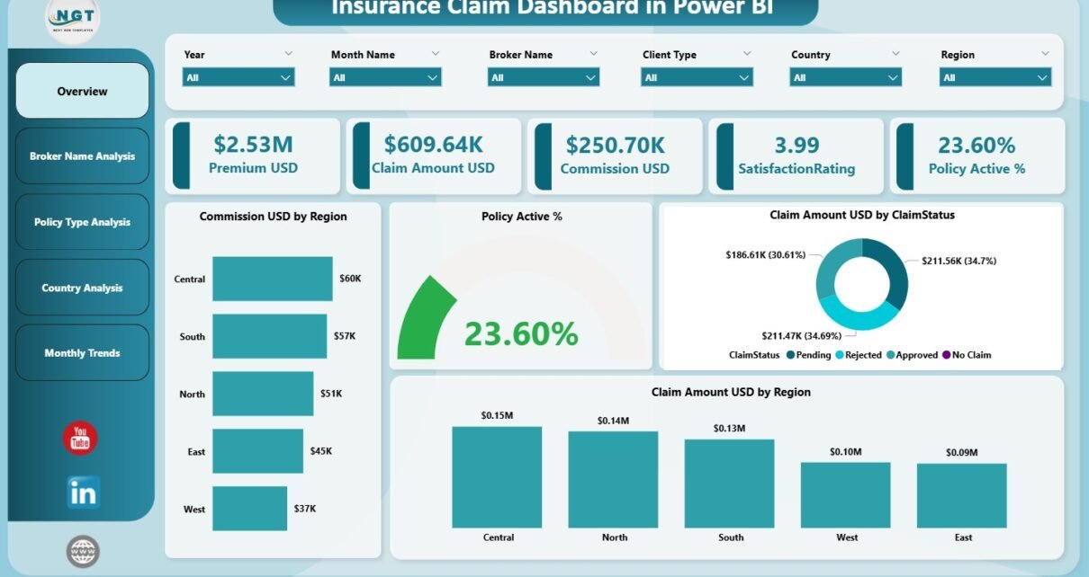
1. Overview Page – Your Main Performance Screen
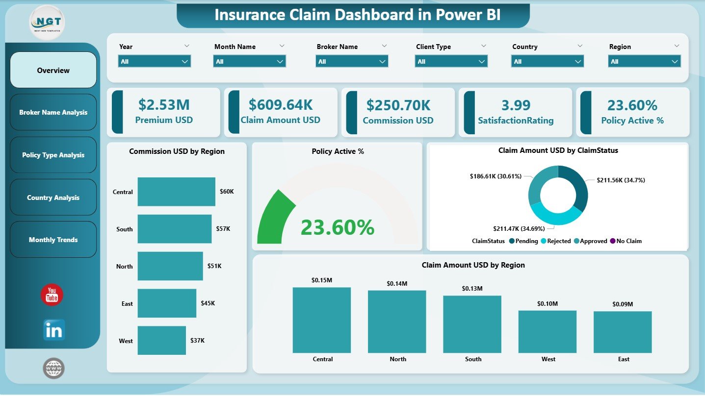
The Overview Page acts as the control center of the entire dashboard. It provides a high-level view of all claim-related activities.
Visuals Included on the Overview Page
✔ Five KPI Cards
These cards appear at the top and display key metrics such as:
-
Policy Active %
-
Total Claim Amount (USD)
-
Commission Amount (USD)
-
Number of Claims
-
Overall Satisfaction Rating
The cards show instant performance insights for decision-makers.
✔ Four Powerful Charts
The Overview page includes four main visuals:
⭐ 1. Policy Active %
Shows how many policies stay active compared to expired or lapsed ones.
⭐ 2. Claim Amount (USD) by Claim Status
Displays amounts for approved, rejected, pending, or under-review claims.
⭐ 3. Commission (USD) by Region
Helps identify which regions generate the highest commission.
⭐ 4. Claim Amount (USD) by Region
Shows geographical claim volume and payout distribution.
Because of these charts, users understand the organization’s overall health immediately.
Click to Purchases Insurance Claim Dashboard in Power BI
2. Broker Name Analysis – Track Broker Performance
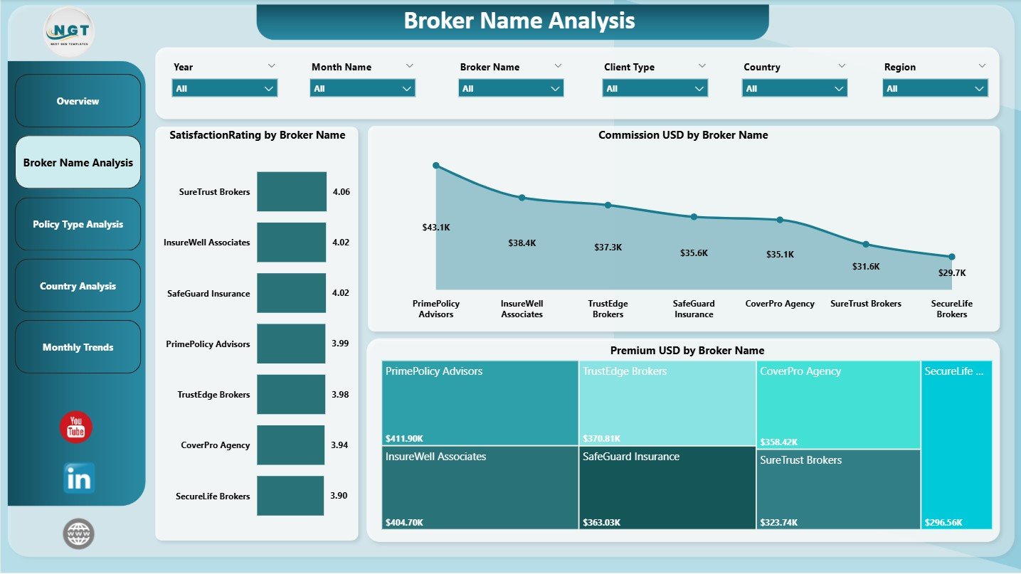
Brokers play a central role in insurance sales and claims. The dashboard includes a full page dedicated to broker analysis.
It includes three important visuals:
✔ 1. Commission (USD) by Broker Name
Shows which brokers contribute the most commission to the company.
✔ 2. Satisfaction Rating by Broker Name
Tracks customer satisfaction for claims handled by each broker.
✔ 3. Premium (USD) by Broker Name
Shows how much premium each broker brings in.
This page helps insurance teams:
-
Identify top performers
-
Detect poor-performing brokers
-
Improve training and support
-
Reward the best brokers
Because broker performance directly affects customer experience, this page becomes extremely helpful.
Click to Purchases Insurance Claim Dashboard in Power BI
3. Policy Type Analysis – Understand Which Policies Perform Best
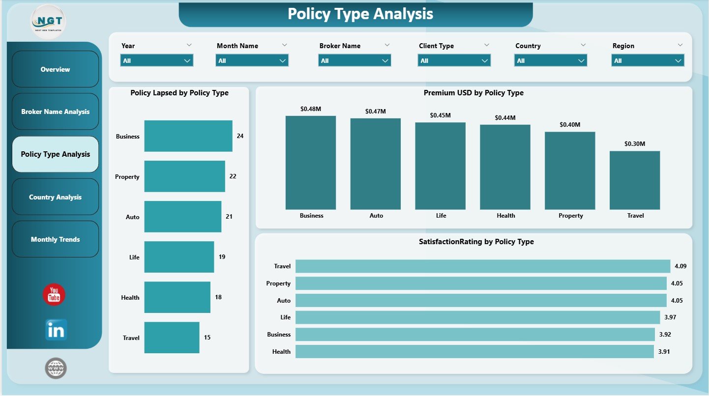
Different policies create different results. For example, health, motor, travel, fire, and life policies behave differently in terms of premium, lapses, satisfaction, and claims.
This page shows three visuals:
✔ 1. Premium (USD) by Policy Type
Helps compare revenue generated by each policy category.
✔ 2. Policy Lapsed by Policy Type
Identifies policy types with high lapse rates.
✔ 3. Satisfaction Rating by Policy Type
Shows customer experience across policy categories.
Because policy behavior changes often, this page helps insurance teams understand trends and improve policy performance.
4. Country Analysis – Track Regional Performance
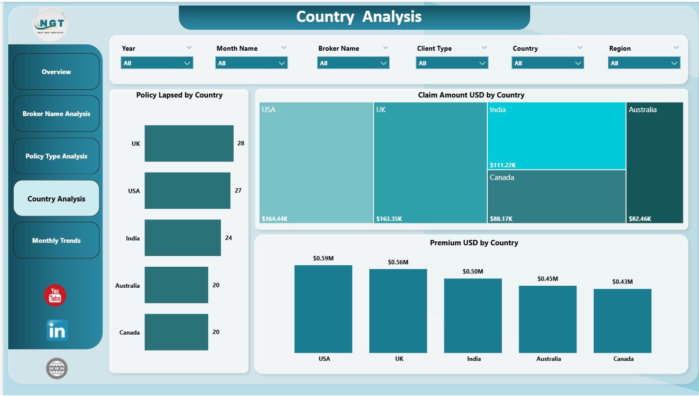
The Country Analysis page gives deep insights into geographic claim behavior.
It includes three visuals:
✔ 1. Claim Amount (USD) by Country
Highlights countries with higher or lower claim amounts.
✔ 2. Policy Lapsed by Country
Shows which countries experience more lapsed policies.
✔ 3. Premium (USD) by Country
Tracks where the company receives the highest premium collections.
This page helps insurance companies:
-
Expand in the right areas
-
Improve support in low-performing regions
-
Adjust claim strategies for high-loss areas
It also helps identify fraud-prone regions or areas with unusual claim spikes.
Click to Purchases Insurance Claim Dashboard in Power BI
5. Monthly Trends – Understand Month-wise Performance
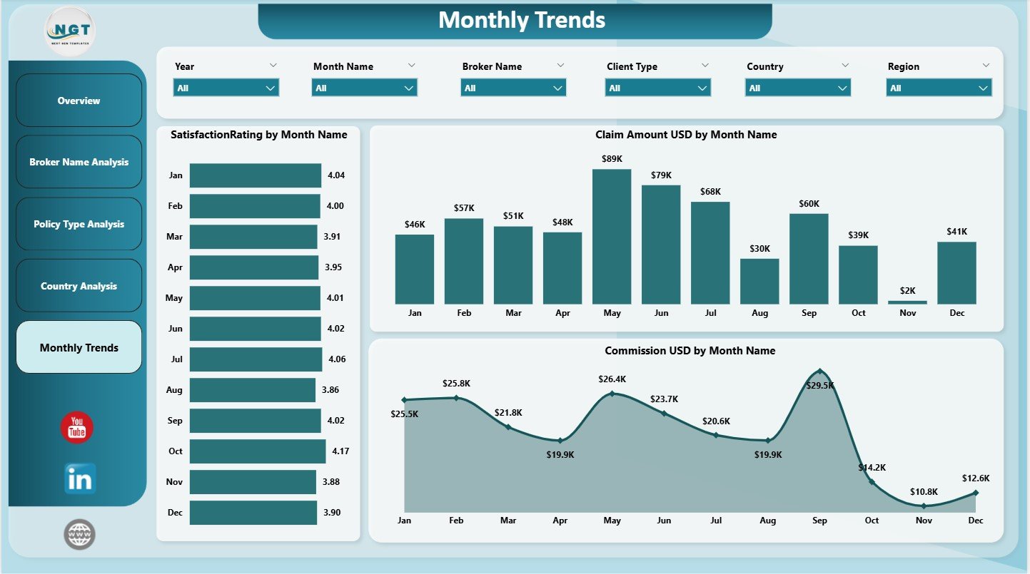
The Monthly Trends page shows how important KPIs move throughout the year.
It includes three combo charts:
✔ 1. Claim Amount (USD) by Month Name
Shows claim amounts and identifies patterns in claim seasonality.
✔ 2. Satisfaction Rating by Month Name
Shows customer service performance each month.
✔ 3. Commission (USD) by Month Name
Tracks commission trends across months.
This page helps teams analyze:
-
Seasonal claim spikes
-
Monthly dips in satisfaction
-
Premium and commission changes
-
Month-wise policy behavior
Because the dashboard presents trends clearly, leaders make better long-term planning decisions.
Click to Purchases Insurance Claim Dashboard in Power BI
Advantages of the Insurance Claim Dashboard in Power BI
The dashboard offers several strong benefits.
1. Easy and Quick Decision-Making
The dashboard shows important KPIs instantly. Leaders do not depend on manual reports or spreadsheets.
2. Clear Claim Transparency
Users understand claim types, status, and payout behavior more easily.
3. Strong Broker Monitoring
The dashboard highlights high-performing and low-performing brokers. This supports better sales and claim strategies.
4. Better Customer Satisfaction Tracking
It displays monthly and policy-level satisfaction ratings that help improve service delivery.
5. Regional and Country-Wise Insights
Managers identify high-risk or high-potential regions easily.
6. Accurate Trend Analysis
MTD and monthly trends help detect unusual claim behavior early.
7. Improved Policy Management
It becomes simple to identify policy types with high lapses, low satisfaction, or low premiums.
Click to Purchases Insurance Claim Dashboard in Power BI
How to Build an Insurance Claim Dashboard in Power BI
Let’s understand the step-by-step process.
Step 1: Collect All Data Sources
Prepare datasets for:
-
Claims
-
Brokers
-
Premiums
-
Commissions
-
Policy Types
-
Regions
-
Dates
Step 2: Clean and Transform Data in Power Query
Remove:
-
Duplicates
-
Null values
-
Spelling errors
Add calculated fields if needed.
Step 3: Build Data Model
Create relationships between:
-
Claims table
-
Broker table
-
Policy table
-
Region table
-
Calendar table
Step 4: Create DAX Measures
Build measures such as:
-
Total Claim Amount
-
Total Premium
-
Total Commission
-
Policy Active %
-
Satisfaction Rating
-
Claim Count
Step 5: Design the Overview Page
Add:
-
KPI cards
-
Bar charts
-
Pie charts
-
Slicers
Step 6: Create the Broker, Policy, and Country Pages
Add:
-
Clustered bars
-
Line charts
-
Matrix visuals
-
Filters
Step 7: Build the Monthly Trends Page
Use combo charts to compare multiple KPI values over months.
Click to Purchases Insurance Claim Dashboard in Power BI
Best Practices for the Insurance Claim Dashboard in Power BI
1. Use Clean and Simple Layouts
Avoid clutter. Keep the visuals minimal and meaningful.
2. Use Consistent Colors
Example:
-
Green for positive performance
-
Red for negative trends
3. Refresh Data Regularly
Always use up-to-date claim and policy data.
4. Group KPIs Smartly
Keep KPIs under correct categories like:
-
Claims
-
Region
-
Policy Type
-
Broker Performance
5. Add Clear Filters
Filters improve user experience and allow quick comparisons.
Conclusion
The Insurance Claim Dashboard in Power BI offers a complete and smart way to monitor claims, policies, brokers, regions, and customer satisfaction. Because the dashboard presents clear visuals and meaningful KPIs, insurance companies gain better control, faster insights, and improved service quality.
With five pages—Overview, Broker Analysis, Policy Type Analysis, Country Analysis, and Monthly Trends—the dashboard becomes a powerful tool for insurance analytics. If your team wants a modern, accurate, and real-time claim management system, this dashboard is the perfect solution.
Click to Purchases Insurance Claim Dashboard in Power BI
Frequently Asked Questions (FAQs)
1. What is an Insurance Claim Dashboard in Power BI?
It is a visual dashboard that tracks claim amounts, policy status, broker performance, satisfaction rating, and premiums.
2. How many pages does this dashboard include?
Five pages: Overview, Broker Analysis, Policy Type Analysis, Country Analysis, and Monthly Trends.
3. Can I customize the dashboard?
Yes, you can add new KPIs, visuals, or data fields.
4. Does it support region-wise analysis?
Yes, the dashboard includes a full Country Analysis page.
5. Is this dashboard suitable for small insurance teams?
Yes, it works for both small and large companies.
6. Does it show seasonality trends?
Yes, the Monthly Trends page shows clear month-wise patterns.
Click to Purchases Insurance Claim Dashboard in Power BI
Visit our YouTube channel to learn step-by-step video tutorials