Insurance Tech Startups Dashboard in Excel is a ready-to-use workbook for tracking insurtech startup funding, policies sold, active policies, claims processed, claim payouts, premium revenue, operating cost, burn rate, and market-fit signals. The template includes 7 worksheet tabs, 5 dashboard pages, 5 executive KPI cards, multiple slicers, chart-based analysis, a Data Sheet, and a Support Sheet with pivot tables. Instead of rebuilding monthly reports from scattered policy, claims, funding, and operating-cost files, teams can update the Data Sheet, refresh the workbook, and review the dashboard pages in minutes.
Excel remains a practical reporting layer for many startup and insurance teams because it is widely available, editable, and easy to share through Microsoft 365. Microsoft also documents Excel slicers as a way to filter table and PivotTable data visually, which is exactly the kind of quick filtering used in dashboard-style workbooks. Reference: Microsoft Support on using slicers to filter data.
Click here to purchase Insurance Tech Startups Dashboard in Excel
Key Features of Insurance Tech Startups Dashboard in Excel
- Overview Page: High-level cards and charts for claims, policies, funding stage, startup status, revenue, and operating cost.
- Funding Page: Funding raised by region, operating cost by business model, funding by startup, and policies sold by month.
- Growth Page: Premium revenue, active policies, policy sales, and claims processed by customer, product, and segment dimensions.
- Claims Page: Claim payout by region, burn rate by product type, startup count by business model, and revenue/cost by status.
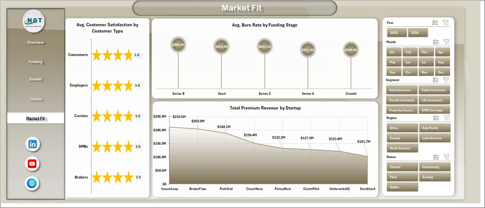
- Market Fit Page: Customer satisfaction, burn rate by funding stage, and premium revenue by startup.
- Data Sheet: Add your own records in the same format to keep dashboard calculations connected.
- Support Sheet: Pivot tables power the dashboard and can be hidden after setup.
Dashboard Pages Explanation
1. Overview Page
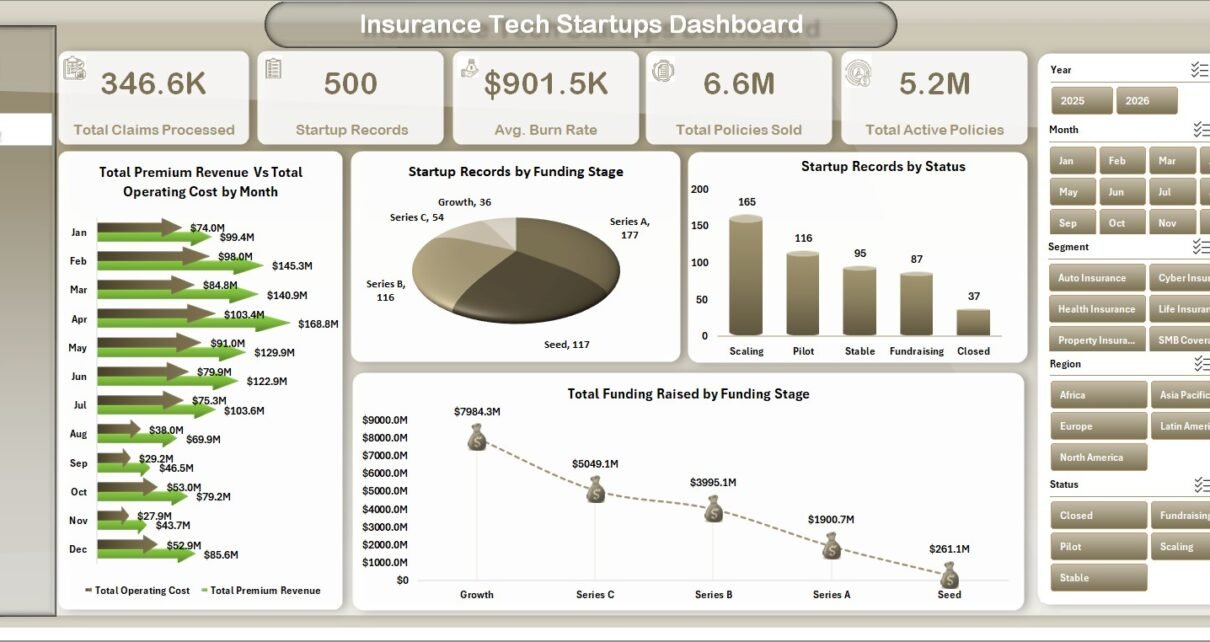
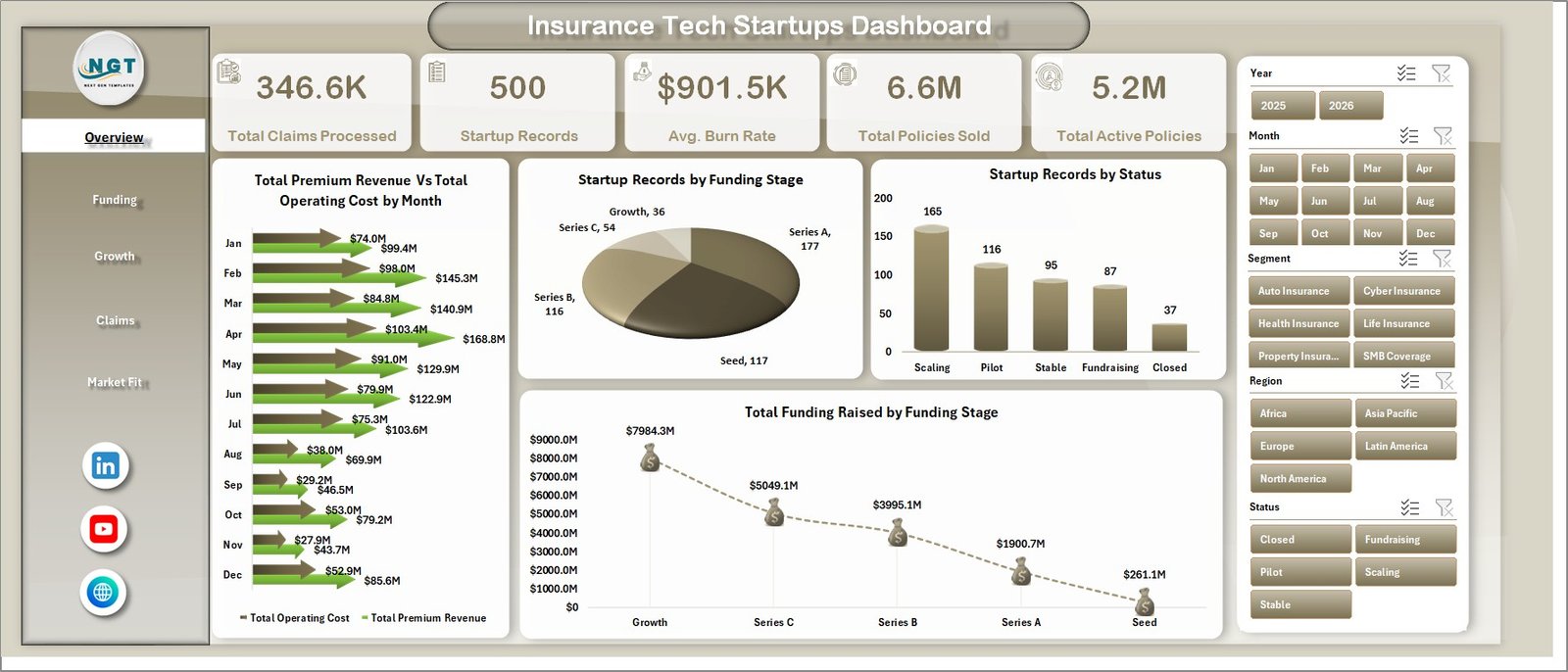
The Overview Page gives a high-level summary of insurance tech startup performance. At the top, cards show Total Claims Processed, Startup Records, Avg. Burn Rate, Total Policies Sold, and Total Active Policies. These cards help leaders scan activity, operational scale, and portfolio size quickly.
Total Premium Revenue and Total Operating Cost by Month: This chart compares revenue and cost month by month. It helps teams see whether premium growth is moving ahead of operating cost or whether spending is increasing faster than revenue.
Startup Records by Funding Stage: This chart shows how startup records are distributed across funding stages. It helps investors, accelerators, and founders understand whether the dataset is weighted toward early, growth, or later-stage companies.
Startup Records by Status: This visual groups startup records by status. It helps users compare active, scaling, inactive, or other status categories in one view.
Total Funding Raised by Funding Stage: This chart shows where total raised capital is concentrated. It helps users identify the stages attracting the largest investment value.
Click here to purchase Insurance Tech Startups Dashboard in Excel
2. Funding
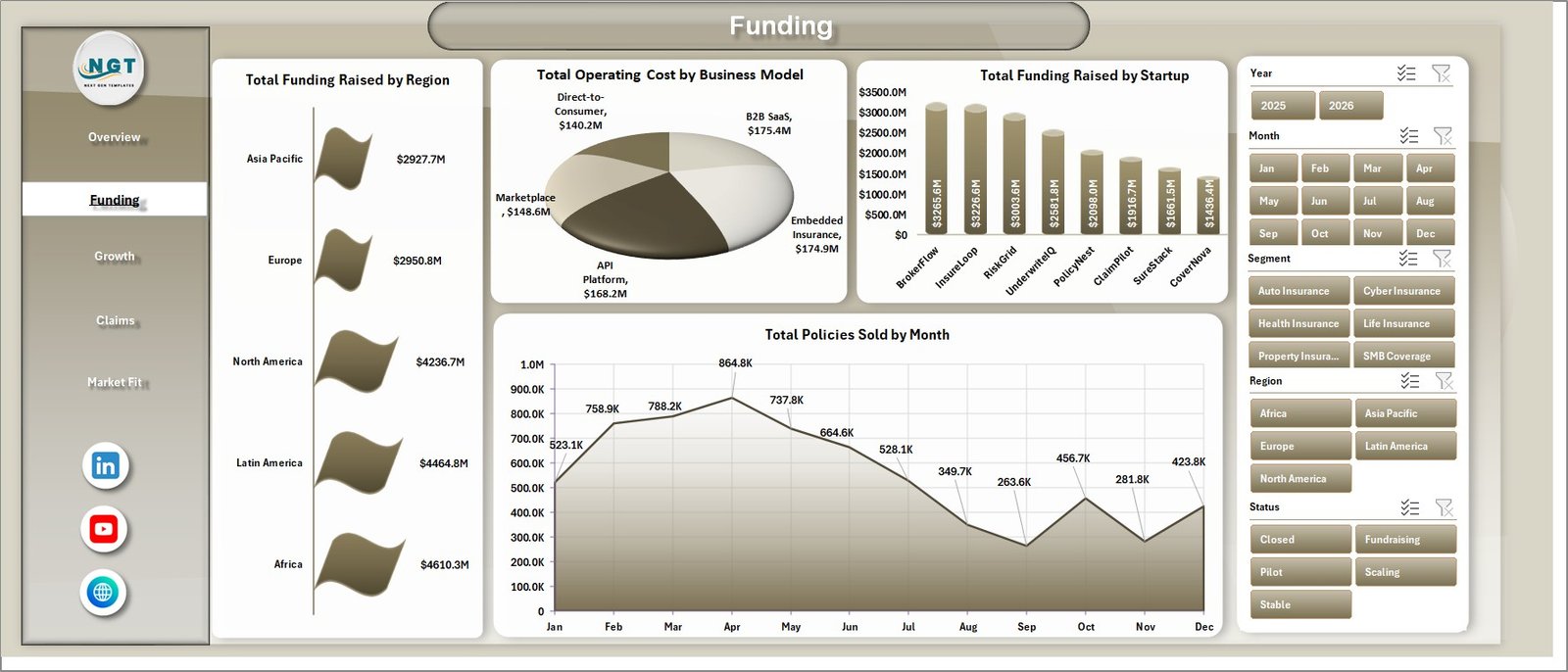
The Funding page focuses on fundraising, operating cost, startup-level funding, and monthly policy sales. It is useful for startup founders, venture teams, accelerators, and analysts who want to compare capital raised against business model and commercial activity.
Total Funding Raised by Region: This chart compares funding across regions. It helps identify strong geographic markets and regions that may need additional sales, investor, or partnership attention.
Total Operating Cost by Business Model: This visual compares operating cost across business models. It helps teams understand which insurtech models are more cost-intensive.
Total Funding Raised by Startup: This chart ranks startups by funding raised. It is helpful for portfolio benchmarking and startup-level fundraising review.
Total Policies Sold by Month: This chart tracks policy sales over time. It helps users spot growth patterns, seasonal changes, and underperforming months.
3. Growth
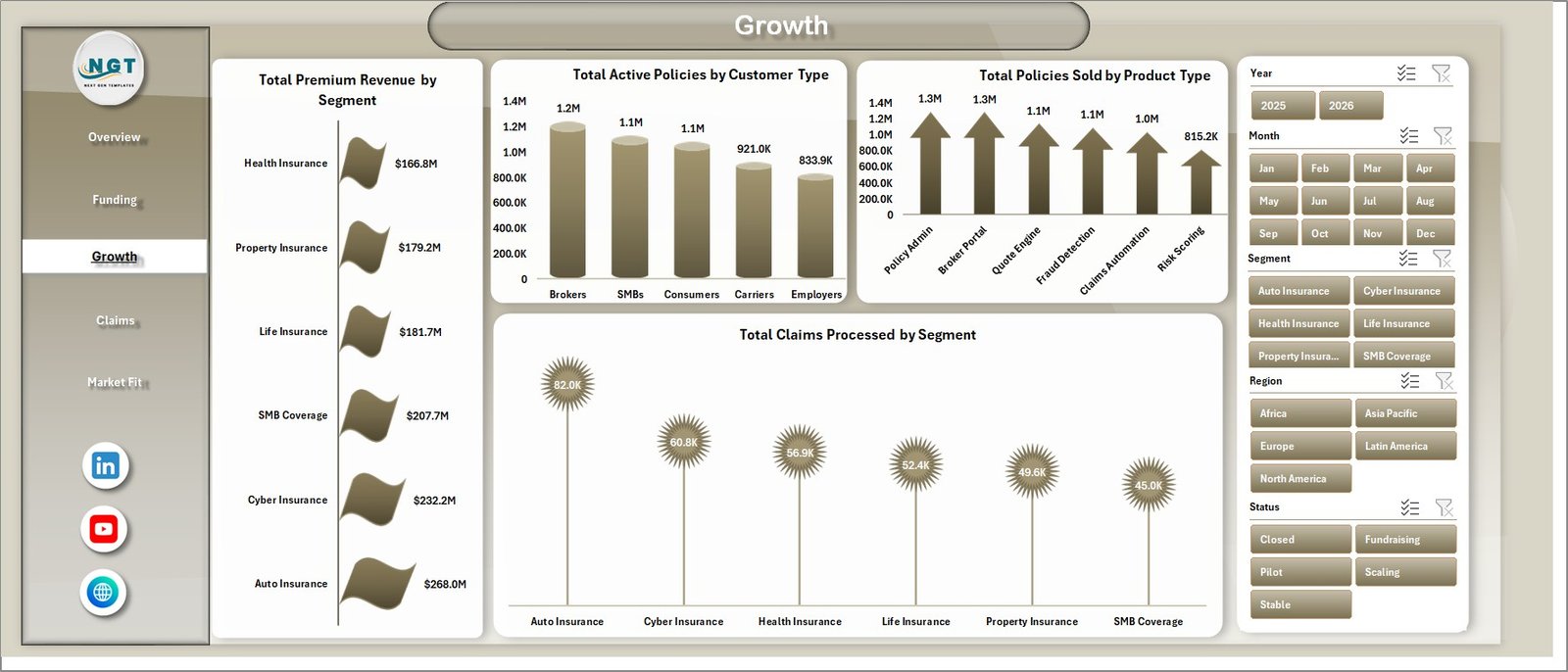
The Growth page is designed for tracking commercial traction and operational workload. It connects premium revenue, active policies, policy sales, and claims processed to customer and product dimensions.
Total Premium Revenue by Segment: This chart compares premium revenue by segment. It helps users identify which customer or market segments are driving the most revenue.
Total Active Policies by Customer Type: This visual shows active policies by customer type. It helps evaluate where the active policy base is concentrated.
Total Policies Sold by Product Type: This chart compares policy sales across insurance product types. It helps product and sales teams see which products are gaining stronger traction.
Total Claims Processed by Segment: This visual compares claims workload by segment. It helps link growth with servicing demand.
4. Claims
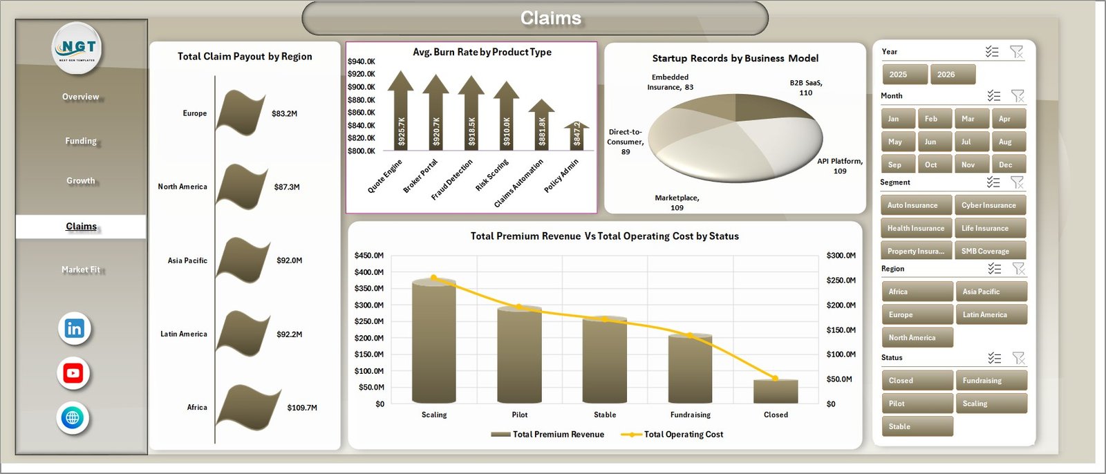
The Claims page supports claims and cost review. It combines regional claim payout, burn rate, business model mix, and premium revenue versus operating cost by status.
Total Claim Payout by Region: This chart compares claim payout across regions. It helps identify geographies with heavier claims exposure.
Avg. Burn Rate by Product Type: This visual shows average burn rate by insurance product type. It helps founders and analysts see where cost pressure is higher.
Startup Records by Business Model: This chart shows startup distribution by business model. It helps users understand the shape of the startup dataset.
Total Premium Revenue and Total Operating Cost by Status: This visual compares revenue and cost by startup status. It helps assess whether active or scaling startup groups are generating enough premium revenue against operating cost.
Click here to purchase Insurance Tech Startups Dashboard in Excel
5. Market Fit
The Market Fit page brings customer satisfaction, burn rate, funding stage, and startup revenue together. It helps product leaders and founders review whether customer outcomes, funding maturity, and revenue contribution are aligned.
Avg. Customer Satisfaction by Customer Type: This chart compares satisfaction across customer types. It helps identify stronger and weaker audience fit.
Avg. Burn Rate by Funding Stage: This visual shows average burn rate by funding stage. It helps teams understand how spending changes as startups mature.
Total Premium Revenue by Startup: This chart ranks startups by premium revenue. It helps identify the strongest commercial performers in the workbook.
6. Data Sheet Tab
The Data Sheet is where you add or replace the data in the same format as the sample records. Keep the column structure consistent so all pivot tables, slicers, and charts continue to work correctly after refresh.

7. Support Sheet
The Support Sheet contains the pivot tables that create the dashboard dynamically. After updating the Data Sheet, go to the Excel Ribbon, open the Data tab, and click Refresh All. All pivots and related charts will refresh. You can keep the Support Sheet hidden for regular dashboard users.

Insurance Tech Startups Dashboard in Excel vs. Google Sheets vs. Paid CRM/SaaS – Feature Comparison
| Feature | Insurance Tech Startups Dashboard in Excel | Google Sheets alternative | Paid insurance SaaS |
|---|---|---|---|
| Cost | $17.99 one-time | Template cost or custom build time | Monthly or annual subscription |
| Platform | Microsoft Excel | Google Sheets | Vendor cloud platform |
| Setup time | Replace data and refresh pivots | Import data and configure analysis | Implementation and onboarding |
| Real-time team collaboration | Available through OneDrive or SharePoint | Native collaboration | Usually included |
| Mobile access | Excel mobile with limitations | Google Sheets mobile | Vendor app or browser |
| Customizable fields | Fully editable workbook | Editable sheet | Depends on vendor plan |
| Share with link | Possible through Microsoft 365 | Yes | Usually login-controlled |
| Year-1 cost at 5 users | $17.99 plus any Microsoft licensing | Template cost plus maintenance | Often hundreds or thousands |
| Insurtech startup analysis | Funding, policies, claims, premium, burn rate, and market fit built in | Must be built or adapted | Depends on module |
Who Should Use This Template
This template is a strong fit for insurance tech startup founders, startup finance analysts, accelerator managers, venture analysts, insurance innovation consultants, product leaders, and operations managers who need a clear Excel-based dashboard for funding, claims, premium revenue, policies, and market-fit reporting.
It is not the right tool if you need a claims processing system, customer portal, policy administration platform, live API data sync, regulatory filing automation, or enterprise insurance core system. It is a reporting and analytics workbook for prepared data.
Real-World Use Cases
Ravi, insurtech founder: uses the Overview and Funding pages to prepare investor updates that show policies sold, active policies, operating cost, funding stage, and premium revenue movement.
Meera, startup portfolio analyst: uses the Funding and Market Fit pages to compare startups by funding raised, premium revenue, burn rate, and customer satisfaction.
James, insurance innovation consultant: uses the Claims and Growth pages to review how different customer types, product types, and regions affect claims workload and revenue outcomes.
Advantages of Insurance Tech Startups Dashboard in Excel
The biggest advantage is speed. The workbook already has the dashboard structure, chart layout, slicers, Data Sheet, and Support Sheet ready. You do not need to start from a blank workbook, design pivot tables manually, or build every chart from scratch.
It is also flexible. Because it is Excel-based, users can rename fields, adjust chart titles, change formatting, add formulas, and adapt the sample data structure to match their own reporting workflow. For teams that already use Excel internally, this reduces training time and avoids another monthly software subscription.
Opportunities for Improvement
This template does not automatically connect to policy systems, claims platforms, accounting tools, or CRM software. Users need to paste or import prepared data into the Data Sheet. If your team needs live daily refreshes from multiple systems, consider connecting Excel to Power Query or using a BI platform such as Power BI.
The dashboard also depends on clean source data. If startup names, regions, product types, customer types, and statuses are inconsistent, the pivot tables may split values into separate categories. Standardizing the Data Sheet before refresh will make the dashboard more reliable.
Best Practices
- Keep the Data Sheet structure consistent: Add new records without changing column names unless you are ready to update pivots.
- Refresh after every update: Use Data > Refresh All so pivot tables and charts read the latest records.
- Use slicers for review meetings: Filter by region, funding stage, startup, status, business model, segment, customer type, and product type.
- Standardize categories: Use consistent naming for regions, product types, business models, and status values.
- Hide the Support Sheet: Keep it available for refresh logic but hidden from everyday users who only need the dashboard pages.
Explore Relevant Templates
You may also like Freight Insurance Providers Dashboard in Excel, Insurance Brokers KPI Dashboard in Excel, and Financial Tech Startups KPI Dashboard in Excel. You can also browse the full Excel Dashboard Templates category.
Frequently Asked Questions
What is included in the Insurance Tech Startups Dashboard in Excel?
The workbook includes Overview Page, Funding, Growth, Claims, Market Fit, Data Sheet, and Support Sheet tabs. It also includes KPI cards, slicers, charts, pivot tables, and sample data structure.
Can I replace the sample data with my own data?
Yes. Add your records to the Data Sheet in the same format, then use Refresh All from the Excel Data tab to update the pivots and charts.
Does this template require macros?
The dashboard is designed around Excel tables, charts, slicers, and pivot tables. It is intended for normal Excel dashboard use and does not require a claims system or external SaaS tool.
Can I hide the Support Sheet?
Yes. The Support Sheet contains pivot tables used to create the dashboard dynamically. You can hide it after setup and keep dashboard users focused on the main pages.
Who is this dashboard best for?
It is best for insurtech founders, startup analysts, investors, accelerator teams, consultants, and insurance teams that need Excel-based reporting for funding, policies, premium revenue, claims, burn rate, and market fit.
Is this a full insurance software system?
No. It is an Excel analytics dashboard. It does not replace policy administration, claims processing, regulatory filing, billing, or customer portal software.
About the Author
Built by PK – Microsoft Certified Professional with 15+ years of Excel, Google Sheets, and Power BI experience. Founder of NextGenTemplates, reaching 300K+ subscribers across YouTube channels. Every template is hand-built and tested before release.
Conclusion
The Insurance Tech Startups Dashboard in Excel gives insurtech teams a structured way to review funding, policies, premium revenue, operating cost, claims, burn rate, customer satisfaction, and market-fit signals in one workbook. With dashboard pages for Overview, Funding, Growth, Claims, and Market Fit, plus a refreshable Data Sheet and Support Sheet, it is a practical reporting template for teams that want Excel-based insights without a recurring SaaS subscription.
Click here to purchase Insurance Tech Startups Dashboard in Excel
Visit our YouTube channel for step-by-step video tutorials: Youtube.com/@PKAnExcelExpert