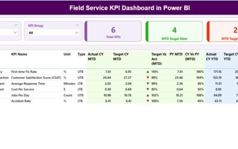
The IT helpdesk plays a vital role in every organization. It supports users, resolves technical issues, and ensures smooth business operations. Because of this, leaders must track performance in a simple and reliable way. An IT Helpdesk KPI Dashboard in Power BI helps teams monitor key metrics, analyze trends, and improve service quality.
Power BI gives you a dynamic, interactive, and real-time view of the helpdesk activities. You can track tickets, measure response time, monitor SLA compliance, and make quick decisions. In this article, you will learn everything about the IT Helpdesk KPI Dashboard in Power BI. You will also see its features, advantages, best practices, and practical tips for implementation.
Click to Purchases IT Helpdesk KPI Dashboard in Power BI
What Is an IT Helpdesk KPI Dashboard in Power BI?
An IT Helpdesk KPI Dashboard in Power BI is a ready-to-use performance monitoring tool that displays the most important IT support metrics. It connects to an Excel data source and converts raw numbers into clear visuals. Because of this, managers understand service performance within seconds.
The dashboard shows:
-
Ticket volume
-
Resolution time
-
Response time
-
SLA compliance
-
Customer satisfaction
-
Workload distribution
-
Performance trends
-
Monthly and yearly comparisons
This dashboard helps you measure both MTD (Month-to-Date) and YTD (Year-to-Date) performance. You can also compare current results with previous year values and analyze KPI behavior across time.
Why Do IT Teams Need a KPI Dashboard?
IT helpdesk teams manage hundreds of requests daily. Without a clear dashboard, performance tracking becomes confusing. A Power BI dashboard solves this by bringing all metrics together in one place.
Key reasons IT teams need a dashboard:
-
It gives real-time visibility
-
It reduces manual reporting
-
It highlights service issues quickly
-
It improves decision-making
-
It supports SLA compliance
-
It increases productivity
-
It ensures transparency across teams
Because of these benefits, IT service managers prefer Power BI dashboards for monitoring daily helpdesk performance.
Key Features of the IT Helpdesk KPI Dashboard in Power BI
This dashboard has three main pages, each designed to give a deep understanding of helpdesk operations.
1. Summary Page (Main Dashboard View)
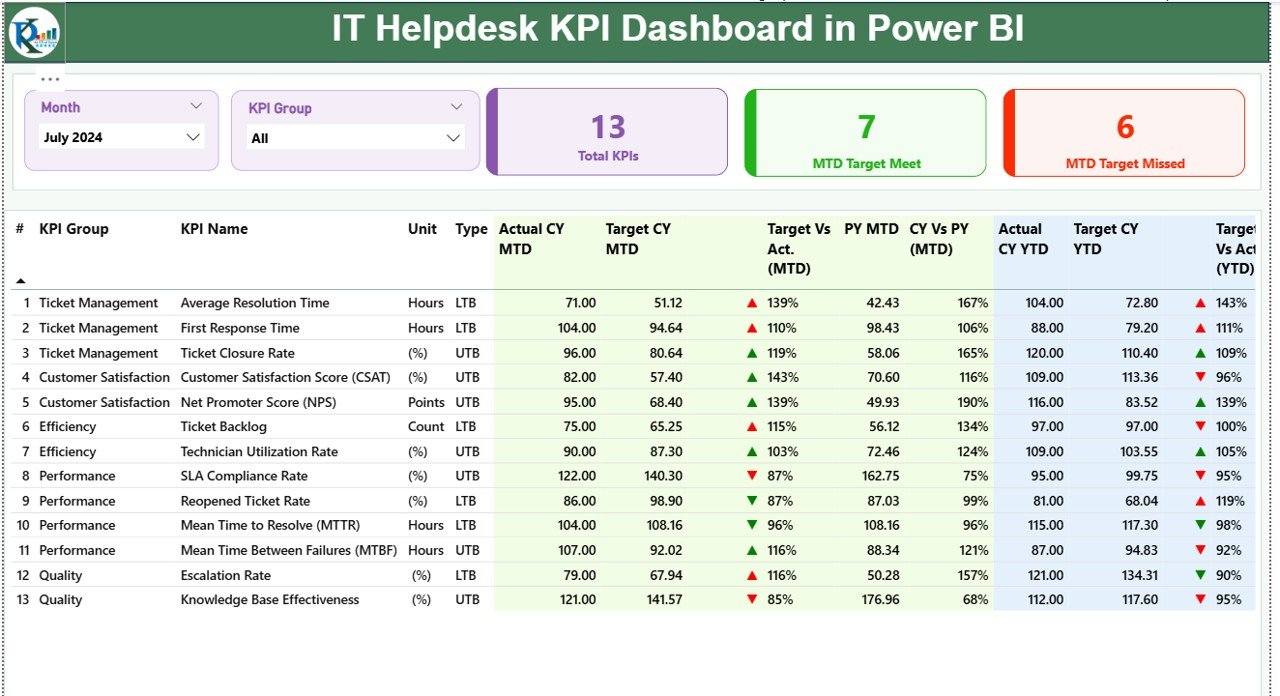
The Summary Page gives a full overview of IT helpdesk performance. It includes important slicers, cards, tables, and indicators.
Top Section: Slicers and Cards
You see two slicers at the top:
-
Month
-
KPI Group
These slicers help you filter KPIs and analyze performance for any time period or KPI category.
Below the slicers, you see three important cards:
-
Total KPIs Count
-
MTD Target Met
-
MTD Target Missed
These cards help you understand the overall service performance instantly.
Detailed KPI Table
The lower part of the Summary Page shows a detailed KPI table. It displays the most important fields:
-
KPI Number – Unique sequence number
-
KPI Group – Category such as Tickets, SLA, Response Time, etc.
-
KPI Name – Specific performance metric
-
Unit – Measurement unit such as %, hours, or count
-
Type – LTB (Lower the Better) or UTB (Upper the Better)
You also see all performance values for MTD and YTD:
-
Actual CY MTD
-
Target CY MTD
-
MTD Icon (▲/▼)
-
Target vs Actual (MTD %)
-
PY MTD
-
CY vs PY (MTD %)
And the same structure for YTD:
-
Actual CY YTD
-
Target CY YTD
-
YTD Icon (▲/▼)
-
Target vs Actual (YTD %)
-
PY YTD
-
CY vs PY (YTD %)
Why this is powerful
This layout helps you evaluate:
-
Whether KPIs met their monthly targets
-
How current performance compares to last year
-
Whether year-to-date performance shows improvement
-
Whether service quality is improving or declining
Because this page is fully interactive, you can filter and analyze results with a single click.
2. KPI Trend Page
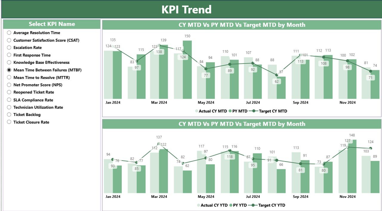
The KPI Trend page gives a deep understanding of how each KPI behaves over time.
It includes two combo charts:
-
Chart 1: Actual, Target, and Previous Year for MTD
-
Chart 2: Actual, Target, and Previous Year for YTD
You also see a slicer to choose the KPI name. Once you select a KPI, the charts refresh to show its performance trends.
Click to Purchases IT Helpdesk KPI Dashboard in Power BI
Why this page matters
You understand:
-
Seasonal patterns
-
Improvement or decline in KPI performance
-
Long-term changes
-
Target alignment
-
Month-over-month behavior
-
Year-over-year comparison
These visuals help leaders identify which KPIs require improvement.
3. KPI Definition Page
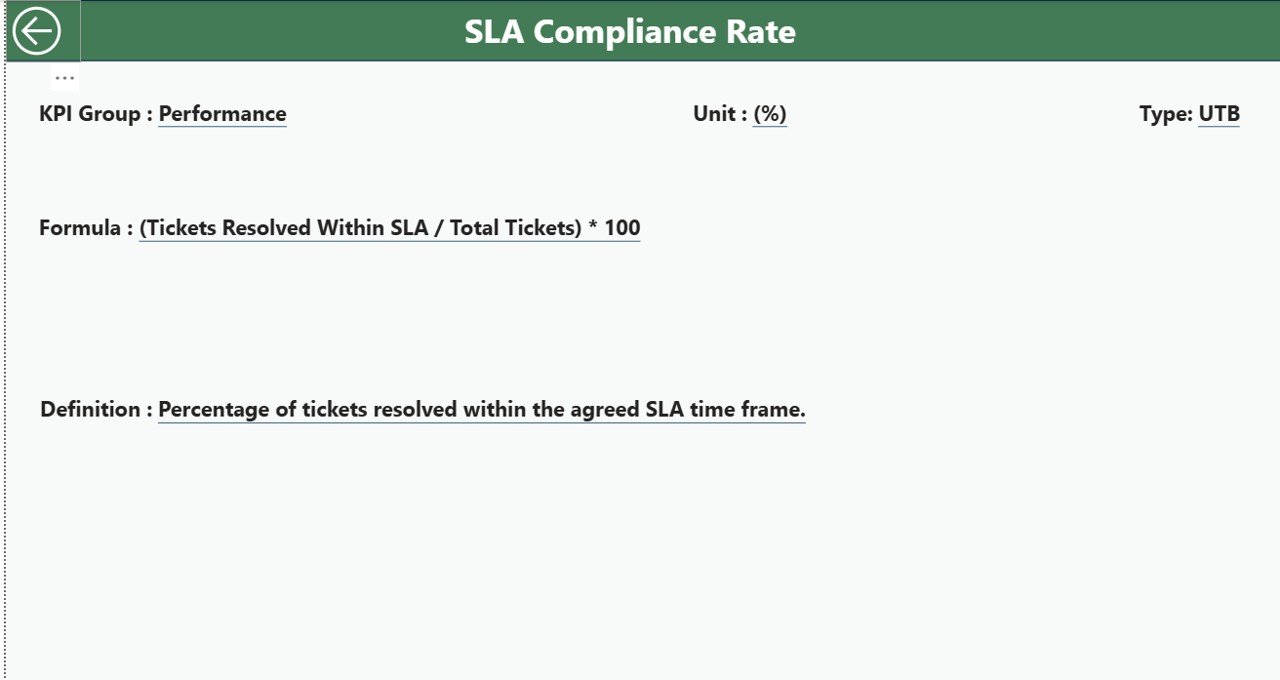
The KPI Definition Page is a drill-through page. It stays hidden, and you can access it directly from the Summary Page.
When you right-click any KPI and choose Drill Through, you can see:
-
KPI Number
-
KPI Group
-
KPI Name
-
Unit
-
Formula
-
Definition
-
Type (LTB or UTB)
You also get a Back button at the top-left corner to return to the Summary Page.
Why this page is important
It helps:
-
New team members understand KPIs quickly
-
Managers check formulas with ease
-
Everyone stays aligned with definitions
-
Teams avoid confusion or misinterpretation
Because every KPI stays clearly defined, decision-making becomes accurate and consistent.
Excel Data Structure for the Dashboard
This dashboard connects directly to an Excel file. The Excel file includes three worksheets.
1. Input_Actual Sheet
In this sheet, users fill:
-
KPI Name
-
Month (use the first day of each month)
-
MTD Actual Value
-
YTD Actual Value
You can enter new data every month. Power BI refreshes the dashboard automatically when you update the file.
2. Input_Target Sheet
This sheet captures:
-
KPI Name
-
Month
-
MTD Target Values
-
YTD Target Values
You can set monthly and yearly goals for each KPI. These values act as benchmarks for performance analysis.
3. KPI Definition Sheet
This sheet stores:
-
KPI Number
-
KPI Group
-
KPI Name
-
Unit
-
Formula
-
Definition
-
KPI Type (UTB or LTB)
This list helps maintain consistency across the dashboard.
Why IT Teams Love This Dashboard
Power BI dashboards save time and improve clarity. IT teams prefer this dashboard because it combines automation with rich visuals.
Key advantages include:
-
You reduce manual work
-
You get real-time insights
-
You track KPIs with accuracy
-
You improve SLA performance
-
You identify bottlenecks quickly
-
You manage IT support better
-
You boost end-user satisfaction
Because the dashboard gives a single source of truth, it supports better teamwork across IT departments.
Advantages of an IT Helpdesk KPI Dashboard in Power BI
A dedicated dashboard transforms the way IT teams work. Below are the major advantages.
1. Better Visibility of Service Performance
The dashboard shows all KPIs in one place. You know exactly what is happening at any moment.
2. Improved SLA Compliance
You can monitor response time, resolution time, and backlog with ease. As a result, you meet SLAs more consistently.
3. Faster Decision-Making
Clear visuals help you make decisions quickly. You can identify problems early and take corrective action.
4. Improved Team Productivity
Teams understand where they must improve. This increases focus and productivity.
5. Stronger User Satisfaction
When KPIs improve, user satisfaction increases automatically.
6. Accurate Monthly and Yearly Comparisons
You can compare performance with previous year numbers. This helps you understand growth clearly.
7. Fully Automated Reporting
You do not need manual Excel charts or long reports. Power BI updates everything instantly.
Best Practices for the IT Helpdesk KPI Dashboard in Power BI
Click to Purchases IT Helpdesk KPI Dashboard in Power BI
To get maximum value from the dashboard, follow these best practices.
1. Update Data Regularly
Maintain the Excel files weekly or monthly so dashboards remain accurate.
2. Use Clear KPI Definitions
Maintain a clean KPI definition table. Everyone must understand the meaning of each KPI.
3. Focus on the Right KPIs
Track KPIs that impact service quality, such as:
-
First Response Time
-
Resolution Time
-
Ticket Backlog
-
SLA Compliance
-
User Satisfaction Score
4. Keep Dashboard Design Simple
Avoid too many visuals. Keep it clean and easy to read.
5. Review Historical Trends
Always analyze trends instead of only looking at current numbers.
6. Encourage Team Engagement
Review the dashboard during weekly IT meetings. Encourage team members to discuss results and solutions.
7. Use Drill-Through Pages
Use drill-through options to understand KPI formulas and definitions. This increases clarity and accuracy.
Conclusion
An IT Helpdesk KPI Dashboard in Power BI helps organizations monitor service performance, analyze trends, and improve efficiency. It gives a clear real-time view of KPIs such as ticket volume, resolution time, SLA compliance, and user satisfaction. Because the dashboard connects with Excel, you can update data anytime and refresh the visuals instantly.
The dashboard supports better decisions, improves SLA performance, increases productivity, and creates a more efficient helpdesk environment. When IT teams use this dashboard regularly, they deliver faster resolutions and better support to users.
Frequently Asked Questions (FAQs)
1. What is an IT Helpdesk KPI Dashboard?
It is a Power BI dashboard that tracks key performance indicators like ticket resolution time, SLA compliance, and backlog.
2. Why should IT teams use this dashboard?
It gives real-time visibility, reduces manual reporting, and improves service performance.
3. Which KPIs are most important for IT helpdesk monitoring?
Important KPIs include response time, resolution time, SLA compliance, user satisfaction, backlog, and ticket volume.
4. Can I connect this dashboard to Excel data?
Yes, this dashboard uses Excel as a data source for Actual, Target, and KPI Definition tables.
5. Does the dashboard work automatically?
Yes. When you refresh Power BI, all visuals update instantly based on the Excel data.
6. Can I add more KPIs?
Yes, you can add more KPIs by updating the KPI Definition sheet and input tables.
7. Does it support month-to-month comparison?
Yes, the dashboard compares actual, target, and previous year data for both MTD and YTD.
Visit our YouTube channel to learn step-by-step video tutorials