Power distribution companies operate in a complex and data-intensive environment. Every day, they manage assets, monitor energy flow, track maintenance activities, handle outages, and ensure reliable electricity delivery. However, when critical data stays scattered across spreadsheets, SCADA exports, and manual reports, decision-making becomes slow and reactive.
That is exactly where a Power Distribution Dashboard in Power BI plays a vital role.
This comprehensive, SEO-friendly guide explains what a Power Distribution Dashboard in Power BI is, why it is essential, how it works, its page-wise structure, key insights, advantages, best practices, and frequently asked questions. Moreover, the language remains simple, clear, and practical so that engineers, analysts, and management teams can easily understand and use it.
Click to Purchases Power Distribution Dashboard in Power BI
What Is a Power Distribution Dashboard in Power BI?
A Power Distribution Dashboard in Power BI is an interactive business intelligence solution designed to monitor, analyze, and visualize operational and performance data related to electricity distribution.
Instead of reviewing multiple static reports, this dashboard consolidates energy supply data, billing data, asset health metrics, maintenance status, and outage information into a single Power BI file. As a result, decision-makers gain real-time visibility into distribution performance across assets, regions, and time periods.
Most importantly, Power BI transforms raw power distribution data into visual insights using cards, charts, slicers, and trends. Therefore, teams can identify issues faster, improve reliability, and optimize operational efficiency.
Why Do Power Distribution Companies Need a Power BI Dashboard?
Power distribution networks face constant pressure to deliver uninterrupted power while controlling costs and maintaining aging infrastructure. Because of this, companies must track performance continuously.
A Power Distribution Dashboard in Power BI helps because it:
-
Centralizes all distribution KPIs in one place
-
Improves visibility into asset health and maintenance
-
Tracks energy supplied versus energy billed
-
Identifies regional performance gaps
-
Supports proactive maintenance decisions
Additionally, interactive dashboards reduce dependency on manual reporting and enable faster decision-making at all management levels.
How Does a Power Distribution Dashboard in Power BI Work?
The Power Distribution Dashboard typically works with structured data stored in Excel, databases, or ERP systems. Power BI connects to these data sources and refreshes the data regularly.
The workflow usually includes:
-
Collecting energy, asset, and maintenance data
-
Cleaning and structuring data in a tabular format
-
Creating relationships between data tables
-
Designing interactive visuals and KPIs
-
Publishing and sharing insights with stakeholders
Because Power BI supports slicers, users can filter data by region, asset type, maintenance type, or month. As a result, analysis becomes faster and more focused.
Page-Wise Structure of Power Distribution Dashboard in Power BI
A well-designed Power Distribution Dashboard follows a logical, page-wise structure. Below is a detailed explanation of each page included in this dashboard.
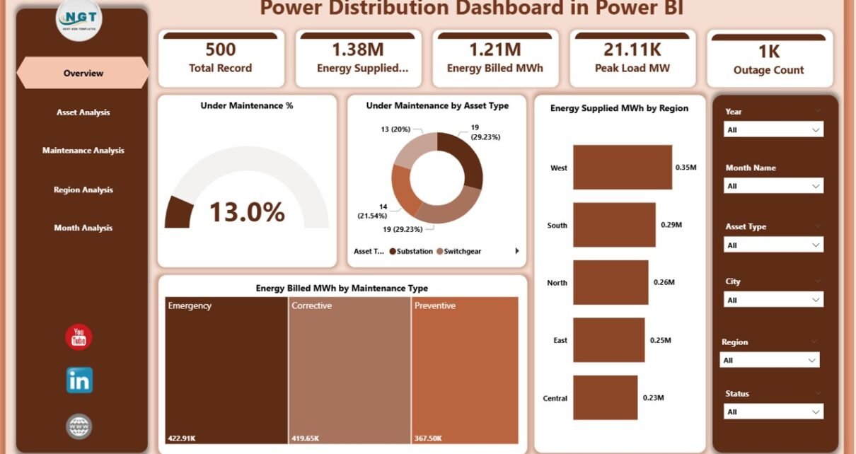
1. Overview Page: How Can You See the Big Picture Instantly?
The Overview Page acts as the executive summary of the dashboard. It provides a high-level snapshot of overall power distribution performance.
Key Elements of the Overview Page
Slicers
-
Region slicer
-
Asset Type slicer
-
Maintenance Type slicer
These slicers allow users to filter all visuals dynamically.
KPI Cards
-
Under Maintenance %
-
Other high-level performance indicators
Charts Included
-
Under Maintenance %
-
Under Maintenance by Asset Type
-
Energy Supplied (MWh) by Region
-
Energy Billed (MWh) by Maintenance Type
Why the Overview Page Matters
Because leaders need quick insights, this page helps them:
Click to Purchases Power Distribution Dashboard in Power BI
-
Identify maintenance intensity
-
Compare energy supply across regions
-
Analyze billing impact by maintenance type
-
Spot red flags instantly
2. Asset Analysis Page: How Healthy Are Your Distribution Assets?
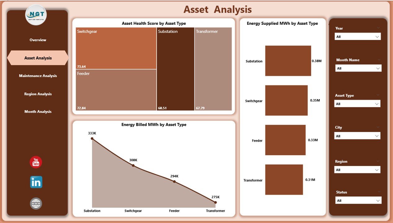
The Asset Analysis Page focuses on asset-level performance and health. Since distribution assets age over time, continuous monitoring becomes essential.
Charts on the Asset Analysis Page
-
Asset Health Score by Asset Type
-
Energy Supplied (MWh) by Asset Type
-
Energy Billed (MWh) by Asset Type
Key Insights from This Page
Using this page, teams can:
-
Compare health scores across transformers, substations, feeders, and other assets
-
Identify asset types with declining performance
-
Understand how different assets contribute to energy supply and billing
Therefore, asset managers can prioritize maintenance and replacement decisions more effectively.
3. Maintenance Analysis Page: Where Are Maintenance Efforts Concentrated?
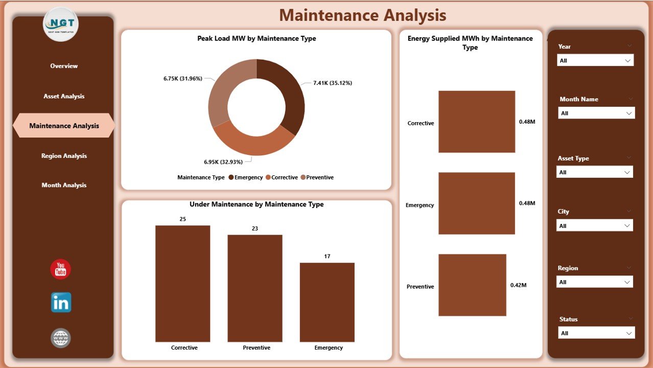
The Maintenance Analysis Page highlights maintenance-related performance metrics. Since maintenance directly affects reliability and downtime, this page becomes extremely valuable.
Charts Included
-
Peak Load (MW) by Maintenance Type
-
Energy Supplied (MWh) by Maintenance Type
-
Under Maintenance by Maintenance Type
Benefits of Maintenance Analysis
Click to Purchases Power Distribution Dashboard in Power BI
This page helps teams:
-
Understand which maintenance types impact peak load
-
Evaluate energy supply during maintenance activities
-
Balance preventive and corrective maintenance strategies
As a result, maintenance planning becomes data-driven rather than reactive.
4. Region Analysis Page: Which Regions Perform Better or Worse?
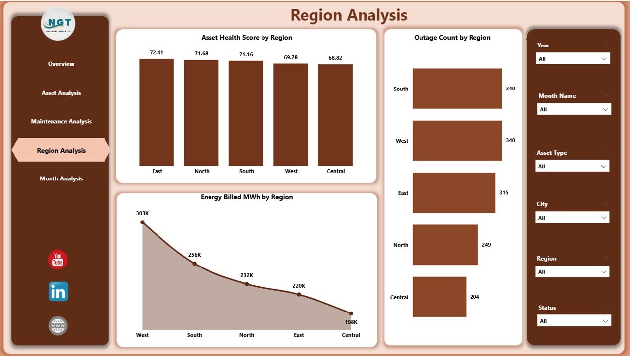
The Region Analysis Page compares performance across geographical regions. Since distribution challenges vary by location, regional analysis becomes critical.
Charts on the Region Analysis Page
-
Asset Health Score by Region
-
Outage Count by Region
-
Energy Billed (MWh) by Region
Why Regional Insights Matter
With this page, decision-makers can:
-
Identify high-outage regions
-
Compare asset health across service areas
-
Evaluate revenue generation by region
Consequently, management can allocate resources and investments more strategically.
5. Monthly Trends Page: How Is Performance Changing Over Time?
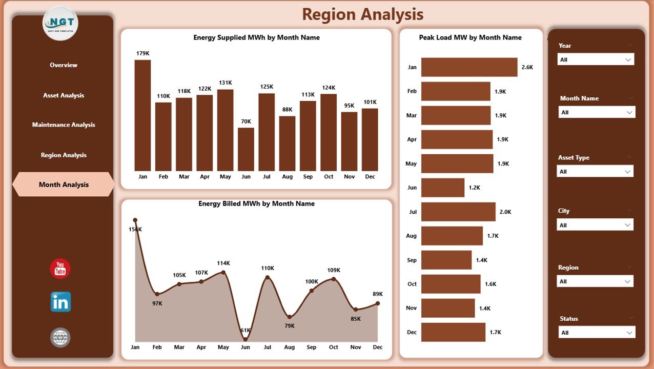
The Monthly Trends Page focuses on time-based analysis. It shows how key metrics change month by month.
Charts Included
-
Energy Supplied (MWh) by Month
-
Peak Load (MW) by Month
-
Energy Billed (MWh) by Month
Value of Trend Analysis
Trend analysis allows users to:
-
Detect seasonal patterns
-
Monitor growth or decline in energy demand
-
Forecast future capacity requirements
Therefore, this page supports both operational planning and strategic forecasting.
Click to Purchases Power Distribution Dashboard in Power BI
Key KPIs Tracked in a Power Distribution Dashboard in Power BI
A robust dashboard typically tracks the following KPIs:
-
Energy Supplied (MWh)
-
Energy Billed (MWh)
-
Under Maintenance %
-
Asset Health Score
-
Peak Load (MW)
-
Outage Count
-
Maintenance Distribution by Type
-
Regional Performance Metrics
Because these KPIs update dynamically, teams can respond quickly to operational changes.
Advantages of Power Distribution Dashboard in Power BI
Implementing a Power Distribution Dashboard in Power BI offers multiple operational and strategic advantages.
1. Centralized Performance Monitoring
All KPIs remain available in one dashboard. As a result, teams avoid switching between multiple reports.
2. Improved Decision-Making
Interactive visuals help decision-makers understand issues faster and act confidently.
3. Better Asset Management
Continuous monitoring of asset health supports proactive maintenance planning.
4. Enhanced Operational Efficiency
Clear visibility into maintenance and outages reduces downtime and improves reliability.
5. Time and Cost Savings
Automation reduces manual reporting efforts and minimizes errors.
6. Scalability and Flexibility
Power BI dashboards easily scale as data volume and complexity grow.
Best Practices for the Power Distribution Dashboard in Power BI
To maximize the value of your dashboard, follow these best practices.
1. Define Clear KPIs
Always align KPIs with operational and business goals.
2. Use Consistent Data Structures
Maintain standardized formats for dates, regions, asset types, and units.
3. Keep Visuals Simple
Avoid clutter. Use clean charts and clear labels.
4. Use Slicers Wisely
Add slicers that improve analysis without overwhelming users.
5. Refresh Data Regularly
Ensure timely data refreshes to keep insights accurate.
6. Validate Data Quality
Check for missing values, duplicates, and incorrect units.
7. Train Users
Provide basic Power BI training so users can explore insights independently.
Click to Purchases Power Distribution Dashboard in Power BI
How Can Power BI Transform Power Distribution Operations?
Power BI does more than visualize data. It transforms how power distribution companies operate.
Because teams gain instant access to performance metrics, they can:
-
Reduce outage response time
-
Improve billing accuracy
-
Optimize maintenance schedules
-
Support regulatory reporting
-
Enhance customer satisfaction
Therefore, Power BI becomes a strategic asset rather than just a reporting tool.
Conclusion: Why Power Distribution Dashboard in Power BI Is a Must-Have
A Power Distribution Dashboard in Power BI delivers clarity, control, and confidence to power distribution companies. It converts complex operational data into meaningful insights through interactive visuals, structured pages, and dynamic KPIs.
By using this dashboard, organizations can improve asset health, reduce outages, optimize maintenance, and monitor energy flow efficiently. Moreover, its scalable design supports both daily operations and long-term strategic planning.
In today’s data-driven energy landscape, adopting a Power Distribution Dashboard in Power BI is not optional—it is essential.
Frequently Asked Questions (FAQs)
1. What is the main purpose of a Power Distribution Dashboard in Power BI?
The main purpose is to monitor, analyze, and visualize power distribution performance metrics from a single interactive dashboard.
2. Who should use a Power Distribution Dashboard?
Power distribution engineers, asset managers, maintenance teams, analysts, and senior management can all benefit from it.
3. Can this dashboard work with Excel data?
Yes, Power BI easily connects to Excel files and other data sources.
4. How often should the dashboard data refresh?
Ideally, data should refresh daily or in real time, depending on system availability.
5. Does Power BI support regional and asset-level analysis?
Yes, slicers and filters enable detailed regional and asset-level analysis.
6. Is Power BI suitable for large power distribution networks?
Yes, Power BI scales efficiently for large datasets and complex networks.
7. Can this dashboard help reduce outages?
Yes, by identifying high-risk assets and regions, teams can take preventive actions.
8. Is coding required to use Power BI dashboards?
No, Power BI offers a user-friendly interface with minimal coding requirements.
Visit our YouTube channel to learn step-by-step video tutorials