Railway cargo plays a vital role in national and international supply chains. From bulk commodities to containerized freight, railway cargo operations demand efficiency, accuracy, and timely decision-making. However, many railway operators still rely on fragmented Excel files, manual reports, and delayed summaries. As a result, performance gaps remain hidden, and corrective actions arrive too late.
That is exactly why a Railway Cargo KPI Dashboard in Excel becomes an essential tool.
In this detailed guide, you will learn what a Railway Cargo KPI Dashboard in Excel is, why railway cargo operators need it, how it works, its sheet-wise structure, key metrics, advantages, best practices, and frequently asked questions. Moreover, the article uses clear language, smooth transitions, and practical explanations to ensure clarity and strong SEO performance.
Click to Purchases Railway Cargo KPI Dashboard in Excel
What Is a Railway Cargo KPI Dashboard in Excel?
A Railway Cargo KPI Dashboard in Excel is a ready-to-use, interactive performance tracking tool that helps railway operators monitor cargo operations using key performance indicators (KPIs).
Instead of maintaining multiple spreadsheets for actuals, targets, and historical data, this dashboard brings everything into one structured Excel file. As a result, operations teams, planners, and management gain instant visibility into cargo performance across months and years.
Moreover, because the dashboard is built entirely in Excel, it remains easy to use, flexible, and accessible without advanced BI tools or software.
Why Do Railway Cargo Operations Need a KPI Dashboard?
Railway cargo operations involve wagon utilization, freight volume tracking, turnaround time, revenue monitoring, and service reliability. Therefore, tracking performance manually becomes time-consuming and inconsistent.
A Railway Cargo KPI Dashboard in Excel solves these challenges effectively.
Key reasons railway cargo teams need this dashboard:
-
Cargo performance data comes from multiple departments
-
Manual reporting delays decision-making
-
Month-wise and YTD tracking becomes complex
-
Performance trends remain unclear
-
Management needs quick, reliable insights
As a result, this dashboard acts as a single source of truth for railway cargo performance.
Click to Purchases Railway Cargo KPI Dashboard in Excel
How Does a Railway Cargo KPI Dashboard in Excel Work?
The dashboard follows a simple, logical, and structured workflow.
First, users enter actual, target, and previous-year data into dedicated input sheets. Then, the dashboard automatically calculates MTD and YTD metrics, applies conditional formatting, and updates charts and tables.
Overall workflow:
-
Enter KPI definitions
-
Input actual cargo performance data
-
Input target cargo values
-
Enter previous year performance data
-
Select month from the dashboard
-
Analyze MTD and YTD performance instantly
Because of this structure, users focus on insights instead of calculations.
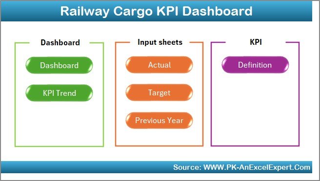
Sheet-Wise Structure of the Railway Cargo KPI Dashboard in Excel
This dashboard contains 7 well-organized worksheets, each designed for a specific purpose.
1) Home Sheet: How Does Navigation Work?
The Home Sheet acts as an index page for the dashboard.
Key Features of the Home Sheet
-
Clean and simple layout
-
6 navigation buttons
-
One-click access to key sheets
As a result, users can navigate the dashboard easily without scrolling or searching.
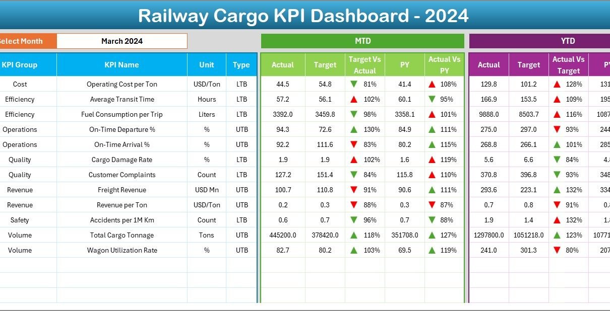
2) Dashboard Sheet: The Main Performance Overview
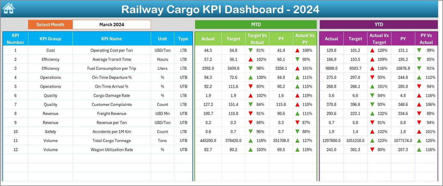
The Dashboard Sheet serves as the core reporting page.
Month Selection
On cell D3, users can select the Month from a drop-down list. Once selected, the entire dashboard updates automatically for that month.
This feature ensures:
-
Faster analysis
-
Consistent reporting
-
Error-free month selection
MTD Performance Metrics Displayed
The dashboard shows the following Month-to-Date (MTD) metrics:
-
MTD Actual
-
MTD Target
-
MTD Previous Year
-
Target vs Actual (MTD)
-
PY vs Actual (MTD)
To improve interpretation, the dashboard uses conditional formatting with up and down arrows:
-
▲ Green arrow indicates positive performance
-
▼ Red arrow indicates negative performance
YTD Performance Metrics Displayed
The dashboard also displays Year-to-Date (YTD) metrics:
-
YTD Actual
-
YTD Target
-
YTD Previous Year
-
Target vs Actual (YTD)
-
PY vs Actual (YTD)
These metrics help management understand long-term cargo performance trends.
3) KPI Trend Sheet: How Can You Analyze Trends?
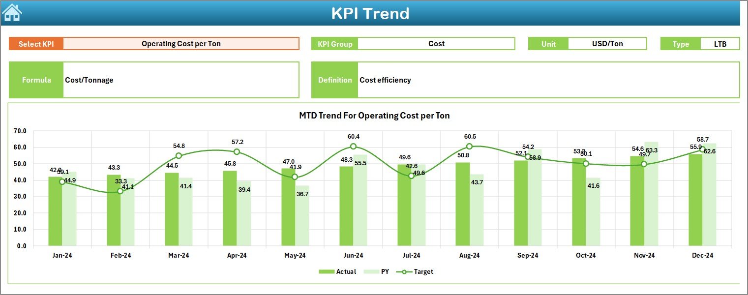
The KPI Trend Sheet focuses on detailed KPI-level analysis.
KPI Selection
On cell C3, users can select a KPI Name from a drop-down list. Once selected, all details and charts update automatically.
KPI Details Displayed
This sheet shows:
-
KPI Group
-
Unit of KPI
-
Type of KPI (Lower the Better or Upper the Better)
-
KPI Formula
-
KPI Definition
This information ensures clarity and consistency across teams.
Trend Charts Included
The sheet displays two trend charts:
-
MTD Trend Chart (Actual, Target, PY)
-
YTD Trend Chart (Actual, Target, PY)
As a result, users can quickly identify:
-
Performance improvement
-
Seasonal trends
-
Target gaps
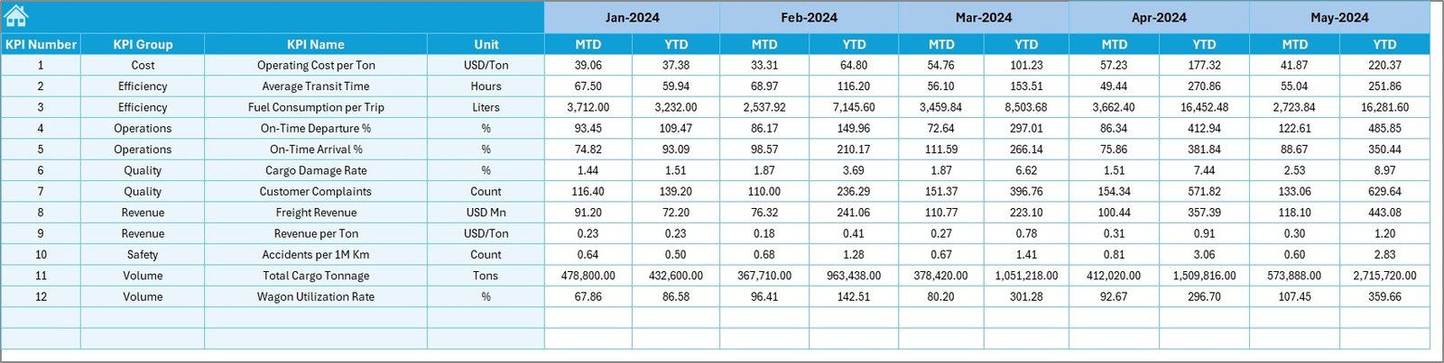
4) Actual Numbers Input Sheet: Where Do You Enter Data?
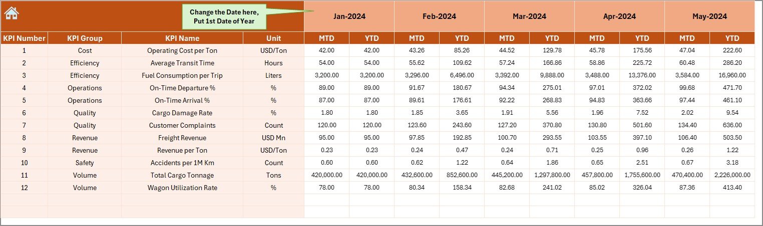
The Actual Numbers Input Sheet captures current-year cargo performance.
How to Use This Sheet
-
Enter Actual MTD and YTD values
-
Change the month from cell E1
-
Always enter the first month of the year in cell E1
This structure ensures accurate YTD calculations.
5) Target Sheet: Defining Cargo Performance Goals
The Target Sheet stores planned performance values.
Data Entered in This Sheet
-
KPI-wise MTD Target
-
KPI-wise YTD Target
-
Month-specific targets
As a result, the dashboard automatically compares actual performance against goals.
6) Previous Year Number Sheet: Year-Over-Year Comparison
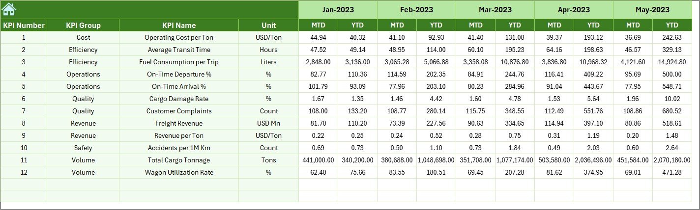
This sheet captures previous year performance data.
Purpose of This Sheet
-
Enable PY vs Actual analysis
-
Support year-over-year comparison
-
Highlight growth or decline
The structure remains the same as the current-year data, which ensures consistency.
Click to Purchases Railway Cargo KPI Dashboard in Excel
7) KPI Definition Sheet: Standardizing KPIs
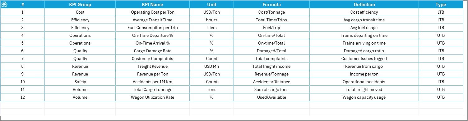
The KPI Definition Sheet defines each KPI clearly.
Fields Included
-
KPI Name
-
KPI Group
-
Unit
-
Formula
-
KPI Definition
This sheet ensures transparency and avoids confusion during analysis.
Advantages of Railway Cargo KPI Dashboard in Excel
Using this dashboard delivers strong operational and strategic benefits.
Key Advantages
-
🚆 Centralized cargo performance tracking
-
🚆 Faster reporting and analysis
-
🚆 Clear MTD and YTD visibility
-
🚆 Reduced manual effort
-
🚆 Easy Excel-based data entry
-
🚆 Visual performance indicators
-
🚆 Improved decision-making
As a result, railway cargo operations become more efficient and data-driven.
How Does This Dashboard Support Better Decision-Making?
The dashboard converts raw cargo data into actionable insights.
Decision-Making Benefits
-
Identify underperforming cargo KPIs early
-
Monitor freight volume and utilization trends
-
Compare current performance with previous year
-
Improve planning and capacity utilization
-
Align teams with performance targets
Therefore, management shifts from reactive reporting to proactive control.
Best Practices for the Railway Cargo KPI Dashboard in Excel
To get the maximum value, follow these best practices.
Data Entry Best Practices
-
Update actual data regularly
-
Use consistent KPI names across sheets
-
Always select the correct month
-
Validate data before review
Dashboard Usage Best Practices
-
Review MTD performance monthly
-
Analyze YTD trends quarterly
-
Use trend charts for forecasting
-
Focus on KPIs with negative arrows
Governance Best Practices
-
Standardize KPI definitions
-
Document formulas clearly
-
Restrict unnecessary changes
-
Train users on KPI interpretation
Following these practices ensures long-term success.
Click to Purchases Railway Cargo KPI Dashboard in Excel
Who Should Use a Railway Cargo KPI Dashboard in Excel?
This dashboard suits multiple stakeholders.
Ideal Users
-
Railway Cargo Operations Teams
-
Freight Planning Departments
-
Logistics and Supply Chain Managers
-
Performance Analysts
-
Senior Management
Each user benefits from clear, structured insights without technical complexity.
Conclusion: Why Is a Railway Cargo KPI Dashboard in Excel Essential?
A Railway Cargo KPI Dashboard in Excel enables railway organizations to track performance with clarity, speed, and confidence.
Instead of managing multiple files and delayed reports, this dashboard provides a centralized view of cargo KPIs, trends, and targets. Moreover, its Excel-based design ensures ease of use, flexibility, and scalability.
Therefore, if your goal is to improve cargo efficiency, reduce operational gaps, and strengthen decision-making, this dashboard becomes an essential tool.
Click to Purchases Railway Cargo KPI Dashboard in Excel
Frequently Asked Questions (FAQs)
What is a Railway Cargo KPI Dashboard in Excel used for?
It helps track cargo KPIs, compare actual vs target performance, and analyze MTD and YTD trends.
Do I need advanced Excel skills to use this dashboard?
No. You only need basic Excel knowledge to enter data and review results.
Can I customize KPIs in this dashboard?
Yes. You can easily add or modify KPIs using the KPI Definition sheet.
How often should data be updated?
You should update data monthly for accurate MTD and YTD reporting.
Is this dashboard suitable for large railway networks?
Yes. The structure supports small, medium, and large railway cargo operations.
Click to Purchases Railway Cargo KPI Dashboard in Excel
Visit our YouTube channel to learn step-by-step video tutorials