Remote crop monitoring creates a large amount of operational data very quickly. A farm team monitoring 30 fields every month can record 360+ monitoring visits in a year before adding crop type, region, sensor type, field zone, irrigation status, alert level, pest risk, farm name, and drone operator details. The Remote Crop Monitoring Dashboard in Excel turns those records into a structured reporting workbook for area monitored, yield estimate, monitoring cost, alerts raised, quality score, crop trends, field health, cost analysis, and operator performance.
Click here to purchase the Remote Crop Monitoring Dashboard in Excel
This template is designed for farm owners, agribusiness teams, crop consultants, drone monitoring operators, and field supervisors who need a clear Excel dashboard without building slicers, pivot charts, cards, and support sheets from scratch. Users can replace the sample data in the Data sheet, click Refresh All from the Excel Data ribbon, and review the updated dashboard pages.
Key Features of Remote Crop Monitoring Dashboard in Excel
- 5 dashboard pages: Overview, Crop Trends, Field Health, Cost Analysis, and Operator View.
- 5 high-level KPI cards: Total Area Monitored, Total Yield Estimate, Total Monitoring Cost, Total Alerts Raised, and Avg. Quality Score.
- Interactive slicers: Filter dashboard views quickly by the available crop monitoring fields.
- Crop trend analysis: Review quarterly area, monthly alerts, monitoring status, and crop-level alert resolution.
- Field health analysis: Compare alert levels, pest risk, region cost, irrigation status, and quality score.
- Cost analysis: Understand monitoring spend by sensor type, farm name, field zone, operator, region, and month.
- Operator view: Review drone operator quality score, sensor resolution percentage, action required percentage, and monthly cost movement.
- Data and support sheets: Update raw records and refresh pivot-backed visuals dynamically.
Dashboard Pages Explanation
Overview Page
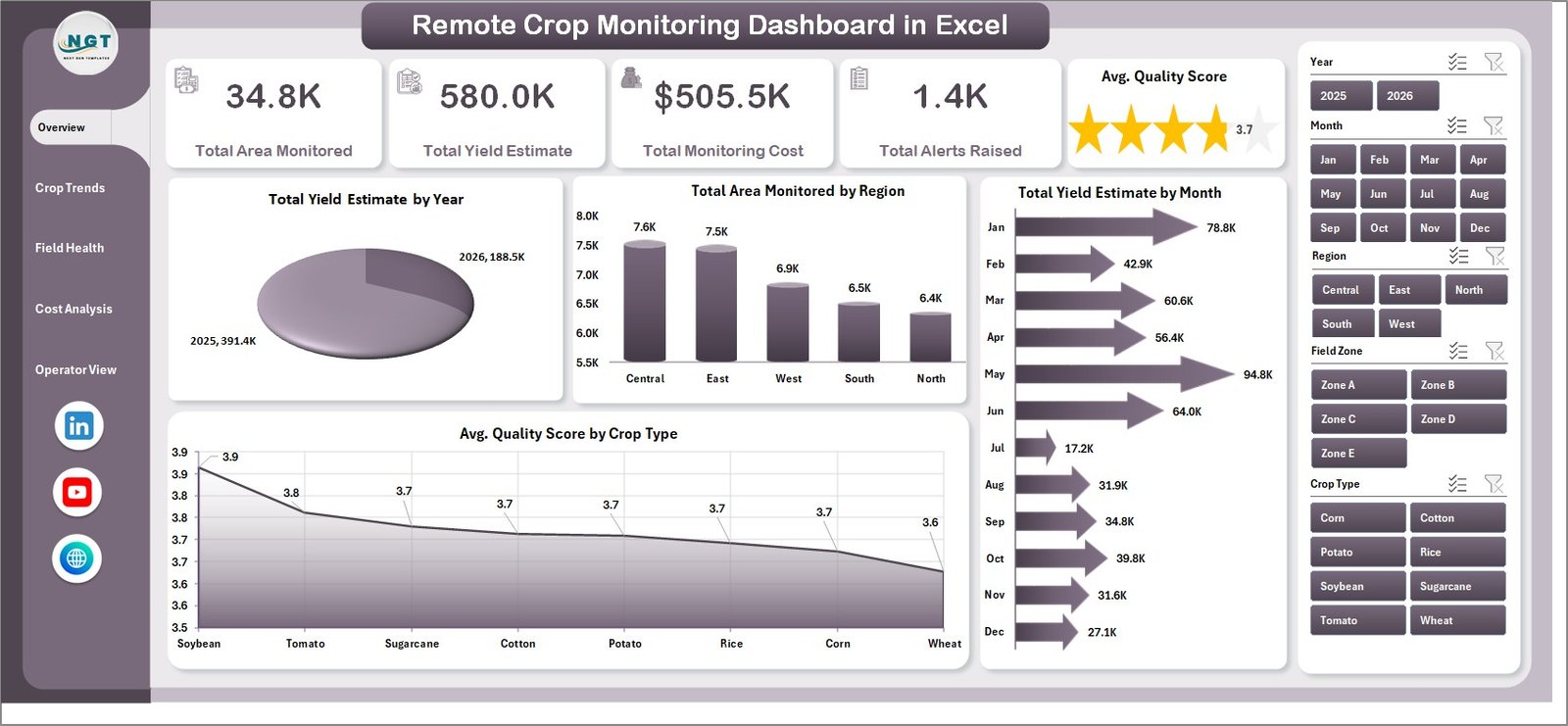
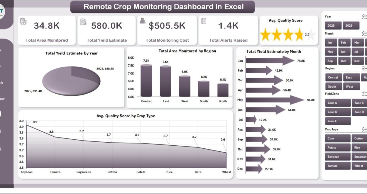
The Overview page is the executive view of the workbook. It starts with cards for Total Area Monitored, Total Yield Estimate, Total Monitoring Cost, Total Alerts Raised, and Avg. Quality Score so users can check crop monitoring coverage, expected production, spending, field risk, and monitoring quality in one place.
Total Yield Estimate by Year
This chart shows how expected crop yield changes across years. It helps users compare long-term crop performance and identify whether monitoring outcomes are trending in the right direction.
Total Area Monitored by Region
This chart compares monitored area across regions. It helps field teams see where coverage is strong and where additional monitoring visits may be needed.
Total Yield Estimate by Month
This visual tracks yield estimate month by month. It helps teams notice seasonal movement and prepare for months that may need closer review.
Avg. Quality Score by Crop Type
This chart compares average monitoring quality across crop types. It helps agronomy teams identify crops with strong inspection quality and crops that may need better review routines.
Crop Trends
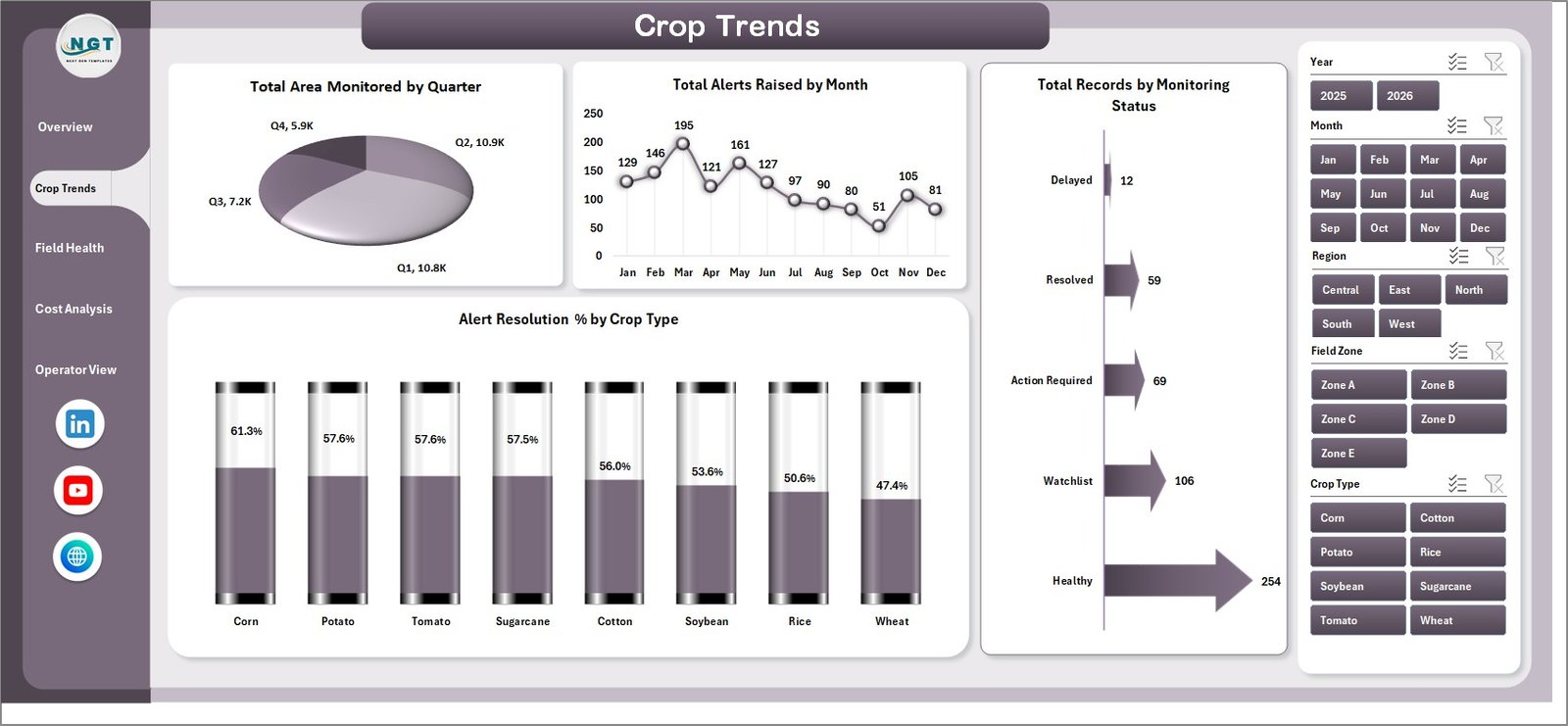
The Crop Trends page focuses on time-based and status-based movement. Total Area Monitored by Quarter shows whether field coverage is rising or falling by quarter. Total Alerts Raised by Month helps users identify months with heavier issue volume. Total Records by Monitoring Status explains how many records are completed, pending, active, or otherwise classified. Alert Resolution % by Crop Type compares how effectively alerts are resolved across crops.
Field Health
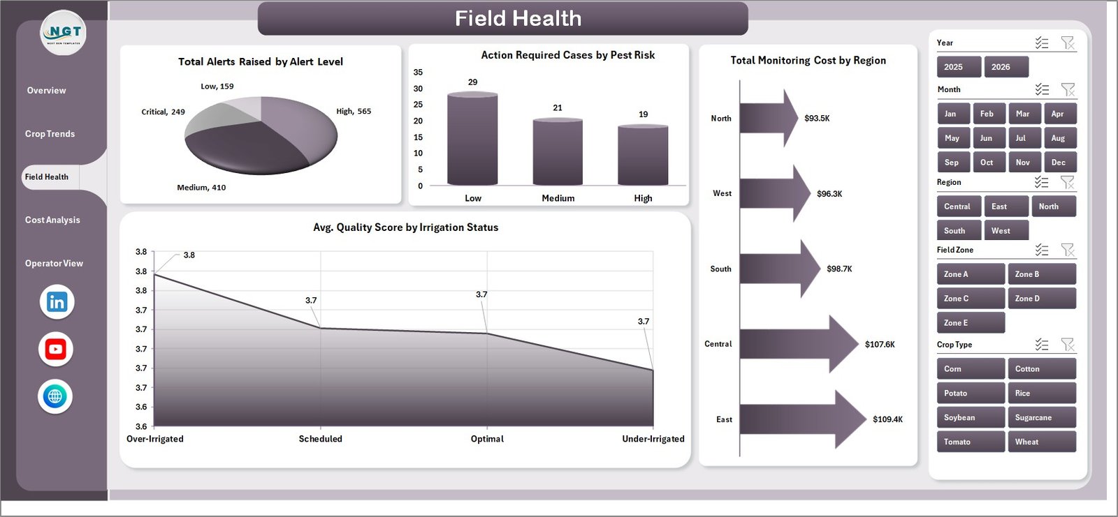
The Field Health page is useful for risk review and agronomy follow-up. Total Alerts Raised by Alert Level separates issue volume by severity. Action Required Cases by Pest Risk connects pest exposure with follow-up workload. Total Monitoring Cost by Region shows where field monitoring spend is concentrated. Avg. Quality Score by Irrigation Status helps users compare inspection quality by irrigation condition.
Cost Analysis
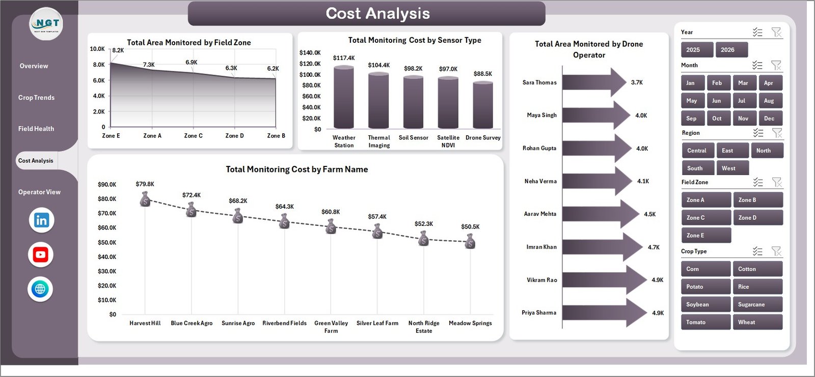
The Cost Analysis page helps teams understand how monitoring resources are used. Total Area Monitored by Field Zone shows where coverage is happening. Total Monitoring Cost by Sensor Type compares spending across sensor methods. Total Area Monitored by Drone Operator reviews operator coverage. Total Monitoring Cost by Farm Name helps managers identify farms with higher monitoring cost.
Operator View
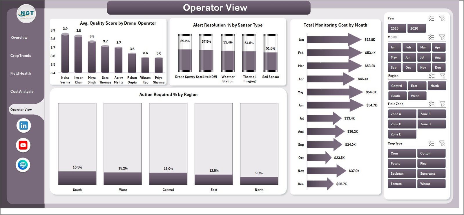
The Operator View page supports drone team and field team management. Avg. Quality Score by Drone Operator compares operator-level inspection quality. Alert Resolution % by Sensor Type shows whether certain sensor methods lead to better resolution. Total Monitoring Cost by Month tracks monthly cost movement. Action Required % by Region highlights regions where more follow-up is needed.
Data Sheet Tab

The Data sheet is the input layer. Add crop monitoring records in the same format as the sample data, keep the headers consistent, and refresh the workbook. This keeps the dashboard repeatable for weekly, monthly, or seasonal reporting.
Support Sheet

The Support sheet contains the pivot tables that power the dashboard dynamically. After users update the Data sheet, they can go to the Excel Data ribbon and click Refresh All. The pivots and charts refresh together, and this sheet can be hidden during normal use.
Remote Crop Monitoring Dashboard in Excel vs. Google Sheets vs. Paid CRM/SaaS – Feature Comparison
| Feature | This Excel dashboard | Google Sheets alternative | Paid farm SaaS |
|---|---|---|---|
| Cost | $17.99 one-time | Low software cost but manual dashboard build | Monthly or annual subscription |
| Platform | Microsoft Excel | Browser-based spreadsheet | Vendor-hosted web app |
| Setup time | Replace sample data and click Refresh All | Build formulas, pivots, charts, and filters manually | Onboarding and configuration |
| Real-time team collaboration | Available through OneDrive or SharePoint | Native real-time collaboration | Usually included |
| Mobile access | Limited by Excel mobile layout | Available in browser and app | Usually included |
| Customizable fields | Editable workbook, data sheet, pivots, charts, and slicers | Editable but manual | Depends on vendor permissions |
| Share with link | Available through cloud storage if used | Built in | Usually login controlled |
| Year-1 cost at 5 users | $17.99 plus Microsoft licensing if needed | Low license cost plus build time | Often hundreds or thousands per year |
| Crop monitoring fields | Area, yield, cost, alerts, quality, status, pest risk, irrigation, region, farm, sensor, zone, and operator | Must be designed manually | Depends on reporting module |
Who Should Use This Template
This template is a good fit for farm owners, agribusiness managers, crop consultants, precision agriculture teams, drone monitoring operators, field supervisors, regional agriculture managers, and analysts who prepare recurring crop monitoring reports in Excel. It is especially useful when your team already has structured data but needs a faster way to turn records into management visuals.
It is not a live drone control system, satellite imagery processor, IoT platform, farm ERP, pesticide recommendation engine, or automated agronomy advisory tool. It works best as a reporting layer for prepared data.
Real-World Use Cases
Anika, agribusiness manager: uses the Overview page to check total monitored area, yield estimate, cost, alerts, and quality score before monthly crop performance meetings.
Rohan, crop consultant: uses Crop Trends and Field Health pages to explain pest risk, irrigation status, alert level, and quality score to farm clients.
Meera, drone operations lead: uses Cost Analysis and Operator View to compare sensor cost, drone operator coverage, alert resolution, and regions needing action.
Advantages of Remote Crop Monitoring Dashboard in Excel
The main advantage is speed. Users do not need to build pivot tables, slicers, cards, charts, and dashboard sheets from a blank workbook. They can start with a ready layout, replace the sample data, and refresh the dashboard.
Another advantage is ownership. Excel files can be stored locally or in a company-controlled OneDrive or SharePoint location. For teams that prefer spreadsheet-based reporting, this keeps the data workflow familiar. Microsoft provides useful documentation on creating PivotTables in Excel for users who want to customize the workbook further.
Opportunities for Improvement
The dashboard depends on clean source data. If monitoring records are incomplete or inconsistent, the dashboard will reflect those data quality issues. Teams should standardize names for regions, farms, crops, operators, sensor types, and statuses before refreshing the workbook.
The template also does not automate data collection from drones, satellites, or sensors. If live data feeds are required, users will need a separate integration workflow before the data enters Excel.
Best Practices
- Keep the Data sheet headers unchanged so pivots continue to work correctly.
- Use consistent names for region, farm, crop type, operator, alert level, and monitoring status.
- Refresh the workbook after every data update.
- Review high alert levels and high pest risk before routine field visits.
- Compare monitoring cost by sensor type and farm name before planning the next monitoring cycle.
- Use Operator View for coaching, workload balancing, and quality improvement.
- Keep an unchanged backup copy before making structural edits to pivots or charts.
Explore Relevant Templates
For related reporting, explore Remote Crop Monitoring Dashboard in Power BI, Drone Farming Startups Dashboard in Excel, Agriculture and Farm Dashboard in Excel, and Indoor Farming Systems Dashboard in Excel. You can also browse more Excel Dashboard templates on NextGenTemplates.
Frequently Asked Questions
What is the Remote Crop Monitoring Dashboard in Excel?
It is an editable Excel dashboard template for analyzing crop monitoring records, monitored area, yield estimate, monitoring cost, alerts, quality score, crop trends, field health, and operator performance.
Can I use my own crop monitoring data?
Yes. Replace the sample rows in the Data sheet with your own records and click Refresh All.
What pages are included?
The workbook includes Overview, Crop Trends, Field Health, Cost Analysis, Operator View, Data Sheet, and Support Sheet tabs.
Do I need macros?
No macro requirement was specified. The described workflow uses data entry, pivot tables, slicers, charts, and Refresh All.
Can I hide the Support Sheet?
Yes. The Support Sheet contains pivot tables and can be hidden after setup if users only need the dashboard and Data sheet.
Does this connect directly to drones or sensors?
No. It is a reporting template for prepared crop monitoring data. Direct drone, satellite, or sensor integrations require separate setup.
Is this a subscription product?
No. It is a one-time downloadable Excel dashboard template.
About the Author
Built by PK – Microsoft Certified Professional with 15+ years of Excel, Google Sheets, and Power BI experience. Founder of NextGenTemplates, reaching 300K+ subscribers across YouTube channels. Every template is hand-built and tested before release.
Conclusion
The Remote Crop Monitoring Dashboard in Excel gives agriculture teams a practical way to review monitored area, yield estimate, field alerts, cost, quality score, pest risk, irrigation status, and operator performance in a familiar workbook format. It is best for teams that already collect crop monitoring data and want a faster way to analyze it with Excel pivots, slicers, and dashboard pages.
Click here to purchase the Remote Crop Monitoring Dashboard in Excel
Visit our YouTube channel for step-by-step tutorials: Youtube.com/@PKAnExcelExpert