Remote work communities create reporting data faster than many teams expect. A community with 1,000 active members, 4 conversation platforms, monthly events, membership plans, and regional segments can produce 12,000+ message, attendance, support, and engagement records in a year. The Remote Work Communities Dashboard in Excel turns those records into a ready reporting workbook for active members, new members, subscriptions, posts, messages, events, attendance, support cost, moderation status, and satisfaction score.
Click here to purchase the Remote Work Communities Dashboard in Excel
This template is built for community managers, coworking teams, remote-work platform operators, creator communities, membership analysts, and event coordinators who need a practical Excel dashboard without building pivot tables, slicers, KPI cards, and chart pages from a blank workbook. Users can replace the sample records in the Data Sheet, click Refresh All from the Excel Data ribbon, and review updated dashboard pages quickly.
Key Features of Remote Work Communities Dashboard in Excel
- 5 dashboard pages: Overview, Community Growth, Engagement, Events, and Operations.
- 5 high-level KPI cards: Total Active Members, Total New Members, Total Subscription, Total Posts, and Avg. Satisfaction Score.
- Multiple slicers: Filter the dashboard quickly by community, region, platform, plan, work style, event type, time period, engagement status, and moderation status fields.
- Membership analysis: Review active members, new members, subscription revenue, and community-level growth.
- Engagement analysis: Track messages, member segments, work styles, events hosted, attendance percentage, and satisfaction score.
- Operations reporting: Analyze support cost by region, platform, and membership plan.
- Data and support tabs: Update raw records and refresh pivot-backed charts dynamically.
Dashboard Pages Explanation
1. Overview Page
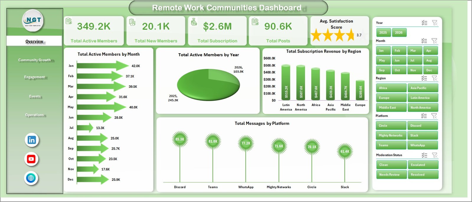
Remote Work Communities Dashboard in Excel
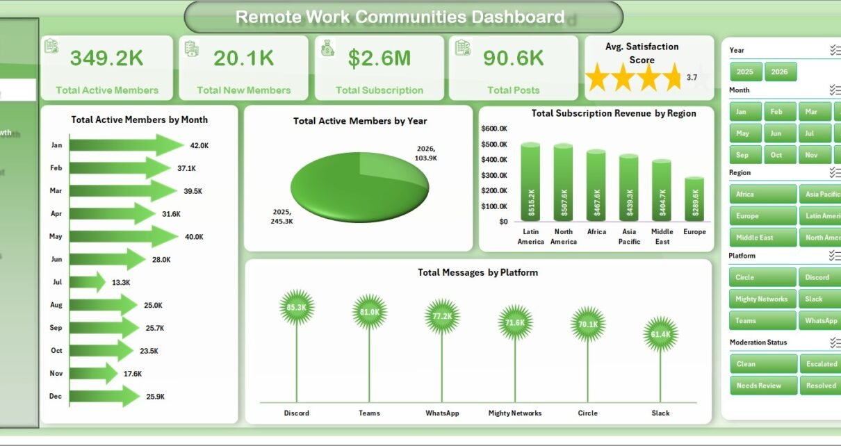
The Overview page is the executive summary of the workbook. It gives users a fast view of community scale, member growth, subscription activity, posts, and satisfaction before they move into detailed pages.
Total Active Members by Month
This chart shows how active member volume changes month by month. It helps community teams spot growth periods, slow months, and possible retention issues.
Total Active Members by Year
This visual compares active members across years. It helps leaders understand whether the community is building long-term momentum or losing participation over time.
Total Subscription Revenue by Region
This chart shows paid subscription revenue by region. It helps membership teams identify stronger markets and regions that may need more sales, onboarding, or engagement effort.
Total Messages by Platform
This chart compares message volume across community platforms. It helps managers see where member conversations are most active and where moderation coverage may be needed.
2. Community Growth
The Community Growth tab focuses on member volume, subscription revenue, support cost, and engagement status. It is useful for monthly growth reviews and membership planning.
Total Active Members by Community Name: This chart compares active members across community groups. It helps identify the communities with stronger participation and those that need growth attention.
Total Subscription Revenue by Quarter: This chart shows quarterly paid subscription revenue. It helps teams review seasonality, renewals, and revenue progress over time.
Total Support Cost by Membership Plan: This visual compares support cost across membership plans. It helps teams see whether specific plans require more support effort than expected.
Total Records by Engagement Status: This chart groups records by engagement status. It helps managers understand how much of the community is active, inactive, at risk, or otherwise classified.
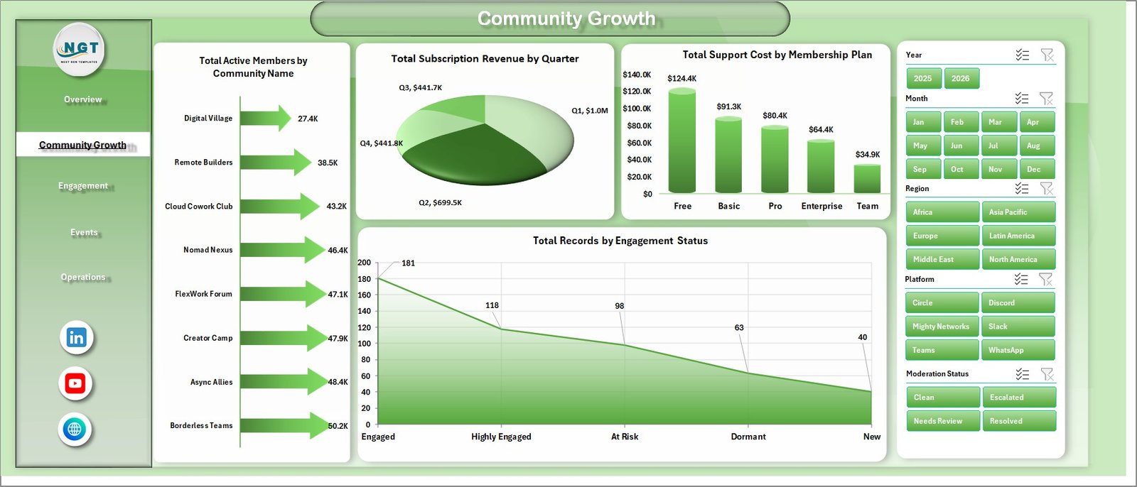
Community Growth
3. Engagement
The Engagement tab helps users understand how members participate across segments, work styles, events, and community activity.
Total Messages by Member Segment: This chart compares message volume by member segment. It helps teams identify which member groups are contributing the most conversations.
Avg. Satisfaction Score by Work Style: This visual compares satisfaction by work style. It helps managers understand whether remote, hybrid, freelance, or other work styles report stronger community experience.
Attendance % by Event Type: This chart shows which event types attract stronger attendance. It supports better event planning and calendar decisions.
Total Events Hosted by Event Type: This chart compares the number of events hosted by type. It helps teams check whether event supply matches member interest.
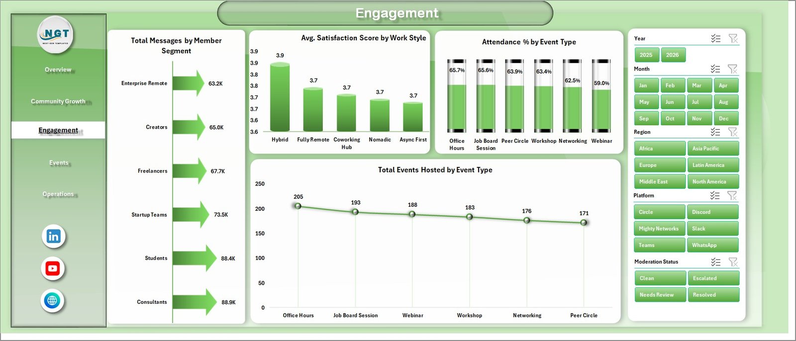
Engagement
4. Events
The Events tab supports event operations, attendance review, platform planning, and moderation follow-up.
Total Events Hosted by Month: This chart tracks event volume by month. It helps teams compare event cadence and identify months with more community programming.
Total Attendance by Platform: This visual compares attendance across platforms. It helps event teams decide where live sessions or community meetups are performing best.
Total Records by Moderation Status: This chart groups records by moderation status. It helps managers check whether content and participation issues are being reviewed.
Attendance % by Community Name: This chart compares attendance percentage by community. It helps identify communities with stronger event participation and those needing engagement support.
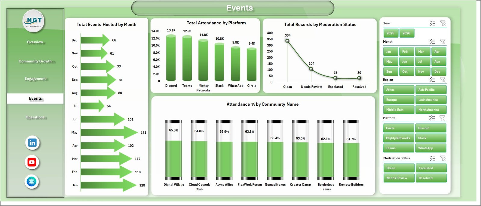
Events
5. Operations
The Operations tab connects community performance with support cost and member satisfaction. It is useful for operational reviews where community health must be considered alongside cost.
Total Support Cost by Region: This chart compares support cost across regions. It helps teams understand where support resources are being consumed.
Total Support Cost by Platform: This visual shows support cost by platform. It helps managers check whether certain platforms create more operational workload.
Avg. Satisfaction Score by Membership Plan: This chart compares satisfaction by membership plan. It helps teams understand whether premium, standard, or free plans are delivering the expected experience.
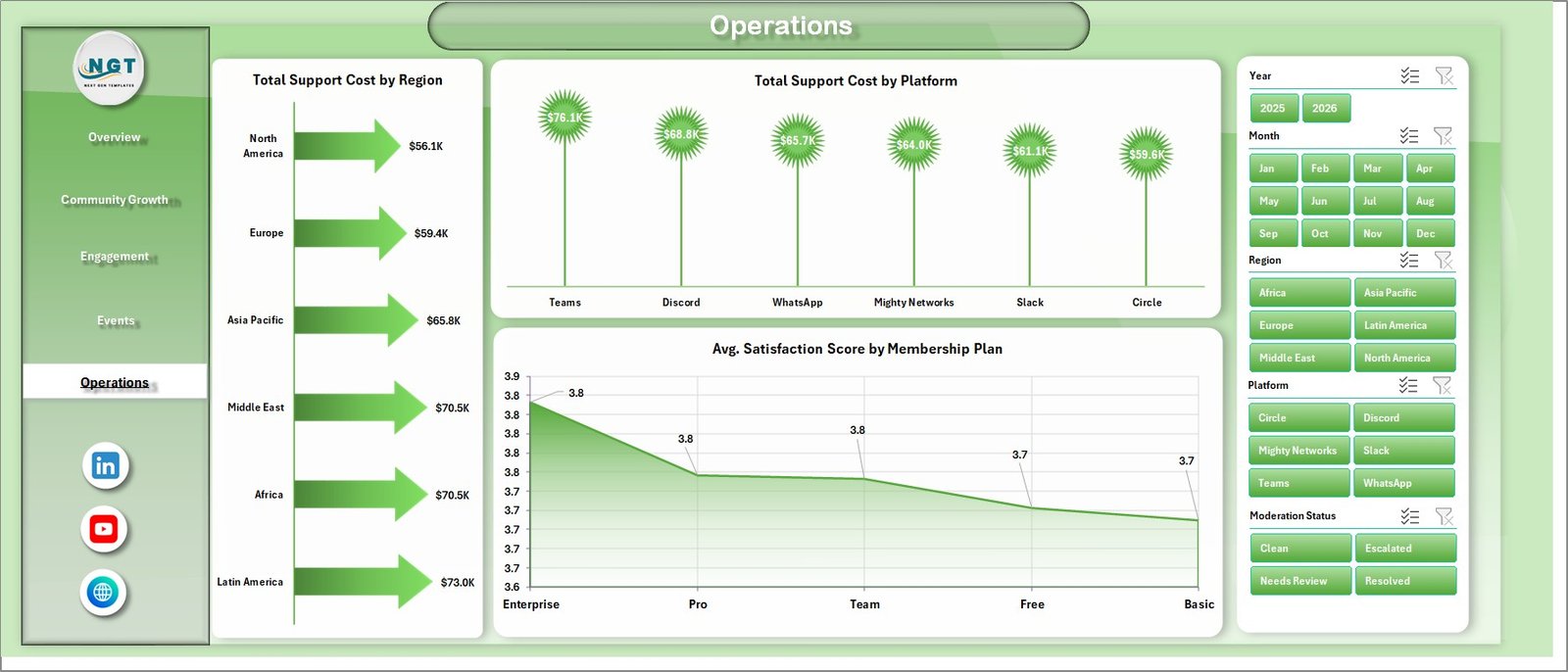
Operations
6. Data Sheet Tab
The Data Sheet is where users add or replace remote work community records in the same format as the sample data. Keeping the same column structure helps the pivot tables, slicers, KPI cards, and charts refresh correctly.

Data Sheet tab
7. Support Sheet
The Support Sheet contains the pivot tables used to create the dashboard dynamically. After updating the Data Sheet, go to the Excel Data ribbon and click Refresh All. All pivots and charts refresh together. You can keep this sheet hidden before sharing the workbook with regular users.

Support sheet tab
Remote Work Communities Dashboard in Excel vs. Google Sheets vs. Paid CRM/SaaS – Feature Comparison
| Feature | This Excel dashboard | Google Sheets alternative | Paid community SaaS |
|---|---|---|---|
| Cost | $17.99 one-time sale price | Low software cost but manual setup required | Recurring subscription |
| Platform | Microsoft Excel | Google Sheets | Vendor-hosted cloud application |
| Setup time | Update data and refresh pivots | Build sheets, formulas, charts, and filters manually | Onboarding and configuration |
| Real-time team collaboration | Available through Microsoft 365 sharing workflows | Native browser collaboration | Usually included |
| Mobile access | Excel mobile or web for light review | Google Sheets mobile app | Usually included |
| Customizable fields | Editable workbook, pivots, charts, and slicers | Editable spreadsheet model | Limited by vendor settings |
| Share with link | Possible through OneDrive or SharePoint | Native link sharing | Role-based access |
| Year-1 cost at 5 users | $17.99 template plus Excel access | Workspace cost plus build time | Often hundreds or thousands per year |
| Community reporting | Members, subscriptions, posts, messages, events, attendance, support cost, satisfaction, region, plan, platform, and status analysis | Must be built or adapted | Depends on modules purchased |
Who Should Use This Template
This template is ideal for remote work community managers, coworking network operators, online course communities, creator communities, membership teams, event coordinators, support managers, and analysts who need repeatable Excel-based community reporting.
It is best when source records are already available in Excel, CSV, or export format. It is not a live chat product, billing system, moderation engine, customer support desk, mobile app, or full community CRM.
Real-World Use Cases
Monthly community review: A community operations manager uses the Overview and Community Growth pages to report active members, new members, subscription revenue, posts, and satisfaction.
Event planning review: An events coordinator uses the Engagement and Events pages to compare attendance percentage, event type, platform attendance, and event volume by month.
Support cost review: A membership analyst uses the Operations page to compare support cost by region, platform, and membership plan before resource planning.
Advantages of Remote Work Communities Dashboard in Excel
- It centralizes community growth, revenue, engagement, events, support cost, and satisfaction metrics.
- It gives managers KPI cards and detailed page-level analysis in one workbook.
- It reduces manual report preparation time for recurring community reviews.
- It works inside Excel, so teams can edit formulas, pivots, slicers, and visuals.
- It supports quick filtering without rebuilding charts.
Opportunities for Improvement
The dashboard depends on clean source data. Community names, region labels, platform names, membership plans, member segments, work styles, event types, engagement statuses, and moderation statuses should be standardized before refresh. Teams that need live messaging, payment collection, support ticketing, or automated moderation should use this workbook as a reporting layer connected to exported operational data.
Best Practices
- Keep the Data Sheet column structure unchanged unless you also update the pivots.
- Use consistent names for community, region, platform, membership plan, work style, and event type.
- Refresh all pivots after every major data update.
- Check slicer selections before presenting numbers.
- Review satisfaction together with engagement and support cost.
- Keep the Support Sheet hidden if end users only need dashboard pages.
For official Excel guidance, see Microsoft Support: Create a PivotTable to analyze worksheet data.
Explore Relevant Templates
- Remote Work Communities Dashboard in Excel
- Remote Crop Monitoring Dashboard in Excel
- Drone Farming Startups Dashboard in Excel
- Agriculture and Farm Dashboard in Excel
- Excel Dashboard templates
Frequently Asked Questions
What is the Remote Work Communities Dashboard in Excel?
It is a ready-to-use Excel dashboard for tracking remote work community members, subscriptions, posts, messages, events, attendance, support cost, satisfaction, regions, platforms, membership plans, work styles, and statuses.
How many sheets are included?
The workbook includes 7 tabs: Overview, Community Growth, Engagement, Events, Operations, Data Sheet, and Support Sheet.
Can I use my own community data?
Yes. Replace the sample data in the Data Sheet with your own records in the same format, then refresh all pivots and charts.
Does this dashboard require macros?
No. The dashboard is built with Excel tables, pivot tables, charts, and slicers.
Can I hide the Support Sheet?
Yes. The Support Sheet contains pivot tables and can be hidden during regular dashboard use.
Does this replace community management software?
No. It is a reporting dashboard, not a live community platform, billing system, support desk, or moderation engine.
About the Author
Built by PK – Microsoft Certified Professional with 15+ years of Excel, Google Sheets, and Power BI experience. Founder of NextGenTemplates, reaching 300K+ subscribers across YouTube channels. Every template is hand-built and tested before release.
Conclusion
The Remote Work Communities Dashboard in Excel gives community teams a practical way to review active members, new members, subscription revenue, posts, messages, attendance, events, support cost, moderation status, engagement status, and satisfaction score. With 7 tabs, 5 KPI cards, multiple analysis pages, slicers, a Data Sheet, and a Support Sheet, it is built for repeatable community reporting without starting from a blank workbook.
Click here to purchase Remote Work Communities Dashboard in Excel
Visit our YouTube channel to learn step-by-step Excel dashboard tutorials.