In today’s fast-paced business world, resellers play a crucial role in bridging the gap between manufacturers and customers. But managing multiple channels, tracking targets, and monitoring performance metrics can be extremely challenging. That’s where the Reseller KPI Dashboard in Power BI comes into play.
This ready-to-use dashboard helps resellers, distributors, and sales managers visualize their key performance indicators (KPIs) in real time, using clear visuals and interactive reports — all powered by Microsoft Power BI.
Whether you manage hundreds of resellers or oversee a single distribution network, this dashboard transforms complex data into easy-to-understand insights, so you can make smarter business decisions instantly.
Click to Purchases Reseller KPI Dashboard in Power BI
What Is a Reseller KPI Dashboard in Power BI?
A Reseller KPI Dashboard in Power BI is an analytical tool designed to measure reseller performance across various business dimensions — such as sales volume, profit margins, inventory turnover, target achievement, and year-over-year growth.
Built using Microsoft Power BI, this dashboard connects to your Excel data source and converts raw figures into visual insights. It tracks both Month-to-Date (MTD) and Year-to-Date (YTD) metrics, helping managers identify trends, compare results with targets, and evaluate reseller performance efficiently.
With interactive visuals, slicers, and trend charts, you can explore data by month, region, product category, or KPI group — all within a single, user-friendly interface.
🧩 Key Features of the Reseller KPI Dashboard in Power BI
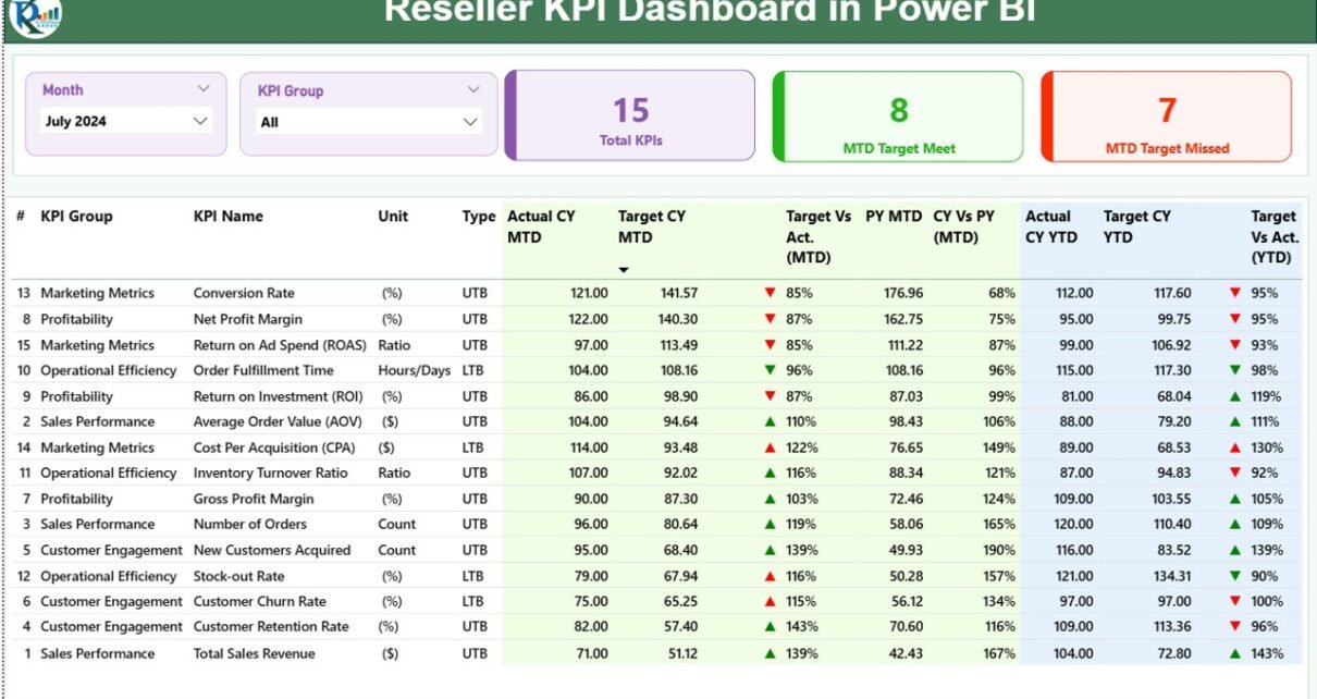
The Reseller KPI Dashboard in Power BI includes three interactive pages, each built to deliver clear and actionable insights.
1️⃣ Summary Page (Main Dashboard)
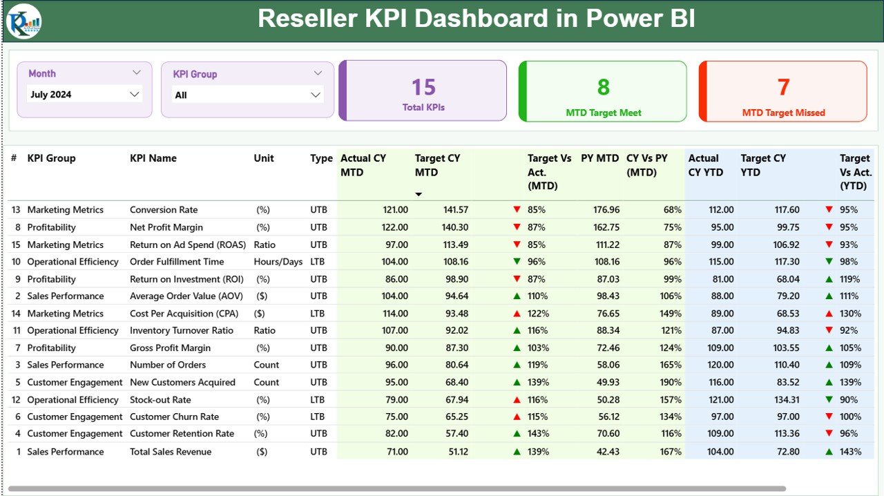
This is the main page and the heart of the dashboard.
Here’s what it offers:
-
📅 Month and KPI Group Slicers: Users can select the desired month and KPI group from dropdown filters to dynamically update all visuals.
-
📊 KPI Summary Cards:
-
Total KPIs Count: Displays how many KPIs are being tracked.
-
MTD Target Met Count: Shows how many KPIs have achieved their monthly targets.
-
MTD Target Missed Count: Indicates KPIs that failed to meet targets.
-
2️⃣ KPI Trend Page
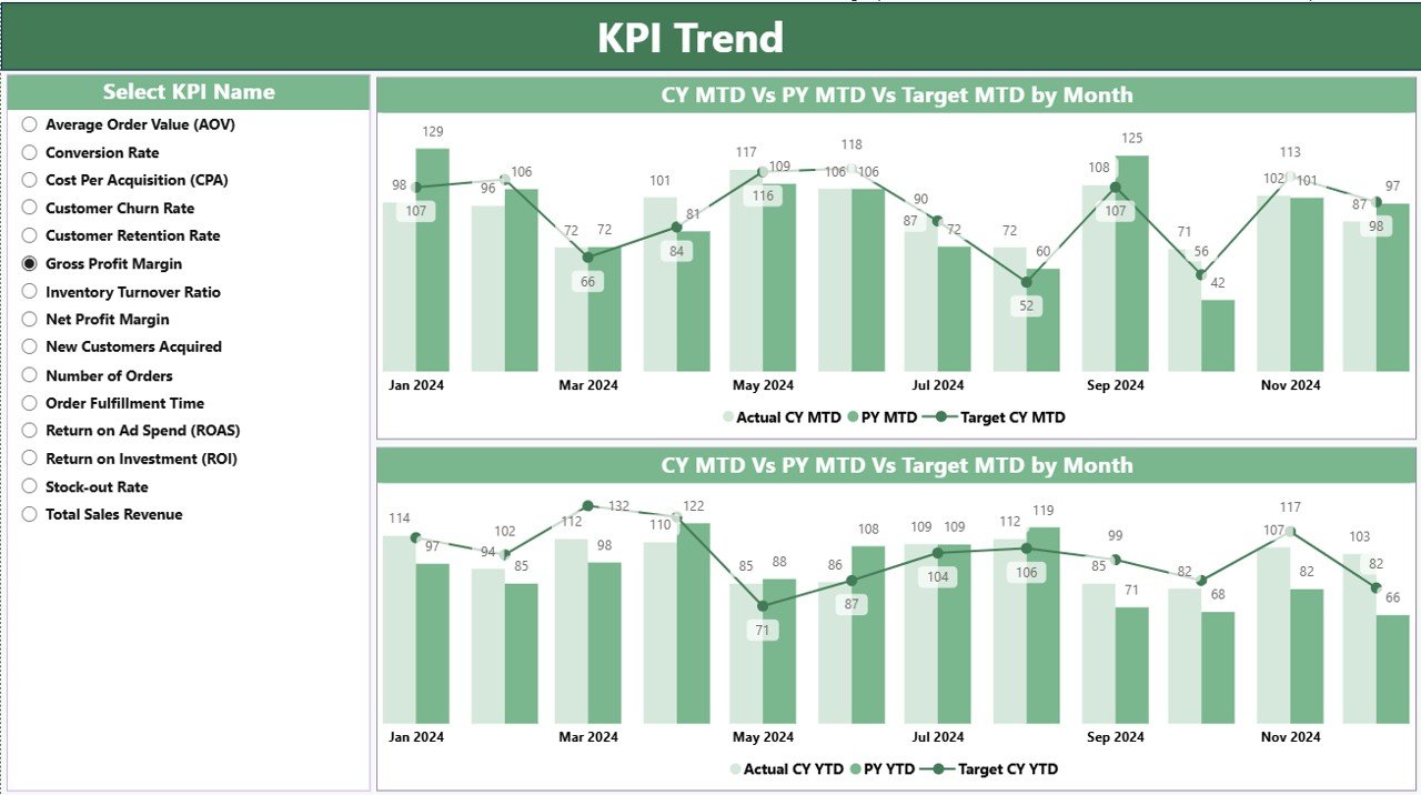
The KPI Trend Page gives a deeper look into how performance changes over time.
It features:
-
📈 Two combo charts to compare Actuals vs Targets for both MTD and YTD.
-
📅 KPI Name Slicer: Select any KPI to see its trend for the chosen period.
-
📊 Comparative View: Displays current year, previous year, and target values together to visualize improvement or decline.
With this page, you can easily recognize seasonal patterns, growth trends, and consistent under- or over-performance, making it ideal for strategy planning.
3️⃣ KPI Definition Page (Drill-Through Page)
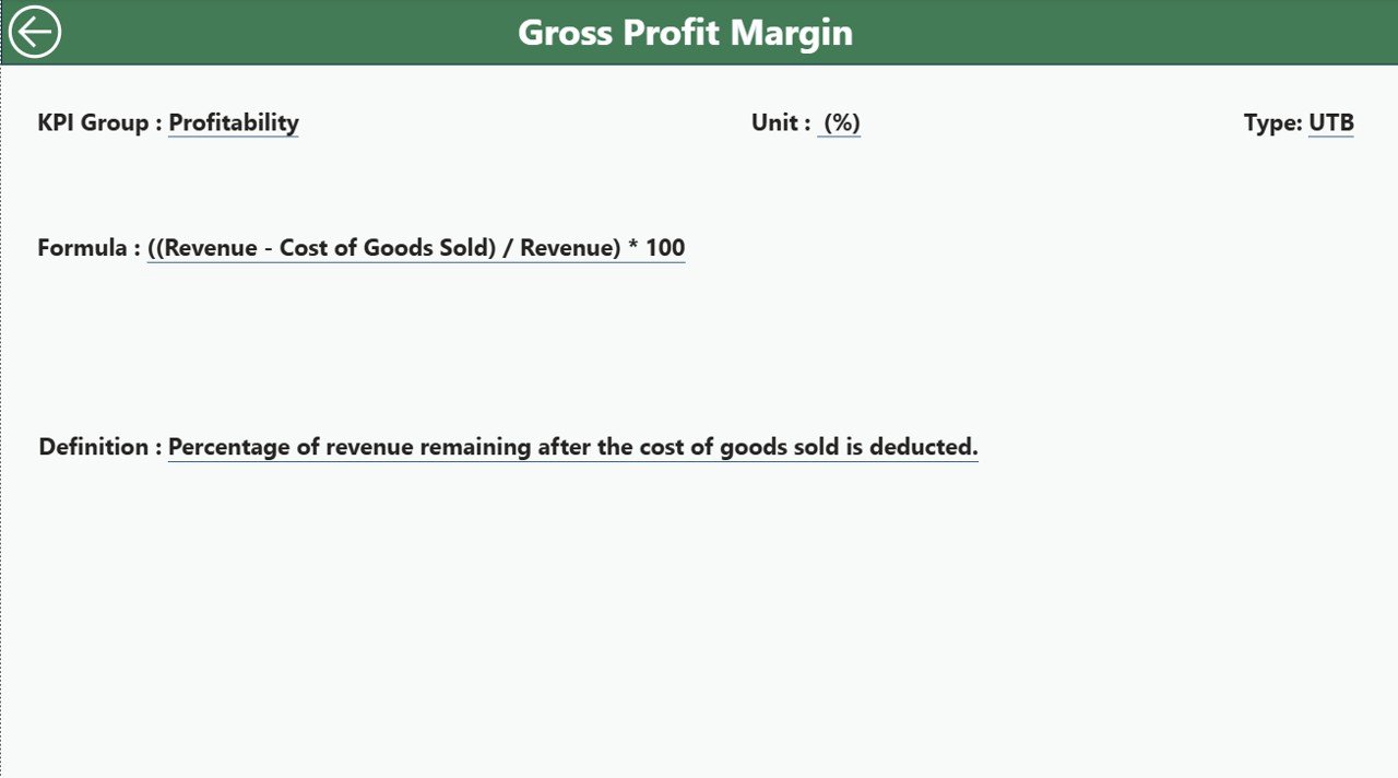
This hidden drill-through page provides detailed KPI definitions, making it a valuable reference for analysts and managers.
From the Summary Page, you can right-click on any KPI and drill through to view:
-
KPI Formula
-
Definition or description
-
KPI Type (UTB / LTB)
-
Unit of Measurement
To return to the main dashboard, just click the Back button on the top-left corner.
📊 Excel Data Source for the Dashboard
The Reseller KPI Dashboard in Power BI uses an Excel file as its data source, making it simple to update and maintain.
The Excel workbook contains three key worksheets, each with a specific role:
🧾 1. Input_Actual Sheet
-
Contains all actual KPI numbers for each month.
-
Fields include: KPI Name, Month (use the first date of the month), MTD Actual, and YTD Actual.
-
Data is refreshed automatically in Power BI after updating this sheet.
🎯 2. Input_Target Sheet
-
Includes target values for each KPI.
-
Fields: KPI Name, Month, MTD Target, and YTD Target.
-
Used for calculating variance and target achievement rates.
🧠 3. KPI Definition Sheet
-
Defines each KPI in detail.
-
Fields: KPI Number, KPI Group, KPI Name, Unit, Formula, Definition, and Type (UTB/LTB).
-
This sheet supports the drill-through functionality in Power BI.
By organizing data in these sheets, Power BI can refresh the visuals seamlessly with every data update — ensuring that your dashboard remains current and accurate.
Click to Purchases Reseller KPI Dashboard in Power BI
🚀 Why Reseller KPI Tracking Is Essential
Reseller performance directly impacts a company’s sales success and brand presence in the market. Tracking KPIs helps you:
-
Monitor reseller contribution to overall revenue.
-
Evaluate channel effectiveness.
-
Identify bottlenecks in sales performance.
-
Maintain transparency between manufacturer and reseller.
-
Improve decision-making with real-time data.
Without clear KPI tracking, many organizations face inefficiencies like overstocking, missed targets, or unrecognized top performers. The Reseller KPI Dashboard in Power BI eliminates this confusion through data-driven clarity.
💡 Advantages of the Reseller KPI Dashboard in Power BI
Let’s explore why businesses love using this dashboard solution:
🔹 1. Real-Time Data Insights
Power BI automatically refreshes and displays real-time metrics, helping you react instantly to changes in reseller performance or sales trends.
🔹 2. Unified View of All KPIs
Instead of juggling multiple reports, this dashboard consolidates sales, financial, and operational KPIs into one place.
🔹 3. Easy Comparisons (MTD vs YTD vs PY)
You can compare Month-to-Date, Year-to-Date, and Previous Year figures side by side, giving you a complete picture of performance trends.
🔹 4. Target Achievement Visualization
Color-coded icons (green/red) and up/down arrows visually communicate whether each KPI is meeting its target. This makes it easy for even non-technical users to interpret data quickly.
🔹 5. Drill-Through Analysis
You can click on any KPI to see its definition, formula, and related information, ensuring full transparency and understanding of the metrics being tracked.
🔹 6. Flexible Excel Integration
Since the source file is Excel-based, updating data or modifying KPIs doesn’t require coding — just basic spreadsheet knowledge.
🔹 7. Time-Saving Automation
Automated data refreshes and calculations save hours of manual reporting work each month.
🔹 8. Improved Decision-Making
With data visualization at your fingertips, you can identify high-performing resellers, lagging regions, and opportunities for improvement — leading to smarter strategies.
⚙️ How the Dashboard Works Step-by-Step
Here’s a simple workflow to understand how this dashboard functions:
-
Data Entry: Input monthly Actuals and Targets into Excel.
-
Power BI Connection: The dashboard connects directly to the Excel file.
-
Auto-Refresh: Data updates automatically (or manually on refresh).
-
Visualization: Summary and trend pages display calculated KPIs, icons, and charts.
-
Drill-Through: Users explore details using the hidden KPI Definition page.
The entire process runs smoothly without needing advanced Power BI knowledge, making it accessible for all professionals.
🎯 Key Metrics You Can Track
The Reseller KPI Dashboard covers a wide variety of performance indicators across business functions. Some examples include:
Click to Purchases Reseller KPI Dashboard in Power BI
-
Sales Growth %
-
Revenue Achievement %
-
Customer Retention Rate
-
Gross Profit Margin %
-
Inventory Turnover Ratio
-
Average Order Value
-
On-Time Delivery %
-
Return Rate %
-
Target Achievement % (MTD & YTD)
-
Performance vs Previous Year %
These KPIs give a balanced overview of both short-term and long-term performance across reseller networks.
🏆 Best Practices for Using the Reseller KPI Dashboard in Power BI
To get the most out of your dashboard, follow these best practices:
✅ 1. Keep Data Clean and Consistent
Always validate data before uploading to Excel. Use consistent date formats (like 1-Jan-2025) and ensure all KPIs have both actual and target values.
✅ 2. Update Data Regularly
Refresh your Excel data weekly or monthly to maintain accuracy and reliability.
✅ 3. Define Clear KPI Ownership
Assign responsibility for each KPI to specific teams (e.g., Sales, Operations) so that accountability remains transparent.
✅ 4. Use Descriptive KPI Names
Avoid abbreviations that can confuse users. For example, use Sales Growth Percentage instead of SG%.
✅ 5. Analyze Variance Trends
Regularly compare Target vs Actual and Current vs Previous Year metrics to understand performance direction.
✅ 6. Utilize Drill-Through Wisely
Encourage users to explore KPI formulas and definitions before making performance judgments.
✅ 7. Share Reports Securely
Leverage Power BI’s sharing options to distribute reports only to authorized personnel, protecting business-critical data.
✅ 8. Use Visual Filters
Apply slicers (month, region, product category) to focus your analysis and reduce visual clutter.
✅ 9. Combine with Other BI Tools
Integrate this dashboard with CRM or ERP systems for deeper insights and automation.
✅ 10. Review Dashboard Design Quarterly
Periodically evaluate visuals and layout to ensure they remain relevant to business goals.
📈 Real-World Use Cases
Businesses across industries can adapt this dashboard to their specific needs. Here are a few examples:
-
Retail Distributors: Track regional sales, returns, and margin targets for each reseller.
-
Manufacturers: Monitor partner performance to identify high-potential resellers.
-
Technology Companies: Measure reseller engagement, lead conversion, and software license renewals.
-
Wholesale Suppliers: Compare product category performance across multiple dealers.
Regardless of the industry, this dashboard provides a 360° view of reseller operations.
🧭 Conclusion
The Reseller KPI Dashboard in Power BI is more than just a reporting tool — it’s a strategic companion for data-driven growth.
By combining Excel’s simplicity with Power BI’s visualization power, it transforms raw numbers into meaningful insights. You can track targets, measure performance, and spot improvement areas in real time.
With features like KPI slicers, trend analysis, and drill-through details, it gives every stakeholder — from executives to sales managers — a clear understanding of how the reseller network performs month after month.
If your goal is to boost reseller performance, enhance accountability, and simplify analysis, then the Reseller KPI Dashboard in Power BI is the perfect solution.
❓ Frequently Asked Questions (FAQs)
1. What is a Reseller KPI Dashboard used for?
It’s used to monitor and evaluate reseller performance using KPIs like sales growth, profit margin, and target achievement. It helps businesses identify top performers and areas that need attention.
2. Which data source does the dashboard use?
The dashboard connects to an Excel workbook that contains three sheets — Input_Actual, Input_Target, and KPI Definition.
3. Can I modify or add new KPIs?
Yes. You can add new KPIs directly to the Excel file and refresh the Power BI dashboard to include them automatically.
4. Is coding knowledge required to use this dashboard?
No. The dashboard is designed for non-technical users. You only need basic Excel knowledge to update data.
5. Can this dashboard handle multiple reseller regions?
Absolutely. You can easily extend it by adding columns like Region or Category to your Excel data and adjusting visuals in Power BI.
6. How often should I refresh the dashboard?
Most users refresh it monthly or weekly, depending on data availability and business needs.
7. Is this dashboard customizable?
Yes. You can modify visuals, colors, KPI cards, and charts according to your branding or reporting preferences.
8. Does Power BI require a license to use this dashboard?
You can use it on Power BI Desktop (free) for personal analysis or publish it to the Power BI Service for online sharing (requires a Pro license).
9. How can this dashboard improve decision-making?
It gives leaders real-time visibility into reseller performance, allowing them to take proactive actions to meet business goals.
Visit our YouTube channel to learn step-by-step video tutorials