In today’s data-driven business world, understanding your revenue performance is not just beneficial—it’s essential. Whether you’re a small business owner, a financial analyst, or a sales team leader, having a clear, dynamic, and insightful view of your revenue streams can directly impact your profitability and decision-making. That’s exactly where the Revenue Analysis Dashboard in Excel becomes a game-changer.
This comprehensive guide walks you through everything you need to know about using a Revenue Analysis Dashboard built in Microsoft Excel, including its features, advantages, use cases, best practices, and frequently asked questions.
Click to Purchases Revenue Analysis Dashboard in Excel
What is a Revenue Analysis Dashboard in Excel?
A Revenue Analysis Dashboard in Excel is a pre-designed template that helps you track, analyze, and visualize your revenue-related data in a structured and insightful manner. Using Excel’s built-in functions, pivot tables, slicers, and interactive charts, this dashboard gives you a bird’s-eye view of your financial performance across multiple parameters—such as regions, sales channels, products, and time periods.
Unlike complex BI software, Excel dashboards are accessible, customizable, and cost-effective—making them ideal for organizations of all sizes.
Key Features of the Revenue Analysis Dashboard in Excel
This ready-to-use dashboard is thoughtfully designed with 5 analytical pages and a user-friendly interface. Let’s break down its core components:
Page Navigator (Left-Side Pane)
A built-in Page Navigator allows you to switch easily between different views:
-
Overview
-
Region Analysis
-
Sales Channel Analysis
-
Product Analysis
-
Monthly Trends
This ensures seamless navigation and boosts user experience—especially helpful when presenting data to different stakeholders.
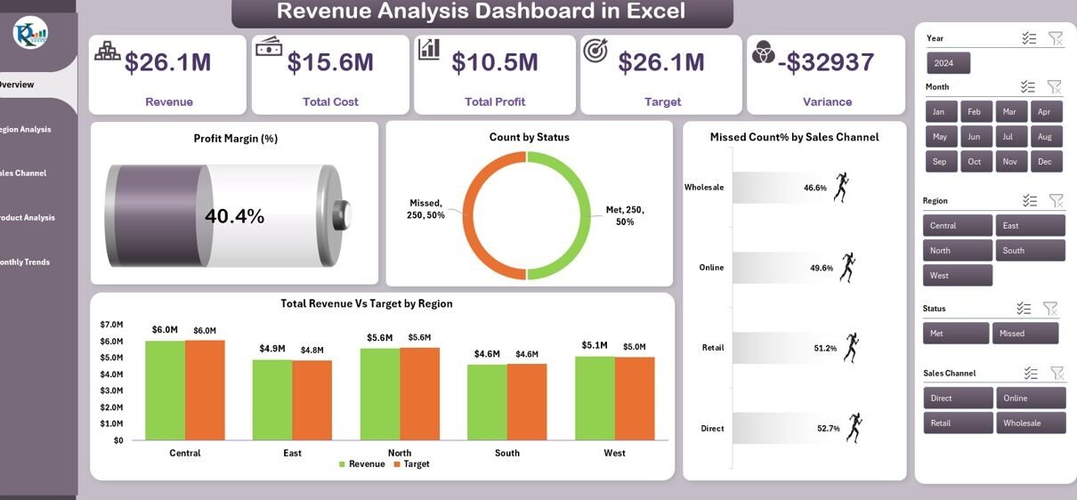
Overview Page
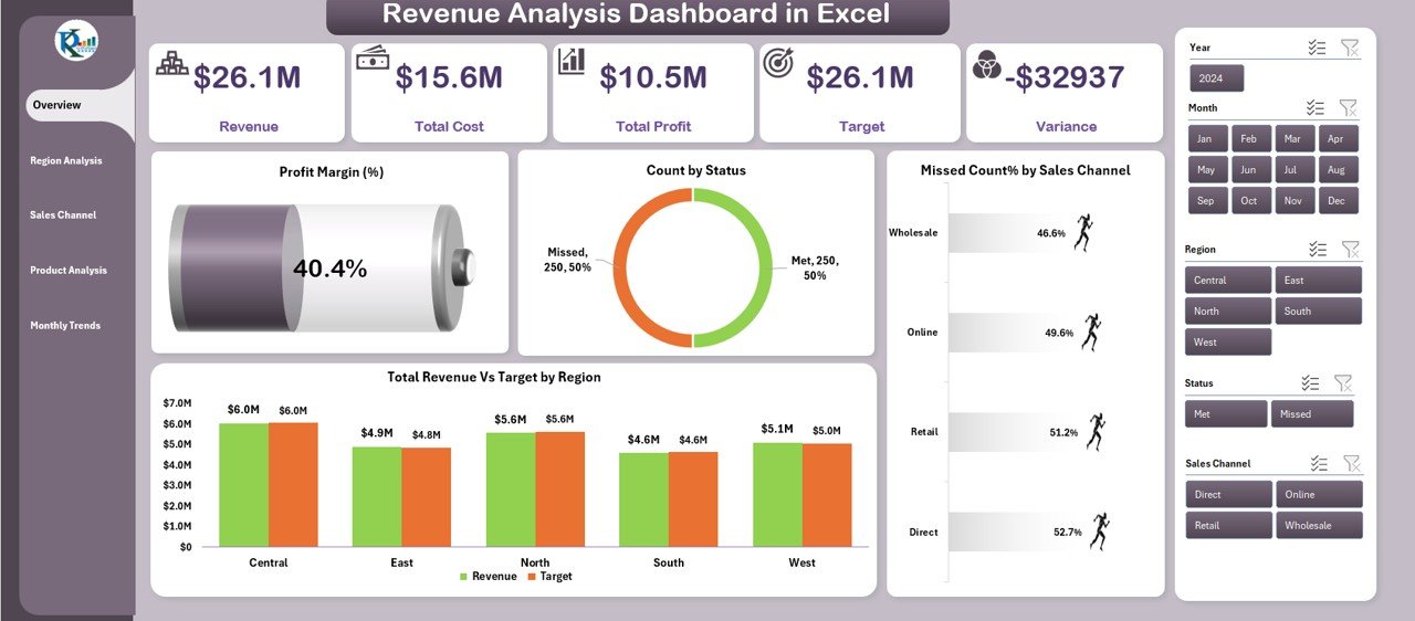
This is your central hub—a high-level summary of revenue performance.
Main Highlights:
-
Slicers on the right side allow filters by Month, Year, Region, and more.
-
5 Dynamic KPI Cards give instant insight into Total Revenue, Target Achievement, Total Profit, Met Count, and Missed Count.
Charts include:
- Profit Margin (%)
- Count by Status
- Missed Count % by Sales Channel
- Total Revenue vs Target by Region
The Overview Page answers the most critical question: How are we performing right now?
Region Analysis Page
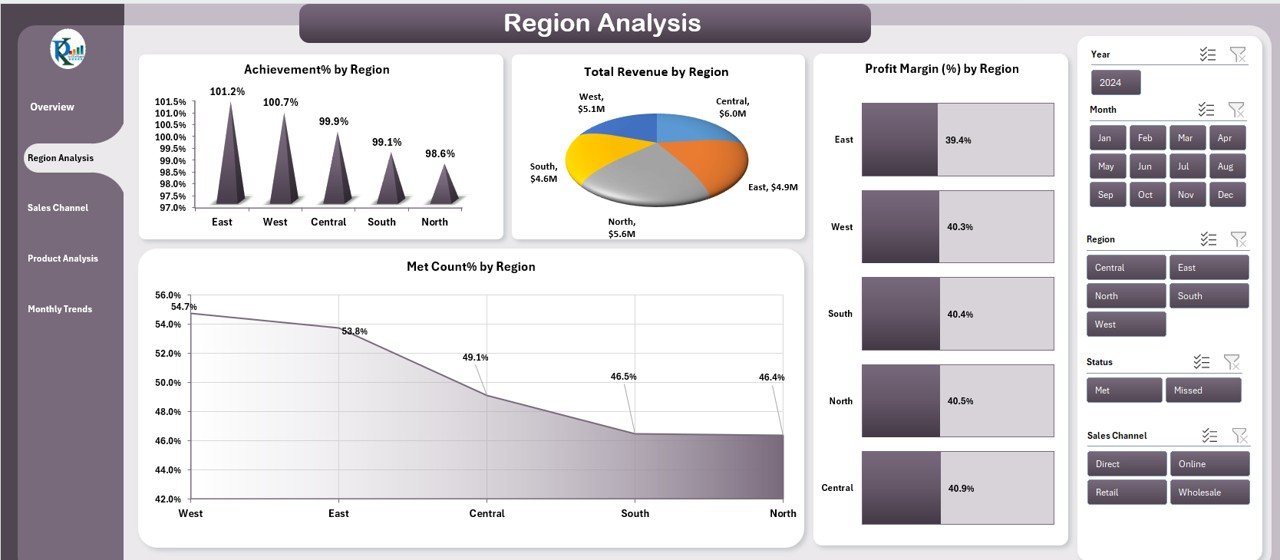
Drill down into geographical performance with 4 well-designed charts:
-
Achievement % by Region
-
Total Revenue by Region
-
Profit Margin (%) by Region
-
Met Count % by Region
This page helps identify high-performing and underperforming regions, guiding your sales strategy and resource allocation.
Sales Channel Analysis Page
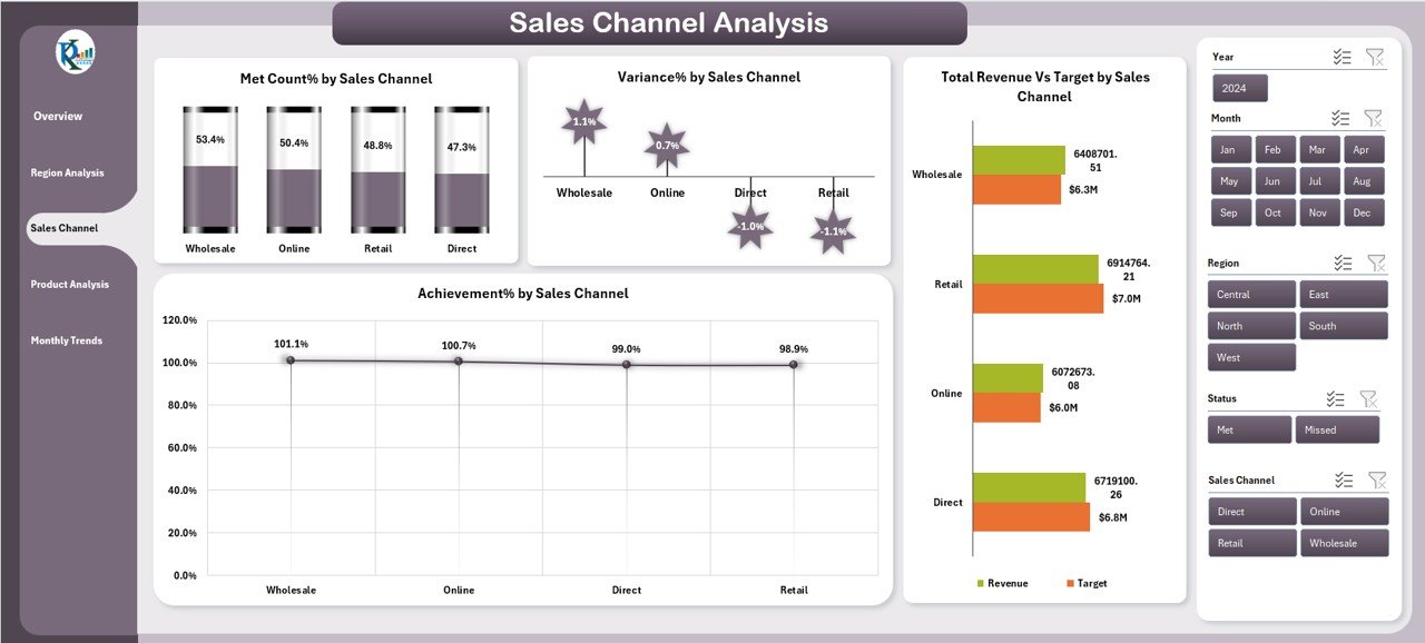
This section focuses on performance by sales channel (e.g., online, retail, wholesale):
-
Met Count % by Sales Channel
-
Variance % by Sales Channel
-
Total Revenue vs Target by Sales Channel
-
Achievement % by Sales Channel
This analysis uncovers the most effective distribution channels and helps improve poor-performing ones.
Product Analysis Page
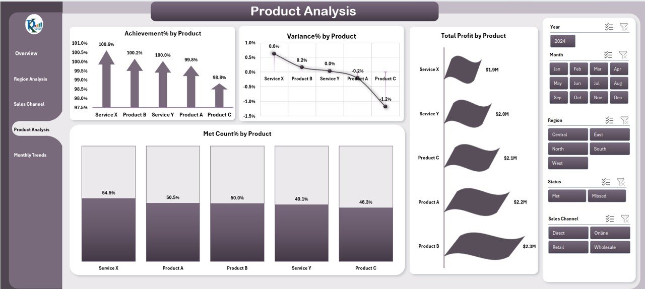
Evaluate your product-wise revenue metrics using:
-
Achievement % by Product
-
Variance % by Product
-
Met Count % by Product
-
Total Profit by Product
This allows for smarter inventory, pricing, and promotional decisions based on product performance.
Monthly Trends Page
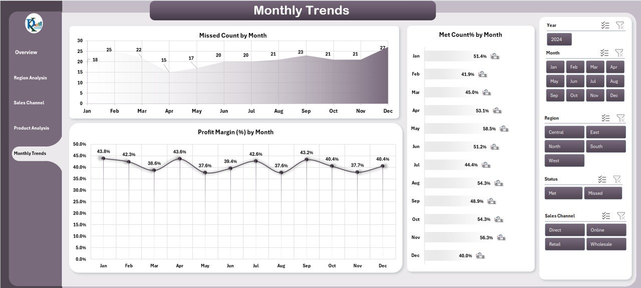
Visualize time-based performance trends using:
-
Missed Count by Month
-
Met Count % by Month
-
Profit Margin (%) by Month
You can easily spot seasonal trends, revenue peaks, or downturns, helping you plan future campaigns or budget allocations.
Data Sheet Tab
This is where all raw data is stored. Users can input:
-
Revenue
-
Target
-
Region
-
Product
-
Sales Channel
-
Profit
-
Status (Met/Missed)
-
Date
All charts and KPIs dynamically update as soon as data is changed.
Support Sheet Tab
This sheet holds lookup values such as:
-
Region list
-
Product categories
-
Channel types
-
Status values (✔/✘)
These values feed drop-downs and slicers in the dashboard to ensure consistent data entry.
Why Should You Use a Revenue Analysis Dashboard in Excel?
You might ask, “Can’t I just use spreadsheets and formulas?” While that’s true, here’s why a dashboard is a massive upgrade:
-
✅ Consolidates all KPIs into a single view
-
✅ Enhances data visualization with interactive charts
-
✅ Filters and slicers make data exploration easier
-
✅ Helps in spotting patterns and anomalies instantly
-
✅ Empowers team discussions and faster decisions
Advantages of Revenue Analysis Dashboard in Excel
Here are the key benefits that make this dashboard a must-have for any business:
● Centralized Decision-Making
All critical revenue data appears on a single screen. This means no more switching between multiple sheets or reports.
● Real-Time Data Refresh
You can refresh your entire dashboard with a click. Update the Data Sheet, and charts update automatically.
● Cost-Effective
No need for expensive BI tools. Excel delivers power and simplicity without the price tag.
● Highly Customizable
You can tailor the dashboard as per your KPIs, teams, or industry—change color themes, chart types, and labels.
● Easy Sharing
Since Excel is widely used, you can easily share the file via email, Teams, or cloud services.
● Ideal for All Skill Levels
From finance managers to junior analysts, anyone can understand and use the dashboard effectively.
Best Practices for Using the Revenue Analysis Dashboard in Excel
To get the most value from your dashboard, follow these best practices:
✔ Maintain Clean Data
Ensure that the Data Sheet is regularly updated with accurate and complete information.
✔ Use Dropdowns from Support Sheet
Always use dropdown lists for fields like Region or Status to avoid errors or duplicates.
✔ Refresh Pivot Tables
After updating data, go to Data > Refresh All to update all charts and summaries.
✔ Back Up Periodically
Save versions of your dashboard weekly or monthly to track historical changes.
✔ Limit Manual Editing
Avoid changing any formulas or chart settings unless you’re confident—use cell-protected zones where applicable.
✔ Use Filters Intelligently
Leverage slicers to compare different time periods, products, or sales channels for deeper insights.
Who Can Use This Dashboard?
This dashboard serves multiple roles and departments:
-
Sales Managers – to evaluate region and product performance
-
Finance Teams – to track profitability and revenue targets
-
Marketing Analysts – to plan campaigns based on seasonal trends
-
Executives – to get a big-picture summary in a few clicks
-
Business Consultants – to prepare client presentations or audits
Real-Life Use Case Scenarios
🏢 Small Businesses
Track income from different store branches and salespeople using Region and Sales Channel views.
🛒 E-Commerce Platforms
Evaluate performance by product category, online platform (Amazon, Shopify, etc.), and monthly revenue.
🏭 Manufacturing Companies
Analyze B2B vs B2C performance across products and months to streamline production schedules.
💼 Financial Advisors
Use the dashboard to showcase revenue growth and forecasting to clients in a compelling format.
Tips to Customize This Dashboard Further
-
Add a new slicer for Customer Type (Retail vs Wholesale)
-
Insert a trendline to visualize revenue growth over time
-
Include conditional formatting to highlight underperforming products
-
Use color-coded cards to signal KPIs that are on target (green) vs missed (red)
Conclusion
In conclusion, the Revenue Analysis Dashboard in Excel is an incredibly powerful yet simple tool for turning numbers into actionable insights. Whether you’re analyzing product performance, regional trends, or channel efficiency, this dashboard saves time, improves accuracy, and supports better decision-making.
You don’t need expensive tools to get started—Excel already gives you everything you need to analyze revenue like a pro. All it takes is a smart dashboard design, and this template does exactly that.
Frequently Asked Questions (FAQs)
Click to Purchases Revenue Analysis Dashboard in Excel
Q1: Do I need advanced Excel skills to use this dashboard?
A: No. This dashboard is designed for ease of use. You can operate it using slicers, dropdowns, and a simple refresh action.
Q2: Can I add more KPIs or charts to this dashboard?
A: Yes. Excel’s flexibility allows you to add more KPIs or modify chart types depending on your needs.
Q3: How often should I update the data sheet?
A: Ideally, you should update it weekly or monthly, depending on your business cycle.
Q4: Is this dashboard compatible with Google Sheets?
A: No. This dashboard uses Excel-specific features like slicers and pivot charts, which do not work in Google Sheets.
Q5: Can I share this dashboard with my team?
A: Absolutely. You can share the file over email, Microsoft Teams, or cloud drives like OneDrive or Google Drive.
Q6: How can I filter data for a specific month or product?
A: Use the slicers on the right-hand panel to filter by date, product, region, or channel.
Q7: Can I use this dashboard for forecasting?
A: While the current version tracks actual vs. target, you can add a forecasting sheet using Excel formulas or trendlines.
Q8: What’s the best way to present this in a meeting?
A: Use the Overview Page for high-level summaries, then drill down into other tabs like Region or Product Analysis for detailed discussions.
Q9: Is there a way to lock the structure so others don’t mess up formulas?
A: Yes. You can protect individual sheets or cells using Review > Protect Sheet in Excel.
Q10: Can I change the color theme of the dashboard?
A: Yes. You can use Excel’s built-in themes under Page Layout > Themes to match your brand or personal preference.
Visit our YouTube channel to learn step-by-step video tutorials