
Risk assessment firms need a fast way to explain assessment volume, fees, risk score, critical findings, remediation cost, and compliance coverage without rebuilding reports each month. The Risk Assessment Firms Dashboard in Power BI is a ready-to-use PBIX dashboard template with 5 report pages, 5 executive KPI cards, and focused visual analysis for client risk profile, industry trends, delivery performance, and compliance findings.
For teams managing dozens or hundreds of client assessments, a static spreadsheet can hide urgent risk patterns. A visual Power BI report helps partners, analysts, GRC leaders, and compliance managers review high-risk clients, fee mix, remediation cost, analyst effort, and standard-level findings in one interactive model. You can learn more about Power BI Desktop from Microsoft Learn.
Click here to purchase the Risk Assessment Firms Dashboard in Power BI
Key Features of Risk Assessment Firms Dashboard in Power BI
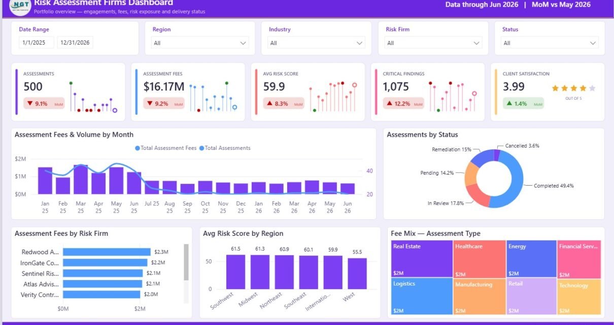
This Power BI dashboard template includes 5 pages: Overview, Client Risk Profile, Industry Trends, Firm Delivery Performance, and Compliance and Findings. The Overview page includes KPI cards for Assessments, Assessment Fees, Avg Risk Score, Critical Findings, and Client Satisfaction.
The report includes charts for monthly fees and volume, assessment status, fees by risk firm, risk score by region, fee mix by assessment type, remediation cost, industry mix, analyst effort, firm delivery scorecards, compliance standards, priorities, and critical findings.
The template is built for Power BI Desktop, so you can update the data model, rename fields, change visuals, adjust slicers, and publish to Power BI Service when your team needs shared access.
Dashboard Pages Explanation
1. Overview Page
The Overview page gives a high-level summary of the risk assessment portfolio. It shows Cards for Assessments, Assessment Fees, Avg Risk Score, Critical Findings, and Client Satisfaction.
Assessment Fees and Volume by Month: This chart compares monthly billed fees against assessment count. It helps partners see whether revenue is rising with workload or whether high-volume months are producing lower fee yield.
Assessments by Status: This visual breaks assessments into workflow stages. It helps delivery teams track completed, pending, active, or similar statuses during recurring operations meetings.
Assessment Fees by Risk Firm: This chart compares fee contribution across risk firms. It helps leadership identify the firms or practice groups that generate the highest assessment revenue.
Avg Risk Score by Region: This visual compares client risk score across regions. It helps teams focus follow-up and remediation planning in regions with higher average risk.
Fee Mix by Assessment Type: This chart explains which assessment types contribute the largest share of fees. It is useful for service-line planning and pricing review.
Risk Assessment Firms Dashboard in Power BI
2. Client Risk Profile
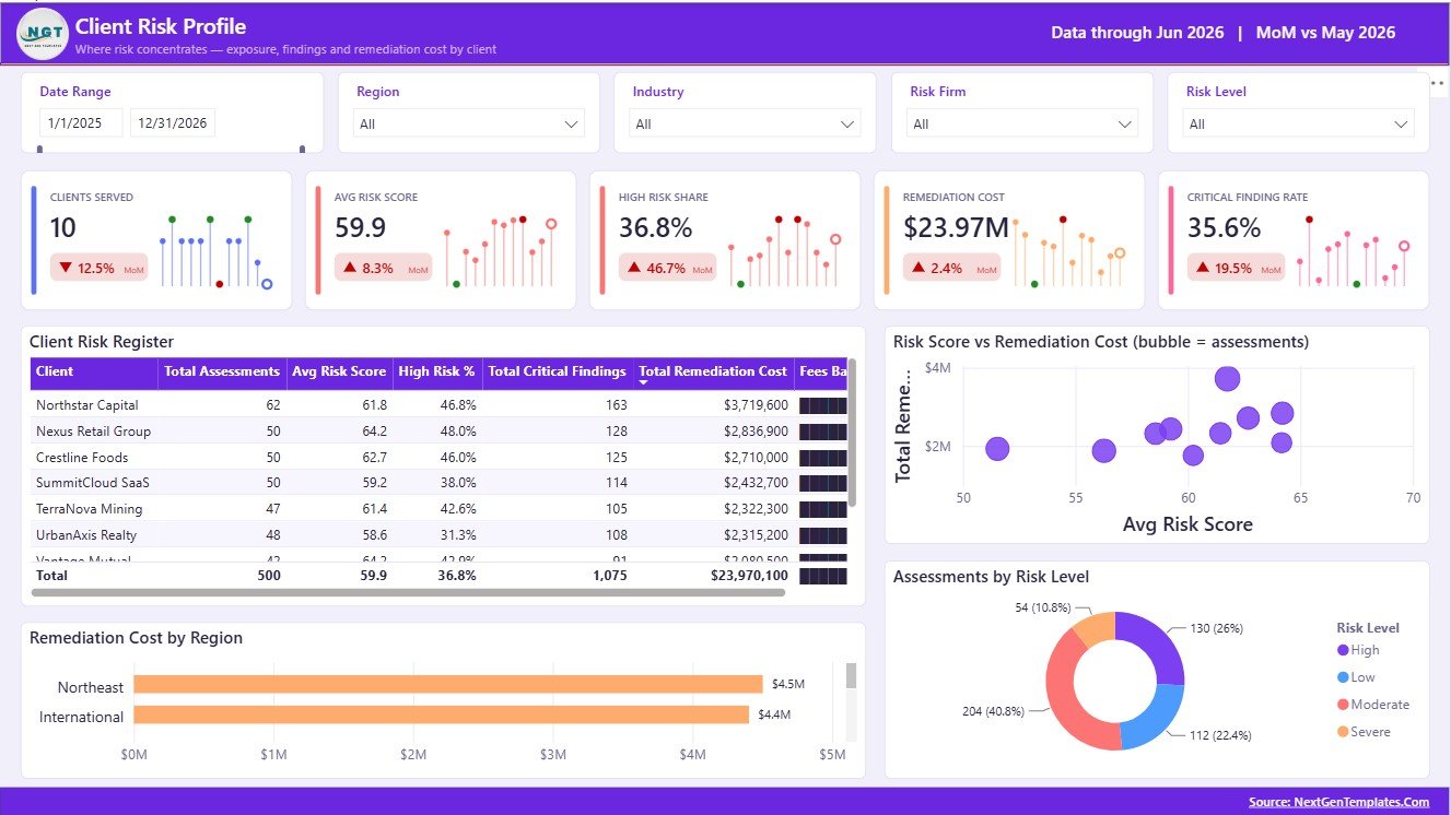
The Client Risk Profile page focuses on client-level risk, remediation exposure, and risk tiering. It is useful for account reviews, prioritization meetings, and client-facing summaries.
Client Risk Register by Client: This view lists client-level assessment indicators in a structured register. It helps reviewers identify high-risk clients quickly.
Risk Score vs Remediation Cost by Assessment Volume: This analysis connects risk score, remediation cost, and assessment volume. It helps separate high-risk clients from clients that also require larger corrective budgets.
Remediation Cost by Region: This chart compares remediation cost by geography. It helps firms identify where post-assessment work may need more resources.
Assessments by Risk Level: This visual groups assessments by risk level. It helps leaders understand whether the portfolio is weighted toward low, medium, high, or critical risk.
Client Risk Profile
3. Industry Trends
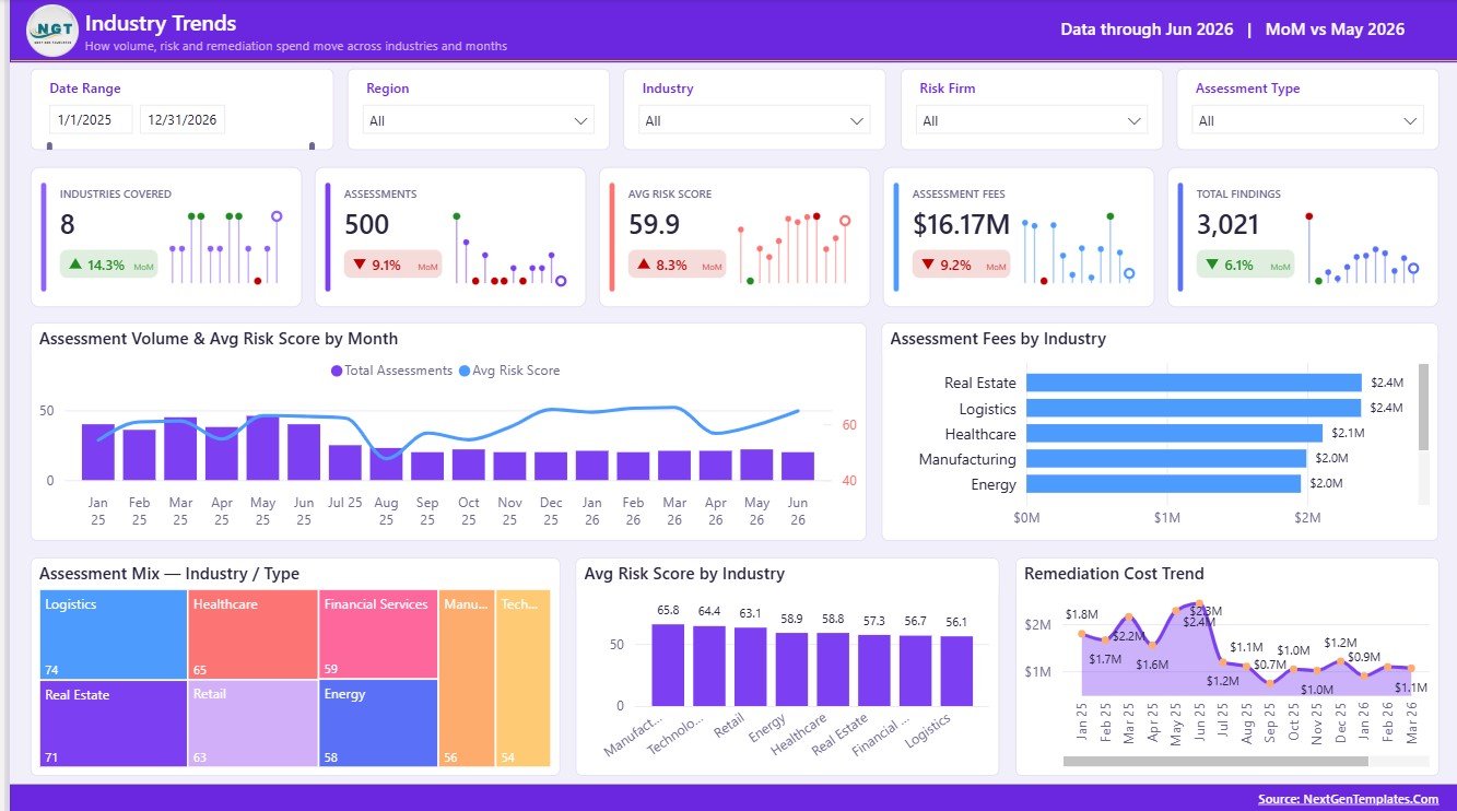
The Industry Trends page helps firms compare assessment activity and risk patterns by industry and month. It supports sector planning, advisory positioning, and practice development.
Assessment Volume and Avg Risk Score by Month: This chart compares monthly volume with average risk score. It helps detect whether busy months also bring higher-risk work.
Assessment Fees by Industry: This visual compares revenue by industry. It helps leadership understand which sectors are driving the most commercial value.
Assessment Mix by Industry and Type: This chart shows how assessment types vary across industries. It helps identify sector-specific demand patterns.
Avg Risk Score by Industry: This visual compares risk intensity across industries. It helps prioritize industry-level advisory and remediation focus.
Remediation Cost by Month: This trend shows how remediation cost changes over time. It supports cost forecasting and post-assessment planning.
Industry Trends
4. Firm Delivery Performance
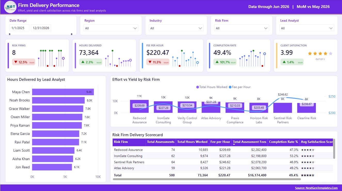
The Firm Delivery Performance page helps managers review analyst effort, firm efficiency, and delivery scorecard results. It is designed for internal performance review.
Hours Delivered by Lead Analyst: This chart compares effort by lead analyst. It helps managers balance workload and identify delivery bottlenecks.
Effort vs Yield by Risk Firm: This analysis compares delivery effort against output or fee yield. It helps leadership identify efficient and inefficient delivery patterns.
Risk Firm Delivery Scorecard by Risk Firm: This scorecard summarizes performance by firm. It supports partner reviews and internal benchmarking.
Firm Delivery Performance
5. Compliance and Findings
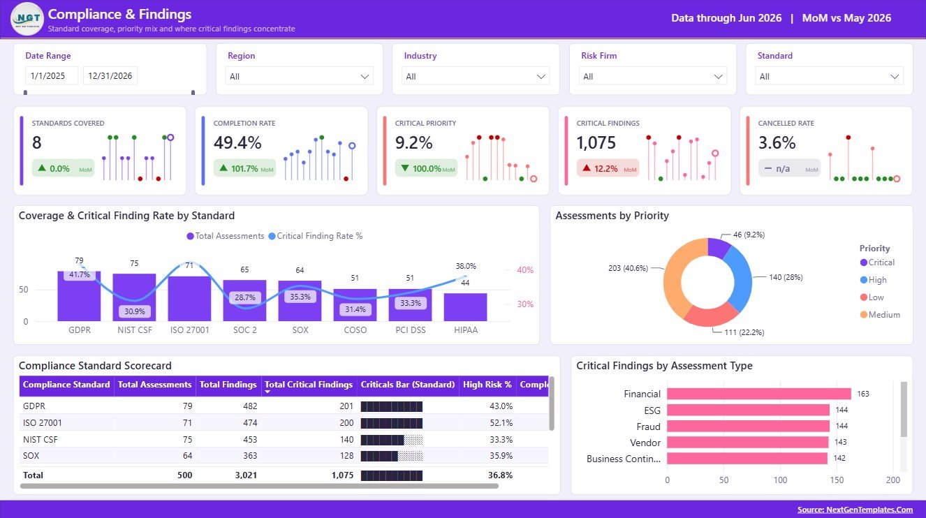
The Compliance and Findings page brings standard coverage, priority, scorecards, and critical findings into one review layer. It is useful for audit committees, GRC updates, and client compliance summaries.
Coverage and Critical Finding Rate by Standard: This chart compares standard coverage with critical finding rate. It helps identify standards where control gaps may be more severe.
Assessments by Priority: This visual groups assessments by priority. It helps teams focus time on high-urgency work.
Compliance Standard Scorecard by Compliance Standard: This scorecard summarizes standard-level performance. It is useful for recurring compliance reporting.
Critical Findings by Assessment Type: This chart shows which assessment types produce the most critical findings. It helps improve scoping and remediation planning.
Compliance and Findings
Risk Assessment Firms Dashboard in Power BI vs. Tableau vs. Paid GRC SaaS – Feature Comparison
| Feature | This Power BI template | Tableau or Qlik alternative | Paid GRC SaaS |
|---|---|---|---|
| Cost | $17.99 one-time sale price | BI license plus report build effort | Recurring subscription and setup fees |
| Platform | Power BI Desktop and optional Power BI Service | Tableau, Qlik, or another BI platform | Vendor-hosted governance, risk, and compliance system |
| Setup time | Open PBIX, replace source data, refresh | Build model and visuals manually | Configuration, workflow design, training, and rollout |
| Real-time team collaboration | Available through Power BI Service licensing | Available by platform plan | Usually included by vendor plan |
| Mobile access | Available through Power BI mobile and service options | Available by platform | Usually included |
| Customizable fields | Edit pages, measures, slicers, visuals, and model | Editable with analyst support | Often limited by vendor configuration |
| Share with link | Available after publishing to Power BI Service | Available by BI platform plan | Usually available in the SaaS platform |
| Year-1 cost at 5 users | Template cost plus your Microsoft licensing choice | License cost plus dashboard development | Often much higher due to subscriptions and services |
| Risk assessment reporting | Best for visual reporting from prepared assessment data | Best when the team already uses that BI stack | Best for live workflow, evidence, and control management |
Who Should Use This Template
This template is a good fit for risk assessment firms, audit consulting teams, compliance reviewers, internal audit departments, cyber risk teams, GRC analysts, advisory partners, and Power BI consultants who need a reporting layer for assessment data.
It is not a fit if you need automated audit evidence collection, live control testing, ticket routing, approval workflows, or a full GRC platform. The dashboard is designed for analysis and reporting, not workflow execution.
Real-World Use Cases
A GRC partner can use the Overview and Industry Trends pages to brief leadership on fees, risk score, critical findings, and client satisfaction by month, firm, region, and industry.
A lead analyst can use the Firm Delivery Performance page to review analyst hours, effort yield, and delivery scorecard results before resource planning.
A compliance manager can use the Compliance and Findings page to summarize standard coverage, priorities, and critical finding rates for audit committee updates.
Advantages of Risk Assessment Firms Dashboard in Power BI
The biggest advantage is speed. Instead of designing a model and layout from a blank Power BI file, users start with 5 organized pages and a risk assessment reporting structure. The visuals already follow common management questions: how many assessments were done, how much revenue was generated, where risk is concentrated, which clients need attention, and which standards produce critical findings.
The dashboard is also flexible. Power BI users can update data sources, measures, page names, chart titles, colors, slicers, and relationships. That makes it useful as both a ready template and a learning file for teams building their own reporting practice.
Opportunities for Improvement
Advanced users may want to connect the PBIX file to a live SQL database, SharePoint list, CRM export, audit management tool, or data warehouse. Teams may also add row-level security, scheduled refresh, more client drill-through pages, or additional compliance frameworks.
If your firm has a mature GRC platform, this dashboard can still work as an executive reporting layer, but it should be connected carefully to governed data sources.
Best Practices
Keep assessment IDs unique, standardize client and firm names, and define risk levels consistently before refreshing the dashboard. Validate Assessment Fees, Avg Risk Score, Critical Findings, Remediation Cost, and Client Satisfaction totals against the source file after every data update.
Use slicers during review meetings instead of creating separate report copies for every audience. Publish to Power BI Service only after checking data sensitivity, workspace permissions, and sharing rules.
Explore Relevant Templates
- Reg Tech Dashboard in Excel
- Cybersecurity Dashboard in Google Sheets
- Roadside Assistance Networks Dashboard in Power BI
- Power BI Templates
- Power BI Dashboard Templates
Frequently Asked Questions
What does the Risk Assessment Firms Dashboard in Power BI track?
It tracks assessments, assessment fees, average risk score, critical findings, client satisfaction, remediation cost, risk levels, assessment types, industry trends, delivery performance, and compliance findings.
Do I need Power BI Desktop to use this template?
Yes. You need Power BI Desktop to open and edit the PBIX file. Power BI Desktop is available from Microsoft.
Can I replace the sample data with my own assessment records?
Yes. You can replace or connect the sample source with your own structured data and refresh the report.
Can I customize the dashboard?
Yes. You can customize pages, visuals, measures, slicers, colors, relationships, and field names inside Power BI Desktop.
Is this a full GRC or audit management system?
No. It is a reporting dashboard. It does not manage evidence requests, control testing workflows, tickets, or approvals.
Can I share this dashboard with clients or team members?
Yes, if you publish it to Power BI Service and share it according to your Microsoft licensing and data permissions.
About the Author
Built by PK – Microsoft Certified Professional with 15+ years of Excel, Google Sheets, and Power BI experience. Founder of NextGenTemplates, reaching 300K+ subscribers across YouTube channels. Every template is hand-built and tested before release.
Conclusion
The Risk Assessment Firms Dashboard in Power BI helps risk and compliance teams turn assessment records into clear management reporting. With 5 pages, executive KPI cards, client risk views, industry trends, delivery performance analysis, and compliance findings, it gives firms a practical starting point for better risk assessment reporting.
For walkthroughs and dashboard tutorials, visit youtube.com/@PKAnExcelExpert.
Risk assessment firms need a fast way to explain assessment volume, fees, risk score, critical findings, remediation cost, and compliance coverage without rebuilding reports each month. The Risk Assessment Firms Dashboard in Power BI is a ready-to-use PBIX dashboard template with 5 report pages, 5 executive KPI cards, and focused visual analysis for client risk profile, industry trends, delivery performance, and compliance findings.
For teams managing dozens or hundreds of client assessments, a static spreadsheet can hide urgent risk patterns. A visual Power BI report helps partners, analysts, GRC leaders, and compliance managers review high-risk clients, fee mix, remediation cost, analyst effort, and standard-level findings in one interactive model. You can learn more about Power BI Desktop from Microsoft Learn.
Click here to purchase the Risk Assessment Firms Dashboard in Power BI
Key Features of Risk Assessment Firms Dashboard in Power BI
This Power BI dashboard template includes 5 pages: Overview, Client Risk Profile, Industry Trends, Firm Delivery Performance, and Compliance and Findings. The Overview page includes KPI cards for Assessments, Assessment Fees, Avg Risk Score, Critical Findings, and Client Satisfaction.
The report includes charts for monthly fees and volume, assessment status, fees by risk firm, risk score by region, fee mix by assessment type, remediation cost, industry mix, analyst effort, firm delivery scorecards, compliance standards, priorities, and critical findings.
The template is built for Power BI Desktop, so you can update the data model, rename fields, change visuals, adjust slicers, and publish to Power BI Service when your team needs shared access.
Dashboard Pages Explanation
1. Overview Page
The Overview page gives a high-level summary of the risk assessment portfolio. It shows Cards for Assessments, Assessment Fees, Avg Risk Score, Critical Findings, and Client Satisfaction.
Assessment Fees and Volume by Month: This chart compares monthly billed fees against assessment count. It helps partners see whether revenue is rising with workload or whether high-volume months are producing lower fee yield.
Assessments by Status: This visual breaks assessments into workflow stages. It helps delivery teams track completed, pending, active, or similar statuses during recurring operations meetings.
Assessment Fees by Risk Firm: This chart compares fee contribution across risk firms. It helps leadership identify the firms or practice groups that generate the highest assessment revenue.
Avg Risk Score by Region: This visual compares client risk score across regions. It helps teams focus follow-up and remediation planning in regions with higher average risk.
Fee Mix by Assessment Type: This chart explains which assessment types contribute the largest share of fees. It is useful for service-line planning and pricing review.
Risk Assessment Firms Dashboard in Power BI
2. Client Risk Profile
The Client Risk Profile page focuses on client-level risk, remediation exposure, and risk tiering. It is useful for account reviews, prioritization meetings, and client-facing summaries.
Client Risk Register by Client: This view lists client-level assessment indicators in a structured register. It helps reviewers identify high-risk clients quickly.
Risk Score vs Remediation Cost by Assessment Volume: This analysis connects risk score, remediation cost, and assessment volume. It helps separate high-risk clients from clients that also require larger corrective budgets.
Remediation Cost by Region: This chart compares remediation cost by geography. It helps firms identify where post-assessment work may need more resources.
Assessments by Risk Level: This visual groups assessments by risk level. It helps leaders understand whether the portfolio is weighted toward low, medium, high, or critical risk.
Client Risk Profile
3. Industry Trends
The Industry Trends page helps firms compare assessment activity and risk patterns by industry and month. It supports sector planning, advisory positioning, and practice development.
Assessment Volume and Avg Risk Score by Month: This chart compares monthly volume with average risk score. It helps detect whether busy months also bring higher-risk work.
Assessment Fees by Industry: This visual compares revenue by industry. It helps leadership understand which sectors are driving the most commercial value.
Assessment Mix by Industry and Type: This chart shows how assessment types vary across industries. It helps identify sector-specific demand patterns.
Avg Risk Score by Industry: This visual compares risk intensity across industries. It helps prioritize industry-level advisory and remediation focus.
Remediation Cost by Month: This trend shows how remediation cost changes over time. It supports cost forecasting and post-assessment planning.
Industry Trends
4. Firm Delivery Performance
The Firm Delivery Performance page helps managers review analyst effort, firm efficiency, and delivery scorecard results. It is designed for internal performance review.
Hours Delivered by Lead Analyst: This chart compares effort by lead analyst. It helps managers balance workload and identify delivery bottlenecks.
Effort vs Yield by Risk Firm: This analysis compares delivery effort against output or fee yield. It helps leadership identify efficient and inefficient delivery patterns.
Risk Firm Delivery Scorecard by Risk Firm: This scorecard summarizes performance by firm. It supports partner reviews and internal benchmarking.
Firm Delivery Performance
5. Compliance and Findings
The Compliance and Findings page brings standard coverage, priority, scorecards, and critical findings into one review layer. It is useful for audit committees, GRC updates, and client compliance summaries.
Coverage and Critical Finding Rate by Standard: This chart compares standard coverage with critical finding rate. It helps identify standards where control gaps may be more severe.
Assessments by Priority: This visual groups assessments by priority. It helps teams focus time on high-urgency work.
Compliance Standard Scorecard by Compliance Standard: This scorecard summarizes standard-level performance. It is useful for recurring compliance reporting.
Critical Findings by Assessment Type: This chart shows which assessment types produce the most critical findings. It helps improve scoping and remediation planning.
Compliance and Findings
Risk Assessment Firms Dashboard in Power BI vs. Tableau vs. Paid GRC SaaS – Feature Comparison
| Feature | This Power BI template | Tableau or Qlik alternative | Paid GRC SaaS |
|---|---|---|---|
| Cost | $17.99 one-time sale price | BI license plus report build effort | Recurring subscription and setup fees |
| Platform | Power BI Desktop and optional Power BI Service | Tableau, Qlik, or another BI platform | Vendor-hosted governance, risk, and compliance system |
| Setup time | Open PBIX, replace source data, refresh | Build model and visuals manually | Configuration, workflow design, training, and rollout |
| Real-time team collaboration | Available through Power BI Service licensing | Available by platform plan | Usually included by vendor plan |
| Mobile access | Available through Power BI mobile and service options | Available by platform | Usually included |
| Customizable fields | Edit pages, measures, slicers, visuals, and model | Editable with analyst support | Often limited by vendor configuration |
| Share with link | Available after publishing to Power BI Service | Available by BI platform plan | Usually available in the SaaS platform |
| Year-1 cost at 5 users | Template cost plus your Microsoft licensing choice | License cost plus dashboard development | Often much higher due to subscriptions and services |
| Risk assessment reporting | Best for visual reporting from prepared assessment data | Best when the team already uses that BI stack | Best for live workflow, evidence, and control management |
Who Should Use This Template
This template is a good fit for risk assessment firms, audit consulting teams, compliance reviewers, internal audit departments, cyber risk teams, GRC analysts, advisory partners, and Power BI consultants who need a reporting layer for assessment data.
It is not a fit if you need automated audit evidence collection, live control testing, ticket routing, approval workflows, or a full GRC platform. The dashboard is designed for analysis and reporting, not workflow execution.
Real-World Use Cases
A GRC partner can use the Overview and Industry Trends pages to brief leadership on fees, risk score, critical findings, and client satisfaction by month, firm, region, and industry.
A lead analyst can use the Firm Delivery Performance page to review analyst hours, effort yield, and delivery scorecard results before resource planning.
A compliance manager can use the Compliance and Findings page to summarize standard coverage, priorities, and critical finding rates for audit committee updates.
Advantages of Risk Assessment Firms Dashboard in Power BI
The biggest advantage is speed. Instead of designing a model and layout from a blank Power BI file, users start with 5 organized pages and a risk assessment reporting structure. The visuals already follow common management questions: how many assessments were done, how much revenue was generated, where risk is concentrated, which clients need attention, and which standards produce critical findings.
The dashboard is also flexible. Power BI users can update data sources, measures, page names, chart titles, colors, slicers, and relationships. That makes it useful as both a ready template and a learning file for teams building their own reporting practice.
Opportunities for Improvement
Advanced users may want to connect the PBIX file to a live SQL database, SharePoint list, CRM export, audit management tool, or data warehouse. Teams may also add row-level security, scheduled refresh, more client drill-through pages, or additional compliance frameworks.
If your firm has a mature GRC platform, this dashboard can still work as an executive reporting layer, but it should be connected carefully to governed data sources.
Best Practices
Keep assessment IDs unique, standardize client and firm names, and define risk levels consistently before refreshing the dashboard. Validate Assessment Fees, Avg Risk Score, Critical Findings, Remediation Cost, and Client Satisfaction totals against the source file after every data update.
Use slicers during review meetings instead of creating separate report copies for every audience. Publish to Power BI Service only after checking data sensitivity, workspace permissions, and sharing rules.
Explore Relevant Templates
- Reg Tech Dashboard in Excel
- Cybersecurity Dashboard in Google Sheets
- Roadside Assistance Networks Dashboard in Power BI
- Power BI Templates
- Power BI Dashboard Templates
Frequently Asked Questions
What does the Risk Assessment Firms Dashboard in Power BI track?
It tracks assessments, assessment fees, average risk score, critical findings, client satisfaction, remediation cost, risk levels, assessment types, industry trends, delivery performance, and compliance findings.
Do I need Power BI Desktop to use this template?
Yes. You need Power BI Desktop to open and edit the PBIX file. Power BI Desktop is available from Microsoft.
Can I replace the sample data with my own assessment records?
Yes. You can replace or connect the sample source with your own structured data and refresh the report.
Can I customize the dashboard?
Yes. You can customize pages, visuals, measures, slicers, colors, relationships, and field names inside Power BI Desktop.
Is this a full GRC or audit management system?
No. It is a reporting dashboard. It does not manage evidence requests, control testing workflows, tickets, or approvals.
Can I share this dashboard with clients or team members?
Yes, if you publish it to Power BI Service and share it according to your Microsoft licensing and data permissions.
About the Author
Built by PK – Microsoft Certified Professional with 15+ years of Excel, Google Sheets, and Power BI experience. Founder of NextGenTemplates, reaching 300K+ subscribers across YouTube channels. Every template is hand-built and tested before release.
Conclusion
The Risk Assessment Firms Dashboard in Power BI helps risk and compliance teams turn assessment records into clear management reporting. With 5 pages, executive KPI cards, client risk views, industry trends, delivery performance analysis, and compliance findings, it gives firms a practical starting point for better risk assessment reporting.
For walkthroughs and dashboard tutorials, visit youtube.com/@PKAnExcelExpert.