Roofing is a trade where the money is won or lost in the gap between the signature and the final sign-off. A crew installing a square a day slower than plan. A tear-off left open overnight because the truck arrived late. Eight bundles ordered that never left the driveway. A leak callback eighteen months after the job closed. Each one is small, each one is invisible on a profit-and-loss statement, and together they are the difference between a 35% gross margin and a 30% one.
The frustrating part is that the numbers already exist. Win rate is in the CRM. Cycle time is on the production board. Waste is in the purchase ledger. Callbacks are in the warranty file. They are simply never on the same page, next to a target, with an agreed rule for what counts as a miss.
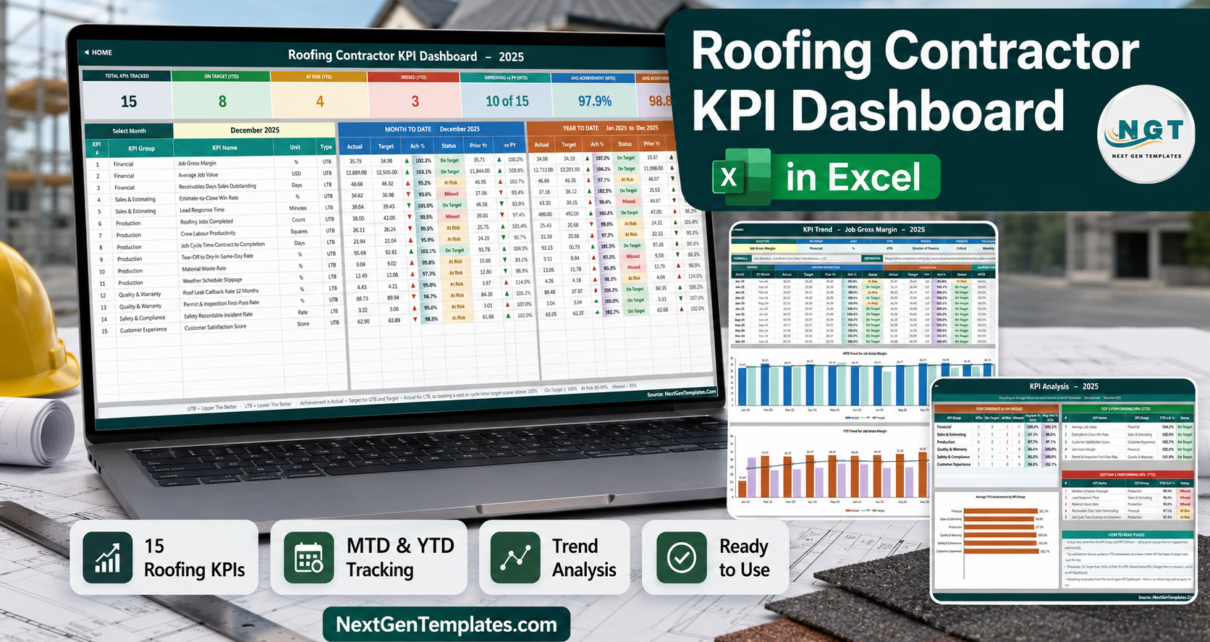
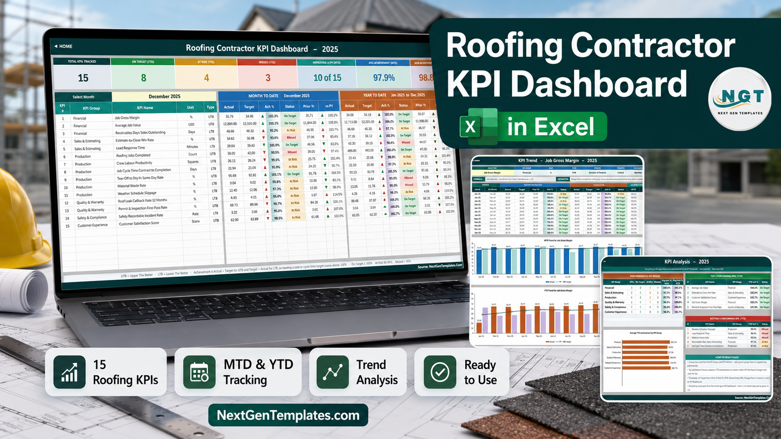
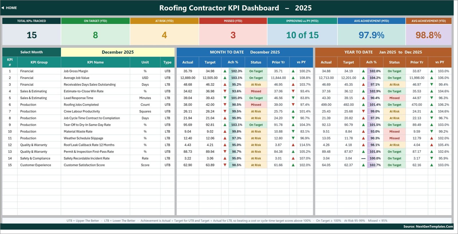
The Roofing Contractor KPI Dashboard in Excel does that one job. It is a month-picker KPI scorecard: choose a month from a single dropdown and 15 roofing KPIs across six groups report their month-to-date and year-to-date actual, target, achievement percentage, traffic-light status, prior-year comparator and year-on-year movement at the same time. The sample file ships a complete 2025 reporting year with December 2025 selected – 8 KPIs On Target, 4 At Risk and 3 Missed on a year-to-date basis, 10 of 15 improving on last year, and average achievement of 97.9% MTD against 98.8% YTD. Every number on every page is a plain worksheet formula. No macros, no Power Query, no data model, no add-in.
Key Features of the Roofing Contractor KPI Dashboard in Excel
One dropdown drives everything. Cell D6 on the KPI Dashboard sheet holds the twelve months of the reporting year. Change it and the whole scorecard, its seven summary cards and the entire KPI Analysis page recalculate. There is no refresh step, because there is no query to refresh.
Direction-aware scoring. Each KPI is tagged UTB (Upper The Better) or LTB (Lower The Better) on the KPI Definition sheet. Achievement is Actual / Target for a UTB KPI and Target / Actual for an LTB one. That single decision is why Receivables Days Sales Outstanding, Lead Response Time, Job Cycle Time, Material Waste Rate, Weather Schedule Slippage, Roof Leak Callback Rate and Safety Recordable Incident Rate – the seven LTB KPIs in this build – score above 100% when you come in under plan, instead of appearing to fail. Anyone who has hand-built a contractor scorecard knows how much conditional-formatting pain that saves.
Traffic-light bands you can move. On Target from 100%, At Risk from 95% to 99%, Missed below 95%. Those thresholds are written into the formulas in columns L and U on the KPI Dashboard sheet, so if your governance says At Risk starts at 97% you change two formulas rather than rebuilding the sheet.
A KPI list you edit, not a list you inherit. The three input sheets, the scorecard, the trend page and the analysis page all read the KPI names from one master list on KPI Definition. Rename a KPI there and it changes everywhere. The sheets are wired for 22 KPI rows and 15 are filled, so seven live empty rows are already waiting for whatever your business tracks that ours does not.
Governance metadata that survives a handover. Every KPI carries a written formula, a plain-English definition, an owner, a priority and a reporting frequency. Crew Labour Productivity, for example, is owned by the Production Manager, flagged Critical and reported Weekly – so nobody spends a review arguing about who owns it or how it is calculated.
Re-base the whole year in one cell. Cell E3 on KPI Input – Actual is the first month of the reporting year. Change it and the Target sheet, the Prior Year sheet, the month dropdown and every sheet title follow it.
Dashboard Pages Explanation
Home
A navigation page rather than a report. Nine tiles in three columns – Dashboard Pages (KPI Dashboard, KPI Trend, KPI Analysis), Input Sheets to edit (KPI Input – Actual, Target, PY) and Reference & Help (KPI Definition, Read Me, Get More Templates) – each with a one-line description of what it is for. Underneath, a “What This Template Does” panel spells out the five things the workbook actually promises: pick a month and read the whole scorecard, direction-aware scoring, add or rename KPIs without touching a formula, charts that follow the KPI you choose, and nothing to install or refresh.
KPI Dashboard
The scorecard, and the page you will live on. Seven summary cards run across the top: Total KPIs Tracked, On Target (YTD), At Risk (YTD), Missed (YTD), Improving vs PY (MTD), Avg Achievement (MTD) and Avg Achievement (YTD). Below them sits one row per KPI – number, group, name, unit and type – and then two mirrored blocks. The blue Month To Date block and the orange Year To Date block each carry Actual, Target, Achievement %, Status, Prior Yr and vs PY. In the shipped sample, December 2025 shows Job Gross Margin at 35.79% against a 34.98% target (102.3%, On Target) while Roofing Jobs Completed comes in at 38 against a target of 42 (90.5%, Missed) – and the same row shows the year as a whole finishing 499 jobs against 492 planned, which is On Target. That contrast, month versus year, on one line, is the entire point of the layout.
KPI Trend
One KPI at a time, chosen from a dropdown in cell B4. Pick Job Gross Margin and the page reports its group (Financial), unit (%), type (UTB), owner (Director of Finance), priority (Critical) and frequency (Monthly), then prints its formula – (Job Revenue – Job Direct Cost) / Job Revenue x 100 – and its definition in full. A twelve-month table follows, with MTD and YTD actual, target, prior year, achievement and status for every month, plus the vs-prior-year percentages. Two combo charts sit underneath: MTD Trend for Job Gross Margin and YTD Trend for Job Gross Margin, each drawing actual and prior-year columns against a target line. Change the KPI in B4 and every element on the page, charts included, redraws.
KPI Analysis
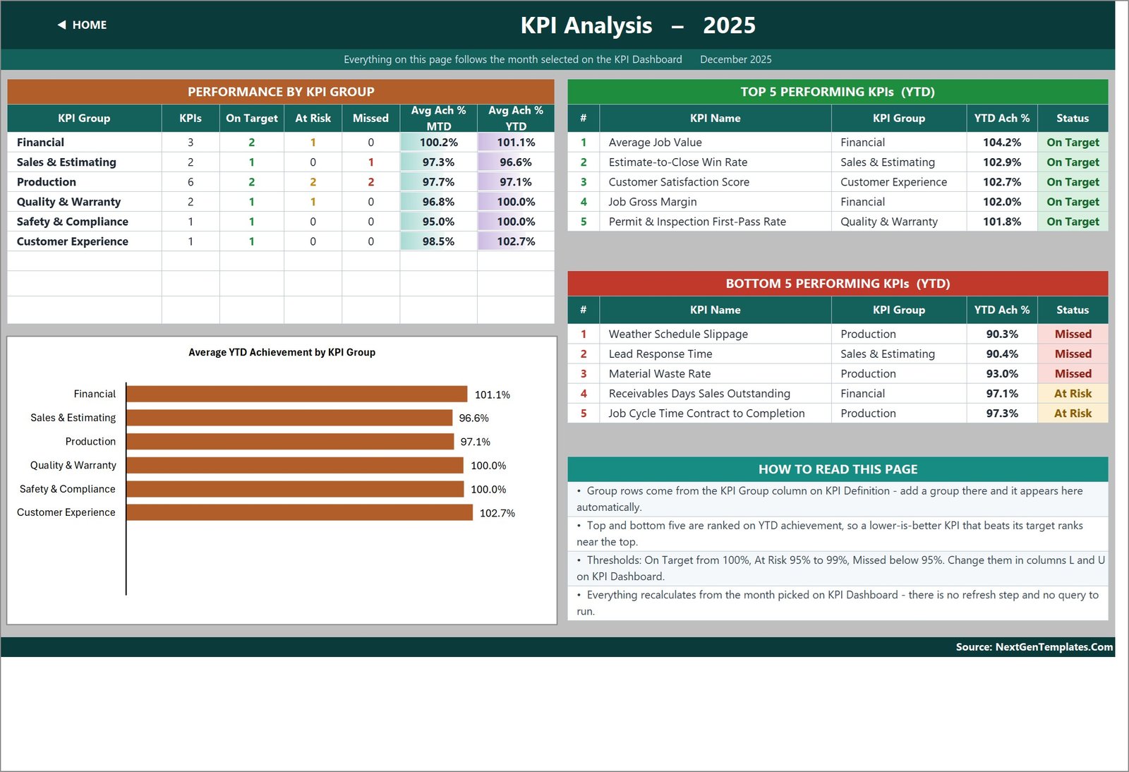
Where you go when a light turns amber and you want to know whether it is one KPI or a whole department. Performance by KPI Group lists each of the six groups with its KPI count, its On Target / At Risk / Missed counts and its average MTD and YTD achievement – in the sample, Production carries six KPIs and averages 97.1% YTD, while Customer Experience carries one and averages 102.7%. An Average YTD Achievement by KPI Group bar chart puts the same story in one glance. To the right, Top 5 and Bottom 5 Performing KPIs rank on year-to-date achievement: Average Job Value leads at 104.2%, and Weather Schedule Slippage sits at the bottom on 90.3%. A short “How to Read This Page” panel explains that groups come from the KPI Definition sheet, that the rankings use YTD achievement so a lower-is-better KPI beating target ranks near the top, and where the thresholds live.
KPI Input – Actual, Target and PY
The three sheets you actually type in, and the only three. Each is laid out identically: KPI number, group, name and unit down the left, then an MTD and a YTD column for every month of the year across the top. The KPI rows are driven by KPI Definition, so all three sheets always line up with each other and with the scorecard. Actual holds this year, Target holds the plan, PY holds last year – and because the Target and PY sheets read their month headers from the Actual sheet, changing the reporting year is a one-cell job.
KPI Definition, Read Me and Get More Templates
KPI Definition is the master list: number, group, name, unit, formula, definition, type, owner, priority and frequency for all 15 KPIs. It is genuinely the control panel – add a row here and the input sheets, scorecard, trend picker and analysis page all pick it up. Read Me is a one-page explanation of the wiring: the five-minute version, the rules the numbers follow (MTD versus YTD, cumulative versus average, UTB and LTB, achievement, status, arrows), how to add, rename and remove KPIs, and a sheet map. Get More Templates links out to the rest of the catalogue. A hidden Support sheet holds the helper calculations – the selected month, the arrow glyphs, the month dropdown list, the chart series and the ranking helpers – and needs no editing.
Roofing Contractor KPI Dashboard in Excel vs. a Sheet You Build vs. Roofing Field Software – Feature Comparison
| Roofing Contractor KPI Dashboard in Excel | A scorecard you build yourself | Roofing field software (JobNimbus / AccuLynx tier) | |
|---|---|---|---|
| Cost | One-time 19.99 (12.99 on offer) | Free tool, your build time | Roughly 50-200+ per user per month |
| Platform | Excel 2013+, Microsoft 365, Excel for the web | Excel or Google Sheets | Browser and mobile, vendor-hosted |
| Setup time | Minutes – the sample year is filled in | Days | Weeks, usually with onboarding |
| Reads your CRM or job board | No – 15 numbers a month, typed or pasted | No | Yes, it is the system of record |
| Direction-aware scoring for cost and cycle-time KPIs | Built in per KPI | You write it | Sometimes configurable |
| Named owner, formula and priority per KPI | Yes, on KPI Definition | If you document it | Rarely |
| Customizable formulas | Yes – every cell is open | Yes | No, vendor model |
| Mobile access | Excel mobile app | Yes | Yes, native |
| Year-1 cost at 5 users | 19.99 once | Your time | 3,000-12,000+ |
| Board-ready one-page scorecard | Yes, that is the whole product | Eventually | Usually needs a report build |
Who Should Use This Template
Roofing company owners and general managers who run a monthly numbers meeting and want it to start with the three amber lights rather than forty minutes of scrolling. Production managers and field superintendents who want crew productivity, cycle time and same-day dry-in scored against a target instead of argued about. Estimators and sales managers watching win rate and lead response together, because the second usually explains the first. Controllers and bookkeepers who carry days sales outstanding on insurance-funded work. Safety and warranty leads who need a defensible twelve-month view of incident rate and callback rate for an insurer or a manufacturer certification audit.
It is a poor fit if you want the file to connect to your CRM, your job board or your accounting package. It reads nothing; you type or paste. It is also not a job-level tool – the workbook holds one number per KPI per month for the whole company, so there is no job list, no crew roster and no transaction table to drill into. If per-job and per-crew analysis is what you need, that is a different product and we say so plainly below.
Real-World Use Cases
The monthly ops review. One page, fifteen lights, seven summary cards. The agenda writes itself: three Missed, four At Risk, and the year-to-date column tells you which of those are a genuine trend rather than one bad month of weather.
Defending a margin conversation. Job Gross Margin sitting next to Material Waste Rate and Crew Labour Productivity, all three against target and against last year, turns “margin is down” into a specific, arguable cause.
Weather-season planning. Weather Schedule Slippage tracked month by month against a target gives you an honest number for how much capacity your climate actually costs – and a basis for the contingency you build into next season’s schedule.
Warranty and safety governance. Roof Leak Callback Rate 12 Months and Safety Recordable Incident Rate each carry a named owner and a twelve-month trend, which is exactly the evidence an insurer or a shingle manufacturer’s certification programme asks to see.
Onboarding a new production manager. Every KPI has a written formula and a plain-English definition inside the file, so what you hand over is the definition of the number, not just a spreadsheet with the number in it.
Advantages of the Roofing Contractor KPI Dashboard in Excel
It opens anywhere. An ordinary .xlsx of worksheet formulas means no macro prompt, no add-in, no gateway, no credentials and no IT ticket. It works in Excel 2013, in Microsoft 365, and in Excel for the web.
It is honest about what a KPI costs to maintain. Fifteen numbers a month, typed into three sheets, is a realistic commitment for a contractor with no analyst. A file that promised to read your systems would need someone to keep the connection alive.
Nothing is locked. Every formula is visible and editable, the thresholds are two formulas, the chart series are on the Support sheet, and the KPI list is a table you own. You are not renting a model you cannot see.
It scores cost KPIs fairly. Most hand-built scorecards quietly punish teams for beating a waste or cycle-time target because achievement is hardcoded as Actual / Target. This one does not.
The sample year does real work. Because a full 2025 is filled in, you can see every card, colour and chart behaving before you commit a single number of your own – and you can hand it to a colleague as a demonstration.
Opportunities for Improvement
Being straight about the limits is more useful than a feature list. It does not integrate. There is no connector to JobNimbus, AccuLynx, QuickBooks or a CRM; the fifteen numbers arrive by hand. It does not derive YTD. Both MTD and YTD are typed, which is deliberate – it keeps you in control of whether a KPI accumulates or averages – but it does mean two figures per KPI per month rather than one. It is company-level. There is no split by crew, branch, job type or insurance versus retail; adding one would mean a different data model. The sample numbers are not benchmarks. They are realistic and internally consistent, built to demonstrate the mechanics, and should never be quoted as roofing industry figures. And two small cosmetic faults are worth knowing about before you open it: the Home page and the Read Me sheet both still say “14 KPIs” where the file actually ships 15 – every calculation uses 15 – and the Read Me’s note about cumulative versus average YTD still carries example wording from a different industry build. Neither affects a single number on the scorecard.
Best Practices
Set the KPI list before you type any data. Editing KPI Definition first, while the input sheets are still sample data, is far quicker than re-typing a year of numbers because you renamed a row afterwards.
Agree the thresholds once, in writing. If your business treats 97% as At Risk, change columns L and U at the start and tell the team. A scorecard whose bands move mid-year is worse than no scorecard.
Fill the Owner column honestly. A KPI with no owner does not get fixed. The template forces the question; answer it with a name your team recognises.
Decide the cumulative-versus-average rule per KPI and stick to it. Roofing Jobs Completed accumulates through the year; Job Gross Margin and Material Waste Rate are running averages. A percentage that reaches 1,100% by December is the classic sign that somebody summed a rate.
Keep one file per reporting year. Roll the year forward by copying the workbook, moving this year’s Actual into next year’s PY sheet, and re-basing cell E3. Archiving beats overwriting when someone asks about a number from two years ago.
Explore Relevant Templates
The same scorecard on another platform. If your crew leads live in a browser, the Roofing Contractor KPI Dashboard in Google Sheets is this exact month-picker scorecard built natively in Sheets, and the Roofing Contractor KPI Dashboard in Power BI delivers the same KPI set as a .pbix report.
Which roofing file do you want? There are two families and they are not versions of each other. This post is the KPI Dashboard line – seven summary cards, a dedicated KPI Trend page with two combo charts, and a KPI Analysis page with group roll-up and Top 5 / Bottom 5 ranking. The Roofing Contractor KPI Scorecard in Excel and the Roofing Contractor KPI Scorecard in Google Sheets are a lighter product on a different engine. Plenty of contractors own one of each.
Other trades on the same engine: Plumbing Business KPI Dashboard in Excel, HVAC Contractor KPI Scorecard in Excel, Electrical Contractor KPI Scorecard in Excel and Painting Contractor KPI Scorecard in Excel.
Going wider: the KPI Dashboard Library (Excel) bundles fifteen scorecards on this engine, and the Construction Project Intelligence Kit covers project-level construction analysis. For job-by-job record keeping rather than monthly KPIs, the Civil Contractor Job Management System Web App is the tool.
Frequently Asked Questions
Does the Roofing Contractor KPI Dashboard in Excel connect to my CRM or accounting software?
No. Nothing in the workbook talks to an external system. You type or paste 15 monthly numbers into three input sheets and the rest calculates. That is why it opens on any machine with no add-in, no gateway and no credentials.
How many KPIs does it track?
Fifteen, across six groups: Financial (3), Sales & Estimating (2), Production (6), Quality & Warranty (2), Safety & Compliance (1) and Customer Experience (1). The Home page and Read Me still carry a stale “14 KPIs” line from an earlier revision – the calculations all use 15.
Will beating a waste or cycle-time target show as a miss?
No. Those KPIs are flagged LTB, so achievement is Target / Actual and coming in under plan scores above 100%. Seven of the 15 KPIs are LTB: Receivables Days Sales Outstanding, Lead Response Time, Job Cycle Time Contract to Completion, Material Waste Rate, Weather Schedule Slippage, Roof Leak Callback Rate 12 Months and Safety Recordable Incident Rate.
Can I add my own KPIs?
Yes. The sheets are wired for 22 rows and 15 are used, so seven are live and empty. Fill the next row on KPI Definition, add its monthly numbers on the three input sheets, and the scorecard, trend picker and analysis page pick it up with no formula work. To go beyond 22, fill down the last data row on each sheet and widen the summary-card ranges on KPI Dashboard row 4 and the Support helper columns.
Is the YTD figure calculated for me?
No, and that is intentional. MTD and YTD are both typed on the input sheets so you decide, per KPI, whether the year-to-date figure accumulates (Roofing Jobs Completed) or averages (Job Gross Margin, Material Waste Rate). It is one extra column per month in exchange for keeping the definition in your hands.
Does it need macros or a particular Excel version?
Neither. It is an ordinary .xlsx of worksheet formulas – VLOOKUP, MATCH, INDEX, COUNTIF – so there is no security prompt and no refresh step. Excel 2013 and later, Microsoft 365, and Excel for the web all open it.
What exactly is in the download?
A ZIP with two files: Roofing Contractor KPI Dashboard.xlsx and the Excel KPI Dashboard user manual as a PDF. One-time payment, lifetime access to the file.
About the Author
Built by PK – Microsoft Certified Professional with 15+ years of Excel, Google Sheets, and Power BI experience. Founder of NextGenTemplates, reaching 300K+ subscribers across YouTube channels. Every template is hand-built and tested before release.
Conclusion
Roofing rewards the contractor who notices a small slip early – a crew half a square down, a waste rate a point high, a callback rate creeping. The Roofing Contractor KPI Dashboard in Excel is built for that one job: fifteen governed KPIs, one month dropdown, MTD and YTD side by side, direction-aware scoring so cost and cycle-time KPIs are judged fairly, and a trend page and a group roll-up for when a light goes amber. It will not read your CRM, it will not forecast, and it will not break down by crew – and it does not pretend otherwise. What it will do is turn a scattered set of monthly numbers into a scorecard your management meeting can read in ten seconds, for a one-time 19.99 and no subscription.
Get the Roofing Contractor KPI Dashboard in Excel on NextGenTemplates