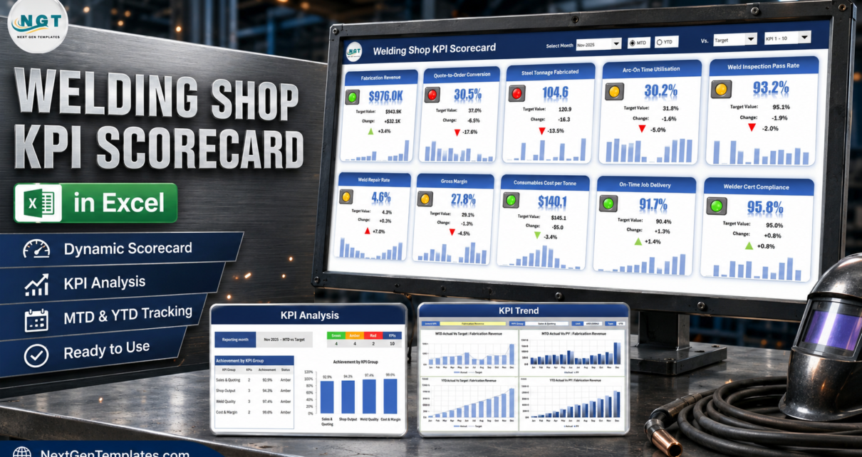
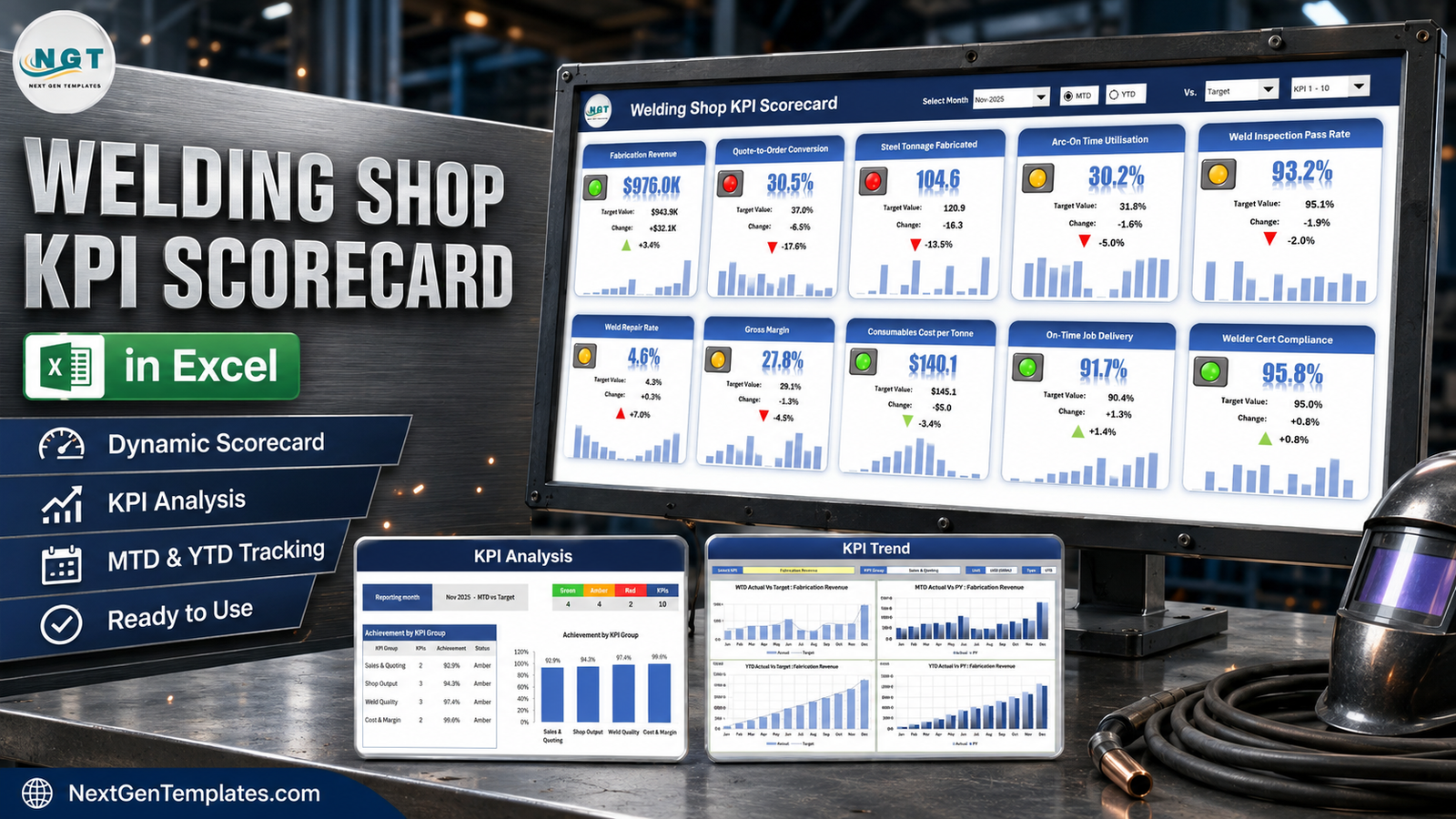
Most fabrication shops can tell you last month’s revenue to the dollar. Far fewer can say, on the second Tuesday of the month, how much of the paid welder hours actually had the arc burning, what share of welds passed inspection first time, and how many tonnes of steel really left the shop against what was promised. The Welding Shop KPI Scorecard in Excel puts all of that on one page: ten KPIs, four groups, a target and a red / amber / green light on every tile, and a twelve-month sparkline underneath.
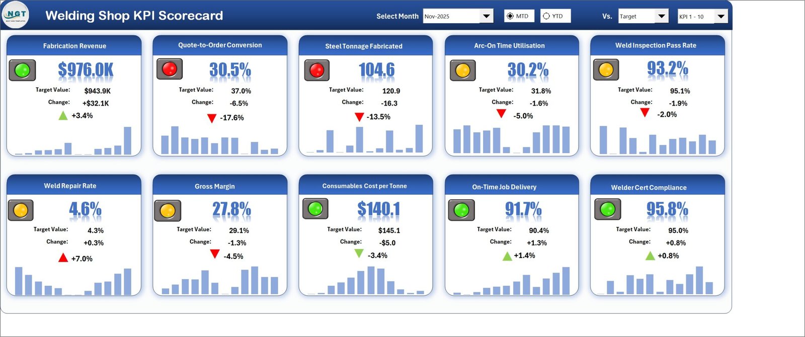
In the November 2025 sample month that ships with the file, the scorecard reads 4 green, 4 amber and 2 red. Fabrication Revenue is green at $976.0K against a $943.9K target, but Steel Tonnage Fabricated is red at 104.6 tonnes against 120.9, and Quote-to-Order Conversion is red at 30.5% against a 37.0% target. That combination — money up, tonnage and conversion down — is exactly the sort of month that looks fine on a P&L and is not fine at all on the shop floor. The whole point of a scorecard is that the two tiles sit next to each other.
It is 100% worksheet formulas: no macros, no Power Query, no add-ins, and it opens in any Excel from 2016 onward.
One thing to get straight before you read on. This is the scorecard line — a month picker and a target-versus-actual tile wall built on figures you type. It is not the slicer-driven analytical dashboard built over a job or weld-log table, and it is not a job-costing or MES system. If you want to slice a transaction table, look at the Steel & Metals or Manufacturing dashboards instead. A Welding Shop KPI Scorecard in Google Sheets also exists for browser-first teams — it is the same idea on a different platform, with its own welding KPI list rather than a copy of this one, so compare the two KPI sets if a particular metric matters to you.
The Ten Welding Shop KPIs
Every KPI below is typed into the workbook’s KPI Definition sheet with its group, unit, formula text, plain-English definition, direction and YTD basis. Rename any of them and the whole workbook follows, because every page looks a KPI up by name.
| KPI | Group | Formula as shipped | Direction |
|---|---|---|---|
| Fabrication Revenue | Sales & Quoting | SUM(Fabrication Job Invoices) | Upper the better |
| Quote-to-Order Conversion | Sales & Quoting | Quotes Converted / Quotes Issued x 100 | Upper the better |
| Steel Tonnage Fabricated | Shop Output | SUM(Fabricated Steel Weight Shipped) | Upper the better |
| Arc-On Time Utilisation | Shop Output | Arc-On Hours / Welder Hours Paid x 100 | Upper the better |
| On-Time Job Delivery | Shop Output | Assemblies Shipped On Date / Assemblies Shipped x 100 | Upper the better |
| Weld Inspection Pass Rate | Weld Quality | Welds Passed First Time / Welds Inspected x 100 | Upper the better |
| Weld Repair Rate | Weld Quality | Weld Repair Length / Weld Length Deposited x 100 | Lower the better |
| Welder Cert Compliance | Weld Quality | Welders With Current Qualification / Welders Employed x 100 | Upper the better |
| Gross Margin | Cost & Margin | (Revenue – Direct Job Cost) / Revenue x 100 | Upper the better |
| Consumables Cost per Tonne | Cost & Margin | Wire, Gas & Electrode Spend / Tonnes Fabricated | Lower the better |
Two of the ten are flagged LTB — lower the better. That flag is not cosmetic. It inverts the traffic light and the arrow, so Weld Repair Rate at 4.6% against a 4.3% target shows a red arrow at +7.0% rather than the green one a naive “actual is higher” rule would give you. Consumables Cost per Tonne at $140.1 against a $145.1 target goes the other way and scores green at -3.4%. Get that wrong in a home-made scorecard and your quality metrics quietly read backwards for a year.
Key Features of the Welding Shop KPI Scorecard in Excel
- Ten KPI tiles on one page — value, target value, absolute change, variance %, a traffic light and a twelve-month sparkline on every tile.
- A month picker, not a rebuild — the Select Month dropdown moves the whole scorecard from Jan-25 to Dec-25 and every tile, chart and table follows.
- MTD or YTD with one click — a radio switch flips the page between the reporting month and the year to date.
- Three comparison bases — the “Vs.” dropdown compares actual against Target, against the same period last year (PY), or against the Prior Month.
- Direction-aware scoring — each KPI is tagged UTB or LTB and the RAG logic respects it.
- Editable RAG bands — green at or above target, amber within 10%, red beyond 10%. Three cells on Color Settings drive every page.
- Room for 20 KPIs — the Scorecard displays ten at a time and a KPI-set picker in the header switches between KPI 1-10 and KPI 11-20.
- A KPI Trend page and a KPI Analysis page — one for explaining a single metric, one for the group-level story.
- No macros — formulas, conditional formatting, camera pictures and sparklines only. Nothing to enable, and it survives corporate security settings and e-mail filters.
Sheet-by-Sheet Walkthrough
Nine visible sheets. You only ever type into two of them.
Home
A navigation wall. Eight linked tiles, each with a one-line description of the sheet behind it, plus the standing reminder in the footer: 100% formulas, no macros, no Power Query, no add-ins.
Scorecard
The month tile wall, and the page you will print. The header carries four controls: Select Month, the MTD / YTD radio pair, the “Vs.” comparison dropdown and the KPI-set picker. Below them sit ten tiles in two rows of five. Each shows the traffic light, the current value in large type, the target value, the absolute change, the percentage change with a direction-aware arrow, and a twelve-month bar strip.
KPI Analysis
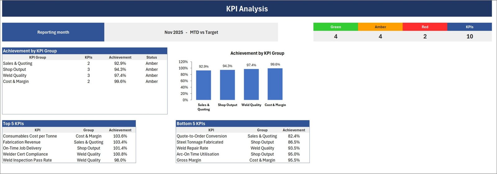
The management page. Achievement by KPI group appears as both a table and a column chart — in the November sample, Sales & Quoting 92.9%, Shop Output 94.3%, Weld Quality 97.4% and Cost & Margin 99.6%, all four sitting in amber. A counter strip across the top gives the green / amber / red split and the KPI total: 4, 4, 2 and 10. Underneath, Top 5 and Bottom 5 KPI tables rank every metric by achievement, so Consumables Cost per Tonne leads at 103.6% and Quote-to-Order Conversion props up the bottom at 82.4%.
KPI Trend
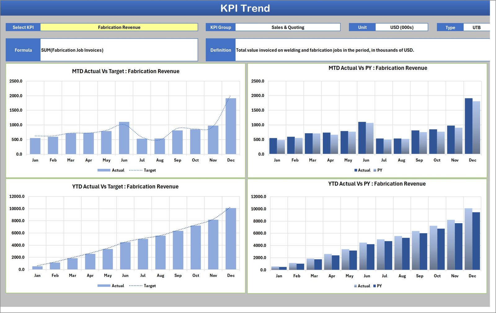
One KPI at a time, across four charts: MTD Actual vs Target, MTD Actual vs PY, YTD Actual vs Target and YTD Actual vs PY, each running Jan to Dec. Above the charts the page prints that KPI’s group, unit, direction, formula and definition, which is what makes it usable in front of an auditor or a customer — the calculation is on the same sheet as the numbers.
Input Data
The only number sheet. Each KPI gets its own numbered block of twelve rows — Jan to Dec — with MTD Actual, Target and PY on one side and YTD Actual, Target and PY on the other. Twenty blocks in all, so ten sit empty until you need them.
KPI Definition, Color Settings and Read Me
KPI Definition holds the name, group, unit, formula text, definition, UTB/LTB direction, YTD basis and a duplicate-name Check column for every KPI. Color Settings holds the RAG thresholds for both UTB and LTB KPIs, the report title and the reporting year — the year is what makes the month picker read Nov-25 rather than a bare Nov. Read Me is nine short sections covering what you type, why YTD is yours to enter, direction logic, traffic lights, adding a KPI, unique names, the header controls and the no-macros build. A Get More Templates sheet closes the workbook.
Why You Type YTD Yourself
This is the question the Read Me sheet answers first, and it is worth repeating here because it looks like a gap until you think about it. The workbook does not roll YTD up from the monthly figures. That is deliberate. The right roll-up genuinely differs by KPI: Fabrication Revenue and Steel Tonnage Fabricated sum across the year, while Weld Inspection Pass Rate, Gross Margin, Arc-On Time Utilisation and Consumables Cost per Tonne average — and a couple of those arguably want a weighted average by tonnage rather than a straight mean.
Rather than guess and be silently wrong on half the metrics, the workbook asks you to type the YTD figure you believe and record the rule you used in the YTD Basis column on KPI Definition. The next person to open the file can then see whether “YTD pass rate” meant a mean of twelve monthly percentages or welds-passed divided by welds-inspected for the year. In a shop that gets audited, that distinction matters.
Excel vs. Google Sheets vs. Paid Shop-Floor Software
| This scorecard (Excel) | Google Sheets edition | Paid MES / shop-floor SaaS | |
|---|---|---|---|
| Cost | $9.99 one time | $8.99 one time | $79-$249 per user / month |
| Platform | Excel 2016 or later, Windows desktop | Browser, any device | Vendor cloud |
| Setup time | 15-30 minutes | 10-20 minutes | 4-12 weeks onboarding |
| Where the numbers come from | You type them | You type them | Machine and ERP feeds |
| Customisable KPIs | Rename any KPI, up to 20 | Rename any KPI | Vendor-defined, some custom fields |
| Works offline in the shop | Yes | No | Partly |
| Year-1 cost at 5 users | $9.99 | $8.99 | $4,700-$14,900 |
| Owns your data | Your file, your disk | Your Drive | Vendor database |
The honest framing: a scorecard is a reporting layer, not a data-capture system. If you need welder qualification expiry alerts, weld procedure specifications, per-job costing or machine monitoring, buy software for that. Then use this to report the result upward once a month in a form an owner, a lender or a customer’s quality auditor can read in thirty seconds.
Who Should Use This Template
It fits a structural steel, plate or general fabrication shop running roughly five to sixty welders that already knows its monthly numbers and wants one page that says whether the month was good. It fits an owner reporting to a partner or a bank, a works manager running a Monday production meeting, a quality manager who has to demonstrate that first-pass inspection and welder certification are under control, and a group reporting a standard KPI set upward from several sites.
It does not fit if you need per-works-order profitability, if you want the workbook to pull revenue and tonnage out of your ERP, if you need more than 20 KPIs, or if you cannot supply YTD figures.
Real-World Use Cases
Ray, owner of a twelve-welder structural steel shop. He closes the month, types his figures into Input Data and sends the Scorecard page to his accountant and his bank. The November sample shape is one he recognises: revenue green, tonnage red. Revenue held up on price and rework recovery while the shop actually shipped less steel — and that is the conversation the two tiles force.
Sandra, works manager at a plate fabrication shop. She runs Monday review straight off KPI Analysis. Because the page ranks the Bottom 5 KPIs by achievement, the agenda writes itself: Quote-to-Order Conversion at 82.4% and Steel Tonnage Fabricated at 86.5% take the first fifteen minutes, Weld Repair Rate at 93.5% takes the next five.
Tom, quality manager preparing for a customer audit. He prints the KPI Trend page for Weld Inspection Pass Rate and again for Welder Cert Compliance. Twelve months of actual against target and against last year, with the formula and the definition printed above the charts — the auditor can see exactly how each number was arrived at without asking for a spreadsheet.
Nadia, group operations lead across three fabrication sites. She ships the same workbook to each site with the KPI names and targets already set, so all three report the same ten metrics on the same RAG bands and the Scorecard pages stack side by side.
Advantages of the Welding Shop KPI Scorecard in Excel
- No macro warning. A .xlsx with no VBA passes e-mail filters and corporate security policy, which matters when you are sending it to a customer or a lender.
- The calculation travels with the number. KPI Definition and the KPI Trend header carry the formula text and the definition, so nobody has to reverse-engineer what “pass rate” meant.
- Direction handled properly. LTB metrics score correctly instead of reading backwards.
- Ten minutes a month once it is set up. The recurring work is typing twelve numbers, not rebuilding a report.
- You own the file. No seat licences, no renewal, no vendor holding your history.
Opportunities for Improvement
Being straight about the limits: there is no data connection, so the figures are only as current as the last time somebody typed them. YTD is manual by design, which is right but is still work. Twenty KPI slots is a real ceiling — a large group reporting thirty metrics will outgrow it. And the tile wall relies on camera pictures and sparklines, which are Excel-for-Windows features; it is not built for Excel for the web or for Mac, which is precisely why the Google Sheets edition exists.
Best Practices
- Set the reporting year first. Color Settings, before anything else — it feeds the month picker.
- Rename the KPIs before you type a single number. Every page looks a KPI up by name, so renaming after you have filled Input Data is harmless but confusing.
- Keep names unique. Two KPIs with the same name are added together. The Check column on KPI Definition turns red if you create a duplicate — trust it.
- Write the YTD rule down. Use the YTD Basis column. “Sum” or “Average” is enough; “welds passed / welds inspected, full year” is better.
- Tighten the RAG bands for quality metrics. A 10% miss on revenue is a bad month; a 10% miss on Welder Cert Compliance is a compliance problem. Nothing stops you running tighter bands, but remember the bands are global — if you need per-KPI thresholds, set the targets to do that work instead.
- Fill PY in the first year even if you have to estimate it. The “Vs. PY” comparison is where seasonality shows up, and welding shops are seasonal.
- Print the Scorecard page to PDF each month and keep it. Twelve of those side by side is a management history no accounting package will give you.
Explore Relevant Templates
- Welding Shop KPI Scorecard in Google Sheets — the browser edition, with its own welding KPI set.
- Steel & Metals Dashboard in Excel — an analytical dashboard with slicers, for cutting a transaction table rather than scoring a month.
- Manufacturing Dashboard in Excel — the wider production dashboard for a plant rather than a single shop.
- Job Work Order Data Entry System in Excel — capture the works orders whose totals feed this scorecard.
- Scrap Record Data Entry System in Excel — log offcuts and rejects behind the repair-rate and cost-per-tonne numbers.
- Machine Maintenance Data Entry System in Excel — keep welding sets and plant on schedule so arc-on time holds up.
- Roofing Contractor KPI Scorecard in Excel — the same scorecard build for a different trade.
Frequently Asked Questions
Does the Welding Shop KPI Scorecard in Excel use macros?
No. It is 100% worksheet formulas, conditional formatting, camera pictures and sparklines. There is no VBA, nothing to enable, and no macro-security prompt when it opens.
Can I replace the ten welding KPIs with my own?
Yes — that is how it is meant to be used. Rename any row on KPI Definition with its group, unit, formula text, definition, direction and YTD basis, then fill the matching numbered block on Input Data. There is room for 20 KPIs, shown ten at a time via the KPI-set picker, so you can add deposition rate, consumable wastage, shop downtime or a safety metric alongside the ten shipped.
Does it read my ERP, weld logs or welding machine data?
No. There is no query connection and no API. You type the monthly figures or paste them from your own export. That is what keeps the file small, fast, auditable, and independent of whichever system your shop happens to run.
How do the traffic lights decide green, amber and red?
Green is at or above target, amber is within 10% of target and red is more than 10% off. For the two LTB KPIs — Weld Repair Rate and Consumables Cost per Tonne — the bands invert, so lower is better. All the thresholds live in a small table on Color Settings, and a KPI with a blank or zero comparison value reads n/a rather than guessing.
Will it run in Excel for the web or on a Mac?
It is built for Excel for Windows desktop, 2016 or later. The camera pictures behind the tile wall do not render reliably elsewhere, which is exactly why the Google Sheets edition exists for browser-first teams.
How long does the first setup take?
Plan on an hour if you are renaming all ten KPIs and typing a full year of history, and about ten minutes a month afterwards.
Is this the same as a Welding Shop KPI Dashboard?
No. This is the scorecard line — month picker, traffic lights, KPI Trend and KPI Analysis, fed by figures you type. The analytical dashboard products are a different build, with slicers over a transaction table. Check the product title before buying so you get the one you meant.
What is in the download?
One ZIP holding the .xlsx workbook and the Excel KPI Scorecard user manual as a PDF. No installer, no add-in.
About the Author
Built by PK — Microsoft Certified Professional with 15+ years of Excel, Google Sheets, and Power BI experience. Founder of NextGenTemplates, reaching 300K+ subscribers across YouTube channels. Every template is hand-built and tested before release.
Conclusion
A fabrication shop rarely fails because nobody knew the revenue. It slips because arc-on time, repair rate and quote conversion were never scored against a target on the same page as the money — and by the time they show up in the accounts, they are two quarters old. The Welding Shop KPI Scorecard in Excel is $9.99, opens without a macro warning, and takes about ten minutes a month once your KPI names are in. Prefer to work in a browser? Take the Google Sheets edition instead — same scorecard idea, its own welding KPI set.
For walkthroughs of this and other templates, subscribe at youtube.com/@PKAnExcelExpert.