Seed and fertilizer manufacturing plays a vital role in global agriculture. Every day, manufacturers handle complex production cycles, raw material planning, quality checks, regulatory compliance, inventory control, and timely distribution. However, when teams track performance using scattered Excel files or manual reports, decision-making slows down and risks increase.
That is exactly why a Seed & Fertilizer Manufacturing KPI Dashboard in Power BI becomes a critical business tool.
This detailed, SEO-friendly guide explains what a Seed & Fertilizer Manufacturing KPI Dashboard in Power BI is, why it matters, how it works, its page-wise structure, data input process, advantages, best practices, and frequently asked questions. Moreover, the language remains simple, clear, and practical so operations managers, plant heads, quality teams, and leadership can use it without technical complexity.
Click to buy Seed & Fertilizer Manufacturing KPI Dashboard in Power BI
What Is a Seed & Fertilizer Manufacturing KPI Dashboard in Power BI?
A Seed & Fertilizer Manufacturing KPI Dashboard in Power BI is a centralized, interactive analytics solution designed to track and monitor key performance indicators (KPIs) across seed and fertilizer production operations.
Instead of reviewing multiple Excel sheets or static reports, this dashboard converts raw operational data into clear metrics, comparisons, trends, and performance signals. As a result, decision-makers gain instant visibility into manufacturing efficiency, target achievement, and year-over-year performance.
Because the dashboard runs on Power BI and uses Excel as a data source, teams can update data easily while still benefiting from advanced visualization and analytics.
Why Do Seed & Fertilizer Manufacturers Need a KPI Dashboard?
Seed and fertilizer manufacturing environments operate under constant pressure. Therefore, organizations must monitor performance regularly to stay competitive and compliant.
Key challenges manufacturers face include:
- Production target slippage
- Yield and quality inconsistencies
- Cost overruns in raw materials
- Delays in batch processing
- Poor visibility into MTD and YTD performance
- Lack of comparison with previous-year results
However, a Seed & Fertilizer Manufacturing KPI Dashboard in Power BI solves these challenges by providing real-time performance insights in one place.
As a result, managers act faster, teams stay aligned, and leadership makes data-driven decisions with confidence.
How Does a Seed & Fertilizer Manufacturing KPI Dashboard in Power BI Work?
The dashboard works on a simple yet powerful structure.
First, users enter actual and target data into an Excel file. Then, Power BI connects to this file and transforms the data into interactive visuals, KPI tables, and trend charts.
Because of this approach:
- Data entry remains easy
- Reporting becomes automated
- Performance monitoring stays consistent
Moreover, slicers allow users to filter performance by Month, KPI Group, and KPI Name, which improves analysis accuracy.
What Are the Key Pages in the Seed & Fertilizer Manufacturing KPI Dashboard in Power BI?
This dashboard includes three professionally designed pages, each serving a clear purpose.
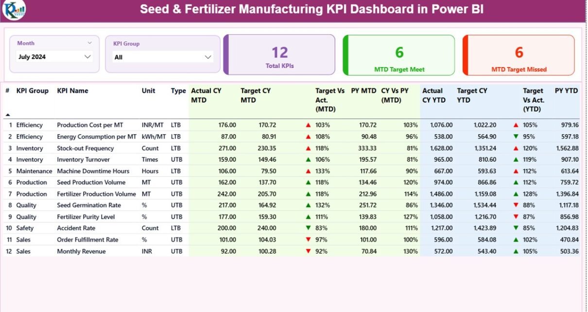
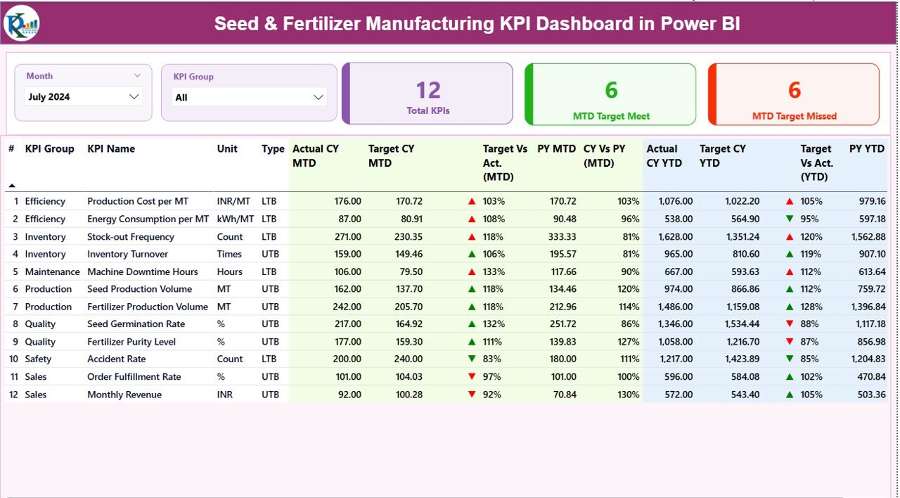
Summary Page: How Does It Provide a Complete Performance Snapshot?
The Summary Page acts as the main control center of the dashboard.
Top-Level Filters and Cards
At the top of the page, users can apply:
- Month slicer
- KPI Group slicer
These slicers instantly update all visuals on the page.
Additionally, the dashboard displays three key KPI cards:
- Total KPIs Count
- MTD Target Meet Count
- MTD Target Missed Count
Because of these cards, leadership can quickly assess overall performance health.
Detailed KPI Performance Table
Below the cards, the dashboard shows a comprehensive KPI table with the following fields:
- KPI Number – Sequential identifier for each KPI
- KPI Group – Category or functional group of the KPI
- KPI Name – Name of the KPI
- Unit – Unit of measurement
- Type – KPI type (LTB – Lower the Better, UTB – Upper the Better)
- Actual CY MTD – Current Year actual MTD value
- Target CY MTD – Current Year target MTD value
- MTD Icon – ▲ or ▼ icon with green/red color indicating target status
- Target vs Actual (MTD) – Percentage comparison using Actual ÷ Target
- PY MTD – Previous Year MTD value
- CY vs PY (MTD) – Growth or decline percentage vs previous year
- Actual CY YTD – Current Year actual YTD value
- Target CY YTD – Current Year target YTD value
- YTD Icon – ▲ or ▼ indicator for YTD performance
- Target vs Actual (YTD) – YTD performance percentage
- PY YTD – Previous Year YTD value
- CY vs PY (YTD) – Year-over-year YTD comparison
Because of this structure, users can analyze MTD and YTD performance in a single view.
Click to buy Seed & Fertilizer Manufacturing KPI Dashboard in Power BI
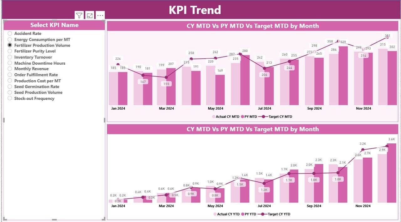
KPI Trend Page: How Can You Track Performance Over Time?
The KPI Trend Page focuses on performance movement and historical comparison.
Key Features of the KPI Trend Page:
- Two combo charts showing:
- Current Year Actual
- Previous Year Actual
- Target values
- Separate visuals for MTD and YTD
- KPI Name slicer on the left for focused analysis
Because of these visuals, users can:
- Identify seasonal patterns
- Detect performance dips early
- Compare current results with historical data
As a result, teams gain deeper insight into operational consistency.
Click to buy Seed & Fertilizer Manufacturing KPI Dashboard in Power BI
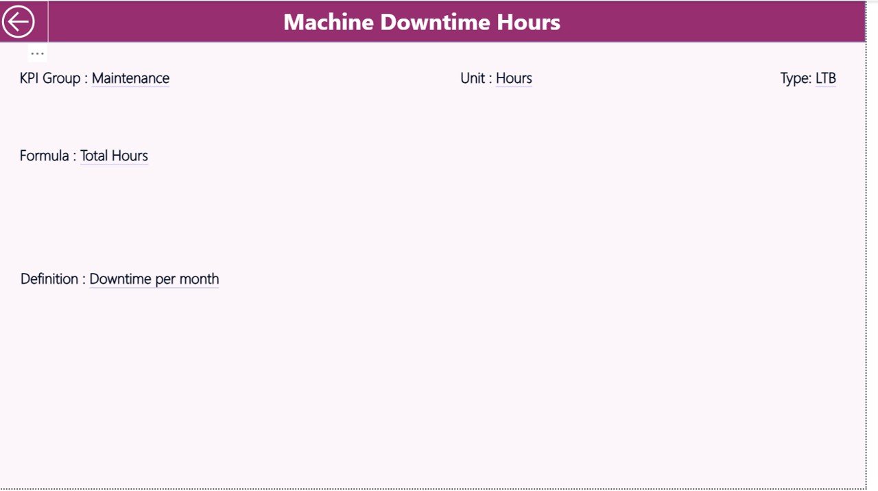
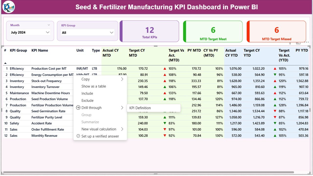
KPI Definition Page: Why Is KPI Clarity Important?
The KPI Definition Page acts as a drill-through page and remains hidden by default.
From the Summary Page, users can drill through to view:
- KPI Formula
- KPI Definition
- Unit and KPI Type
Because of this page:
- Everyone interprets KPIs the same way
- Reporting stays consistent
- New team members understand metrics faster
A Back button on the top-left corner allows users to return to the main page easily.
Click to buy Seed & Fertilizer Manufacturing KPI Dashboard in Power BI
How Does the Excel Data Source Work in This Dashboard?
The dashboard uses an Excel file as its data source, which keeps the system flexible and user-friendly.
The Excel file includes three worksheets:
Input_Actual Sheet: How Do You Enter Actual Performance Data?
In this sheet, users enter:
- KPI Name
- Month (use the first date of the month)
- MTD Actual values
- YTD Actual values
Because data entry remains structured, Power BI refreshes visuals accurately.
Input_Target Sheet: How Do You Track Planned Performance?
In this sheet, users enter:
- KPI Name
- Month (first date of the month)
- MTD Target values
- YTD Target values
As a result, the dashboard can compare Actual vs Target automatically.
Click to buy Seed & Fertilizer Manufacturing KPI Dashboard in Power BI
KPI Definition Sheet: How Do You Standardize KPIs?
In this sheet, users define:
- KPI Number
- KPI Group
- KPI Name
- Unit
- Formula
- Definition
- Type (LTB or UTB)
Because of this setup, KPI logic remains centralized and transparent.
What Types of KPIs Can Seed & Fertilizer Manufacturers Track?
This dashboard supports a wide range of KPIs, such as:
- Production volume
- Yield efficiency
- Quality rejection rate
- Batch cycle time
- Raw material usage
- Energy consumption
- Inventory turnover
- Order fulfillment rate
- Cost per unit
- Downtime hours
Therefore, manufacturers can customize the dashboard to match their operational priorities.
Advantages of Seed & Fertilizer Manufacturing KPI Dashboard in Power BI
Using this dashboard delivers multiple business benefits.
Key advantages include:
- Centralized KPI monitoring across manufacturing operations
- MTD and YTD performance visibility in one view
- Target vs Actual tracking with visual indicators
- Previous Year comparison for trend analysis
- Drill-through KPI definitions for clarity
- Excel-based data entry with Power BI analytics
- Faster decision-making through real-time insights
Because of these advantages, organizations improve control, efficiency, and accountability.
How Does This Dashboard Improve Decision-Making?
This dashboard improves decision-making by:
- Highlighting underperforming KPIs instantly
- Showing growth or decline trends clearly
- Enabling proactive corrective actions
- Aligning teams with measurable targets
As a result, leadership moves from reactive reporting to proactive management.
Best Practices for Seed & Fertilizer Manufacturing KPI Dashboard in Power BI
To maximize dashboard value, organizations should follow proven best practices.
Define KPIs Clearly
Always document formulas, units, and KPI types in the KPI Definition sheet.
Update Data Consistently
Maintain a monthly data update cycle to ensure accurate MTD and YTD tracking.
Use KPI Groups Wisely
Group KPIs by production, quality, cost, or supply chain for better analysis.
Review Trends Regularly
Analyze trend charts monthly to detect early warning signals.
Align Targets with Strategy
Set realistic targets that match business goals and capacity.
Train Users
Ensure teams understand slicers, drill-through features, and KPI logic.
Following these best practices ensures long-term dashboard success.
Who Should Use a Seed & Fertilizer Manufacturing KPI Dashboard in Power BI?
This dashboard suits:
- Manufacturing managers
- Plant heads
- Operations teams
- Quality control managers
- Supply chain teams
- Finance and cost analysts
- Senior leadership
Because of its flexibility, both mid-sized and large manufacturers can benefit.
Conclusion
A Seed & Fertilizer Manufacturing KPI Dashboard in Power BI transforms raw operational data into meaningful insights. Instead of relying on disconnected reports, organizations gain a single source of truth for performance monitoring.
With structured Excel inputs, interactive Power BI visuals, MTD and YTD tracking, and year-over-year comparisons, this dashboard enables faster decisions, better accountability, and improved operational control.
For seed and fertilizer manufacturers aiming to improve efficiency, consistency, and profitability, this dashboard serves as a powerful performance management solution.
Frequently Asked Questions (FAQs)
- What is the main purpose of a Seed & Fertilizer Manufacturing KPI Dashboard in Power BI?
The main purpose involves tracking, analyzing, and improving manufacturing performance using real-time KPIs.
- Can non-technical users operate this dashboard?
Yes, users only need to update Excel files and use simple Power BI slicers.
- Does the dashboard support MTD and YTD analysis?
Yes, it shows both MTD and YTD Actual, Target, and Previous Year comparisons.
- Can I customize KPIs for my organization?
Yes, users can add or modify KPIs using the KPI Definition sheet.
- How often should data be updated?
Monthly updates work best for accurate trend and performance analysis.
- Does this dashboard require advanced Power BI skills?
No, basic Power BI knowledge is enough to operate and refresh the dashboard.
- Can this dashboard scale for large manufacturing operations?
Yes, it supports multiple KPI groups and large datasets effectively.
Visit our YouTube channel to learn step-by-step video tutorials
Watch the step-by-step video tutorial:
Click to buy Seed & Fertilizer Manufacturing KPI Dashboard in Power BI