In today’s dynamic sports and recreation industry, performance tracking, event profitability, and participant satisfaction play a major role in driving success. Whether you manage a community sports center, a recreation department, or an event management agency, having the right insights at your fingertips makes all the difference.
That’s where the Sports & Recreation Dashboard in Power BI comes in — a ready-to-use analytical dashboard that helps you visualize, measure, and manage key performance metrics for all sports and recreation activities.
This modern, data-driven dashboard empowers decision-makers to monitor event outcomes, participant engagement, and revenue generation — all within a single, interactive Power BI workspace.
Click to Purchases Sports & Recreation Dashboard in Power BI
What Is a Sports & Recreation Dashboard in Power BI?
A Sports & Recreation Dashboard in Power BI is an advanced reporting tool designed to consolidate operational, financial, and satisfaction data from your sports or recreation programs into one place.
It connects with your Excel-based data and transforms it into meaningful visuals like KPI cards, charts, and slicers. From event completion percentages to profit margins, satisfaction scores, and monthly performance trends — everything becomes instantly visible and actionable.
Using Power BI’s interactivity, you can filter, drill down, and compare insights across event types, venues, departments, or regions — helping organizations make smarter, data-driven decisions.
Key Features of the Sports & Recreation Dashboard in Power BI
This dashboard includes five key analytical pages within the Power BI desktop file, each designed to focus on specific aspects of your operations.
1️⃣ Overview Page

The Overview Page serves as the main hub of your dashboard.
Here you can instantly see your overall performance through:
-
5 KPI Cards – such as Completed Events %, Profit Margin %, Total Revenue, Total Cost, and Average Satisfaction Rating.
4 Interactive Charts:
- ✅ Completed Event % – measures the ratio of successfully executed events.
- 💰 Profit Margin % by Venue Type – reveals which venues deliver higher profitability.
- ⭐ Satisfaction Rating (1–10) by Category – helps identify service areas that delight participants.
- 💵 Cost (USD) and Revenue (USD) by Organizer – compares organizers’ efficiency and financial contribution.
With built-in slicers for Month and KPI Group, users can customize their view to analyze performance across different time frames or categories.
2️⃣ Department Analysis Page

The Department Analysis Page provides in-depth insights into the financial and satisfaction performance of each department involved in sports and recreation management.
This section includes:
-
Profit (USD) by Department – shows profitability trends per department.
-
Satisfaction Rating (1–10) by Department – evaluates the quality of service delivered by each team.
-
Cost (USD) and Revenue (USD) by Department – provides a side-by-side view of income and expenditure across departments.
This page enables departmental heads to identify underperforming areas and take data-driven actions to enhance efficiency.
3️⃣ Event Type Analysis Page

Sports and recreation programs often include multiple event types — tournaments, workshops, community sessions, and more. The Event Type Analysis Page categorizes performance across these different formats.
Charts on this page include:
-
Profit (USD) by Event Type – identifies which event formats yield higher returns.
-
Satisfaction Rating (1–10) by Event Type – assesses participant happiness and experience level.
-
Cost (USD) and Revenue (USD) by Event Type – provides financial transparency for each event type.
This page is perfect for optimizing event planning and resource allocation, ensuring every type contributes positively to overall objectives.
Click to Purchases Sports & Recreation Dashboard in Power BI
4️⃣ Region Analysis Page

For organizations managing events across multiple regions or locations, this page is invaluable.
The Region Analysis Page includes:
-
Profit (USD) by Region – visualizes which regions perform better financially.
-
Satisfaction Rating (1–10) by Region – highlights regional service quality differences.
-
Cost (USD) and Revenue (USD) by Region – compares operational costs versus generated revenue across regions.
By using slicers and filters, users can easily detect regional patterns and plan resource allocation or marketing strategies accordingly.
5️⃣ Monthly Trends Page
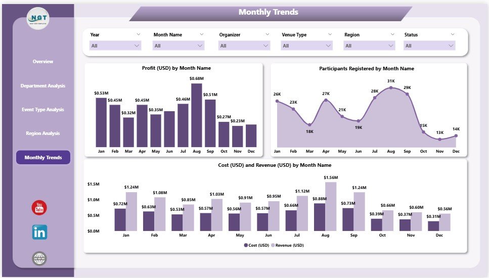
Monitoring performance over time helps identify seasonal trends and growth patterns.
The Monthly Trends Page provides:
-
Profit (USD) by Month – to track month-over-month profitability.
-
Participants Registered by Month – to analyze engagement patterns.
-
Cost (USD) and Revenue (USD) by Month – for monitoring financial consistency and performance evolution.
This time-based analysis helps management teams make strategic adjustments in scheduling, pricing, and event planning.
Why Do Organizations Need a Sports & Recreation Dashboard?
The sports and recreation industry generates large amounts of data — from registration details and event outcomes to participant satisfaction and financial performance.
Without a structured system, it’s nearly impossible to analyze all this data efficiently. Power BI simplifies this challenge by creating one central visual dashboard that provides instant insights.
Here’s what it helps you achieve:
-
Consolidate scattered data from multiple sources (Excel, online forms, etc.).
-
Measure KPIs like Profit Margin, Event Completion Rate, and Satisfaction Ratings.
-
Identify the best-performing venues, departments, and event types.
-
Detect areas that need improvement through visual performance cues.
-
Make real-time, informed decisions using dynamic dashboards.
Advantages of Sports & Recreation Dashboard in Power BI
The benefits of using this dashboard go beyond visualization. It transforms how sports and recreation teams make decisions.
1️⃣ Improved Decision-Making
Data-driven visuals allow managers to make faster and more confident decisions regarding budgeting, scheduling, and resource planning.
2️⃣ Centralized Data Management
All data from multiple departments or locations comes together in one platform — eliminating the need for multiple spreadsheets or manual consolidation.
3️⃣ Real-Time Performance Monitoring
With live data connections, you can instantly see up-to-date KPIs and react promptly to changing business conditions.
4️⃣ Financial Transparency
Tracking revenue, costs, and profit margins by various categories ensures you always know where money flows and where it generates value.
5️⃣ Enhanced Accountability
Each department or organizer can be evaluated based on their measurable contributions, promoting transparency and responsibility.
6️⃣ Increased Participant Satisfaction
By analyzing satisfaction ratings, you can identify which activities resonate most with your audience and continuously improve engagement.
Best Practices for Using the Sports & Recreation Dashboard
To maximize the potential of this Power BI dashboard, organizations should follow these proven best practices:
1. Keep Data Clean and Consistent
Ensure that your Excel data source uses uniform formats for dates, currencies, and categories. Clean data guarantees accurate visualizations.
2. Refresh Data Regularly
Set up scheduled refreshes in Power BI to keep your dashboard updated with the latest data — daily, weekly, or monthly as required.
3. Use Filters Wisely
Leverage slicers to drill down into specific event types, departments, or time periods instead of crowding visuals with unnecessary data.
4. Track KPIs Over Time
Monitor both MTD (Month-to-Date) and YTD (Year-to-Date) performance to identify seasonal trends or recurring patterns.
5. Encourage Departmental Collaboration
Share the dashboard across teams to promote shared accountability and goal alignment across the organization.
6. Combine Qualitative and Quantitative Insights
Incorporate participant feedback and satisfaction data alongside financial metrics for a balanced view of performance.
7. Continuously Refine Metrics
Over time, refine your KPIs to ensure they reflect evolving goals, such as new event categories or emerging success indicators.
How the Dashboard Supports Strategic Decision-Making
1️⃣ Resource Optimization
By highlighting profitable and underperforming departments, management can allocate resources more effectively.
2️⃣ Budget Planning
Historical trends help in predicting future costs, setting realistic targets, and planning budgets for upcoming events.
3️⃣ Performance Benchmarking
Departments and regions can be benchmarked against one another, motivating improvement and healthy competition.
4️⃣ Enhanced Stakeholder Reporting
Visual reports are ideal for sharing progress with senior management, sponsors, and government agencies — eliminating manual reporting.
5️⃣ Strategic Event Planning
Monthly trends reveal participation peaks and dips, enabling smarter scheduling and promotional campaigns.
How to Get Started with the Sports & Recreation Dashboard
-
Collect and Structure Your Data: Start by compiling all your sports and recreation data in Excel — including financials, satisfaction ratings, and participation details.
-
Import into Power BI: Connect the Excel file to Power BI using the “Get Data” option.
-
Load the Dashboard Template: Use the ready-to-use template from NextGenTemplates.com.
-
Customize KPIs and Charts: Adjust slicers, labels, and visuals according to your organization’s structure.
-
Publish and Share: Publish the report to the Power BI Service for organization-wide access and collaboration.
Within minutes, you can transform raw data into a professional, interactive analytics tool.
Opportunities for Improvement
While the Sports & Recreation Dashboard in Power BI already offers comprehensive insights, you can enhance it further with:
-
Integration with real-time APIs from registration systems or booking software.
-
Adding forecasting visuals using Power BI’s AI capabilities to predict future event performance.
-
Incorporating geo-mapping to visualize participant distribution across cities.
-
Automating alerts for KPI thresholds (e.g., when satisfaction drops below 8/10).
-
Building mobile-responsive dashboards for on-the-go access.
Conclusion
The Sports & Recreation Dashboard in Power BI is more than just a visualization tool — it’s a strategic command center for organizations aiming to achieve operational excellence, financial transparency, and higher participant satisfaction.
By centralizing all event, department, and region-level data, it simplifies complex decision-making and promotes a culture of continuous improvement.
Whether you’re managing local community programs, large-scale sports events, or recreation centers, this dashboard helps you stay ahead — driving performance through clarity, insight, and action.
Frequently Asked Questions (FAQs)
1️⃣ What is a Sports & Recreation Dashboard in Power BI used for?
It is used to monitor, analyze, and visualize data related to sports events, recreational activities, costs, revenues, and participant satisfaction — all in one place.
2️⃣ Who can benefit from this dashboard?
Sports event managers, recreation department heads, fitness centers, and government agencies overseeing community programs can all benefit from this tool.
3️⃣ Can I connect this dashboard to live data sources?
Yes. Power BI allows you to connect Excel, SQL, or web-based data sources for real-time analytics and automatic refreshes.
4️⃣ How often should I update the data?
It depends on your operations. Most organizations update it monthly, while others prefer weekly refreshes for more frequent insights.
5️⃣ Is it possible to customize KPIs?
Absolutely. You can edit, add, or remove KPIs in the Power BI dashboard to align with your specific business goals and event structures.
6️⃣ Can non-technical users operate this dashboard?
Yes. The dashboard is designed for simplicity. With intuitive slicers and visuals, anyone can explore the data without technical training.
7️⃣ What makes Power BI suitable for sports analytics?
Power BI offers interactive visualizations, AI-driven insights, and seamless integration with Excel — making it ideal for visualizing sports and recreation data efficiently.
Visit our YouTube channel to learn step-by-step video tutorials
Click to Purchases Sports & Recreation Dashboard in Power BI