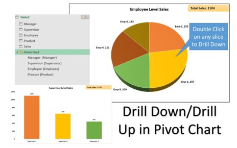
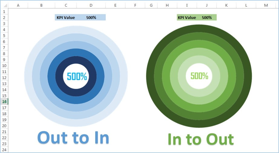
5 Layered Advanced Doughnut Chart
In this article, we have created the 5 Layered Doughnut Chart to display the KPI value up to 500%. We have created two different version of this chart – In to Out and Out to In.
Click to buy 5 Layered Advanced Doughnut Chart
Visit our YouTube channel to learn step-by-step video tutorials
Watch the step by step video tutorial:
Click to buy 5 Layered Advanced Doughnut Chart