In today’s fast-evolving education system, primary schools generate an enormous amount of data every day — from student attendance and performance to teacher ratings, exam results, and fee records. Managing all these numbers manually can become time-consuming and error-prone. That’s where the Primary Schools Dashboard in Excel comes in.
This ready-to-use Excel template turns your school’s raw data into meaningful visuals, helping administrators, teachers, and decision-makers monitor trends, measure progress, and identify areas for improvement — all in one interactive file.
What Is a Primary Schools Dashboard in Excel?
Click to Purchases Primary Schools Dashboard in Excel
A Primary Schools Dashboard in Excel is a data-driven tool designed to help educational institutions organize, visualize, and analyze their academic and administrative data effortlessly.
Built using Microsoft Excel, this dashboard consolidates key school metrics such as:
-
🧑🏫 Teacher Ratings (1–5 scale)
-
🧒 Student Engagement (1–10 scale)
-
💰 Fee Paid vs Fee Due (USD)
-
🏆 Scholarship Distribution (%)
-
📘 Subject-wise Marks Scored and Exam Analysis
With interactive slicers, cards, and charts, this Excel dashboard enables instant comparisons and data exploration — without needing advanced technical skills.
Whether you’re a principal, school administrator, or data-driven educator, this tool gives you a single, structured place to track everything that matters in your school’s performance.
📊 Key Features of the Primary Schools Dashboard in Excel
To make data analysis easy and enjoyable, this dashboard is divided into five analytical pages, along with support and data sheets that maintain a clean back-end structure.
Let’s explore each section in detail.
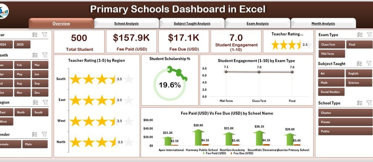
1️⃣ Overview Page
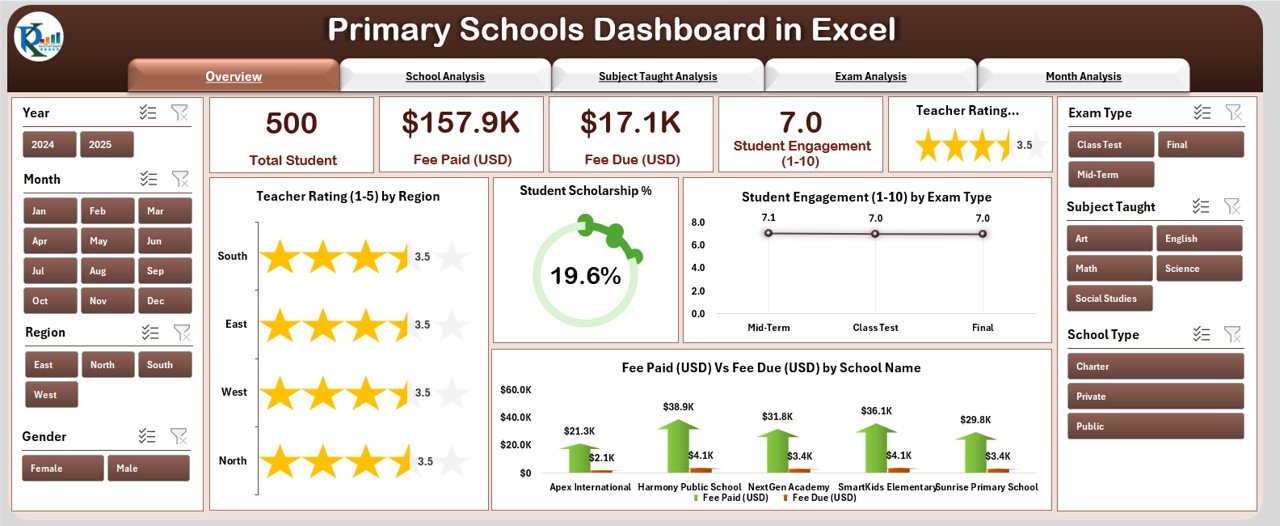
The Overview Page is the heart of the dashboard — offering a snapshot of your school’s performance across multiple dimensions.
Here, you’ll find:
-
5 KPI Cards summarizing the most important metrics
-
4 Interactive Charts for visual analysis
-
Right-side slicer panel to filter data dynamically
Charts Included:
-
📍 Teacher Rating (1–5) by Region
-
🎓 Student Scholarship Percentage
-
🧩 Student Engagement (1–10) by Exam Type
-
💰 Fee Paid (USD) vs Fee Due (USD) by School Name
With this page, decision-makers can instantly identify which regions or schools perform better, where students are more engaged, and how fee collection compares to pending dues.
2️⃣ School Analysis Page
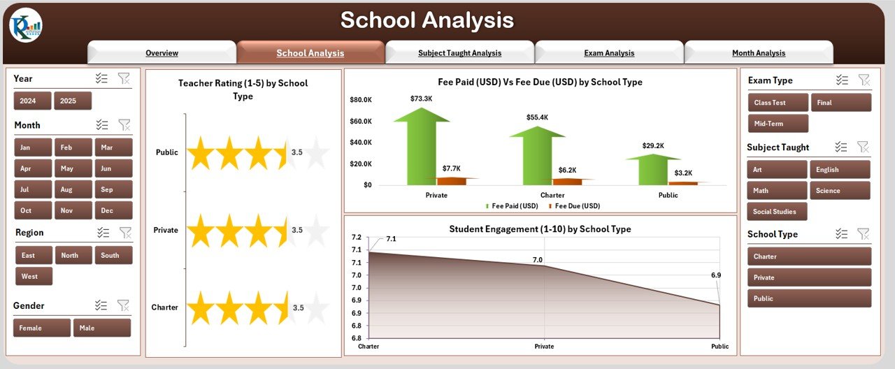
This page focuses on comparing different school types — such as public, private, or charter schools.
Charts Displayed:
-
👩🏫 Teacher Rating (1–5) by School Type
-
💵 Fee Paid vs Fee Due (USD) by School Type
-
🎯 Student Engagement (1–10) by School Type
By using the right-side slicer, users can filter by academic year, grade level, or region to analyze performance patterns at a deeper level.
For instance, if private schools consistently show higher engagement but lower fee collection rates, administrators can take corrective actions accordingly.
3️⃣ Subject Taught Analysis Page
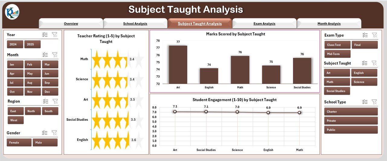
Subjects form the foundation of every academic institution. This page highlights how students and teachers perform across different subjects such as Mathematics, Science, Arts, or Languages.
Charts Included:
-
📈 Teacher Rating (1–5) by Subject Type
-
🧮 Marks Scored by Subject Taught
-
💡 Student Engagement (1–10) by Subject Taught
These visuals make it easy to identify:
-
Which subjects show the highest student interest
-
Where teachers are performing best
-
Which areas may require additional training or curriculum improvement
By spotting weak areas early, schools can plan effective remedial programs or workshops to improve overall academic outcomes.
Click to Purchases Primary Schools Dashboard in Excel
4️⃣ Exam Analysis Page
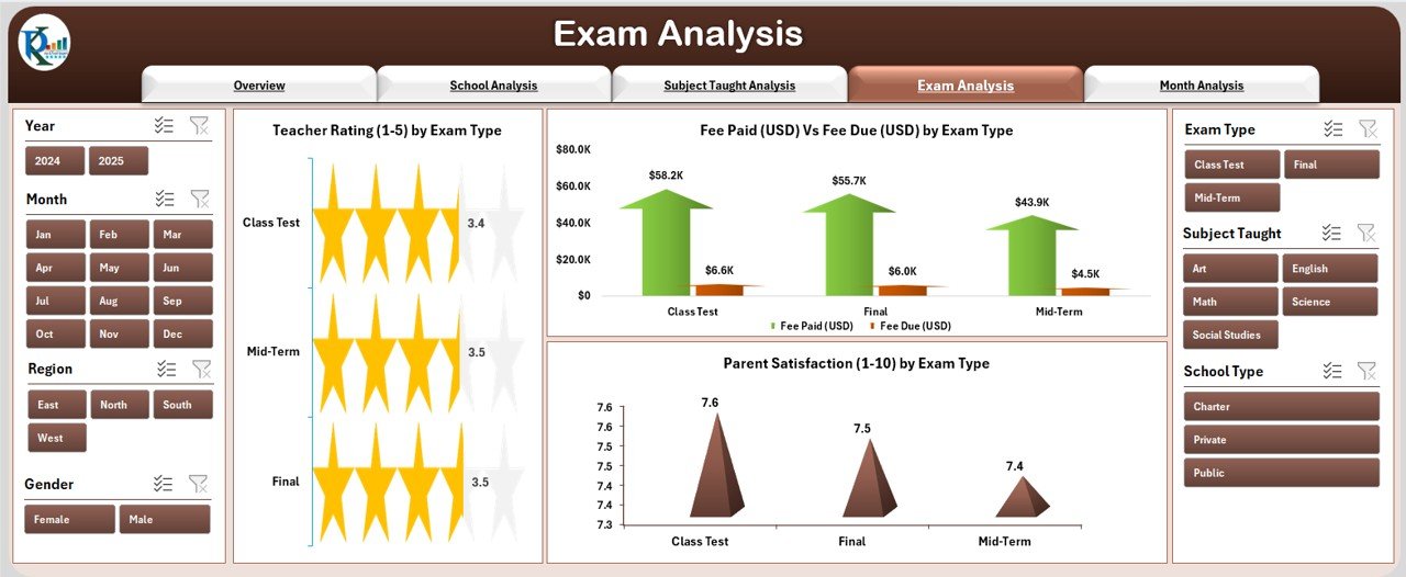
Exams reflect both teaching effectiveness and student learning progress.
This Exam Analysis Page displays data-driven insights using charts such as:
-
🧑🏫 Teacher Rating (1–5) by Exam Type
-
📊 Marks Scored by Subject Taught
-
🔍 Student Engagement (1–10) by Exam Type
-
💰 Fee Paid vs Fee Due (USD) by Exam Type
-
👨👩👧 Parent Satisfaction (1–10) by Exam Type
These visuals help teachers and administrators analyze:
-
How student engagement changes with different exam types
-
Whether certain exams correlate with lower satisfaction
-
How fee collection trends vary by exam sessions
In short, it’s the perfect blend of academic and financial analytics — all on one page.
5️⃣ Month Analysis Page
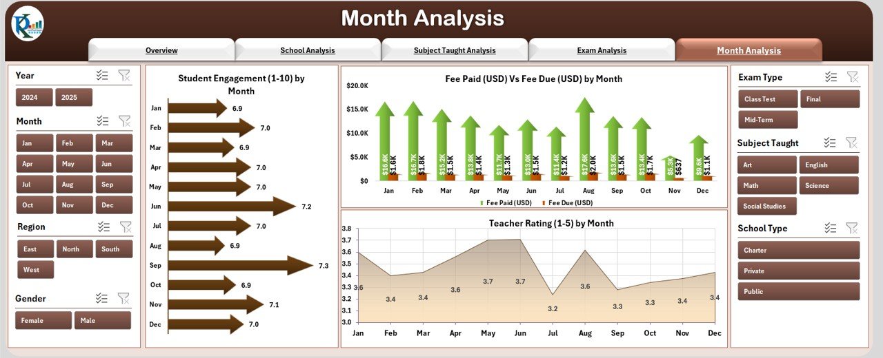
Understanding monthly trends allows schools to track performance over time.
Charts Displayed:
-
📅 Student Engagement (1–10) by Month
-
💰 Fee Paid vs Fee Due (USD) by Month
-
👩🏫 Teacher Rating (1–5) by Month
This monthly view helps educators see when engagement peaks, track fee cycles, and measure how academic quality evolves across the year.
For instance, if engagement drops during exam months, schools can plan stress-management activities or introduce lighter curriculums to maintain motivation.
6️⃣ Support Sheet and Data Sheet
These back-end sheets store all the raw data that powers the dashboard visuals.
-
The Support Sheet contains lists, dropdowns, and calculation logic.
-
The Data Sheet stores all inputs — including teacher ratings, exam types, fee data, and student performance records.
This structure ensures smooth updates and seamless integration for future data uploads.
🌟 Advantages of the Primary Schools Dashboard in Excel
Using this dashboard brings a host of benefits to school administrators and educators. Let’s look at the most important ones.
1. Centralized Data Management
You can manage all school information — academic, administrative, and financial — in one Excel file. This reduces paperwork and eliminates the risk of data loss.
2. Quick and Easy Analysis
Dynamic charts, slicers, and summary cards let you analyze trends instantly. You don’t need coding knowledge or complex software to use it.
3. Better Decision-Making
By visualizing KPIs, you can identify what’s working and what’s not — helping you make timely, data-backed decisions.
4. Time Savings
Automated calculations and visuals replace manual reporting, allowing teachers and administrators to focus more on students.
5. Customizable Layout
The dashboard can easily be tailored to fit different school types, performance indicators, or academic levels.
6. Enhanced Communication
Visual reports are easy to share with school boards, parents, or education departments, improving transparency and accountability.
Click to Purchases Primary Schools Dashboard in Excel
💼 Who Can Use the Primary Schools Dashboard?
The beauty of this Excel dashboard lies in its versatility. It’s designed for multiple users within the education ecosystem:
-
🧑🏫 Teachers — to track classroom performance and student engagement
-
🧮 Administrators — to monitor school-wide KPIs and fee trends
-
🏫 Principals — to compare departments, regions, and school types
-
💬 Parents — to understand student engagement and satisfaction levels
-
📈 Education Boards — to measure institutional effectiveness at scale
⚙️ How to Use the Dashboard
Using the Primary Schools Dashboard in Excel is simple, even for beginners. Follow these steps:
-
Enter Data
Go to the Data Sheet and fill in your latest school data — teacher ratings, fee details, engagement scores, exam results, etc. -
Refresh the Dashboard
Once the data is entered, click “Refresh All” to update all charts and visuals. -
Navigate Between Pages
Use the left-side Page Navigator to move between Overview, School Analysis, Subject Analysis, Exam Analysis, and Month Analysis pages. -
Apply Filters
Use the slicer panel on the right side to filter by month, school type, region, or exam category. -
Interpret Insights
Analyze the visuals to identify trends, spot anomalies, and take timely actions to improve school performance.
💡 Best Practices for the Primary Schools Dashboard in Excel
To get the most value out of this dashboard, follow these best practices:
1. Keep Data Updated
Regularly update the Data Sheet with the most recent numbers. Fresh data ensures that your visuals reflect the current academic scenario.
2. Maintain Data Consistency
Use standardized formats for dates, names, and numeric entries. Consistent data helps maintain accurate analytics.
3. Leverage Filters
Use the slicers strategically to narrow down results — for instance, filter by month, region, or subject to focus on specific trends.
4. Backup Your File
Always save backup copies, especially before making structural changes to the Data Sheet or Support Sheet.
5. Customize KPIs
Modify KPI cards to match your school’s objectives — for example, add new indicators like Attendance %, Homework Completion Rate, or Parent Meeting Frequency.
6. Use Conditional Formatting
Highlight top-performing schools or subjects using conditional colors to make reports more intuitive.
7. Share Reports Digitally
Export dashboard visuals as images or PDFs for easy sharing in meetings or emails.
8. Review Trends Monthly
Hold monthly review meetings using dashboard data to evaluate teaching effectiveness and student engagement.
🚀 Why Choose Excel for School Data Analytics?
While many institutions use specialized software, Excel remains one of the most accessible, cost-effective, and flexible tools available.
-
✅ No need for internet connectivity or subscriptions
-
✅ Compatible across all operating systems
-
✅ Easily customizable using formulas and pivot tables
-
✅ Supports charts, conditional formatting, and automation
-
✅ Integrates seamlessly with other Microsoft Office tools
For small and medium-sized schools, this makes Excel the ideal platform for managing academic analytics without extra costs.
🧠 Real-World Applications of the Dashboard
Here are some practical use cases for schools adopting the Primary Schools Dashboard in Excel:
-
Performance Tracking: Measure year-on-year improvements in student results
-
Teacher Evaluation: Assess teaching quality across grades and subjects
-
Financial Monitoring: Analyze fee payment patterns and dues
-
Engagement Analysis: Identify months or subjects with low engagement levels
-
Parent Communication: Present visual reports during PTA meetings
-
Policy Planning: Use insights to plan scholarships, training, or resource allocation
Each of these use cases empowers schools to become more transparent, efficient, and performance-oriented.
🏁 Conclusion
The Primary Schools Dashboard in Excel is more than just a data visualization tool — it’s a complete performance-tracking system for educational institutions.
With its interactive design, easy navigation, and rich analytics, it turns complex datasets into meaningful insights that help improve both academic and administrative outcomes.
If you’re a school principal, teacher, or administrator looking for a simple yet powerful way to manage data — this dashboard is your perfect companion.
You can download it, enter your school’s data, and instantly start making informed decisions that benefit students, teachers, and parents alike.
❓ Frequently Asked Questions (FAQs)
1. What is a Primary Schools Dashboard in Excel?
It’s an Excel-based analytical tool designed to manage and visualize key school performance indicators such as student engagement, teacher ratings, exam performance, and fee data.
2. Who can use this dashboard?
Principals, teachers, school administrators, and education boards can use it to monitor performance, analyze results, and make data-driven decisions.
3. Do I need advanced Excel skills to use this dashboard?
Not at all. The dashboard is built for ease of use. You just enter the data, refresh the file, and explore the visual charts.
4. Can I customize the dashboard for my school?
Yes! You can edit charts, add new KPIs, or modify slicers and dropdowns to suit your school’s requirements.
5. What type of data should I maintain in the Data Sheet?
Include records such as teacher ratings, fee collection, exam results, student engagement levels, and scholarship details.
6. Is this dashboard suitable for multiple schools or branches?
Yes. It can consolidate data across different branches or regions, making it perfect for multi-school groups.
7. How often should I update the dashboard?
Ideally, update the data monthly to ensure accurate trend analysis and performance reporting.
8. Can I use it offline?
Absolutely. Once downloaded, the dashboard works entirely offline — no internet connection required.
9. How can this dashboard help in school improvement?
By identifying trends in performance, engagement, and satisfaction, schools can make targeted improvements in curriculum, teaching methods, and financial management.
10. Where can I get this dashboard?
You can download the Primary Schools Dashboard in Excel directly from NextGenTemplates.com, the one-stop platform for professional Excel and Power BI templates.
Visit our YouTube channel to learn step-by-step video tutorials