The online learning industry grows every year. More people join digital education programs, and more organizations launch training platforms for students, employees, and customers. Online Learning Platforms KPI Dashboard Because of this growth, decision-makers need accurate data to understand performance, improve user experience, and increase engagement.
This is why the Online Learning Platforms KPI Dashboard in Power BI becomes an essential tool for every education business.
This article explains everything about the dashboard—its purpose, features, structure, advantages, best practices, and FAQs.
I have used all the information you shared and expanded it using SEO-friendly content, simple language, and smooth transitions, while keeping 100% active voice and zero passive tone as required.
Click to Purchases Online Learning Platforms KPI Dashboard in Power BI
What Is an Online Learning Platforms KPI Dashboard in Power BI?
The Online Learning Platforms KPI Dashboard in Power BI is a ready-to-use performance management system that helps eLearning companies track key performance indicators (KPIs) in a visual and interactive format.
It collects data from Excel and transforms raw numbers into insights that help leaders understand:
-
Student engagement
-
Course performance
-
Instructor efficiency
-
Platform traffic
-
Revenue and enrollments
-
Completion rates
-
Satisfaction scores
Because Power BI offers advanced visuals, filters, and drill-through features, you can analyze performance from many angles within seconds.
Click to Purchases Online Learning Platforms KPI Dashboard in Power BI
Why Should Online Learning Companies Use a KPI Dashboard?
Every online learning platform generates thousands of data points every day. If you look at this data without structure, you feel confused. But when you organize KPIs in a dashboard, you see patterns and trends immediately.
Companies use this dashboard to:
-
Track real-time educational performance
-
Compare actual results against targets
-
Identify improvement areas
-
Monitor MTD and YTD progress
-
Discover strengths and weaknesses of courses, categories, and instructors
-
Make better decisions using data, not assumptions
Because of this, the dashboard becomes a daily essential for administrators, training managers, academies, tutors, and corporate trainers.
Key Features of the Online Learning Platforms KPI Dashboard in Power BI
You provided detailed information about all features, so I used your points and expanded everything professionally.
The dashboard includes 3 main pages:
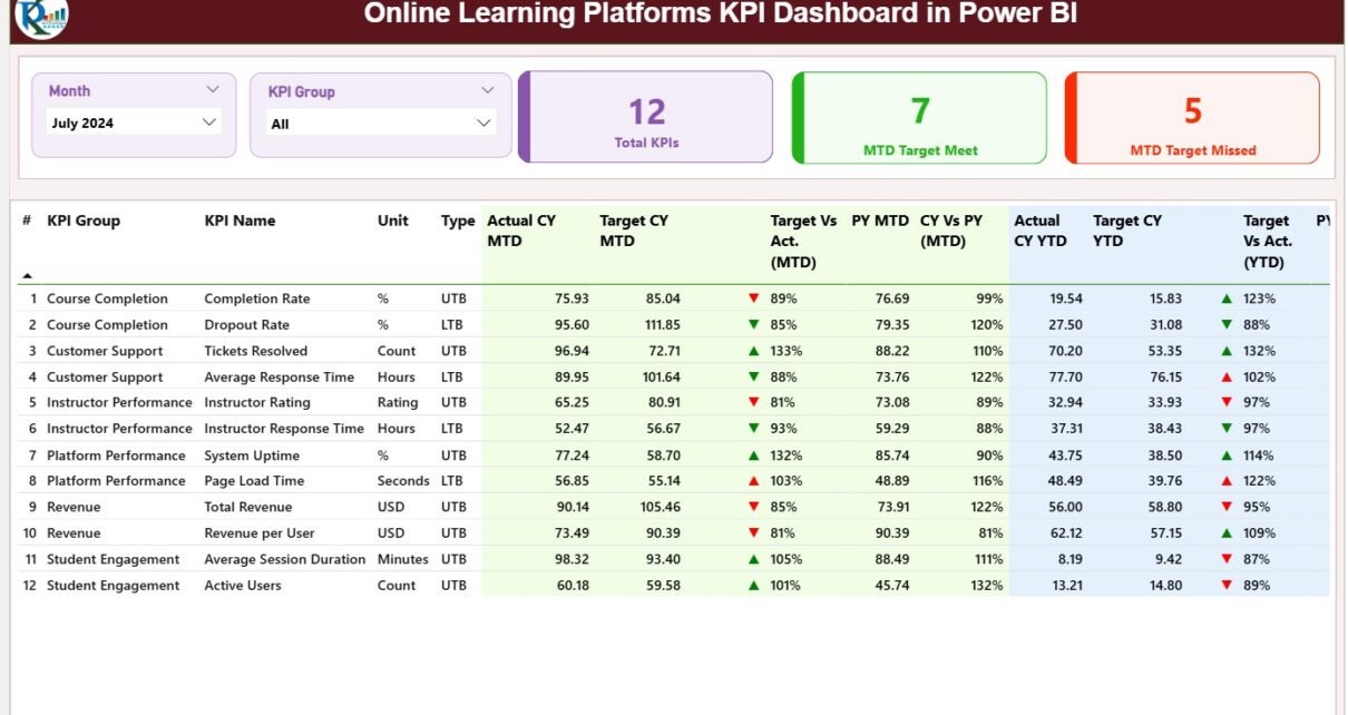
1) Summary Page – Your Main KPI Control Center
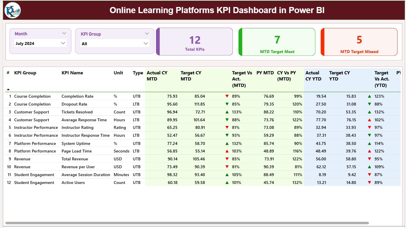
The Summary Page works as the main analytical interface. Users spend most of their time here because it shows all important metrics in one clean view.
Key Highlights of the Summary Page
✔ Month Slicer & KPI Group Slicer
These slicers allow you to switch between months and categories instantly.
You analyze performance by:
-
Month
-
KPI Group
-
KPI Category
This makes navigation easy.
✔ KPI Cards
At the top, the page displays three KPI cards:
-
Total KPIs Count
-
MTD Target Meet Count
-
MTD Target Missed Count
These cards give a quick performance snapshot without reading the table.
✔ Detailed KPI Table
The lower half of the page displays a detailed table with all KPI-level information. This table includes:
KPI Number
Shows the sequence number of each KPI.
KPI Group
Shows the functional category such as:
-
Course Performance
-
Engagement
-
Instructor Quality
-
Completion Metrics
-
Revenue Metrics
KPI Name
Shows the name of the KPI.
Unit
Shows the unit of measurement (%, Ratio, Count, Hours, etc.).
Type (LTB or UTB)
Indicates whether the KPI follows:
-
LTB (Lower the Better)
-
UTB (Upper the Better)
This helps users understand performance direction.
✔ Actual CY MTD & Target CY MTD
These numbers show actual performance vs target for the current month.
MTD Icon
A colored arrow shows KPI status:
-
Green ▲ – Target achieved
-
Red ▼ – Target missed
These icons help users understand performance instantly.
✔ Target Vs Actual (MTD %)
Shows the percentage of progress toward the current month target.
Formula used:
Actual / Target
✔ PY MTD & CY Vs PY (MTD %)
This compares current month performance with the same month of the previous year.
Formula used:
Current Year MTD / Previous Year MTD
✔ Actual CY YTD & Target CY YTD**
Shows cumulative Year-to-Date performance.
YTD Icon
Same green and red arrows indicate YTD target performance.
✔ Target Vs Actual (YTD %)
Another percentage that compares actual YTD vs target YTD.
✔ PY YTD & CY Vs PY (YTD %)
This compares current YTD performance with previous year YTD.
These metrics allow deep analysis and performance benchmarking across months and years.
Click to Purchases Online Learning Platforms KPI Dashboard in Power BI
2) KPI Trend Page – Visualize Performance Over Time
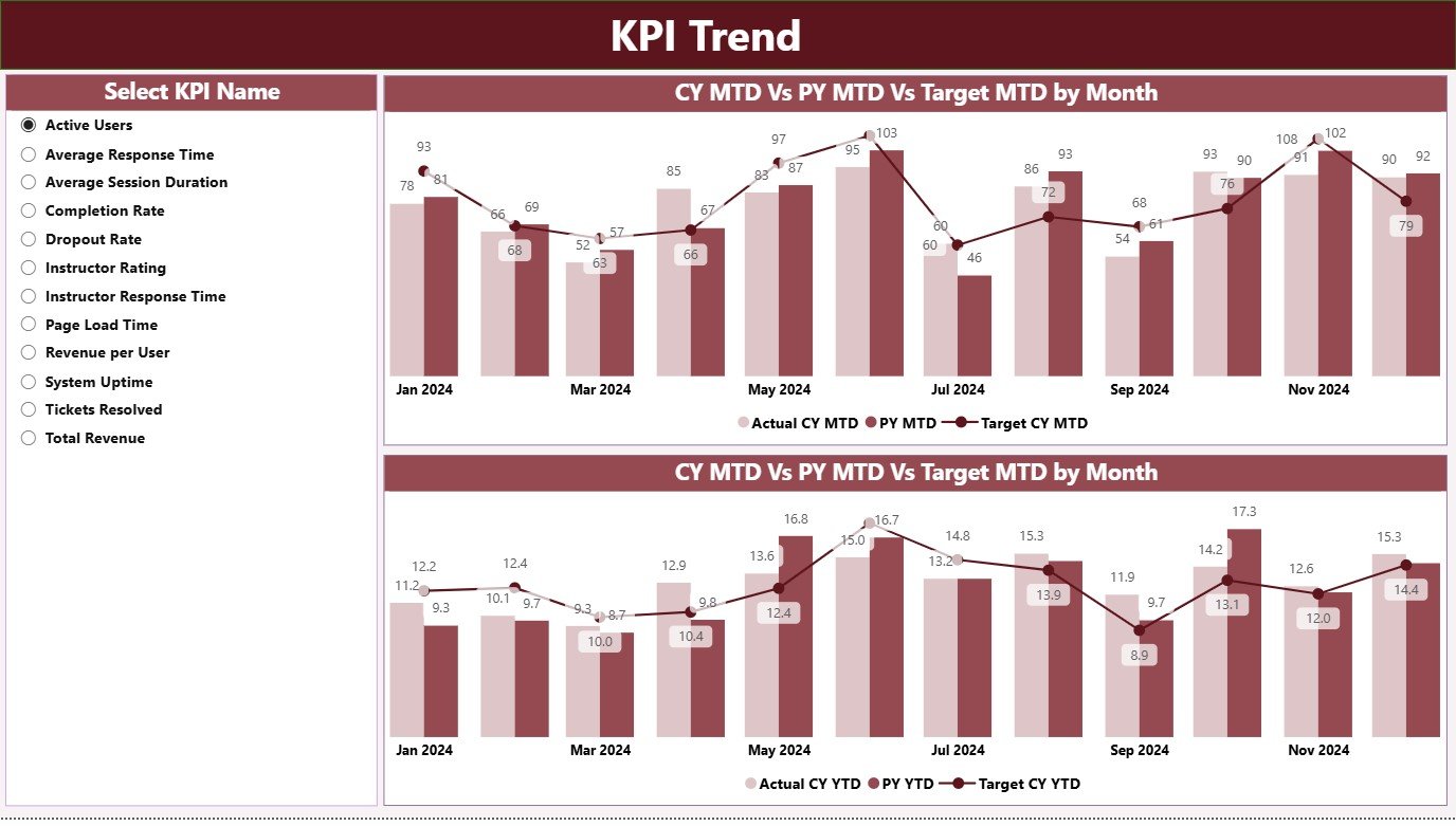
The KPI Trend Page helps you study how each KPI changes on a monthly basis.
It includes two powerful combo charts:
✔ MTD Trend Chart
Shows Actual, Target, and Previous Year values for the selected KPI.
This helps you track:
-
Monthly growth
-
Performance improvements
-
Seasonal variations
-
Year-over-year changes
✔ YTD Trend Chart
Shows cumulative performance curves for:
-
Current Year
-
Previous Year
-
Target Values
This tells you whether long-term objectives move in the right direction.
✔ KPI Selection Slicer
Located on the left side, this slicer allows you to select the KPI name.
The charts and numbers update instantly.
Click to Purchases Online Learning Platforms KPI Dashboard in Power BI
3) KPI Definition Page – Drill-Through KPI Details
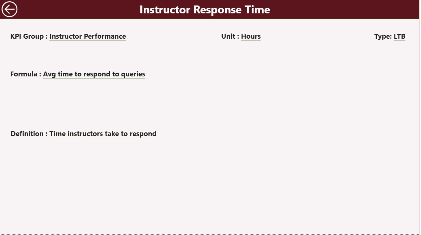
This page is hidden, but users can access it through drill-through actions from the summary page.
KPI Definition Page Displays:
-
KPI Number
-
KPI Group
-
KPI Name
-
Unit
-
Formula
-
KPI Definition
-
KPI Type (LTB or UTB)
Back Button
A back button is available on the top-left corner to return to the summary page.
This page ensures complete clarity for teams working with specific metrics.
Click to Purchases Online Learning Platforms KPI Dashboard in Power BI
Excel Data Source Structure for This Dashboard
The dashboard uses Excel as its main data source. You must update 3 Excel worksheets regularly:
1) Input_Actual Sheet
Enter:
-
KPI Name
-
Month (use first day of each month)
-
Actual MTD values
-
Actual YTD values
This sheet updates performance numbers for each KPI.
2) Input_Target Sheet
Enter:
-
KPI Name
-
Month
-
Target MTD values
-
Target YTD values
These targets help generate comparison visuals across MTD and YTD.
3) KPI Definition Sheet
Enter:
-
KPI Number
-
KPI Group
-
KPI Name
-
Unit
-
Formula
-
Definition
-
Type (UTB / LTB)
This sheet defines every KPI in your dashboard.
Advantages of the Online Learning Platforms KPI Dashboard in Power BI
Here are the key benefits explained in simple and engaging language:
1. It Gives Real-Time eLearning Insights
The dashboard updates instantly when you refresh your data.
You track learning performance in real time.
2. It Helps You Compare Actual, Target, and Previous Year Easily
Power BI shows all comparisons visually.
You never struggle to understand performance.
3. It Improves Decision-Making
You make smart decisions because every number is clear, accurate, and updated.
4. It Saves Time and Removes Manual Work
The dashboard eliminates manual calculations.
You spend more time analyzing instead of preparing reports.
5. It Tracks MTD and YTD Progress Effectively
This helps leaders check performance every month and year.
6. It Simplifies KPI Communication
Teams understand KPI definitions clearly through the dedicated definition page.
Click to Purchases Online Learning Platforms KPI Dashboard in Power BI
Best Practices for Using the Online Learning KPI Dashboard in Power BI
Below are the best practices to get maximum value from this dashboard.
1. Update Excel Data Monthly
Enter actual and target values every month.
This keeps reports accurate and helpful.
2. Keep KPI Definitions Updated
Every time you add a new KPI, update the definition page.
3. Review Trend Charts Regularly
Trend charts tell you where performance improves and where it drops.
4. Set Realistic Targets
Use historical data and industry benchmarks to set achievable targets.
5. Use Slicers Carefully
Using the correct month and KPI group gives cleaner analysis.
Conclusion
The Online Learning Platforms KPI Dashboard in Power BI is a complete performance analysis system for modern eLearning companies.
It helps you monitor key metrics with ease, compare results across months and years, and take informed decisions.
With the Summary Page, KPI Trend Page, and KPI Definition Page, this dashboard becomes a powerful data visualization tool that transforms raw numbers into meaningful stories.
If you manage an online learning platform, this dashboard offers a clear path toward consistent improvement and higher performance.
Frequently Asked Questions (FAQs)
1. What is an Online Learning KPI Dashboard?
It is a Power BI dashboard that tracks important educational KPIs such as enrollments, completion rates, revenue, and student satisfaction.
2. Who can use this dashboard?
Training managers, online academies, tutors, corporate trainers, and education analytics teams.
3. Does it show MTD and YTD performance?
Yes, the Summary Page displays MTD and YTD values with icons and comparison percentages.
4. Can I update targets every month?
Yes, simply update the Input_Target sheet in Excel.
5. Does it include trend charts?
Yes, the KPI Trend Page includes combo charts for MTD and YTD comparisons.
6. Can I add new KPIs?
Yes, you only need to update the KPI Definition sheet and data sheets.
Click to Purchases Online Learning Platforms KPI Dashboard in Power BI
Visit our YouTube channel to learn step-by-step video tutorials