Managing wealth becomes easier when you track every investment, every contribution, and every performance indicator in one place. Yet, many individuals, financial advisors, and wealth managers still use scattered sheets, outdated reports, or manual logs. This often leads to confusion, delayed decisions, and missed opportunities.
A Wealth Management Dashboard in Excel brings all financial insights together on a single screen. It turns complex investment data into clear visuals, charts, and KPIs. You can track risk scores, asset allocation, high-risk exposure, contributions, portfolio categories, and advisor-wise performance in seconds. Because of this simplicity, Excel becomes a powerful tool for wealth planning and portfolio optimization.
In this complete article, you will learn what a Wealth Management Dashboard is, how it works, what pages it includes, and why it helps you manage wealth with more confidence. You will also explore its advantages, best practices, and answers to common questions.
Click to Purchases Wealth Management Dashboard in Excel
What Is a Wealth Management Dashboard in Excel?
A Wealth Management Dashboard in Excel is a ready-to-use analytical template that helps you track all major wealth and investment KPIs in one place. You can monitor portfolio performance, compare investment types, analyze client trends, and review advisor-level performance. Excel formulas, charts, slicers, and interactive visuals make the dashboard fast, dynamic, and easy to use.
You do not need advanced technical skills to operate it. Every section refreshes automatically when you update the data sheet. Because of this, you can make better financial decisions without switching between multiple files.
Why Do You Need a Wealth Management Dashboard?
Most wealth managers deal with:
-
Multiple client portfolios
-
Different investment categories
-
Varying risk profiles
-
Monthly contributions
-
Advisor-wise performance
-
AUM trends
When data stays scattered, it becomes hard to understand what is growing and what needs improvement. A dashboard solves this problem by giving you a single source of truth. You see the entire financial picture in one glance and take decisions with full clarity.
Key Features of the Wealth Management Dashboard in Excel
This dashboard comes with five easy-to-navigate analytical pages and two supporting sheets.
Before exploring each page, let’s understand one important feature.
Page Navigator
You will find the Page Navigator on the left side of the dashboard. It works like a menu bar and helps you switch between different analysis pages instantly. Because of this, you save time and move through portfolio insights with zero effort.
Pages Inside the Wealth Management Dashboard
The dashboard includes five powerful pages designed for complete wealth analysis.
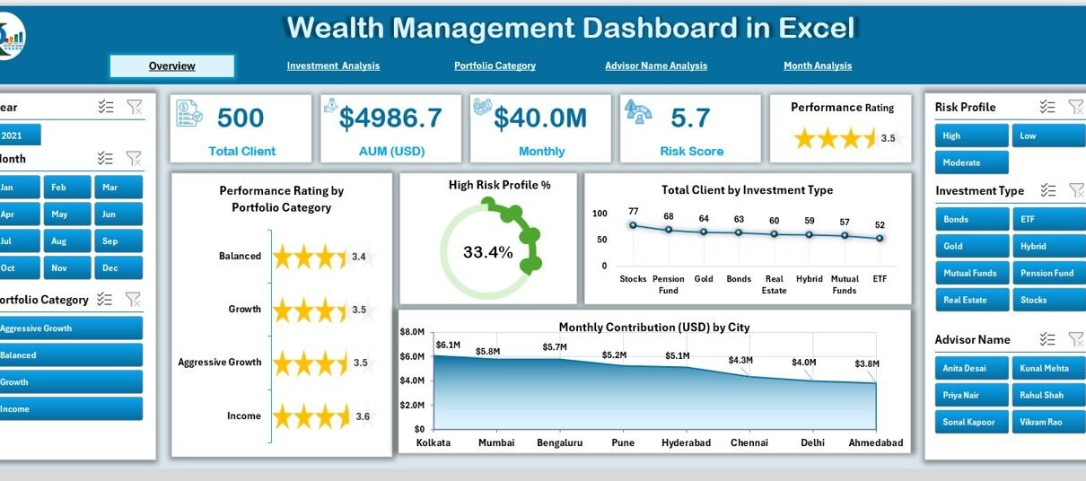
1. Overview Page: The Snapshot of Your Entire Wealth Performance
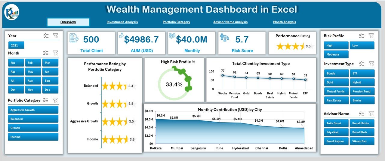
The Overview Page is the main page of the dashboard. It shows high-level KPIs and charts that give you a clear snapshot of overall portfolio performance.
What You See on This Page
✅ Month slicer on the right side
✅ Five summary cards
These cards highlight key metrics such as:
-
Total Clients
-
Total AUM
-
High-Risk Portfolio Percentage
-
Total Investment Types
-
Contribution Summary
Charts on This Page
You will also find four visually rich charts:
-
Performance Rating by Portfolio Category
-
High-Risk Profile (%)
-
Total Clients by Investment Type
-
Monthly Contribution (USD) by City
These charts help you understand client distribution, risk exposure, portfolio balance, and location-wise contribution trends.
2. Investment Analysis Page
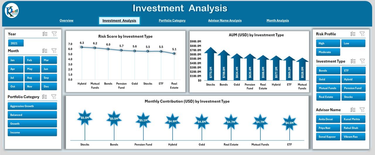
If you want to study investment categories deeply, this page is the perfect section.
Features in This Page
You will see a Month slicer on the right side to filter the results. The page includes three major charts:
-
Risk Score by Investment Type
-
AUM (USD) by Investment Type
-
Monthly Contribution (USD) by Investment Type
Why This Page Matters
This page helps you understand:
-
Which investment types carry more risk
-
Where AUM is concentrated
-
Which investment category brings strong monthly contributions
Because of these insights, you can optimize your investment mix.
3. Portfolio Category Analysis Page
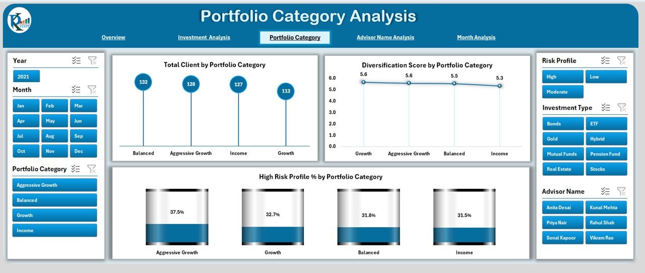
Portfolio categories differ in risk, diversification, and client distribution. This page focuses on those category-wise insights.
Click to Purchases Wealth Management Dashboard in Excel
Charts Included
You will find three powerful charts:
-
Total Clients by Portfolio Category
-
Diversification Score by Portfolio Category
-
High-Risk Profile % by Portfolio Category
How This Page Helps
You can understand:
-
How many clients fall under each category
-
How well each category maintains diversification
-
Which categories carry the highest risk
This helps you improve portfolio balance and reduce overexposure.
4. Advisor Name Analysis Page
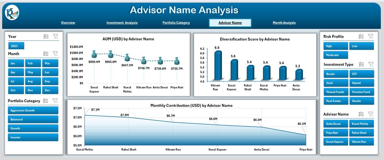
Advisor performance plays a major role in wealth management. Because of this, the dashboard includes a complete advisor-wise analysis page.
Charts Included
The page includes three advisor-focused charts:
-
AUM (USD) by Advisor Name
-
Diversification Score by Advisor Name
-
Monthly Contribution (USD) by Advisor Name
Why This Page Is Useful
You can track:
-
How much AUM each advisor manages
-
How well advisors maintain diversification
-
Monthly contribution strength by advisor
This makes advisor evaluation simple and transparent.
5. Month Analysis Page

Monthly trends help you track growth patterns, contribution cycles, and risk changes. The Month Analysis page focuses on time-based insights.
Charts Included
This page includes three monthly charts:
-
AUM (USD) by Month
-
Monthly Contribution (USD) by Month
-
High-Risk Profile (%) by Month
Insights from This Page
You can observe:
-
Seasonal contribution patterns
-
High-risk trend movement
-
Month-over-month AUM growth
This makes trend forecasting and planning easier.
Supporting Sheets
Data Sheet
This is the core sheet where you enter or update your raw data. It includes fields such as:
-
Client Name
-
Advisor Name
-
Portfolio Category
-
Investment Type
-
Monthly Contribution
-
AUM
-
Risk Score
-
Client Location
-
High-Risk Flag
-
Diversification Score
-
Month and Year
Once you update this sheet, the entire dashboard refreshes automatically.
Advantages of Using a Wealth Management Dashboard in Excel
Using this dashboard helps you save time and bring full transparency to your financial performance. Here are some major advantages:
1. Better Decision-Making
The dashboard converts scattered financial data into meaningful insights. Because of this, you make smarter decisions about portfolio allocation and risk management.
2. Clear Investment Visibility
You can see all investment types, client categories, and portfolio performance without switching between multiple files.
3. Easy Risk Tracking
Charts such as High-Risk Profile (%) help you identify red-flag areas before they become a problem.
4. Advisor-Level Performance Tracking
You can evaluate the strength of each advisor through AUM, diversification score, and contributions.
5. Improves Productivity
The page navigator and automated charts reduce manual work. You spend more time analyzing and less time preparing reports.
6. Ideal for Financial Advisors and Firms
Advisors can present clear visuals to clients and build trust through transparent reporting.
Best Practices for Using the Wealth Management Dashboard in Excel
Click to Purchases Wealth Management Dashboard in Excel
To get the best results, follow these simple practices:
1. Update Data Regularly
Make sure you update the Data Sheet every month. Consistent updates ensure accurate trends.
2. Use Meaningful Portfolio Categories
Clear categorization helps you avoid confusion and improves analysis accuracy.
3. Review Risk Scores Often
Risk levels change fast. Check the High-Risk Profile (%) chart frequently.
4. Compare Advisors Quarterly
Advisor-wise AUM and diversification performance help you refine team strategy.
5. Track Monthly Trends
Use the Month Analysis page to understand seasonal investment patterns and growth cycles.
6. Maintain Clean Data Structure
Remove duplicates, fix incorrect entries, and keep fields accurate. Clean data leads to accurate analytics.
Conclusion
A Wealth Management Dashboard in Excel simplifies the entire process of tracking investments, risk, contributions, and advisor performance. Because of its clear visuals, built-in pages, and dynamic charts, you understand your financial health instantly. It helps individuals, advisors, and wealth management firms stay organized, reduce risks, and plan better.
When you use this dashboard regularly, you gain full control over your wealth performance. You can also make confident decisions about diversification, investment timing, and advisor allocation. This makes Excel a powerful tool for modern wealth management.
Frequently Asked Questions (FAQ)
1. What is a Wealth Management Dashboard in Excel?
It is a ready-to-use Excel template that displays investment KPIs, portfolio categories, contributions, and advisor performance using charts and slicers.
2. Who should use this dashboard?
Financial advisors, investment managers, wealth management firms, and individuals who track multiple investments.
3. Do I need Excel skills to use this dashboard?
No. You only update the data sheet, and the dashboard updates automatically.
4. Can I add new KPIs or charts?
Yes. You can modify charts, add fields, or customize the visuals based on your needs.
5. How often should I update the data?
It is best to update monthly so that the trend charts stay accurate.
6. Does the dashboard support client-wise analysis?
Yes. It supports analysis by investment type, advisor name, portfolio category, and month.
7. Can I use this dashboard for client presentations?
Yes. The visuals are clean, professional, and perfect for client meetings.
Visit our YouTube channel to learn step-by-step video tutorials