Urban mobility continues to grow at a rapid pace. Streets get busier every year, and people want cleaner, faster, and more flexible travel options. Because of this shift, bike and scooter sharing services expand across major cities worldwide. Riders use these vehicles for short-distance trips, office commutes, deliveries, and leisure travel. However, mobility operators face a huge challenge. They handle thousands of trips daily, maintain large fleets, monitor city zones, track discounts, and analyze weather patterns. Therefore, every operator needs a powerful dashboard that brings clarity to their data.
A Bike and Scooter Sharing KPI Dashboard in Power BI solves this problem instantly. It converts raw trip numbers into easy insights and helps mobility teams take better decisions. This dashboard shows MTD trends, YTD numbers, KPI comparisons, trip behavior, and more. You understand your performance quickly without spending hours cleaning data.
In this detailed guide, you will learn:
-
What this dashboard is
-
Why mobility companies need it
-
How each page works
-
How the Excel data structure supports reporting
-
Advantages of using this dashboard
-
Best practices for smooth usage
-
Frequently asked questions
Let’s explore the full details step by step.
Click to Purchases Public Bike and Scooter Sharing KPI Dashboard in Power BI
What Is a Bike and Scooter Sharing KPI Dashboard in Power BI?
A Bike and Scooter Sharing KPI Dashboard in Power BI is a ready-to-use reporting tool designed for mobility operators, shared vehicle startups, fleet managers, and city transport planners. It tracks all important KPIs related to shared bikes and scooters. Because the dashboard connects to an Excel data source, you can update data any time without technical skills. You only enter Actual and Target numbers, and Power BI updates everything automatically.
This dashboard provides complete clarity on:
-
Gross fare
-
Net fare
-
Discounts
-
Cancellations
-
Ongoing trips
-
Ride duration
-
City-wise performance
-
Weather-based analysis
-
Membership-based analytics
-
Trends for MTD and YTD values
Moreover, you see whether KPIs meet targets using easy icons and percentage comparisons. As a result, the dashboard becomes a central decision-making tool for your mobility business.
Click to Purchases Public Bike and Scooter Sharing KPI Dashboard in Power BI
Why Mobility Companies Need This Dashboard
Bike and scooter sharing companies face daily challenges. Demand changes every hour. Weather impacts ridership. Fleet availability reduces due to breakdowns. New riders join, and old riders drop off. Without a proper dashboard, these changes stay hidden.
Here are the biggest problems mobility teams face:
-
Data stored in scattered spreadsheets
-
No real-time view of trip behavior
-
Difficulty comparing current month vs. previous month
-
No breakdown between members and non-members
-
No clear city-wise performance data
-
No understanding of fare patterns by vehicle type
-
Difficulty identifying the real reason for low revenue
A Bike and Scooter Sharing KPI Dashboard in Power BI solves all these challenges. It helps teams stay organized, improve service quality, and track real-time business performance.
Key Features of the Bike and Scooter Sharing KPI Dashboard in Power BI
This dashboard includes three pages inside the Power BI file:
-
Summary Page
-
KPI Trend Page
-
KPI Definition Page
All three pages work together to give you a complete performance picture.
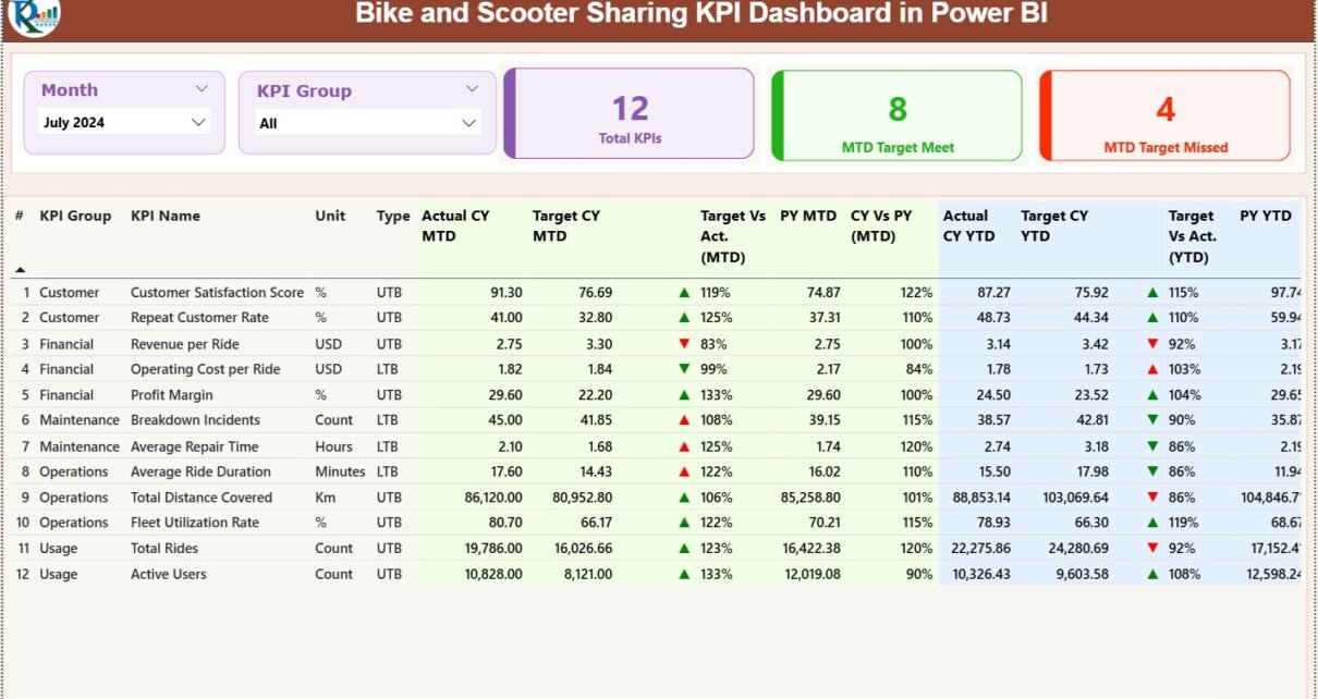
1. Summary Page
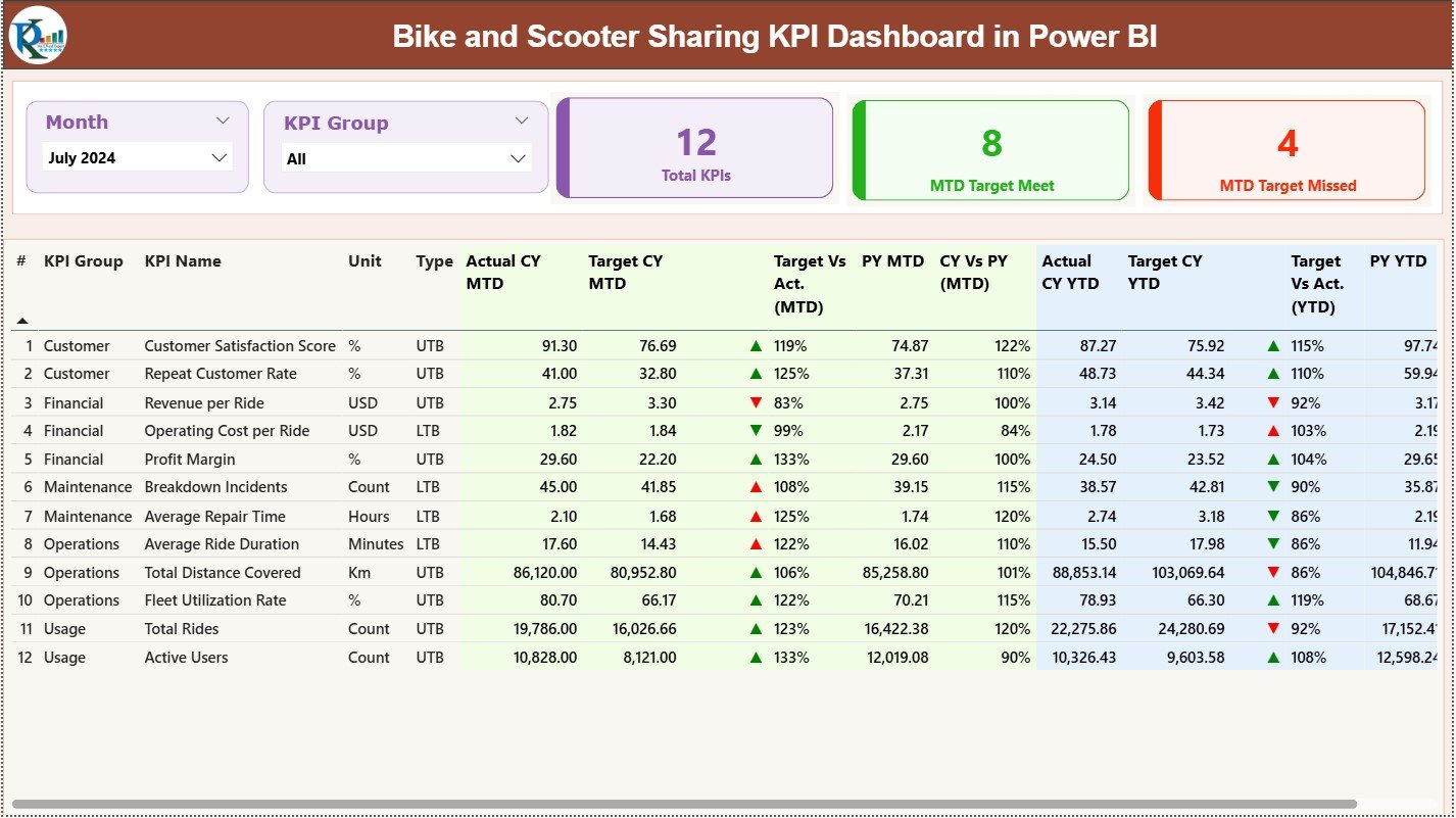
The Summary Page is the most important part of this dashboard. It shows every major KPI in a single view. You analyze MTD and YTD performance instantly.
Key Elements on the Summary Page
✔ Month Slicer
You choose the reporting month from this slicer. When you change a month, every chart and number updates instantly. This gives you complete control over time-based analysis.
✔ KPI Group Slicer
This slicer helps you filter KPIs by category such as:
-
Revenue KPIs
-
Trip KPIs
-
Vehicle KPIs
-
Customer KPIs
-
Promotion KPIs
Because of this filter, you avoid confusion and focus on specific results.
KPI Cards at the Top
You see three important cards:
-
Total KPIs Count
-
MTD Target Met Count
-
MTD Target Missed Count
These cards give you a quick summary of how many KPIs perform well and how many need attention.
Full KPI Table
The table displays all key metrics in detail. Every row represents one KPI and includes the following:
-
KPI Number
-
KPI Group
-
KPI Name
-
Unit of measurement
-
Type (LTB or UTB)
-
Actual CY MTD
-
Target CY MTD
-
MTD Icon (▲ or ▼)
-
Target vs Actual MTD (%)
-
PY MTD
-
CY vs PY MTD (%)
-
Actual CY YTD
-
Target CY YTD
-
YTD Icon (▲ or ▼)
-
Target vs Actual YTD (%)
-
PY YTD
-
CY vs PY YTD (%)
This level of detail helps mobility managers track performance across:
-
Cities
-
Months
-
Vehicle types
-
Weather conditions
-
Membership types
Because everything appears in one table, you save hours of effort every month.
Click to Purchases Public Bike and Scooter Sharing KPI Dashboard in Power BI
2. KPI Trend Page
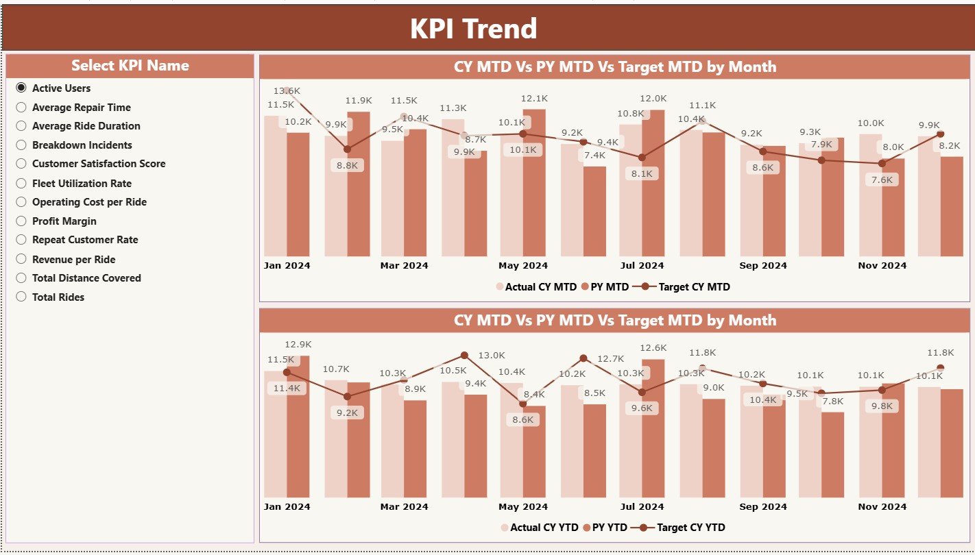
The KPI Trend Page shows two important combo charts:
✔ MTD Combo Chart
This chart includes:
-
Current Year Actual
-
Previous Year
-
Target
When you look at this chart, you understand if your monthly performance improves or drops.
✔ YTD Combo Chart
This chart includes:
-
Current Year YTD
-
Previous Year YTD
-
Target YTD
This helps you measure long-term performance across the entire year.
KPI Selection Slicer
A slicer on the left side allows you to select a specific KPI. When you choose a KPI, both combo charts update instantly.
Because of this slicer, your team can analyze trends for:
-
Gross fare
-
Trip count
-
Cancelled trip percentage
-
Net fare
-
Ongoing trip percentage
-
Discount amounts
Trends help you catch early warning signs and make fast decisions.
3. KPI Definition Page
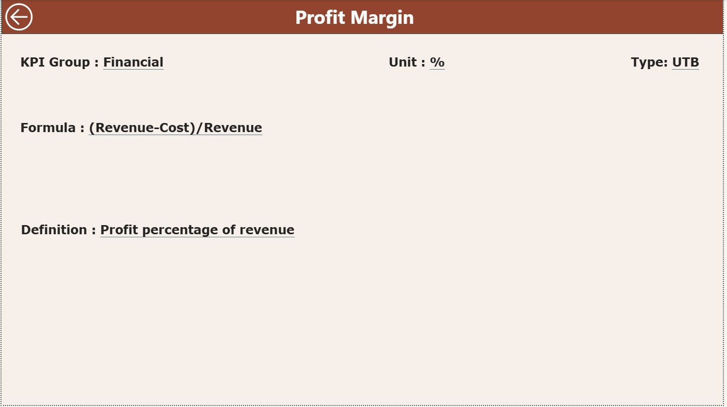
This is a hidden page that opens through drill-through from the Summary Page. When you right-click on any KPI row and choose “Drill Through,” you see full details about that KPI.
This page includes:
-
KPI Number
-
KPI Group
-
KPI Name
-
Unit
-
KPI Formula
-
KPI Definition
-
Type (LTB or UTB)
A Back Button on the top-left takes you back to the Summary Page. This simple navigation design helps users move smoothly across pages.
Because this page stores formulas and definitions, every team member understands how KPIs get calculated. This removes confusion and builds transparency.
Excel Data Structure for the Dashboard
This Power BI dashboard uses a simple Excel file as its source. You only fill three sheets:
1. Input_Actual Sheet
It contains:
-
KPI Name
-
Month (use the first date of the month)
-
MTD Actual value
-
YTD Actual value
This sheet is easy to update, and it takes only a few minutes per month.
2. Input_Target Sheet
It contains:
-
KPI Name
-
Month
-
MTD Target
-
YTD Target
These numbers help you compare performance against goals.
3. KPI Definition Sheet
It contains:
-
KPI Number
-
KPI Group
-
KPI Name
-
Unit
-
Formula
-
Definition
-
Type (LTB or UTB)
This sheet defines your performance rules.
Click to Purchases Public Bike and Scooter Sharing KPI Dashboard in Power BI
Advantages of Bike and Scooter Sharing KPI Dashboard in Power BI
1. Instant Performance Visibility
The dashboard updates all numbers automatically. You understand performance in seconds.
2. Better Fleet Management
When you track ongoing trips and cancellations, you improve fleet allocation.
3. More Accurate Revenue Forecasting
Gross fare, net fare, and discount data help you plan for upcoming months.
4. Faster Operational Decisions
Trend charts show early warning signs and help you act before problems grow.
5. Transparency Across Teams
The KPI Definition page builds trust because everyone follows the same logic.
6. Reduced Manual Work
You remove the need for complex spreadsheets and manual calculations.
7. Better City-Level Insights
You analyze performance by route, zone, or city and improve service based on demand.
8. Higher Rider Satisfaction
Clear understanding of delays, cancellations, and weather impact helps you improve rider experience.
Click to Purchases Public Bike and Scooter Sharing KPI Dashboard in Power BI
Best Practices for Using the KPI Dashboard
1. Update Excel Data Regularly
Enter Actual and Target numbers every month to keep the dashboard accurate.
2. Maintain Consistent KPI Names
Use the same KPI names in all sheets to avoid mismatches.
3. Check Formula Definitions
Always verify KPI formulas so every user follows the same rules.
4. Use Filters Smartly
Filters help you study patterns for a specific vehicle type, city, or month.
5. Train Your Team
Teach team members how to use slicers, charts, and drill-through options.
6. Review Trend Charts Frequently
Trends reveal issues faster than month-to-month numbers.
7. Keep KPI Categories Organized
Choose clear groups like “Revenue KPIs,” “Trip KPIs,” etc.
8. Validate Your Data
Double-check your Actual and Target sheets for missing values.
Conclusion
A Bike and Scooter Sharing KPI Dashboard in Power BI gives mobility operators complete control over their performance data. It shows revenue trends, trip behavior, membership comparisons, vehicle type insights, and weather impacts in one view. With its Summary Page, Trend Page, and Definition Page, this dashboard becomes a powerful solution for decision-making.
When mobility teams use this dashboard, they reduce manual reporting, improve operational accuracy, and make smarter business decisions. As a result, passengers enjoy a better travel experience, and companies achieve higher profitability.
Click to Purchases Public Bike and Scooter Sharing KPI Dashboard in Power BI
Frequently Asked Questions (FAQs)
1. What is a Bike and Scooter Sharing KPI Dashboard in Power BI?
It is a reporting dashboard that tracks trip data, fare performance, KPIs, and trends for bike and scooter sharing companies.
2. Who should use this dashboard?
Bike sharing companies, scooter rental startups, fleet managers, mobility service operators, and city transport teams.
3. Do I need technical skills to use it?
No. You only update the Excel sheet, and Power BI handles the reporting.
4. Can I add more KPIs later?
Yes. You can add unlimited KPIs by updating the KPI Definition sheet.
5. What is LTB and UTB?
-
LTB = Lower The Better
-
UTB = Upper The Better
6. How often should I update the data?
Update data once every month for accurate results.
7. Does the dashboard support drill-through?
Yes. You can drill through from the Summary Page to the KPI Definition Page.
8. Can I customize the visual layout?
Yes. You can modify visuals, colors, themes, and card designs.
9. Does this dashboard support city-wise analysis?
Yes. It supports analysis across cities, zones, and routes.
10. Can I track both MTD and YTD?
Yes. The dashboard displays both Month-to-Date and Year-to-Date performance clearly.
Click to Purchases Public Bike and Scooter Sharing KPI Dashboard in Power BI
Visit our YouTube channel to learn step-by-step video tutorials