The news and journalism industry moves fast. Every hour, new stories break, audience behavior changes, and digital platforms evolve. Because of this rapid movement, media organizations must track their performance consistently. They need clear insights, quick comparisons, and strong reporting methods. That is why many teams now use a News and Journalism KPI Dashboard in Power BI to stay ahead.
A KPI dashboard helps newsrooms track production efficiency, audience engagement, publishing timelines, and digital growth. It gives real-time updates that support better decisions. Moreover, it allows journalists, editors, and managers to work together with complete clarity. In this detailed guide, you will learn how a modern Power BI dashboard helps media teams stay productive, efficient, and data-driven.
Click to Purchases News and Journalism KPI Dashboard in Power BI
What Is a News and Journalism KPI Dashboard in Power BI?
A News and Journalism KPI Dashboard in Power BI is a ready-to-use reporting tool designed for media companies. It visualizes the performance of key activities like story production, publishing efficiency, viewer reach, campaign success, and team productivity. Because the dashboard runs on Power BI, users can explore insights, drill into details, and compare performance with just a click.
This dashboard works with Excel data, so teams can update numbers quickly. Editors, leadership teams, and reporting heads use it to evaluate month-to-date (MTD) and year-to-date (YTD) performance. As a result, everyone stays aligned and informed.
Click to Purchases News and Journalism KPI Dashboard in Power BI
⭐ Why Do News Organizations Need KPI Dashboards?
Modern newsrooms manage huge amounts of content. They publish across TV, radio, websites, social media, and mobile apps. This creates several questions:
-
Are we producing enough stories?
-
Do audiences engage with our news?
-
Which categories perform better—politics, business, or sports?
-
How does this year compare to last year?
-
Are we meeting our publishing targets?
A KPI dashboard answers all these questions in one place. It brings clarity, speed, and transparency to the entire workflow.
⭐ Key Features of the News and Journalism KPI Dashboard in Power BI
This ready-to-use dashboard includes three well-designed pages, each providing strong insights. All pages connect to Excel data, which keeps the file flexible and easy to maintain.
Let’s explore each page in detail.
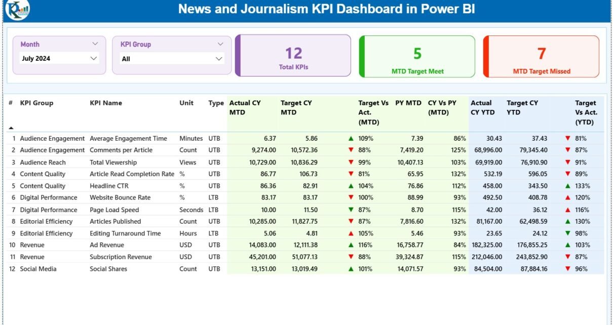
1️⃣ Summary Page — The Main Performance Overview
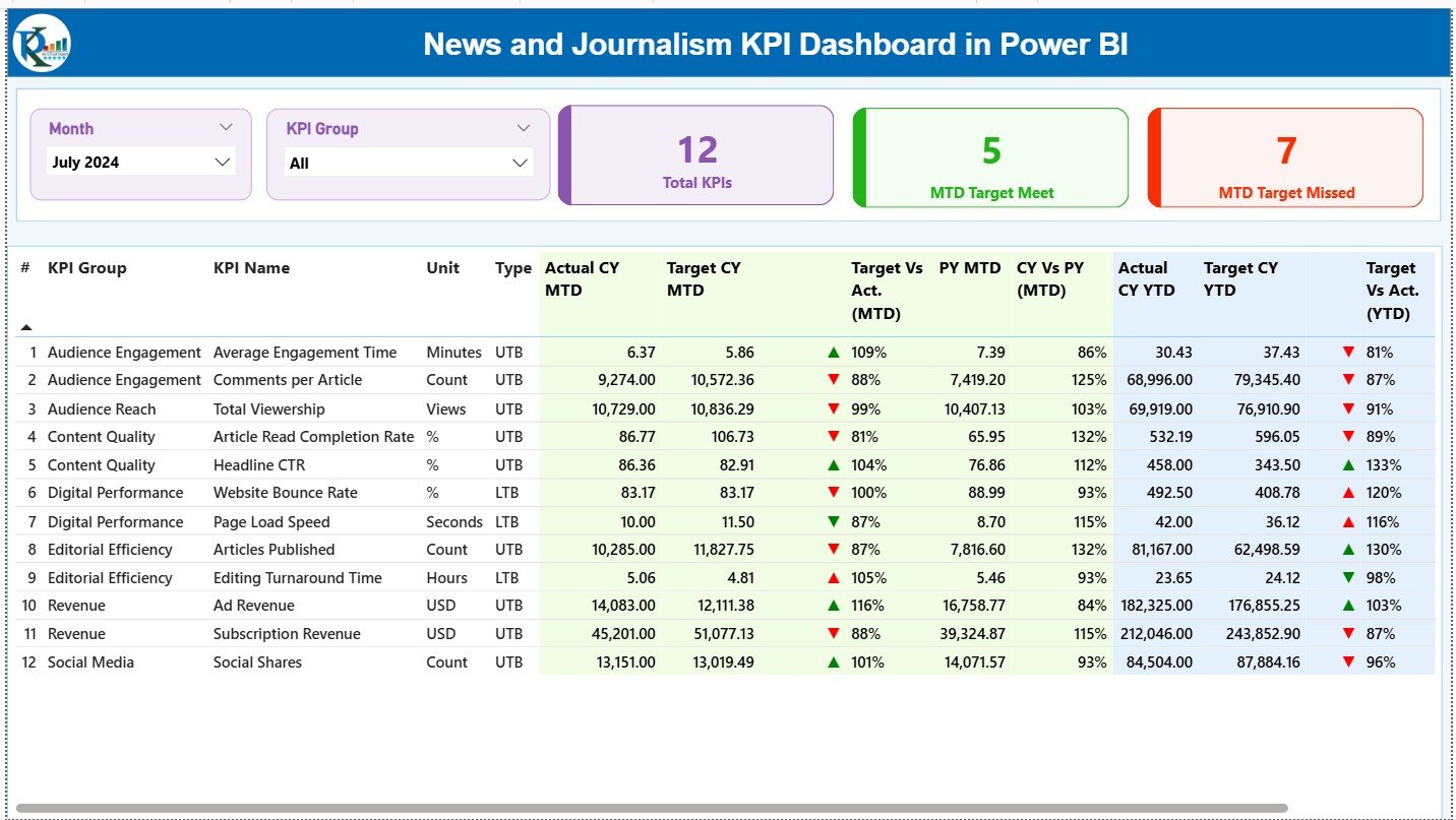
The Summary Page gives a complete snapshot of newsroom performance. It includes smart visuals, slicers, icons, and comparison tables. Because of its clean layout, users understand the performance status in seconds.
Top Section Features
-
Month Slicer – Select the month you want to analyze.
-
KPI Group Slicer – Filter KPIs by categories like Production, Digital Reach, Engagement, or Operations.
-
Three KPI Cards
-
Total KPIs Count
-
MTD Target Met Count
-
MTD Target Missed Count
-
These cards help users identify strengths and weaknesses quickly.
2️⃣ KPI Trend Page — Month-Wise Trend Analysis
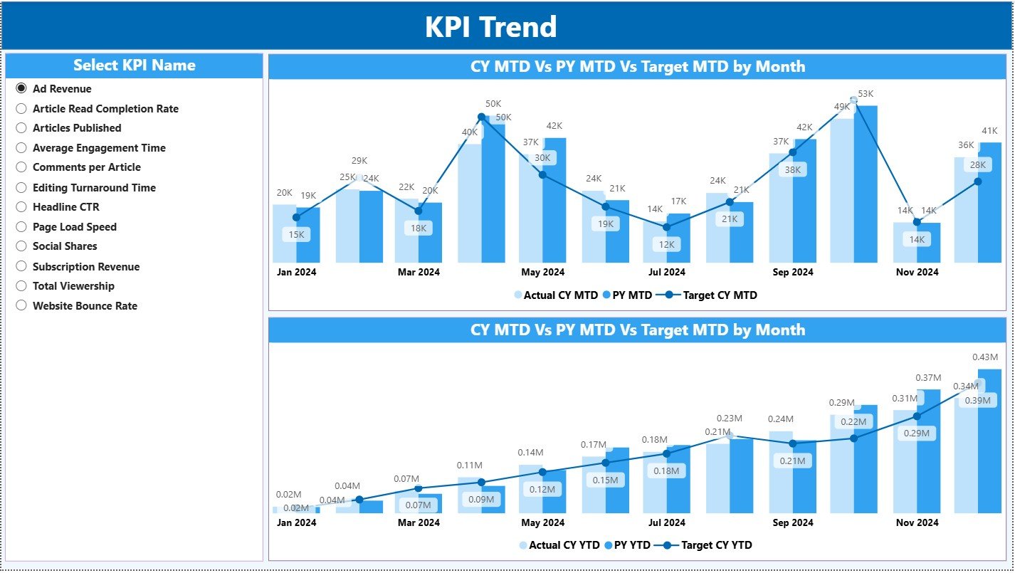
The KPI Trend Page shows how each KPI performs across months. Users select any KPI from the slicer on the left. As soon as they make a selection, the visuals update automatically.
What You See on This Page
-
Two Combo Charts
-
Chart 1: MTD Trend (Actual vs PY vs Target)
-
Chart 2: YTD Trend (Actual vs PY vs Target)
-
These charts help you identify patterns such as:
-
Growth or drop in story production
-
Engagement improvements
-
Digital reach expansion
-
Seasonal fluctuations
-
Performance consistency over time
This page is perfect for editors and managers who want to see long-term trends.
Click to Purchases News and Journalism KPI Dashboard in Power BI
3️⃣ KPI Definition Page — Drill-Through for KPI Details
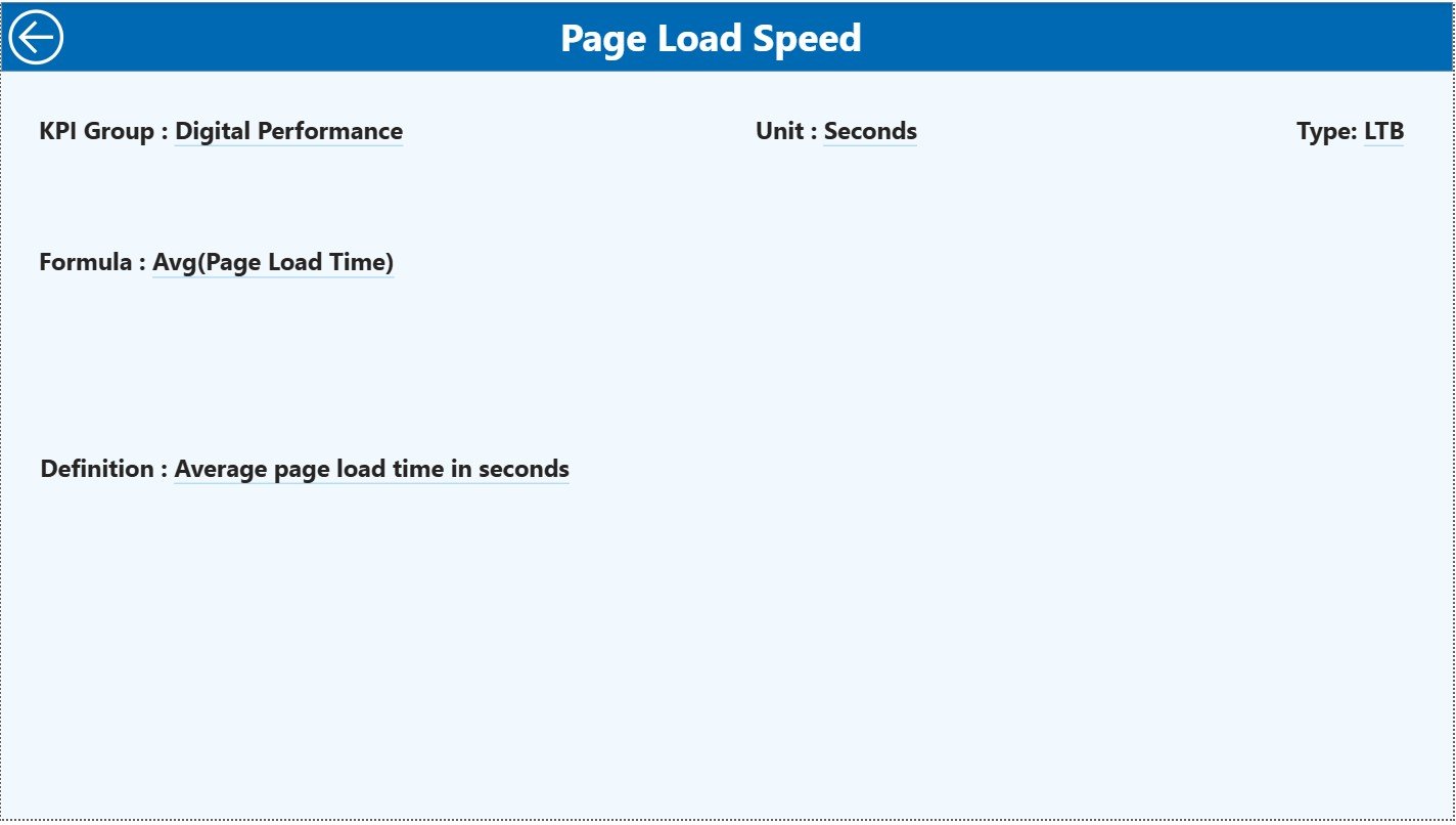
This is a hidden drill-through page. Users open it by right-clicking on any KPI entry from the Summary Page. It shows:
-
KPI Number
-
KPI Group
-
KPI Name
-
Unit
-
Formula
-
Definition
-
Type (LTB or UTB)
This page helps journalists and analysts understand how each KPI is calculated. It also brings transparency, especially when teams want clarity on formulas.
To return to the main page, just click the Back button located at the top left corner.
⭐ Excel Data Structure for the Dashboard
This Power BI dashboard connects to an Excel file with three worksheets. These sheets store all raw data.
1️⃣ Input_Actual Sheet
Fill the following columns:
-
KPI Name
-
Month (use the first date of each month)
-
MTD Actual
-
YTD Actual
You only enter numbers here. Power BI handles the rest.
2️⃣ Input_Target Sheet
Fill these fields:
-
KPI Name
-
Month (first date of month)
-
MTD Target
-
YTD Target
These targets help Power BI compare performance accurately.
3️⃣ KPI Definition Sheet
This sheet includes definitions and formulas. Add:
-
KPI Number
-
KPI Group
-
KPI Name
-
Unit
-
Formula
-
Definition
-
Type (LTB or UTB)
This sheet also feeds the drill-through page.
⭐ What KPIs Should Newsrooms Track?
Different news organizations track different KPIs, but some important ones include:
Content Production KPIs
-
Number of stories published
-
On-time publishing rate
-
Breaking news response time
Digital Engagement KPIs
-
Page views
-
Video watch time
-
Social media impressions
-
Bounce rate
Audience KPIs
-
Unique visitors
-
Returning visitor rate
-
Subscriber growth
Operational KPIs
-
Editing cycle time
-
Reporter workload
-
Production efficiency
Revenue KPIs
-
Ad revenue
-
Sponsorship performance
-
Subscription revenue growth
A KPI dashboard makes it easy to review all these metrics together.
Click to Purchases News and Journalism KPI Dashboard in Power BI
⭐ Advantages of a News and Journalism KPI Dashboard in Power BI
A Power BI dashboard gives news companies a strong competitive edge. Let’s explore the key advantages.
⭐ 1. Real-Time Visibility
Teams monitor performance instantly. Because Power BI refreshes data quickly, editors know what works and what needs improvement.
⭐ 2. Strong Collaboration
Everyone sees the same numbers. This reduces confusion and creates alignment between departments.
⭐ 3. Easy Comparisons
Comparisons like:
-
CY vs PY
-
Actual vs Target
-
MTD vs YTD
help users understand growth clearly.
⭐ 4. Visual Decision-Making
Color indicators, charts, and simple visuals make insights easier to understand.
⭐ 5. Better Audience Strategy
With engagement KPIs, news teams learn what content performs best. They adjust their publishing strategy accordingly.
⭐ 6. Time Savings
Manual reports take time. Power BI dashboards update automatically, saving hours each month.
⭐ 7. Improved Accountability
Clear KPIs create ownership. Reporters, editors, and digital teams know exactly what to improve.
Click to Purchases News and Journalism KPI Dashboard in Power BI
⭐ Best Practices for the News and Journalism KPI Dashboard
✔ Keep KPI definitions clear
Avoid confusion by using simple formulas and short definitions.
✔ Update data regularly
Refresh Excel data every week or month for accuracy.
✔ Use meaningful KPI groups
Create groups like Production, Audience, Revenue, and Digital.
✔ Limit the number of KPIs
Focus on quality KPIs, not quantity.
✔ Use color indicators wisely
Green means good, red means action needed.
✔ Compare with historical data
Year-over-year comparisons show true performance.
✔ Share the dashboard with the entire team
Encourage collaboration by giving access to all members.
✔ Review targets quarterly
Because the media landscape changes fast, update targets often.
⭐ How to Use the Dashboard Effectively
1. Use the Summary Page First
Start with the high-level view. Analyze MTD and YTD performance.
2. Drill Into KPIs
Right-click any KPI to view its details. Understand formulas and definitions.
3. Analyze Trends
Use the trend page to see monthly and yearly changes.
4. Adjust Editorial Strategy
Review which categories perform well. Adjust resources based on real data.
5. Improve Workflow Efficiency
Use operational KPIs to identify bottlenecks.
⭐ Conclusion
A News and Journalism KPI Dashboard in Power BI empowers media organizations to make data-driven decisions with confidence. It provides a complete view of newsroom performance, digital engagement, and operational efficiency. Because it uses Excel data and Power BI visuals, it offers accuracy, clarity, and flexibility. News teams can track trends, compare performance, measure growth, and improve every process.
Whether you run a digital media house, a print publication, a TV channel, or an online news portal, this dashboard gives you the insights you need to perform better every day. It helps teams stay coordinated, focused, and informed in a fast-moving industry.
Click to Purchases News and Journalism KPI Dashboard in Power BI
⭐ Frequently Asked Questions (FAQs)
1. What is a News and Journalism KPI Dashboard in Power BI?
It is a visual reporting tool that tracks content production, engagement, audience behavior, and operational performance using Power BI.
2. Who can use this dashboard?
Editors, journalists, digital teams, analysts, and leadership teams use this dashboard to review newsroom performance.
3. What type of data does it use?
It uses Excel data from three worksheets: Actuals, Targets, and KPI Definitions.
4. Can I customize the KPIs?
Yes, you can add, remove, or modify KPIs based on your organization’s needs.
5. Does the dashboard show month-to-date and year-to-date numbers?
Yes, it shows MTD, YTD, Previous Year comparisons, and Target vs Actual ratios.
6. Can I drill through to view KPI details?
Yes, the dashboard includes a drill-through KPI Definition page.
7. Is Power BI required to use this dashboard?
Yes, you must have Power BI Desktop or Power BI Service to use it.
Click to Purchases News and Journalism KPI Dashboard in Power BI
Visit our YouTube channel to learn step-by-step video tutorials