Online education grows every year because learners want flexible, accessible, and high-quality courses. As more people move toward digital learning, online learning platforms face new challenges. They must track enrollments, course performance, revenue, learner behavior, and overall satisfaction. However, doing all this manually leads to delays and confusion.
Therefore, educational companies, EdTech startups, training providers, and online academies use an Online Learning Platforms Dashboard in Power BI. This dashboard brings clean visual insights, real-time tracking, and powerful analytics to one single place. In this article, you will learn everything about this dashboard, how it works, and why every online learning platform needs it.
Click to Purchases Online Learning Platforms Dashboard in Power BI
What Is an Online Learning Platforms Dashboard in Power BI?
An Online Learning Platforms Dashboard in Power BI organizes all your learning performance data into interactive charts, KPIs, and trends. You can explore enrollment growth, revenue flow, course popularity, learner satisfaction, and category-wise performance within seconds.
Power BI makes it easier to compare months, evaluate platforms, and understand which courses perform the best. Additionally, you can use slicers, filters, and drill-downs to get deeper insights without any technical complexity.
Why Do Online Learning Platforms Need a Power BI Dashboard?
Online learning platforms generate thousands of data points every day. Without a smart dashboard, teams may struggle to see patterns or take quick action. A Power BI dashboard solves these issues because it:
-
Shows real-time data in one place
-
Improves decision-making
-
Helps you understand learner behavior
-
Tracks revenue and profitability
-
Highlights course and category performance
-
Saves time and reduces manual reporting
Because of these reasons, almost every modern online learning company now uses BI dashboards to run operations smoothly.
Key Features of an Online Learning Platforms Dashboard in Power BI
This dashboard includes five powerful pages, each built to give deep clarity. Every page contains slicers for quick filtering and easy exploration.
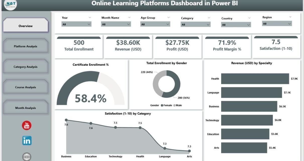
1. Overview Page: Your Complete Learning Performance Snapshot
The Overview Page works as your dashboard’s home. It shows the most important KPIs in one place so you can make quick decisions.
What You See on the Overview Page
-
Four KPI Cards showing essential metrics
-
Certificate Enrollment %
-
Total Enrollment by Gender
-
Revenue (USD) by Specialty
-
Satisfaction by Category
These visuals help you understand your learner base, total course performance, and revenue flow. You can check which specialties earn the highest revenue and which categories score well in satisfaction.
Why the Overview Page Matters
This page gives instant clarity. It also tells you where your platform performs well and where you must improve. Because of that, you save a lot of time and decide confidently.
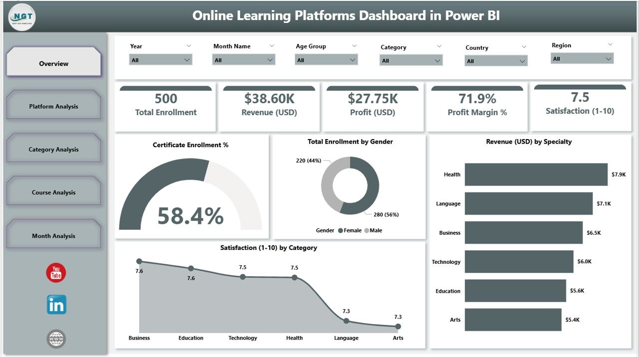
2. Platform Analysis Page: Compare All Learning Platforms Easily
If your organization uses multiple platforms—such as Udemy, Coursera, LinkedIn Learning, or internal portals—you must know which platform performs better. The Platform Analysis Page helps you compare performance instantly.
Visuals on This Page
-
Revenue (USD) by Platform Name
-
Profit Margin % by Platform Name
-
Instructor Rating by Platform Name
You can check which platform gives more revenue, higher profit, or better instructor ratings. As a result, you can decide where to invest, promote, or redesign your content.
Why This Page Is Important
Learners behave differently on each platform. One platform may have high engagement, while another may attract premium learners. This page reveals these patterns so you can optimize your strategy.
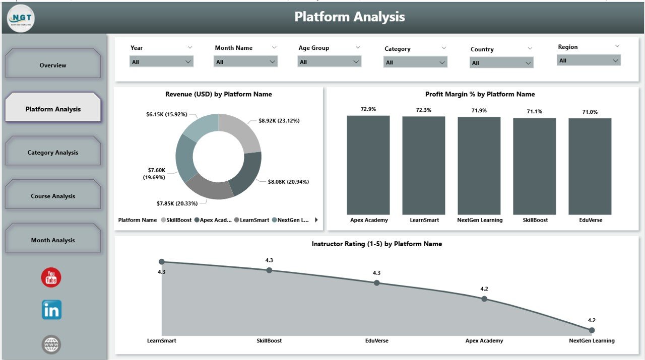
3. Category Analysis Page: See Which Learning Categories Perform Best
Categories such as Technology, Business, Health, Marketing, and Lifestyle perform differently. Therefore, you must understand how each category affects your results.
Click to Purchases Online Learning Platforms Dashboard in Power BI
Charts on This Page
-
Revenue (USD) by Category
-
Profit (USD) by Category
-
Course Price (USD) by Category
With these charts, you can find:
-
Which categories earn the most revenue
-
Which ones generate more profit
-
Whether your pricing model works well
Why Category Analysis Matters
Each category attracts a different type of learner. When you understand these patterns, you create better courses, improve pricing, and market your content more effectively.
4. Course Analysis Page: Track Course-Level Performance
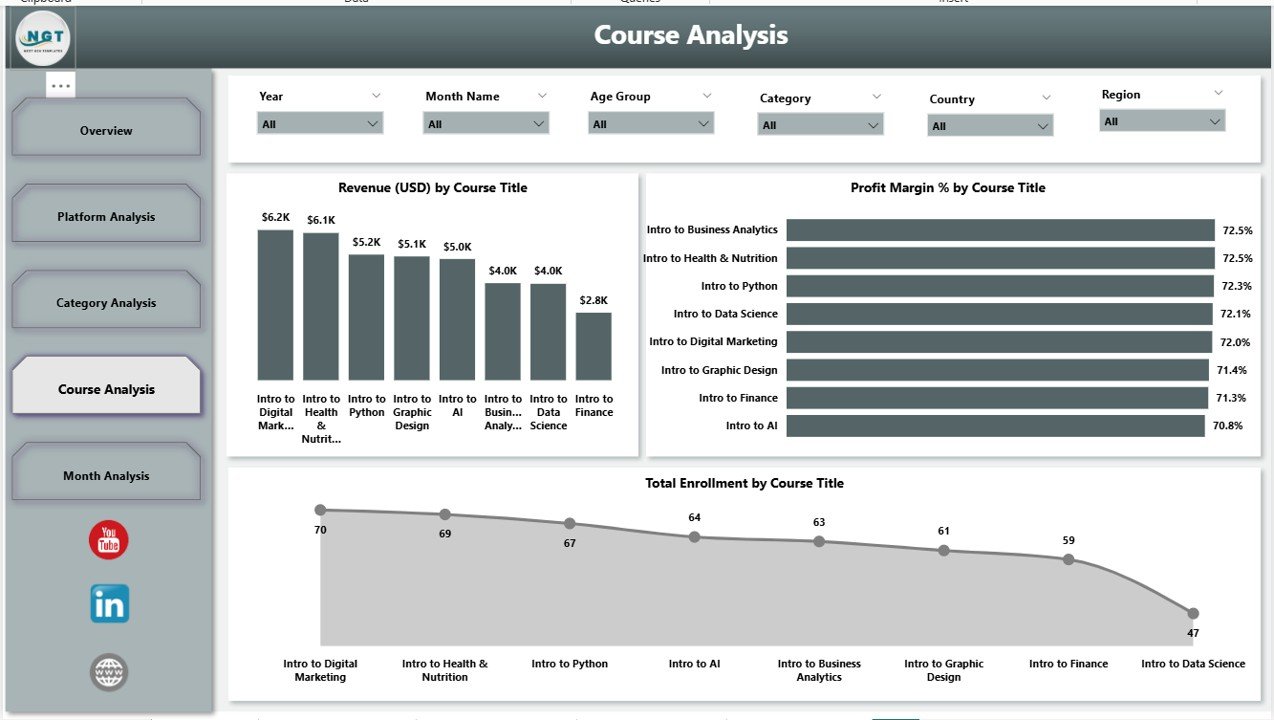
The Course Analysis Page helps you understand which courses do the best and which ones need improvement.
Charts on This Page
-
Revenue (USD) by Course Type
-
Profit (USD) by Course Type
-
Total Enrolment by Course Type
This analysis gives you a clear picture of learner preferences. You can decide which course types to promote, expand, redesign, or remove.
Why Course Analysis Matters
Every course has strengths and weaknesses. When you track course-wise performance, you improve content quality, increase enrollments, and enhance learner satisfaction.
5. Monthly Trends Page: Identify Patterns Throughout the Year
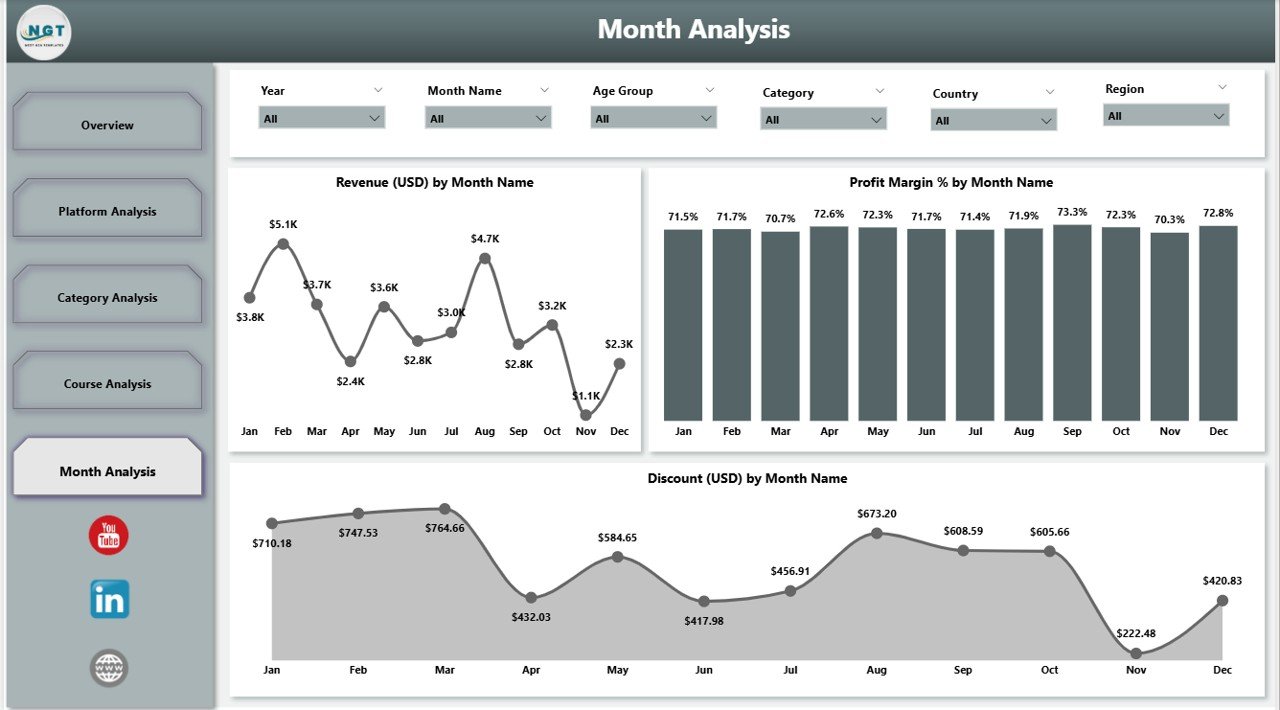
The Monthly Trends Page shows how your platform performs month by month. It gives valuable insights into seasonal patterns, promotions, or marketing campaigns.
Charts on This Page
-
Revenue (USD) by Month
-
Profit (USD) by Month
-
Discount (USD) by Month
You can find:
-
High-revenue months
-
Months with lower profit
-
Discount impact on sales
Why Monthly Trends Are Useful
Monthly analysis helps you plan ahead. You can schedule promotions, launch new courses, or invest in marketing during high-growth months. As a result, you grow consistently.
Advantages of Using an Online Learning Platforms Dashboard in Power BI
Below are some of the most important benefits of this dashboard:
⭐ 1. Real-Time Decision-Making
Click to Purchases Online Learning Platforms Dashboard in Power BI
The dashboard updates quickly, so you always see fresh data. This helps teams act immediately without delays.
⭐ 2. Clear Visualization of Complex Data
Even if you handle massive data, Power BI turns it into simple charts and cards. You understand data faster and more clearly.
⭐ 3. Better Revenue and Profit Insights
You see the sources of revenue, profit margins, and discount impact. As a result, you create smarter pricing strategies.
⭐ 4. Improved Learner Engagement
The dashboard shows enrollment trends, satisfaction scores, and ratings. You can use this to improve content and support.
⭐ 5. Easier Course and Category Management
You see which courses or categories need updates. This helps you focus on what matters the most.
⭐ 6. Enhanced Platform Comparison
You compare performance across platforms with ease. This leads to better planning and resource allocation.
⭐ 7. Saves Time and Reduces Manual Reporting
You don’t prepare long spreadsheets anymore. Power BI automates everything.
How Does an Online Learning Platforms Dashboard Improve Business Performance?
This dashboard improves business performance in many ways. It helps your team track learner behavior, analyze market trends, and understand course demand. You get quick insights that guide your marketing, course creation, pricing, and overall strategy.
Because you see every important factor clearly, you grow faster and operate more efficiently.
Best Practices for Using the Online Learning Platforms Dashboard in Power BI
Follow these best practices to get maximum value:
1. Update Your Data Regularly
Fresh data gives you accurate insights. Keep your datasets updated daily or weekly.
2. Use Filters and Slicers Smartly
Slicers give deeper clarity. Use them to explore platform-wise, category-wise, and course-wise performance.
3. Monitor Monthly Trends Carefully
Monthly charts show patterns. Track revenue, profit, and discounts to plan yearly strategies.
4. Compare Platforms Before Making Decisions
Always check platform-wise ratings, revenue, and profit before launching new courses.
5. Review Satisfaction and Enrollment Frequently
Learner satisfaction affects your enrollment rate. Track these metrics often.
6. Improve Low-Performing Categories
Find weak categories and redesign content, pricing, or marketing strategies.
7. Use DAX Measures and Calculated Fields
Power BI becomes more powerful with DAX. Use simple DAX formulas for deeper insights.
8. Share Dashboard Access with Your Team
Collaboration improves decision-making. Share reports with instructors, managers, and marketing teams.
Conclusion
An Online Learning Platforms Dashboard in Power BI transforms the way learning companies work. It organizes all essential data into clean visuals and real-time insights. Because of its simple structure, you understand revenue, trends, enrollments, and satisfaction in just a few seconds.
With this dashboard, you make smarter decisions, improve your courses, and track the complete learning journey. Any online learning platform that wants to grow faster must use a dashboard like this.
Frequently Asked Questions (FAQs)
1. What is an Online Learning Platforms Dashboard in Power BI?
It is an interactive reporting system that tracks revenue, enrollments, course performance, and satisfaction for online learning platforms using Power BI.
2. Who should use this dashboard?
Training companies, EdTech startups, academies, instructors, and online course creators can use this dashboard.
3. Does this dashboard show platform-wise performance?
Yes. You can check revenue, profit margin, and instructor ratings for each platform.
4. Can I track category and course performance?
Yes. The dashboard includes dedicated pages for category and course analysis.
5. Why is Power BI useful for online learning analytics?
Power BI provides real-time insights, interactive visuals, and faster decision-making.
6. Can I customize this dashboard?
Yes. Power BI allows you to customize visuals, formulas, measures, and design layouts.
7. Does the dashboard handle large datasets?
Yes. Power BI supports large datasets and performs smoothly.
8. Is this dashboard helpful for marketing planning?
Yes. Monthly trends help you plan promotions, launches, and seasonal campaigns.
Visit our YouTube channel to learn step-by-step video tutorials

