Corporate training helps employees grow and helps companies improve performance. However, training teams often handle large amounts of data. They track trainer ratings, training costs, employee feedback, completion status, and much more. Because of this, teams struggle to find trends or understand what works. A Corporate Training Dashboard in Power BI solves this issue. It converts complex training data into clear insights and helps companies take quick action.
In this detailed guide, you will learn everything about using a Power BI dashboard for corporate training. You will understand the dashboard structure, key pages, charts, advantages, best practices, and many useful examples. After reading this article, you will know how a training dashboard can improve your entire learning and development (L&D) process.
Click to Purchases Corporate Training Dashboard in Power BI
What Is a Corporate Training Dashboard in Power BI?
A Corporate Training Dashboard in Power BI is a visual tool that tracks all important training KPIs in one place. It shows real-time data through charts, cards, and tables. Because of this, training managers can see current progress, compare training types, find improvement areas, and evaluate training ROI.
The dashboard includes pages such as:
-
Overview Page
-
Training Analysis
-
Department Analysis
-
Location Analysis
-
Monthly Trends
Each page provides focused insights so teams can take better decisions.
Why Do Companies Need a Corporate Training Dashboard?
Companies run training programs to improve skills and performance. Yet they often cannot measure the real impact. A dashboard helps them see important insights such as:
-
Which training brings the highest benefit
-
Which department needs more support
-
Which trainer performs the best
-
How much cost the company spends
-
How many employees complete training
-
Which training mode works better
Because the dashboard updates automatically, teams save time and avoid manual work.
How Many Pages Does the Corporate Training Dashboard Have?
The dashboard has five powerful pages, each focused on a different area:
-
Overview Page
-
Training Analysis
-
Department Analysis
-
Location Analysis
-
Monthly Trends
Each page includes charts, slicers, and KPIs that help training managers take action quickly.
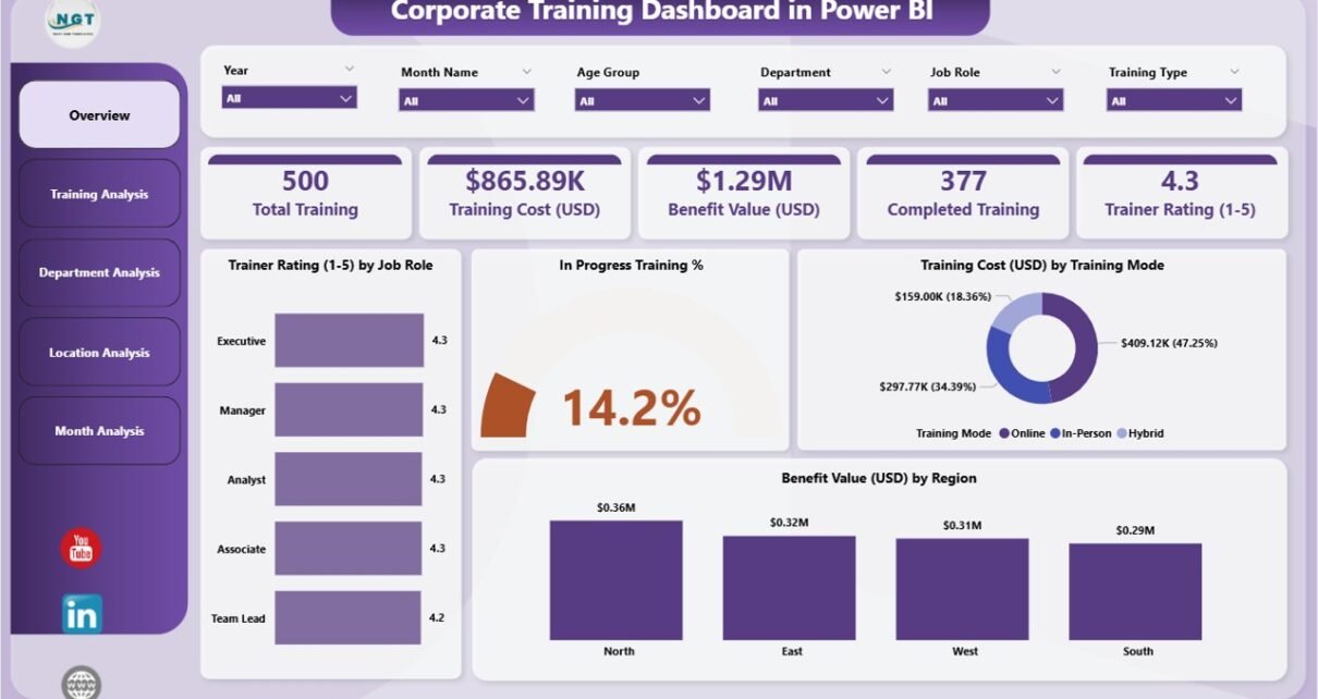
1. Overview Page: What Does It Show?
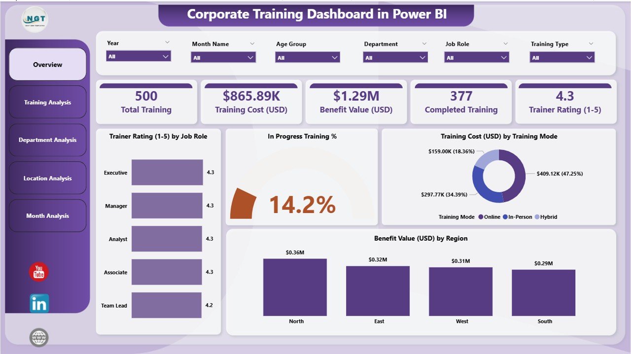
The Overview Page is the main page of the dashboard. It shows quick highlights so training teams can understand performance in seconds. The page includes slicers that allow the user to filter data by month, department, location, or training type.
Key Components of the Overview Page
The page includes four important KPI cards:
-
Total Training Count
-
Total In-Progress Trainings
-
Average Trainer Rating
-
Total Benefit Value (USD)
These cards help users see the overall status instantly.
Charts on the Overview Page
The page further includes four useful charts:
-
Trainer Rating by Job Role – Helps teams understand which job role receives better training support.
-
In Progress Training % – Shows the percentage of employees who are still completing their trainings.
-
Training Cost (USD) by Training Mode – Helps understand cost distribution among online, offline, or blended training modes.
-
Benefit Value (USD) by Region – Shows how much value each region receives from training programs.
This page gives a complete snapshot and guides users to the next pages for deeper insights.
2. Training Analysis Page: How Does It Help?
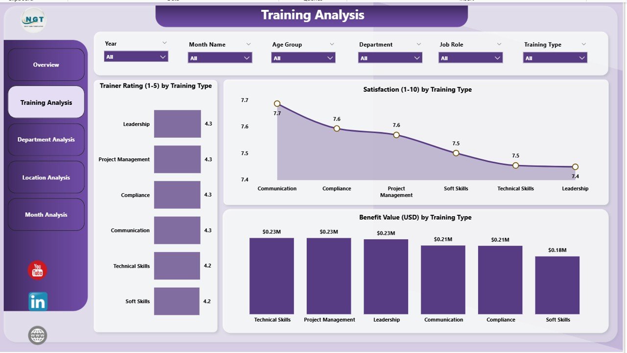
The Training Analysis Page focuses on training types and how employees respond to them. It includes slicers that help you refine your view by month, trainer, department, or training type.
Charts on This Page
It includes three powerful charts:
-
Trainer Rating by Training Type
-
Helps identify which training type creates the best learning experience.
-
Helps compare soft skills, technical training, leadership training, and more.
-
-
Satisfaction by Training Type
-
Shows which training type employees like the most.
-
Helps teams redesign or improve low-satisfaction programs.
-
-
Benefit Value (USD) by Training Type
-
Shows the value gained from each training type.
-
Helps in budget planning and future strategy.
-
Because this page gives detailed insights, teams can decide which training type brings maximum impact.
Click to Purchases Corporate Training Dashboard in Power BI
3. Department Analysis Page: What Can You Learn From It?
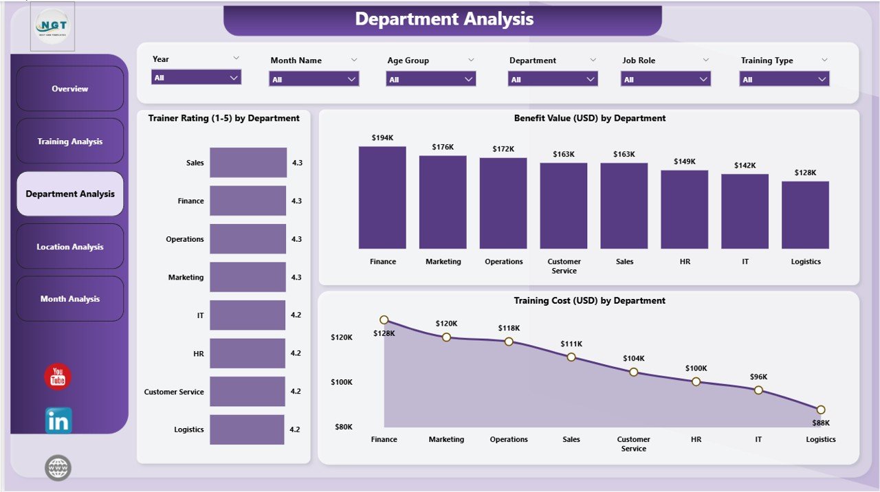
This page focuses on department-level insights. It helps identify which department is doing well and which needs improvement.
Charts on the Department Analysis Page
-
Trainer Rating by Department
This chart helps compare different departments. It shows which department gives better feedback and which one needs stronger training plans. -
Benefit Value (USD) by Department
This chart measures the department-level return on investment (ROI). -
Training Cost (USD) by Department
This chart shows how much each department spends on training.
Together, these charts help leaders invest in the right areas.
4. Location Analysis Page: Why Is Location-Level Insight Important?
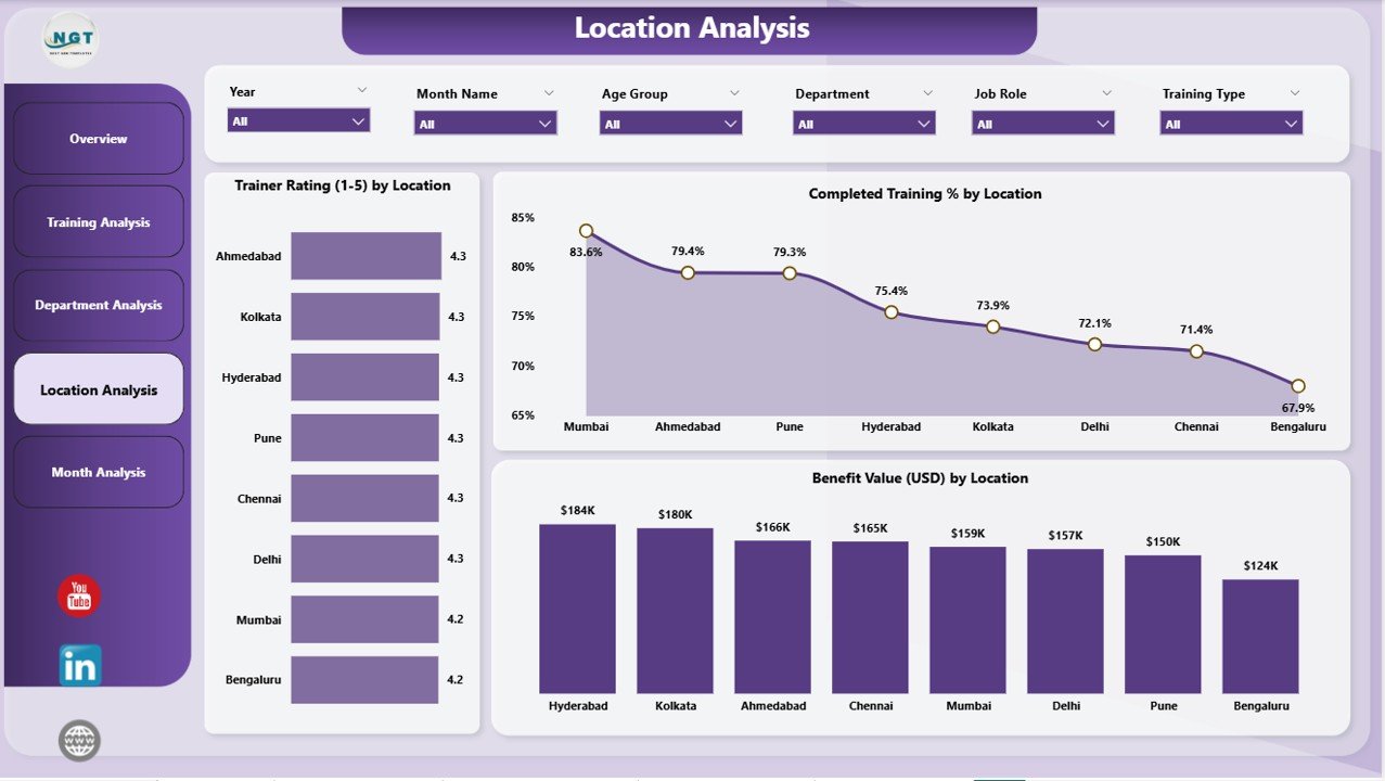
Companies with multiple locations need to compare training performance across cities or countries. The Location Analysis Page helps them understand local differences.
Charts on the Location Analysis Page
This page includes the following charts:
-
Trainer Rating by Location
Helps find the locations where trainers perform the best. -
Benefit Value (USD) by Location
Shows the value created at each location. -
Completed Value (USD) by Location
Helps measure training success at workplace level.
This page helps teams set better strategies for national or global training rollouts.
5. Monthly Trends Page: Why Do Monthly Insights Matter?
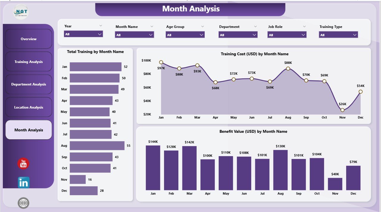
Monthly trends help teams track performance over time. They can see improvement or decline in training outcomes.
Charts on the Monthly Trends Page
-
Trainer Rating by Month
-
Benefit Value (USD) by Month
-
Total Training by Month
These charts help managers track progress, understand seasonal patterns, and plan future training programs.
What Are the Advantages of Using a Corporate Training Dashboard in Power BI?
A training dashboard offers many advantages that improve decision-making and productivity. Below are the main benefits:
1. Real-Time Insights
The dashboard updates instantly. As a result, managers can take quick decisions without waiting for manual reports.
2. Better Training ROI
The dashboard shows which training gives higher value. Therefore, companies can invest in programs that deliver better results.
3. Improved Planning
Managers understand trends, weak areas, and top-performing departments. So they plan future trainings with more confidence.
4. Reduced Manual Work
The dashboard removes the need for manual Excel reports. This saves time and ensures accuracy.
5. Clear Visualization
Charts and cards make data easy to understand. Anyone can read the dashboard even without technical knowledge.
6. Employee Growth
When training improves, employee performance improves as well. This creates a stronger workforce.
Click to Purchases Corporate Training Dashboard in Power BI
What Are the Best Practices for Using a Corporate Training Dashboard?
To get maximum value from the dashboard, follow these best practices:
1. Update Data Regularly
Always update your training records. Fresh data gives more accurate insights.
2. Use Meaningful Filters
Use slicers to compare departments, locations, or job roles. This helps you find hidden insights.
3. Review Monthly Trends
Always review monthly charts. They show whether your training strategy works or needs change.
4. Compare Training Types
Compare trainer ratings and satisfaction levels. This helps identify the most effective training programs.
5. Track Costs Closely
Monitor training cost charts. This helps you control budgets and avoid overspending.
6. Focus on Benefit Value
Benefit Value (USD) shows the real impact of training. Always track this metric.
7. Share the Dashboard With Leaders
Share insights with HR, department heads, and leadership teams. This helps build strong learning culture.
Conclusion
A Corporate Training Dashboard in Power BI helps companies track all training KPIs in a clear and simple way. It brings all insights into one place, which helps teams take quick decisions. Because the dashboard includes pages like Overview, Training Analysis, Department Analysis, Location Analysis, and Monthly Trends, it becomes a complete tool for Learning and Development teams.
When companies use this dashboard the right way, they improve employee skills, control training costs, measure ROI, and create more effective training plans. As a result, employees grow and the company grows along with them.
Frequently Asked Questions (FAQs)
1. What is a Corporate Training Dashboard in Power BI?
A Corporate Training Dashboard in Power BI is a visual tool that shows training data through charts and KPIs. It helps companies track performance, cost, trainer ratings, and overall training impact.
2. How many pages does this dashboard have?
The dashboard has five pages: Overview, Training Analysis, Department Analysis, Location Analysis, and Monthly Trends.
3. Who can use this dashboard?
HR teams, Learning and Development teams, managers, trainers, leadership teams, and department heads can use this dashboard.
4. What KPIs does the dashboard track?
It tracks Trainer Rating, Benefit Value, Training Cost, Satisfaction, Completion Status, and Monthly Training Count.
5. Can small companies use this dashboard?
Yes, small companies can use it because Power BI works well for all training sizes and budgets.
6. What is the benefit value in the dashboard?
Benefit Value (USD) shows how much value the company receives after completing a training program.
7. Can I add more pages to the dashboard?
Yes, Power BI allows you to add more pages based on your company’s needs.
8. Why should companies track training through dashboards?
Because dashboards help teams take fast decisions, reduce manual work, and improve training results.
Visit our YouTube channel to learn step-by-step video tutorials