Cloud migration grows faster every year because companies move their apps, data, and workflows to the cloud to improve speed, agility, and cost savings. However, many teams struggle when they try to measure the results of their migration. They track data in different sheets, reports, and tools. As a result, they fail to compare performance, monitor progress, or decide what needs improvement.
A Cloud Migration KPI Dashboard in Power BI solves this problem. It brings all KPIs into one interactive dashboard. Users can check migration success, risk levels, timelines, quality, and cost with a single click. In this 2500-word detailed guide, you will learn everything about this dashboard—its structure, features, benefits, best practices, and FAQs.
Click to Purchases Cloud Migration KPI Dashboard in Power BI
What Is a Cloud Migration KPI Dashboard in Power BI?
A Cloud Migration KPI Dashboard in Power BI is a ready-to-use monitoring solution that tracks all important performance indicators related to cloud migration. It pulls data from Excel and converts it into meaningful visuals. As a result, teams understand their migration performance quickly and take better decisions without confusion.
This dashboard tracks metrics like:
-
Migration progress
-
Application readiness
-
Cost savings
-
Downtime
-
Risk levels
-
Data transfer speed
-
User adoption rate
-
Compliance score
-
MTD vs YTD comparison
-
Current year vs previous year analysis
Because of this, both technical and non-technical users can monitor cloud migration performance in real time.
Why Cloud Migration KPIs Matter?
Cloud migration is a long journey. It includes discovery, assessment, planning, migration, testing, optimization, and monitoring. Every stage has risks. A small mistake may cause downtime, high cost, or performance issues.
KPIs help you measure:
-
How well the migration is going
-
Whether the migration stays on schedule
-
Whether the team meets the defined targets
-
How much improvement the company gets after migration
-
Where risks exist
-
What needs immediate attention
With a Power BI dashboard, teams track all these KPIs in one place.
Key Features of the Cloud Migration KPI Dashboard in Power BI
This dashboard includes three main pages inside the Power BI file. Each page gives a different level of detail. Below is the complete explanation.
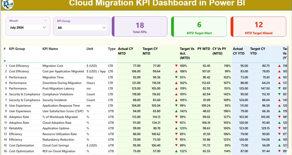
1. Summary Page – The Main View
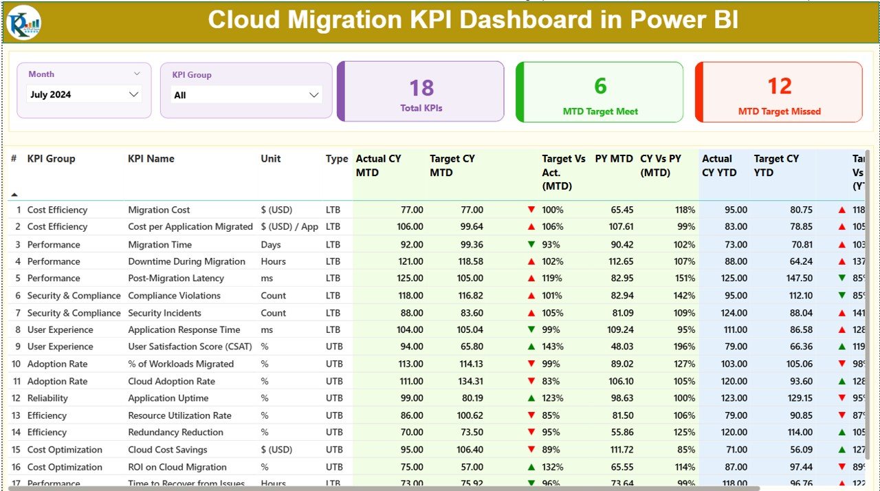
This is the most important page of the Cloud Migration KPI Dashboard. It provides an instant snapshot of all KPIs.
Top Filters
You get two slicers:
-
Month Slicer – Choose any month to see the performance
-
KPI Group Slicer – Filter KPIs by categories like Performance, Cost, Security, Readiness, Quality, etc.
Key KPI Cards
You will see three cards on the top:
-
Total KPIs Count
-
MTD Target Met Count
-
MTD Target Missed Count
These cards help you understand how many KPIs meet the target and how many need improvement.
Detailed KPI Table
Below the cards, the dashboard displays a detailed table with the following fields:
-
KPI Number: Serial number
-
KPI Group: Category of KPI
-
KPI Name: Name of the KPI
-
Unit: Measurement unit
-
Type: LTB (Lower the Better) or UTB (Upper the Better)
-
Actual CY MTD: Current year MTD actual value
-
Target CY MTD: Current year MTD target
-
MTD Icon: Red/Green icons to show performance
-
Target vs Act. (MTD): Actual / Target in percentage
-
PY MTD: Previous year MTD actual
-
CY vs PY (MTD): Comparison of current vs previous year
You will also get YTD fields:
-
Actual CY YTD
-
Target CY YTD
-
YTD Icon
-
Target vs Act. (YTD)
-
PY YTD
-
CY vs PY (YTD)
These fields help you compare MTD and YTD performance and take quick action.
2. KPI Trend Page – Performance Over Time
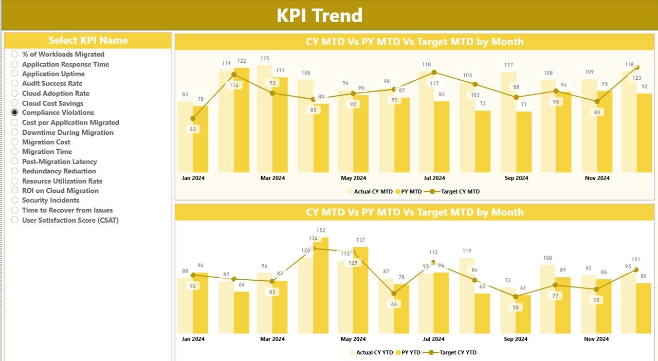
This page helps you understand how each KPI performs month-by-month.
What This Page Shows:
-
Two combo charts
-
Current Year Actuals
-
Previous Year Actuals
-
Target Values
-
MTD and YTD trends
Users can also choose any KPI from the slicer on the left side. After selection, both charts update instantly. This gives a clear idea of performance movement.
Click to Purchases Cloud Migration KPI Dashboard in Power BI
3. KPI Definition Page – Drill-Through Detail
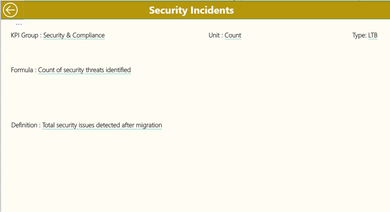
This is a hidden page. You can access it through drill-through from the Summary page.
This page shows:
-
KPI Number
-
KPI Name
-
Unit
-
Formula
-
Definition
-
KPI Type (LTB or UTB)
This page is useful when the user needs a clear explanation of how the KPI works.
Excel Data Structure for the Cloud Migration KPI Dashboard
The dashboard uses an Excel file as the main data source. Inside this file, you will fill three worksheets.
1. Input_Actual Sheet
Fill the following fields:
-
KPI Name
-
Month (use first date of month)
-
MTD values
-
YTD values
This sheet contains actual performance numbers.
2. Input_Target Sheet
Fill the target values:
-
KPI Name
-
Month
-
MTD target
-
YTD target
This helps Power BI compare actual vs target.
3. KPI Definition Sheet
Fill the KPI details like:
-
KPI Number
-
KPI Group
-
KPI Name
-
Unit
-
Formula
-
Definition
-
Type (LTB / UTB)
This sheet helps Power BI show drill-through detail when required.
Why Companies Need a Cloud Migration Dashboard in Power BI
Cloud migration involves multiple teams—IT, security, finance, operations, and product. Each team tracks different KPIs. Without a single dashboard, confusion grows. Teams fail to match their numbers.
A Power BI dashboard removes this confusion because it:
-
Combines data from many sheets
-
Shows automatic MTD and YTD analysis
-
Highlights risk with icons
-
Reduces manual reporting
-
Saves time
-
Improves accuracy
As a result, companies make faster and smarter decisions.
What KPIs Should You Track in Cloud Migration?
Click to Purchases Cloud Migration KPI Dashboard in Power BI
Below are some common cloud migration KPIs:
Migration Progress KPIs
-
Applications migrated
-
Migration completion rate
-
Data transfer progress
-
Workload readiness
Performance KPIs
-
Transfer speed
-
System uptime after migration
-
Latency improvement
Cost KPIs
-
Cost savings
-
Cloud spend
-
Migration cost variance
Risk KPIs
-
Security issues
-
Compliance scores
-
Downtime incidents
User KPIs
-
User adoption rate
-
User satisfaction score
By tracking these KPIs, companies avoid delays and improve the success of migration.
Advantages of Cloud Migration KPI Dashboard in Power BI
A Cloud Migration Dashboard provides many benefits. Here are some major advantages explained in simple words.
1. Real-Time Insights
The dashboard updates instantly. Users see their latest KPI status without waiting for monthly reports.
2. Easy Comparison of MTD and YTD
You can compare:
-
Month-to-Date vs Target
-
Year-to-Date vs Target
-
Current Year vs Previous Year
This helps you understand performance quickly.
3. Better Visibility Across Teams
Cloud migration involves many people. Power BI gives a single view for all teams. As a result, everyone stays aligned.
4. Reduced Manual Work
You only update numbers in Excel. Power BI updates all visuals automatically, saving hours of manual reporting.
5. Clear Target Tracking with Icons
Red and green icons help you understand KPI status instantly. No need to read long numbers.
6. Faster Decision-Making
The dashboard highlights problems early. This allows teams to fix issues before they grow bigger.
Best Practices for the Cloud Migration KPI Dashboard in Power BI
To get the best results from this dashboard, follow the practices below.
1. Keep Your Data Clean
Always use the correct format for:
-
Month
-
KPI Name
-
Units
-
Numbers
Clean data improves accuracy.
2. Update Excel Sheets Every Month
Power BI refreshes your visuals based on Excel. So, update the sheets regularly for accurate reporting.
3. Use Standard KPI Definitions
Make sure every team uses the same definition for KPIs. This avoids confusion during comparison.
4. Review Trends Every Month
Do not focus only on MTD numbers. Check trends to understand movement over time.
5. Set Realistic Targets
Targets should match your cloud migration plan. Unrealistic targets lead to poor alignment.
6. Use the Drill-Through Page Often
The hidden KPI Definition page helps you understand formulas and explain KPIs to stakeholders.
Conclusion
Cloud migration success depends on continuous monitoring. Without proper tracking, teams face delays, extra cost, and performance issues. A Cloud Migration KPI Dashboard in Power BI solves all these problems. It gives a full view of performance and helps teams make quick, smart, and confident decisions.
This dashboard becomes even more powerful when you update Excel data regularly and follow all best practices. With the right setup, companies improve visibility, reduce risk, and achieve faster cloud transformation.
Frequently Asked Questions (FAQs)
1. What is a Cloud Migration KPI Dashboard?
It is a Power BI dashboard that tracks all key metrics related to cloud migration, such as progress, readiness, cost, quality, and performance.
2. Why do companies need this dashboard?
Companies need it to monitor cloud migration status, compare progress, track risks, and make better decisions.
3. Does this dashboard support MTD and YTD analysis?
Yes, it supports both Month-to-Date and Year-to-Date comparisons with actual vs target values.
4. Can I update the dashboard using Excel?
Yes. You can fill the Actual, Target, and KPI Definition sheets in Excel. Power BI will update the visuals.
5. Is the KPI Definition page visible to users?
No. It is a hidden drill-through page. You can access it only from the Summary page.
6. Can I customize the KPI list?
Yes. You can add or remove KPIs anytime by updating the Excel sheets.
7. Does the dashboard show trends?
Yes. The KPI Trend page shows MTD and YTD trends for Current Year, Previous Year, and Targets.
Visit our YouTube channel to learn step-by-step video tutorials
Click to Purchases Cloud Migration KPI Dashboard in Power BI