Managing an ophthalmology clinic involves more than providing quality eye care. Clinics must also track visits, surgeries, revenue, insurance cases, and departmental performance. However, when data stays scattered across multiple Excel files or systems, decision-making becomes slow and unclear.
That is exactly where an Ophthalmology Services Dashboard in Excel becomes a powerful solution.
In this detailed guide, you will clearly understand what an Ophthalmology Services Dashboard in Excel is, how it works, what insights it provides, and how each dashboard page supports smarter clinical and financial decisions. Moreover, this article explains dashboard features, analysis structure, advantages, and best practices in a simple and practical way.
Click to Purchases Ophthalmology Services Dashboard in Excel
What Is an Ophthalmology Services Dashboard in Excel?
An Ophthalmology Services Dashboard in Excel is a ready-to-use analytical tool designed specifically for eye care clinics, hospitals, and diagnostic centers. This dashboard consolidates critical operational and financial data into one interactive Excel file.
Instead of reviewing long spreadsheets or manual reports, clinic managers can instantly monitor patient visits, charges, revenue, surgeries, insurance cases, and doctor performance.
Most importantly, Excel makes this dashboard flexible, cost-effective, and easy to use without requiring advanced software or technical skills.
Why Do Ophthalmology Clinics Need a Dashboard?
Ophthalmology services generate large volumes of data every day. Clinics manage OPD visits, surgical cases, billing, insurance claims, and doctor schedules. However, without clear analytics, clinics struggle to answer simple but critical questions.
For example:
-
Which department generates the highest revenue?
-
Which doctor handles the most surgical cases?
-
How does insurance impact monthly revenue?
-
Which service type delivers higher profit per visit?
An Ophthalmology Services Dashboard in Excel answers all these questions clearly and visually.
How Does an Ophthalmology Services Dashboard in Excel Work?
This dashboard pulls data from a structured data sheet and transforms it into meaningful visuals using pivot tables, slicers, charts, and calculated KPIs.
Because everything runs inside Excel, users can:
-
Filter results by month, doctor, department, or service
-
Compare trends over time
-
Analyze revenue and visit patterns instantly
-
Make informed decisions faster
Key Features of the Ophthalmology Services Dashboard in Excel
The dashboard includes smart design choices that improve usability and analysis.
Page Navigator for Easy Navigation
The dashboard contains a page navigator located on the left side of the Excel file. This navigator allows users to move smoothly between different analytics pages without scrolling or confusion.
As a result, even non-technical users can explore insights effortlessly.
What Pages Are Available in the Ophthalmology Services Dashboard?
This ready-to-use Excel dashboard includes five powerful analytical pages, each focusing on a specific area of clinic performance.
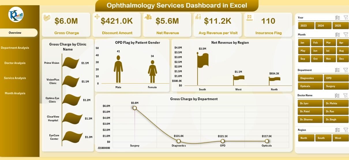
Overview Page: What Is the Overall Performance of the Clinic?
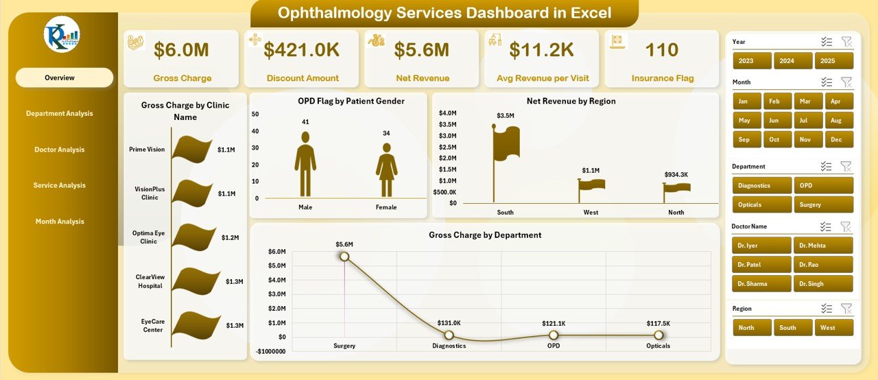
The Overview Page acts as the control center of the dashboard. It provides a quick and complete snapshot of clinic performance.
Key Elements on the Overview Page
-
Right-side slicer for filtering by key dimensions
-
Five KPI cards displaying high-level metrics
-
Four interactive charts offering summarized insights
Charts Available on the Overview Page
-
Gross Charge by Clinic Name
Helps compare billing performance across multiple clinics or branches. -
OPD Flag by Patient Gender
Shows the gender-wise distribution of outpatient visits. -
Net Revenue by Region
Highlights revenue contribution from different geographical areas. -
Gross Charge by Department
Compares department-level billing strength.
With this page, decision-makers quickly understand where the clinic stands overall.
Department Analysis Page: Which Department Performs the Best?
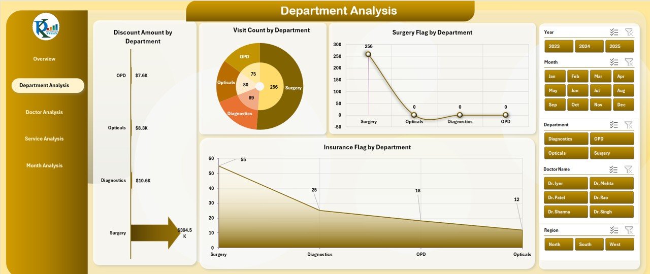
The Department Analysis Page focuses on department-level performance and utilization.
Key Features of Department Analysis
-
Right-side slicer for quick filtering
-
Clear breakdown of department KPIs
-
Visual comparison across departments
Charts Available on the Department Analysis Page
-
Discount Amount by Department
Identifies departments offering higher discounts and potential revenue leakage. -
Visit Count by Department
Shows patient load distribution across departments. -
Surgery Flag by Department
Highlights departments handling more surgical cases. -
Insurance Flag by Department
Tracks departments with higher insurance dependency.
As a result, management can optimize department resources and pricing strategies.
Doctor Analysis Page: Which Doctor Drives the Most Value?
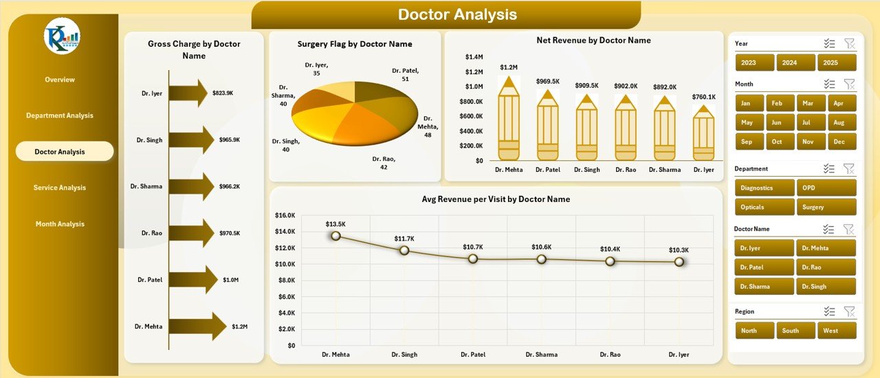
Doctors play a critical role in ophthalmology service delivery. Therefore, the Doctor Analysis Page helps clinics evaluate individual doctor performance.
Key Insights Provided by Doctor Analysis
Click to Purchases Ophthalmology Services Dashboard in Excel
-
Revenue contribution per doctor
-
Surgical workload analysis
-
Average revenue per patient visit
Charts Available on the Doctor Analysis Page
-
Gross Charge by Doctor Name
Displays billing contribution by each doctor. -
Surgery Flag by Doctor Name
Highlights doctors performing more surgeries. -
Net Revenue by Doctor Name
Shows profitability by physician. -
Average Revenue per Visit by Doctor Name
Helps evaluate consultation quality and service mix.
Using this analysis, clinics can manage incentives, schedules, and training more effectively.
Service Analysis Page: Which Services Generate Maximum Revenue?
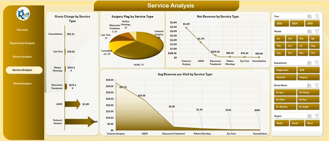
The Service Analysis Page helps clinics understand which treatments or procedures deliver better financial and operational results.
Why Service Analysis Matters
Different ophthalmology services vary in cost, complexity, and margin. This page allows clinics to balance volume and profitability.
Charts Available on the Service Analysis Page
-
Gross Charge by Service Type
Compares billing across different service categories. -
Surgery Flag by Service Type
Identifies surgery-heavy services. -
Net Revenue by Service Type
Shows which services generate higher net returns. -
Average Revenue per Visit by Service Type
Highlights value per patient visit.
As a result, clinics can refine service offerings strategically.
Month Analysis Page: How Does Performance Change Over Time?
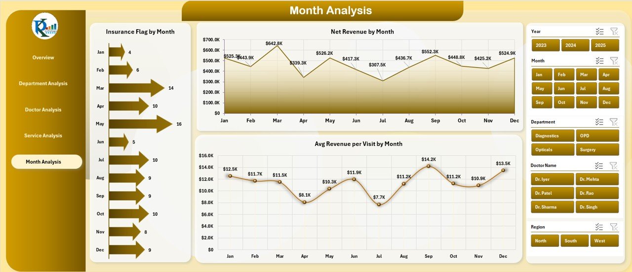
The Month Analysis Page focuses on trend analysis and seasonality.
Click to Purchases Ophthalmology Services Dashboard in Excel
Benefits of Monthly Analysis
-
Tracks insurance trends
-
Monitors revenue growth or decline
-
Evaluates financial consistency
Charts Available on the Month Analysis Page
-
Insurance Flag by Month
Shows monthly variation in insurance-based cases. -
Net Revenue by Month
Tracks revenue growth trends. -
Average Revenue per Visit by Month
Helps assess improvement in service value over time.
With this page, managers can forecast demand and plan resources better.
What Is the Role of the Data Sheet and Support Sheet?
Data Sheet
The Data Sheet stores all raw ophthalmology service records, including:
-
Patient visits
-
Charges and discounts
-
Insurance flags
-
Surgery indicators
-
Department, doctor, and service details
-
Dates and monthly fields
This structured data feeds all dashboard visuals.
Support Sheet
The Support Sheet contains helper tables, mappings, or lookup values that ensure clean filtering and accurate calculations across the dashboard.
Together, these sheets ensure reliability and scalability.
Advantages of Ophthalmology Services Dashboard in Excel
Using this dashboard brings several operational and strategic benefits.
-
✅ Centralizes all clinical and financial metrics in one file
-
✅ Improves decision-making through real-time visual insights
-
✅ Reduces manual reporting effort and errors
-
✅ Enhances doctor and department performance evaluation
-
✅ Supports revenue growth and cost control
-
✅ Requires no additional software investment
-
✅ Easy to customize based on clinic size and services
Best Practices for the Ophthalmology Services Dashboard in Excel
Following best practices ensures long-term dashboard success.
-
✅ Keep data updated regularly
-
✅ Use consistent department and doctor naming
-
✅ Validate insurance and surgery flags carefully
-
✅ Review discount policies using department analysis
-
✅ Track monthly trends for forecasting
-
✅ Limit manual edits to dashboard visuals
-
✅ Train staff on basic filtering and slicer usage
Who Can Use the Ophthalmology Services Dashboard?
This dashboard suits multiple healthcare stakeholders.
-
Ophthalmology clinic owners
-
Hospital administrators
-
Medical billing teams
-
Finance and revenue managers
-
Healthcare analysts
-
Operations managers
Because Excel remains widely used, adoption stays easy.
How Does This Dashboard Improve Decision-Making?
This Excel dashboard converts raw data into actionable insights. Managers no longer rely on assumptions. Instead, they use data-backed evidence to:
-
Improve doctor productivity
-
Optimize service mix
-
Reduce revenue leakage
-
Balance insurance versus cash cases
-
Boost overall clinic profitability
Therefore, clinics stay competitive and financially healthy.
Final Thoughts: Why Choose an Ophthalmology Services Dashboard in Excel?
Click to Purchases Ophthalmology Services Dashboard in Excel
An Ophthalmology Services Dashboard in Excel delivers everything modern eye care clinics need to monitor operations and revenue efficiently. It combines simplicity, flexibility, and powerful analytics in one familiar tool.
Instead of spending hours on manual reports, clinics gain instant clarity across departments, doctors, services, and time periods. Consequently, leadership can focus on growth, quality care, and patient satisfaction.
Frequently Asked Questions About Ophthalmology Services Dashboard in Excel
What is an Ophthalmology Services Dashboard in Excel?
An Ophthalmology Services Dashboard in Excel is a visual reporting tool that tracks clinic revenue, visits, surgeries, insurance cases, and doctor performance using Excel-based analytics.
Is Excel suitable for healthcare dashboards?
Yes, Excel works perfectly for small to medium healthcare organizations due to its flexibility, affordability, and ease of use.
Can this dashboard handle multiple clinics?
Yes, the dashboard supports multiple clinics through clinic name fields and slicers.
Does the dashboard support monthly analysis?
Yes, the Month Analysis page provides monthly trends for revenue, insurance, and average revenue per visit.
Can clinics customize this dashboard?
Yes, users can easily customize charts, KPIs, and filters based on their requirements.
Does this dashboard require Excel VBA?
No, the dashboard works using pivot tables, slicers, and formulas. No VBA is required.
How often should clinics update the data?
Clinics should update data daily or weekly to ensure accurate insights.
Who benefits the most from this dashboard?
Clinic owners, administrators, finance teams, and doctors benefit significantly from using this dashboard.
Visit our YouTube channel to learn step-by-step video tutorials